7 Interface Design Techniques to Simplify and De-clutter Your Interfaces
 What is simplicity? Simplicity is the quality of being natural, plain and easy to understand. It is not surprising then that simplicity is often thrived for in user interface design. Most people naturally dislike complexity in devices and software. Yes, some people find joy in figuring out how something works, but for most of us, being unable to operate a device leads to wasted time and frustration, and that's not a good thing.
If you can take a complex device or a piece of software and somehow rearrange, reorganize and redesign the interface to make it easy to use and understand, then you're well on the way to delivering a better user experience.
In this article I'm going to talk about 7 practical techniques that you can utilize in web design to make your websites or web applications simpler and less cluttered.
1. Modal windows.
I'm sure you can remember the days before pop-up blockers were introduced into web browsers, when you had to fight a swarm of little windows that all too often decided to pop up over the top of your browser window, seemingly with the sole purpose of annoying you. Nobody liked those pop-up windows, and blocking technologies were introduced to stop them. But today, we're seeing a new breed of pop-up windows on the web that are a lot cleaner and work a lot better at their intended purpose. These are modal windows.
Modal windows are like pop-up windows, but instead of appearing in a separate browser window, they appear right inside the current one, over the top of the content. Modal windows require interaction to proceed, so the content below is usually darkened to indicate this, as well as to block out the distracting noise of the content and shift visual focus on the window above.
So why would you use modal windows and how do they simplify your interface? Well, if you look at the alternative, their purpose becomes much clearer. The alternative to using something like a modal window is usually to load a new page. For example, some sites have a settings page for your account. When you click on the settings link, you're taken to a new page. But what if there were only a few settings options -- is it really worth redirecting the user to a new page?
In a lot of cases, things like settings, edit boxes and login forms can be displayed in a modal window over the content. This saves the user a return trip to another page. It also lightens the load on the web server as it has to deal with fewer requests.
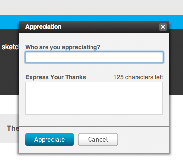
ActionMethod, a project management app, displays modal windows throughout the application. Here's the Appreciation form.
2. Hover controls.
Putting fewer things on the plate would also make the dish easier to swallow. If your application has many controls, your users will need to scan through most of them to find what they're looking for. Chances are, some of the controls are less important than others, and some of the controls are used much less than others. The simplest thing you can do is tuck away and hide these controls from the default view.
A clever way to do this is to hide the controls, but then show them when the user is hovering over certain areas. These are hover controls. For example, Twitter, a popular micro-blogging app, displays a feed of what everybody on your follow list has recently said. Each message is encapsulated in its own little box. There are two actions you can perform on each message: add it to your favorites or reply to it.
Displaying the favorite and reply buttons on all the messages would lead to clutter. You're not likely to want to respond to every message in the feed, and even less likely to want to add all of them to your favorites. So Twitter only displays the controls in the right context -- when you hover over the message. This leads to a simpler interface and no loss in functionality. There is a danger of new users not noticing these controls when they're hidden; however, a lot of people tend to mouse over things they're looking at, so given the hover areas are large enough, these controls are likely to be discovered quickly.
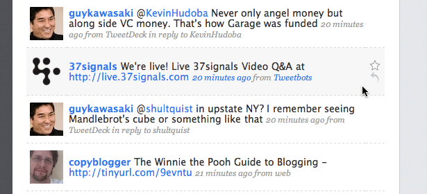
Twitter shows the add to favorites and reply buttons for each message as you hover over it.
3. Controls on demand.
Another way of hiding things is to utilize Javascript and display a set of controls when the user clicks somewhere. For example, you may have a search box on your site that allows for some custom filters or advanced searches. Instead of showing these options by default, you can hide them away and make them accessible via a button at the end of the search bar. Clicking on this button could reveal the set of options or filters. This means you retain the advanced functionality for those users who need it, and at the same time simplify the interface for people who just need to use the simple search.
Not everybody uses some of the more advanced or specialized controls on your site. By hiding them, you're making the interface cleaner and easier to understand because new users have fewer elements to process and figure out. Selecting what to hide and what to keep isn't an easy task though, and it is your job as the designer to find a suitable balance.
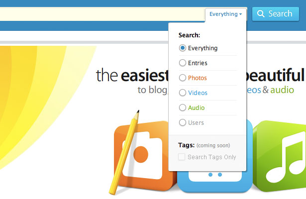
Kontain, a blogging app, provides advanced search filters for their search, concealed in a drop-down menu at the end of the search bar.
4. Expanding forms.
I'm sure you're familiar with the file upload field we often see in web forms. It's usually a little bar with a file browse button by the side. Imagine a situation where the user is likely to upload several files at once though. You could display several file upload fields, but that's not ideal because it will clutter the interface and there is no way to tell how many fields the user will need. A great solution in this case would be to use an expanding form.
Once the user uploads one file, another file upload field will appear underneath, ready to accept more. You can implement the same technique for any other input field. For example, maybe this form needs a bunch of email addresses for people you want to invite to a team or some other purpose. Instead of having a lot of text fields, you could just have one or a couple, and then as the user fills them in, new ones are created underneath. Expanding the form in this way is a great way to save space and simplify your interface.
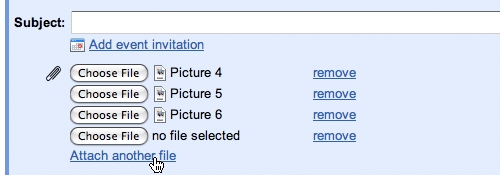
Gmail only displays one attachment field when you compose a new message. You can click on the "Attach another file" link to open up more when you need them.
5. Labels inside input forms.
Forms can get complex fast. You have text fields, labels, text areas, drop downs, checkboxes and so on and so forth. What's more, filling out forms isn't usually very fun, so speeding up the process and making forms simpler will make them less daunting and easier to use. One technique you can use to make the forms appear simpler, is to move the labels from outside of the input areas inwards. So, instead of showing a label next to that text field, show it as a pre-filled value inside the text field.
This cuts down on space considerably, shrinking the overall size of the form. Smaller things appear simpler, so the form should look easier to fill in. It may not be possible to do this for more complicated forms where you have a variety of input types (checkboxes, radio buttons, drop-downs), but if you have a few text fields it is well worth considering, e.g. a login form.
Now, there is a downside to this method, which fortunately can be addressed with a more thorough implementation. When the user first loads the page, they'll see the fields and will be able to read the labels. Once they click on a field, most forms like this will hide the label completely, allowing the user to type in their input. But what if the user prematurely clicks on a field, and then forgets what it is they were meant to be typing? They may need to click away from the form to get the label to appear again (hopefully).
To address this, instead of completely hiding the label, you can dim it when the user clicks on it, and then hide it completely when the user starts typing.
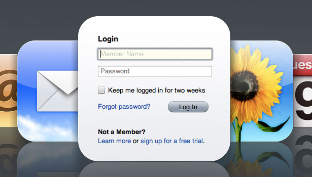
MobileMe shows labels inside input fields on their login screen, and then dims them further when you select a field.
6. Icons instead of text.
To achieve simplicity in interface design, you need to reduce and take away all the unnecessary or seldom used parts. These not only include controls, but can also be things like text labels. If your interface has a lot of labels, look at it and ask yourself -- are all these labels necessary? Are most of them simply stating the obvious? If a label is pointing out something which is obvious given the context of that item, then you don't need that label -- it's obsolete.
To give you an example of this, think about posts in a blog. Under each post's headline you may have things like date and author. Attaching labels before each one like "Author:" and "Date:" may not be needed. When somebody sees a name and a date under an article's headline they are very likely to figure out that this is the author and that's the date. The context, as well as the format that they're used to from reading other blogs, gives your users all the clues they need to instantly understand the meaning behind the data. Stripping away those labels will give you a cleaner interface.
In some cases where leaving out a label won't work, you can replace the label with an icon. An icon has some advantages over a text label. It takes less space. It's easier to focus on as its color and distinctive shape attracts the eye easier than text. In some cases the meaning can be conveyed just as effectively as text. For example, if you have a label called "Tags:" followed by a list of tag links, you could replace the label with a small image of a tag. Provided that you have a tech savvy audience, the meaning in this case should remain just as clear.
Of course it won't work for all cases, and if there is a danger of being ambiguous, you should play it safe and use a text label. Having said this, there is no reason to pick one or the other exclusively -- you can benefit from the attractive eye-catching properties of icons together with the clarity of text by using them together; although in that case you'll be trading off space.
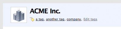
Highrise, a CRM app, uses a tag icon in place of a text label before a list of tags.
7. Context based controls.
There are a couple of approaches you can use in interface design that relate to context and consistency. One dictates that you should keep controls consistent throughout your applications or websites to ensure that people know where everything is and don't get confused. The other approach is to change controls or navigation based on the context of each page or window. The context based approach is one where you display only the stuff the user needs to complete the task they're working on in that particular context.
A good illustration of the two approaches can be seen in the recent redesign of the Microsoft Office interface. Office 2003, as well as its older siblings, followed the design principle of keeping things consistent. You had a bunch of toolbars displayed on the screen at all times, and these didn't change whether you were working with tables, graphics, text or pictures. Microsoft redesigned this interface for Office 2007 using a context based approach. At the top you now see a ribbon -- or a set of tabs. When selected, each tab displays a set of controls relevant to any given task, be it proofreading, working with graphics, or simply writing.
The context based approach allows you to show fewer controls at any given time, but at the same time, more controls that are relevant to the task at hand. I wouldn't recommend using a context-heavy approach for general web design because for most websites people expect to see consistent site-wide navigation. This is because every website is different, and it would make the browsing experience much harder if all the individual pages on a particular site were different too.
Having said this, this can be utilized for web applications because they're not just simple websites -- they're pieces of software that live in the cloud. People are likely to spend a lot of time on a web app and will have more opportunity to learn how it works. The complexity of some web apps means that you really need to utilize the context based approach, because if you don't, there will be too much on the screen at any given time for anyone to process. By showing only a few relevant controls for a given task, your users can figure out what to do in much less time.
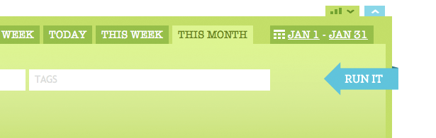
Freckle, a time tracking app, has a switcher at the top of their main toolbar. It switches between time input controls and report controls, only showing one set at a time. This makes sense because you're either inputting time or making a report -- not two things at the same time.
To conclude...
"The simplest way to achieve simplicity is through thoughtful reduction" - John Maeda, The Laws of Simplicity.
Making your interface smaller, hiding advanced functionality and taking out the obvious is the path to a simpler interface. Along this path you'll face many obstacles. For every feature you hide or take away, there will be people who complain and demand that you bring it back. But every one of your users has different needs and uses your web app or website in a different way. If you listen to all the feature requests and needs, and go as far as addressing and implementing them all, you're unlikely to arrive at the zenith of software design. More likely, you'll stumble into a deep pit of bloat from which it's almost impossible to climb out.
Once you add a feature, it is very hard to take it out because people will begin using it and some will depend on it. Because of this, make sure that every feature, and every interface element you add makes sense and adds real value to your product. More features means more controls and content. More controls and contents makes it harder to make the interface simple and clutter free.
Simplicity is all about reducing and reorganizing the complex into small and manageable. If anything, you should aim to take away, rather than to to add. A product with fewer buttons isn't necessarily less powerful -- it's likely just better designed.
Written exclusively for WDD by Dmitry Fadeyev. He runs a blog on usability called Usability Post.
Do you use any of these techniques in your designs? Do you think they help the user experience? Please share your experiences with us.
WDD Staff


Read Next

20 Best New Websites, April 2024

Exciting New Tools for Designers, April 2024

14 Top UX Tools for Designers in 2024

What Negative Effects Does a Bad Website Design Have On My Business?

10+ Best Resources & Tools for Web Designers (2024 update)

3 Essential Design Trends, April 2024

How to Plan Your First Successful Website

15 Best New Fonts, March 2024

LimeWire Developer APIs Herald a New Era of AI Integration

20 Best New Websites, March 2024

Exciting New Tools for Designers, March 2024
