
The everyday tasks in our lives are being revolutionized by technology. One task that technology is helping to simplify is shopping: the task of buying products in stores is just not as convenient as online shopping.
With that in mind, it is becoming more and more important to pay attention to the usability of e-commerce websites.
When customers want to buy a product, they want the process to be quick and easy, without any hassles.
Here are 10 tips to help you create usable e-commerce checkouts and shopping carts.
1. Full page and mini carts
Shopping carts often come in two forms, a fully functional cart that is contained within a page of its own and a "mini" shopping cart, usually located in the sidebar, or above the page fold. The best practice is to include both.
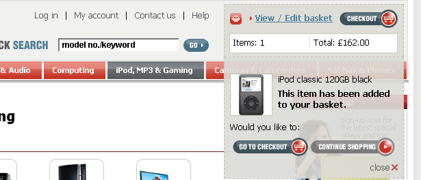
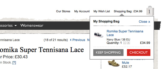
Mini shopping carts show information within a small area that doesn't take away from the rest of the layout. Here is an excellent example of a usable mini shopping cart.
When a product is selected, the item is immediately shown in the mini cart. After you continue shopping, the details minimize and only the number of items and total price is shown. Also, there is a link from the mini cart to view the full page cart.
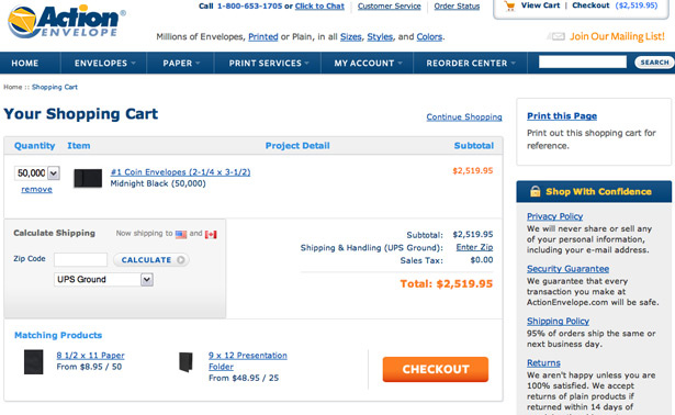
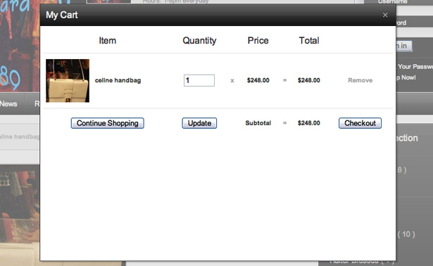
With the full page cart you can provide more information and more options than a mini cart. For example, information such as product details, remove/edit items, tax prices and shipping options can all be included in a full page cart. The full page cart example below also displays a mini cart in the upper right corner.
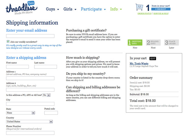
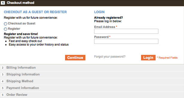
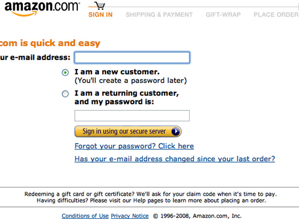
2. Checkout: Step-by-step or one page
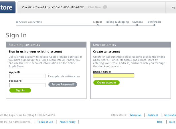
Using a step by step method makes the checkout process easy for the customer to follow. Take a look at the Apple.com checkout page below. The checkout procedure is performed in four different steps: Sign In, Billing & Shipping, Payment and finally Verify/Edit.
This is a well structured process and you should certainly consider using something similar to this when designing step-by-step checkouts.
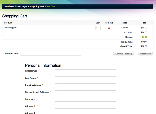
Besides a step-by-step process, another option is to include the shopping cart, personal information and shipping/billing information on a single page.
This can work nicely if done with a good layout. The following site uses a good single page checkout process. There is a table at the top which contains the cart, with the purchase information forms below.
3. Link from mini cart to full cart with an icon
When building a shopping cart, there are subtle features that impact the customer's experience. Clicking on the mini cart should link to the full cart and an icon should appear alongside the mini cart to draw the customer's attention to the mini cart and this link.
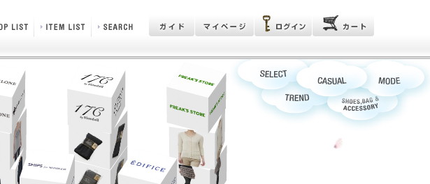
The following website is a perfect example of this. These buttons are in a foreign language, but the shopping cart icon can easily be recognized by anyone.
4. Make checkout/add to cart buttons obvious
When designing an e-commerce checkout and shopping cart, it's important to include easily accessible links to guide the customer through the checkout process. It's best to use large obvious buttons. Make sure that the buttons contain clearly legible and understandable text, such as 'Add To Cart' or 'Continue to checkout'.
The buttons below are well styled and well placed directly under the information of each product. If the customer can't find the checkout button, they can't buy your product!
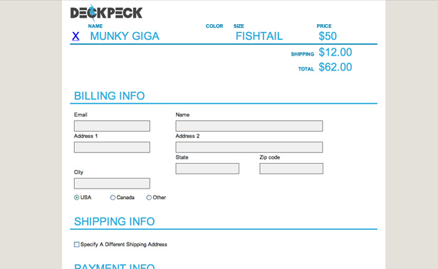
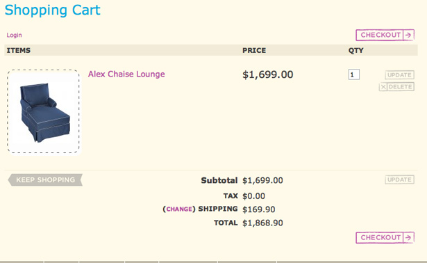
5. Use a readable table based layout
When designing a full shopping cart, it's always best to use a table based structure. The layout should efficiently display the information without interruption. Use standard fonts and avoid using complex backgrounds.
Always be sure to use strong borders to separate cells, but don't style the borders. Information in a shopping cart table should be easy to see without distraction from other elements, or complex styling.
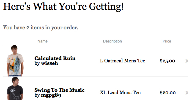
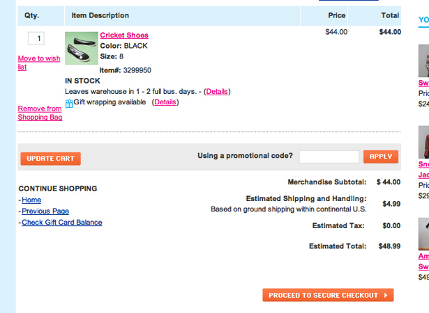
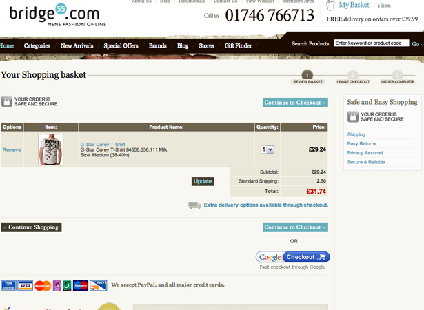
This is a very clean cart. The table is easily readable and it contains all the necessary elements. More importantly, note the image. The image of the product gives the customer a good visual of what they are buying, which can help customers confirm that they are indeed purchasing the product that they intended.
6. "Continue Shopping" link
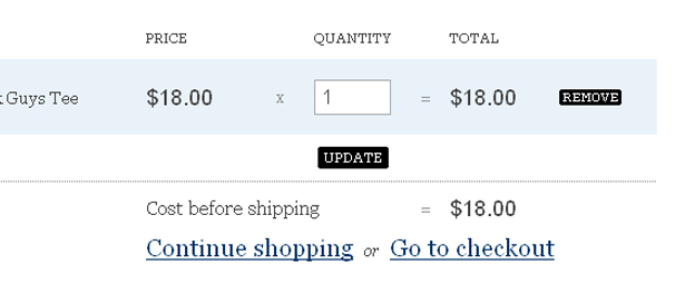
One more feature is a "Continue Shopping" link. When clicked, the link should bring the customer back to the store and catalog. This is generally placed under the table of the full shopping cart, where the customer can easily find it.
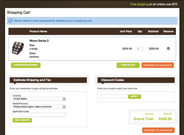
The example below shows the "Continue Shopping" and the "Go to Checkout" links. Notice how easy it is to find these.
7. Avoid too many fields
There's nothing more annoying to the average consumer than having to fill out an unnecessary amount of input fields in a form. You want the checkout process to be as easy as possible, because if the customer does not find it convenient, they will most likely not buy from the site again.
Keep the number of input fields to the minimum, place similar input fields into groups and provide headers for each section. An appropriate amount of white space will also help to make the form feel more organized.
The following form is minimal and contains a small number of input fields.
8. Provide plenty of help elements
There are many places that help elements should be included within the shopping cart and checkout process.
In the shopping cart, include quick tips on how to best use the cart's features and explain the checkout process. Labels in the cart and on the checkout form can be explained using tooltips.
On the checkout page, you can include sample text as to what should be included in each input field as well as examples of specific billing information, such as an image showing where the CVD number on the back of a credit card is located.
In the form below, the input fields have explanatory sample text and the middle column includes additional helpful information.
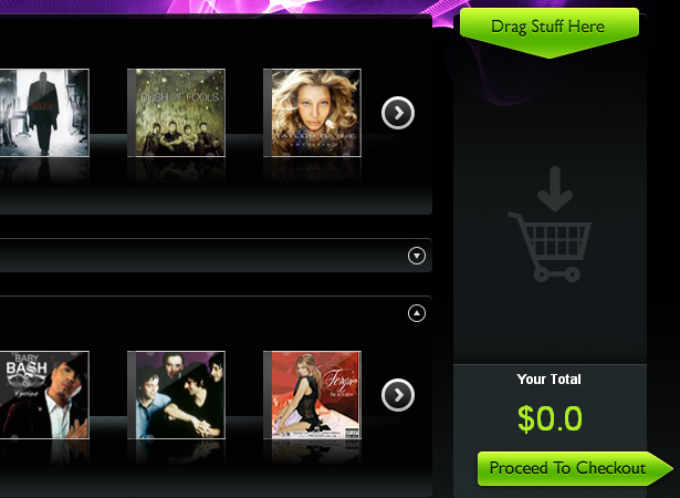
9. Give Visual Support
Visual support can be anything from diagrams to simple icons. An image showing the location of an account number on a credit card helps customers through the process of entering their billing information. Icons to support text are helpful to make the form easier to scan through.
The following image shows a very convenient click and drag cart. The image of the cart icon tells customers that they can drag items into the cart. The cart also has a label above it which says "Drag Stuff Here."
10. Always Include a Verify Page
The most important feature of any checkout process is certainly a verify and edit page as the final step. Usually customers would like to confirm that they are buying the correct items. Every good checkout process has this feature as a last chance for the customer to review his or her order before they commits to it through the payment process.
On the verify page, you should include all the information about the product in a table, similar to the full page checkout. The customer should be able to cancel their order, or be able to use a "Continue Shopping" link to add more items. Make the button to complete the process very evident, eliminating even the slightest confusion.
Showcase of Usable Carts and Checkouts
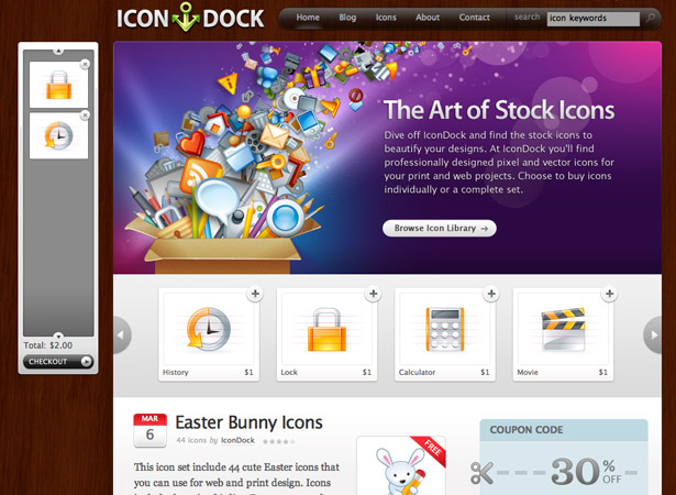
IconDock - This site has a very usable and convenient cart. All you have to do is click and drag an item into the panel. It automatically calculates the total and is a very quick shopping solution.
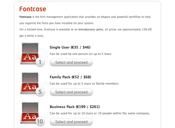
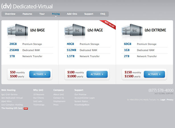
MediaTemple - Here is a very nice pricing table containing obvious checkout buttons with good placement.
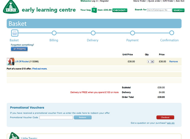
Early Learning Centre - This site has an excellent full cart, a mini cart, and a step by step checkout procedure illustrated with a timeline.
Roxy - This is a simple cart, and it also has a helpful mini cart that shows the customer the running total.
Mia & Maggie - This is a nicely styled cart that is easy to read and contains a large checkout button.
Mia & Maggie - Here is another example from Mia & Maggie, this one of the checkout page. This checkout uses a step by step process on a single page, which is a very clever and usable layout.
Amazon - Amazon is yet another popular e-commerce site that uses a step-by-step process.
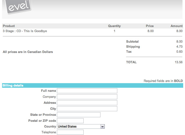
Evel - This is a very usable and quick checkout without too many input fields on the form. Also notice that the shopping cart is located above the form, which can be very convenient to some customers.
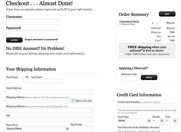
Design By Humans - Another example of a perfect single page checkout. This one contains an order summary, which can be very helpful. There are numerous help elements throughout the form too.
Bridge55 - A nice shopping cart with an image of the product.
Cosmic Soda - A good e-commerce website using both a mini cart and a full cart.
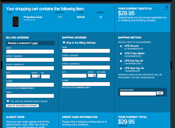
Incase - A well organized checkout with a minimal amount of fields.
Shoon - A great mini cart that displays a popup window containing additional information when the "Add to Cart" button is clicked.
Wunderbloc - A lightbox shopping cart.
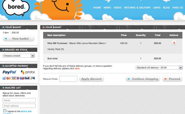
Bored of Southsea - A good mini cart and organized full cart.
Subnormals - Use of mini and full cart and a step-by-step checkout process.
AlphaStore - A table structure and a mini cart with a recognizable shopping cart icon.
Me & Mommy-to-be - A beautifully styled cart that isn't over the top with decoration.
Written exclusively for WDD by Matt Cronin from Spoonfed Design.
Which tips are the most important when designing an online shopping cart? Please share your comments with us.
WDD Staff


Read Next

3 Essential Design Trends, May 2024

How to Write World-Beating Web Content

20 Best New Websites, April 2024

Exciting New Tools for Designers, April 2024

How Web Designers Can Stay Relevant in the Age of AI

14 Top UX Tools for Designers in 2024

What Negative Effects Does a Bad Website Design Have On My Business?

10+ Best Resources & Tools for Web Designers (2024 update)

3 Essential Design Trends, April 2024

How to Plan Your First Successful Website

15 Best New Fonts, March 2024
