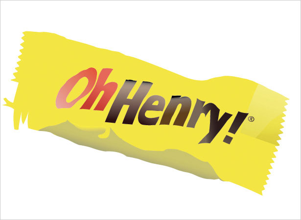
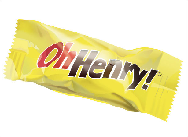
 Realistic renderings can be done easily in Adobe Illustrator.
With vector shapes, the objects can be preserved and edited infinitely which is a great advantage over raster objects.
A few simple tweaks from the Effects menu and an understanding of basic object rendering can create a bold and stunning finish.
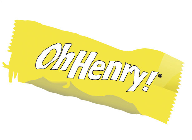
In this tutorial, created exclusively for WDD by Wendy Ding, she'll be guiding you step by step through the stages required to create a realistic candy bar using Illustrator.
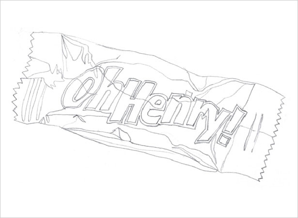
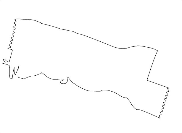
1. Sketch
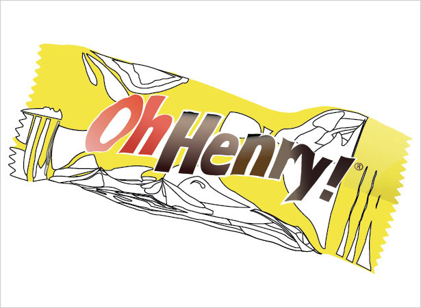
Start by sketching the overall shape complete with linear guides, which will be used to show how to define the vector shapes that we'll be drawing on top. Define the main shape, wrinkles, highlights and shadow areas. It helps to use an actual candy bar or an image of one for reference.
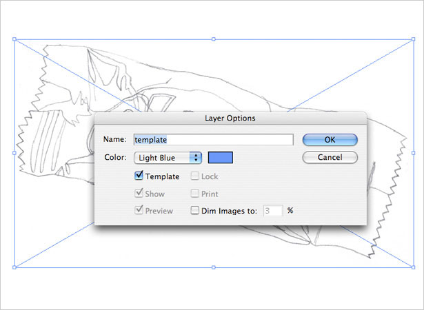
2. Import to Illustrator
Scan the sketch into Photoshop and adjust Image > Adjust > Brightness / Contrast until the lines are clearly visible. Open Illustrator and import the sketch using File > Place.
In the Layers panel, double click on the sketch layer to bring up the layer options pop-up window and check Template. For tracing purposes, the sketch can be dimmed to be less visible if preferred.
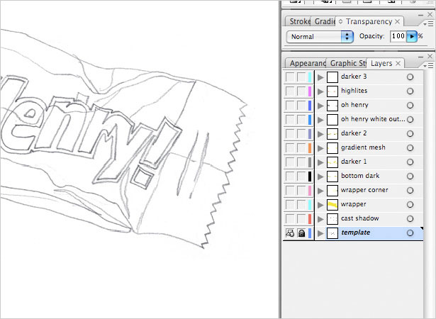
3. Stacking Order
It is crucial in vector files to have a logical stacking order of the layers. The elements all work together cumulatively, so be sure to arrange separate elements accordingly.
For example, the main wrapper, highlights, shadows and text all have their own respective layer. It also helps to name the layers appropriately.
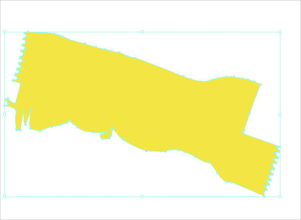
4. Tracing Technique
An efficient way to trace and color in Illustrator is to first create the shape using the Pen tool with a default white fill and black stroke (or no fill, depending on your preference).
Then, when the shape is finalized, select a color or gradient and apply it.
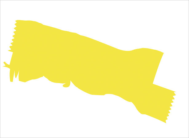
5. Main Shape
Create a new layer on top of the sketch template layer, so as to use the sketch template layer a guide. Trace along the main wrapper shape with the Pen tool, taking care to add details such as the zig-zagged ends.
Omit the bottom portion and top right corner of the wrapper for now, as this will be dealt with separately. Fill the shape with a very subtle yellow gradient of #F7EC94 to #F6E22C at an angle of -104.25.
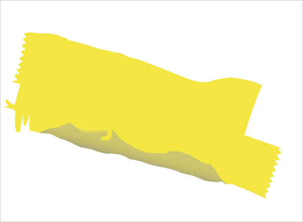
6. Bottom Portion
On a new layer above the main wrapper layer, trace along the sketch to create the bottom portion. Apply a tan-hued gradient of #C8C26A to #A9A574 at an angle of -105.59.
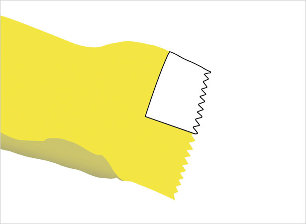
7. Top Corner
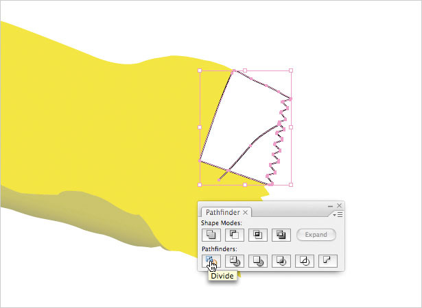
Create a new layer on top and trace the top right corner of the wrapper. To make the top corner look creased, draw a new black stroke with no fill across the bottom corner - this will be the dividing line.
With both the corner shape and the black line selected, click the Divide button in the Pathfinder panel to separate the shapes. Right click (ctrl-click) and select Ungroup.
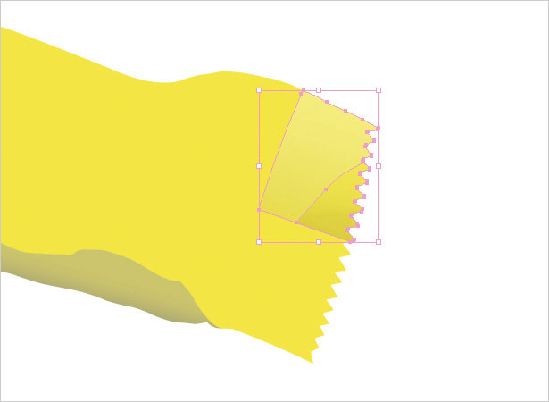
Now, apply a gradient of #FAEE8A to #E5D64B at an angle of -107.48 to the bigger shape, and #5A530B to #F6E775 at an angle of 91.66 to the smaller piece.
Last, change the Opacity of the smaller piece under the Transparency panel to 35% Color Burn.
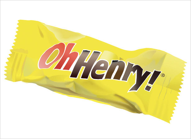
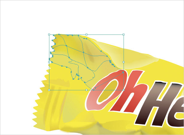
8. Candy Bar Name
On a new layer, trace the shape of the candy bar name. Try to trace the letters slightly skewed and wrinkled to make it appear more realistic. Use the Divide method from the last step to create hollow letters like "O" or "e", except instead of a line, use a shape as the divider.
The colors can be set to various gradients, as long as they give the letters the appropriate contouring of the form beneath them. Notice how this application gives the illusion of highlights.
Next, make a new layer underneath the name layer and trace a slightly bigger outline around the letters in a white fill and no stroke.
9. Main Shadows
For best results, use an actual candy bar or image of one for reference as this makes it easier to plot out the shadow areas.
A general rule regarding shadows: for direct folds, the shadows are crisp and darker; for slight creases, the shadows are lighter and blurrier. Also, shadows can differ in size and shape: some are large and rounded, while others are small and linear.
Use the Pen tool to first create the various shadow areas.
With a combination of experimentation and using actual reference, set the color and value of each shadow to match the amount that you see in the folds in your reference candy bar. Gradients can also be applied to get the look right.
There are two ways to blur a shape: 1) select it and click Effect > Stylize > Feather. With Preview turned on, toggle the amount till satisfied. 2) Effect > Blur > Gaussian Blur.
Another tip is to play with the Opacity to tone some shadows down. This may take some patience to get the results right.
10. Gradient Mesh
For tricky shadows, use the Gradient Mesh tool from the Tools panel. With this, the way the gradients bend and move can be custom-controlled, curved and angled.
Make the grid fuller by adding points with the Pen tool and take them away by selecting and deleting each point. Drag and position the anchor points with the Direct Select Cursor (A). Experiment with it to produce a look that feels right.
11. Highlights
Generally, candy bar wrappers are shiny and give off a sheen. On a new layer with the Pen tool, create a large shape that encompasses the main highlighted area. Create a few more smaller areas for secondary highlights.
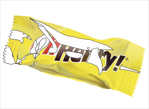
Change the fill for the highlights to white with no stroke. Now, similar to the shadows, experiment with Blur and Opacity to determine the right look.
It is important to tone down the highlights so that it looks like a slight wash over the other objects instead of a patch of white. This is what makes highlights natural and realistic.
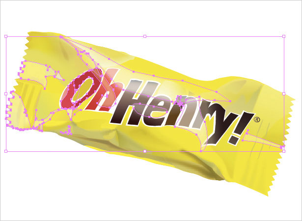
12. Shadows 2
Now the topmost portion needs a bit more shadow. On a new layer, create shapes with the Pen tool similar to the first set of shadows, but smaller in size and less in quantity.
These shadows are different because they are not the main ones. They are also subtler.
Instead of darker colors, apply gradients in a tan or light brown to pale yellow, which gently add hints of folding and creases.
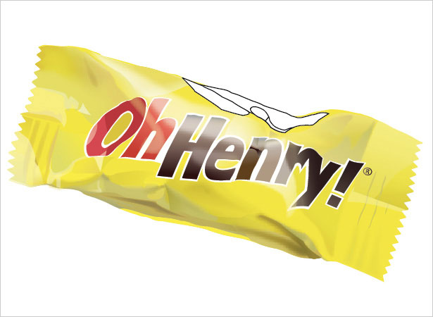
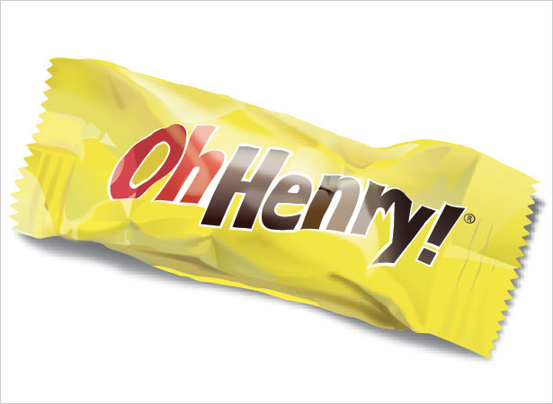
13. Cast Shadow
The cast shadow falls on the opposite side of the light source, which in this case is along the bottom and right side of the wrapper.
On a new layer, underneath all the other layers, first trace along the bottom of the wrapper to make the bottom shadow. Then, trace along the right side of the wrapper for the right shadow.
Do not trace it in the same exact shape as the wrapper since this is a shadow, which should look different.
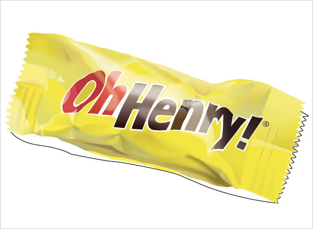
Select both shapes and move them so that they sit slightly below and to the right of the wrapper. Now, set the fill to a gradient of 70% grey to 37% grey with no stroke.
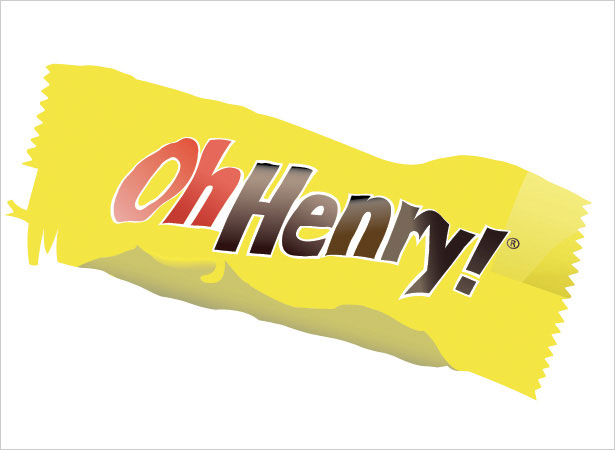
Last, add Gaussian blur (Effect > Blur > Gaussian Blur) to both shapes: the bottom shape at 2.8 pixels, and the right shape at 1.6 pixels. This is the final step in making the candy bar realistic because it grounds the object.
Written exclusively for WDD by Wendy Ding.
If you followed this tutorial, please share your results with us by posting the links to your results below...
WDD Staff


Read Next

3 Essential Design Trends, May 2024

How to Write World-Beating Web Content

20 Best New Websites, April 2024

Exciting New Tools for Designers, April 2024

How Web Designers Can Stay Relevant in the Age of AI

14 Top UX Tools for Designers in 2024

What Negative Effects Does a Bad Website Design Have On My Business?

10+ Best Resources & Tools for Web Designers (2024 update)

3 Essential Design Trends, April 2024

How to Plan Your First Successful Website

15 Best New Fonts, March 2024
