 A well developed and organized sign-up page has to relay a large quantity of data in a small area and must be quick and easy to read and understand.
Overly creative plan names are more likely to hurt your sign-up process instead of help, as they'll take longer to understand.
It's better to save your creativity for the other pages which will be redirecting the user to the sign-up page.
Start a trial and error phase to test out what your audience might specifically be attracted to as this will vary from site to site.
Here are 25 creative examples of sign-up pages which you can use as a starting point for inspiration when designing your own.
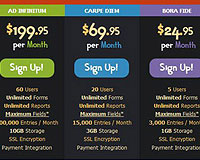
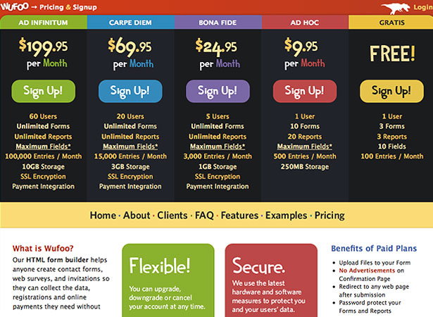
1. Wufoo
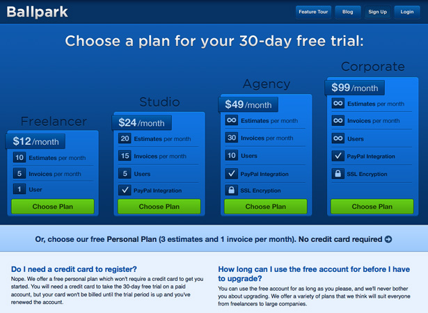
2. Ballpark
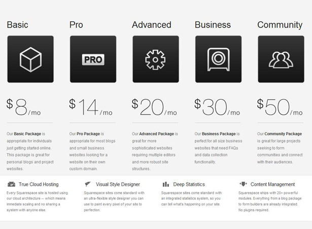
3. Squarespace
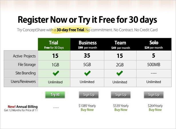
4. Concept Share
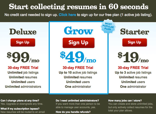
5. The Resumator
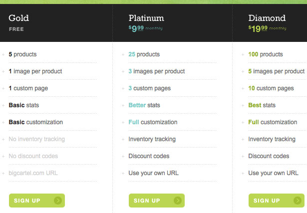
6. Big Cartel
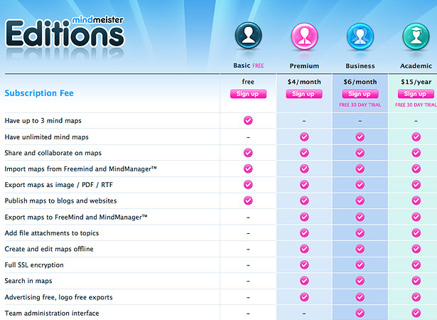
7. MindMeister Editions
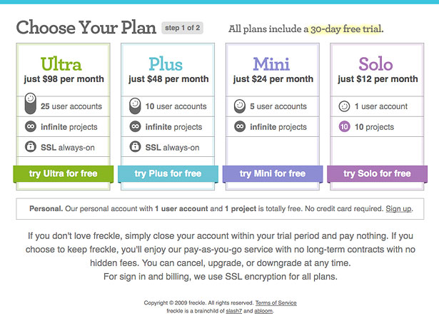
8. Freckle
9. Nibble Tech
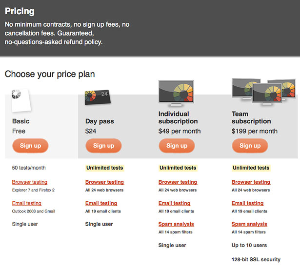
10. Form Spring
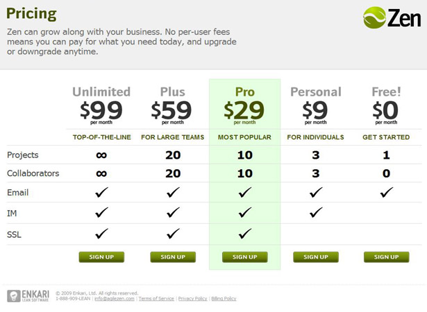
11. Zen
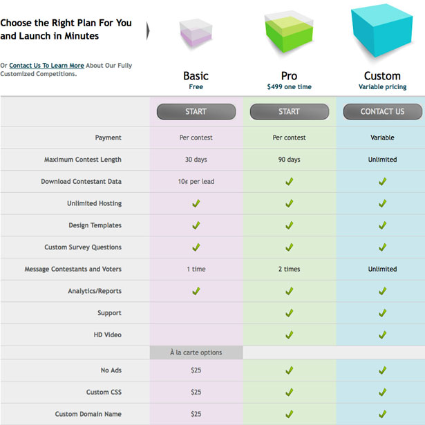
12. Strutta
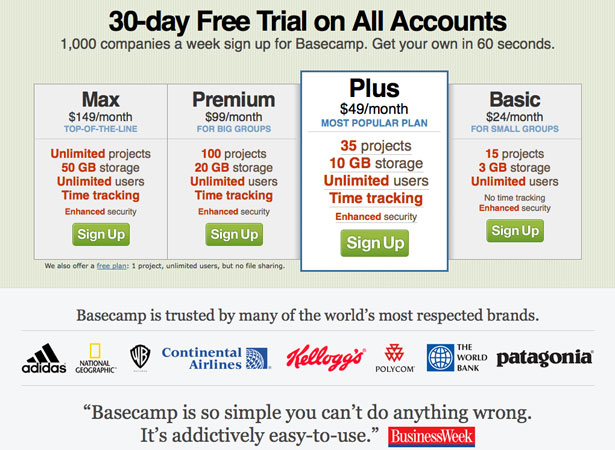
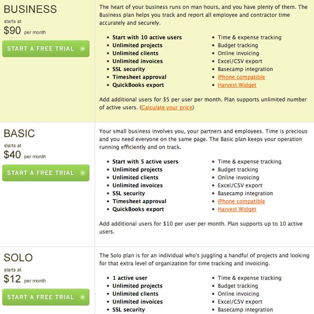
13. Basecamp
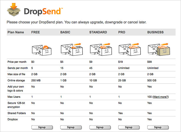
14. DropSend
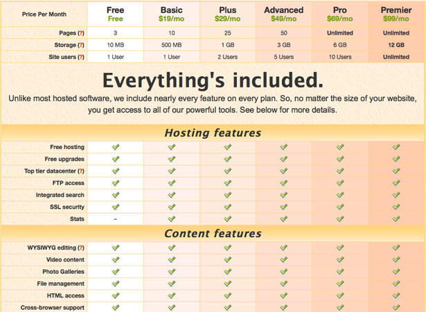
15. LightCMS
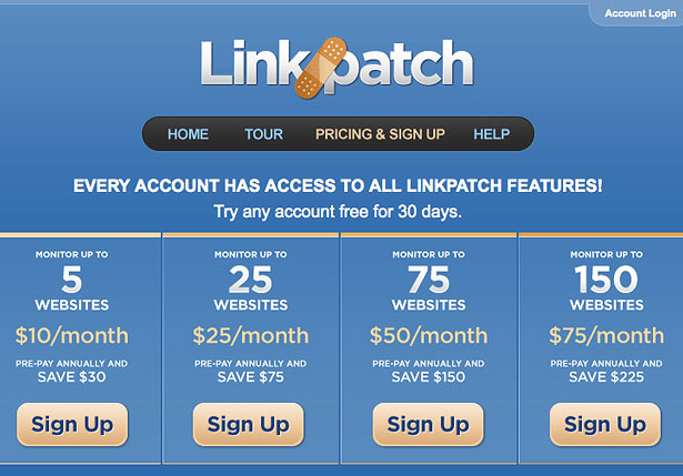
16. Linkpatch
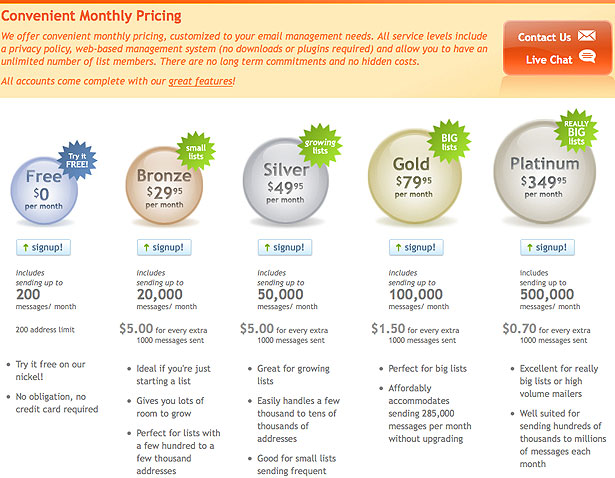
17. Mailer Mailer
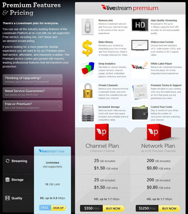
18. Livestream
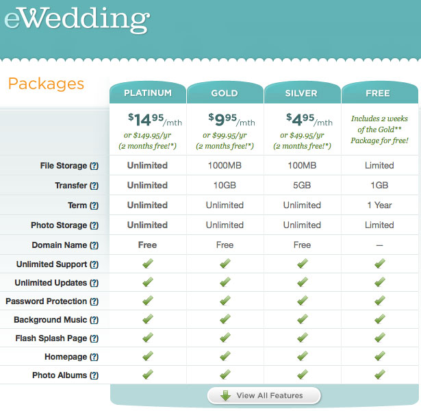
19. eWedding
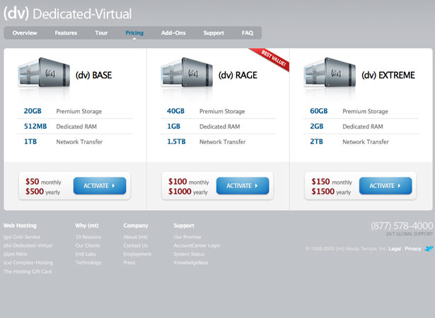
20. Media Temple
21. Litmus
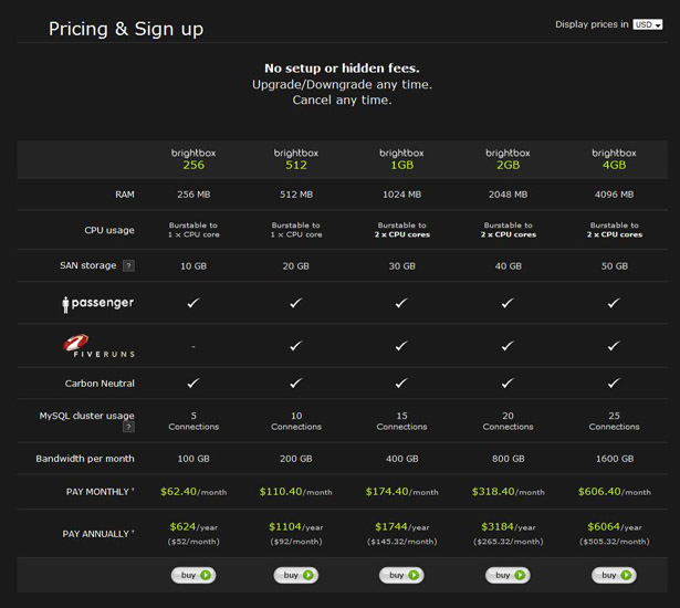
22. Brightbox
23. Harvest
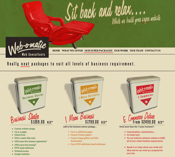
24. Web-o-matic
25. Crazy Egg

Compiled exclusively for WDD by Liz Fulghum
What aspects are important to you when designing a sign-up page? Please share your views with us!
WDD Staff


Read Next

20 Best New Websites, April 2024

Exciting New Tools for Designers, April 2024

14 Top UX Tools for Designers in 2024

What Negative Effects Does a Bad Website Design Have On My Business?

10+ Best Resources & Tools for Web Designers (2024 update)

3 Essential Design Trends, April 2024

How to Plan Your First Successful Website

15 Best New Fonts, March 2024

LimeWire Developer APIs Herald a New Era of AI Integration

20 Best New Websites, March 2024

Exciting New Tools for Designers, March 2024
