 We designers tend to get frustrated with developers when they take liberties with our work.
But we have to understand they're not entirely at fault.
Put yourself in their shoes: imagine what it's like opening a Photoshop file (PSD), only to find a jumble of poorly labeled layers and folders, plus a heap of unchecked hidden layers and other half-baked ideas that didn't make it to fruition.
The following tutorial outlines how to create organized, designer and developer friendly PSD files.
This is in no way the only solution, but hopefully it will encourage better practice in the web design world.
While writing this tutorial, I interviewed several developers who have a lot of experience working with multiple designers.
Their feedback was extremely insightful. I definitely encourage you to also reach out to the developers you work with, to find out if you can do anything to improve your PSD files.
1. Basic Folder Structure
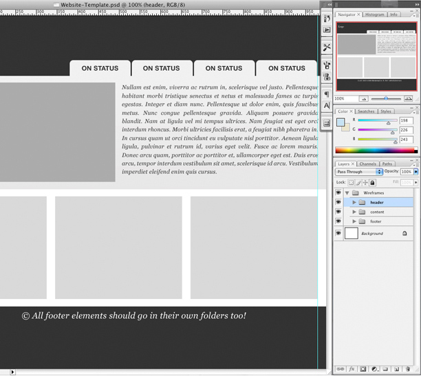
For starters, I keep a PSD file on hand named "Website-Template.psd".
This file contains the basics of each website, including the grid system, basic folder structure and common dimbroeensions (I use a 1000 by 1440 pixel workspace, with a site width of 960 pixels).
This template eliminates the need to set up a new file for each project.
Let's take a moment to familiarize ourselves with the basic organization of these folders.
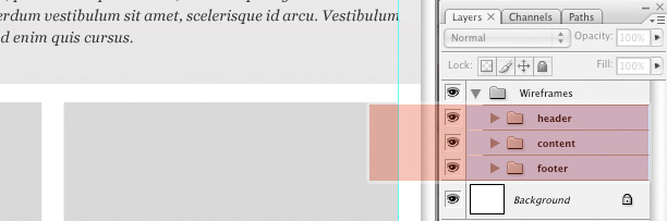
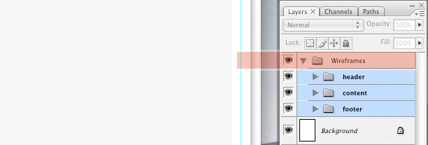
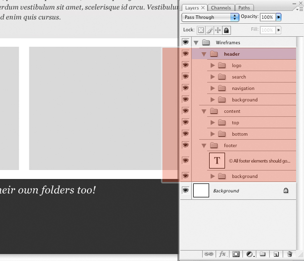
You'll notice that my default folder structure contains only three core folders: "header," "content," and "footer".
This simple set contains the basic folders that most websites use and gets me started on the right foot by providing an effective organizational platform.
You will notice I've labeled all of the folders as simply as possible.
These folders will house a slew of sub-folders. As your design grows, be sure those new folders are labeled just as clearly.
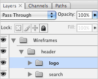
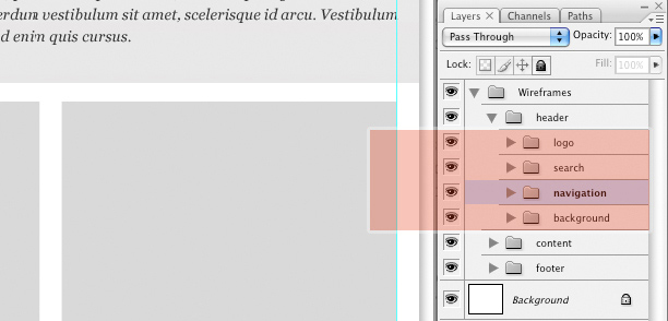
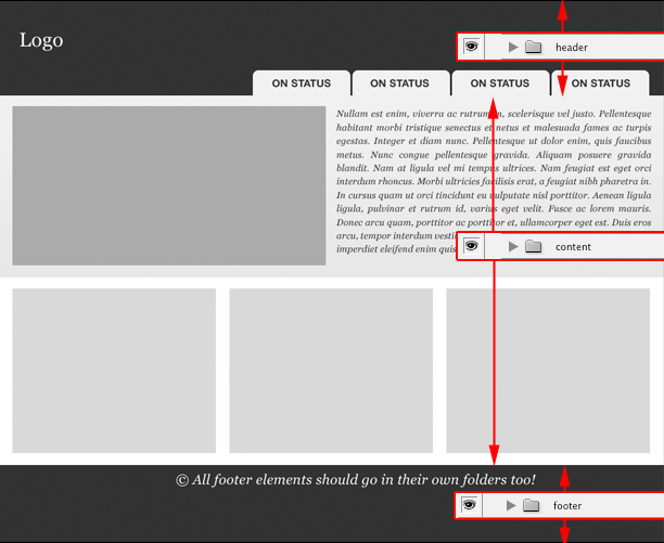
Expanding the "header" folder, you'll see the organization of sub-folders.
Note that the "navigation" sub-folder is usually the most complex: keeping the developer in mind as you label and create this sub-folder and its contents is important.
One last step before jumping into the design is to group this collection of folders into a parent folder named "wireframes".
This will help keep the content organized for when we begin designing and coloring. It's also a good way to distinguish between various pages within the same PSD file.
2. Managing Layers for an Entire Site
When we designers get into a groove, forgoing structure for creativity can be easy. This is when self-discipline has to kick in.
We must force ourselves to take the time to organize the layers we create.
Now that the initial setup is complete, I'll give an overview of how I group together various elements of a full design.
As you are aware, designing rarely follows a linear path, so please keep in mind that this is only one of perhaps countless solutions.
"If all designers followed a standard procedure of organizing their PSDs [organizing their folders by following a standard set of guidelines], you could easily knock off an hour of development cost, if not more. Not to mention you'd be filling a rift between design and development, cutting back on any wavering from the original design that is common in the development phase"
Matt Sears, Ruby on Rails developer
3. Folder Structure in Detail
We'll start with an overview of the main body (the content), and finish with the header, because it has an important element (navigation) that needs special attention.
Opening up the content folder, you'll notice I've divided the sub-folders so that the visual layout of the site's design is reflected in the folder structure.
For example, because the content has a top and bottom section, I've labeled them accordingly: "top" and "bottom".
I've also placed all of the background graphics (gradients and other images that will need to be sliced for the HTML) into their own folders.
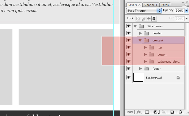
Now let's open the "top" folder (a sub-folder of the "content" folder), which contains several common elements, such as a space for text, a space for an image, etc.
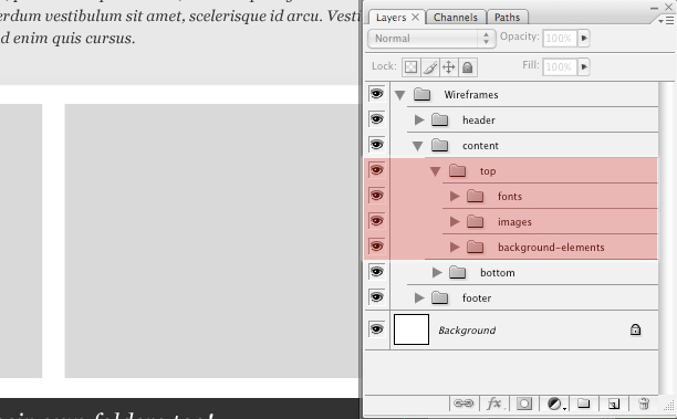
Notice the use of yet another sub-structure for additional layers and folders.
Folders have been designated for fonts, images and background graphics (gradients, solid colors, etc.).
Because fonts can be distracting for developers as they sort through a PSD, let's open the "fonts" folder to see how I've organized these.
I based my method on feedback I received from a developer who mentioned that it would be great to be able to click off the fonts to create slices without the text getting in the way.
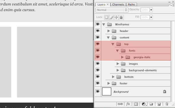
I've taken an extra step and actually given the layer the same name as the font.
This immediately lets the developer know which font to use when coding the HTML.
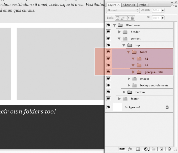
For more complicated templates, you could create additional folders to specify other fonts and important header fonts.
(Hint: headers are typically labeled H1, H2 and so on in CSS/XHTML terminology, so labeling your header fonts the same way is good practice).
Anything related to fonts should be contained in the "fonts" folder, so that the developer has to make only a single click to remove all fonts and isolate the graphical elements of the site.
It could look something like this:
Always use your intuition and keep your labels simple and obvious.
This technique isn't about hand-holding the developer; it's about creating an easy-to-use file that helps everyone in the long run.
The more you distinguish the elements, layers and folders in your design, the smoother things will be in the development phase.
Use this method of organization throughout the entire process, and you'll be surprised how quickly it becomes second nature.
4. Navigation and Roll-Overs
When setting up your navigation interface -- whether you're using tabs, plain text or something else -- you'll want to indicate to your developer how the tabs should look in specific states.
For example, should a tab change color when the user rolls over it? Is special JavaScript, such as for fading in, needed? The possibilities are endless, so don't expect the developer to be able to read your mind. Folders go only so far in showing these details.
I encourage you to supplement your PSD with a design brief that gives specific directions on the more complicated and detailed aspects of your design.
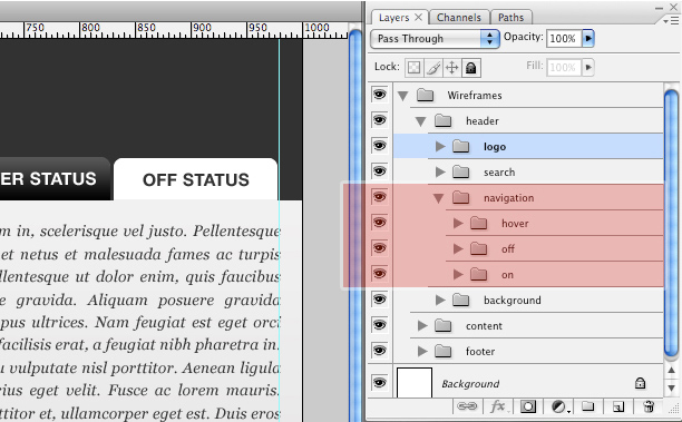
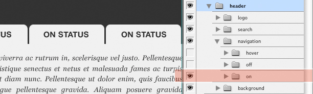
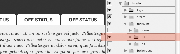
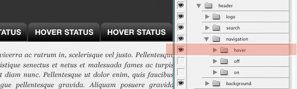
Let's assume the user interface (UI) of our design has a tab structure. Developers tend to use specific terms when referring to the various "states" of a tab (by "state" I mean the various ways in which a tab is displayed to the user).
In my interviews with developers, I found the following terms to be the most consistently used and recognizable.
Please note the image that corresponds to each description, and notice how the folder structure reflects my thought process.
5. Correct Label Your Tabs and Their States
On: The "on" state of a navigation item (in this case, a tab) indicates that its related page is currently being viewed. Typically, it should be the most noticeable.
Off: This state indicates that a tab is clickable but is not currently being viewed or hovered over with the mouse.
Hover: This state shows how the tab appears when the mouse cursor hovers or rolls over an inactive tab. The graphical treatment of this state is often the same as the "on" state, but it should still be given its own folder.
The key is consistency: no matter what you label your tabs, be sure to keep them consistent!
6. A Final Note on Tabs
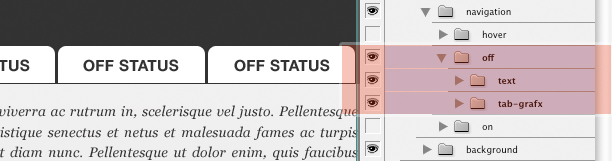
Opening up one of the sub-folders in the navigation (the "off" folder in the screenshot below), you'll see that I've once again grouped all text in a separate folder.
This is optional, because text is often a part of the graphical makeup of the tab.
If the text will be recreated in HTML, I recommend placing it in a separate folder so that the developer can click it off for easier slicing of the graphic.
7. Finalizing the Files
This strategy may seem a bit obsessive, and paying attention to structure and order when one is caught in the throws of a great design is not easy.
Nevertheless, take the time at the end of a project to organize and label your folders appropriately.
If you have complicated illustrations in your design, try to flatten them into a single well-labeled layer.
If that can't be done (perhaps because of sophisticated blending methods), try converting the layers to smart objects and then rasterizing them.
Ultimately, the goal is to reduce the layers and folders to the bare minimum, and then label them all as clearly as possible.
8. A Step in the Right Direction
Developers and designers do not always think alike.
Whereas many designers work in a state of creative chaos, developers typically rely on order, structure, and logic.
As we design, a little organization goes a long way towards keeping developers happy.
There is certainly no one right way to organize PSD files, so reach out to your developers and see what you can do to create PSD files that keep everyone sane!
![]()
Josh Sears is a writer, illustrator and designer for a slew of web-based projects. He makes his living as Lead Web Designer, Creative Director and Co-Owner of Littlelines.com. You can check out his work here or follow his updates on Twitter.
Do you apply these tips when working with Photoshop? What other techniques do you use to organize your Photoshop layers?
WDD Staff


Read Next

20 Best New Websites, April 2024

Exciting New Tools for Designers, April 2024

14 Top UX Tools for Designers in 2024

What Negative Effects Does a Bad Website Design Have On My Business?

10+ Best Resources & Tools for Web Designers (2024 update)

3 Essential Design Trends, April 2024

How to Plan Your First Successful Website

15 Best New Fonts, March 2024

LimeWire Developer APIs Herald a New Era of AI Integration

20 Best New Websites, March 2024

Exciting New Tools for Designers, March 2024
