 Email newsletters are hotter than ever.
They’re a great extension to your business’ communication toolkit and offer you and your clients an excellent channel by which you can reach potential and existing customers.
In this article, we'll explore common design patterns of email newsletters and learn which approaches work well, so that you’ll be prepared to create one for yourself and your clients.
We've also included a compilation and analysis of different newsletter designs so that you can learn from them as well as tips on what to do and what not to do.
If you know of any other tips, please share them with us in the comments area.
Which Came First: Chicken or Egg?
Before you create and send your email newsletter, you’ll need subscribers. Making this process as easy and intuitive as possible is important. After all, users are giving you permission to contact them. You wouldn’t want to mess that opportunity up!
Not Too Many Fields
You don’t need a user’s social security number to send them an email! It’s most frustrating when someone signs up for an email newsletter only to be confronted with a form that asks for their address, age, phone number, mother’s maiden name, favorite pet... All we really need is their email address and, if we want to push a bit further, their name.
Seth Godin, in his article Permission Marketing, offers good insight into getting viewers to sign up and follow you:
Permission marketing is the privilege (not the right) of delivering anticipated, personal and relevant messages to people who actually want to get them.
In other words, the viewer wants to listen to you. They are giving you their attention, so at least respect them and don’t ask for unnecessary data.
With that in mind, let’s look at some examples of good newsletter sign-up forms:
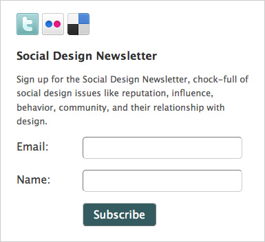
Joshua Porter’s sign-up form is an excellent example of what to do right. First, he puts the sign-up form close to his social icons, indicating that this is an extension of his communications with you, the user.
Next, he offers a short blurb explaining what the newsletter is about. This gets you and your users on the same page, so that they’re clear on what to expect from your content.
Finally, he asks only for the user's email address and name, followed by a big button with a verb label: “Subscribe.” Very simple, yet packed with just the right information!
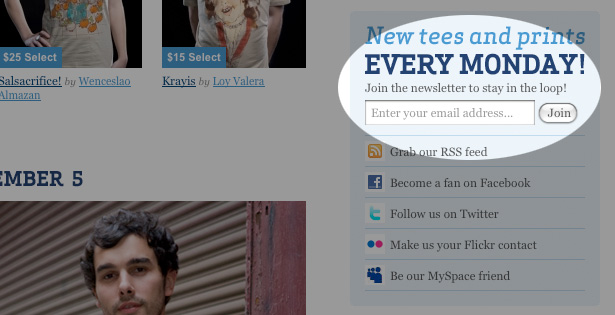
Threadless also puts its newsletter sign-up form in the social area of its home page. The location is prominent, and Threadless provides information on how often and when the newsletter will be delivered. Also, notice the simplicity of asking only for an email address: no name, no social security number, no favorite pet!
We’ve Got Subscribers!
Your sign-up form is now a success, and you’re ready to send out some content!
Before we move to the design stage, let’s figure out what the focus of our newsletter is. For example, if you are giving away coupons, you could use more graphics and buttons than usual. If it’s text-heavy, you’ll want it to be as readable and scannable as possible.
Let’s examine two newsletters with different goals. The first is from Barnes and Noble, offering promotions for its stores. The second is from Sitepoint, which gives its newsletter a magazine-style layout and structure.
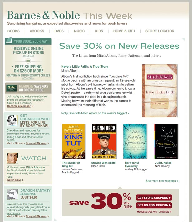
The first thing you’ll notice about the Barnes and Noble newsletter is that it is designed like a website. It’s literally an extension of the main website, complete with top-level navigation.
You’ll also see that it’s timely; right next to the logo it says “This week,” reminding you that the offers are for a limited time only and that you should make your purchase quickly.
Notice how easy it is to scan the page. All of the paragraphs are short, and the images and content hierarchy make the design feel comfortable even in your email browser!
Finally, the designers have put a clever call to action at the bottom of the page. The numbers in big red type attract your attention, sitting beside buttons with verb labels, pushing you to take advantage of the promotion.
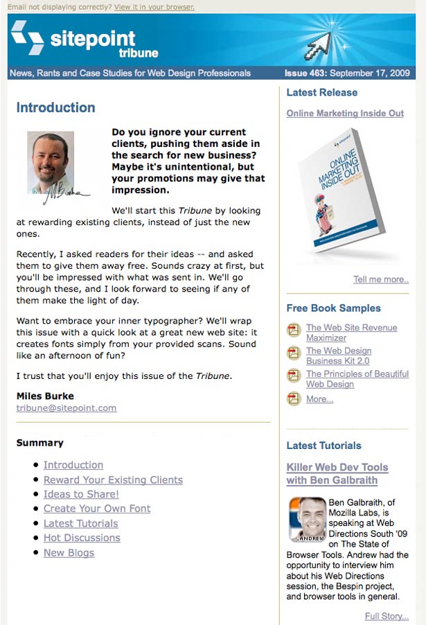
Sitepoint goes for a completely different layout because it has a different goal. Its goal is to build a following for its content, to be able to extend its advertising space.
It adopts a magazine style, starting each issue with a letter from the editor, followed by a table of contents (in-page links) that guides you to the concise articles in the email.
One important design decision made by Sitepoint was to include a photograph of the editor at the top of every email. This approach makes the email feel more personal, like it’s coming from a human who took the time to organize the content.
HTML or Plain Text?
Now that we’ve discussed your business goals for the email newsletter and how to support it with the design, let’s briefly consider the construction.
Back in the old days (i.e. three years ago), composing email newsletters in plain text was safer and more common. You would also see full-length articles incorporated in the email (as long as today’s blog posts).
Since then, people have discovered that they don’t really like reading long emails, and that scannable content that functions as a gateway to the main website makes more sense.
With this in mind, the most logical design would be a hybrid of images and HTML text. Jakob Nielsen has this to say about how much time users spend reading a newsletter:
Users spend 51 seconds reading the average newsletter. The layout and writing both need superb usability to survive in the high-pressure environment of a crowded inbox.
Once you’ve got a good hybrid design, you will have to dive in and code the newsletter (unless you have a great coder sitting next to you). A great resource for best practices and insight on the state of HTML emails is Campaign Monitor’s tips area:
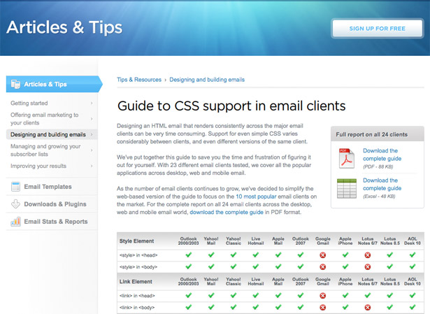
Not only can you get started with one of the templates, but you can also consult a comprehensive checklist of supported CSS and HTML features in all modern email clients.
Email Newsletter Software
Now that we’ve got a solid grasp of what’s involved in creating an email newsletter that serves our business goals, we will choose the right software for our design.
You could, of course, manually write the scripts to create the newsletter, subscribe users and send out the email. But you likely have a business to run, and using tools that were created for these tasks would save you a lot of time.
Here are the three most popular email newsletter services today. They are all low-priced and feature-rich:
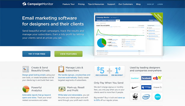
Campaign Monitor, which we mentioned earlier, not only has great resources for designers but also great prices: a flat delivery fee of only $5, plus $0.01 for each subscriber.
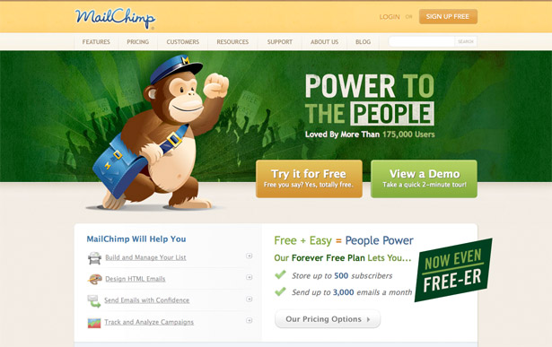
Mail Chimp is another popular email campaign service. It has a great analytics feature for your email newsletter campaigns and a free plan!
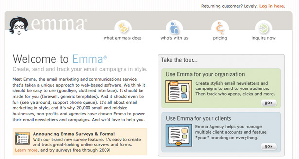
Emma offers email marketing with style. It even plants five trees for each customer who joins. If your business is growing, Emma allows you to easily adjust your pricing plan.
Inspiration
By now, you should have a good understanding of what’s involved in creating an email newsletter campaign for you or your client.
Now for some more fun. Let’s look at some email newsletters for reference and inspiration...
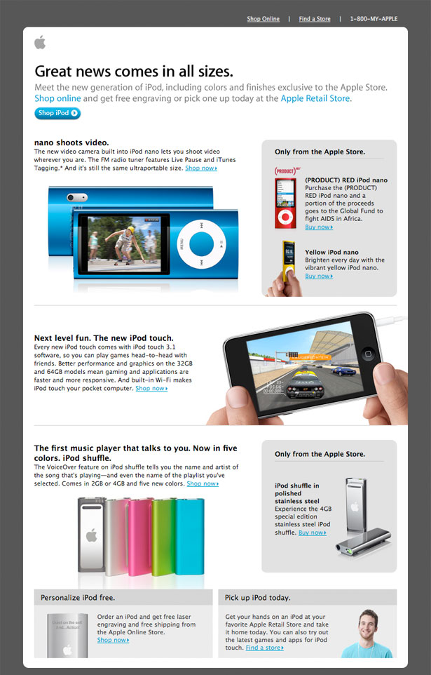
Apple looks good, as always. Its email newsletter is fresh, scannable and beautifully balanced. Notice the attention to detail, specifically how the buttons are color-coordinated with the images.
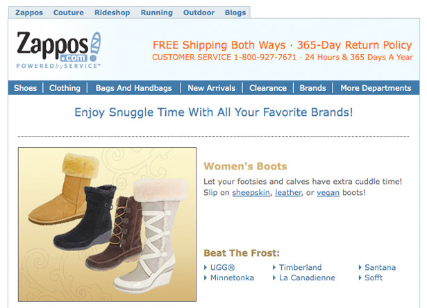
Zappos’ approach is similar to that of Barnes and Noble: its navigation at the top is an extension of the website, and it highlights its popular free 365-day shipping service.
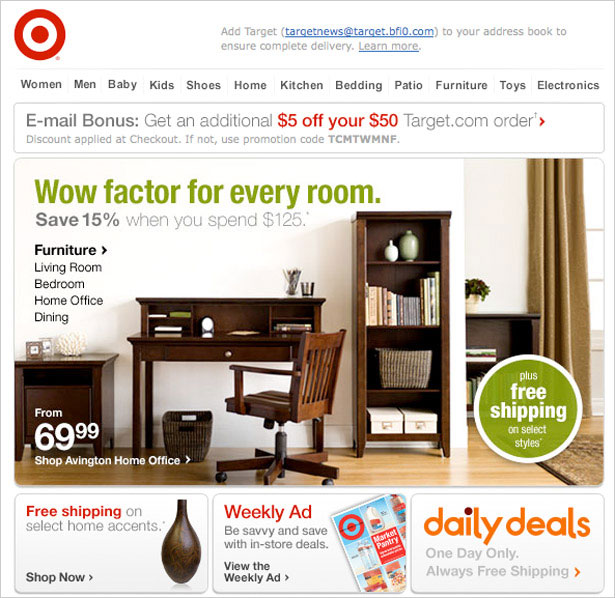
Target also focuses on scannablilty and clickablity. Notice the email discount, rewarding you for following the newsletter.
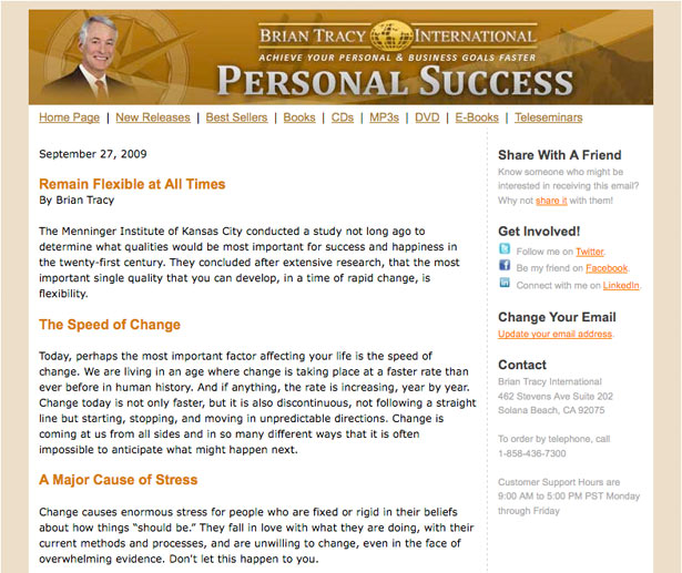
Personal success guru Brian Tracy offers a clean, easy-to-read email newsletter. His approach is simple yet focused on his brand and main goal: helping you to achieve success.
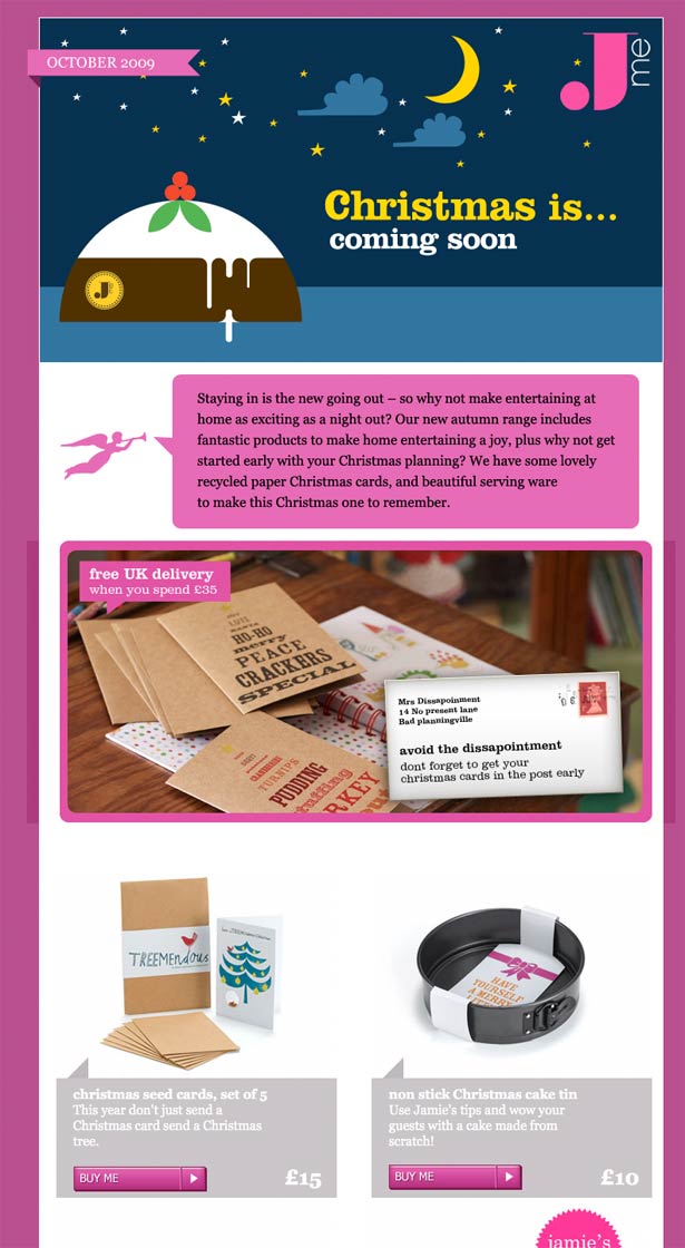
Master chef Jamie Oliver has a more artistic email newsletter, keeping the visual language consistent with his upbeat and personal approach to cooking. The buttons match the background nicely and create a fun feel.
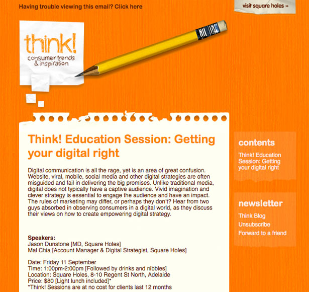
Think has followed sensible art direction for its newsletter. The design is consistent with that of its blog.
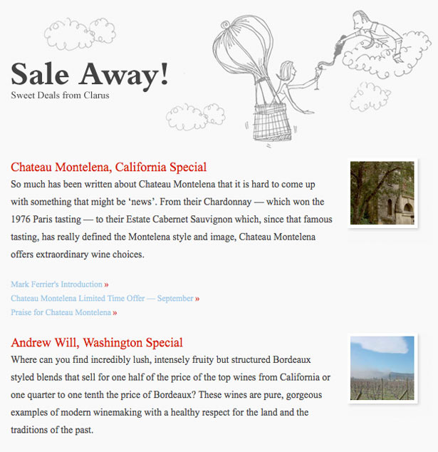
Clarus Wines beautifully illustrates its newsletter, giving it a human touch. The soft gray offers respite from your cluttered inbox.
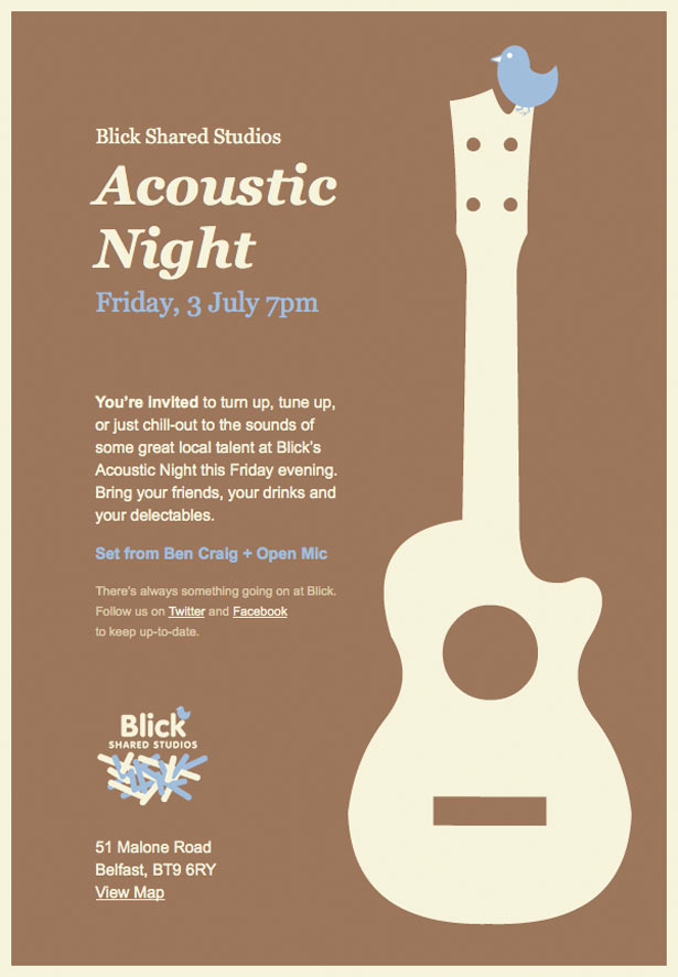
A great example of borrowing real-world analogies (in this case, an event poster) and translating it to the web, Blick Shared Studios offers an attractively designed email newsletter.
If your interested in seeing more great examples, check out Campaign Monitor’s Inspiration Gallery.
When Should I Send?
We’re almost wrapped up, feeling inspired and ready to extend our communication with clients through an email newsletter! Just one more topic to cover, and that is what day to send it. 37 Signals has a humorous take on the question:
Want something to blow up? Tell the world about it on a Tuesday morning. Avoids the Monday avalanche people face and gives you the rest of the week to get play.
Want something to fade away? Tell the world about it on a Friday afternoon. It'll fade into the weekend.
Written exclusively for WDD by Noam Almosnino, a web designer and blogger who helps businesses and individuals connect with their customers online!
Do you have tips to share with us from your email newsletter experiences? Please post them in the comments below...
WDD Staff


Read Next

20 Best New Websites, April 2024

Exciting New Tools for Designers, April 2024

14 Top UX Tools for Designers in 2024

What Negative Effects Does a Bad Website Design Have On My Business?

10+ Best Resources & Tools for Web Designers (2024 update)

3 Essential Design Trends, April 2024

How to Plan Your First Successful Website

15 Best New Fonts, March 2024

LimeWire Developer APIs Herald a New Era of AI Integration

20 Best New Websites, March 2024

Exciting New Tools for Designers, March 2024
