 The appearance and usability of certain interface elements and functionality are crucial to the success any websites in today's market.
Studies have demonstrated that even a split-second delay in thinking on the user's part will weaken their perception and interest in a website and ultimately lower the website's conversion rate.
In certain niches and industries, having UI elements that are not obvious in their use may be perfectly acceptable. The blogging and web development industry are perfect examples.
But when we design user interfaces for non-tech-savvy audiences—which is usually the case with client work—we have to ensure that certain UI elements do not stray too far from what users are accustomed to.
This article discusses some best practices and usability traits of six user interface elements and the conventions for each, so that developers can create user experiences that are both beautiful and simple.
1. Appearance of the Search Box
On large information-rich or product-heavy websites, search is king. Users here generally forgo conventional navigation bars in favor of the search box.
A search box that is not immediately visible will have one of two effects: 1) the user will assume no search functionality is available, or 2) the user will find the search functionality after a delayed, and possibly irritating, period.
Ensure that the search box on your website is easy to see. Dark backgrounds and fancy graphics will impair usability, so keeping it white or light gray is best. Also, make sure the search box is large enough relative to other important elements on the page, thus maintaining its position in the visual hierarchy.
The search box on Domain by IP fits the visual theme of the website nicely, being orange and graphically consistent with its surroundings. But if a search box on a busier website were given this treatment, it would probably be difficult to spot.
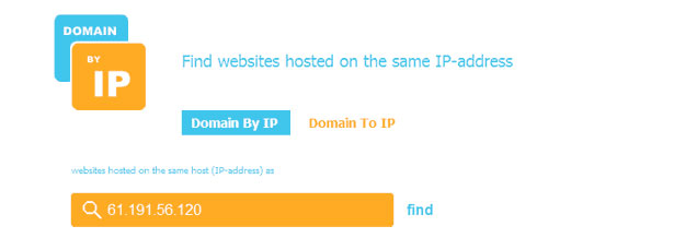
The design is not a hindrance on Domain by IP because the website has one function: search, which is right in the middle of the page. Plus, being in a technology niche, its developers have less of an incentive to stick with convention. But this degree of creativity should be avoided on larger websites, whose target audiences may not be as technically savvy.
Adventure Time, meanwhile, keeps its search box white, conveniently sized and easy to find on the page:
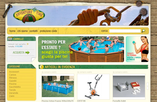
Despite being in a foreign language, Adventure Time has a very clear search box, even for English-speaking users. The size and color of the box is complemented by the magnifying glass graphic, which has become the universal symbol for online search. A user looking for this functionality will not have a problem here.
This pattern should be followed in all projects targeted to a diverse user base.
Further Reading:
2. Clearly Marked Collapsible/Expandable Content
Websites benefit from collapsible panels and drop-down menus because they make for cleaner and less cluttered layouts. The hidden content in these interface elements can, however, impair a website's usability if their presence is not clearly indicated.
When a user clicks on a bare link or button, they expect to be taken to a new page. But when a user clicks a link or button that has a hidden content indicator, they expect the new content to be instantly displayed (via JavaScript or AJAX) and have the option to hide it subsequently. Thus, a website should sharply differentiate between normal links and links that reveal new content via JavaScript.
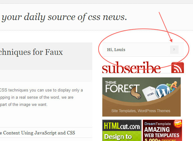
Collapsible content, such as in side panels and menu trees, can be indicated with an arrow, triangle, or Windows Explorer-like plus/minus indicator. The panel that logged-in users see on CSS Globe clearly indicates that it is collapsible:
Below is the same page after the panel has been expanded to reveal a group of functions:
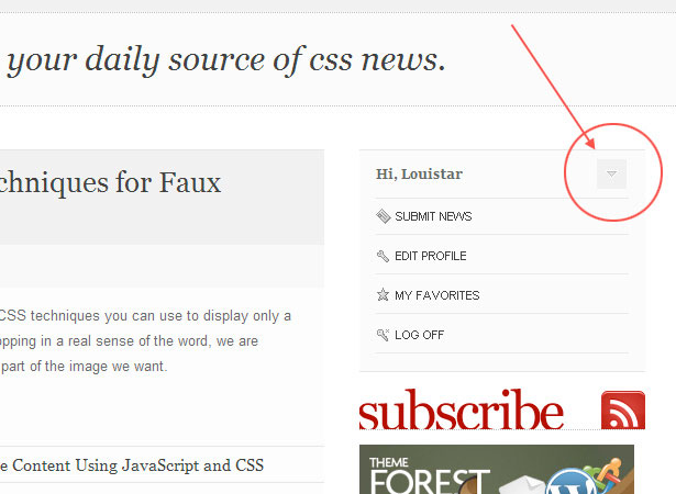
With the content in the panel now expanded, the arrow is rotated 90 degrees, suggesting that the same content can now be hidden or collapsed. This same principle can be applied to drop-down or fly-out menus, although these would not require a rotating arrow. Surprisingly, this feature is often omitted even on professionally designed websites.
Further Reading:
3. AJAX Loading Indicator
When you improve the user experience by loading content through asynchronous requests, make sure to inform the user that an AJAX request is being processed. Without this indicator, the user may give up waiting or wonder why nothing has happened in response to their click.
You can accomplish this in a number of ways; one way is to highlight a "Loading" or similar message in or near the location where the action will occur, as Google's RSS reader does:
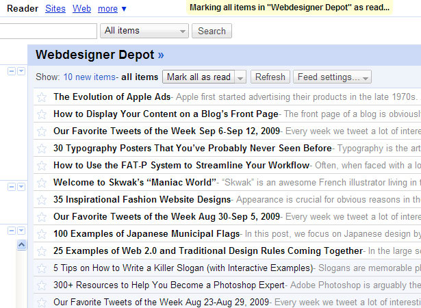
At the top of the screenshot is yellow highlighted text, which appears when the "Mark all as read" button is clicked, telling the user that something is happening.
Another way to indicate this is with animation or a revolving hour glass, which would be familiar to Windows users. An animated indicator is used on numerous websites, including Twitter, where users click a "More" button to view older tweets:
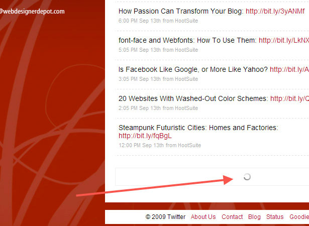
Once the button is clicked, and depending on the speed of the client's connection to the server, a familiar animated swirling graphic appears, telling the user that their request is being processed.
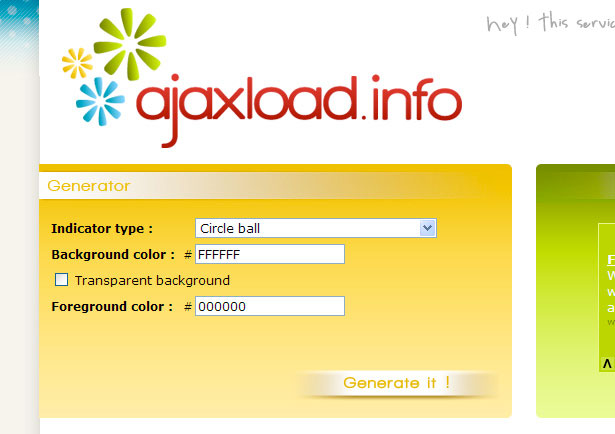
AJAX loading graphics are available for free from a number of different websites, many of which allow you to customize the graphics with size, color and other options.
This type of visual indicator is important for asynchronous requests that don't provide client-side clues about what activity is loading.
An AJAX-like indicator could also be used to enhance non-AJAX functionality that behaves like AJAX and takes time to load. This could include a photo gallery that loads a larger image when a thumbnail is clicked.
AJAX loading graphics and other indicators don't actually speed up a page, but they do improve the "perceived" load time, which is often just as valuable as improving the actual load time.
Further Reading:
4. Location of Shopping Cart and Log-In and Register Functions
When users scan a page for the "Shopping cart" button or "Register now" link, the first place they look is the top-right corner of the page. Unless you have a compelling reason to do so, keep this functionality in its familiar location, or else you risk slowing down and disrupting the user experience.
Options and functions that would fall under this category include "View cart," "Check out," "Log in," "Log out," "Register," "Submit link," "Forgot password?" and even "Contact us." This last item would usually be the last one in a horizontal navigation bar.
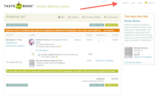
TasteBook includes four such links in the top-right corner of its layout:
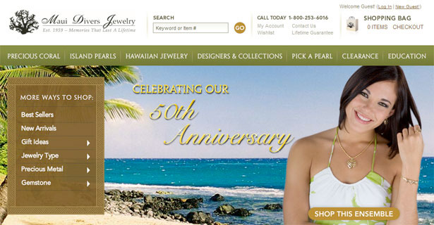
Maui Divers Jewelry is another good example and also includes a shopping bag graphic:
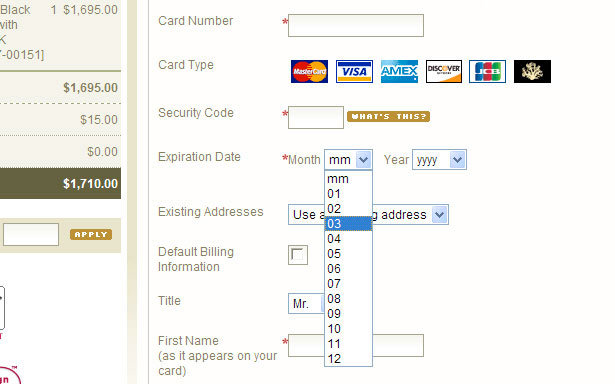
5. Expiration Date Format on Credit Card Forms
When a form asks for your credit card's expiration date, the format is always the same: the month, represented by two digits, followed by the year, represented by two or four digits (e.g. 03/11 or 03/2011). The four-digit format is how the expiration date appears on the credit card itself.
The best way, then, to collect this information and strengthen the user experience is to use two separate select boxes, one for the month and the other for the year. Don't make the user enter the expiration date in a single text box, even if you provide instructions.
Here is a good example from the payment page of Maui Divers Jewelry:
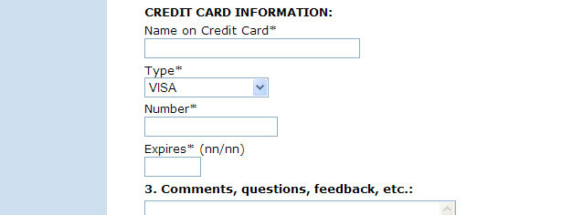
And here is an example of a poorly designed expiration date field:
Moreover, the month selector should not display the names of the months, but instead should list the numbers 01 through 12. There is no reason to slow users down by making them figure out that "08" means "August."
6. Easily Identifiable Links
This should never be a problem, but unfortunately some websites still do not clearly distinguish between links and regular text in the main body.
In most cases, the best way to indicate this difference is by making links a different color and underlining them. In some cases, a strong contrasting color alone is enough; but only underlining or just changing the color slightly is rarely enough and will often impair accessibility.
Cameron.io makes this distinction well:
These links would not be as visible if they were merely underlined but not changed in color. You wouldn't design a button that didn't look like a button, so why let text links blend into the main body? As most users scan text online, designers should ensure that all links are identifiable long before a mouse is rolled over them.
Further Reading:
Conclusion
All of the user interface elements and functions discussed in this article are crucial to website usability and play important roles in the user's perception of your brand.
Many small enhancements can make a big difference in perceived speed and can keep users from getting frustrated or uncomfortable.
Make your user interface elements simple and streamlined, and follow conventions where possible. You will see reduced bounce rates, better conversions and a steady flow of returning traffic.
Written exclusively for WDD by Louis Lazaris, a freelance writer and web developer. Louis runs Impressive Webs, where he posts articles and tutorials on web design.
How could some of these or other user interface elements be improved? Please share your thoughts in the comments below.
WDD Staff


Read Next

3 Essential Design Trends, May 2024

20 Best New Websites, April 2024

Exciting New Tools for Designers, April 2024

14 Top UX Tools for Designers in 2024

What Negative Effects Does a Bad Website Design Have On My Business?

10+ Best Resources & Tools for Web Designers (2024 update)

3 Essential Design Trends, April 2024

How to Plan Your First Successful Website

15 Best New Fonts, March 2024

LimeWire Developer APIs Herald a New Era of AI Integration

20 Best New Websites, March 2024
