 Wikipedia is currently undergoing a much needed redesign to improve the user experience.
Anyone can preview this redesign by creating an account, logging in and then clicking the "Try Beta" link at the top right of any page.
The "Wikipedia Usability Initiative" has been divided into two phases. Phase 1 was the prototype phase, and it ended in the summer of 2009.
The project team is currently in the second phase, which is the development and testing phase.
The project has also been separated into four releases; as of the writing of this article, the second release (Babaco) is currently in development.
In this article, we'll discuss Wikipedia's design changes and the reasons behind them.
The Wikipedia Usability Initiative is scheduled to be ready in the spring of 2010. More information about the project can be found here.
The redesign is focused on usability. Although no drastic changes have been made, the overall look and feel of the website is much cleaner and more modern. The revamped editing interface is a major upgrade that Wikipedia editors will surely get excited about.
Like many small-scale operations, Wikipedia does not have the budget to systematically test how visitors use the website. Instead, it relies on feedback from users to pinpoint and address issues.
Cleaned Up
Our first impression of the beta redesign is that it looks quite sharp and tidy. The layout is still fundamentally the same; this redesign likely won't cause the same outrage that Facebook stirred with its redesign back in March 2009.
The most obvious change is that the various components on the page are no longer confined to their own box. The navigation and main content areas are not closed in, and they extend all the way to the edge of the browser window.
The other obvious change is that Wikipedia has retired the background image of the open book. This cleans up the design significantly and makes the logo look much sharper.
Old design:
![]()
New design:
![]()
Slight Change in Colors
On the whole, the new design looks softer. The navigation links in the left sidebar are now slightly bigger and easier to read. The link colors throughout have been altered slightly to make them less vibrant.
The old link color (left) compared to the new link color (right):
The old visited link color (left) compared to the new one (right):
Changing the visited link color from purple to dark blue goes a long way to making the website look more modern. It also simplifies the color scheme and makes the appearance more professional.
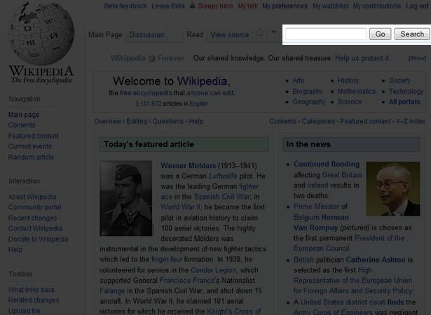
Search Bar Relocation
The one change that might trip up regular visitors is the relocation of the search bar.
It is no longer nestled in the middle of the navigation section. It has been moved to the top-right of the page. This placement has become standard on many websites and is where people look first when they want to perform a search.
The new location of the search bar:
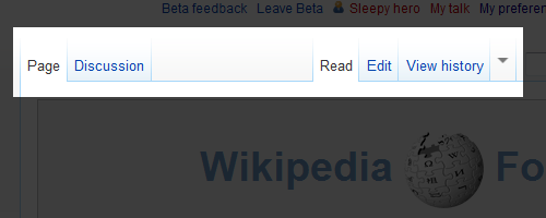
Reorganized Tabs
The tabs have also been reorganized. They've been given a new look and are now easier to spot. Dividing them into two groups makes their structure more logical. The fading top of the tabs opens up the page, too.
Old design:
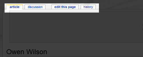
New design:
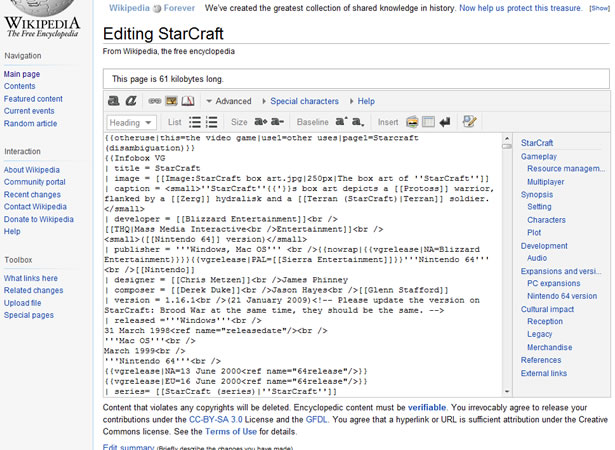
Page Editing
The new page-editing interface is wonderful. The mixture of textual and graphic icons and the grouping of editing options makes editing much easier.
To figure out what each button did before, the user had to hover over the unintuitive icon and wait for the tooltip to pop up; not anymore. And the new panel to the right of the text area helps users navigate the page.
Old editing interface:
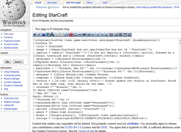
New editing interface:
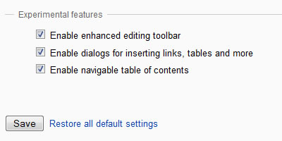
To turn on the new features, go to your "Preferences," and then click on the "Editing" tab. At the bottom, you'll find some checkboxes labeled "Experimental."
Enabling the experimental features:
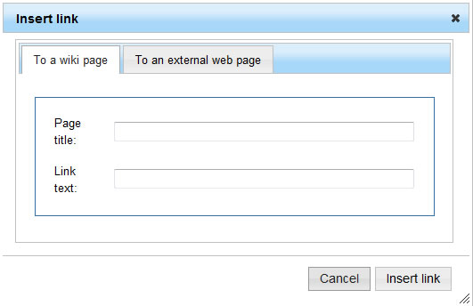
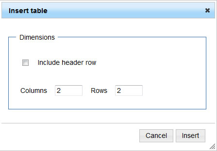
The latest release includes new dialog boxes for inserting links and tables. Because the text area can get a bit cluttered, these dialog boxes are handy for helping users focus on one task at a time.
The table dialog box could do with more functionality (such as allowing you to edit the contents of table cells), but this release is still in development, so I'll wait to see if more comes before officially adding features to my wish list.
The dialog box for inserting a link:
The dialog box for inserting a table:
What's Missing?
Because the project is still in beta, now is the best time to suggest what else can be done to improve Wikipedia's user interface. Here are my ideas:
- AJAX BeautyTip preview on link hover
It would be neat if a tooltip appeared, via the BeautyTip jQuery plug-in, whenever you hovered over an internal link. The tooltip would contain the first paragraph of the linked article. The increase in bandwidth from this feature might be too big, but I'd still like to see it tested. - Syntax coloring in the editing text area
Working with code all in the same color is very difficult. The human eye has to scan the text linearly to find it wants. Visual hints would be a huge help. While we're at it, the text area should also have a horizontal scroll bar so that things like tables look nicer in the code. - Option to have fixed-width body text
When I'm reading a long passage of text, I like to maximize my window to minimize distractions. As it is, I can't do this because the lines of text become wider than my widescreen monitor. I would love to be able to fix the width of paragraphs to around 600 pixels to make reading easier. - Increase visual weight of "Go" button
The one change I'm against is making the "Go" button the same weight as the "Search" button. The old design weighted the "Go" button text a little heavier, making it obvious that hitting the "Enter" key was the same as clicking the "Go" button. The difference in weight was small enough that users could see the difference only by looking right at it. This should be brought back.
Try It Out!
The new design looks pretty good, but it's not finished yet. I'm sure that the Wikipedia Usability Initiative team would appreciate everyone trying out the beta and sending feedback.
Wikipedia depends on its users to figure out how to improve the website, and I'm certain the Webdesigner Depot community can come up with some great ideas.
Lastly, consider donating to Wikipedia. Because being able to read about old Nintendo games without Evony ads littering the page is rather nice.
Written exclusively for WDD by Eli Penner.
What do you think of Wikipedia's upcoming design? How would you improve the design?
WDD Staff


Read Next

3 Essential Design Trends, May 2024

How to Write World-Beating Web Content

20 Best New Websites, April 2024

Exciting New Tools for Designers, April 2024

How Web Designers Can Stay Relevant in the Age of AI

14 Top UX Tools for Designers in 2024

What Negative Effects Does a Bad Website Design Have On My Business?

10+ Best Resources & Tools for Web Designers (2024 update)

3 Essential Design Trends, April 2024

How to Plan Your First Successful Website

15 Best New Fonts, March 2024
