 Years ago, HTML tables were the standard for laying out web pages. CSS and semantic thinking changed that, and today CSS frameworks make designing relatively easy.
But they can also generate a surprising number of superfluous elements.
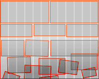
The 960 Grid System encourages the addition of <div> elements and class attributes, especially on complicated pages. Is this really an improvement over nested tables?
Creating cleaner code means going beyond the framework and thinking about what it really represents.
CSS frameworks provide a workflow solution, namely a rapid deployment of grid-based web layouts. One of the most popular frameworks today is the 960 Grid System (960.gs), named after its default width. With practice, 960.gs can be a great tool for any web designer. But it also revisits a few old problems.
Before CSS saw widespread use, tables provided all the layout a web designer needed. More complicated designs had tables nested within tables, but used in excess these created a tangled mess of HTML. CSS-based layouts lured designers with the promise of less HTML; they also appealed to semantics enthusiasts. Simply put, CSS encouraged the use of HTML that described what content was about, not what it should look like.
As designers learned to use CSS, div elements replaced tables. But divs can be—and often are—nested, just like tables.
The Spread of Class-itis and Div-itis
Clear, lean code offers many advantages. It’s easy to fix, quick to download and causes fewer problems across different types of browsers. Relevant tags help screen readers, search engines and mobile devices interpret meaning in addition to layout.
Other than the semantics, the great advantage of using <div>…</div> over <table><tr><td>…</td></tr></table> is that we end up with less code to do the same job. But now designers face a glut of classes and divs.
Do CSS frameworks such as 960.gs recreate the underlying problem with tables? If their goal is efficient HTML, can designers and developers use 960.gs without spreading “class-itis” (i.e. excessive use of classes) and “div-itis” (i.e. so many divs that tables start looking good again)? Yes, they can.
To understand how, we need to look at the framework itself.
A Rundown of 960.gs
960.gs provides a set of columns, written in CSS, that facilitate the laying out of web pages. Download the files, add them to your website and it’s ready to go. No special plug-ins or new technology are needed, and you can use it in conjunction with other CSS files.
Columns are contained within blocks called (naturally) “containers.” The defaults are container_12 and container_16, which divide into 12 and 16 columns, respectively. Custom sizes are available.
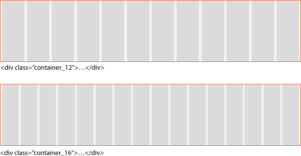
The diagram above shows the two default containers with 12 and 16 columns. The gray won’t be visible on your final website, of course. The columns merely show where blocks, called “grids,” can be arranged.
A grid is a block of content that can cross more than one column in a container. Grids float left by virtue of being held in .container_x, making them ideal for modular layouts. The width of each block is determined by which grid you apply to it: grid_1 is one column wide, grid_5 is five columns wide, etc.
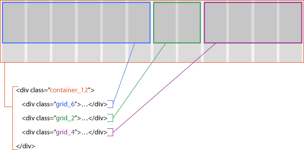
Above, .container_12 holds three grids. Each grid, in turn, would hold different elements of the page’s content.
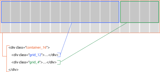
Above, .container_16 holds two blocks of 12 and 4 columns, respectively. Like .container_12, this 16-column-wide layout measures 960 pixels wide—but its columns are narrower.
Resizing the grids in which the content’s elements fit is simple: change the grid_x in each div.
The official 960.gs website showcases websites that were built on the framework, and it also provides page templates, links to a custom grid generator and the framework itself. Detailed instructions are included, too, because there’s more to learn. Grid margins and the ability to step into gutters between grids make the system even more flexible.
In spite of these benefits, embedding <div class="grid_x">…</div> in <div class="container_x">…</div> encourages coders to use many class attributes (class-itis) and divs (div-itis).
Solutions
Arguing against tables for layout is easy enough. But using three or more levels of nested divs doesn’t solve the problem—it just replaces one set of tags with another. Frameworks help but don’t always solve the dilemma. With a little forethought, many of these problems can be avoided.
Only Use Classes That You Actually Need
The simplest solution to excessive CSS code is to cut out what isn’t necessary. 960.gs was conceived as a wireframing tool, meant to be replaced when the website goes live. It includes more than 180 class definitions.
If your design is structured on, say, .container_12 and never uses more than .grid_5 and .grid_7, then remove the others from the CSS.
Apply class="grid_x" to Appropriate Elements: Headings, Images, Links, Paragraphs
The .container_x and .grid_x classes aren’t restricted to div elements. The class attribute can be applied to any element except html, head, meta, param, script, title and style—so, practically anything in the body. If a pair of div tags enclose only one item, then they may be unnecessary.
Applying Grid Code to Non-Divs
| Using divs | Using semantic code |
|---|---|
<div class="grid_12"> |
<h1 class="grid_12">…</h1> |
<div class="grid_3"> |
<img src="…" alt="photo" class="grid_3" /> |
<div class="grid_6"> |
<ul class="grid_6"> |
<table> |
<a href="#" class="grid_3">…</a> |
Grant Grid Properties to Certain Elements
Being simple CSS, .grid_x has properties that would work with any other class name—or any element. By copying the properties to certain elements, extra classes become unnecessary.
.examples li { (properties of .grid_4) }
<ul class="examples">
 <li>…</li>
 <li>…</li>
 <li>…</li>
</ul>
Below, applying the grid to list items creates even columns, with minimal changes to the HTML.
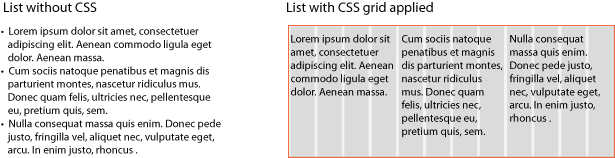
CSS turns the above list into a multi-column group. If you need a normal list with bullet points, just discard the class="examples" attribute. Is this semantic? Certainly—as long as the content merits a list. The CSS merely changes how each bullet point is presented.
Another example:
.photos p { (properties of .grid_10) }
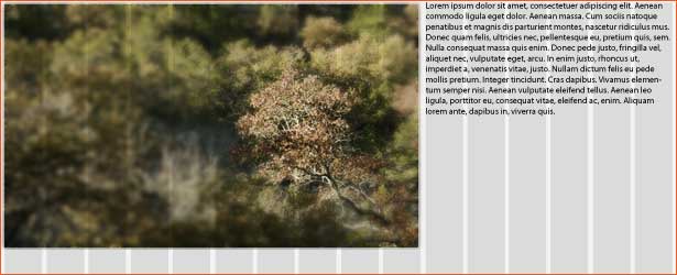
.photos img { (properties of .grid_6) }<div class="container_16 photos">
<img src="…" alt="photo" />
<p>First caption</p>
<img src="…" alt="photo" />
<p>Another caption</p>
</div>
This automatically puts captions, enclosed in paragraph tags, adjacent to photos.
When tables are not appropriate, the tabular effect is easy to create with non-tabular HTML.
.datelist { (properties of .container_12) }
.datelist h3 { (properties of .grid_3) }
.datelist p { (properties of .grid_7) }
.datelist strong { (properties of .grid_1) }
<div class="datelist">

 <h3>subhead</h3>
 <p>…</p>
 <strong>3 p.m.</strong>
 <strong>Jan 1, 2010</strong>

 <h3>subhead</h3>
 <p>…</p>
 <strong>3 p.m.</strong>
 <strong>Jan 1, 2010</strong>

</div>
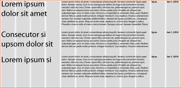
The example above is a schedule of events in which each “cell” in the table has a different tag to reflect its unique content, rather than having the catch-all <td> tag. (Ideal? Maybe not. The HTML doesn’t distinguish between groups of content.)
Applying .grid_x properties to other elements requires some planning, but it results in less-cluttered HTML and doesn’t interfere with 960.gs itself.
Use Classes in Parent Items, not Child Items
Div-itis and class-itis aren’t limited to CSS frameworks.
All of the examples in the last section share an interesting trait: only one class declaration in each. Wherever the same class attribute is used several times in a row in the HTML, change the parent instead of the children.
Unnecessary:
.item { (various properties) }
<ul>
 <li class="item">…</li>
 <li class="item">…</li>
 <li class="item">…</li>
 <li class="item">…</li>
 <li class="item">…</li>
 <li class="item">…</li>
</ul>
Above, all six elements have a class. They’re redundant because the classes are identical. Here’s a better way:
.group-of-items li { (various properties) }<ul class="group-of-items">
<li>…</li>
<li>…</li>
<li>…</li>
<li>…</li>
<li>…</li>
<li>…</li>
</ul>The remedy here for class-itis is to assign a single class to the parent element. CSS selectors do the job, applying the styling to every <li> inside the .group-of-items class. This method can be used on any group of elements with a common parent. For example:
<div>
 <h1 class="title">…</h1>
 <h1 class="subhead">…</h1>
 <p class="publication-date">…</p>
 <p class="body-text">…</p>
 <p class="body-text">…</p>
 <p class="body-text">…</p>
 <p class="body-text">…</p>
 <p class="body-text">…</p>
</div>
.title { (various properties) }
.subhead { (various properties) }
.publication-date { (various properties) }
.body-text { (various properties) }
Most of the paragraphs above are just simple paragraphs and yet have needless class attributes. We also have two headings, distinguished only by their classes—yet adjoining <h1> elements don’t make for a good content structure. Here is a better solution:
<div class="article">
 <h1>…</h1>
 <h2>…</h2>
 <p class="publication-date">…</p>
 <p>…</p>
 <p>…</p>
 <p>…</p>
 <p>…</p>
 <p>…</p>
</div>
.article h1 { (various properties) }
.article h2 { (various properties) }
.article .publication-date { (various properties) }
.article p { (various properties) }
Now only two classes remain. We’ve kept the .publication-date class to distinguish it from the normal paragraphs below it. Because HTML doesn’t have a “date” tag, this class is necessary to show what the paragraph contains. The new .article class enables you to style that div and the elements in it in the CSS with minimal mark-up. The CSS in both examples has four definitions each, and yet we end up with much cleaner code in the second.
In general, identical elements with a common parent do not need extra attributes. Classes only help when there’s a difference between them. A rule of thumb: use classes only when you need to distinguish between otherwise identical types of content.
Simplify
The purpose of the 960 Grid System, and CSS frameworks in general, is to reduce the effort needed to lay out web pages. The benefit of CSS is that it reduces the amount of HTML necessary to display a page. But as a layout language, CSS isn’t perfect. Frameworks are merely tools that help people achieve solutions, not the solutions themselves. It’s up to designers and developers to combat class-itis and div-itis.
Written exclusively for Webdesigner Depot by Ben Gremillion. Ben is a freelance web designer who solves communication problems with better design.
How do you say more with less? Share how you streamline code and your workflow in the comments below…
WDD Staff


Read Next

20 Best New Websites, April 2024

Exciting New Tools for Designers, April 2024

14 Top UX Tools for Designers in 2024

What Negative Effects Does a Bad Website Design Have On My Business?

10+ Best Resources & Tools for Web Designers (2024 update)

3 Essential Design Trends, April 2024

How to Plan Your First Successful Website

15 Best New Fonts, March 2024

LimeWire Developer APIs Herald a New Era of AI Integration

20 Best New Websites, March 2024

Exciting New Tools for Designers, March 2024
