1
Textures make a website feel tangible.
They give content a relationship to the physical world, a sense of place and a reality that people can relate to.
Unfortunately, simulating physical textures isn’t as simple as shooting a photo or running a few Photoshop filters.
One has to blend random noise and recognizable patterns, striving for similarities rather than pure repetition.
Here, we’ll discuss what gives textures an organic quality, and we’ll look at techniques for creating and applying natural-looking textures and seamless tiles.
Sense of Touch via Sight
A “texture” is the surface of a physical substance or object. Like sight, our sense of touch helps us understand objects. Rough, smooth, slick and crumbly are textures and tell someone what an object is made of, where it has been and if it is related to something else.
On the web, a person’s sense of touch is limited to their input device. But not all websites need to “feel” the same. Based on their experience from handling everyday objects, people associate certain appearances with certain textures. In digital art, one could say that texture is how something “feels” to one’s eyes.
While modern image editors make texture creation easy, not every texture is a surefire winner. Creating a natural-looking texture is a tricky task that mixes pattern, chaos and usage to create character.
Natural Textures Have a Measure of Randomness
Many textures fall between two extremes: regular patterns and random noise. Pattern-based textures make no apologies for looking artificial. They can be made up of a known symbol or text, and they always have a predictable arrangement.

Above, samples of tiled patterns.
At the other extreme, noise-based textures embody random static. They’re easy to create—Photoshop has its own “Add Noise” filter—and easy to tile because they lack any features that look odd when cut off.

Above, samples of noisy textures.
Natural-looking textures sit somewhere between regular patterns and random noise.

Above, a range of textures mix patterns and noise to varying degrees.
While nothing is wrong with either extreme, many good textures have characteristics of both. In natural-looking textures, seams are absent or hard to spot, and we can’t identify any patterns in repeated tiles. Their look is as distinct and effective as any regular pattern, but less blatant.
“Organic” textures have the right combination of noise and pattern.
Rational Chaos, Orderly Noise
In the context of texture, “noise” refers to irregular variations in a group of pixels. Film grain, low-light artifacts and dithering are three common types of noise that, desirable or not, are often found in complex images.
Texture noise is what makes natural surfaces look natural. But it’s not simply static. Rather, texture noise balances chaos and order.

Above, a single geometric shape repeated many times creates a pattern. On the left, the shape varies only in placement: the rows aren’t quite even.
The other shots show changes in the shape’s angle, density and size. Textures made from these variations in shape would appear more chaotic—but all of the textures would retain the original’s unique character, because the variations are based on the same basic shape.
Of course, the result still looks artificial. Obvious repetitions in noise-based textures ruin the effect because people are very good at recognizing patterns. Textures in the real world have variation in shape, color and depth.

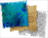
Above, real-world textures show both noise and repetition. Burlap, pink granite and wax paper have their own “regular irregular” patterns, but each is still distinct from the others.
- With its predictable horizontal and vertical lines, burlap is the most regular. But the lines aren’t perfect. Slight variations in tone and direction keep the pattern from looking artificial.
- The pockmarks in the granite aren’t evenly distributed. Seeing the unevenness up close is hard. The characteristic becomes more apparent when seen over a wide area.
- The wax paper has both the least contrast and the least personality. A few clumps of dark shades keep it from being random noise.
Every texture has certain features—whether pockmarks, streaks, spots or rills—that make it unique. Variations in these characteristics make it work.

Above, a metallic texture incorporates overlapping ragged-edged shapes in no particular order, but it retains its distinct character. (Texture courtesy The Design Mag.)
Depth and Contrast Range from Murmurs to Screams
A key variable of any natural texture is depth. The “bumpiness” of a texture provides a sense of tactility more than color or size. But depth also adds contrast, which attracts attention and might degrade legibility.

A screaming texture in the background will raise the volume of the content itself. At what point is it too loud? That depends on the strength of the content and the disposition of the audience.
If a loud texture fits the subject matter, then it contributes to the mood. But if it interferes with readability, then you’ve got a problem.

Which of the writings above is easiest to read? Which texture best reflects the message in the writing? There may be more than one right answer, but there’s only one guideline: when mixing textures and content, especially textual content, ensure that the edges of the content remain visible.

Speaking of edges, for extra realism, pay attention to where the texture ends. Slimy or gritty textures, for example, need not end in a perfect line. Instead, let them ooze or crumble into the next surface. The trick is to think of everything on the page as a surface with texture, even if it’s a plain solid color.

Textures That Become Apparent With Light Sources
Not every texture needs deep cracks to look tangible. Consider glossy paint. Without ridges or bumps, its slick enamel feel comes from its sheen.

The textures above show how the surface of an object doesn’t have to be rough. They may not work as repeating tiles, but sheen, reflection and translucency provide visual clues about what an object might feel like in the real world.
The Sweet Spot Between Character and File Size
A common problem with any natural texture is how to repeat it. When people spot repetition, any illusion of reality is destroyed. The easiest solution is to use larger—and thus fewer—tiles. With more variation, spotting repetition becomes harder.

As shown above, the wider the tiles, the lower the chance that people will spot repetition. Unfortunately, wider tiles also make for larger files, which slow down page loading. For many people, a hovering loading sign kills the mood as much as seeing a tile’s edge.
Another solution is to make the shapes in the individual tile smaller.

As we see, repetition of finer textures has less of a chance of being spotted. But the finer the texture, the less character you can give it. The finest texture would be pure noise—but that doesn’t help you. Natural textures always evoke a known surface.
To sum up, natural textures should:
- Have enough personality that they’re not just random noise. This means that shapes, or “clumps” of pixels, should be similar but not identical.
- Have enough personality that a scene or mood is established but not so much that users are distracted from the content. This means that no distinct “clumps” or other characteristics should stand out when viewed from afar.
- Be random enough to avoid repetition. The texture’s characteristics must not form a pattern that people could spot without focusing.
How do we do all of this?
Creating Textures in Photoshop
Many programs enable designers to create their own natural textures. And the web has no shortage of downloadable textures. Creating your own texture can be a rewarding, non-copyright-violating experience that contributes to a truly unique design.
1. Create a new Photoshop document with a white background. For this example we’ll make it 600 x 300 pixels.
2. Fill the background with black.
3. Draw random white strokes pointed in the same general direction. In this example, we’re using a simple hard-edged brush. Different brush tips will create different results. 
4. Use the smudge tool to smear the strokes into random blurry edges. A fuzzy-edged tip (with a hardness lower than 30) works best. However distorted the texture becomes, the best results will have many shades of gray. 
5. Go to Filter > Noise > Add Noise, and add static according to your taste. Then Filter > Other > High Pass. Together, these add more gray tones (vital for step 6) and a bit of grit. 
6. Create a Gradient Map layer. This special layer applies color to underlying layers based on their tone. Unlike normal gradients, which color in pixels based on location, gradient maps color in highlights, midtones and shadows. Use low-saturated colors, especially green, brown and blue, to simulate the colors of nature. 

Above, the result of applying a brown and yellow gradient map.
7. Crop an interesting part of the texture. Try not to use more than half of the entire image. We’ll use the rest shortly. 
8. Important: Save the cropped tile as a separate file. You’ll need the original file later.
The details shown here are deliberately large to demonstrate the technique, but the result isn’t bad for a texture. Here’s how the process works in general:
- Any size you feel appropriate will do. Larger tiles will have more realistic traits but be larger in file size. Always start much larger than you need, because the edges of a texture that was made from scratch will rarely match the edges of the canvas.
- Create a series of marks with the same tool or tools. The essence of a texture is established by picking a similar technique or two and using them many times.
- Add a little chaos with Photoshop filters.
- Add color: gradient maps to emphasize depth, and spots of random color for splatters. Use low-saturated colors, especially green, brown and blue, to simulate the colors of nature.
Make Tiles Seamless
Natural-looking or not, most textures and patterns should be seamless. That is, visitors shouldn’t be able to see the edges of the repeating tile. How do we do this? The tile itself provides the solution.

9. Above, the image is split along the blue and red lines. Because pixels along the split already match, moving them to either side ensures that the left and right edges will match. Of course, the problem still exists, but it’s easier to fix.

10. This square tile comes from a larger image. Above, the tile’s split is filled in with material from the full image. Repeat step 8 to fix the horizontal seam (at the top and bottom of the image).
The Final Property
The simple texture created above has a glaring flaw: because it was designed to demonstrate the process, its characteristics repeat too frequently.
A natural texture’s characteristics are usually less than one-tenth of the whole tile. That is, for a tile measuring 500 x 100 pixels, the largest wrinkle, rill or other mark would measure 50 x 10 pixels or less.
Well-crafted textures require one more feature: time. Short of downloading a freebie, you have to take time to develop and refine a great texture. But don’t think of it as a chore. It’s part of the process, naturally.
Written exclusively for Webdesigner Depot by Ben Gremillion. Ben is a freelance web designer who solves communication problems with better design.
How do you create natural-looking textures? Share your ideas in the comments below.
20 Useless Websites to Waste Your Time
The internet is usually a place for “getting things done,” but sometimes the soul just needs a little bit of high-quality nonsense. These websites aren’t trying to sell you a…

Exciting New Tools for Designers, February 2026
There are so many new – and good – tools for designers out there right now. From tiny bits of artificial intelligence to icons that delight, there’s something to help…
Exciting New Tools for Designers, March 2025
Spring into action this season with new tools to boost your workflows, facilitate creative thinking, and help you be a more efficient designer. This roundup is packed with new goodies…

Compilation: 15 Hilarious Google Flops
When it comes to tech, Google has been synonymous with innovation, success, and world domination (hello, Android and Chrome!). But even the mightiest giants trip over their own feet from…

3 Essential Design Trends, January 2025
Happy New Year! If the website design trends we are already seeing are any indication, 2025 is going to be a great year for visual communication. This month’s collection of…

Exciting New Tools For Designers, January 2025
Welcome to our first tools round up of 2025. It’s the first Monday of a new year, and many of you are back at work after a much needed break….