 The process of designing a type-based logo is similar to that of designing a shape-based logo. Both logos need to convey a message, do it quickly and appease the client’s taste.
All of these objectives can be accomplished by defining goals, favoring message over convention and questioning our assumptions as designers—even to the point of considering Arial or Helvetica.
Anyone who designs a logo faces many questions. What should it look like? In what formats will it be presented? Does a particular color scheme need to be followed? As rough drafts are refined, the urge to find a general “solution” overrides the importance of these initial questions, which often end up neglected. When design becomes a question of preference, the end result is debatable.
Graphic design is a process of solving problems through visual communication. The process of designing a logo can be regarded as a series of steps that solves a series of questions. This article tells the story of a process that focuses on those questions.
What’s the Project?
Smalls, Middleton & Bigman, a fictional law firm, hires a professional design company to develop its company logo. Problems begin with its initial requirements:
- It must be easily recognizable.
- It should work at all sizes, including for business cards, letterheads and billboards.
- It should look professional.
These could apply to any logo for any company. So, the designer asks for more information about the company itself.
- In what specialties does it excel?
- What sets it apart from competitors?
- What brings clients back for business?
Smalls, Middleton & Bigman is an aggressive new firm specializing in regional real estate deals. Its owners want to make a dent in the established market. Most of its staff were born and raised in the area that it covers. They are locals who understand the region’s history and politics and could rattle off a list of the best barbecue places in town. Although the principal partners have many contacts, the firm has no repeat business because it has no clients yet.
Everyone involved agrees that starting with the right logo is important, especially in a market with 20-year veterans who advertise actively. While the competition uses law books and scales of justice in its imagery, SM&B wants to emphasize its memorable names.
The designer immediately sets out to create a logotype.
The Importance of Shape
A logotype is a graphical trademark that uses type as its primary or only element. Like an icon, it expresses a message, but with letterforms alone. A logotype should communicate the name of the company and reflect its personality.
The temporary letterhead created by the firm’s secretary is quickly rejected.
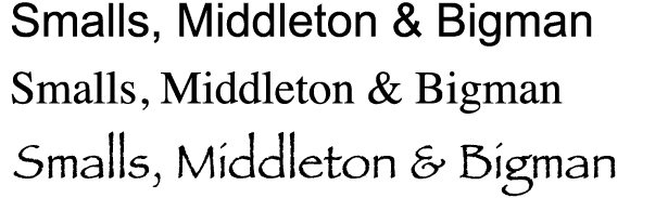
Seasoned type designers might roll their eyes at the sight of Arial, Times New Roman or Papyrus (or of a letterhead created in MS Word), but that response smacks of snobbery.
Which of the above logos tells people what the law firm specializes in? Which one sets the firm apart from its competitors? When we ask whether these are solutions to problems, then we’re using design as a means of problem-solving.
The examples above aren’t logotypes. They’re just text. How do we tell people non-verbally what the law firm does? That is, not with text alone.
“It’s Ugly” Isn’t Reason Enough
What about Arial, Times New Roman and Comic Sans makes designers cringe? It’s not necessarily the letterforms. Helvetica, for example, is a well-designed geometric typeface that dates back to 1957.
At a glance, Helvetica is rather plain. But that’s because we’re used to it. Look again:
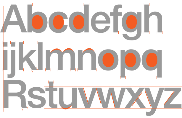
- The uppercase A steps outside of its container on the left to accommodate its acute point.
- The round counters in b, c, d, g, o, p and q match precisely.
- The ascenders and feet have a uniform width, even when they end at an angle or curve.
- The x-height of most letters may as well have been cut with a razor.
- There are only three variations of diagonal angles.
Overall, it’s hard to imagine a more legible face (though some have tried). But its success turned into a dilemma. Faces such as Helvetica lack impact because they are common. Common typefaces blend into the background. We see them everywhere. Anyone can use them.
Rejecting Helvetica, Times, Arial, Papyrus or Comic Sans is justified if it’s inappropriate or if a better alternative exists, not because we just don’t like it.
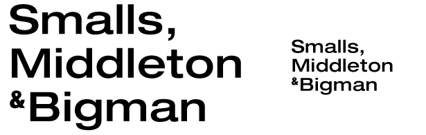
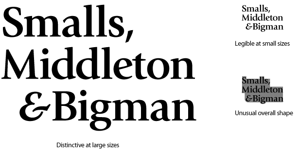
Above, the SM&B logotype is set in Helvetica at two sizes. Whether large or small, it is legible, modern, and sensible. It’s a good start, but rather plain. Nothing about this logotype presents the law firm as aggressive, young or specialists in real estate. Except for the fact that law firms are often named after three people, this logotype could be for anything.
A typeface speaks volumes about the company’s character:
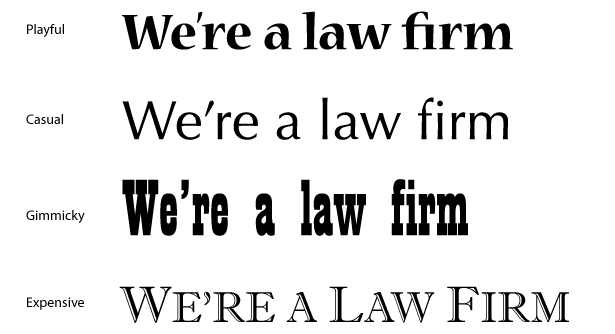
Above, the statement “We’re a law firm” is written in different voices. As in the movies, delivery can change the same line into a comment, a joke, a question or a threat. When Meg Ryan smiles and says, “I’ll be back,” she means something different than Arnold Schwarzenegger. Likewise, four different law firms could each use a different one of the above typefaces, but guess which three would have trouble finding business?
Viewing Type, Not Reading Text
If you work on a logotype long enough, you’ll reach a point when the word in the logotype starts to look funny. Something’s odd about the text. Has it always been spelled that way?
If you’ve just noticed that it contains a peculiar combination of letters, then congratulations: you’ve stopped reading the words and started looking at the shapes of the letters. The effect is stronger when you set the words in a variety of font styles. (Unfortunately, staring at the examples in this article won’t work. For a taste of type nirvana, play around with a program that lets you experiment with fonts up close.)
The name SM&B is already set, so the designer can take his time choosing the right typeface for it.
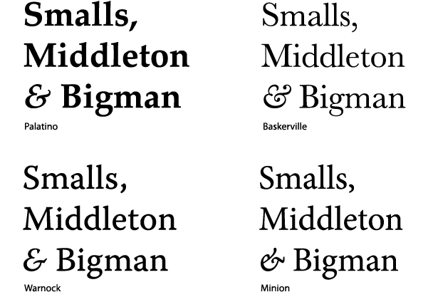
Above, our law firm’s name is set in four different—and more appropriate—serif typefaces. The differences are subtle, but two immediately stand out: the ampersand and the letter S. (Look closely: setting it in large type helps you notice the details.)
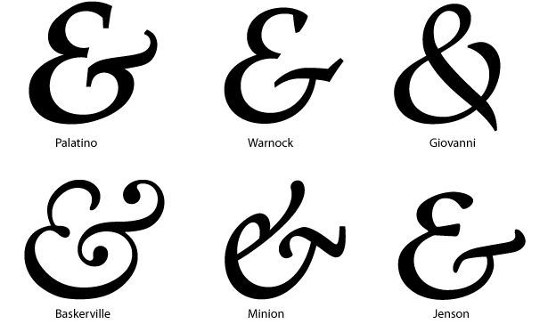
Originally an abbreviation for the Roman “et” (“and” in English), the ampersand can take on unique personalities. Above, six fonts show how wide the variety can be. For SM&B, the important question remains: which best suits a young aggressive real-estate company?
All of the ampersands “flow” (i.e. have a sense of motion), but they take radically different approaches. Choosing an ampersand is not about which looks nicest, but about which sets the appropriate mood.
- Jenson’s bar is balanced like the scales of justice, which is too close to SM&B’s competitors.
- Warnock’s combination of hard angles and refined lines makes it the most modern.
- The ornate style of Palatino looks more like calligraphy than an aggressive law firm.
- Giovanni, which curves inward, is either introspective or self-centered—neither of which fits SM&B’s personality.
- Baskerville’s vine-like swirls are the least appropriate.
The question is, what shape(s) best communicates energy, professionalism and real estate?
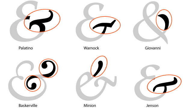
No less important are the serifs:
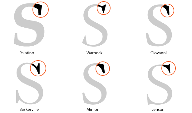
Each letterform ends in a distinct serif (although Minion and Giovanni are close).
Warnock and Palatino don’t quite fit. They are clunky compared to Baskerville and Jenson, whose serifs flow from the S shape. Minion and Giovanni’s serifs are subtle accents to the letterforms.
Eventually, the designer settles on the Warnock ampersand and the Giovanni letters.
A few extra tweaks add to the sense of motion:
- A gap enhances the ampersand’s “hop.”
- Right-aligning the last word balances the white space in the upper-right and lower-left corners.
- Using bold instead of Giovanni Book lends greater intensity.
So, how do we convey the professionalism and capacity of a firm that does not yet have years of experience? Which font says “fresh and new”? A serif face whose tails are kept to a minimum.
Text Informs. Color, Style and Font Emote.
People “read” and “view” logotypes at the same time. Reading text is informational: people interpret the words and relate them to other information. Absorbing text is emotional: people get a sense of the company’s character and attitude, and this is determined by font choice, color, placement and size.
For example:

The text of each word contradicts its hue. But if you processed the text before the style, then you followed the pattern that most people follow. When people see text, they look for a literal message. The message (for example, the mood) is absorbed much less consciously but is no less important.
At this point, one might ask what colors SM&B’s logo should be? But choosing colors isn’t the goal. Communication is the goal.
Instead of looking for colors that he likes, the designer returns to the original problems. Specifically, how do we convey specialization in real estate? Treating color choice as a solution, not an arbitrary preference, leads to a revelation. Most law firms use dark blue, red, gold and white. SM&B wants to stand out. Earth tones solve the problem of how to avoid conformity while conveying the firm’s real estate specialization.
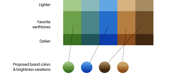
The designer and law firm start reviewing earth tones. Representing lawyers with browns and greens is unusual, but the decision isn’t arbitrary. The color scheme solves a design problem.
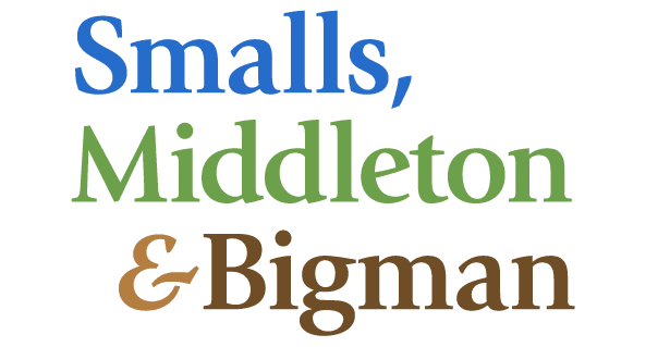
The order of blue, green and brown suggests a landscape, but not explicitly so.
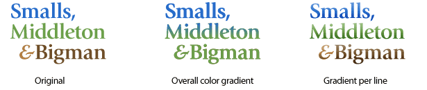
The designer tries a few variations, which don’t add anything. Gradients, for example, are a solution with no problem.
So, how did we manage to say that this is a real-estate law firm without actually saying “Real estate law firm?” through color.
The Right Questions Lead to the Right Answers
The story of SM&B’s logotype is about process, not solutions. The final logotype depends as much on personality and good sense as the client and designer’s tastes. Any of the proposed solutions are open to debate, as a logotype should be. But the questions that sparked the process by which the logo was created should not be forgotten.
Written exclusively for Webdesigner Depot by Ben Gremillion. Ben is a freelance web designer who solves communication problems with better design.
How do you approach icon, logo or logotype design? How do you communicate identity in a simple logo? Contribute your ideas in the comments below.
WDD Staff


Read Next

20 Best New Websites, April 2024

Exciting New Tools for Designers, April 2024

14 Top UX Tools for Designers in 2024

What Negative Effects Does a Bad Website Design Have On My Business?

10+ Best Resources & Tools for Web Designers (2024 update)

3 Essential Design Trends, April 2024

How to Plan Your First Successful Website

15 Best New Fonts, March 2024

LimeWire Developer APIs Herald a New Era of AI Integration

20 Best New Websites, March 2024

Exciting New Tools for Designers, March 2024
