 And it's finally out! Please meet our new site: TECHi.com
It's a brand new and amazing technology blog that focuses on tech stuff that's always fresh and never boring.
You may have already come across it, or seen a few of the ads floating around the web. But now, it's official, TECHi.com is out of beta and ready for prime time.
I'm super proud and excited today to shine the spotlight on the site that we've been working on so much for the past few months. And now, I'll be taking you on a little tour of the new website, discussing the content and design and how it all came together.
As always, your feedback will be greatly appreciated and it will help us make the site even better...
What is TECHi?
Putting it simply, it's a technology blog. But we don't like the 'boring' tech stuff that we often find on the web (stuff like acquisitions, mergers, stocks going up/down, start-ups that nobody cares about, etc), so we avoid those topics for the most part, unless they're truly relevant, and we try to make them as much fun to read as possible.
You'll find in depth articles, like on WDD, as well as the latest tech news and the coolest/weirdest gadgets, along with some fun posts. Our tagline is 'fresh and never boring' and I think it really describes Techi to a tee.
While on WDD we usually post only one article per day, on Techi you can sometimes find more than 20 posts on a day. The daily content usually includes a couple of editorials with the rest being short posts for news and cool stuff. Don't worry, we won't overwhelm you, and you can have as much or as little as you want. Even our RSS feeds are customized so that you can choose to either get the whole 'enchilada' or just eat the bytes that you're most interested in.
Here's a full preview of our homepage. Click anywhere on the image to go to the live site:
The TECHi name
I love the name of this site! And at only 5 letters, it's even shorter than Google! We played with many different names and we originally decided on one that I liked but wasn't quite perfect. As usual we went through the frustrating process of going through dozens of domain name options only to find that most of them were already taken.
We registered a few domains that contained the word 'tech', which is something that I really wanted. Eventually, we ended up buying Techi.com from a domain name reseller and I couldn't be happier. It was a bit pricey, but it was worth every penny. I love the domain name and it couldn't be simpler or easier to remember or type.
Oh, and by the way, it's pronounced Tech-ee, not Tech-eye.
Where did the idea come from?
I know this sounds funny, but it seems that most of my good ideas come to me while taking a hot bath and that's precisely where the idea for Techi came up.
I basically looked at my personal browsing patterns and noticed that while I love to browse and read design blogs, I also like to keep up to date with the latest technology stuff. I think that many WDD readers will relate to this and be in the same boat with me on this one.
So that's where Techi.com fills the gap between design and all the other cool stuff happening on the web right now.
The Content
At the top of the latest posts on our homepage, we have a menu which acts as a filter for the content. You can choose to view ALL content or select just EDITORIALS, COOL, NEWS or BREAKING. We made sure to have a good mix of things for everyone, whether you're looking for a quick read or something more in-depth.

EDITORIALS
These are in-depth articles, similar in style to what we have on WDD and 100% original. We do analysis pieces about technology, make sense of the latest tech news as well as fun posts, or interesting round ups about tech related stuff. Here are some examples of our latest editorials:
- The RIAA and MPAA Have Failed To Understand A Cultural Shift
- CAPTCHA Advertising Coming Soon To A Website Near You
- The Changes at Facebook: The Good, The Bad and The Very Ugly
- Six Back to the Future Innovations We're Still Waiting For
- How the Blackberry Can Get Its Mojo Back
- The (Potentially Grim) Future Of Firefox
- How I Learned to Love 3D... I Think
- 3D: Half-Baked Tech Not Ready For Prime Time
- Identity: The Twitter Killer We Never Expected
- Rules of Engagement: Six Things Not To Do on Twitter
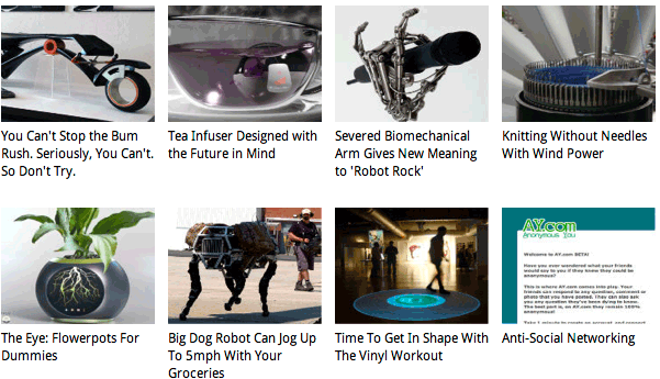
COOL
The cool section features new, cool (and sometimes really weird) gadgets, fun things and anything else that we feel is 'cool'. Here are just some examples to get you going, but there are tons more:
- Revolutionary Watch Designs That Blow Traditional Timepieces Away
- 3D views of New York City using Google Earth
- We Might Have Underestimated How Big Google Really Is
- Did You Honestly Think the Kindle Was Your Best Bet for Mobile Books?
- Vintage Postcards Invaded by Star Wars
- New Headphones Will "Light Up" Your Day
- Glowing USB Stick Changes Color According to Contents
- The Straight Poop on Texting Underwear
- The Toe Mouse: Browsing Porn Just Got Really, Really Convenient
- Too Cheap to Buy an iPad? Join the Club and Get a PixelPad!
- Lightsaber Bookends Support Those Paper Thingies You Don't Read
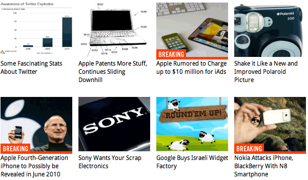
NEWS / BREAKING NEWS
The news section is pretty straightforward, we feature the news items of the day that we feel are most relevant and interesting to our readers.
On several occasions, we have broken stories even before they hit the big news and social media sites, so check back often to see what's happening - we're sure to have you covered as far as tech news goes, at least the stuff most people care about. Here are some of the news topics that we recently covered:
The Design
I hired my good friend, the very talented Matt Dempsey (whom I've worked with in the past), to put together my vision for Techi.
For my own projects, I like to work together with other designers as a joint collaboration gets me the best results. The fact that we're both designers allows us to bounce ideas back and forth until we get the best possible solution. An external designer will also see things more objectively and call things as they see them. And Matt got it perfectly right.
Good design is transparent, they say, and this is what we tried to achieve here. There's so much great content on Techi that the design had to be kept to a minimum so as not to interfere. We wanted to let our readers focus on the content of the site and not on the design. That being said, you will notice beautiful details and a truly excellent layout that makes the site design the perfect platform for Techi's content.
Here are some of Matt's insights about the design:
My aim for Techi was to really highlight the content and let the design blend into the background. For a tech site with constantly updating news, big pictures and big videos, you really don't want the design to get in the way, especially if your visitors come back every day. Consequently most of the design is grayscale, with occasional bright colours being given to highlight categories and social media.
Also, for a new technology site which will undoubtedly get a large portion of its initial traffic from occasional articles performing well on social media, it was important to make the logo as prominent as possible to increase the likelihood of a first time visitor remembering the brand. Walter also wanted the featured articles to be prominent and detached from the latest articles.
Bearing both of these in mind, instead of predictably having the logo on the top left, I've decided to place it between the featured and latest content, acting as a separator whilst increasing the chances of still being in view if the user does choose to scroll straight to the latest post.
TYPOGRAPHY
The logo is set in Trade Gothic Bold Condensed No. 20 with the tagline being in Aller Light. The font used for the headers, as well as for the text under the thumbnails in the cool and latest news sections, is Droid Sans which is being displaying using @font-face. The body text uses Helvetica.
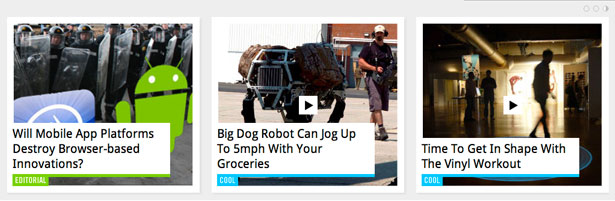
FEATURED POSTS
There are a total of 9 posts being featured in a slideshow format at the top of the site. Check out the cool custom pagination buttons in the top right corner. They each have their own timer which resets when you mouse over the content so that the page doesn't slide out of view when you're focusing on it.
The featured content includes some of our latest editorials, breaking news and other pieces that we feel are worth highlighting. The section is updated several times a day, so that there's always something fresh to read when you come back to the site.
SIDEBAR: Widgets, Popular Posts, Latest Videos
Besides the section navigation menu, a site this big has a lot of content and instead of having a massive horizontal menu at the top, or drop down menus, I decided to ignore this traditional way of organizing content by creating a right sidebar that allows you to drill deeper into the site's content. Remember that my goal with Techi is to keep it 'fresh and never boring' and I felt that this should relate to the content's organization as well as how you interact with it.
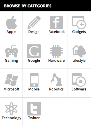
- Widgets: Categories
This is a really neat way to find content of interest by clicking on the main categories of the site. We designed some neat icons for each category. Try it out on the live site: simply click on any icon and a new page will slide in to view the latest posts on any given category. At the top right corner you'll find a link to see all posts in the selected category. Click on the back link to return to the category list. I drew inspiration from the navigation style of the iPhone and we implemented these sliding panels using Ajax.
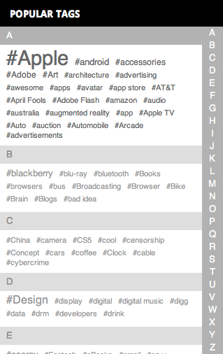
This custom widget was based on the iPhone once again and is one of the most original ways to browse through tags that I've ever seen. Try it out, it's really fun to play with. Simply click on a tag to see all posts related to that tag. Originally we put all the tags that we had there, but there were too many and that was slowing the widget down and became too difficult to navigate, so now we're only showing the most popular tags.
Plain and simple, this area displays the current most popular posts using a special algorithm.

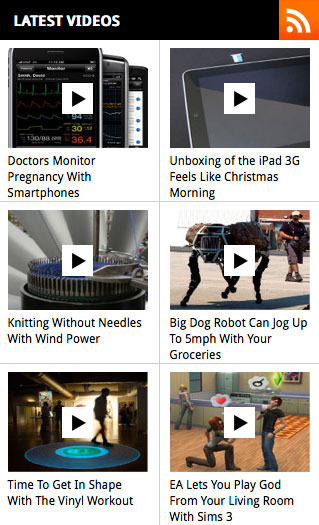
This area highlights the latest posts that contain videos.
FOOTER
I wanted something original and unobtrusive for the footer. With so many posts displayed vertically, I didn't want a tall footer that's loaded with information as it would extend the page unnecessarily. That's why we used the sidebar as a way to display content and navigation. Matt designed a really cool and original footer with just the basics that you'd expect to find there. It works very well and I really like it.
PAGE DOES NOT EXIST / NO SEARCH RESULTS
You gotta have them! And I had some some fun creating these two pages: 404 and no search results
Hosting
Techi.com is hosted by the good folks at VPS.net which are also the hosts for Webdesigner Depot. The site is running and responding really well even on days of massive traffic. VPS uses the Akamai Content Delivery Network which allows for higher speeds thanks to object caching and delivery of images based on the servers closest to each visitor's location.
You and Techi
I had great success with WDD thanks to an awesome team of very dedicated writers, and the same is true for Techi. There's an amazing group of people working together behind the scenes to create a truly awesome site with great content. But that of course is only one part of the equation.
Ultimately, your support and input will make this site really better and better every day, just like you did for WDD. So today, I'd like to ask you for your support. If you enjoy what we're doing on Techi, please help us out by spreading the word to your friends, colleagues, etc. It can be a quick email, a retweet, or sharing one of our stories on Facebook, or even word of mouth. A comment on the site means a lot to me and to the authors writing the content as it shows us that you care about the effort that we put into this and it help us become better at what we do.
Of course, if you have ideas or suggestions for improvement, I'm all ears, please do let me know about it. I love constructive criticism and although we're still tweaking a few things, and I'm always happy to listen to your feedback! Thanks in advance for your support!
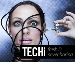
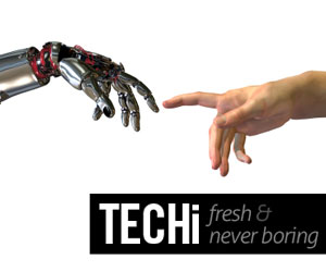
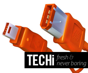
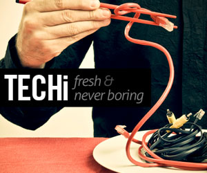
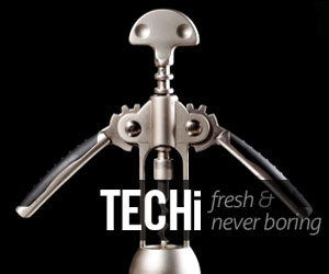
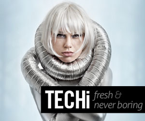
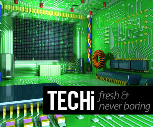
Banner ads
If you wish to promote Techi through your own site or blog, that'd be truly awesome and deeply appreciated. I made some really cool banners that you can download to display on your own sites. Here are some examples, but there are a lot more in this file: banners.zip
That's all folks!
So there you have it, the entire Techi story in a nutshell! I hope you enjoyed reading this and most importantly that you enjoy reading and visiting Techi.com
It's a really great site with potential for a lot more, go ahead and try it out, there's tons of great stuff there that most of you will enjoy and hey, there's even have a design section, so I'm sure you'll feel at home right away. Thank you for Techi-ing!
WDD Staff


Read Next

20 Best New Websites, April 2024

Exciting New Tools for Designers, April 2024

14 Top UX Tools for Designers in 2024

What Negative Effects Does a Bad Website Design Have On My Business?

10+ Best Resources & Tools for Web Designers (2024 update)

3 Essential Design Trends, April 2024

How to Plan Your First Successful Website

15 Best New Fonts, March 2024

LimeWire Developer APIs Herald a New Era of AI Integration

20 Best New Websites, March 2024

Exciting New Tools for Designers, March 2024
