 The ability to tint black-and-white photographs with color has been a staple of photography for decades, and modern image editors make warming and cooling grayscale images a snap.
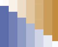
This concept of a steady progression of shades can be used to present information as well.
This technique of tinting digital photos works well for presenting information and can improve usability.
Just as a gradient shows a range of colors, a monotone or duotone can be used to show a range of data.
In this article, we'll learn how to apply color to enhance infographics.
Unless they're calculating sales, most people don't associate spreadsheets with fine-art photography. But even outside the world of accounting, tables and duotones can mix. The trick is knowing when to use color.
Tinting Enhances a Grayscale Image
Digitally sepia-toned images are grayscale images whose pixels have been colored slightly, usually with beige or blue. Orange or yellow can replicate the effect of aged photos, which were sometimes tinted with sepia pigment. Sepia tones (or, more broadly, monotones) can either "warm up" or "cool down" a black-and-white (grayscale) image without detracting from the composition.
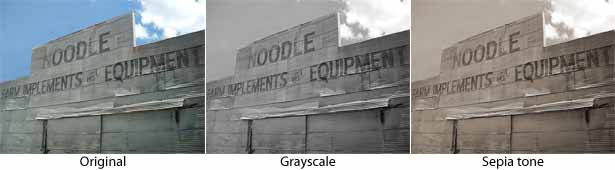
The difference between a grayscale image and a sepia-toned one is the sepia's tint, as seen above. Any digital photo can be turned into a sepia tone, although some photos work better than others. Images that rely more on color (specifically hue) than contrast often weaken in the transition to tint.
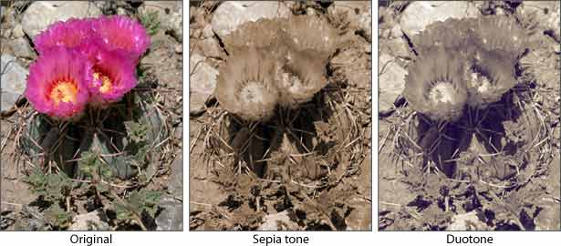
The striking pink shines in the original image above but disappears when the hues become uniform. Even if an image could work with a tint, the wrong tint may overpower the photo.
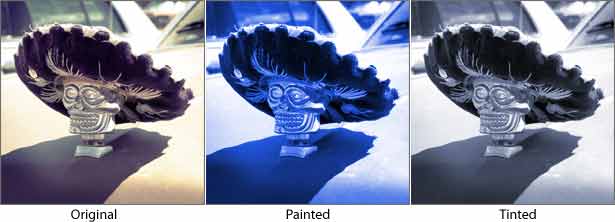
A tint can become a gimmick if the color is too obvious. Above, the original photo takes on a psychedelic air when too much blue is applied. The goal isn't to add color but to add "flavor."
Using more than one color in a tint is possible:
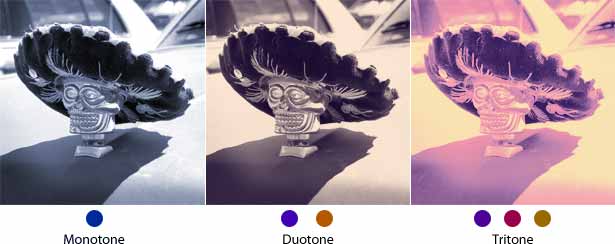
The three types of tints above are appropriately named. Monotones apply the same hue across the whole image. Duotones use one hue for shadows and another for highlights. Tritones add a third hue for mid-tones.
Duotones Provide Natural Ranges
Traditional tables and bar charts work in two dimensions, but not all data fits the row-column format.
A duotone is great for presenting a range of data because it is itself a range of colors. Aesthetically speaking, blends of two main colors tend to look like they belong together. But applied to data, ranges of colors have other benefits. First, because not everyone can see colors well, using a range of dark-to-light colors helps people with visual impairments to see the effect. Secondly, distinct shades are useful for representing different sets of data.
The charts below show the sales volumes of a fictional company over several years. How could color improve them?
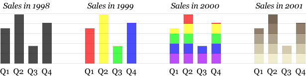
Let's take charts one by one:
- 1998: This standard bar chart uses space to explain data. The height and horizontal position of each bar tells us how sales went in each quarter of the year. It's functional and clear.
- 1999: Color-coding the bars adds style but doesn't tell us anything new. Colors could have been used to group the bars together, but because each bar is a different color, nothing is improved. We can tell the difference between each bar just as easily without color.
- 2000: Using colors vertically shows how the bars relate to each other. For example, notice how Q4 barely reaches the red area, a fact easily overlooked in the first two charts.
- 2001: This last one uses a duotone, but it doesn't help. Adding an effect without making the data more informative doesn't benefit the user. That's the difference between a gimmick and an enhancement.
The charts above use color variation in lieu of solid bars. Both versions serve the same purpose: to show sales in increments per quarter. Color takes the data a step further.
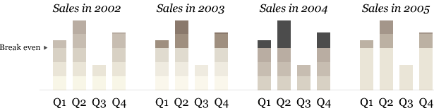
- 2002: The break-even point adds some new information: sales must pass this line for the company to make a profit. The 2002 chart shows that the company operated at a loss in only one quarter.
- 2003: A difference in shading indicates the break-even point. But is it clear enough?
- 2004: The areas of the bars showing profit are indicated even more clearly here, but we've lost the increments.
- 2005: The opposite of the chart for 2004, this one marks increments above the break-even point, clearly indicating the company's profit (if any) in each quarter and ignoring the rest.
Color is a powerful tool for non-verbal communication. Beyond aesthetics, it can be used to organize. How else could we use the colors in the last set of examples?
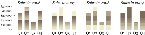
- 2006: Gradients indicate where each bar hits the $20,000 and $40,000 marks. This is helpful, but the break-even point is $30,000.
- 2007: Pure gradients grow darker to show higher sales—until we reach the break-even point. Because the colors above the $30,000 mark are similar to the background color, they fade away. High contrast draws attention to the fact that the company turned a profit in only three quarters.
- 2008: Reversing the gradient midway up the y-axis is an unusual approach. This implies that the $20,000 to $30,000 block is significant but not the $30,000 break-even point itself. Unlike the pure gradients for 2007, though, this graph clearly indicates every $10,000 increment.
- 2009: They say that some rules were made to be broken, but this graph breaks them for no apparent reason. None of the shades match the dollar increments, and the break-even point is hard to see. Shading works best when it tells the user something. Shading for its own sake is mere decoration.
More Examples
This technique isn't limited to bar charts.
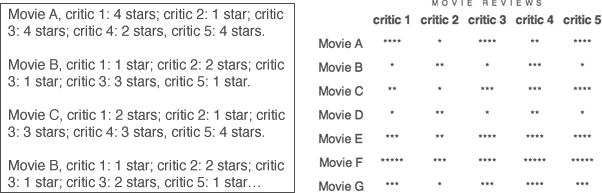
The data above compiles the star ratings of critics for several movies. The raw data on the left is legible but unhelpful; scanning each line of text for a single datum is possible, but it's difficult to see the big picture. Presenting the data in a table (right) gives the viewer a sense of everything at once. We can at least clearly tell that there are five critics and seven movies, and we get a rough idea of who liked what.
Assigning a color to each star rating would reveal more about how each movie fared. But not any colors will do.
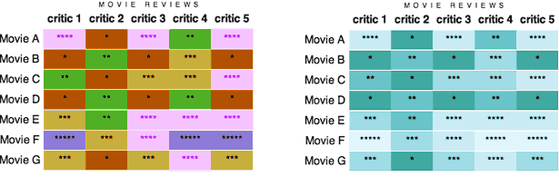
The table on the left follows the rules but not the spirit of color-coding. Telling the ratings apart at a glance is easy because each value has a consistent color, but there is no logic behind the color choices.
The table on the right uses color more purposefully. Dark shades are assigned to lower ratings, and light shades are assigned to higher ones. It would also work the other way around, but the effect is the same: a range of shades is assigned to a range of values.
Not only is this more visually pleasing, it reveals trends in the data. Now it's easy to see that movie F scored well overall but movie B didn't, that critic 2 was harder to please than critic 4, that all critics liked movie F but not movie D, and that they disagreed about movie A. Different shades of the same hue, then, can reveal more than the data on its own.
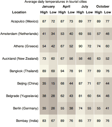
Monotones and duotones work best when information is arranged in layers, levels or a range. For example:
Source: infoplease
Source: An Event Apart, Boston 2010
Written exclusively for Webdesigner Depot by Ben Gremillion. Ben is a freelance web designer who solves communication problems with better design.
Where else can a monotone or duotone help explain information? Share your thoughts in the comments section below.
WDD Staff


Read Next

3 Essential Design Trends, May 2024

20 Best New Websites, April 2024

Exciting New Tools for Designers, April 2024

14 Top UX Tools for Designers in 2024

What Negative Effects Does a Bad Website Design Have On My Business?

10+ Best Resources & Tools for Web Designers (2024 update)

3 Essential Design Trends, April 2024

How to Plan Your First Successful Website

15 Best New Fonts, March 2024

LimeWire Developer APIs Herald a New Era of AI Integration

20 Best New Websites, March 2024
