1
The content of any website is paramount to a site’s success.
High quality content, regardless of whether the site aims to inform, entertain, or sell a product, will increase the site’s likelihood of converting visitors. But beyond providing high quality content, a site also needs to organize that content in a way that makes it accessible to visitors.
Prioritizing your content is one of the best ways to make sure your visitors are finding the information you want them to find, and that they want to find. But figuring out what content is most important and how to arrange it to reflect that can get confusing, fast.
In many cases, designers and content creators feel like it’s all important, and should all get equal billing. But that’s not doing your visitors any favors. You need to get to the root of what’s most important to them, and then provide that in the most user-friendly way possible.
What Are the Site’s Goals?
The first thing you need to think about when deciding which content is most important on a website is what the website’s goals are. Different sites are going to have different goals. For one, it might be selling a product. Another one might be looking to provide information. Others might want people to become members. Some do a combination of the three, or something else all together.
Once you know what your site’s goals are, you can start tailoring the content to fit those goals. If your site aims to sell a product, then the most important information on that site will be that which describes the benefits of the product, answers potential customer questions, and tells visitors how to buy.
If your site aims to recruit members, then you’ll want to put information about why someone should join front and center. If the site’s primary purpose is to provide information, then you’ll want to make sure that either the information or navigation to find that information is place in a prominent position on the home page.
Case Study: Speak Human

Speak Human
It’s obvious from the Speak Human website that their prospective customers are interested in how the book will help them become better marketers. While the emphasis here is placed squarely on that content, they also make it easy to find other information through a well-placed and well-designed navigation bar (which also places more emphasis on the “Buy Now” link than the others, which makes sense since the main goal of the site is to sell books).
Case Study: VaultPress

VaultPress
It’s obvious here that VaultPress wants visitors to sign up for their service, but the positioning of that banner also directs the eye to the content immediately underneath, which talks about the benefits of using VaultPress. Setting apart certain content with a subtle background color also adds priority to some items over others.
Make a List of Necessary Content
Once you know what the site’s goals are, you’ll need to make a list of the necessary content to reach those goals.
For example, if you have a site that aims to sell a product, you’ll want to include product benefits and features, information about your company, a FAQ page, and information on how to purchase the product (or a form to do so right on the website).
If your primary goal is to provide information, then you’re going to want to make sure a taste of that information is available on the home page. You’ll also want to make sure navigation to the rest of the site is placed in an easy-to-find place and is easy to use.
Case Study: Checkout

Checkout
Prioritizing information through the size and placement of content, as well as through icons, is a slightly different approach that isn’t seen as often. In this case, it works very well, though. Also, including an icon and a bit of information about each feature group right in the local navigation make each section appear equally important, regardless of the order in which it appears.
What Do Users Want?
Once you have a list of all the information your site will need, you’ll want to prioritize it so you can figure out what goes where. To do this, think about what your users want. This, again, will depend on the goal of your site. If you want your visitors to purchase something, then think about what information they’re going to want before making a decision. The larger and more expensive the purchase, the more information they’re going to want.
If your site is there to provide information, think about the order in which people need to learn about your topic. Make sure visitors can find information for beginners first, but also make it easy to tap into more advanced information for those visitors who are already familiar with your subject.
For membership sites, think about what your visitors want to know about joining. It’s likely they’ll want to know what benefits they’ll receive (especially if it’s a paid membership). They might also want to be able to view existing members or sample site content that’s generally reserved only for members.
Taking a few hours to really think about what your visitors are going to be interested in is vital. Visit some similar sites to yours and think about how they’ve arranged the information on their site and what seems to be missing or is hard to find. Then, correct those deficiencies on your own site.
Case Study: Global Spend Solutions

Global Spend Solutions
A lot of sites overlook the use of graphics as major conveyors of information, rather than just complementary to the written content. The infographic used here in the header tells us exactly what Global Spend Solutions does and what their business process is, as well as how they can help a visitor. Sometimes they best way to give priority to content is to simplify it into its most basic terms.
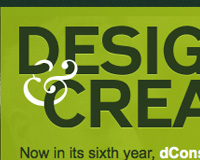
Case Study: dConstruct 2010

dConstruct 2010
dConstruct 2010 obviously knows that visitors are most interested in who the speakers are for the year and place that content front-and-center in the design. They also make other information easy to find, though, both through a well-designed navigation bar and through additional content on the home page.
Deciding How to Organize Information
So, you have a list of the necessary content for your website, and you know what your visitors are going to want to know first. But let’s say you have a lot of information to convey and you aren’t sure how, exactly, you should do that. It’s not uncommon to have lots of information or links that need to be presented that have equal importance on a page. In those cases, it’s best to decide on some formal method for organizing it, rather than just ordering it randomly.
There are a number of schemes you can use to organize lists of information. Alphabetical or numerically are two of the most common, but they only really work for certain types of content. Lists of links, for example, can work really well arranged alphabetically.
Organizing information by who its intended audience is works well for sites where there are likely to be multiple different types of visitors. For example, an online banking website might have business customers and personal customers. Arranging information separately for each type of visitor makes sense, as there will be different priorities for each.
Other schemes for organizing content can include things like geography or format. If your content includes or is dependent at all on geography, that can be an effective and logical way to organize that information. The format of content can be another great way to keep things organized. Let’s say, for example, you have a blog where you offer roundups, tutorials, interviews, and inspiration posts. Separating and organizing that content by format makes a lot of sense in this case. It’s logical.
That’s what content organizing comes down to: logic. If your content is organized and laid out in a logical manner, your visitors will be able to find what they’re looking for. If it’s laid out in a random fashion, they’ll waste time looking for the information they need, and may look elsewhere if they get frustrated.
Case Study: 2pxBorder

2pxBorder
2pxBorder makes use of typography and color to prioritize the information on their home page. The big, bold headings let us know exactly what they do, while other visual cues on the page direct us to the most important other parts on the page.
Card Sorting
If you’re unsure of how to organize the information on your site, or you can figure out multiple ways that seem like they’d work, you might consider using card sorting to figure out the most intuitive way of organizing that information. With card sorting, you put summaries of your site content onto index cards and then let users sort that content into what they think are the most logical groups. You’ll need a focus group in order to carry this out, and turning to your current customers or users can be a good option.
All your users need to do is arrange the cards in the way they think best represents how they should be grouped. You can choose to put them in groups at the start, and then let users rearrange them, or you can just put them all in one group. The former method may work best if you already have a content structure in place and are wondering what improvements could be made, while the second one may be best for new designs.
Card sorting is simple and cost-effective, which makes it a good option for developing a content structure without spending a lot of money. One big disadvantage, though, is that results may not be very consistent between users. You might have ten users and get back ten completely different methods for organizing your site’s content. But it’s often a good starting point, if nothing else.
Pay Attention to Priority on Each Page
Once you know what information is necessary and how important each element is, you’ll need to decide how to prioritize the information on each page. It’s important to properly format and prioritize information within pages, especially when there’s a lot of content present.
If you don’t, the entire thing looks like one giant block of text, and your visitors will have a harder time picking out what’s important and what’s not. Since it’s your site and you have clear site goals, you want to direct your visitors to what’s most important, to increase the chances that they’ll follow through on those goals.
There are a number of elements that play into how information is prioritized on each page of your site. There are the obvious things like color, font size, and graphical indicators, but there are also more subtle cues that will let your visitors know what information is most important.
White space is one of the most important factors in prioritizing information on a page. Leaving more white space around an element on your page increases its importance among the other parts of the page. When combined with color, font size, and other design elements, it does an excellent job of setting apart the most important parts of your page.
The most important information on your pages should be positioned near the top of the page. Use heading tags to format headlines for each of your sections, and remember the hierarchy inherent in those tags (use H1 for the most important, H6 for the least important). Use color sparingly to add even more importance to one section or another. When the page is fully formatted, you should instantly be able to pick out the most important element on that page, without question.
Case Study: Joyent

Joyent
Joyent uses color and typography to emphasize certain content over others. Graphics also play a large role in directing visitors to certain information.
Case Study:The Rackspace Cloud

The Rackspace Cloud
Using different colors in the navigation to set apart the most important element is an excellent way to organize content. Note how they also use different background images and colors, along with icons, to set apart different content areas.
Written exclusively for WDD by Cameron Chapman.
Have you developed any methods for prioritizing content in your web design projects? Or have any resources for getting user feedback on the way your content is presented? Please share them in the comments!
Not Useless: Why Experimental Websites Matter More Than You Think
Every once in a while, a site comes along that makes you pause, grin, and think: Wait—websites can do that? Maybe it’s a portfolio where the cursor morphs into a liquid blob,…
How Aspect Ratios Define Perception, Rhythm, and Flow
Designers talk about color, typography, and hierarchy constantly. But proportion—the silent structure beneath everything—rarely gets the same respect. Every card, photo, video, and module in an interface lives within a…

Token Fatigue: When Abstraction Eats Itself
In theory, design tokens were supposed to save us. They were the missing link between design and code, a neat way to abstract decisions—colors, spacing, typography, motion—into a unified language…

AI as Art Director: Can Machines Develop Taste?
Let’s get this out of the way: AI doesn’t have taste. It has statistics. It knows what’s popular, what’s trending, what’s most likely to earn a double-tap — but it…
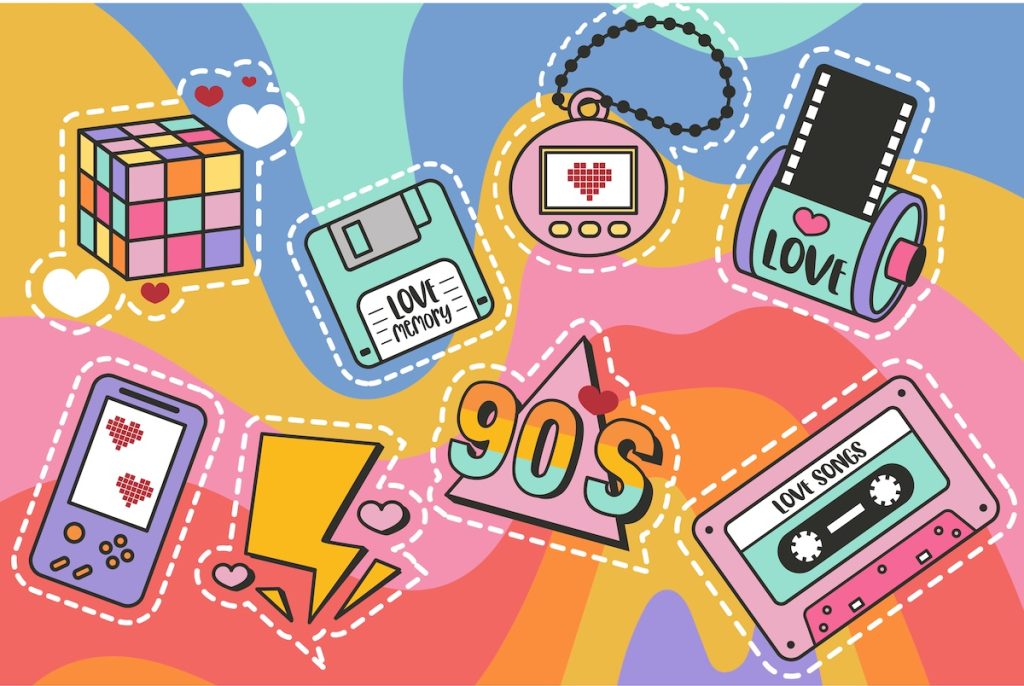
Pixel Nostalgia: Why We Miss the 90s Web (Even If It Was Ugly)
It’s easy to laugh at the 90s web now — the blinking GIFs, Comic Sans banners, table layouts held together with duct tape and hope. But beneath all that chaos…
Exciting New Tools for Designers, February 2026
There are so many new – and good – tools for designers out there right now. From tiny bits of artificial intelligence to icons that delight, there’s something to help…