 Do you want a simpler design for your blog? One that’s lean, elegant and attractive?
Well, there are five easy steps to making your blog look better and to attracting more subscribers, customers and members.
And you don’t have to be a design ninja or have worked at Apple to pull it off!
These steps are simpler than you might think. Those who aren’t sold on simplicity might ask: why would I want it?
Here are three convincing reasons that may work for many blogs:
- Your blog will be easier to read and navigate, and visitors will stick with it.
- Simplicity translates into strong branding. Like a clean office, a simple blog gives visitors a good impression of you and could lead to new subscribers, customers or members.
- You’ll just plain look cooler.
Convinced that a simpler design is better for your blog? Great. Enough jibber jabber, then. Let’s get started.
1. Put Content Front and Center

Prioritize content and call-to-action elements over everything else.
Follow the 80/20 rule: 20% of what’s on the page delivers 80% of the value. What content do visitors come to your blog for? What do you want to achieve? Do you want visitors to read and subscribe to a blog, buy a product or sign up for a service?
The call-to-action elements are the 20%, and everything else is the 80%. Put that 20% front and center; give it priority placement, and make it visible on each page, because it’s what matters most.
So, how do you make your content important? You do it in any number of ways, depending on what’s appropriate for your blog. Here are just a few:
- Make the sidebar smaller.
- Enlarge the font in the main content area so that it’s larger than the font in surrounding areas.
- Thicken or darken the font.
- Put graphics and eye-catching elements in the main content area rather than in the sidebar or header.
Next, remove as much of the 80% (i.e. the unessential elements) as possible.
How? The next four steps will guide you.
2. Get Rid of Unnecessary Elements
Leave only elements in and around your posts that directly contribute to the experience you want visitors to have, and get rid of the rest.
- Is your content timeless? Then remove the date stamp.
- Are you the blog’s only author? Then remove the byline.
- Does most of your social media traffic come from one or two sources (e.g. Twitter and Facebook)? Then keep those icons and ditch the others.
- Not getting any comments? Then there’s no need for a section saying “Comments closed.”
For visitors with short attention spans, your blog will be easier to read; and with fewer choices (i.e. buttons), more people are likely to click and share.
Think about it: when was the last time you clicked on one of those social media badges in a row of ten or more? Isn’t it easier when there’s just a “Retweet” button?
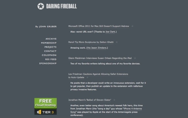
3. Get Rid of Unnecessary Sidebar Elements
The more stuff that is in the sidebar, the greater the chance that visitors will click away from the main content (that all-important 20%), so make the sidebar as lean and unobtrusive as possible.
Remove all non-critical widgets and elements, including:
- Admin and meta features
- Links
- Recent posts
- Top comments
- Latest tweets
Here’s a simple way to determine whether a sidebar widget or element should stay: ask yourself whether it would be worth a visitor to stop reading and click on it. If not, get rid of it.
4. Shorten the Header’s Height
Move more content above the fold by shortening the height of the header.
Why is this important? The more content that appears above the fold, the more likely new visitors will stay and read, because they’ll immediately see the content without having to scroll or scan down.
A few simple ways to shorten the header’s height:
- Remove white space; your theme’s style sheet is your friend.
- Make the logo smaller; again, it’s style sheet time.
- Reduce wasted space by combining two rows. If your logo doesn’t need its own row, move the navigation menu to its left or right.
5. Reduce the Number of Colors
The fewer the colors in your design, the easier it will be for the visitor’s eyes (which are lazy by nature) to focus, meaning the visitor will stay on your blog longer. Try to use no more than three colors (that is, three in addition to your main text color, which is probably black or white): one for the background, one as your primary and a third as your secondary.
Here’s one possible three-color scheme:
- Background: white
- Primary (logo, links, call-to-action buttons): blue
- Secondary (icons, graphic flourishes): green
When in doubt, use fewer colors.
The more colors you display, the more stimulated the visitor’s eye will be, and the greater the effort they will have to exert to focus, and thus the more inclined they will be to click that “Back” button.
Notice how Apple sticks with just white and silver. That might sound boring, but it’s stylish, simple and attractive to most people.
5 Steps Summarized
Simplicity is an art, and these five steps are just the beginning. These are the easy 20% of changes you can make to get 80% of the way to a simple blog design:
- Put content front and center.
- Get rid of unnecessary elements in your posts.
- Get rid of unnecessary sidebar elements.
- Shorten the header’s height.
- Reduce the number of colors.
Take these steps and you’ll be well on your way to a simpler blog design—one that will help you achieve your goals.
Written exclusively for Webdesigner Depot by Oleg Mokhov, the world’s most mobile electronic musician and co-founder of Soundtrackster, the premium royalty-free music store.
What other tips and tricks do you know to simplify a blog’s design? Share them in the comments section.
WDD Staff


Read Next

3 Essential Design Trends, May 2024

How to Write World-Beating Web Content

20 Best New Websites, April 2024

Exciting New Tools for Designers, April 2024

How Web Designers Can Stay Relevant in the Age of AI

14 Top UX Tools for Designers in 2024

What Negative Effects Does a Bad Website Design Have On My Business?

10+ Best Resources & Tools for Web Designers (2024 update)

3 Essential Design Trends, April 2024

How to Plan Your First Successful Website

15 Best New Fonts, March 2024
