 Designing for young kids is something not a lot of designers think about until approached by a client who wants to target that age group.
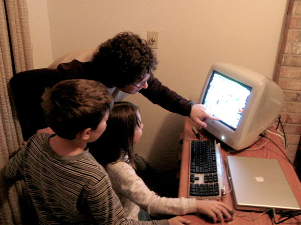
But the truth is that kids in the 3-12 age group are using the Internet in surprising numbers. Ten years ago, it was rare for a child who hadn't even yet reached school-age to use a computer. Now, there are a surprising number of websites specifically catering to them. And that number is growing all the time.
The Nielsen Norman Group, long known for their usability studies, has recently completed a study on the Internet habits and related usability issues often encountered by kids in the 3-12 age group.
The report is based on actual user studies, rather than just surveys asking kids what their internet habits and experiences are, and provide invaluable insight into the real usability issues confronting kids, and what users can do about it.
Below is just a brief sampling of some of the topics covered in the report and the study. The report can be purchased and downloaded from the NN/G website.
Myth: Kids Have Cutting-Edge Technology
A lot of us tend to believe that kids have access to cutting-edge technology. They have the newest computers, cell phones, and other gadgets at their disposal. While this may be more common among teenagers, younger kids often have outdated computers.
If you think about it for a minute, it makes sense. Kids in elementary school often aren't as dependent on computers for schoolwork, and therefore parents often give them hand-me-downs (either their own or from an older sibling) or less expensive machines. This not only means that kids often have computers with slower processors, but may also be more limited in internet connection speeds.
Even the computers kids use at school are often older and outdated. School computers are often donated and budgets for new technology are often very limited. School computer labs may hang on to the same computers for five years or more due to budgetary restrictions. And often these computers aren't particularly cutting-edge when they're purchased.
Myth: Kids Understand the Technology They Use
A lot of adults look at kids using computers and assume they understand how they work. After all, a lot of these kids have grown up using computers and it seems like second-nature for many of them.
The truth is that just because kids know how to use something doesn't mean they have any clue how it actually does what it does:
Like most adults who don't understand how a refrigerator works, kids do not feel they need to understand the underlying mechanisms of the Web before using it.
Because of this, it's important that designers don't overestimate the knowledge of their visitors. It becomes more important as a user's age decreases, as they have less experience in how technology generally works.
Myth: Kids are More Web Savvy Than Adults
Because kids often spend so much time using technology, people often assume they're much more savvy online than adults. But the truth is, they have just as many problems with usability as adults do.
Don't think that you can skip certain principles of good usability with the idea that kids will just figure it out. Kids don't have any special powers that allow them to circumvent usability problems. And in fact, when talking about the youngest web users, they're often much less savvy with the Internet than their parents. They have no experience online to draw from, and therefore are constantly learning new things.
The youngest users do not know where to click and what to do on a website. There are no rules because the users are not aware of them. Many of the inexperienced users do not know how to read. How do you tell children what they are supposed to do when they cannot read instructions?
That last part presents a particular challenge to designers. Visual cues are particularly important for sites with younger user groups. Even on sites where the target audience can likely read, remember that reading comprehension is still a huge variable among young children and keep your instructions simple and straight-forward.
Kids Have Little Patience Online
We all have a tendency to stop using sites that frustrate us because of poor usability or other issues. Kids and teens do so even faster than adults. If they have issues using a site, they'll leave almost immediately, where adults might click around and try to figure it out.
Kids also get fed up with loading times for things like videos. This can be compounded by the fact that these kids often have older and less powerful computers than their older siblings or parents. Designers should be very wary of longer load times, or at least make it clear how long kids can expect to wait (ex, using a progress bar rather than just a "loading" text or animation).
We saw several kinds of reactions while users were waiting for Flash files to download, but they all showed their dissatisfaction with the website when they had to wait. The longer the users had to wait, the worse their reactions got. Many just clicked the Back button.
Kids Are Online to Be Entertained
Adults often go online for information. They check out news sites, visit portals, and use search engines. Kids, on the other hand, mostly go online for entertainment (and homework). They play games, check out sites about their favorite characters or celebrities, and otherwise have fun online.
If the site you're designing isn't strictly an entertainment site, adding entertaining elements like games or other interactive content can greatly improve the site's engagement among younger visitors.
Because many kids look for entertainment on the Web, multimedia elements are very attractive when they serve content in a richer and more amusing way.
Take Into Account Poorer Motor Skills
Designers often forget about the physical differences between children and adults when designing a site. Kids are less dexterous than adults, and therefore have a harder time typing and manipulating a mouse. This means they tend to make more mistakes than adults.
Kids also had trouble using the mouse and they often clicked on the right button by mistake, and many didn't know how to drag. They...often missed the target and clicked a different item close by, by mistake.
Designers should take care to make links and clickable areas large and well-defined, with buffer space between them to help minimize the number of mistaken clicks kids make while using their sites.
Kids Are More Likely to Experiment Online
Adults often have very strict preconceived notions about how things should work online. They're used to sites they visit behaving in a certain way, and expect similar sites to act in similar ways.
Kids, because of their limited experience online, don't have all those same preconceived notions about the way things are supposed to be. Because of this, they're much more willing to experiment with different elements of a website. Kids will even sometimes engage in a "minesweeping" method of exploring a website, where they basically just click randomly hoping for a response.
Because of this, designers need to be careful to remove unnecessary and extraneous links from their pages (or move them to places where kids are less likely to click, like below the footer) so kids don't accidentally click on content that's unlikely to engage them (like an about page or information intended for parents rather than kids).
If a kid gets lost on your site, they'll often leave rather than knowing to use the back button to get back to where they wanted to be.
Kids Don't Differentiate Between Content and Advertising
Adults often have "banner blindness" and ignore promotional or advertising content on websites they visit.
Kids, partly because of their limited web experience, make little distinction between advertising and promotional parts of a website and the site's actual content.
This is both good and bad. It's great for advertisers, who can often lure kids away from sites they've intentionally visited much more easily than they can adults. For site owners, it can be detrimental, as kids often leave a site without even realizing they've left.
So What Does That All Mean?
If you're designing a website for young children, it's important to note the differences between the way kids use the Internet and the way teens and adults do. Kids are much less forgiving in a lot of ways than adults, and will more quickly abandon a site that doesn't meet their needs and expectations.
If you're a designer who takes on projects aimed at kids on a regular (or even occasional) basis, it's worth checking out the full-length study from Nielsen Norman Group.
Understanding how kids actually use the internet (rather than how they say they use it, which often varies widely from the truth) will greatly improve your ability to create websites that are engaging for this often-overlooked group of Internet users.
For more information, you can purchase and download the full report from the NN/G website.
Written exclusively for WDD by Cameron Chapman.
WDD Staff


Read Next

3 Essential Design Trends, May 2024

20 Best New Websites, April 2024

Exciting New Tools for Designers, April 2024

14 Top UX Tools for Designers in 2024

What Negative Effects Does a Bad Website Design Have On My Business?

10+ Best Resources & Tools for Web Designers (2024 update)

3 Essential Design Trends, April 2024

How to Plan Your First Successful Website

15 Best New Fonts, March 2024

LimeWire Developer APIs Herald a New Era of AI Integration

20 Best New Websites, March 2024
