 If you spend enough time online, it's surprising how much most websites start to look alike.
Sure, there are variations, but to a large extent, web design is pretty standardized.
Swap out the graphics or color scheme and you can make almost any website look similar to almost any other website.
But that doesn't mean that there aren't websites out there that are doing something really different and funky.
Below are over 30 websites that have added some funky elements to their designs. Whether it's the layout, color scheme, graphics, or some combination of the three, these sites are pushing beyond the standards of web design conventions.
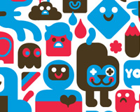
Consumer
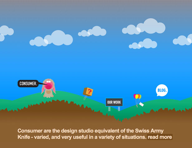
The Consumer site uses an animated header that transitions through a number of colors, including blue, green, and pink, and the site includes some screaming cartoon rabbits. It's definitely non-traditional.
Contrast
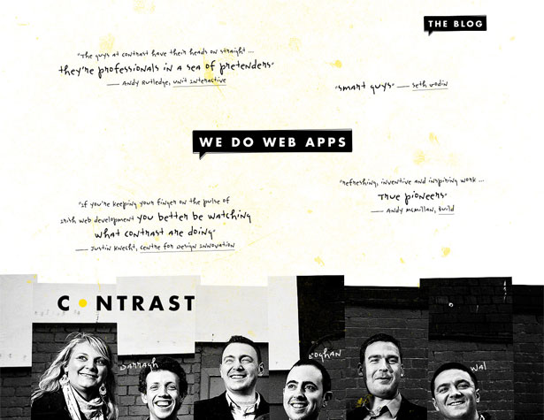
The mix of grunge and collage elements, combined with 'hand-written' testimonials in the header makes for a very interesting first glimpse at the Contrast website. The layout only continues its unconventionalism from there, with more testimonials further down the page, as well as links to some of their work.
Jim Carrey

Jim Carrey's website is one of the most interesting Flash-based sites that I've come across. Every part of the page is animated, including the "bird" with Carrey's head spitting out his most recent tweets. There are also links throughout the page, with animations between pages. But the artwork and overall design are what really pushes this design to the limits and makes it so much fun to browse.
Filcka
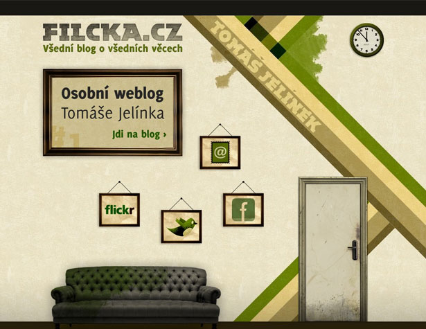
The more organic design of this page is unconventional but still very user-friendly. The pictures on the wall work great as links to view social media profiles or contact the site, while the grunge elements bring everything together.
F91W
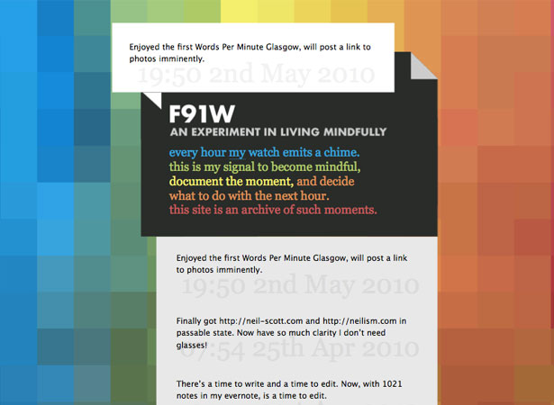
It's not just the design of this site that's a bit funky, but also the concept. Reporting activity every hour and consciously deciding what to do with the next hour is an interesting idea for a website and goes a bit beyond regular lifecasting. The color scheme and narrow layout push the design to the next level.
Living Lyric
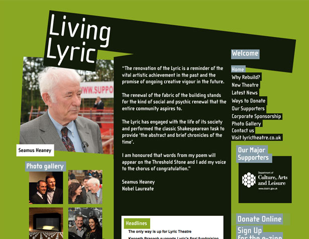
The skewed header and grass-green background color of the Living Lyric website lends a bit of funkiness to the overall design. It's a simple site, with bold graphics and a clear purpose.
Transformer Studio
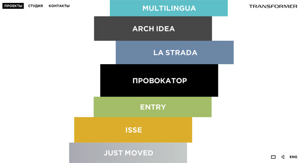
The subtle animations on the home page of the Transformer Studio site make it unconventional. And whenever one of the links on the home page is clicked, the background color expands to the whole page where the new content is displayed. It's another great example of a very user-friendly page that does something different than the norm.
Grip Limited
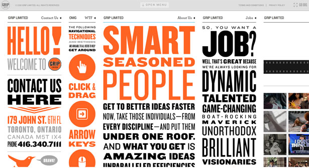
Grip Limited's website is visually striking, with oversized, diverse typography and bright orange accents. Its functionality is also different, with each column scrolling individually (via a number of methods, see column 2 for details).
Random Thought Pattern
Between the chartreuse and gray color scheme and the typography that doesn't quite sit on the page, the RandomThoughtPattern website fits the definition of funky perfectly. It's also a very usable site and the unconventional layout doesn't detract from that.
Sold-Out
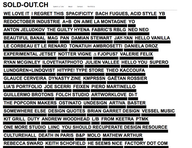
The sold-out site is a collection of links, each of which shows a tooltip when hovered over that gives a bit of information about the link. It's an unconventional design that's usable in this context, but could get confusing fast.
Wolf & Badger
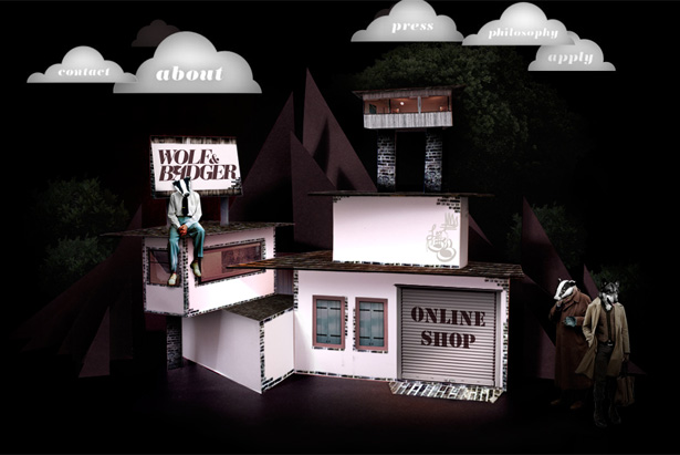
Here's another Flash site that has some incredibly interesting visuals. It's unconventional design at its best, fun to look at as well as to use.
Creative with a K
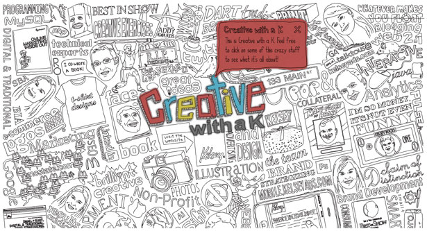
The animated, illustrated background here is funky and interesting, as well as tons of fun to use. Just close the initial modal window and parts of the illustration will become colorized when you hover. Click on any of those and another modal window is opened. It's a unique take on interface design and works incredibly well here.
Blue Bug Digital
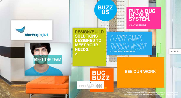
Here's another site that uses not only a funky color scheme, but also an unconventional layout and navigation (which you can rearrange depending on your own preferences). The background responds to your mouse movements, and each link displays new content in something like a full-page modal window. There's also a pull-out menu you can use so you don't have to go back to the home page before visiting a new page.
Ozan Akoglu
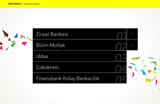
This is a fairly simple layout, but the background image (which looks like paper cutouts) and bright yellow header make it funky. The navigation is what really sets it apart though. Through a combination of mouse movements and keyboard entries, you can view projects and the information about those projects. Instructions are included for each step, but are integrated perfectly into the site's design.
Monster CSS
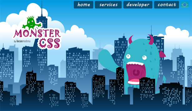
The animated monster in the background (he walks back and forth across the screen and occasionally makes some noise) sets the Monster CSS site apart from other sites. It's a simple design otherwise.
Ryan O'Rourke
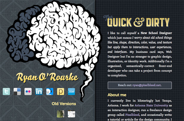
The animated brain sets this site apart. It also uses a stationary left column while the right column is scrollable.
The Digital Invaders
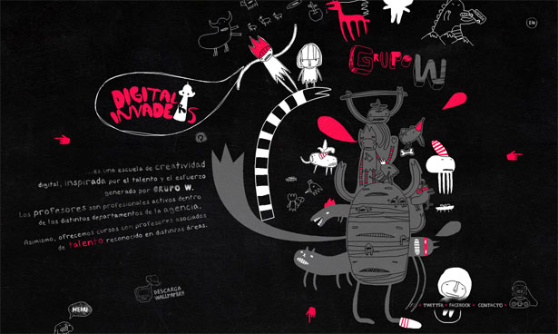
The illustration here has a constant animation. You can click anywhere and move the page around, or use the menu at the bottom. It's a fun user experience.
Natrashka
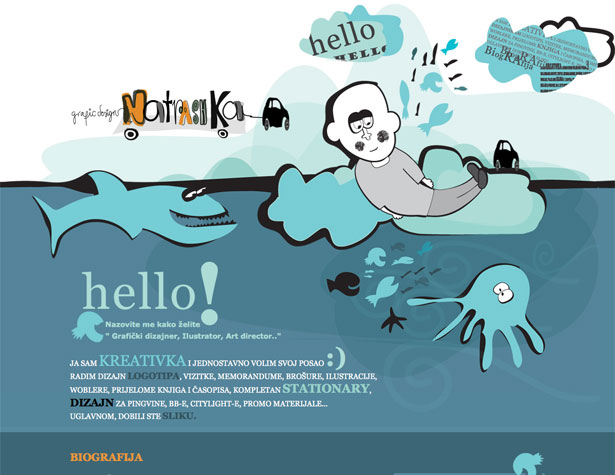
The graphics here are definitely what make this site great. The layout is simple, but the typography is a bit unconventional and the header image is definitely funky.
Toykyo
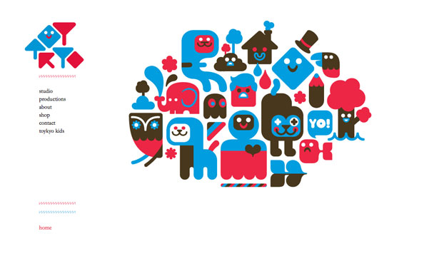
This is a relatively simple site design, but the bright blue, red, and brown color scheme set it apart and make it funkier than most sites, especially minimalist ones.
We Made That
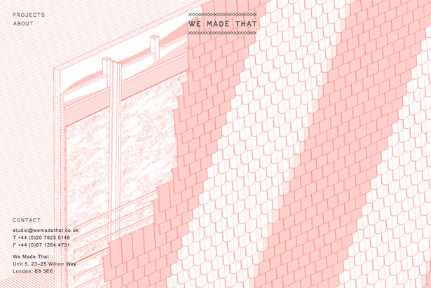
The mostly-monochromatic design here is interesting, as is the background graphic (which appears to be a cross-section of a wall or roof). It's a simple design that's very aesthetically pleasing and interesting.
Paul Frank Art Attack Contest
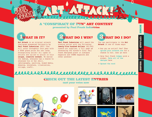
The bright red and aqua color scheme are definitely what put this site squarely into the funky category. The layout is relatively traditional, with a basic grid and tabbed navigation on the side. Using old-school Courier New for some of the typography also helps the site stand out.
The FARM
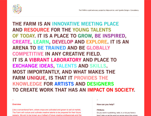
The layout here is pretty traditional, but using multiple colors in the typography at the top makes it great.
Wilkintie
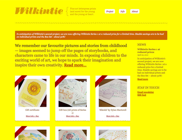
The design here is pretty traditional, too, but the bright yellow and brown color scheme is not something you see often online. It really sets the site apart, and when combined with lots of other little details (the torn paper effect on the bottom of the images, etc.) it really makes this site something special.
Emigre
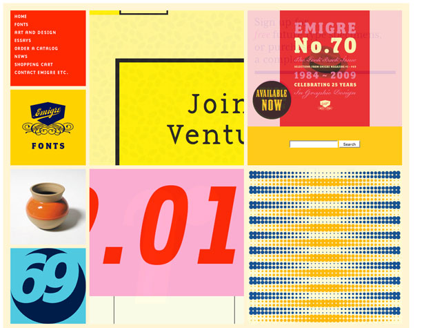
Color schemes based on primary colors aren't seen very often, mostly because of the high probability they'll clash. But here they're used beautifully and really set the site apart. The grid layout also works well, and is a bit different than most of the grids we see.
MultiAdaptor
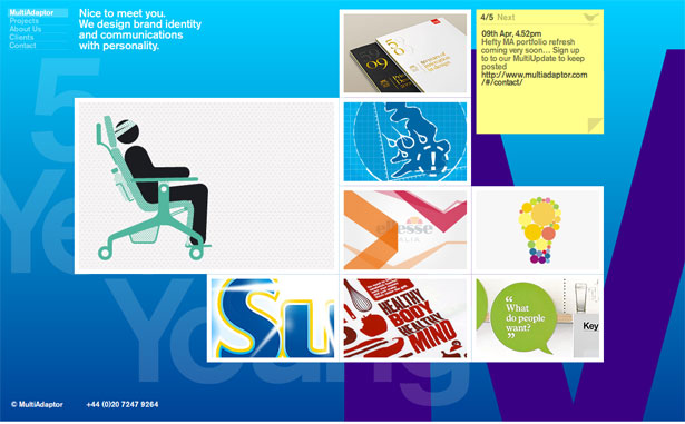
The big background here, which changes color slowly, along with the grid-based layout with different image sizes is visually interesting and user-friendly. When the images are clicked on, new content slides across the screen, blocking everything out except the main navigation.
Rudd Studio
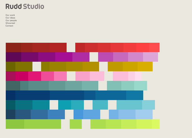
Click on any of the colored squares here and all of them will convert to an animated portfolio view, with clickable projects. If a project is clicked on, it will replace the colored blocks and display information about that specific project, with multiple images for each one (the number of colored blocks in each section corresponds to the number of images for that project).
Herron School of Art and Design
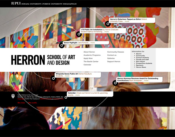
The concentric circles in the interface here offer up additional content links beyond what the main navigation provides. It's a neat way to highlight specific content while doing something a bit different.
Kokoro & Moi
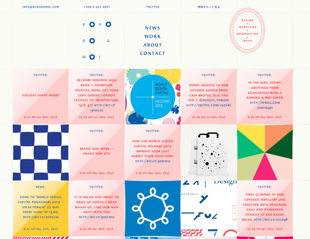
The grid layout works well to organize a lot of content into a relatively small area. The dual-color blocks that contain text stand out, and the color corresponds to the content (news is orange, Twitter updates are pink, etc.). It's a fantastic interface design that works well for displaying a lot of information.
Rachel Comey Men's
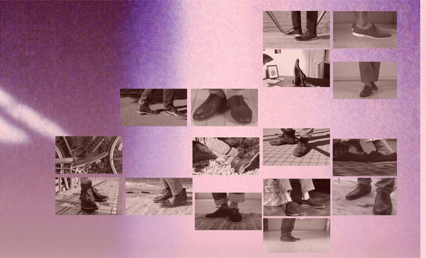
The feet here animate when hovered over, and each one is also a product link. When clicked on, the page scrolls horizontally and vertically to display the product information, as well as links to share, find shipping information, view related products, and contact the company.
Story Hotel
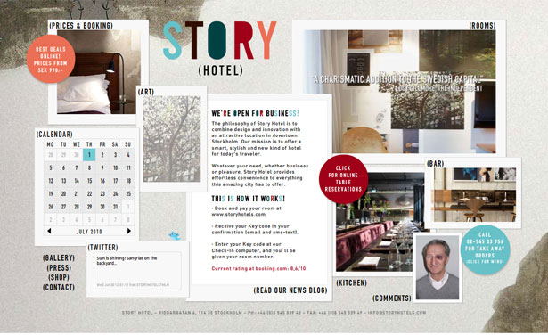
The organized collage layout here isn't often seen, especially on a corporate website. Animations are used throughout the home page. The color scheme keeps everything tied together and professional-looking while still allowing for plenty of artistic freedom.
Woki Tokee
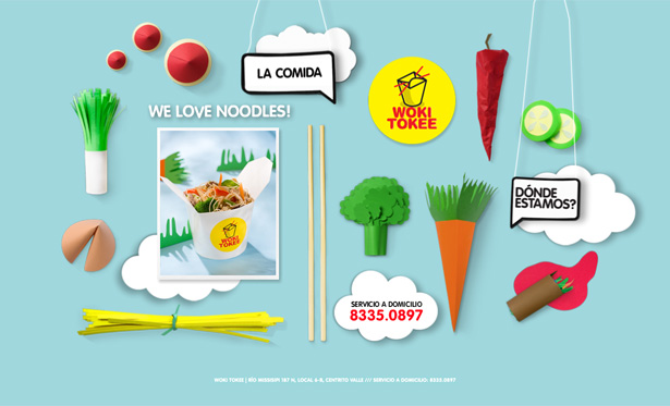
The illustrated food here makes for a very interesting user interface. Links are easy to find and there are subtle animations on each page. It's a fun site, that goes above and beyond considering there are only four pages total (including the home page).
Written exclusively for WDD by Cameron Chapman.
Have you come across any other funky website designs or tutorials for creating funky designs? Please share them in the comments!
WDD Staff


Read Next

3 Essential Design Trends, May 2024

How to Write World-Beating Web Content

20 Best New Websites, April 2024

Exciting New Tools for Designers, April 2024

How Web Designers Can Stay Relevant in the Age of AI

14 Top UX Tools for Designers in 2024

What Negative Effects Does a Bad Website Design Have On My Business?

10+ Best Resources & Tools for Web Designers (2024 update)

3 Essential Design Trends, April 2024

How to Plan Your First Successful Website

15 Best New Fonts, March 2024
