 The way you handle color in your web designs is about to change. Perhaps you’ve been playing around with hexadecimal color values since you were a wee web-babe; if you were, get ready to to grow up fast. CSS3 has arrived, and your palette is about to get a whole lot bigger.
Compared to what’s coming, it’s sas though designers have been color-blind, working with only a small part of the chromatic spectrum. No, new hues will not be added to the rainbow.
What will happen is that color values will be defined in new ways, the entire spectrum of opacity levels will be added and gradients based on pure CSS rather than images will be thrown in, too.
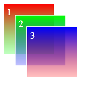
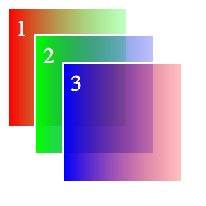
Some forward-thinking websites, such as the impressive 24 Ways to Impress Your Friends, are already playing around with RGBa for text and background color effects—and the results are great.
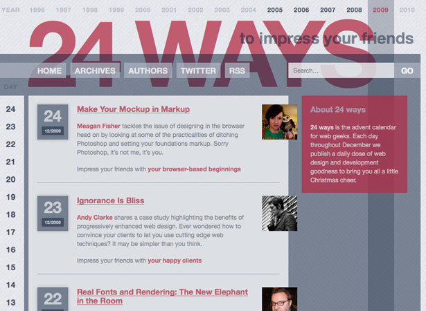
24ways.org uses opacity and RGBa to create a cool layered design.
The Truth About HEX
Despite what some of the developers I’ve been sparring with recently might think, RGB has been around on the web for a while. RGB color values are supported in every browser you can think of, so they’re nothing new. It’s just that most developers (and designers) got used to defining colors in HEX and have had no reason to change. Now they do.
HEX and RGB systems can define the millions of colors available on your screen equally well:
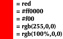
All of these color value settings produce the same result.
Still, I prefer trying out colors in RGB. I’m a human being with 10 fingers, so imagining colors that use base-10 values is easier than imagining ones that use base-sixteen values. I’m funny that way: I can figure out a color with values from 0–255 or 0–100% much faster than one with values from 00–99 or aa–ff.
HEX has a slight advantage over RGB: it’s compact—even more so if you’re use the shorthand (three values instead of six). This is significant only if you’re strict about code optimization, though. The only thing HEX shorthand is good for is web-safe colors. But if you limit yourself to web-safe colors, it’s time to move on anyway.
New and Improved RGB: Now With Alpha!
Here’s a reason to start using RGB values: they can include an alpha value to create opacity. Adding an alpha value to an RGB color is simplicity itself:
background-color: rgba(100%, 0, 0, 0.5)
or:
background-color: rgba(255, 0, 0, 0.5)
Both of these values produce red at 50% opacity. When you use RGBa, be sure to specify rgba() as the value (note the a), and then add the alpha value as a fourth comma-separated value, ranging from 0 (transparent) to 1.0 (opaque). A value of 0 is equivalent to the transparent color value.
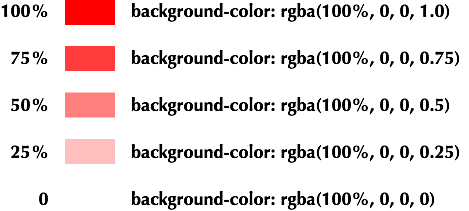
Color values, from opaque to transparent.
Why can’t HEX support a similar syntax? Well, it can, actually, as we’ll see a bit later, but the W3C has no apparent plans to add it to its color specifications. That might change, but for now RGB is the future of color on the web.
As long as the user’s browser supports CSS3, you can use an RGBa value to get transparency wherever there’s a color value: in text, backgrounds, borders, outlines, text shadows, box shadows—anywhere.
The only question left is, what about browsers that don’t support RGBa? I do hear that one browser that a few people are still using (say, 70 to 75% of the browsing public) still doesn’t support any CSS3, including RGBa. Why, that would be Internet Explorer!
What to Do With IE?
If a browser encounters a value it doesn’t understand, it’s supposed to ignore it and render whatever other value is set for that property. The following CSS should cover IE and everyone else:
color: rgb(255, 0 , 0);

 color: rgba(255, 0, 0, .5);
Adjusting colors in IE so that they look more like transparent colors is possible. For example, if you know that a block of text will appear on a white background, you could use the value rgb(255, 127, 127) to make it look about 50% transparent. When the background changes, though, the difference will become clear:

The pink value simulates what a 50% transparent red looks like. But as soon as you put the text on a dark background, the illusion is revealed.
Okay, this isn’t a perfect solution because it’s not really transparent. I can’t fix that. But I can share a tip on how to put transparent colors in the background of any element in any modern web browser.
Behind the Scenes, Part 1: Transparent Colors in your Backgrounds
A little quirk of Internet Explorer is that it includes several “filters.” IE filters are not part of the standard CSS language and won’t ever be, but we can exploit them in interesting ways to get results similar to those of some CSS3 features.
With one of these IE-specific filters, we can add a gradient to the background of an element and include transparent colors using hexadecimal notation. The first value in the hex string is for the opacity of the color, and it ranges from 00 (opaque) to ff (transparent). This provides an interesting little loophole, because by setting the start and end values of the gradient to be the same color, we can effectively add a transparent background color:
/* For CSS3 */ background-color: rgba(255,0,0,.5);/* For lt IE8 */ filter: progid:DXImageTransform.Microsoft.gradient(gradientype=0,startColorstr='#88ff0000', endColorstr='#88ff0000');/* For gte IE8 */ -ms-filter: progid:DXImageTransform.Microsoft.gradient(gradientype=0,startColorstr='#88ff0000', endColorstr='#88ff0000');
We have to use the filter twice: once for older versions of IE (lt stands for “less than”) and again for IE8 and later (gte stands for “greater than or equal to”), which use the new -ms prefix to identify themselves as Microsoft extensions. This adds a 50% transparent background to both standards-compliant browsers and Internet Explorer going back to version 5.5.
These should look the same in most browsers. See this live example.
Behind the Scenes, Part 2: Gradients in Your Backgrounds
Wait a minute! Didn’t I just say that you could add gradients to backgrounds in Internet Explorer using the gradient filter? Indeed, I did. And can’t you add gradients to backgrounds using CSS3? Well, sort of. What we’re looking at, then, is a cross-browser solution that will let us add gradients in the background using nothing but CSS: no graphics, no transparent PNGs, no fumbling in Photoshop every time your client wants to make a shade of purple slightly more blue. You can do this with Firefox 3.6, Safari 4 and Chrome 5.
Lest you think that using gradients would be easy, there is one slight complication that, believe it or not, does not come from Internet Explorer. The W3C has only recently begun work on a gradient syntax for CSS, and it’s nowhere near complete, but both Mozilla (Firefox) and Webkit (Safari) have already added their own (conflicting) browser-specific versions. These browser “extensions” are intended to push the industry forward by adding desirable and necessary features ahead of the sanctioned versions from the W3C.
All is not lost. Each version has its own browser extension prefix, so if we add all the gradient syntaxes to our code, then all the browsers will play nice:
/* For WebKit */ background: -webkit-gradient(linear, left top, left bottom, from(rgba(255,0,0,1)), to(rgba(0,0,255,.25)));/* For Mozilla */ background: -moz-linear-gradient(top, rgba(255,0,0,1), rgba(0,0,255,.25));/* For lt IE8 */ filter: progid:DXImageTransform.Microsoft.gradient(gradientyype=0,
startColorstr='#88ff0000', endColorstr='#3300ff00');/* For gt IE8 */ -moz-filter: progid:DXImageTransform.Microsoft.gradient(gradientyype=0,
startColorstr='#88ff0000', endColorstr='#3300ff00');
This is a vertical linear gradient that works in IE 5.5+, Firefox 3.6+, Chrome 5+ and Safari 4. See this live example.
This create a linear vertical gradient in most modern browsers. The big exception is Opera; it hasn’t introduced a gradient syntax, most likely because its creators are waiting to see what the W3C does.
To allow you to change the direction of the gradient, Webkit defines start and stop corners, Mozilla defines the side or corner where the gradient starts, and IE simply defines 0 (vertical) or 1 (horizontal). So, to turn our gradient by 90°, we code like so:
/* For WebKit */ background: -webkit-gradient(linear, left top, right top, from(rgba(255,0,0,1)), to(rgba(0,255,0,.25)));/* For Mozilla */ background: -moz-linear-gradient(left, rgba(255,0,0,1), rgba(0,255,0,.25));/* For lt IE8 */ filter: progid:DXImageTransform.Microsoft.gradient(gradientyype=0,
startColorstr='#88ff0000', endColorstr='#3300ff00');/* For gt IE8 */ -ms-filter: progid:DXImageTransform.Microsoft.gradient(gradientyype=0,
startColorstr='#88ff0000', endColorstr='#3300ff00');
Here is a horizontal linear gradient that works in IE, Firefox, Chrome and Safari. See this live example.
Both Webkit and Mozilla allow plenty of variation in their gradients, including radial gradients and multiple colors. The syntaxes can get quite complex, but we’ll keep it simple for now because IE supports only linear vertical and horizontal gradients.
Add Some Color to Your Life
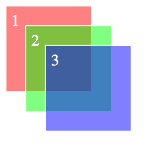
Opening before us is nothing less than a revolution in the way we treat color in web design. The kludges we use now to get transparent color will disappear. We’ll begin to see a lot more designs that layer elements by relying on RGBa and the already established opacity property.
Further Reading
Jason Cranford Teague is an author, teacher and designer. His next book, CSS3 Visual Quickstart Guide, will be out this fall. Find out more about Jason on his website, JasonSpeaking, or follow him on Twitter (@jasonspeaking).
WDD Staff


Read Next

3 Essential Design Trends, May 2024

How to Write World-Beating Web Content

20 Best New Websites, April 2024

Exciting New Tools for Designers, April 2024

14 Top UX Tools for Designers in 2024

What Negative Effects Does a Bad Website Design Have On My Business?

10+ Best Resources & Tools for Web Designers (2024 update)

3 Essential Design Trends, April 2024

How to Plan Your First Successful Website

15 Best New Fonts, March 2024

LimeWire Developer APIs Herald a New Era of AI Integration
