 Headings introduce content.
We can apply many effects and tricks to graphic-based headings to entice readers to continue reading, to set the tone or to make one heading stand out among many.
But sometimes the most obvious techniques, such as modifying visual weight and layout, work a lot better.
Overlapping titles use a small amount of big text and a big amount of small text to communicate more than a plain heading could do on its own. Sounds contradictory? Only if you ignore the fine points.
Read on to learn how to create memorable headings with overlapping text.
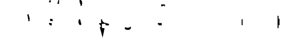
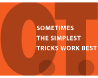
What do the odd shapes above have to do with the names “WDD” and “WebdesignerDepot.com”? They are unfortunate artifacts from having laid one text over the other with no regard to placement or detail. Here’s the offending image:

At a glance, the graphic above is a straightforward presentation of a blog name and its abbreviation. The typeface is the official one used by the blog; the bright orange comes straight from the website's theme; and both lines of text are centered almost perfectly.
It is even spelled and capitalized according to the blog’s style. But it’s an amateurish attempt to mimic the overlapping technique by slapping a long line of text onto a short one. (The weaknesses in this example are exaggerated, though not uncommon.)

The shading above reveals the new shapes created by the two pieces of text. How the two lines relate to each and the order in which they’re read depends on how they’re laid out. There’s more to overlapping text than setting one on top of the other.
Of course, overlapping isn’t always the best way to arrange a short title and long sub-title.
The examples below show some possible treatments when a design calls for something more creative than regular h1 and h2 elements.
Overlapping text has an elegance that can’t easily be duplicated with HTML (yet). Two lines of text together often amount to more than the sum of each individually.
Fundamentals of Overlapping Text
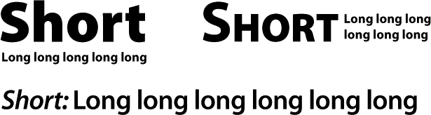
Overlapping text contrasts two lines of type against each other. The big text rests behind the small text, which often contains more words. The tricky parts are ensuring that both lines are equally legible, making both work together instead of against each other and keeping the whole package on topic.
Different techniques change the effect of overlapping text.
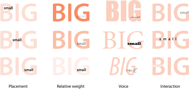
Here are the four main factors that affect overlapping text:
- Placement has to do with how the small text is positioned relative to the big text. This directly affects how the text is read. If the small text is towards the top-left, it will likely be read first (i.e. before the big text). If the small text is towards the bottom-right, it will likely be read second.
- Relative weight refers to the amount of attention one piece of text draws relative to the other. Given its size, the big text tends to dominate. However, if the big text is faded into the background, then the small text will jump out.
- Voice (mainly typeface and color) relates to the aesthetic choices that set the mood of the typography.
- Interaction is the trickiest. It has to do with how the letterforms of the texts work with each other. Interaction depends on placement, typeface and the characters themselves. The goal is to visually tie seemingly opposing lines of text together.
Placement Affects How Lines as a Whole Are Read
The order in which you want visitors to read the text is the most important factor in determining how to arrange the lines of type. English being a left-to-right language, small text on the left will read significantly different than small text on the right.
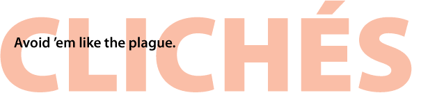
With the small text in the upper-left corner, the graphic above reads as such: “Avoid ’em like the plague. Clichés.” Still, “clichés” is written so big that people might read it first. The balance between size and placement puts the two lines on equal footing.
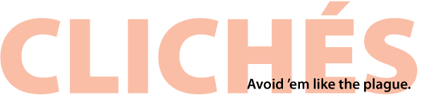
The version above is less ambiguous. Shunting the small text to the lower-right gives clear precedence to the big text. Now it reads as: “Clichés: Avoid ’em like the plague.”
The headings above are interchangeable because each line is more or less independent. When the lines depend on each other, placement is more critical. Here’s an example of a poor job:
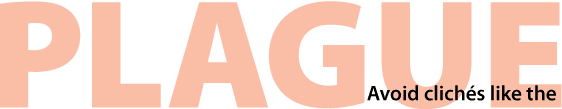
Putting the small text in the lower-right leaves readers hanging. “Plague: Avoid clichés like the…”? Although most people will figure it out, the moment of hesitation is the difference between a mediocre and a good presentation.

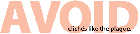
The arrangement just above is best because the small text is the first part of the sentence. If we want to put the small text on the right, then the big text will have to form the first part of the sentence. But again, there’s a hitch.
Depending on the sentence, using just the first word for the big text is not enough, because the lines of text have to work individually as well as together. The text above splits the phrase improperly. The commanding verb “avoid” doesn’t have enough meaning by itself to warrant independence. And “clichés like the plague” sounds like we’re comparing overused phrases to disease, instead of prescribing avoidance of both. The meaning of the whole graphic changes.

Even if we have to shrink the big text to fit, using two words (a complete phrase) for the big text makes both lines read better.
With overlapping text, getting the right phrasing through layout is as important as color and font choice.
Balance Dominance by Working With, Not Against, the Background
Although the purpose of big text is to dominate, it can easily smother small text, too. But that’s not always bad. Good balance is not about preventing big text from dominating small text, but rather about showing their relative importance.
The size of the big text naturally makes it the main statement. That’s great if the small text is merely supposed to support the big text. For example:

“WWW” jumps out first. “Welcome to the digital age” elaborates on the idea, supporting the three Ws. But what if the small text was supposed to carry the main message?

Above, the main text is “Welcome to the digital age.” And what does that mean? Faded behind, “WWW” provides a hint.
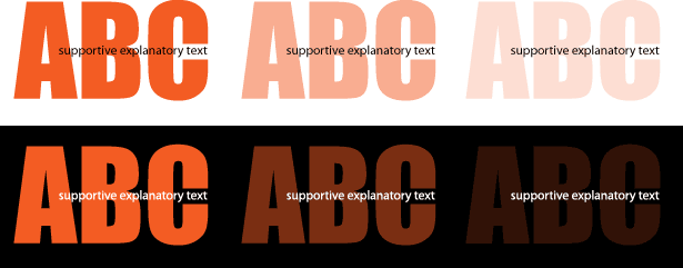
The more the big text blends into the background, the less importance it takes on. When the big text is barely visible, the small text becomes the main element.
Interaction Is in the Details
The shape of a typeface is the key to its distinct look. When two lines of text overlap, they create pockets, odd shapes and other subtle distractions.
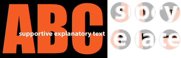
Above, the big orange and small white text add unnecessary clutter to the counters (i.e. the holes inside the letters). Alone, each extra bit doesn’t hinder readability much. But that’s part of the problem: because they’re not bad enough to make the text illegible, they could easily be dismissed as unimportant.
For maximum legibility, we have to preserve the small text’s letters.
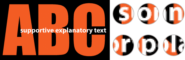
As shown above, slight adjustments have cleared up the interference:
- Repositioned between the clamp-like terminals of the big “C,” the word “text” is now much clearer.
- Notice how the vertical stems of “r” and “n” in “explanatory” meet the edges of the big “C.”
- The counters in the “p” and “o” in “supportive” now contain only black.
- We’ve cut the big letter “A” to make the lowercase “s” in “supportive” clearer.
The goal is to preserve the shapes of the small letters, even if readers don’t notice.
Typeface Makes a Difference
Not every typeface is suitable for both big and small sizes. At a small enough size, a typeface’s details can disappear. And details that are magnified at a big size can sometimes creates unusual problems.
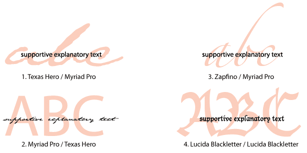
The four font combinations above fail for different reasons:
- This script typeface was designed to mimic handwriting. Its ragged edges contain hundreds of vector points, most of which are lost at a small size.
- But make the script too big and the letters look less like handwriting and more like scalloped Illustrator paths.
- Zapfino’s calligraphic edges fare better than Texas Hero’s, but the enormous ascender on the “b” throws the composition out of balance.
- Lucida Blackletter is too complicated to be practical as a background, at least without very careful arrangement of the small text. Also, its unique character disappears at a small size. Are those swoops and serifs, or is it just fuzzy?
For Big Text, Too Thick or Too Thin Is Just Right
When overlapping text, think of big type as both text and background. The more complicated the letters, the more texture-like they become. That is, they are more likely to obscure the letterforms in the small text.
To avoid problems, go fat or thin. Extra thick and extra light shapes work better than a regular weight of the same face. Both interfere less because the small text has less of a chance of hitting an edge.
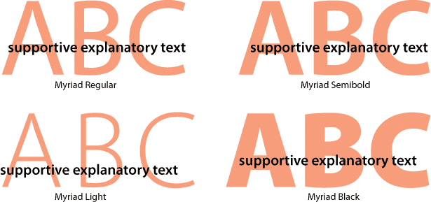
For example, the big text in the Light and Black variations above hit fewer small letters. Of course, every face—and each set of words—is different. But in general, medium weights cause more problems than thin and thick weights.
Practical Examples
How might this work with more probable text? Here are a few examples of overlapping text.

Why it works: Faded into the background, the big text gives clear priority to the small text. Museo’s geometric shapes have few distractions.
Potential problems: This overlap wouldn’t quite work if the small text was any shorter. To carry the message, the small text must overlap all six letters of the big text.
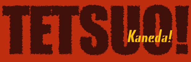
Why it works: The small text crosses over only three thick and two thin strokes of color. Plenty of contrast, even for a warm color palette.
Potential problems: The big text’s energetic edges seem to work against the small text’s elegant lines.

Why it works: Both lines of text have sharp geometric shapes and are precisely aligned.
Potential problems: Does the small text look a little lost? Do the typefaces really reflect the spirit of “steampunk?”

Why it works: Generous tracking in the big letters and clean lines in both texts make every character clear.
Potential problems: Does the background texture make the type too hard to read?

Why it works: The thick big text is legible on its own, while the intimate small text invites reading. Several extra fills maintain the color depth of the capital “S” letters.
Potential problems: SxSW is typically rendered in a bitmap font; these are off-brand. Also, use scripts in small text sparingly.
But Does It Help?
Let’s apply these lessons to our original composition.

Why it works:
- The big text blends into the dark background, but its size ensures that it is visible.
- The bright color makes the small text stand out. The right-alignment balances it.
- Careful spacing of the small letters and the simplicity of the big letters keep conflict to a minimum.
- The two typefaces share common elements. For example, the two “W”s align, despite being in different faces.
Written exclusively for Webdesigner Depot by Ben Gremillion. Ben is a web designer who solves communication problems with better design.
What are some of the potential problems of the last example? Please share your thoughts in the comments below.
WDD Staff


Read Next

20 Best New Websites, April 2024

Exciting New Tools for Designers, April 2024

14 Top UX Tools for Designers in 2024

What Negative Effects Does a Bad Website Design Have On My Business?

10+ Best Resources & Tools for Web Designers (2024 update)

3 Essential Design Trends, April 2024

How to Plan Your First Successful Website

15 Best New Fonts, March 2024

LimeWire Developer APIs Herald a New Era of AI Integration

20 Best New Websites, March 2024

Exciting New Tools for Designers, March 2024
