 Whether we're on iTunes or Spotify, browsing stores (both online and off) or watching advertisements on TV or in magazines, it's safe to say that admiring album cover art is a part of daily life for many of us.t
As long as music exists, the album design industry will thrive, regardless of how we listen to music.
In this post, we will look at over 70 examples of excellent album artwork.
The styles could be categorized as: painted, abstract/experimental, photographic, retro/vintage, minimalist and illustrated.
Scattered through this article, several mini-tutorials will teach you how to create certain effects.
Painted Covers
Believe it or not, a high percentage of album artwork is painted, using both analog and digital media. The examples below have been carefully selected to demonstrate just how many albums rely on this traditional technique.
Examples
Green Day: 21st Century Breakdown
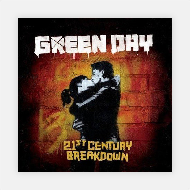
This digital piece looks like stencil graffiti. We don't know whether the stencil is a photograph or a digital illustration.
Iron Maiden: Best of the Beast
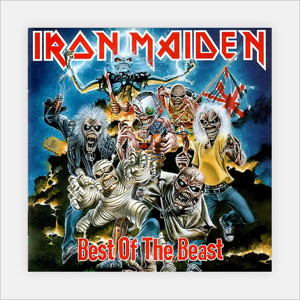
Iron Maiden is well known for its detailed album covers. The artwork in this example was created using several media, including paint.
Black Light Burns: Cruel Melody
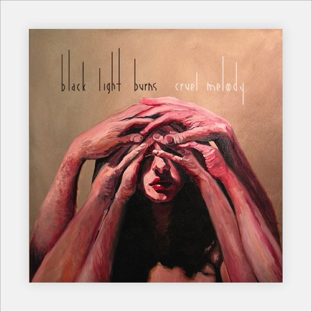
A truly fantastic piece of art that works great as an album cover. The depth of the highlights and shadows makes this painting stand out from the rest, even those that use the latest and "greatest" technology.
King Crimson: In the Court of the Crimson King
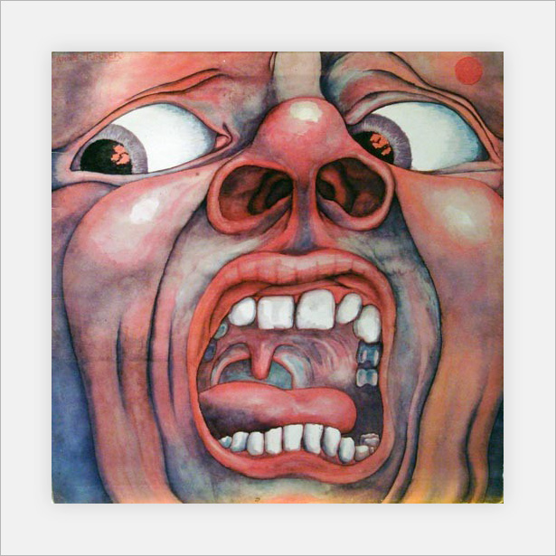
This cover is quite unsettling, and it proves that such emotion can be produced using traditional media.
Circa Survive: Juturna

This is fantastic artwork. The piece was painted at an angle that throws off all proportion, making us look twice (or more).
Ladyhawke
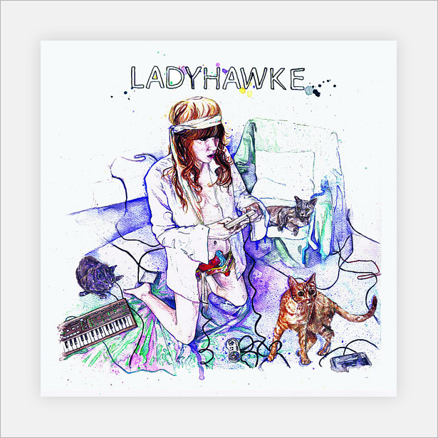
The cover for Ladyhawke's self-titled album was produced using watercolor paints. Watercolor has been a huge recent trend in designs for movie posters and websites. This cover proves that it works with album art, too!
Circa Survive: On Letting Go
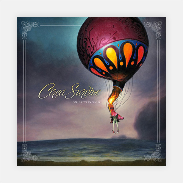
A high-quality painted piece that incorporates digital touch-ups on the frame and typography. A great representation of techniques from different eras!
Iron Maiden: Somewhere in Time
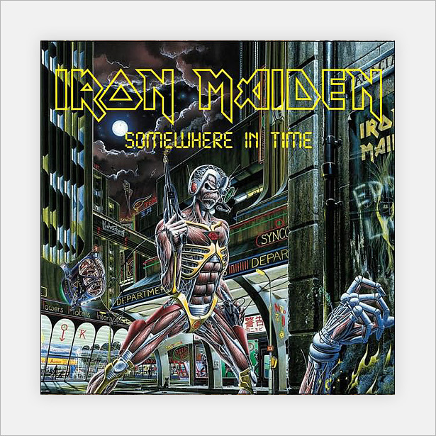
Here's another Iron Maiden cover that has an awesome futuristic look to it. The quality and detail are incredible!
Baroness: The Red Album
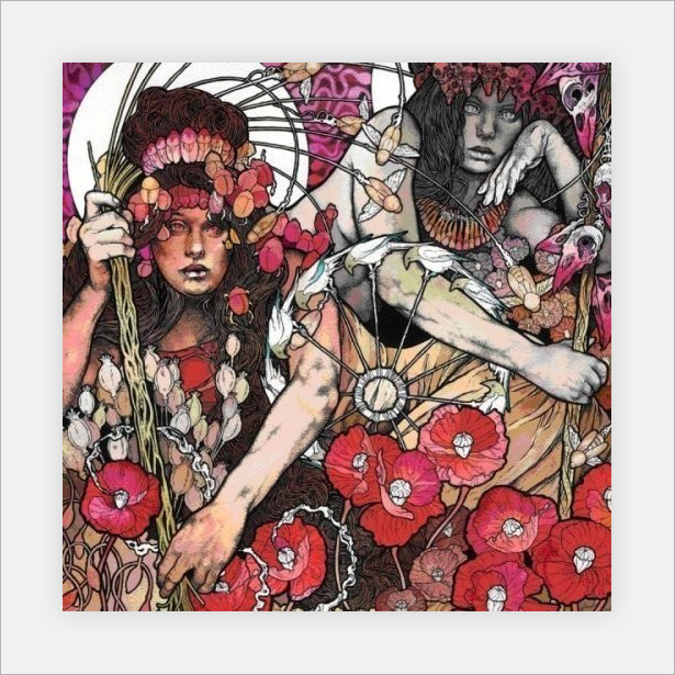
This is one of my personal favorites in this category. Several mediums are combined to produce a beautiful eye-catching cover.
Iron and Wine: The Shepherd's Dog
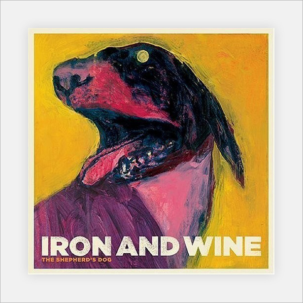
Iron and Wine its well known for its traditionally painted cover art. Not only is its album "The Shepherd's Dog" painted, but so are all of its singles.
2Pac: Until the End of Time
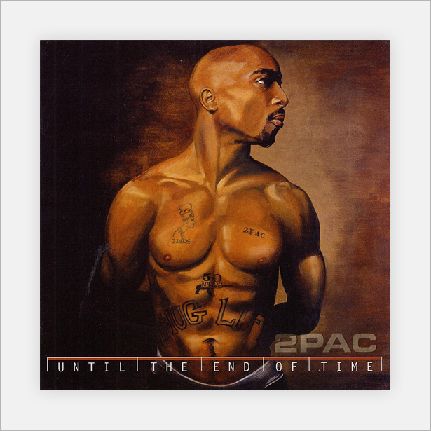
This 2Pac album cover is a skillfully painted portrait that works really well as an album cover. It's finished off with digital typography and pixel-thin lines.
Coldplay: Viva La Vida
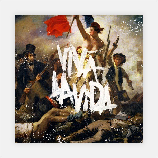
A wonderful and fairly well-known album cover. The title is smeared on with paint. This is one of the only album covers in this showcase that has no digital input whatsoever.
The Flaming Lips: Yoshimi Battles the Pink Robots
![]()
A great cover that uses simple painted techniques to really let the viewer's imagination run wild. And it connects really well with the album's title.
Abstract and Experimental Covers
Many of these covers are for alternative bands and non-lyrical music, including orchestras and instrumental bands. Below is a selection of abstract and experimental designs, some of which take us back to the 1950s!
Cuerpo Meridian: 69
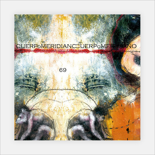
This abstract piece combines analog and digital elements to produce an interesting and slightly odd cover.
Jerry Goodman: Ariel
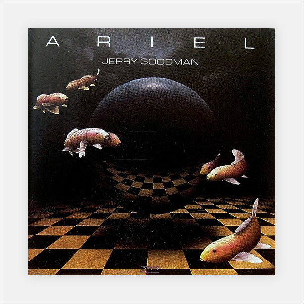
A really great piece of album art that has a superb retro feel, with a high level of noise and subtle texture.
Toad the Wet Sprocket: Coil
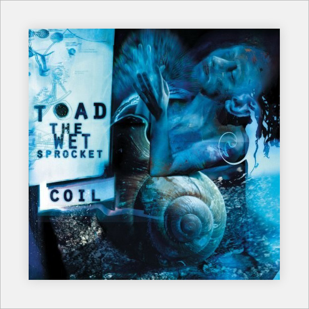
Another weird and slightly psychedelic cover. The many shades of blue gives it an eerie look.
Celia Calle: Dialogue
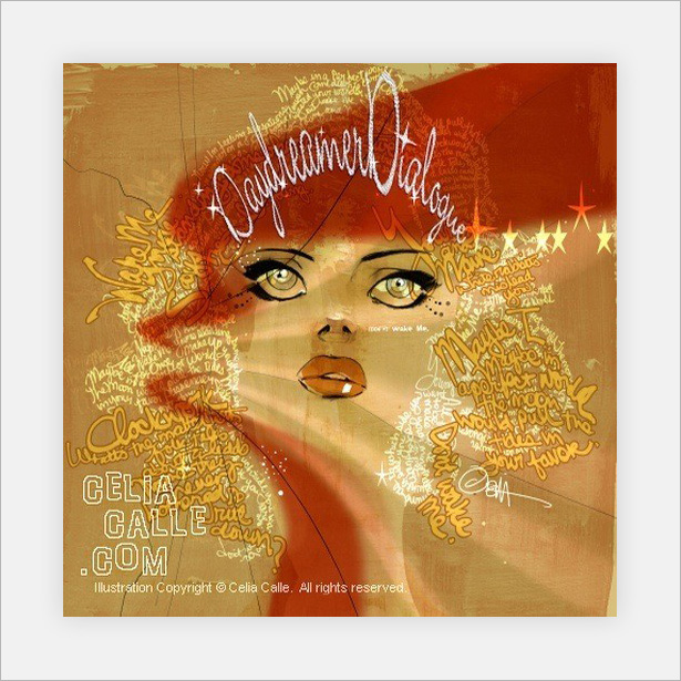
An interesting mix of color, typography and texture is used here to create a portrait image. Without just one of these elements, the design would fall apart.
Ferrante and Teicher: Dynamic Twin Pianos
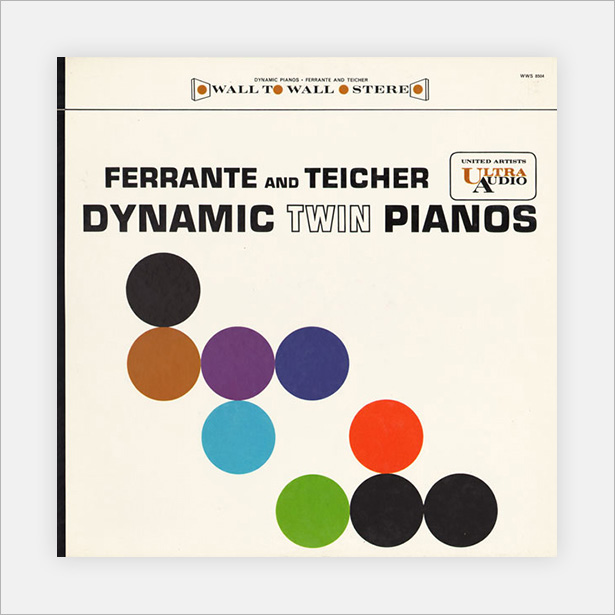
This cover (and the next three) could easily be considered abstract or minimal. I would say abstract because the shapes and lines here are commonly associated with that genre.
Terry Snyder and the All Stars: Persuasive Percussion Volume 2
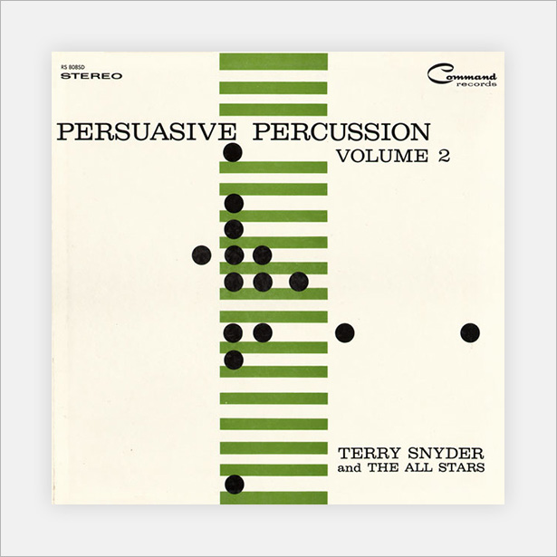
A really cool album cover. Just three colors and two shapes create a minimal but interesting abstract piece of art.
Lew Davies and His Orchestra: Two Pianos & Twenty Voices
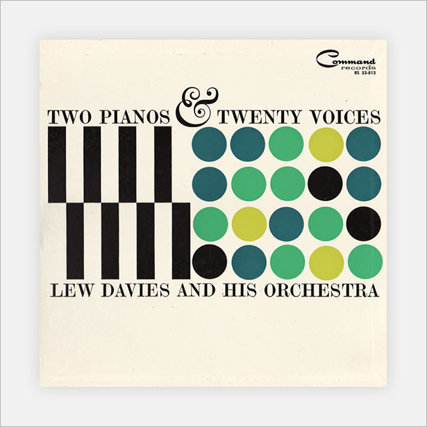
As well as looking great, this cover is clever: on the left side are black lines, representing the two pianos, and on the right are 20 circles, representing the 20 voices.
Sizzling Strings, Castanets, Percussion

Yet another minimal abstract piece, and my favorite of the last four. This combines lines of different weights and circles with a great minimal color scheme to really grab the attention of viewers.
David Diamond: Symphony No. 4
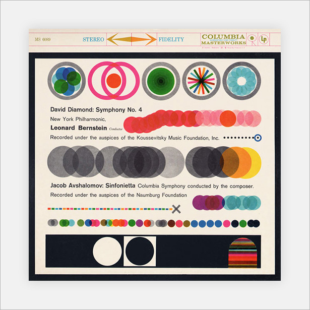
Another vintage cover, blending a lot of different shades, something that is easily achieved in Photoshop and that we will cover in the mini-tutorial just below!
Muse: The Resistance
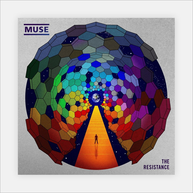
You have most likely seen this cover before, not only because it is for a top-selling album but because it got a lot of attention in the design industry. You can see why!
Mini-Tutorial: Blending Simple Shapes in Photoshop
Blending shapes and objects in Photoshop can be an incredibly useful technique for image manipulation, illustration and web design. Simply by changing the blending mode, you are able to create really interesting and attractive results in a matter of seconds. This mini-tutorial shows you how!
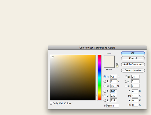
Open a new Photoshop document with a canvas size of 1000 x 1000 pixels. Fill your background layer with a light-beige/brown color; I used #F3EFE4.
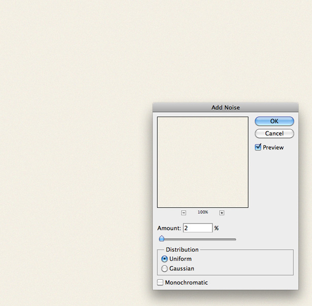
Go to Filter → Noise → Add Noise. Add 2% of Uniform noise and click "OK."
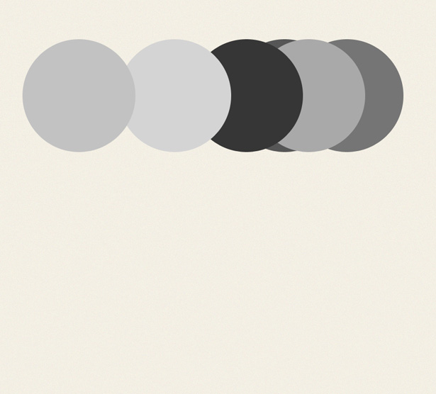
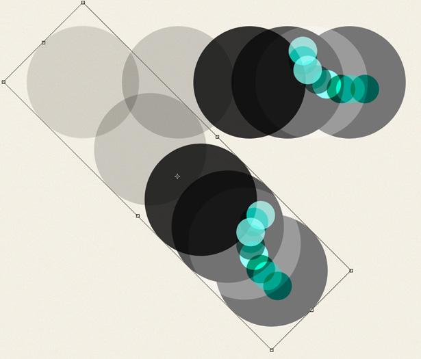
Select the Elliptical Shape tool. While holding the Shift key to keep the shape in proportion, draw a circle. Change the color of the mask to a medium or dark gray.

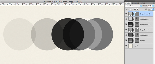
Duplicate the layer several times, and position the layers in different locations along the same horizontal line; I used the cursor keys to nudge the circles. Change the color of all of the circles to different grays. Make sure no two layers of the same shade are touching each other.
Select one of your circle's layers, and in the Layers panel click on the Blending mode drop-down menu. Scroll through the different blending modes to see what each one does. A little tip: use the Shift and + and - keys to scroll through the Blending modes—this will probably save weeks of your life if you use Photoshop daily. You can do this only with the Move tool selected.
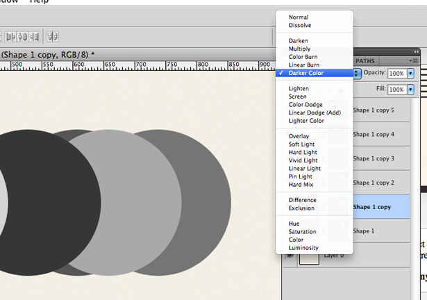
Select another one of the circle's layers, and change the Blending Mode:
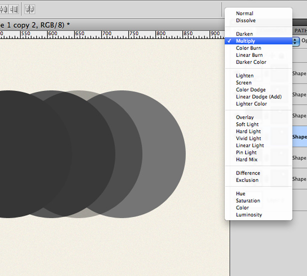
Do this to all of the circles. You can also change the Opacity of the layers.
Select the Elliptical Shape tool again, and draw out a new shape. Fill it with a green/blue shade. Duplicate it several times and position them over one another:
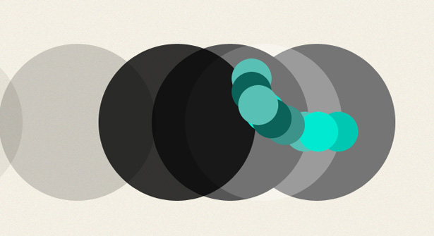
Change the Blending modes and Opacity of all of the circle's layers.
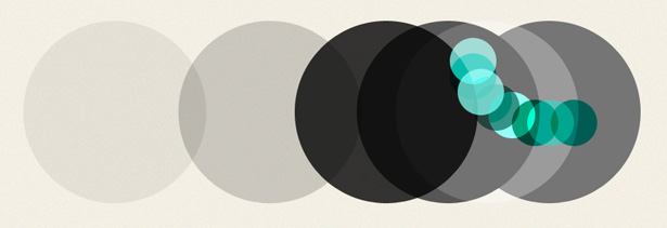
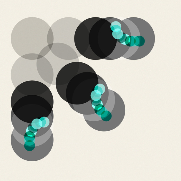
Make a selection of all of your layers (Select → All Layers), and go to Edit → Transform → Free Transform. While holding the Shift key, rotate your selection by 45° by clicking and dragging around the corner anchor point.
Repeat the previous step. By playing with simple shapes, you can create some really interesting artwork in minutes!
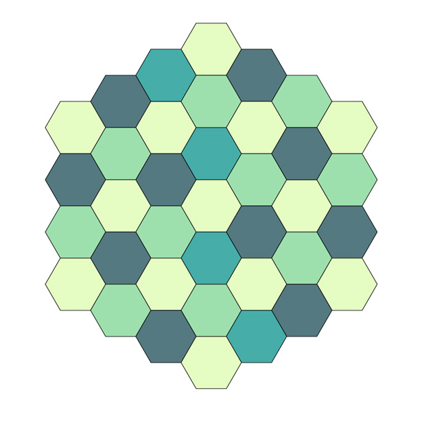
Mini-Tutorial: Creating a Quick Colorful Pattern in Illustrator
Many people are put off of creating their own patterns and end up using stock patterns from the web. Although nothing at all is wrong with this (so long as the pattern is released under a Creative Commons licence), creating your own patterns from time to time doesn't hurt either. This short mini-tutorial teaches you how to create a polygon pattern in a matter of minutes.
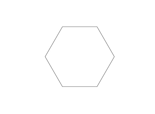
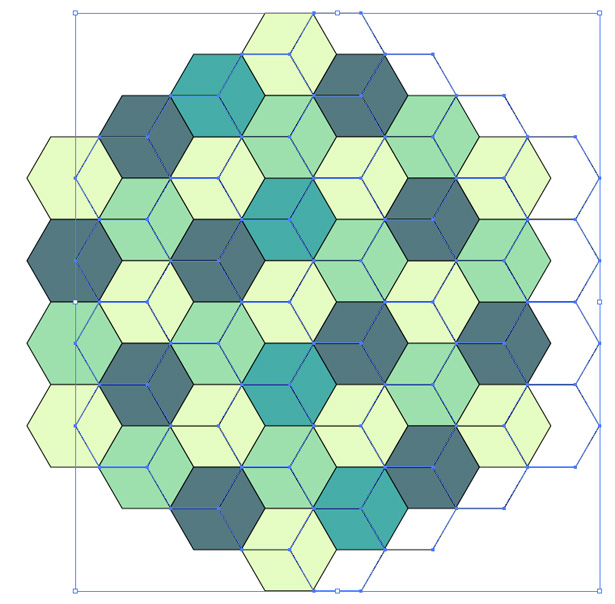
Open a new Illustrator document with a canvas size of 1000 x 1000 pixels. Select the Polygon tool from the Tools panel and, while holding the Shift key, draw your shape. My current color settings are #FFFFFF for Foreground and #000000 for Stroke.
Click on your shape and go to Edit → Copy. Now go to Edit → Paste in Place to duplicate your shape. Reposition it so that it snaps against the original shape.
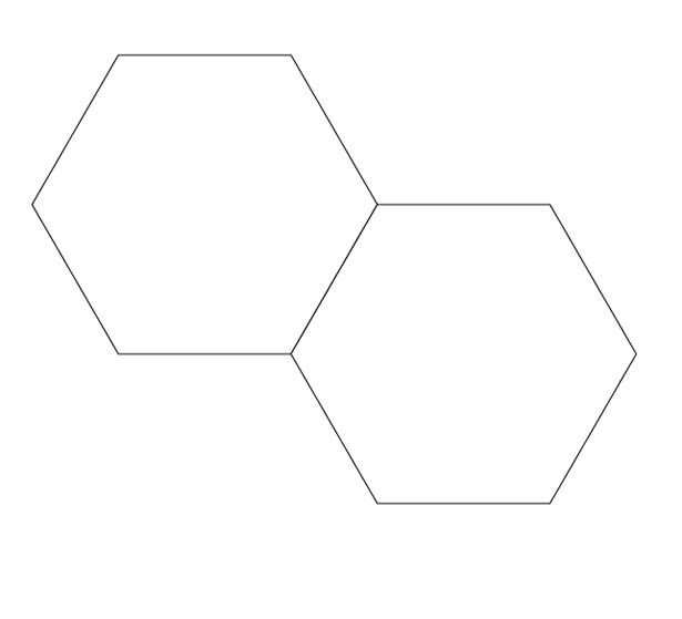
Select the two shapes and repeat the process.
Keep copying and pasting the shapes until you end up with something like this, making sure each shape lines up perfectly:
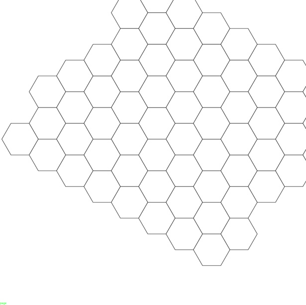
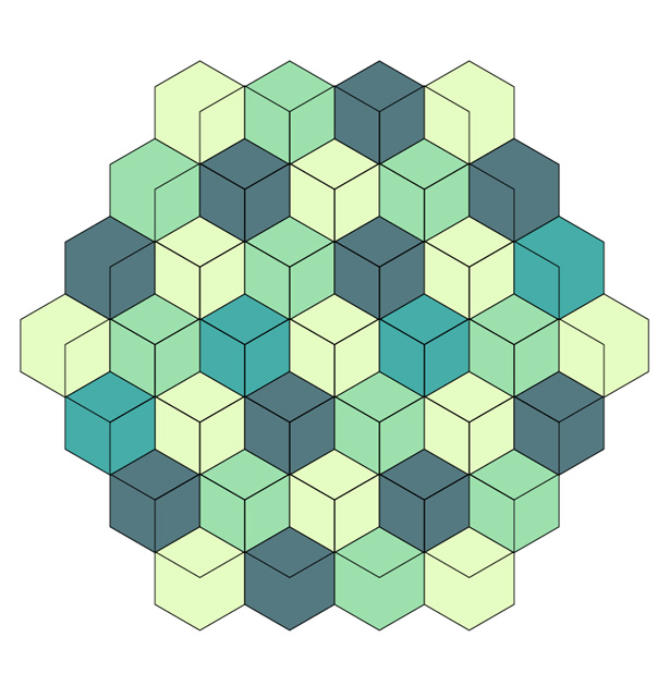
Eventually, you should end up with a whole canvas full of polygons.
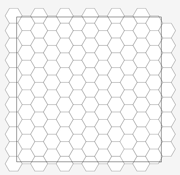
Now remove some of the shapes until you're left with a collection of polygons in the shape of yet another polygon.

Start filling the shapes with colors. You can get some great color schemes from COLOURLovers.
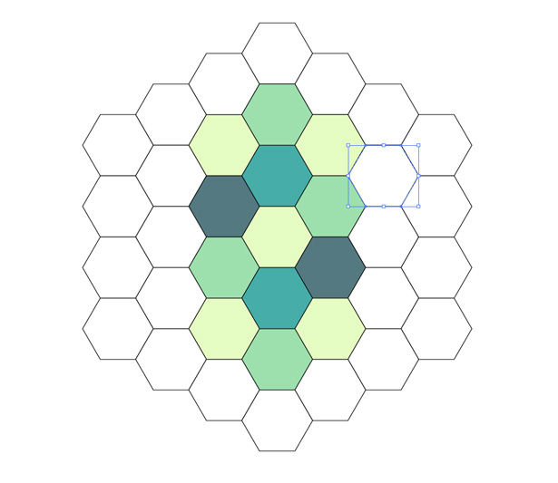
With all of the polygons filled, you should end up with something like the following. Keep the black stroke applied to your shapes.
Select all of the shapes and go to Edit → Copy and then Edit → Paste in Place. With the shapes still selected, remove the color from all of them, leaving the black stroke. Nudge your selection over to the left or right until it lines up like this:
Remove any excess overlapping lines. Select all of your shapes and, while holding the Shift key, rotate your pattern by 90° anti-clockwise. You should end up with a nice little pattern like the one below, which took only a few minutes to create:
Photography-Based Covers
Photographic album art is possibly the most common style today. Whether the photographs are of the band or artist or of a scene or object, they tend to work fairly well. Below is a showcase of great photography-based album art, followed by a hand-picked selection of guides, showcases and full-length tutorials on photo editing and manipulation.
Fabulous Diamonds: 7 Songs
This cover is, if not weird, rather disturbing. But it caught your attention, right? I personally think it's great, and it works incredibly well as an album cover.
The Van Buren Regulars: 14 Minutes 'Till 3
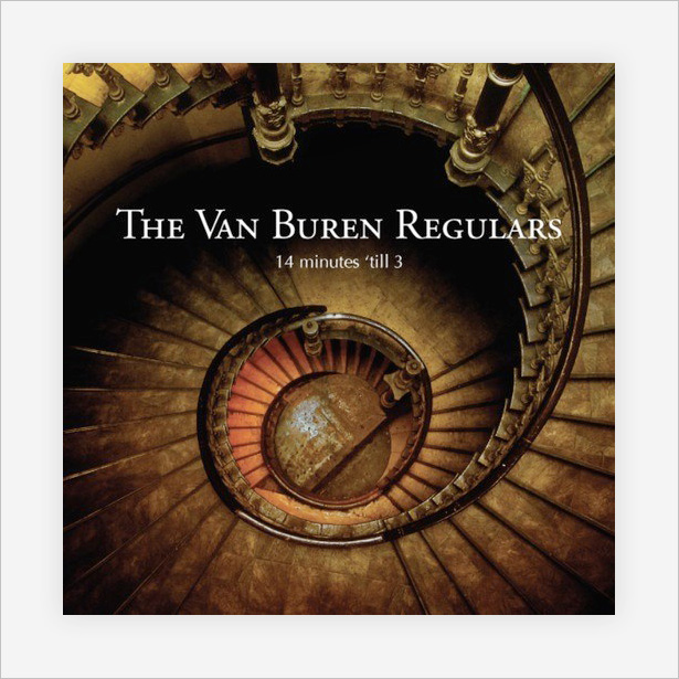
This cover uses height to get a perfect bird's-eye shot of an incredible vintage spiral staircase. It not only looks superb, but gives a sense of time that fits the album's title perfectly.
Bring Me the Horizon: Count Your Blessings
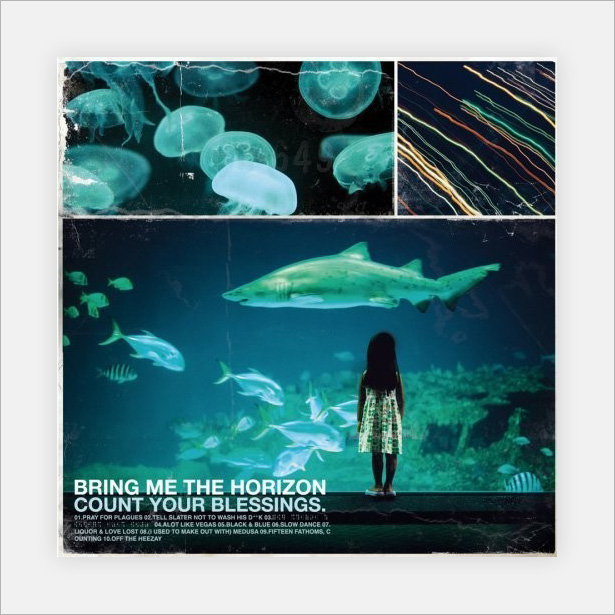
Bring Me the Horizon, for those who don't know, is a hardcore metal band, so the texture and noise in this photo-based art is a great choice. The photographs themselves are captivating, with lovely colors that are sure to grab attention.
Bjork: Medulla

All of Bjork's albums are photographic, and also very minimalist usually with minimal typography, if any at all. The photographs are always incredibly, as is this one, but never quite "perfect": notice how the model (Bjork herself) isn't actually centered here. This adds to the creativity of the cover and makes it even more interesting.
Massive Attack: Mezzanine
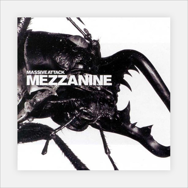
Mezzanine is another that sits on the border of photographic and minimal. I put it in this category because the photography makes up the bulk of the cover. Though simplistic, it's very interesting, especially with the texture of the beetle.
Nirvana: Nevermind
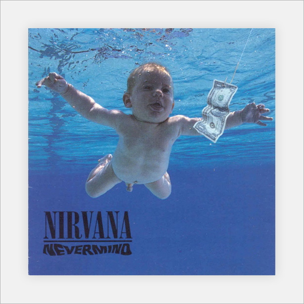
An hugely famous album cover by the great Nirvana. The cover is so popular that even today it can be purchased as posters and mouse mats (in both censored and uncensored versions).
Story of the Year: Page Avenue
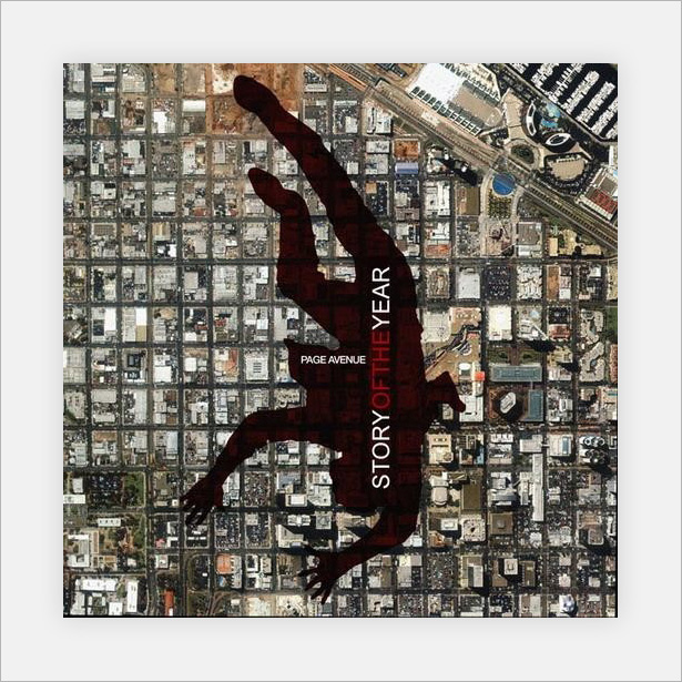
A really clever cover that uses a bird's-eye view of what looks like an industrial complex or suburb. The band's name and album title are presented in the silhouette of the falling man.
The Roots: Things Fall Apart
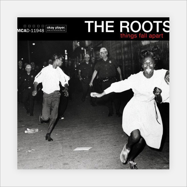
This cover is easily the most emotionally charged in this showcase, with a high-contrast action shot that captures a dramatic moment, fitting the album's title well.
Retro and Vintage Covers
This category showcases a selection of covers that have a vintage and retro style, making use of different typography techniques, texture/noise and illustrations to produce some great results.
Supertramp: Breakfast in America
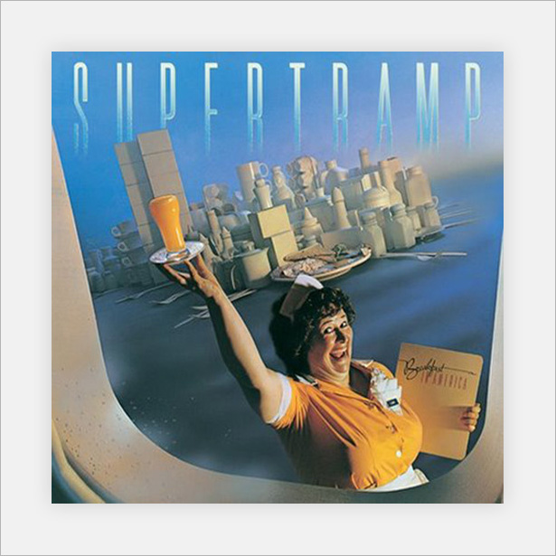
At first glance, this just looks like a waitress with a cityscape in the background. But it is more than that: the city is made up of kitchen and diner items, such as salt-and-pepper shakers and mugs. The retro feel and especially the color scheme work incredibly well with the album's title, which immediately called to mind retro American diners.
thi
Deftones
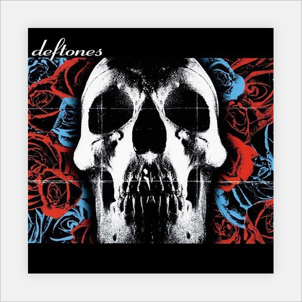
Deftones uses a fairly simple floral pattern and skull with high threshold levels to produce plenty of grungy spray-paint textures. A creased paper texture is also used to give the cover a grid, increasing the visual interest.
Pixies: Doolittle
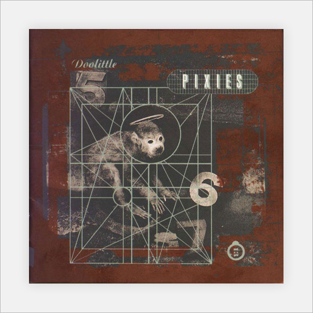
This vintage-style cover art uses rust textures (and plenty of them) with strong noisy lines and faded photographs to produce an awesome result. The art is a kind of digital collage, mixing stamp lettering with photographs, textures and digital lines.
The Postal Service: Give Up
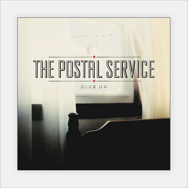
This is one of my favorites in the showcase and overlaps not two but three categories: retro/vintage, minimalism and photographic. I put it in this category mainly because of the appearance of the text, which is clearly the focal point.
Kisschasy: Hymns for the Nonbeliever

A really lovely and well-textured cover based on a vintage-looking book cover. The gold-leaf effect makes the typography and detailed patterns stand out.
Norma Jean: O' God the Aftermath
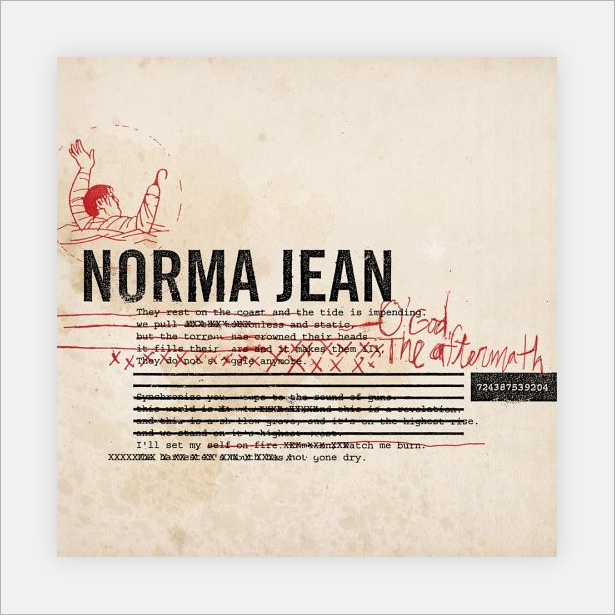
Norma Jean, another hardcore metal band, uses graffitied war-style letters (typewriter typography) to make a rather awesome design. The handwritten type and doodle finish off the textured piece nicely.
Take It Back: Rumors of Revolt
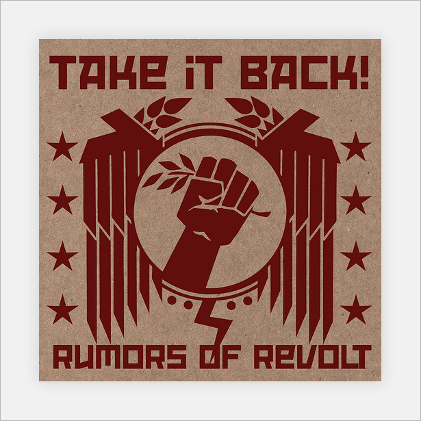
This simple yet great illustration against a textured cardboard background works really well. The minimal color makes the artwork unique and helps it stand out from the crowd.
Alpha Rev: The Greatest Thing I've Ever Learned
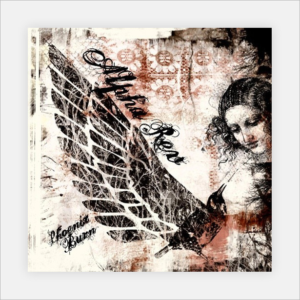
Album art that is equally messy and well composed. The huge amount of images, textures and illustrations make this piece very interesting.
Evanescence: The Open Door
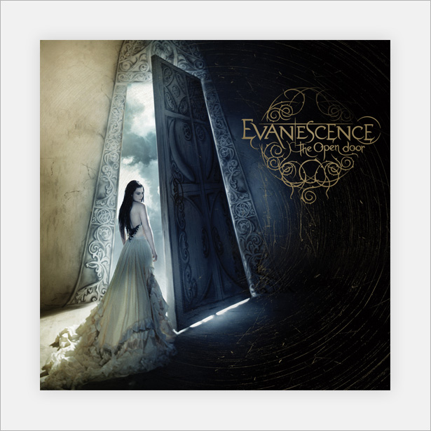
This Evanescence cover is also fairly well known. The weird dimension, great photography, touch-ups and fancy typography makes it nothing less than stunning.
Riverboat Gamblers: To the Confusion of Our Enemies
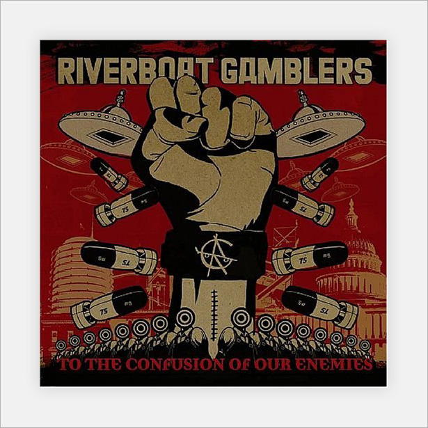
The limited color scheme of this textured cover has shades that were common in the early and mid 20th century. The illustration itself is also great.
Death Cab for Cutie: Transatlanticism
![]()
This one borders on minimalism and retro/vintage. It's in this category because of the worn paper texture and washed-out photograph. A simple yet powerful cover.
The Mothers of Invention: Weasels Ripped My Flesh
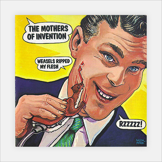
A vintage-style cover, using styles and techniques that date back to the early 20th century (1910s, '20s and '30s). The comic touch (the plug in the weasel) makes it a joy to look at.
Minimalist Covers
Minimalism is one of the most popular trends in the modern design world in most topics; web design, graphic design, user interface design, and most others! This little selection of album covers use minimal design to their advantage to help sell their music and albums to the public.
The Pet Shop Boys: Love etc.
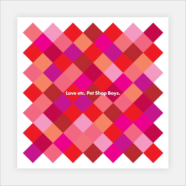
These bright and cheerful colors scream "love" and bring the simple pattern to life. Notice that no two boxes of the same color touch.
Zinkplaat: Mooi Besoedeling
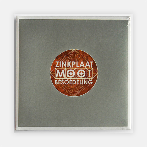
This is another of my favorites in the showcase. The subtle noise and minimal floral texture add depth while still keeping things minimal.
Hard-Fi: Once Upon a Time in the West
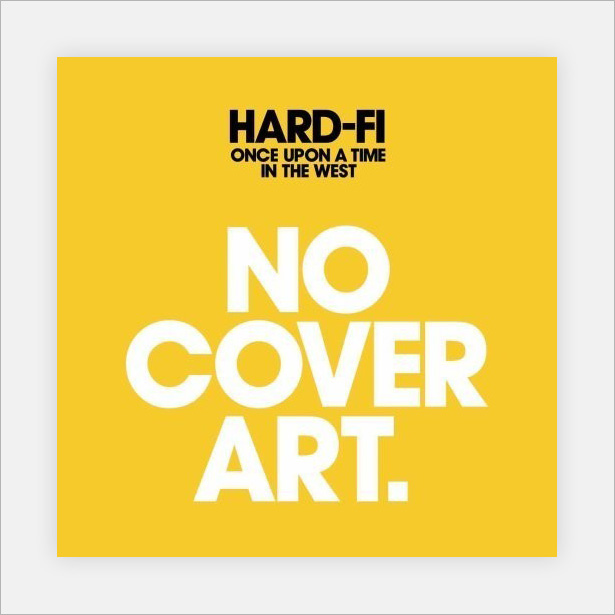
This is a clever and rather cheeky cover. The big "No Cover Art" typography could easily be mistaken for the album's title, but it isn't. Other than that, a great minimalist idea.
Joy Division: +-
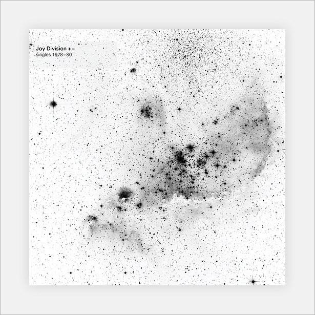
Wow! This Joy Division album art is made purely from splattered ink or watercolor. The only digital thing about it is the typography in the top-left corner. This could easily go in the painted category, but because it is so simple, it deserves a spot here.
Moderat: Rusty Nails
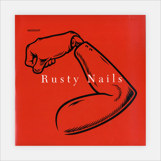
A super-minimal black illustration set against a bright red background, a superb way to grab attention. The white typography stands out well, and overall the simple elements pull the cover together nicely.
The Rogue Players: She Wants Revenge
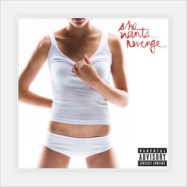
Another photographic cover, but a minimal one at that. A model wearing white clothing against a white background: doesn't get much simpler than that. Overall the design works great and really grabs attention.
Murmur: Some People
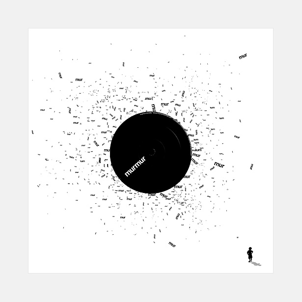
A minimal typographic cover featuring the word "mur" scattered across the page, with the focal points in the center and bottom-right corner. I assume this person represents the titular "Some People."
Pink Floyd: Dark Side of the Moon
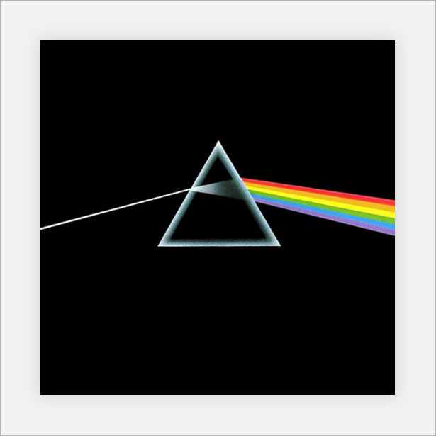
Yet another fairly famous piece of album art. A simple illustration of light going through a prism and breaking up into its constituent spectral colors (which, of course, are the colors of the rainbow).
Explosions in the Sky: The Earth Is Not a Cold Dead Place
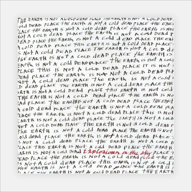
A lovely hand-written cover based purely on typography. The black lettering shows the album's title over and over again, with the artist's name clearly in red below.
Superhotjoy: The Shindig Fantastico
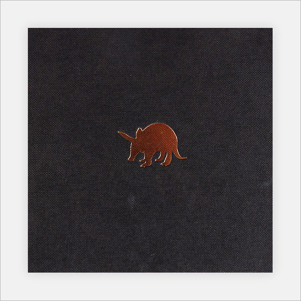
Yet another of my favorites: a simple emblem against a dark textured fabric.
Joy Division: Unknown Pleasures
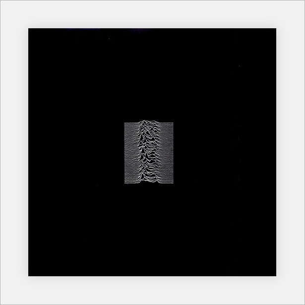
Another Joy Division album cover, also quite well known. This design was so popular that it was used in several products, and was even used as a pattern at the bottom of a pair of sneakers.
New Order: Waiting for the Sirens' Call
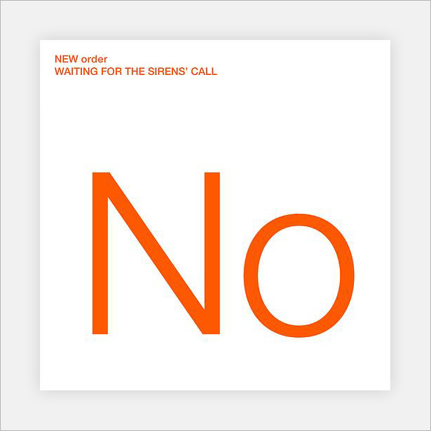
Possibly the simplest design here. The clear orange typography against the white background is all there is. Although so basic, it works well.
The Pet Shop Boys: Yes
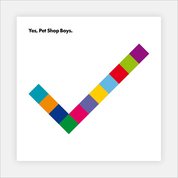
Another simple pattern from yet another Pet Shop Boys album. This time, we have a pattern that forms a check mark, which reflects the title.
Zappa: Ship Arriving Too Late to Save a Drowning Witch
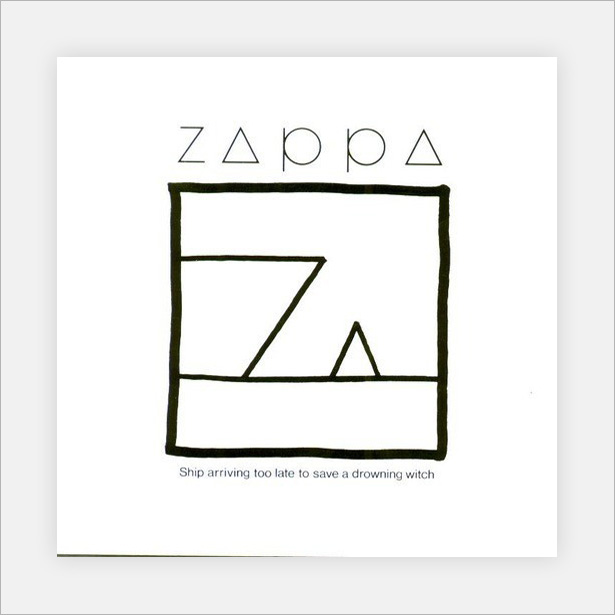
I absolutely love the minimalism of this cover; it reminds me of a gift card illustration. The simple shapes are just shapes at first, until you read the line "Ship arriving too late to save a drowning witch," at which point the shapes immediately become a ship and a witch. Extremely clever and fascinating to look at.
Alice Cooper: Zipper Catches Skin
Similar to the Explosions in the Sky cover above, although this album was released before it. The difference here is that the typography is digital, there is a red speck, and the artist's name is shaded in red (at the top) rather than written out.
Mini-Tutorial: Designing a Minimalist Logo-Based Album Cover in Photoshop
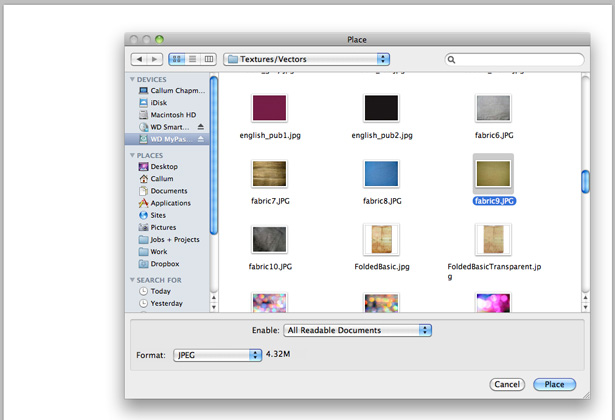
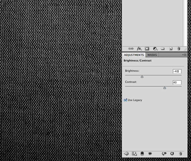
For this mini-tutorial, you will need a fabric texture. You can either take your own photograph or download one. Open a Photoshop document (my canvas size is 1000 x 1000 pixels), and go to File → Place. Select your texture. If you're using the same texture as me, it will be fabric9.JPG
With your fabric texture inserted, scale it down and fit it into the canvas.
The first thing to do is remove the color from the texture. The quickest way to this is by hitting the Shift + Command + U key combination, or by going to Image → Adjustments → Desaturate.

You should end up with something like the following:

Go to Image → Adjustments → Brightness/Contrast. In the Adjustments panel, you should see two sliders, one for brightness and one for contrast. Set the brightness level to -40 and the contrast level to +40. This should darken the image a little.
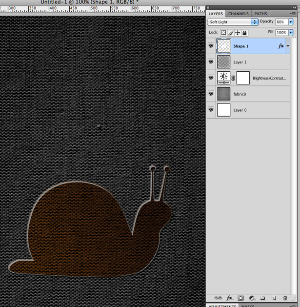
Create a new layer on top of the texture layer, and fill it with black.

Lower the opacity of the black layer to around 75%, thus darkening the texture image further.

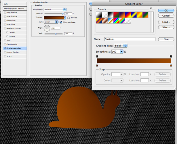
For this tutorial, we'll be using a built-in shape from the Custom Shape tool presets. Select one of the many available animals. I chose the snail.

Drag out the snail shape while holding the Shift key to keep it in proportion. Align it to the center of the document by going to Edit → Transform → Free Transform and then changing the axis settings in the toolbar. If your canvas is 1000 x 1000 pixels, then you will need to change the figures to 500 pixels for both the x and y axis to center the snail shape.
Right-click on the snail layer, and click on Blending options. Apply a gradient similar to the one below:
Now apply a drop-shadow, using the settings below:
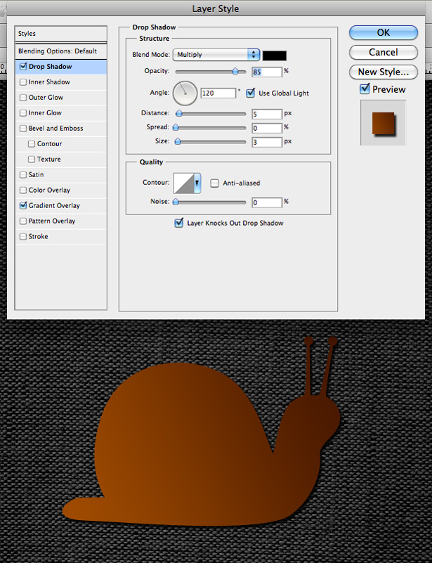
Also, add a white inner shadow. This will serve as our snail's highlight.
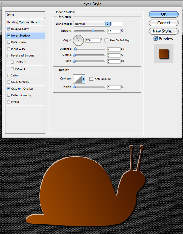
Add a 2-pixel gradient stroke on the outside of the snail shape, with 40% opacity.
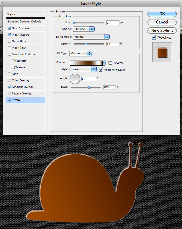
After clicking "OK," change the shape layer's Blending mode to "Soft Light," and lower the opacity to around 80%.
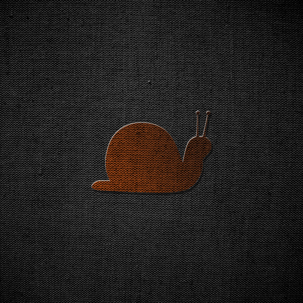
Having done this, I decided I wanted to brighten the snail up a little. To do this, I simply picked brighter colors for the snail's Gradient Overlay in the Layer Style options. I also increased the opacity of my Inner Stroke. With that, we're done!
Obviously, this could be much improved by playing around with the various settings for longer than we did. But you've just learned what settings you'll need to use to do so!
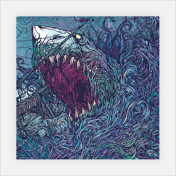
Illustrated Covers
Illustrated album covers are among the most visually powerful covers around. The artwork in some of the examples below is beautiful. You can only imagine how many hours were spent on some of them.
Gallows: Belly of the Shark
The superb color palette, fine details and strokes make this artwork a pleasure to look at. Certainly one of the most inspirational covers in this entire article.
Rivermaya: Buhay
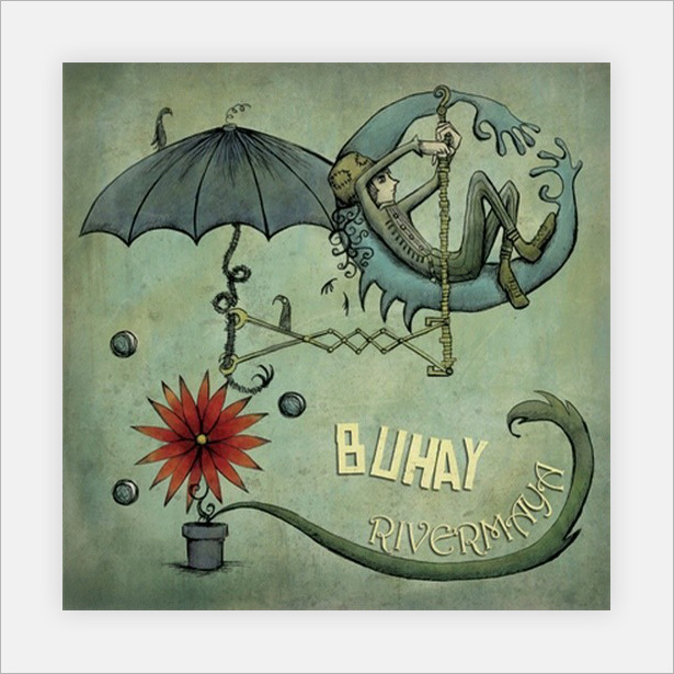
This lovely hand-drawn illustration works superbly with the texture and noise. The dark textures produce the shadows, and the light textures produce the highlights: a great technique.
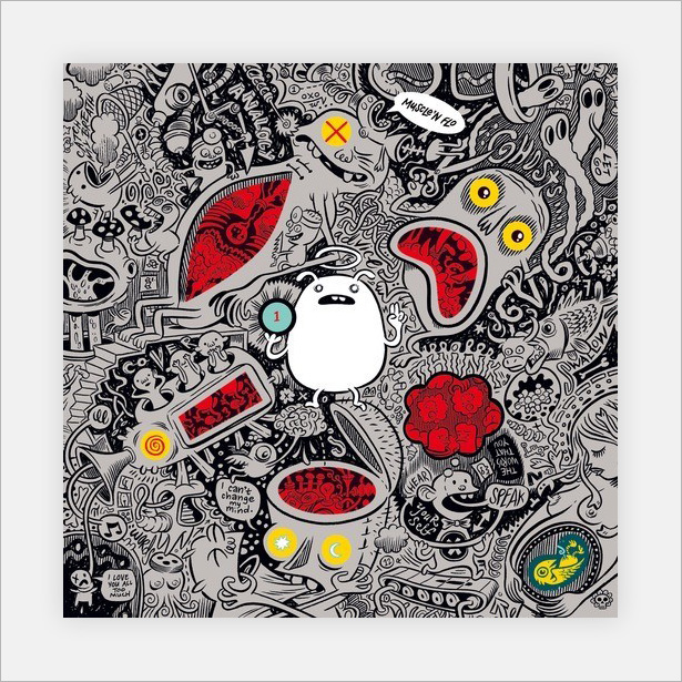
Muscle 'n Flo: Friend or Foe
The bright red, yellow and white among the otherwise gray and black illustration really make this cover pop. Being so jam-packed with characters and scenes, this cover will likely be looked at over and over again by the owner.
KMFDM: Hau Ruck
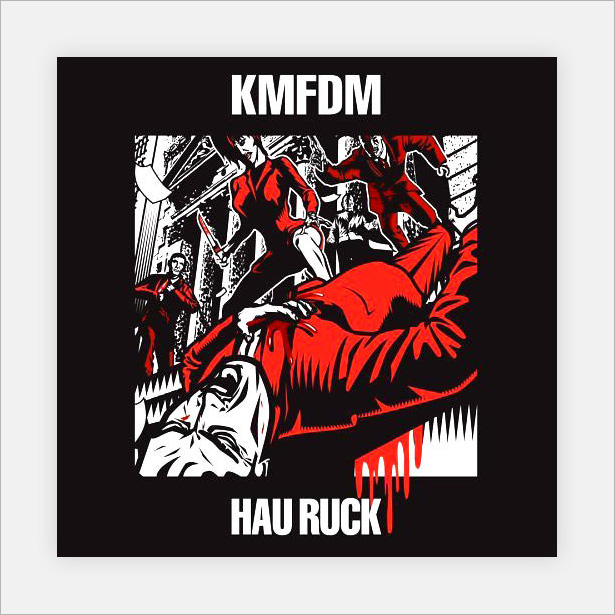
This cover has just one strong focal illustration. The stark black, white and red scheme make this album loud.
As Cities Burn: Hell of High Water
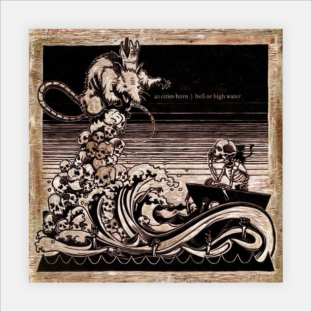
An incredible illustration with great use of texture. It's actually very difficult to tell whether it is digital or hand-carved into wood. Either way, a captivating and memorable cover.
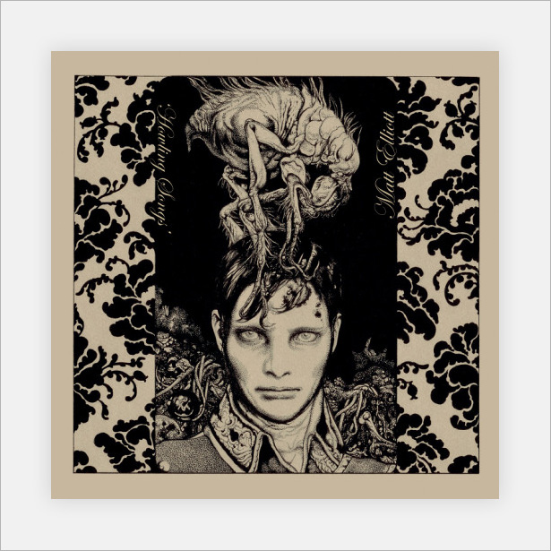
Matt Elliell: Howling Songs
The lack of white and other colors make this cover stand out from all the ones that do have white. The bold patterns running down the side and the odd-looking oversized insect make this artwork interesting indeed.
Lemon Jelly: Lost Horizons
An incredibly simple yet awesome illustration made up of 3-D effects and gradients. A pleasure to look at.
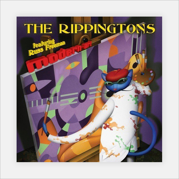
The Rippingtons: Modern Art
This abstract cover uses color and gradients to stand out from the crowd.
Muse: Origin of Symmetry
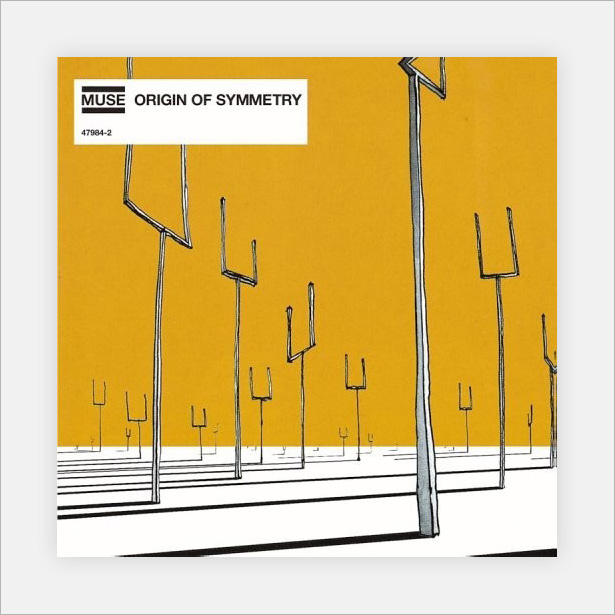
One of my all-time favorite album covers. It combines a basic color scheme with simple hand-drawn illustrations.
Mike Monday: Songs Without Words
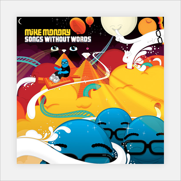
To conclude the showcase and inspire us for our last mini-tutorial, we have this lovely modern digital illustrated cover. It makes use of Illustrator's most powerful tools and techniques to put a strong, colorful scheme to good use.
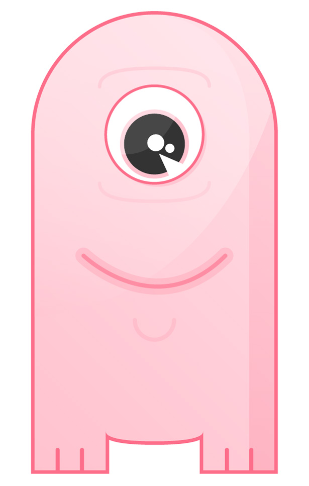
Mini-Tutorial: Creating a Simple, Sleek Character Design in Illustrator
In this mini-tutorial, we will be using some of Illustrator's most basic yet most powerful tools to create a simple monster character illustration.
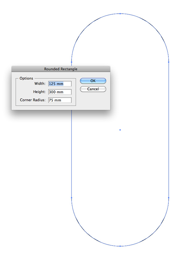
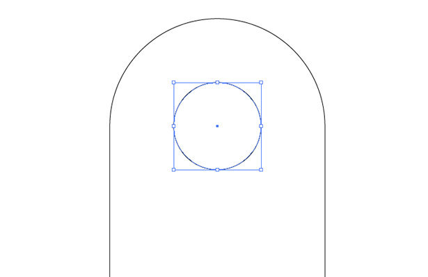
Open up Illustrator, and select the Rounded Rectangle tool. Click anywhere on the canvas to bring up the Dimensions box. Insert a width of 125 mm, a height of 300 mm and a corner radius of 75 mm. Click "OK." This should create the perfect sized shape for our character.
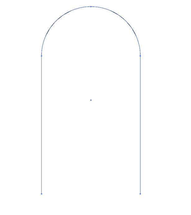
Select the Direct Selection tool, and double-click on the bottom anchor point of the shape. Hit the Delete key. This should remove the bottom two corners of the rectangle.
Select the Elliptical tool and, while holding the Shift key to keep the shape in proportion, draw your circle. Align it to the center of the previous shape.
Grab the Pen tool, and click on the bottom-left anchor point of the rounded rectangle to continue adding to the path.
While holding the Shift key to keep the lines perfectly straight, click to create a bottom line. Align it with the left side of the character's eye, which is most easily done by activating the Smart Guides (View → Smart Guides). Click again to create a foot.
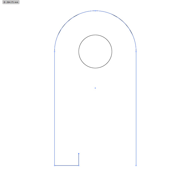
Do the same for the other side of the character's body.

Create another circle using the Elliptical tool. Select the Direct Selection tool, and delete the top half of the shape.
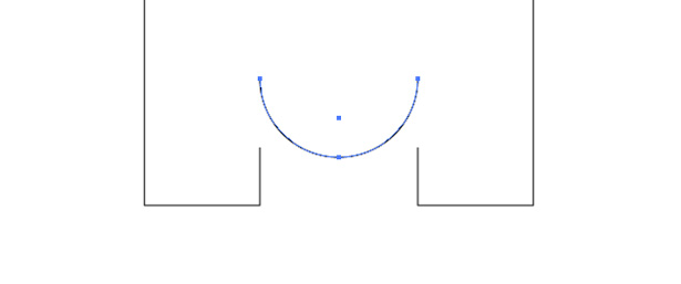
Use the Direct Selection tool to move the top two anchor points down a little, as seen below:

Stretch the shape so that it fits between the character's legs and use the Pen tool to join the lines.
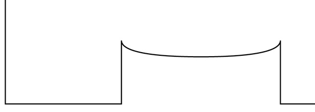
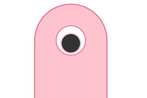
Fill the character's main body with a color, and give it a stroke with a darker shade. My stroke is set to 6 pixels.
Apply the same stroke to the character's eye. Copy the circle/eye by going to Edit → Copy and then to Edit → Paste in Front. While holding Shift + Alt, reduce the size of the new circle. Fill it with a dark gray or black.
Create two new circles using the Elliptical tool, and fill them with white, and remove the stroke if one was automatically applied. Position them in the center of the character's pupil, as seen below.
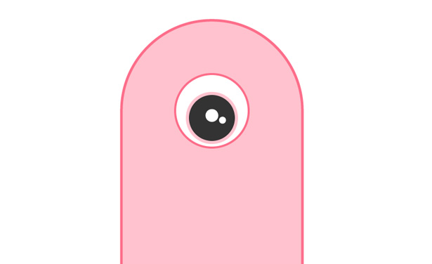
Using the Pen tool, create a small white triangle with no stroke. Position it over the character's pupil.

Now create a rounded shape as seen below. Make sure it doesn't cross any of the outer eye.
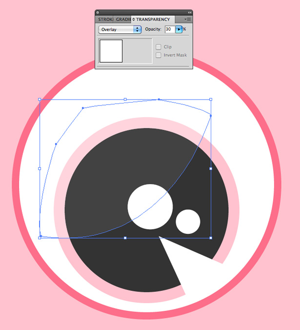
Change the layer's blending mode to "Overlay" and the opacity to 30% to create a nice reflection in the eye.
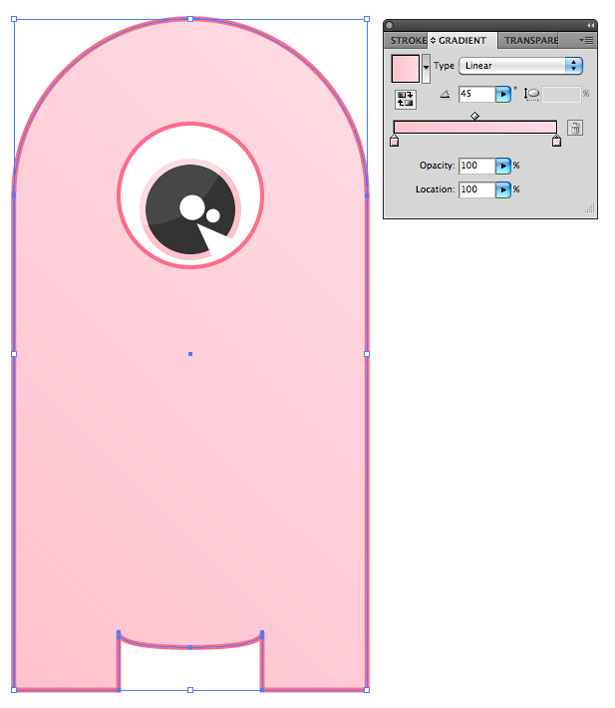
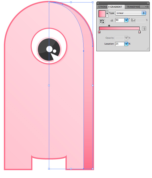
Reselect the character's main body, and go to Window → Gradient to open up the Gradient panel. Apply a gradient to your shape, using the original pink on the left of the gradient and going to a slightly lighter pink on the right. Set the angle to 45°.
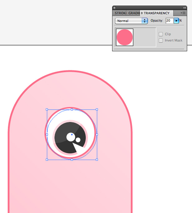
Select the main eye shape, and duplicate it once more. Remove the stroke, and set the color to the one you have been using for the strokes. Place it behind the main eye shape, and nudge it to the right and down a few pixels. Lower the opacity of the layer to 20%. This will create a simple yet effective shadow.
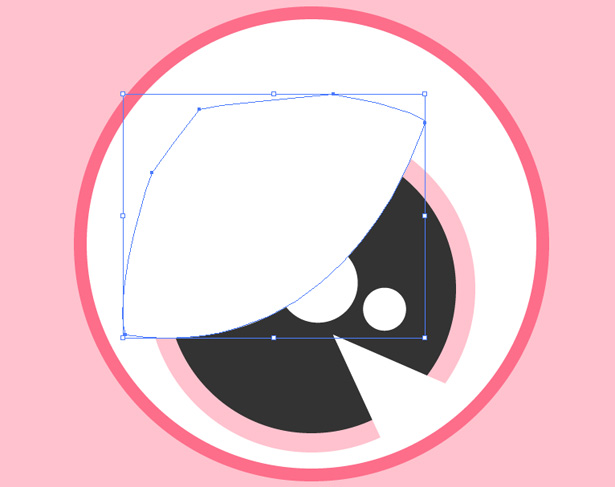
Create a shape similar to the one below. It doesn't matter whether it isn't neat outside of the main body shape.
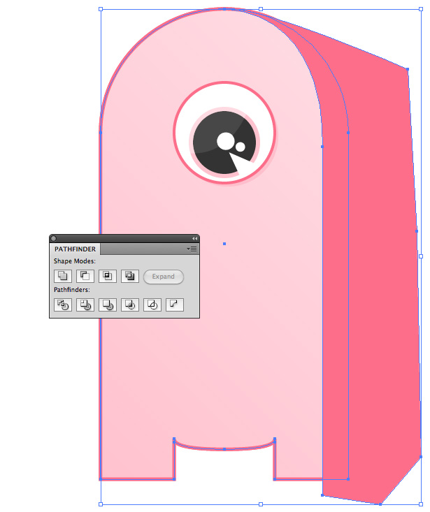
Select the main body shape, and go to Edit → Copy and then Edit → Paste in Front. With the shape still selected, hold the Shift key and select your new (dark pink) shape to select both at once. Open the Pathfinder Panel (Window → Pathfinder) and select the Intersect option to remove any overlapping areas.
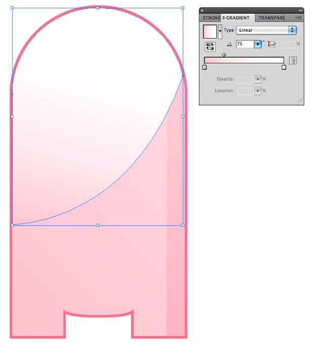
Apply a gradient to the new shape, going from dark pink (i.e. your stroke color) to light pink (i.e. the main body color) at a 90° angle.
Lower the opacity of the new shape until it looks something like below. Create a new shape, and use the same technique to remove any overlapping areas. Apply a gradient, going from light pink to white.
Change this shape's opacity to around 30%. You should end up with something similar to this:
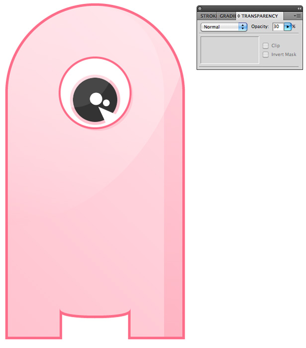
Using the Pen tool, create a "semi-moon"-shaped line. Apply a thick stroke so that it looks something like this:

After lowering the opacity of this stroke, copy and paste it in front, and then reduce the width of the stroke. Increase the opacity of the shape to give the character a nice smile. Repeat this step for any other lines on the character, such as the ones above and below the eye and the chin and toe lines. With that done, we're finished!
Written exclusively for WDD by Callum Chapman, a designer and illustration trading as Circlebox Creative. He also runs The Inspiration Blog and Picmix Store
Which design styles are your favorites and why? Share your thoughts below!
WDD Staff


Read Next

3 Essential Design Trends, May 2024

20 Best New Websites, April 2024

Exciting New Tools for Designers, April 2024

14 Top UX Tools for Designers in 2024

What Negative Effects Does a Bad Website Design Have On My Business?

10+ Best Resources & Tools for Web Designers (2024 update)

3 Essential Design Trends, April 2024

How to Plan Your First Successful Website

15 Best New Fonts, March 2024

LimeWire Developer APIs Herald a New Era of AI Integration

20 Best New Websites, March 2024
