 Good typography is paramount to any good design.
An otherwise-beautiful design can really suffer if the typography choices are wrong. But combining fonts beyond the basic serif/sans-serif pairing can be tricky and confusing to a lot of designers.
While a lot of what goes into good typography is subjective, there are some guidelines that can point you in the right direction. From there, it's up to you to experiment and try out different things.
Don't be afraid to try new things in your typography, but trust your eye and your instincts as a designer. Sometimes, even things that follow all the "rules" of typography can still look awful (and vice versa).
Match the Mood
Every typeface has a mood. Some are lighthearted and fun, some are serious, some are elegant, and some are very professional. Typefaces with similar moods are more likely to be compatible and less likely to be aesthetically jarring.
Take the examples below. The typefaces used on the left, Tahoma for the body copy and Snidely for the headline, don't match up. Snidely is a decorative font with a quirky, funky look to it, while Tahoma is understated and modern. While they're not the worst pairing in the world, they definitely aren't optimal either.
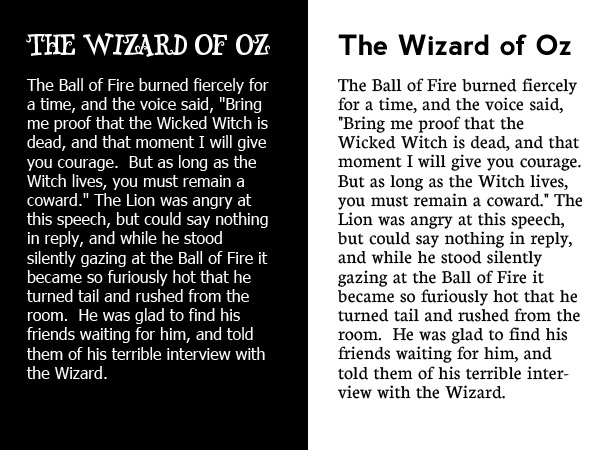
The typefaces on the right, Neuton for the body copy and Nevis for the headline, both have similar casual moods. Neither is stuffy or overly formal, which makes them work well together despite being outwardly very different in appearance.
Match Letterforms
The letterforms that make up a typeface can be incredibly varied, based on a number of factors, like historical influence or overall style. Matching up these letterforms is a good way to find compatible typefaces, though generally you'll also want to match them based on style or other factors as well.
One of the quickest ways to check compatible letterforms is to check the letters "a", "g", and "e". In the example below, you can see how Aller and Gentium have similar letterforms, as do Helvetica and Museo. All four fonts have similar "a" letterforms. The "g" letterforms are where we see the biggest differences.
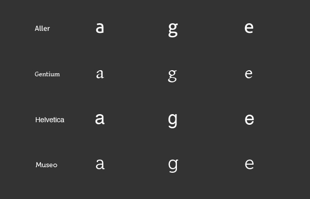
Other letters you might want to check include the lowercase "t" (some fonts will have a tail on the "t" while others won't), lowercase "f" and lowercase "q". Differences in letterforms aren't necessarily a deal-breaker between fonts, but you'll want fonts that have more similarities than differences in these cases.
The Classic Serif / Sans-Serif Combo
The combination of a serif font and a sans-serif font is probably one of the most commonly seen typographical combinations. It's a relatively easy combination to pull off, as there's less chance for conflict. As long as you pay attention to weight and proportion, it's a pretty difficult combo to get wrong.
The text below shows a couple of different ways to mix serif and sans-serif fonts. The example on the left shows that you can mix font weights if things like proportion are very similar. The headline font, ChunkFive, is a slab serif, while the body copy font, Junction, is a simple sans-serif. Both have strong visual styles, though, which prevents Junction from being overpowered.
The pairing on the right is a bit more traditional, with very similarly matched fonts. Junction is used as the headline font here, with Prociono for the body. Both are a bit on the thin side, and have similar letterforms.
Use Color to Tie It Together
If you're combining a lot of really disparate fonts, try tying them together with color. Keeping everything in one color (or shades of a single color) adds harmony and unity that might be missing in the fonts themselves.
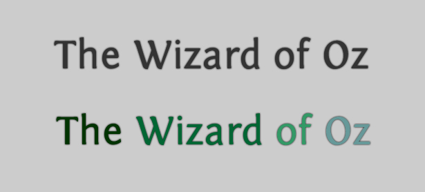
You can see from the image below that color can have a huge impact on the way typography looks. Both lines of text in the image below are identical, with the exception of the letter colors. While neither is what would typically be considered "good" typography, the top one could at least be made to work in the right context. The bottom one, however, looks like something a kindergarten student might design during coloring time.
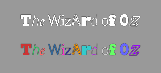
It shows just how important using similar colors is, especially if you're disregarding a lot of the other guidelines in this article. Conversely, if you're looking to add a bit more contrast between typefaces that might be a little too similar, using different colors can do just that.
Using slightly different colors really adds visual interest to the typography here, which is made up of Fontin and Fontin Sans, two fonts from the same family that are nearly identical.
Similar Proportions
Proportion is probably the most important thing to consider, especially when combining typefaces in a single line (like in a header or logo). Fonts that are proportionally similar will blend more easily and look more uniform than fonts with varying proportions.
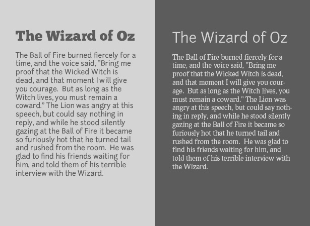
The quickest way to check proportion is by comparing x-heights. Generally speaking, fonts with similar x-heights will have similar proportions overall. In the image below, you can see that Helvetica and Neuton have virtually identical x-heights.
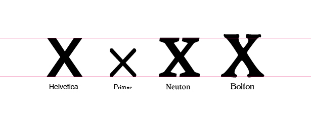
By contrast, the x-height of Bolton is much taller and Primer is much shorter than the other two fonts. Check other letters to be sure they're compatible or incompatible, but x-height is a great place to start.
You'll also want to look at the width of characters within the typeface. Check the width of wider characters like "m", "w", or "o", as well as the narrower characters, like "t", "f" and "j". For the best compatibility, these letters should have similar widths between the two typefaces.
Similar Weights
Fonts with radically different weights can work together, but it's much more likely they'll be compatible if the weights are similar.
The issue that's most often present when fonts have radically different weights is that lighter fonts often get lost, visually, when paired with much heavier fonts. This becomes even more pronounced if the heavier font is being used for a headline, and the lighter font is body copy.
Look at the text below. The "headline" font here (Charlie Brown M54) completely overpowers the "body" font (TitilliumText14L Regular).
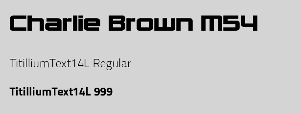
Increasing the font weight of the body font compensates for this. That's always an option, though it can limit your options for using different styles in your design. It's much simpler to find fonts that match up at different weights (so bold in one is equal to bold in the other, etc.).
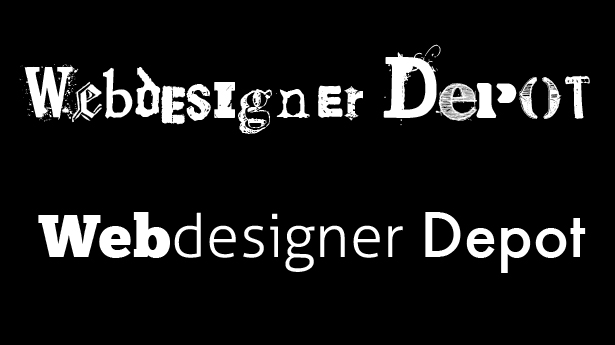
Don't Overlook Single Typefaces
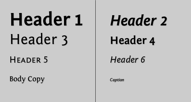
There are a lot of typefaces out there that include multiple fonts within the same family. Typefaces like Fontin (and Fontin Sans) come with a handful of weights that can be combined to create a lot of visual interest.
Below is a great example of how different weights and styles can be used together to create typography that has plenty of visual interest. Because this is all based on one general font family, you don't really have to worry about the different fonts conflicting with each other.
Conflict vs. Contrast
Contrast in typography is generally a good thing. The point of using different fonts is so that they stand out from one another, contributing to the overall visual style of a design. If your fonts are too similar, they conflict with each other, rather than contrast and complement.
Take the examples below. In the first line, the fonts are very similar (Hoefler Text and Goudy Bookletter 1911). Any contrast is lost, and instead, they look a bit strange next to each other.
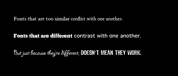
The second line is better, with ChunkFive and Geneva. They have similar proportions, but that's pretty much where the similarities end. There's good contrast here.
The third line, on the other hand, shows why just using different fonts doesn't necessarily result in good contrast. This is why it's important to pay attention to more than just one aspect of combining typefaces.
Radical Contrast
Radical contrast between typefaces can be a great way to add visual interest to a design. This doesn't necessarily mean you can just throw any two fonts together and hope for the best. You still need to keep in mind general principles of typography, and then pick and choose which guidelines you want to adhere to and which ones you want to disregard.
The easiest way to create typographic designs that use radically different fonts is to keep proportion in mind. Pay attention to the overall shape on the fonts and things like x-height, and then play around from there.
You may need to adjust the sizes of different characters if combining a number of different typefaces, as not all typefaces are consistent when it comes to sizing. Look at the two examples below:
The top line uses a wide variety of fonts, but they're all grunge or destructed fonts. This gives them a common style and unites them, even though proportion and weight are different between characters.
The bottom line, though, uses only three typefaces, two of which are sans-serif and one of which is serif. These fonts have a number of things in common, though. First of all, they're all relatively heavy. Using the heaviest for the shortest part, and the lightest for the longest part, helps balance them visually. The line widths are also uniform in each font, with no deviation either between letters or within letters themselves. Finally, all three fonts have fairly wide, round letter shapes.
To a large extent, combining fonts in this manner is subjective, but keeping in mind what makes a good typographic design can help point you in the right direction when you start designing things like this.
Written exclusively for WDD by Cameron Chapman.
Have other tips and tricks for mixing fonts? Share them in the comments below...
WDD Staff


Read Next

20 Best New Websites, April 2024

Exciting New Tools for Designers, April 2024

14 Top UX Tools for Designers in 2024

What Negative Effects Does a Bad Website Design Have On My Business?

10+ Best Resources & Tools for Web Designers (2024 update)

3 Essential Design Trends, April 2024

How to Plan Your First Successful Website

15 Best New Fonts, March 2024

LimeWire Developer APIs Herald a New Era of AI Integration

20 Best New Websites, March 2024

Exciting New Tools for Designers, March 2024
