 Tumblr is a micro-blogging platform that allows users to easily publish snippets of information to the web, such as a photo or photo set, a video, a quote or just a paragraph.
It is often used as an online diary because of to its ease of use compared to other blogging platforms such as WordPress.
A lot of Tumblr themes are out there, both free and premium, but have you ever wondered how you’d go about designing your own?
In this tutorial, you’ll learn how to create a forest-inspired Tumblr theme, making use of wood textures, subtle patterns and modern techniques—a nice blend of natural and modern elements.
What we’re going to design
The theme we’ll be designing in Photoshop consists of four areas: wooden sidebar, main content area, right sidebar and header.

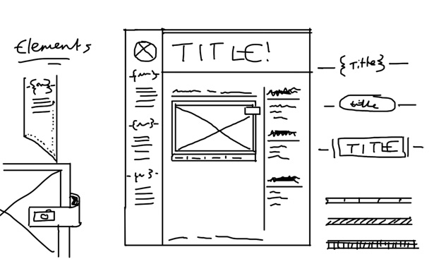
Step 1
The first step, as should be with all things you design, is the sketching stage. Using my Wacom Bamboo graphics tablet and a blank canvas in Photoshop, I sketched the following design, with some larger elements, just to get my ideas down on (digital) paper.
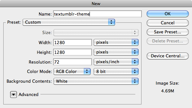
Step 2
With the idea roughed out, create a new document in Photoshop. (Keep in mind, this isn’t set in stone. It’s just something you can refer back to if you get stuck in the design. Personally, I tend to experiment and change a lot of what I initially planned.) I used the following settings in Photoshop:
Step 3
The next stage is to put some guides down on the canvas. This will help you keep the structure of the theme neat as you design it. I want the left sidebar to be 200 pixels, the main content area to be 600 pixels and the right sidebar to be 160 pixels, giving us a width of 960 pixels.
If you’ve used the same settings, you can place your guides at 200, 800 and 960 pixels horizontally. This design will be aligned left, so that the wooden sidebar always sits against the left side of the user’s viewport.
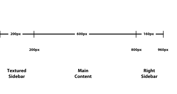
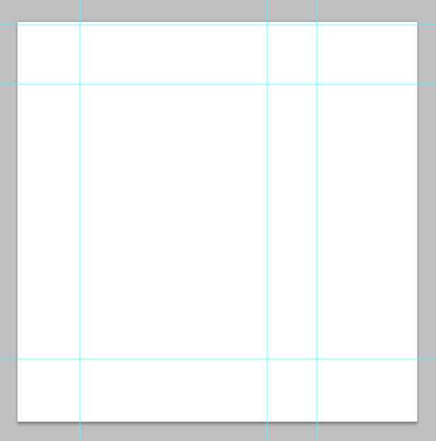
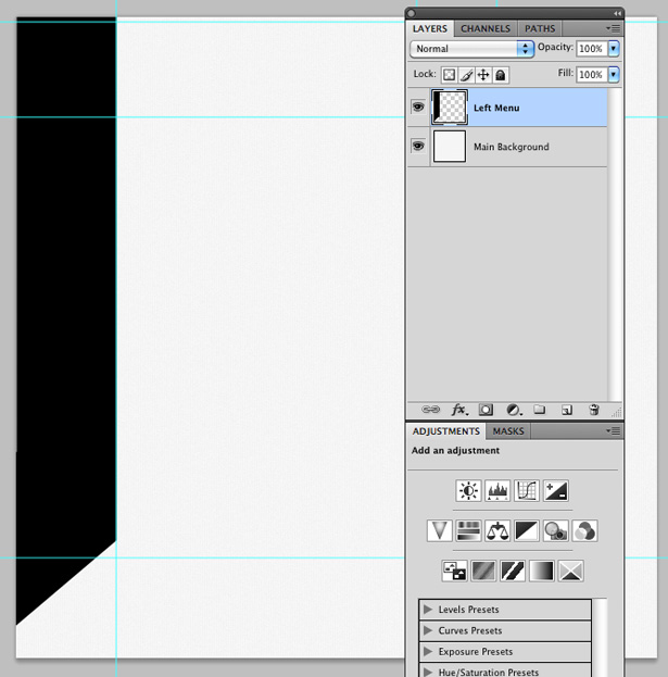
I also placed guides 200 pixels below the top of the canvas and 200 pixels above the bottom of the canvas. This is how my document currently looks:
Step 4
Let’s now add some pattern to our background. Go to File → New, and create a new document that’s 8 × 8 pixels. Draw some vertical lines with a width of 2 pixels. Your canvas should now be 2 pixels black, 2 pixels white, 2 pixels black, 2 pixels white. Go to Edit → Define Pattern. Save your pattern as “Vertical Lines 2px.”
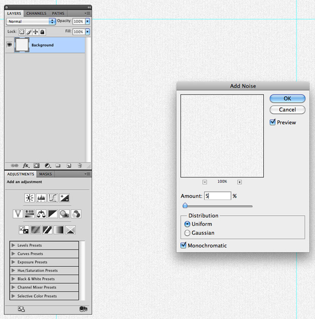
In your original document, go to Layer → New Fill Layer → Pattern. Select the pattern you just created, and click OK. Drop the opacity of the layer until it looks something like this:
Merge the pattern with your background layer, automatically rasterizing it in the process. Go to Filter → Noise → Add Noise. Change the value to 5% and click OK. This will add some subtle texture to the background:
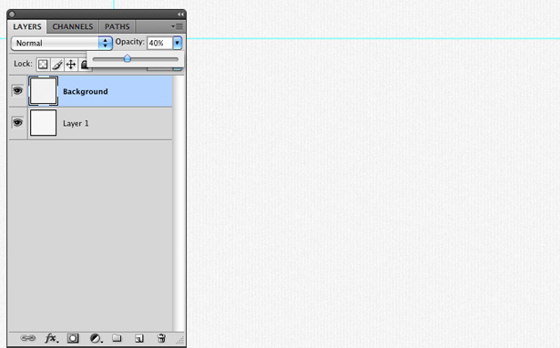
Create a new layer, and fill it with white. Position it beneath the original background layer. Lower the opacity of your textured layer pattern to around 40%, and then merge it with the background layer by going to Layer → Merge Layers.
Step 5
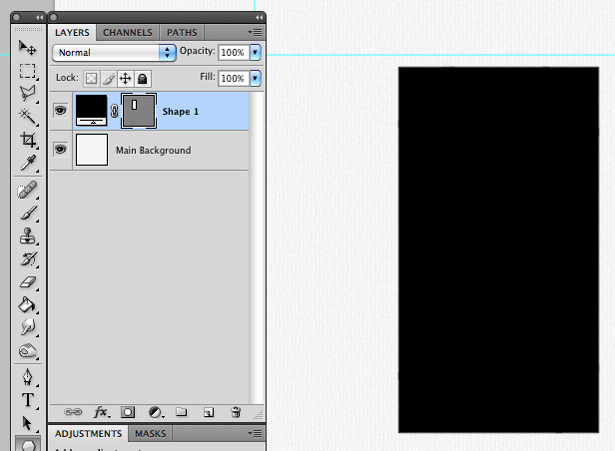
Select the Rectangle tool, and draw a shape that’s 200 pixels wide.
We’re going to slice off the bottom of our shape using the Polygonal Lasso tool, making it look like a ribbon. Create a selection over your shape, rasterize the shape layer, and then hit the Delete key to remove the selected area.
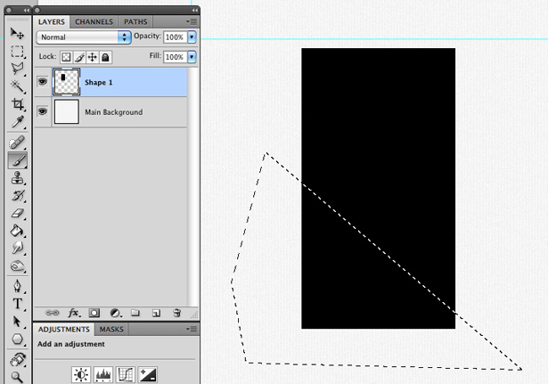
Place the shape in the left sidebar area that we marked using our guides.
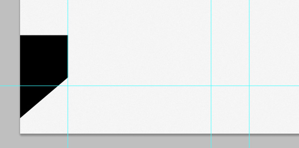
Create a selection of the top portion of the shape, and go to Edit → Free Transform. Stretch the shape so that it overlaps with the top line of the canvas.
Step 6
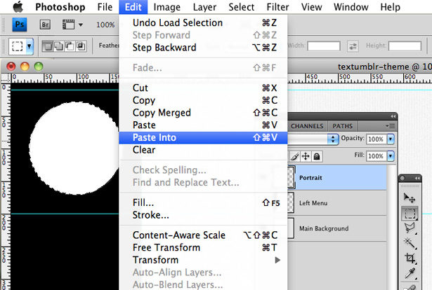
Select the Ellipse Shape tool and, while holding the Shift key to keep it round, draw a circle, filled with white. Position it at the top of the sidebar, and rename the layer to “Portrait.”
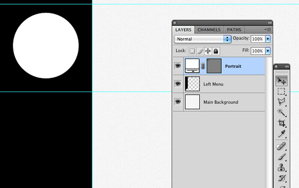
Right-click on the new shape layer, and select the “Rasterize layer” option to turn it from a smart object into pixels. Hold down the Command key, and click on the layer’s preview image in the Layers panel. This will make a selection of your circle.
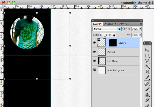
Locate a picture of yourself (or whatever your website is about) and copy it. Head back into Photoshop and, with the circle selection still active, go to Edit → Paste Into. This will paste the object in your circle selection.
Having done this, you have automatically created a layer mask on the image (i.e. on a new layer, not the existing circle layer). Go to Edit → Free Transform to resize and/or rotate the image. It will remain a circle; just be sure not to make it too small. Once that’s done, delete the layer named “Portrait,” and rename your new layer.
Step 7
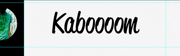
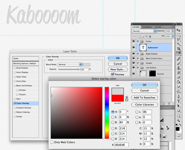
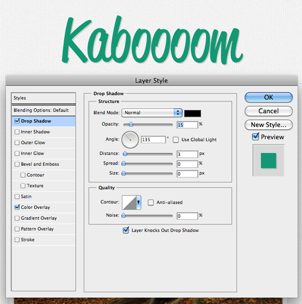
Select the Type tool, and create a text box in the header area. I’ve given my theme a completely random name: “Kabooom.” I used a font called Reklame Script. You can download a demo of the font or purchase it for $30 from MyFonts.
Right-click on your type layer, and select “Blending Options.” Apply a color overlay to the text. I used a light gray that’s a little darker than the background, with the hex code #D6D6D6.
Apply an inner shadow to the type, using an opacity of 10%, a distance of 2 pixels and a size of 1 pixel. Leave everything else at 0. This will make the type look like it was engraved in the background.
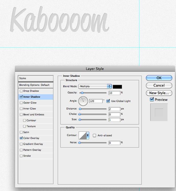
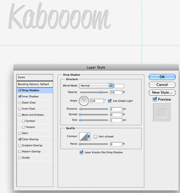
To complete the engraved effect, we’ll add a drop shadow to the type, using the color white with a normal blending mode. Give the shadow a distance of 2 pixels and a size of 1 pixel. These settings will make the shadow appear as a highlight at the bottom of the type, adding more depth to the type and reinforcing the inner shadow.
Step 8
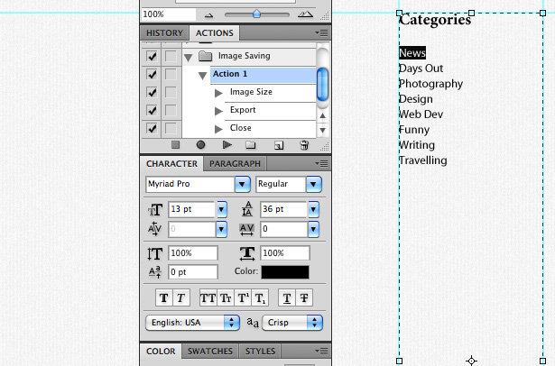
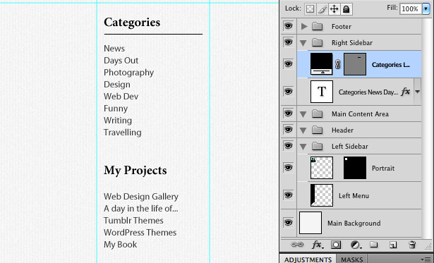
Reselect the Type tool, and create a text box that fills the width of the right sidebar, which we have marked with guides. Put a variety of categories under the category heading, as seen below:
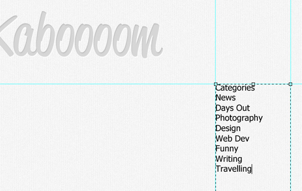
Select the category heading, and change the typeface to one of your choice. I used Minion Pro. Experiment with sub-fonts (bold, italic, etc.) and point sizes.
Change the font for the categories (“News,” “Days out,” “Photography,” etc.) I used Myriad Pro. Lower the point size of the type, and adjust the leading (i.e. the space between the lines of text), so that the top line sits lower than where it is by default.
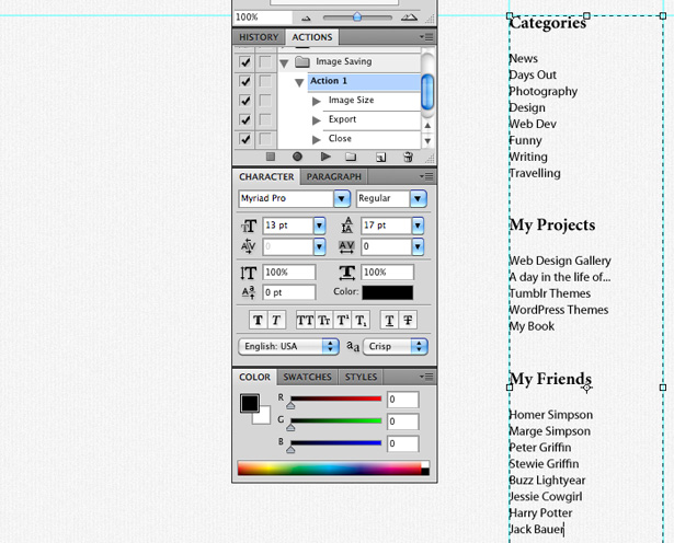
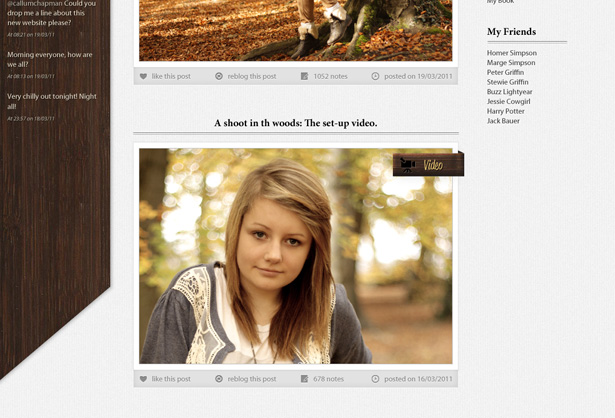
Copy the first heading and the links and paste them below in the same text box. Change the heading and categories. I used the headings “My Projects” and “My Friends.” Use whatever is relevant to your website, of course.
Step 9
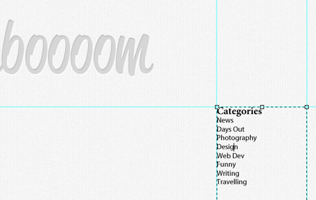
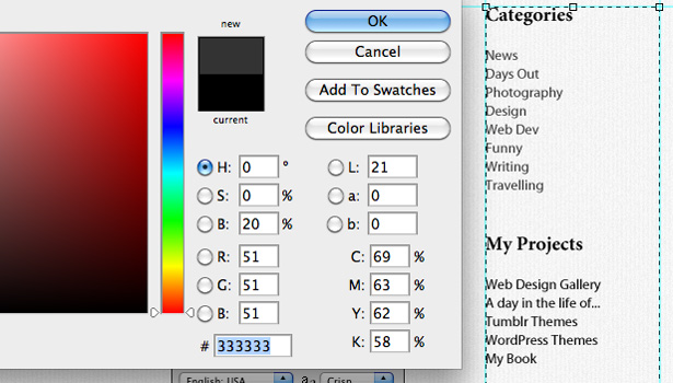
We’re now going to make the text in the right sidebar a little more appealing. Select the text for sub-categories (i.e. not the headings), and change the color from black to a dark gray. I used #333333. Click OK.
Right-click on the type layer, and select “Blending options.” Apply a white drop shadow with a normal blending mode. Change the angle to 120° and the distance and size to 1 pixel. Leave everything else set to 0 pixels. This will add a highlight to the bottom of the text, just like we did with the heading.
Step 10
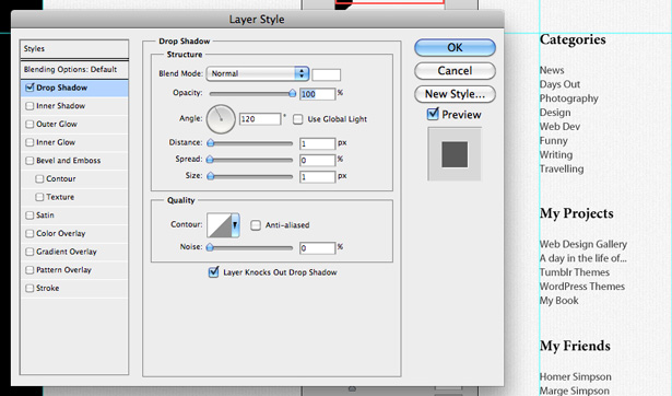
Select the Line tool and, while holding the Shift key to keep it straight, draw a line beneath the “Categories” heading.
Right-click on the line layer, and select “Blending options.” Apply a white drop shadow with a normal blending mode. Set the angle to 90° and the distance to 1 pixel. Set everything else to 0 pixels.
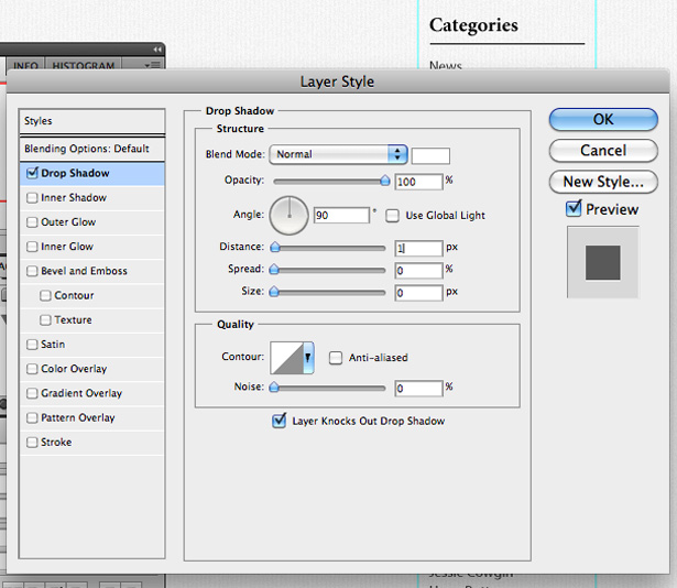
Duplicate the line layer, and position it below each of the headings.
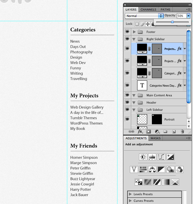
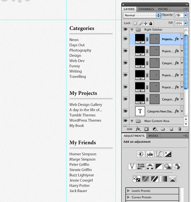
Step 11
If you have the same number of headings as me, then you should have three line layers. Select them all, and duplicate them. With the three line layers still selected, nudge them down 10 pixels by holding the Shift key and pressing the Down key once. Lower the opacity of your newer line layers to 25% to end up with something like this:
Step 12
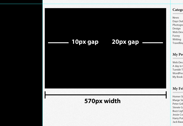
Grab the Rectangle Shape tool, and draw a rectangle similar to what’s below. Make the rectangle exactly 570 pixels wide. This will allow for a 10-pixel gap between the left sidebar and the edge of the new rectangle and a 20-pixel gap between the right sidebar and the edge of the new rectangle, as seen in the annotated screenshot below:
Step 13
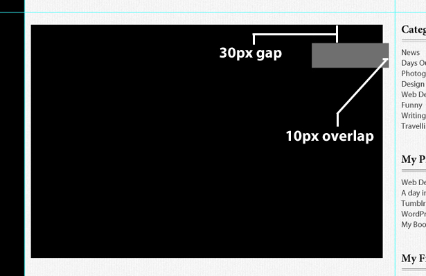
Reselect the Rectangle Shape tool and create a much smaller gray rectangle, like the one below. Position it in the top-right of the large rectangle, offset from the large rectangle by 10 pixels. Position the shape 30 pixels away from the top of the rectangle.
Step 14
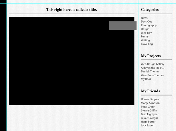
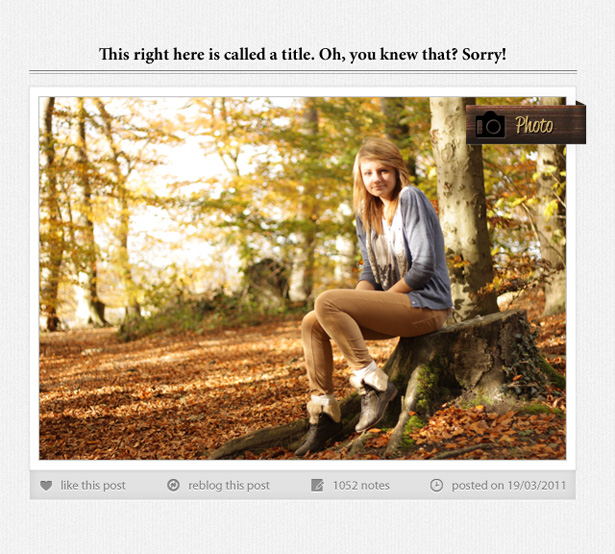
Duplicate the type layer in the right sidebar and, using the Shift key and Cursor key combination, nudge the duplicated type layer over the main content area. Do the same with the two line layers for your “Categories” heading.
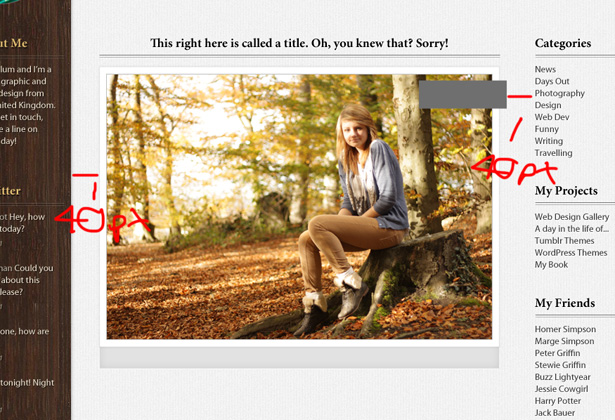
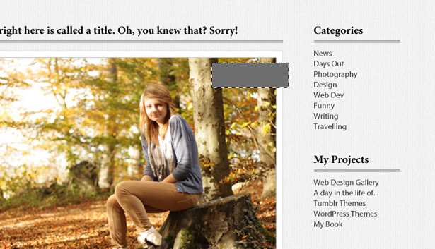
Select the Type tool, and click on your duplicated type layer. Remove all of the text in the box, and change the heading to something more suitable. I just used some dummy text here: “This right here is called a title.”
Step 15
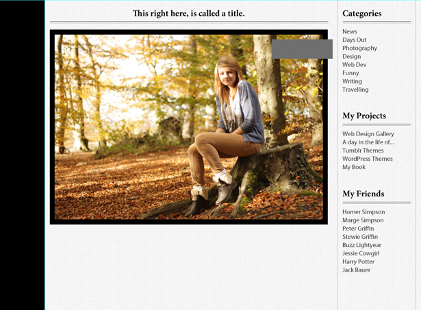
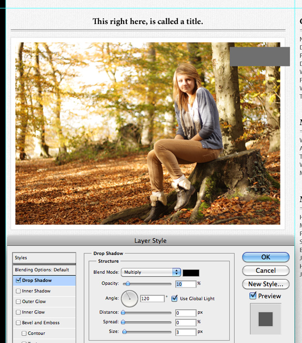
Go to File → Place, and locate a photograph to place in the document as a placeholder. Using real images here is always best because they make the mock-up seem more real and attractive. I used a photo of my sister.
Go to Edit → Free Transform to reduce the size of the photo and position it in the right spot. Make it a total of 20 pixels shorter in both width and height so that it fits nicely in the black rectangle, like so:
Step 16
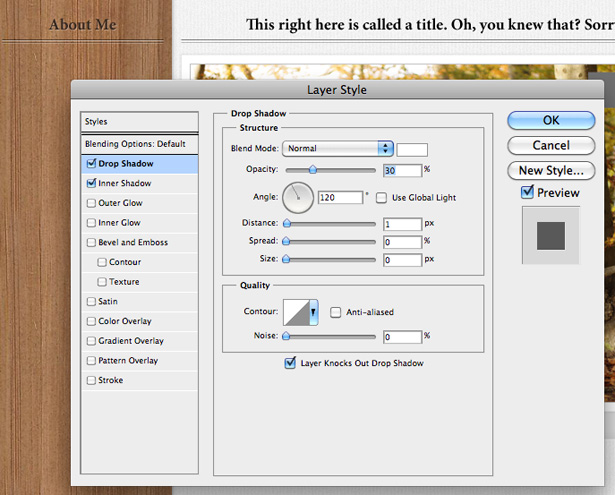
Open up the Blending options for the large black rectangle. Apply a white color overlay and a drop shadow with an opacity of 10% and a size of 3 pixels.
Step 17
Select the Rectangle Shape tool once again, and draw a long shape below the white photo background shape. Make sure it is the same width. Fill it with a light gray.
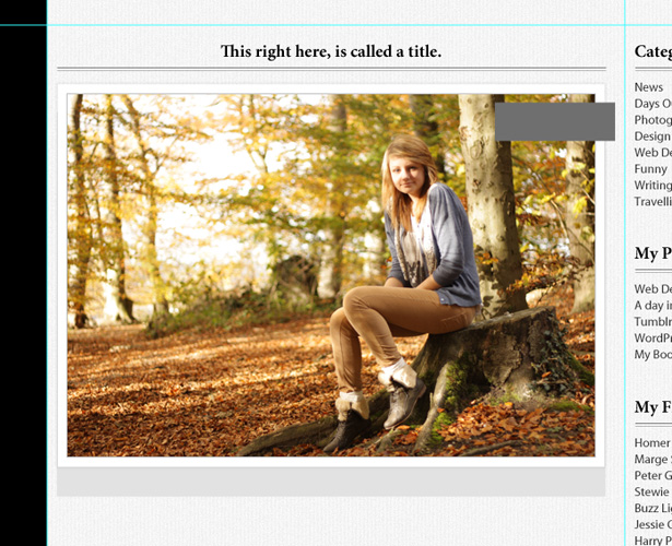
Open the Blending options for the new gray rectangle, and apply a drop shadow. Set the color to white, with a normal blending mode, the opacity to 100% and the distance to 1 pixel. Leave everything else set to 0 pixels.
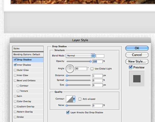
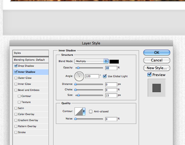
Also, apply an inner shadow, using the color black, with an opacity of 10%. Change the size to 13 pixels, and leave everything else set to 0 pixels. These two layer styles will make the new shape look like it was etched in the background, like our heading typography:
Step 18
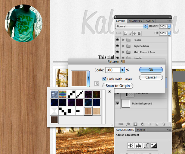
Moving on to the sidebar, download some repeating wood textures. I’m using a set from GraphicRiver that includes three different wood textures: light, medium and dark.
Once you’ve installed the patterns in Photoshop (by opening each image and defining it as a pattern), select the sidebar in your Photoshop document. Go to Layer → New Fill Layer → Pattern. Select one of your wood textures (I selected the medium version), and click OK. By selecting the sidebar first, the pattern should fill only that area.
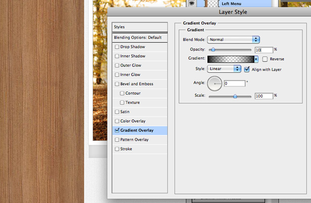
Right-click on the pattern layer, and select “Blending options.” Apply a gradient overlay, going from black to transparent to black:
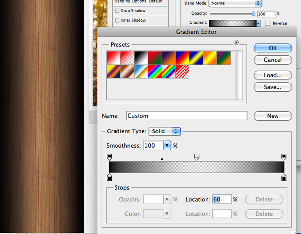
Change the opacity of the gradient overlay to 10%, and give it an angle of 0°. This will add a subtle shadow to the sidebar, making it appear a little more realistic and less flat.
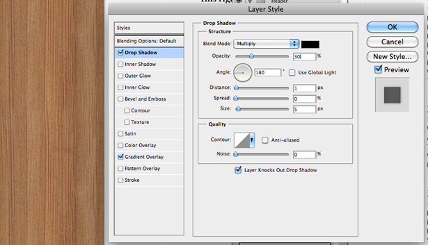
Also, apply a drop shadow to the sidebar. Lower the opacity to 30%, and change the angle to 180°. Change the distance to 1 pixels and the size to 5 pixels, leaving everything else set to 0 pixels. This will add a small and subtle shadow to the sidebar.
Step 19
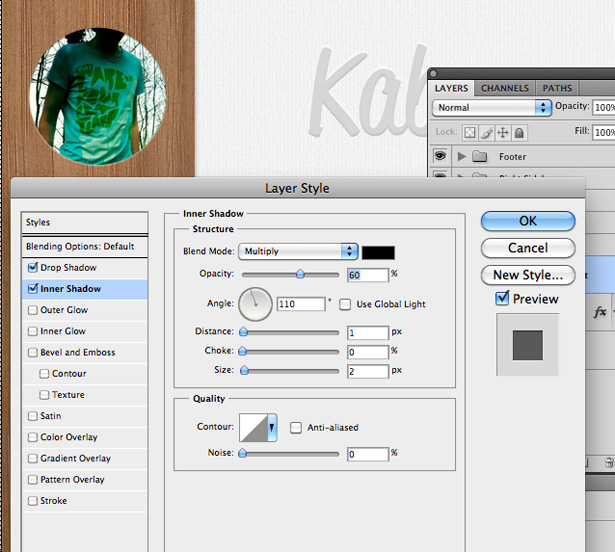
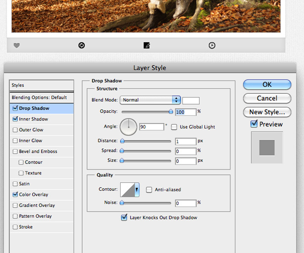
Open up the “Blending options” for the circle portrait that we created near the beginning of this tutorial. Apply a white drop shadow using the settings below:
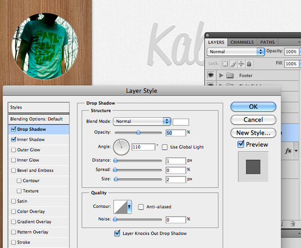
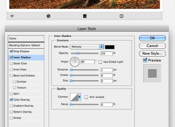
Also, apply an inner shadow using the settings below. This will make the circle portrait look as if it was placed in the tree, rather than just sitting on it.
Step 20
Duplicate the title layer in the main contents. Reposition it to the sidebar, and change the text to “About me.” Also, reposition and resize the two lines below the heading.
Open the “Blending options” for your new type layer, and change the drop-shadow settings to these:
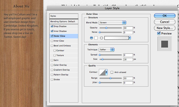
Add some text to the “About me” section, using the same font and size that we used in the right sidebar text. Open the “Blending options” for this new text, and click on the “Outer glow” tab to apply an outer glow; change the opacity to 30%, the color to white and the size to 18 pixels.
This will make our text more readable against the wooden background.
Play around with the font size to make the text easier to scan.
Step 21
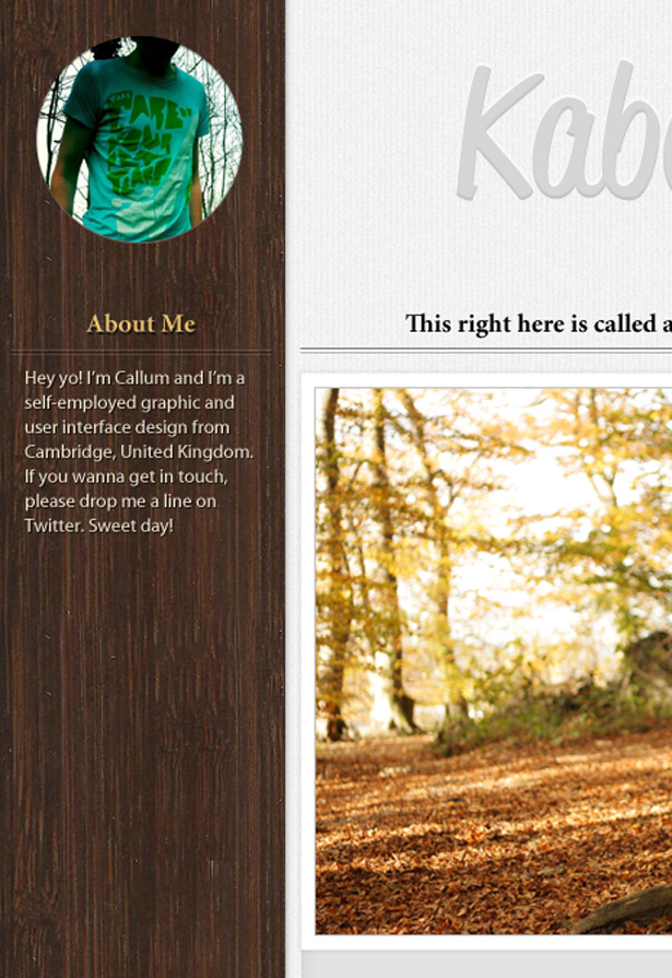
After some experimentation, I decided that the whole sidebar looked much better in the darker of the three textures mentioned above. I changed the sidebar pattern and the colors of the text. Use the techniques you have already learned to do this.
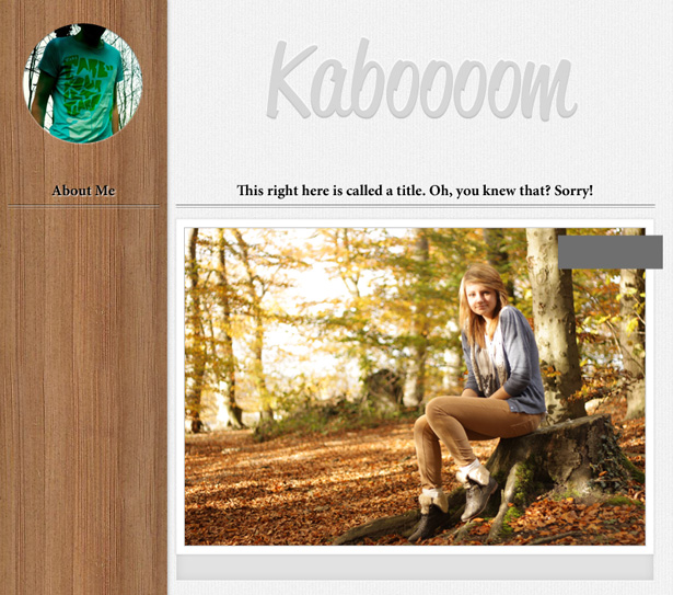
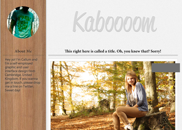
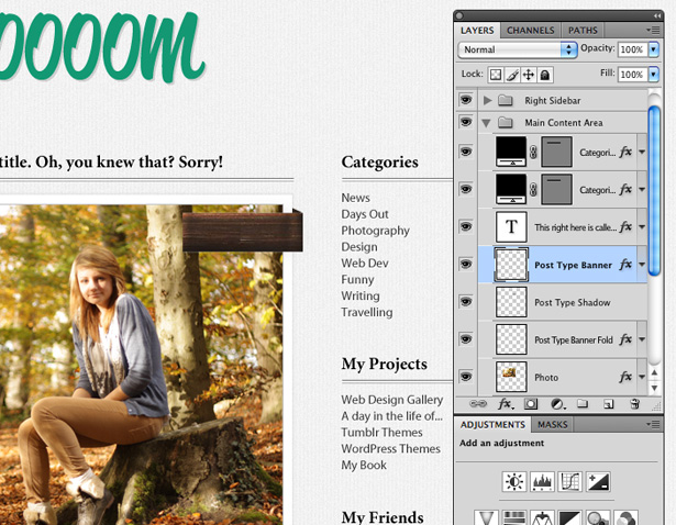
Here is what my design looks like so far:
Step 22
However much you have planned, you’re bound to make changes during the design process. Upon looking at the design as a whole (rather than piecemeal), I concluded that 10 pixels between the sidebars and main content area was nowhere near enough.
Using the Shift key and Cursor key combination, nudge your content across, making the two gaps 40 pixels instead of 10. This will make the design more usable and attractive.
Step 23
I also decided to change the style of the theme’s header.
Change the color (using a color overlay in the “Blending options” window) to one selected from the circle portrait. I picked a dark green-blue.
I also removed the inner shadow and changed the drop-shadow settings, making it look like the header is sitting above the background rather than set into it.
Step 24
Moving on to the main content banner (i.e. the rectangle we created earlier that sits in the top-right corner of our main content’s image area), select the rectangle by clicking on the layer’s thumbnail preview while holding the Command key.
Go to Layer → New Fill Layer → Pattern, and select the same texture you used for the sidebar.
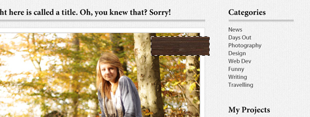
Right-click on the pattern fill layer, and select the “Rasterize layer” option. Using the Dodge and Burn tools, add highlights to the left and top of the shape and shadows to the right and bottom of the shape.
This will add depth and give a slight three-dimensional feel to the shape. The Burn tool will darken the image, whereas the Dodge tool will lighten it.
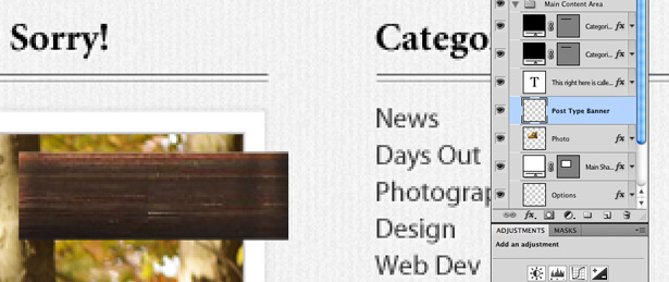
Select the Polygonal Lasso tool. Select a shape similar to the one below, and fill it with a dark brown, selected from your texture.
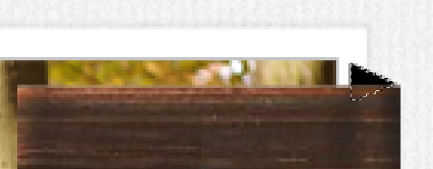
Using the Rectangular Marquee tool, select the areas in the new shape that you don’t need, and hit the Delete key to remove them. You should end up with something similar to this:
Step 25
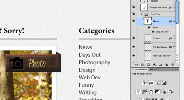
Grab our very own exclusive icon set called “Reflection.” We will use several of these icons in our design.
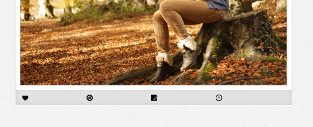
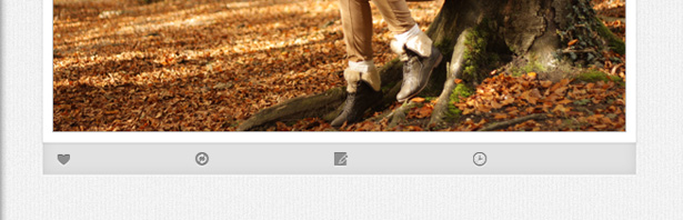
Insert the icons that you need in the document by going to File → Place. I chose the camera, heart, reload, edit and clock icons, which will serve as my photo, like, reblog, notes and time icons in the theme.

Step 26
Select the camera icon and resize it. Position it on the post type bar that we just created. Apply an inner and drop shadow to it, using settings similar to those we have been using throughout this tutorial.
Add some typography to the post type bar. I used the same Reklame Script that we used in the heading and the same blending options that we used for the left sidebar headings.
Step 27
Select the other four icon layers. Right-click, and select “Rasterize layers” to turn them from smart objects to pixel objects.
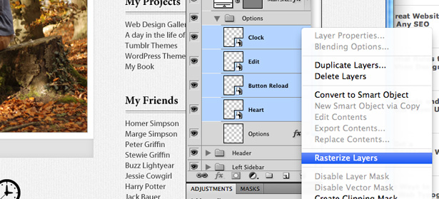
Use the Rectangular Marquee tool to select all of the icon’s reflections.
Hit the Delete key on each of the icon layers to remove its reflection.
Step 28
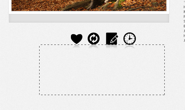
Reselect all four icon layers. Go to Edit → Free Transform and, while holding the Shift key to keep the icons in proportion, reduce their size, and position them on the bar below the main content area that we created earlier.
Space out the icons evenly using the cursor keys.
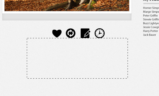
Step 29
Right-click on the heart icon layer, and select “Blending options” from the menu. Change the color to light gray using a color overlay, and apply an inner shadow using the following settings:
Now apply a drop shadow, using these settings:
Once the settings have been applied to the heart icon layer, right-click and select “Copy layer styles.” Reselect all four icons, right-click and select “Paste layer styles.” All of the icons in this bar should now have the same effect.
Step 30
Select the Type tool, and make a small text box next to the heart icon. Type “Like this post.” Apply an inner shadow and drop shadow using settings similar to those we have been using throughout this tutorial.
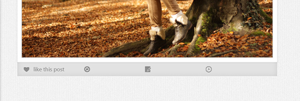
Repeat the previous step for the remaining icons, using the following phrases: “Reblog this post,” “1052 notes” and “Posted on 19/03/2011.” Be sure to copy and paste the same layer style onto each type layer.
You may also want to reposition some of the icons with the new text, making sure that the gap between the text and icons is consistent; because of the different text lengths, this may have changed.
Step 31
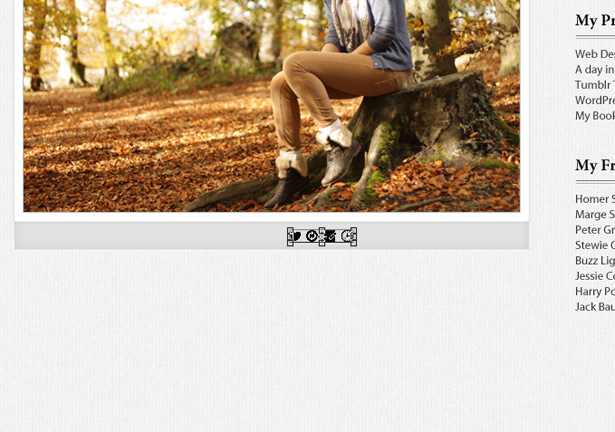
Duplicate all of the layers in the main content area, and position them below the original. Change the title, image and post type rectangle. As mentioned, the more realistic the mock-up, the better.
Step 32
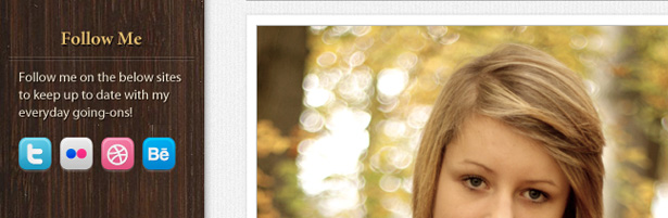
Duplicate the heading and text in the sidebar, and insert some icons. I used the excellent social media icons known as Buddycons, another set exclusive to Webdesigner Depot.
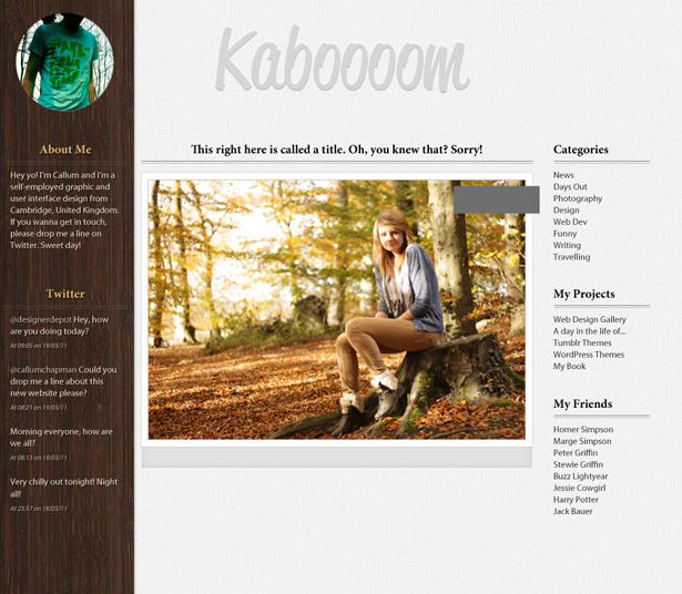
The final product
After some more touch-ups (I removed the jagged ribbon-like cut at the bottom of the sidebar), I’m all done! Here is our final design, ready to be coded or sent off to a developer to do it.
This tutorial was put together exclusively for Webdesigner Depot by Callum Chapman, a freelance user interface designer trading under the name Circlebox Creative. Callum is also working on an inspiration gallery project called Vinspires.
Would you like to see another tutorial on how to slice and code this design into a fully working Tumblr theme?
WDD Staff


Read Next

3 Essential Design Trends, May 2024

How to Write World-Beating Web Content

20 Best New Websites, April 2024

Exciting New Tools for Designers, April 2024

How Web Designers Can Stay Relevant in the Age of AI

14 Top UX Tools for Designers in 2024

What Negative Effects Does a Bad Website Design Have On My Business?

10+ Best Resources & Tools for Web Designers (2024 update)

3 Essential Design Trends, April 2024

How to Plan Your First Successful Website

15 Best New Fonts, March 2024
