
 Good call to action pages (including landing pages and sales pages) are an important part of any website that either sells or asks visitors to sign up for something.
An effective call to action page can increase conversions and signups by a hundred percent or more (sometimes much more). As designers, we should know exactly what makes an effective call to action page, both in terms of actual design and the kinds of content they should ideally include.
Here are more than a dozen do's and don'ts for crafting great call to action pages. In general, they're not difficult to design well, but there are certain guidelines that sometimes run counter to a designer's instincts, or what might work on other kinds of pages.
The main thing to remember is the purpose of a call to action page: to get a visitor to perform a specific action. If you keep that in mind while you're designing, you're likely to have a more successful result.
Good call to action pages (including landing pages and sales pages) are an important part of any website that either sells or asks visitors to sign up for something.
An effective call to action page can increase conversions and signups by a hundred percent or more (sometimes much more). As designers, we should know exactly what makes an effective call to action page, both in terms of actual design and the kinds of content they should ideally include.
Here are more than a dozen do's and don'ts for crafting great call to action pages. In general, they're not difficult to design well, but there are certain guidelines that sometimes run counter to a designer's instincts, or what might work on other kinds of pages.
The main thing to remember is the purpose of a call to action page: to get a visitor to perform a specific action. If you keep that in mind while you're designing, you're likely to have a more successful result.
Do make your page intuitive to use
When a visitor lands on your page, it's vital that they are instantly able to discern certain things: the purpose of the page, what they're expected to do next (and how to do it), and how the page benefits them. Without those things, the page is useless, and your visitor will likely leave before taking the desired action. As soon as you make your user think about what the page's purpose is, or what they're supposed to do next, you're increasing the odds that they'll decide the page isn't what they're looking for, or that it's too much of a hassle. Either of those things will increase your bounce rate.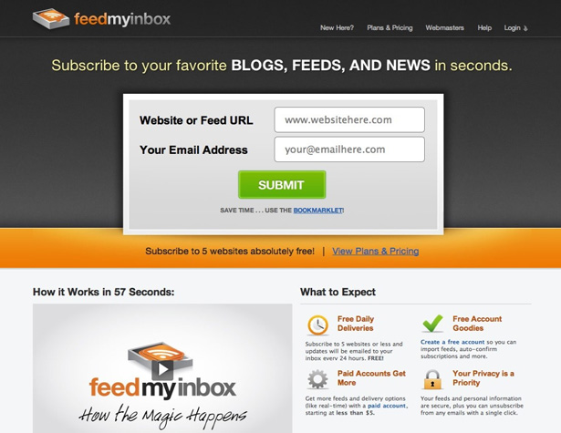
Don't use too many graphics
Your page should include only necessary graphics. Too many graphics only serve to clutter things up, especially when "above the fold" in your page design. In that area, a logo and "hero" image (styled image of the product being sold) are really all that are needed. Beyond those two images, the only other images you'll want to use on your call to action page are those that directly illustrate benefits or features. Icons can be useful, but they can also detract if you're not careful in how you use them and the specific icons you choose to use. Only use them if they help to clarify the meaning of any of your content.
Do minimize your navigation options
The more options you give your visitors to navigate away from your call to action page, the more likely they are to do so. Your main website might have dozens of navigation links, but your call to action page should act like the start of a funnel, and aim to direct visitors in only one direction. If you absolutely must include links to other areas of your website, consider how to minimize the chance visitors will click on those links. For one thing, only include top-level navigation, and consider even leaving some links out entirely. Links should only be included if there's a legitimate reason someone on your call to action page would likely click on those links. If they wouldn't think of it on their own, don't include it.
Do make use of modal windows
For some links or information that visitors might need to know to make a purchasing decision, consider using modal windows rather than redirecting to a new page. Modal windows can serve up whatever information your visitors want, without ever taking them away from the main conversion funnel. Through modal windows and tooltips, you can provide things like FAQs, feature lists, support questions, and more, while still making it easy for your visitor to continue their conversion. Modal windows are an invaluable tool for this purpose, and should be used whenever possible instead of a link that redirects to an entirely new page outside of your conversion funnel.
Don't use red for your call-to-action buttons
In a lot of cultures, especially in the Western world, red means "stop". It's the color of aggression, danger, stop signs, and stop lights. Even in its more positive connotations (passion and love), it's a color of commitment and big steps. So why on earth do designers use it for a button they want visitors to click on? If you're designing a site for a Western audience, avoid red for call to action buttons if at all possible. In some cases it might work, but it's more likely to provoke a negative response, at least subconsciously, in many of your visitors. You'd probably find an increase in conversion rates if you changed the color to something more positive, like blue or green (which is widely considered a very positive color).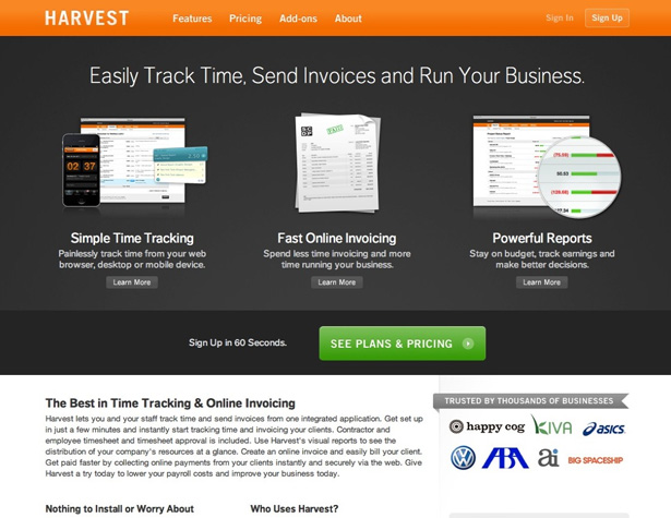
Don't let your call-to-action button get lost
While a big red button isn't going to be the most effective call to action, it's still important to draw attention to your call to action. You can do this through location, negative space around the button, the size of the button, and the contrast with the rest of the page. Some of the most effective call to action buttons are green, while the rest of the site uses little to no green. In effect, creating a button that "clashes", just slightly, with the surrounding page draws attention to that element.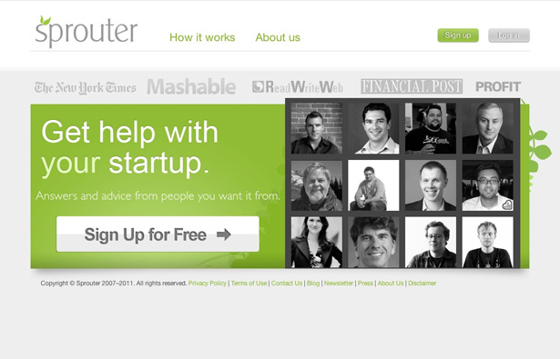
Do only include the information your visitors need
Give your visitors the information they need to take the desired action, and nothing more. The goal is to give as little information as possible while still getting them to convert. This isn't because we want to trick our visitors or customers, but simply because the more information they have to sift through, the more likely something is to interrupt them and take them away from your site. Think in terms of the information your visitors are likely interested in, and then express that in concrete, active terms. Keep your copy brief and to the point. Consider that your visitors are likely busy people, and they want to know right away whether what you're offering them is in line with what they need. If they can't figure that out quickly, they'll likely assume it isn't. A designer's job in all this is to make sure that the copy presented on the page has a distinct hierarchy and is well-organized. It should be scannable, so the visitor can instantly pick out the information they're interested in, without having to read through a bunch of stuff they don't care about.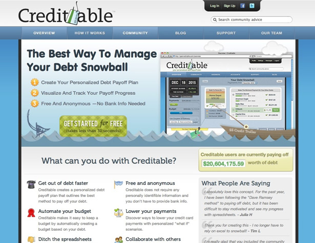
Don't ask for too much information
In creating your signup form, make sure that you only ask for the bare minimum amount of information. If all that's really required is an email address, then only ask for that. If you absolutely need a phone number, make sure you let your customers know why it's necessary. Again, this is all about not giving your visitors an excuse to leave your site. Each additional bit of information you ask them for is putting up a barrier to them completing your form. The more barriers, the less likely they are to finish.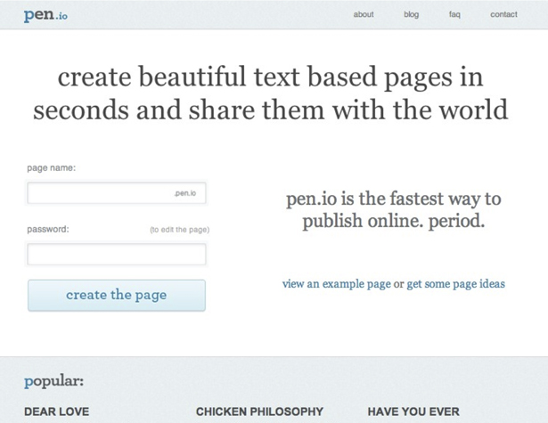
Don't ask for too much commitment
Immediately asking your visitors to purchase something can be a turn-off. Instead, consider using more neutral phrasing for your call to action. Using two or three steps to funnel your visitors in the right direction can be more effective than trying to get them to immediately make a decision. Consider making your primary call to action a button that says something like "See plans and pricing" or "Learn more", rather than "Buy now" or "Sign up". It's less intimidating, and lets visitors know exactly what to expect next.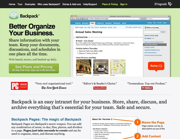
Do keep it simple
Call to action pages have one very specific goal: to get visitors to perform a specific action. Anything that does not directly contribute to that is superfluous. Now, this doesn't mean your page has to be sparse and minimalist, but it does mean that you should take a close look at what really belongs on the page and what doesn't. If it's adding to a visitor's trust in the page, their comprehension of the content, or otherwise positively influencing their visit, then the argument could easily be made that the element is, in fact, necessary.
Don't let your links break
A lot of call to action pages are based on short-term offers. In other words, they have built-in expiration dates. The issue with this is that links coming into the site (including bookmarks) aren't going to change just because your offer ends. Think about how to prevent a broken link when your offer expires. One way is to redirect that offer page to the new offer page (or just keep re-using the same URL for all of your specials). Alternatively, you could redirect to your home page (though only if it's not going to confuse repeat visitors). Or, you could create a post-offer page that talks about what the offer was, how successful it was, or any other pertinent information.
Do direct users to the best options
If you're offering your visitors more than one purchase or sign-up option, it's a good idea to make some kind of indication as to which is the most popular or best option. This can be done in a couple of different ways. The first is to make it the default selection. The second is to use some kind of graphical indication to single out a specific option. The second option is the most popular with things like pricing tables. Be careful not to automatically indicate the most expensive option, though. That can turn off potential purchasers, who feel like you might be trying to sell them more than they actually need. Instead, many companies opt to highlight a good mid-level package.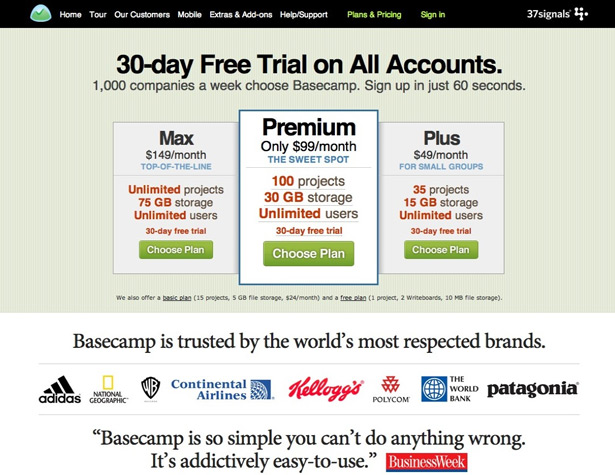
Do make the value clear
Visitors need to know what the value in something is before they purchase or sign up for it. Remember, buyers are interested in how something benefits them, not just the features it has. Tell buyers how your product will help them, rather than just what it does. A strong headline, clear copy, and good organization can all help make the value evident to your visitors. Just make sure that before you start, you know exactly what the value is, so you can convey that to your customers.
Don't forget to test your pages
Too many designers spend all sorts of time creating call to action or landing pages but then never bother to test them to make sure they're working. This leaves conversions on the table, and costs companies money. Take some time to run A/B or multivariate tests before you decide on a final version of your page. Listen to the results of those tests, and put up the page that converts the best, regardless of what your "gut instinct" tells you.More Examples
Zendesk The animation behind the call to action button is a nice touch.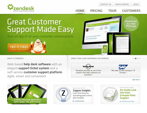 Xero
The combination of a logo and hero image works well, and the rest of the page uses minimal graphics, and only where they improve the customer experience.
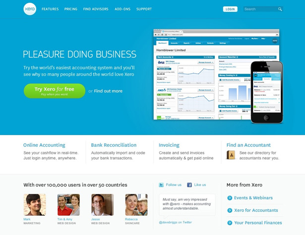
Xero
The combination of a logo and hero image works well, and the rest of the page uses minimal graphics, and only where they improve the customer experience.
 Teambox
A perfect example of the ideal signup form and call to action.
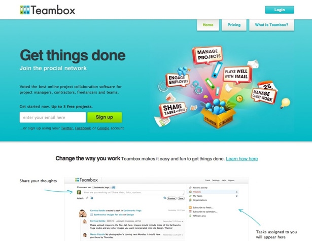
Teambox
A perfect example of the ideal signup form and call to action.
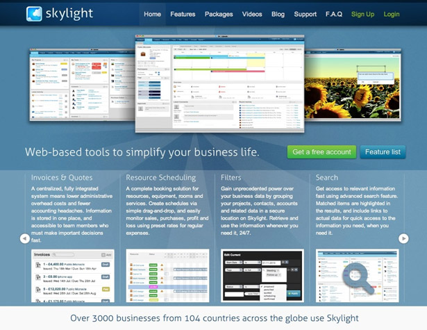
 Skylight
The slider for features and benefits is a nice touch, and the copy here stresses how the features will actually help the user.
Skylight
The slider for features and benefits is a nice touch, and the copy here stresses how the features will actually help the user.
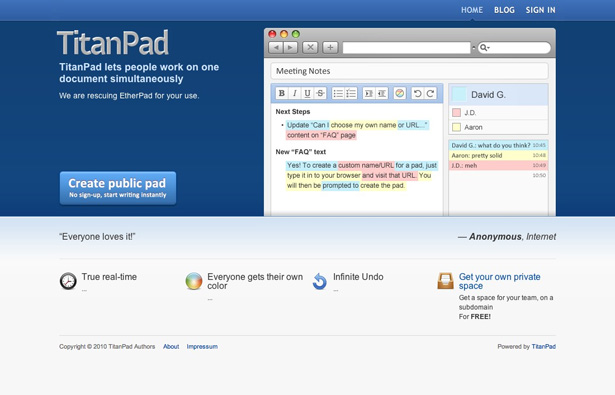
 TitanPad
A great example of simplicity on a call to action page.
TitanPad
A great example of simplicity on a call to action page.
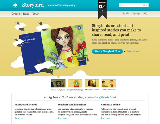
 Storybird
 is smart to use a button for their main call to action, and text links for everything else.
Storybird
Storybird is smart to use a button for their main call to action, and text links for everything else.
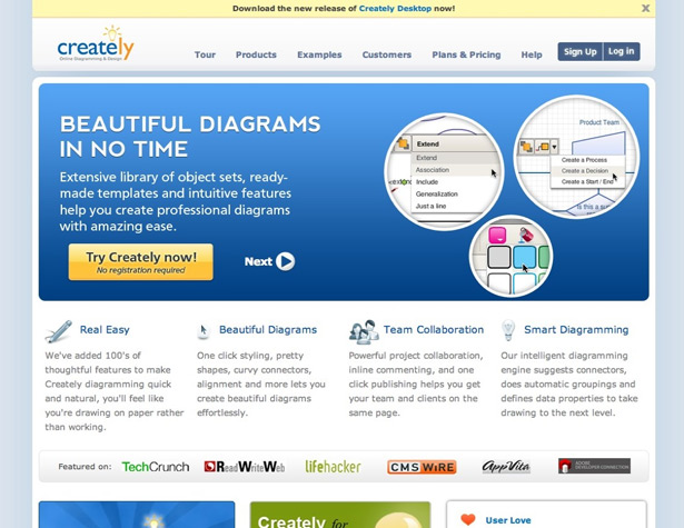
 Creately
Slideshows are a great way to provide more information without adding clutter.
Creately
Slideshows are a great way to provide more information without adding clutter.
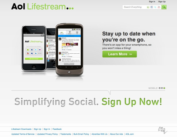
 AOL Lifestream
Another example of a slideshow.
AOL Lifestream
Another example of a slideshow.
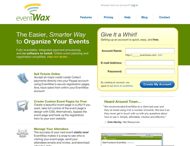
 EventWax
Another minimalist signup form.
EventWax
Another minimalist signup form.
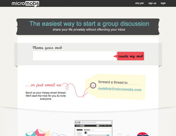
 MicroMobs
This page gives a simple way to sign up, along with an alternative method, all in easy-to-understand copy that only takes a few seconds to read.
MicroMobs
This page gives a simple way to sign up, along with an alternative method, all in easy-to-understand copy that only takes a few seconds to read.
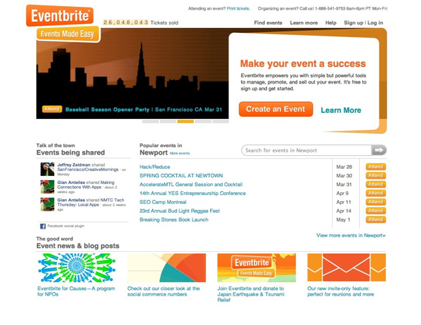
 Eventbrite
The bright orange call to action button really stands out against the white background.
Eventbrite
The bright orange call to action button really stands out against the white background.
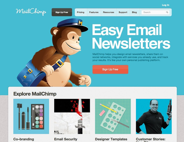
 MailChimp
The red call to action button stands out nicely against the blue background, but it still might be lowering conversion rates.
MailChimp
The red call to action button stands out nicely against the blue background, but it still might be lowering conversion rates.
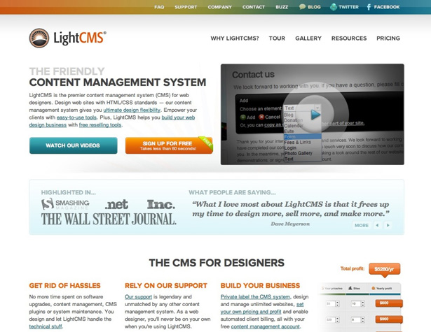
 LightCMS
There could be more contrast between the two call to action buttons to make the signup button more prominent, but the overall page layout and design is great.
LightCMS
There could be more contrast between the two call to action buttons to make the signup button more prominent, but the overall page layout and design is great.
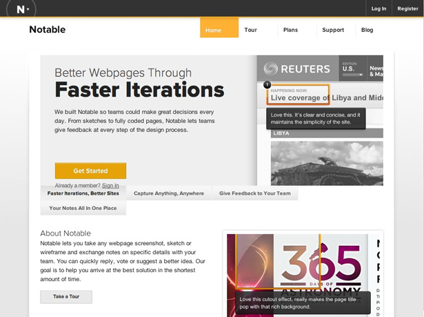
 Notable
The minimalist color scheme of the Notable page makes the call to action button stand out, while putting the focus on the content.
Notable
The minimalist color scheme of the Notable page makes the call to action button stand out, while putting the focus on the content.
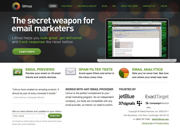
 Litmus
A low-commitment call to action button is less intimidating to new visitors.
Litmus
A low-commitment call to action button is less intimidating to new visitors.
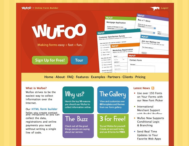
 Wufoo
Putting the call to action above the navigation is a smart way to get visitors to click there first.
Wufoo
Putting the call to action above the navigation is a smart way to get visitors to click there first.
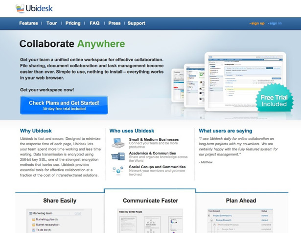
 Ubidesk
Emphasizing the free trial is smart.
Ubidesk
Emphasizing the free trial is smart.
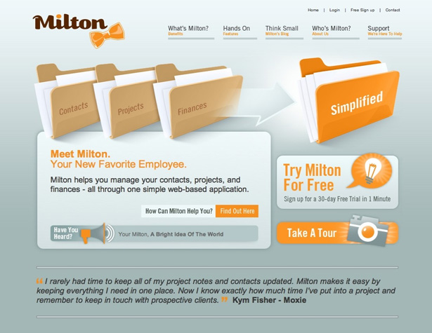
 Milton
A nice design, but the call to action button almost gets lost.
Milton
A nice design, but the call to action button almost gets lost.
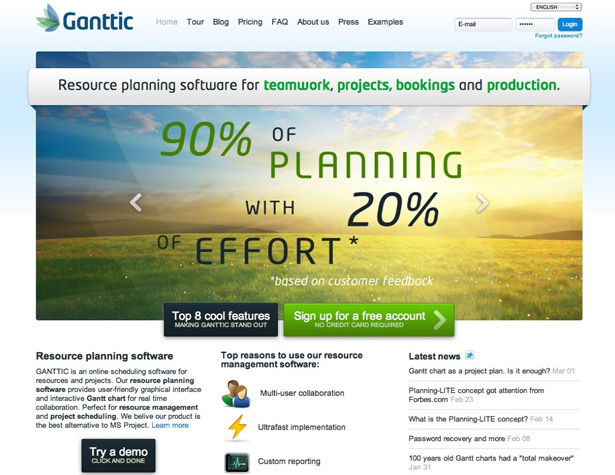
 Ganttic
A large graphic and slideshow at the top draws visitor attention.
Ganttic
A large graphic and slideshow at the top draws visitor attention.
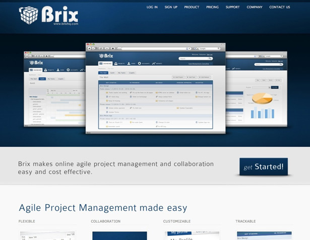
 Brix
A nice, simple layout, but the call to action button could be more prominent.
Brix
A nice, simple layout, but the call to action button could be more prominent.
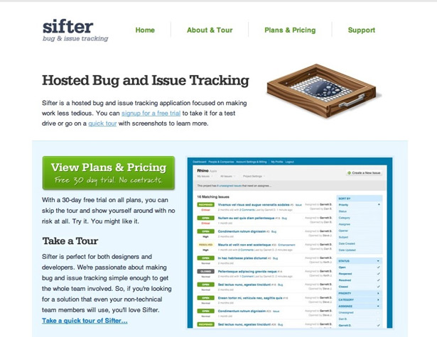
 Sifter
One of the better minimalist pages out there, with a bold call to action, clear value, and simple layout.
Sifter
One of the better minimalist pages out there, with a bold call to action, clear value, and simple layout.
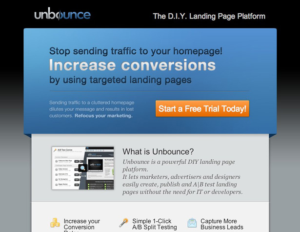
 Unbounce
The orange call to action button stands out nicely against the blue and gray background.
Unbounce
The orange call to action button stands out nicely against the blue and gray background.
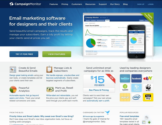
 Campaign Monitor
A nice layout and design, but the "try it for free" button (the real call to action) is less prominent than the green "view features" button.
Campaign Monitor
A nice layout and design, but the "try it for free" button (the real call to action) is less prominent than the green "view features" button.
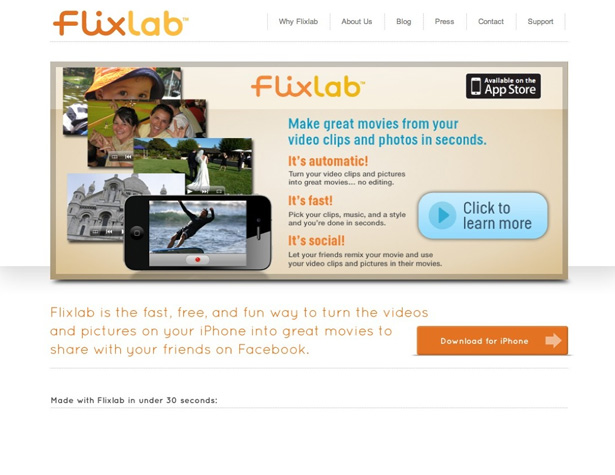
 Flixlab
The Flixlab page has a slightly different call to action setup, as most people browsing the website are going to want more information (and will use the App Store to actually download the app).
Flixlab
The Flixlab page has a slightly different call to action setup, as most people browsing the website are going to want more information (and will use the App Store to actually download the app).
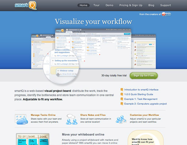
 SmartQ
Including the fact that it's free right on the signup button lowers the commitment level for visitors.
SmartQ
Including the fact that it's free right on the signup button lowers the commitment level for visitors.
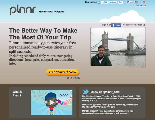
 Plnnr
A clear value statement and contrasting call to action button are both great design choices.
Plnnr
A clear value statement and contrasting call to action button are both great design choices.
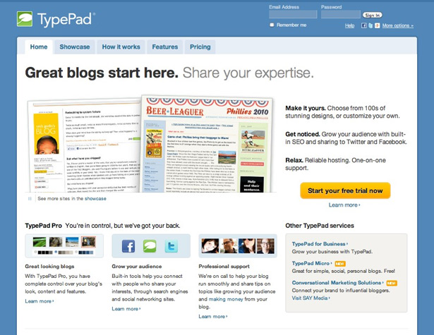
 TypePad
 offers a quick rundown of their benefits on the home page.
TypePad
TypePad offers a quick rundown of their benefits on the home page.
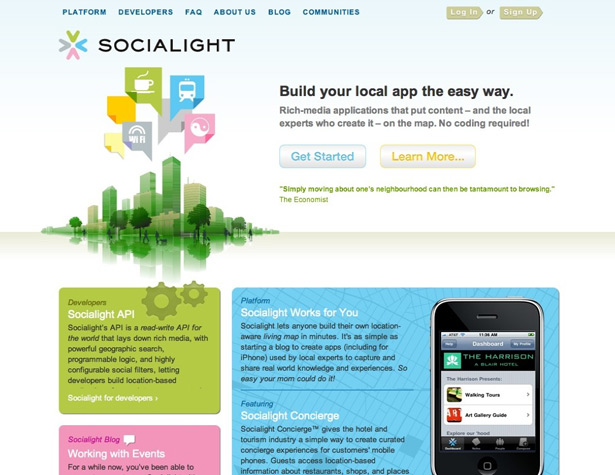
 Socialight
Another site with a clear value statement, and call to action buttons that stand out.
Socialight
Another site with a clear value statement, and call to action buttons that stand out.
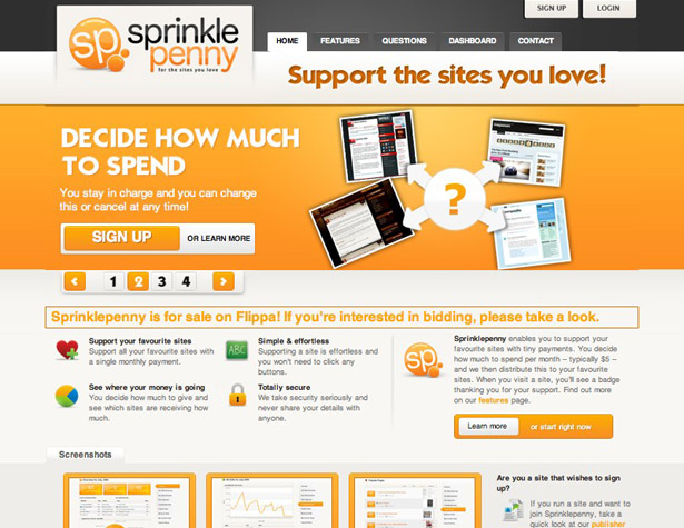
 Sprinklepenny
Another site with a content slider.
Sprinklepenny
Another site with a content slider.
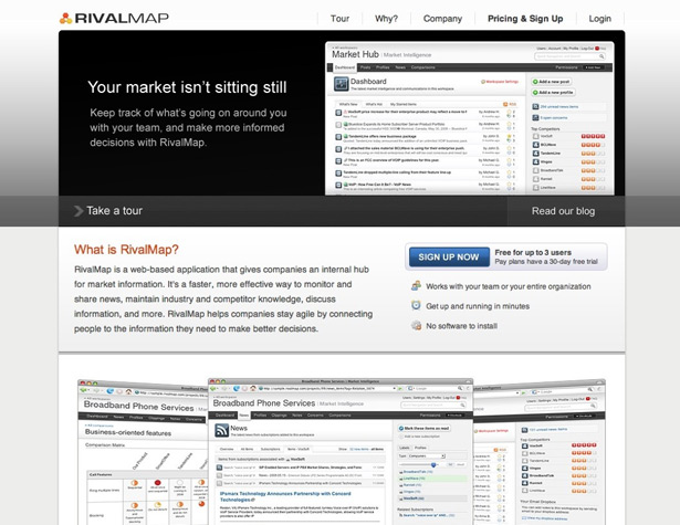
 RivalMap
A simple site with benefits clearly indicated.
RivalMap
A simple site with benefits clearly indicated.
 Seen a great call to action page out there? Or have your own tip for creating great pages? Share it in the comments!


Read Next

3 Essential Design Trends, May 2024
Integrated navigation elements, interactive typography, and digital overprints are three website design trends making…

20 Best New Websites, April 2024
Welcome to our sites of the month for April. With some websites, the details make all the difference, while in others,…

Exciting New Tools for Designers, April 2024
Welcome to our April tools collection. There are no practical jokes here, just practical gadgets, services, and apps to…

14 Top UX Tools for Designers in 2024
User Experience (UX) is one of the most important fields of design, so it should come as no surprise that there are a…
By Simon Sterne

What Negative Effects Does a Bad Website Design Have On My Business?
Consumer expectations for a responsive, immersive, and visually appealing website experience have never been higher. In…

10+ Best Resources & Tools for Web Designers (2024 update)
Is searching for the best web design tools to suit your needs akin to having a recurring bad dream? Does each…
By WDD Staff

3 Essential Design Trends, April 2024
Ready to jump into some amazing new design ideas for Spring? Our roundup has everything from UX to color trends…

How to Plan Your First Successful Website
Planning a new website can be exciting and — if you’re anything like me — a little daunting. Whether you’re an…
By Simon Sterne

15 Best New Fonts, March 2024
Welcome to March’s edition of our roundup of the best new fonts for designers. This month’s compilation includes…
By Ben Moss

LimeWire Developer APIs Herald a New Era of AI Integration
Generative AI is a fascinating technology. Far from the design killer some people feared, it is an empowering and…
By WDD Staff

20 Best New Websites, March 2024
Welcome to our pick of sites for March. This month’s collection tends towards the simple and clean, which goes to show…

Exciting New Tools for Designers, March 2024
The fast-paced world of design never stops turning, and staying ahead of the curve is essential for creatives. As…