 We've talked a lot about responsive design here on Webdesigner Depot, and shared a lot of valuable resources. Today we're sharing another valuable resource: at the end of this article are details for getting a discount on Chris Converse's responsive design course on MightyDeals.
CSS3 media queries allow us to dynamically alter the design and layout of a web page in order to deliver an optimal user experience from a single set of HTML and CSS markup.
The techniques in this article explain how we can leverage this powerful capability of CSS to also change imagery, alter the navigation on hand-held devices, and set up default CSS for compatibility older browsers.
Creating different images
When altering your design for different devices, consider creating multiple versions of your graphics. This can greatly affect the speed at which your design loads on smaller screens, and gives you the opportunity to customize each version of your graphic.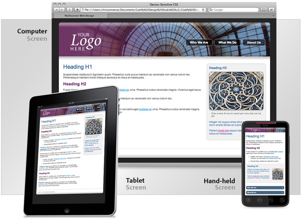 The example below shows the different sizing, and cropping choices, in addition to the varying amounts of compression that are applied to each set of images. Since many small screen devices have higher resolution screens, the extra compression is unnoticeable, and the file size is significantly smaller.
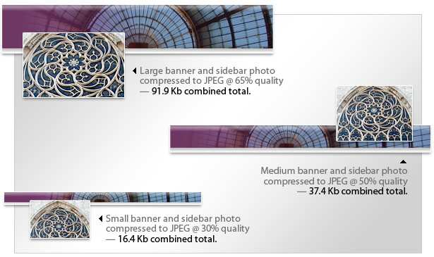 Take advantage of the fact you can switch your images dynamically, and customize the sizing and cropping of your images for each screen size. In the example above, the sidebar photo for the large screen size shows more detail of the stained glass window, whereas the smaller images show more context of the window.
Assign images to HTML elements
Images are typically added to a web page using the image tag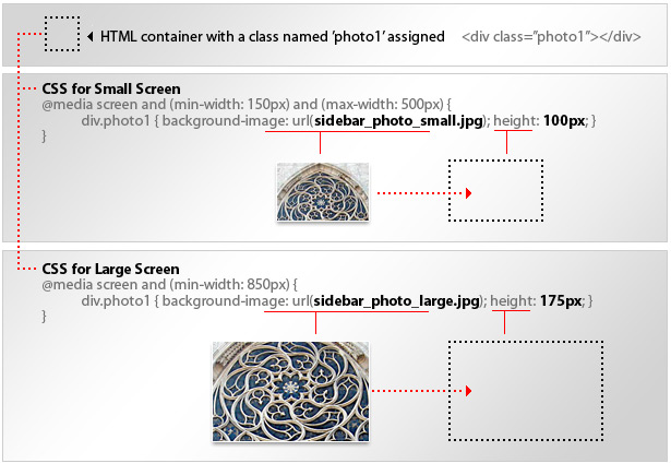 Assigning images to an element's background allows us to change the referenced graphic file, in addition to being able to alter the dimensions and position properties of the container.
Reposition the global navigation on hand-held devices
When viewing web pages on larger screens, the expected location of the navigation is at the top, or left side, of the screen. Considering larger screens allow us to see content in addition to the navigation, this user experience does not hinder the user from getting the content. On hand-held devices, however, the navigation can take up all the screen real estate if it appears at the top. This can also lead the user to believe they must make another navigation choice instead of realizing the content is further below on the page. For hand-held devices, global navigation typically appears after the content, so a user can swipe upward through the content, then be presented with additional navigation options. The challenge here is to reposition the navigation with CSS without needing to alter the HTML.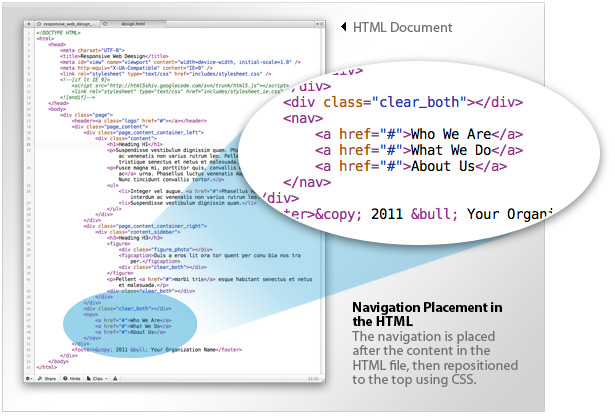 The figure above shows that the navigation markup is placed after the main content markup. This allows us to keep the natural flow of content for hand-held devices, and reposition the navigation on larger screens. This is achieved by setting absolute positioning properties on the navigation container when viewed on larger screens, and removing the position properties on small screens.
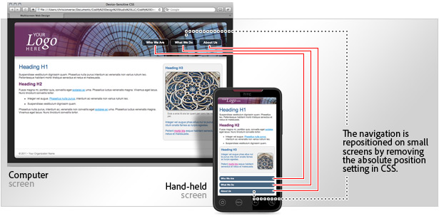 In addition to changing the position of the navigation, we can also change the style as well. Standard anchor tags are restyled on small screens to reflect the look of mobile buttons commonly used on hand-held devices. The figure below shows the dramatic transformation our CSS file can have on our navigation links.

Use large screen CSS as default for older browsers
In order to keep backwards compatibility with older browsers, keep the large screen rules outside of any media queries. This will ensure earlier versions of browsers that lack support for media queries can still "see" a set of CSS rules.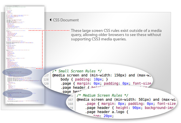 When the media query conditions are met by your user's screen size, the rules defined within the query will override the rules outside of any queries for large screen devices. This will give you some built-in backwards compatibility for browsers that support CSS-based layouts, but not CSS3 media queries.
Learn to create a responsive web design
Follow along with Chris Converse as he teaches you to create the above web design step-by-step. The regular price for the Creating Responsive Web Design course is $150, but for a limited time you can get the course via Mighty Deals for only $39!Chris Converse
Chris Converse is a designer, photographer, and web developer at Cōdify Design Studio. Chris is a regular featured speaker at Adobe MAX, HOW Design and Interactive Conferences, AIGA, and Mogo Media events. Find his video workbooks Bring Your Web Design to Life and Creating Interactive Documents on your favorite bookstore's website, follow him on Twitter and Facebook.
Read Next
20 Best New Websites, April 2024
Welcome to our sites of the month for April. With some websites, the details make all the difference, while in others,…
Exciting New Tools for Designers, April 2024
Welcome to our April tools collection. There are no practical jokes here, just practical gadgets, services, and apps to…
14 Top UX Tools for Designers in 2024
User Experience (UX) is one of the most important fields of design, so it should come as no surprise that there are a…
By Simon Sterne
What Negative Effects Does a Bad Website Design Have On My Business?
Consumer expectations for a responsive, immersive, and visually appealing website experience have never been higher. In…
10+ Best Resources & Tools for Web Designers (2024 update)
Is searching for the best web design tools to suit your needs akin to having a recurring bad dream? Does each…
By WDD Staff
3 Essential Design Trends, April 2024
Ready to jump into some amazing new design ideas for Spring? Our roundup has everything from UX to color trends…
How to Plan Your First Successful Website
Planning a new website can be exciting and — if you’re anything like me — a little daunting. Whether you’re an…
By Simon Sterne
15 Best New Fonts, March 2024
Welcome to March’s edition of our roundup of the best new fonts for designers. This month’s compilation includes…
By Ben Moss
LimeWire Developer APIs Herald a New Era of AI Integration
Generative AI is a fascinating technology. Far from the design killer some people feared, it is an empowering and…
By WDD Staff
20 Best New Websites, March 2024
Welcome to our pick of sites for March. This month’s collection tends towards the simple and clean, which goes to show…
Exciting New Tools for Designers, March 2024
The fast-paced world of design never stops turning, and staying ahead of the curve is essential for creatives. As…
Web Tech Trends to Watch in 2024 and Beyond
It hardly seems possible given the radical transformations we’ve seen over the last few decades, but the web design…
By Louise North


