UI is the saddle, the stirrups, and the reins.
UX is the feeling you get being able to ride the horse, and rope your cattle.
At least that's what they used to say in the olden days. Rather, that is what I wished they'd say. Despite how simple that may have sounded, there are many complications and misconceptions when it comes to the differences between UI and UX design, and they cause the design community to go into quite a stir whenever they are brought up.
An interesting note to that is that I’ve found the people who work at jobs with titles such as Interaction Designer to get paid more simply because they know and act on the differences between those two fields (typically harnessing a little of both). And in fact, I think there are more differences in the people behind these roles than the ideas behind UI and UX design.
Let's jump right into a standardized definition that we will try to metaphorically elaborate on. Defined very simply a User Interface design is the part of the product that faces the user when he looks at the site, and the User Experience is how they feel when they look at the site, aka the broad scope.
More pointedly, good user experience is the art of a drill going through wood, or a surfboard gliding through water effortlessly. The feelings those give you is unparalleled because they just work, simple as that. Though, in contrast, the shape of that board that helps it make those turns on the wave is good UI, and the surfwax on the top so you don’t slip off is also good UI. In short, the ENTIRE package is what makes it good UX, whereas good UI is always a very important inner-element of that.
Before continuing, I'd like to just say that this article is based on my opinion alone and in no way is trying to make large grandiose statements on the way anything should be. I will be trying to educate readers about various elements of each field, based on my own past experiences but I am, again, in no way trying to impede on your personal views should they differ from those stated in this article. All the metaphors are things that I think relate, and if you think they don't feel free to let me know in the comments but be sure to give your own as well. It always helps the reader if they have multiple sources giving input about a topic.
Let’s break it down

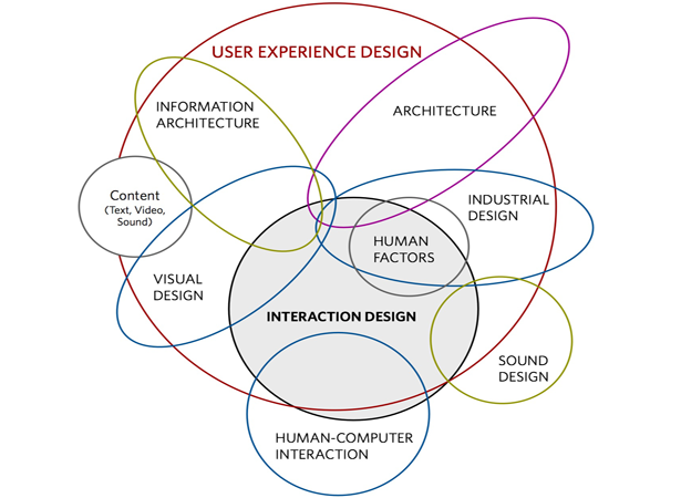
Dan Saffer was kind enough to let us use his image. Thanks, Dan!
Generalities
Just look at that image; that is such a glorious illustration of exactly how much is incorporated in User Experience design. Now you can tell why the people in these roles have to be able to think critically and creatively on an almost constant basis. Though, don't be thrown off if you are a bit confused thus-far, because we have indeed mainly related UX and UI design to physical products like the surfboard, or animals like the horse.
The reason for that is, this is obviously a bit of a confusing topic, and it is mainly that way because it is heavily fractured. That is, little pieces of one make up the larger view of the other, and that can be sort of confusing or challenging to a lot of people. But even designers have a hard time with it, so don't feel let down.
Let's imagine that we convert those ideas we already spoke about into the web or mobile spaces. The UI would be a series of buttons and how they look, and the UX would say that button should physically press down when you click it. The responsiveness of being clicked, and then having the button pressed down on a 2D website is so satisfying after all, how could a designer not do it? Well, it happens all the time, and I think we get spoiled by the ones that do.
For instance, I have been to tons of sites that have nice big beautiful buttons with shadows under them like they are just itching to be clicked on, and then when you do, they don't inset into the page. No responsive animation, and all I know is that it makes me feel disappointed in the design or designer of that product.
Now, I don't believe that is because I am some sort of weird button elitist, but instead I think it is because that is how powerful good user experience is. I believe that when we come into contact with user experience that is so over the top, and so amazing (as the buttons that inset are, for some reason) then we literally feel like all things should be that awesome. Of course, I wouldn't judge an entire product because some buttons don't press down, but that is a big part of how I feel in that given moment going to press that button.
There are tons of outside factors that influence how we feel on a website at any given time, and we need to do all we can to make sure that website presents itself in such a way that we curb all those outside influences into not being as apparent as the inner-influences of our UX is. In general, always think of UX as an umbrella that houses all the points that make up your product's experience, in the now, in the future (though that's some strategy), and in the past.
It has been argued time and time again, based on all this talk regarding UX and Interaction, is how someone feels on a 2D website actually important at all? Well, if you are trying to get conversions it is; if you are trying to get people to be fascinated by your product or blog it is; if you are trying to get people to understand you it is; if you are trying to get people to listen to you it is; if you are trying to get people to spread your message it is; if you are trying to get people to do pretty much anything then yes, it is very important.
I'm sure you can tell that yourselves, but the reason we often have this seemingly unnecessary debate is that designers who are in one field really don't know how to define themselves. And for good reason. Designers often end up doing a number of different jobs within the design realm, and that is why it is actually even more important to find someone who knows exactly what they do best and how they fit into the team - unless of course you are looking for a jack of all trades.
UX: designing for emotion

Outside of the design industry people get really emotionally about design. Which makes it a no-brainer when you think about how important a designer's job really is. They do more than just put a nice pretty ambiance on things. They can literally create an entire emotion around your product, and should.
The designer is one of the most important people on your team, and should be treated as such. As a related example, Mark Zuckerburg keeps the desks of the Facebook lead designers multiple feet from his desk when he is at work. Engineers are important, but they are what the users don't see. Their effects are implicit, like site speed and database architecture, but a designer is very much expressing himself all over your product — and there is something to be said for that.
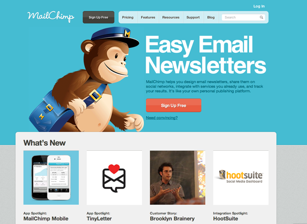
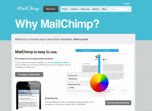
One of the people a lot of designers look up to is Aaron Walters who does various talks and books, but equally important is his job as lead UX Designer at MailChimp. Now, talk about an amazing product. Without even knowing anything about him or what he speaks or writes about, just head on over to the site or look at the image above, and tell me if that doesn't evoke an emotionally response from you. Well, I know it does so we can just cut to the chase.
He is all about what is called Designing for Emotion, and he talks about it quite often. You want your design to center around the user's feelings and emotions when he arrives on your site. Not just what he is feeling externally (more on that later), but what emotions you want your site to convey to him and/or to make him feel.
This is very apparent when you use MailChimp's service, or when just navigating around their product pages. You will immediately see that it is one of the most well-designed websites out there, and the simplicity of creating a rather complex form is astounding. They walk you through everything with guides, in a colorful and step by step manner, and you're never left alone out in the dark. They completely round off the product by sending you examples and tips on how to improve your forms or form behavior, or how to capture other areas of the product for best use after you are using it. And they don't just do it by giving you huge modal windows that block your exit from the site when you log in, but instead they give you beautiful reminders throughout.
Because remember, it's all important. The entire product is UX, an individual section is UI. The joy of throwing a baseball is user experience, the stitching and spherical shape is UI.
UX and UI: within a team
In my opinion, when working on a web or mobile project a UX designer is effectively a creative director. Though, often times in a more formal team structure the creative director is someone who works closely with the founding team to identify the creative vision they have and then he squeezes it through his creative direction and passes it on down to the UX designer who then makes that happen on the site with help from and while leading the UI team.
I think that in a scrum development environment though, the creative director can just be replaced with the UX lead, if he is okay with that sort of responsibility. Simply because they do much of the same thing, and have much of the same expertise from my POV. Though, again, that is just my opinion.
In reality, you should fit them in wherever you feel they should fit on a project, but ideally they would not be a joint UI/UX person, unless they were exceptionally talented. I would love to know what the commenters think about this particularly. A lot of you reading are probably designers or aspiring designers, do you bill yourself as both a UX and UI designer? Or do you think there should be separation between the two?
As far as the actual project goes, the UX designer should be there from inception to completion. He is critical in the project's life cycle. Projects without them often turn out like Google Video, with no emotion.
Alternatively, projects that have a UX person/team on call for the entirety turn out like ZenDesk, just absolutely beautiful and end up being a delight to use. Side-note: go to ZenDesk's site and click the "Try it free" button on the top right. That is how a button should interact. Also as another side-note, apparently I'm obsessed with buttons.
Another thing to remember is that UI is effectively a tool that you will be using, and the people working on it are as powerful as a drill or hammer are to a construction job. Always remember to choose the appropriate designers for the job, even if you believe UX to be more important. You should keep in mind that this is a fractal enterprise and that the susceptibility of one branch effects all the others.
Basecamp is another example of great UX, and in fact they have a great engineering team that has a large focus on UX as well. Typically, engineers don't quite know how to do great UX, *cough* Google *cough*, but in this case 37signals' engineering team along with their splendid designers do an absolutely amazing job of coordinating ideas to create just the most simplistic and awesome project collaboration applications. The new Basecamp has got to be one of the least resistant applications I've ever used (you get up and going so fast).
UX: what it means for your users, and you

We've touched on this a bit throughout the article thus-far, but it is important enough to dedicate it's own subsection to. Simply and straight-forwardly put, if you don't have emotion on your site your readers will become emotionless and indifferent towards it. The more your readers get from the feeling of your site or product, the more they are engaged on a cerebral level and the more they'll want to use it, to comeback, to tell friends, or just overly delight you with compliments about your services/product/or site.
The thing is though, it is often a catch-22 scenario. We are building in pixels, gradients, shine, and artificial depth, and that can often cause us to become complacent when it comes to having a "feeling" toward our products. The software-as-a-service market really helped improve this, and before then especially it was really hit or miss.
Now though, it is starting to become more jarring when a service doesn't help you feel something for it. That's the catch-22: even though this is a flat pixel filled world we work in where we never get to physically touch what we build (ever), we still should feel that it is a part of us and an extension of ourselves. Designers put that much emotion into what they do every day, well the good ones do, and it really is apparent. This is going to become especially important as the web continues to grow and mature over the next few years.
In fact, I can see a web where all sites and products are designed in such a delightful and emotional way that they literally can become the magazines of years past. Web 2.0 seemed to be all about shine on logos, and social interaction online as an experiment — but the future of the web is much more important and critical. In a few years the maturity of the web will demand nothing but maturity from all products and sites that live on it, and rightfully so. This will cut out the sub-par sites or products very fast. You will pick your company's intranet, your to-do list, your form creator, and whatever other tools you need based on the feelings they give you and thereby also the functionality therein.
So, wait a minute, if it's all about feeling doesn't that lead away from functionality? Should I have related those two things? In my opinion, yes I should have, because they are incredibly co-dependent. As the maturity of the web increases, and thereby the robust maturity of product design increases, so to does the maturity of product functionality increase. It is an organic and interdependent umbrella effect.
None of us want to hit our heads on the roof, so what if that roof was non-existent? What if it was up at 10,000 feet? Well, you could do anything - in the world of pixels where gravity doesn't exist. Relating that all back to UX vs UI designers is really important, because they will be the pushers of this mature web.
Yes, of course the protocols, database architecture, and engineers will as well, but ultimately the people that create things that are so unbelievably mature looking, well, they are the people that attract worldwide customers.
And this isn't just about images or design and CSS, it is also about copywriting. Take a look at the copy in the MailChimp image above. It is simple, clean, sleek, and has no BS involved. That is how copy should be, and will be, when we require it to be so. You could be one of those people that helps us along our way, by requiring it to be so.
UI: the line and its curves
UI Is a fascinating concept, and one that has really revolutionized the web as we've known it in the web 2.0 days. As you could no doubt tell, I have done a lot of praising of UX over the course of this article, but I have to say that without the core tools of UI it wouldn't really mean anything. Remember how fractals work from science class? How could a crystal be formed without the first center section having been formed first?
When everyone decided that true beauty online meant a lot, it really took a lot of us by the reigns (horses again, I know), but it actually did. We all took notice, we all started to become obsessed with these products that were designed with these amazing little UI facets that sort of have become overly worn by now. jQuery has had an effect, responsive media queries in CSS have had an effect, so too has the actual design.
I think one of the things about us as people is that we really don't take things seriously until they are fully polished. And yeah, this could relate to the previous paragraph about the maturity of the web but it also relates even more to how UI has evolved.
For instance, we never started to take the internet as a communication method until we got professional email and IM clients. We never started to take cars seriously until Henry Ford came up with the production line. We never started to take ice cream seriously until Cold Stone. Okay, maybe the last one was a stretch — but you get the point.
We relish maturity, and when it comes to UI nothing really has grown the user facing (front-end) web more to what it is today, presently, than UI design has. We are now taking the web more seriously than we ever have, and that will no doubt just continue to increase. Consider how much we do now online. We manage our tasks, meetings, watch video, interact via networking, gaming, and literally do anything we can online. Not only is it better on natural resources, it is one of the more fun ways to do things. Ask yourself why it's so fun, and the answer you will invariably get back is that it is often so beautiful.
We are limited in our day to day offline lives with the resources we have like wood, gas, oil, paper, etc. — but online we are completely free. We are only limited by the creativity of designers and programmers. We are moving into a new wave of online access, and the things we do therein and I think we should give a collective "Thank you" to UI designers for that (and engineers too! I am not leaving you out, but this article is about designers after all).
UI and UX: the proof is in the pudding

I am not one of those who enjoys continuing the bantering that goes on about these two fields, but in reality the terms are completely different. Do not let a job posting, or anyone tell you that UI is equal to UX.
The image above is what I would consider UI work, but I don't get any sort of feeling from being there or looking at it. Though, it has nice polished UI, the reason I don't get a feeling is because it is a facet of UX, but it isn’t UX in totality. UX is the totality of the feeling I get from seeing my accounts all in one place on Mint. The UI is one of the graphs on the page.
The UI elements of a page seem to have been down trotted throughout most of this article, but please let me restate that is not the impression I am trying to give off. I love UI elements, and once again it is super important that we realize that UI is one very important part of UX. UI can make your site look beautiful, think ZenDesk, and yet without UX it can be like Digg is without the community. It is emotionless. If there is no community behind UI without UX to re-state the emotion, then there is literally not going to be any. Yes, sometimes good UI guys are so good that they inadvertently create UX without knowing it, but they are few and far between.
Bringing it all together
Really though, talking about these two fields in isolation is great for a bit of mental acumen, but they are completely related when it comes to working on them. They are fields that should never be separated in the work-place, and they are fields where the two creatives who perform these jobs shouldn't work with different directives.
There is an interdependent aspect to a lot of what we do in the design world, but this really isn't one of those times. Similarly to how a Creative Director or Scrum Master doesn't want to leave his team to run on their own, the UI and UX parties should never run on their own without coordination from the other. I firmly believe in that from past experience.
In summation I think that UI and UX is a topic of much debate, and one that honestly is true to form when it comes to a debate. It enhances the knowledge of both parties in the debate on both topics that are subject to it. It is really an amazing situational topic, and one that you should discuss with your designer friends if you can or when you get a chance. I know I've had many a dinner conversation over this exactly, and it can turn out to be quite heated all simply because one believes another's metaphors aren't accurately displaying what the difference is (hence why I put the disclaimer at the top of the article).


