3 critical design mistakes that cost me tens of thousands of dollars

 Running an ecommerce store is a lot different than running a blog or an affiliate marketing site. The sole purpose of an online store is to make money. As a result, each and every design decision is critical when it comes to converting customers into dollars.
And speaking from experience, even the smallest of slip ups can lead to a drastic loss in sales.
Today, I'm going to reveal to you 3 boneheaded design mistakes that cost my online store tens of thousands of dollars in revenue over a short period of time.
If you are planning on starting an ecommerce store, read carefully so you don't make the same mistakes that I did starting out.
Plug the holes in your checkout funnel
The first mistake that I want to talk about is a fairly subtle one that I noticed while analyzing the checkout process for our online store.
Most shopping carts have a checkout funnel that is between 1-6 steps long. While there are pros and cons to having a single vs multi-page checkout, the checkout process for our store consists of 4 distinct pages: billing information, shipping information, payment information and a confirmation screen.
Looking at the numbers, what was strange about our conversion funnel was that the final step (the confirmation step) was only converting at around 87%. Why is this odd? Normally, once a customer has entered in their billing information, shipping information and credit card information, the sale should be more or less a done deal.
Losing a customer at such an advanced stage of the checkout process should be an extremely rare occurrence.

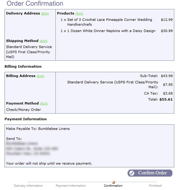
Here's a picture of our confirmation screen. Can you see what's wrong?
The first problem is the page heading. The title says "Order Confirmation" which implies that the order has been completed already.
After contacting some of our abandoned customers directly, we learned that most of them thought that they had already completed the order by the time they had reached this step.
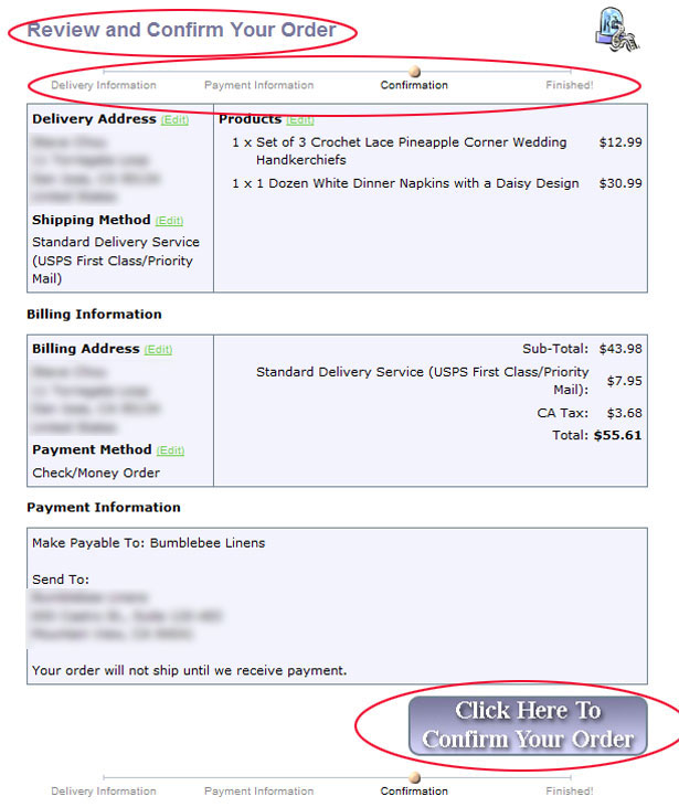
So to rectify this problem, we made 3 changes to our checkout funnel:
- We changed the title of the page to "Review and Confirm Your Order"
- We added a progress meter. Now, there's a clear indication of what point the customer is in during the entire checkout process
- We made the confirm button significantly bigger and more clickable so that it wouldn't go unnoticed

Once all these changes were made, the conversion rate for this last stage of the funnel immediately jumped to 98%+
Be careful with pagination
The second big mistake that cost our store a lot of money was caused by an ingenious idea that I came up with in order to reorganize the products on our website.
Because the number of products in our online store was growing rapidly, I decided to separate the products for some of our larger categories across many pages instead of one long display. Here was my reasoning for making the change:
- When you display too many products on a single page, it may overwhelm the customer with too many choices. By splitting the products across multiple pages, a customer can gradually go through each page at their own pace
- By splitting the categories across multiple pages, you can reduce the page load times which makes for a better shopping experience
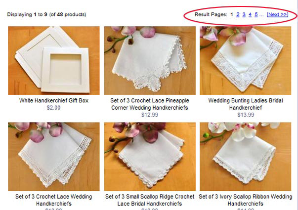
Here's what our page looked like after the change. While my reasoning seemed fundamentally sound, the bounce rate for this page ended up going up by over 30%. Time-on-site metrics for this page shrank dramatically as did click-through rates.

Can you spot what went wrong?
After looking at my analytics and using a tool called CrazyEgg, I was able to figure out why the page underperformed:
- The font of the page numbers was way too small, so people did not know where to click to see more products. Even after increasing the size of these fonts, people still weren't clicking
- People generally don't click on page numbers. Customers have a tendency to scroll down rather than click for more options
So what does this mean? Everytime you force your customer to think or click, you have a greater chance of losing them. A better way to deal with "too many products" on a page is to load them dynamically using AJAX or by simply listing all of your products on the same page.
Ultimately, we ended up removing pagination altogether, allowing the products to flow down the page freely and our metrics immediately improved.
Improve your on-site search engine
The final mistake that I made with my online store was the most egregious one; our onsite search engine was horrible.
Here's the reality. Most online store owners focus so much on optimizing their website for search engines like Google, Yahoo and Bing that they often completely neglect perhaps the most important search engine of all, the search engine on their own site!
Most visitors that land on your ecommerce website fall into 3 categories:
The browsers - these visitors like to browse through your site and check out your entire line of inventory. They may not necessarily have a specific product in mind, but they are willing to surf around and find something they like.
The focused shopper - these visitors are looking for a very specific item. Chances are, the focused shopper has already landed on a specific product or category page from the search engines and will either find the item on the landing page or leave the store.
The searcher - these shoppers go straight for the search bar because they don't want to waste time navigating your store.
The "searcher" is the type of visitor I want to focus on today.
Most shopping cart search engines suck
Most on-site search engines are terrible at finding matching products out of the box. For example, our online store carries the largest selection of handkerchiefs on the internet but our search engine spits out absolutely nothing for the following search queries by default:
- hankerchief
- handkerchief for the mother of the bride
- men's hankies
In case #1 above, the customer clearly can't spell. In case #2, the customer is expecting my site to return a variety of handkerchiefs that are fit for the mother of a bride. And in case #3, the user has used an apostrophe which should have be been removed by our shopping cart.
By default, most shopping cart platforms will not handle the above cases correctly. This is where you have to put in some of your own hard work.
Find out what your customers are searching for
The first step in improving your on-site search engine is to figure out what users are searching for and exactly what they are typing in. This can be easily accomplished by using Google Analytics' search tracking function.
By keeping track of all of the search queries being performed on your site, you can get a bird's eye view of your customer's tendencies. Here's what you'll probably find:
- People can't spell - it's a fact. If you sell products that are greater than 4 letters long, people will butcher your product names
- People use synonyms - if you think hard enough, you can probably come up with many different words to describe your products. Customers are very likely going to use different permutations of these synonyms in their search queries
- People use contractions - in this day and age, of texting and Twitter, customers will often use contractions; slang and abbreviations when performing a search which need to be accounted for
- People use plurals and punctuation - ideally, all punctuation and plurals should be stripped from the search query prior to performing an actual search
Update the search terms for your products
Once you have a good list of customer search queries, it's time to perform the tedious part. You need to update and add these search keywords to all of your products. All of the big name shopping carts usually have a field which allows you to add extra search terms to a product or category.
Because it can be somewhat intimidating and tedious to add all of the permutations for your search terms all in one shot, it's important to create a nice monthly routine. For example, we check our on site search engine once a month and add any new search terms that we find to our products. Over time, your on site search engine will gradually improve.
Allow customers to refine their search
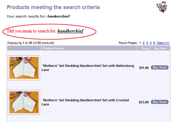
We should all take a lesson out of Google's playbook. Have you ever mistyped or misspelled a search query in Google before? Have you noticed that Google usually suggests an alternative keyword or search phrase? Another way to drastically improve your onsite search is to allow customers to refine their search.
For our online store, we look for common misspellings and suggest alternative searches on the customer's behalf. For example, if someone searches for "hankerchiefs" on our site, we will suggest that they try searching for "handkerchiefs" instead.

What's nice about this method is that you don't have to go through your entire database and add the keyword "hankerchiefs" to all of your products. Offering search suggestions can save you a lot of time by fixing the query at the source.
Bad on-site search can cost you money
Currently, about one-third of our customers go straight for the search bar once they land on our site. And when a customer search yields a big donut, they abandon our store 99% of the time. By improving our on-site search, we have drastically reduced the number of abandoned search customers from 95% down to about 30%. A huge saving!
Conclusion
The most important thing to realize about running an ecommerce store is that every little design change can potentially improve your conversion rate and make you more money. The key is to regularly look at your analytics reports for key pages where you are commonly losing your customers.
Whether that be your checkout funnel, your landing pages or your on-site search results, you need to figure out where the holes are and plug them immediately. Otherwise, you will lose tens of thousands of dollars just like I did, in a very short period of time.
Have you made mistakes like these that have cost you money? Have your analytics ever surprised you? Let us know in the comments.
Thumbnail mistake image via Shutterstock.


