 A long time ago, on a website not that far away, you'd be welcomed by a web page that didn't have much on it.
It maybe had a logo or picture and a button or link telling you to 'enter' the site you just visited. If you were really neat, you maybe had a (then Macromedia) Flash intro with loud music and awful typography. I mean, this was all the rage and your website wasn't cool at all if you didn't have one of these splash pages.
Fast forward to now and people will tell you a splash is stupid. It's corny. It's useless. They'll even tell you it's a detrimental to your search engine optimization. Whatever the excuse, these splash pages have essentially been nullified and are hard to find nowadays.
In all honesty, I didn't hate the idea of having something that introduced a site or brand. It kind of made sense. And now in 2012, aren't we all focused on user experience and making things easy?
Where'd they go?
After browsing through some sites for inspiration, I realized the splash page as an idea hasn't totally vanished. It's actually been reincarnated into a better, more efficient use. How can you create something that introduces you to a brand but doesn't disregard the spidering of content or the usability of a site?
I think we've figured it out. I believe we've come up with making these huge headers that work above the fold. They're often distinguishable from the rest of the site and have all that introductory info we're looking for. These 'splash headers' make sense. They don't take away our SEO and let viewers know immediately what they've stumbled into. And most times they look REALLY good.
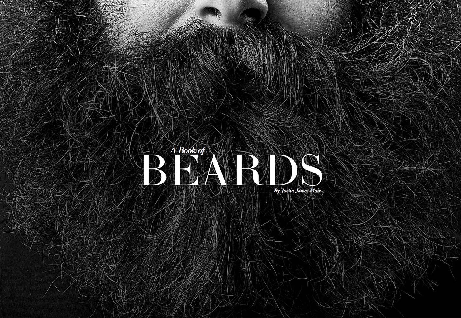
A book of beards
Right off the bat you know exactly what this site is for and what the book is about. It helps to have a big of an obvious product but it doesn't hurt to introduce it.
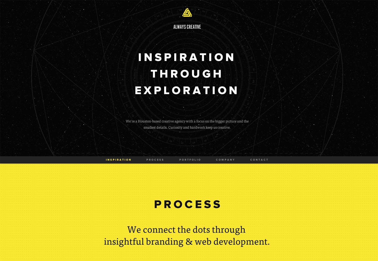
Always Creative
This group uses the header area to tell visitors and viewers exactly what they do and how they do it. It's really kind of dramatic like an opening title.
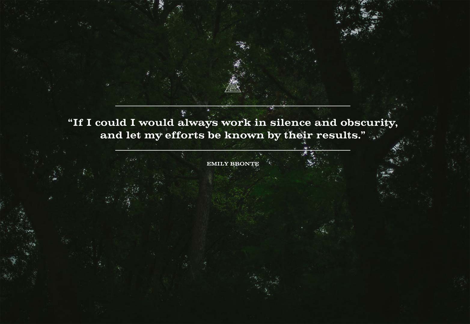
Brady Williams
Some splash pages in previous years have mainly just been a quick, cryptic look at the brand. The purpose is a go at making you interested and wanting to find out more. I believe this is something Brady Williams used.
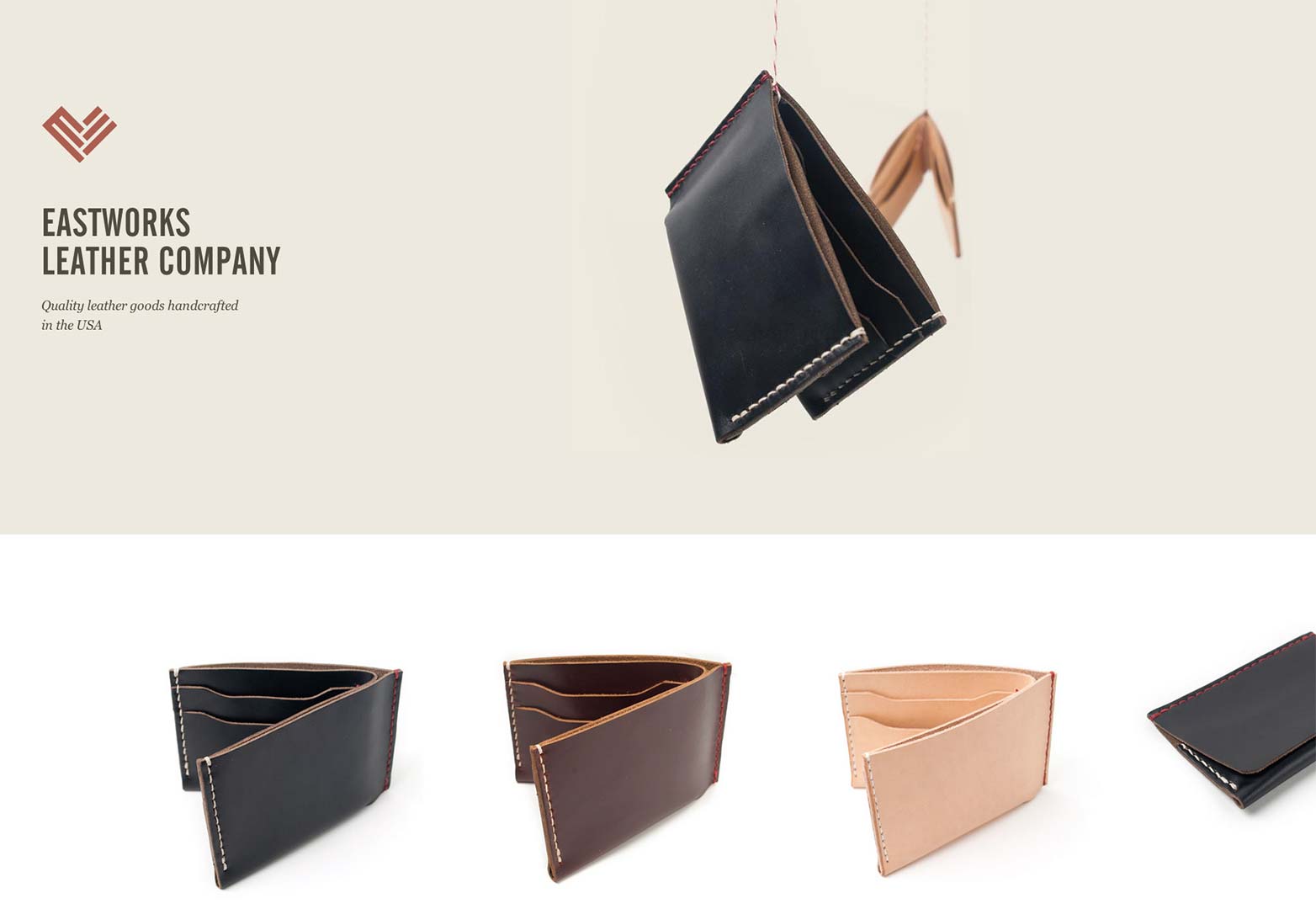
Eastworks Leather Company
This is an excellent representation of the brand. You're able to see the logo and company name, a quick summary of their services and a product shot. This is the most you can ask for if you are completely unfamiliar with a brand
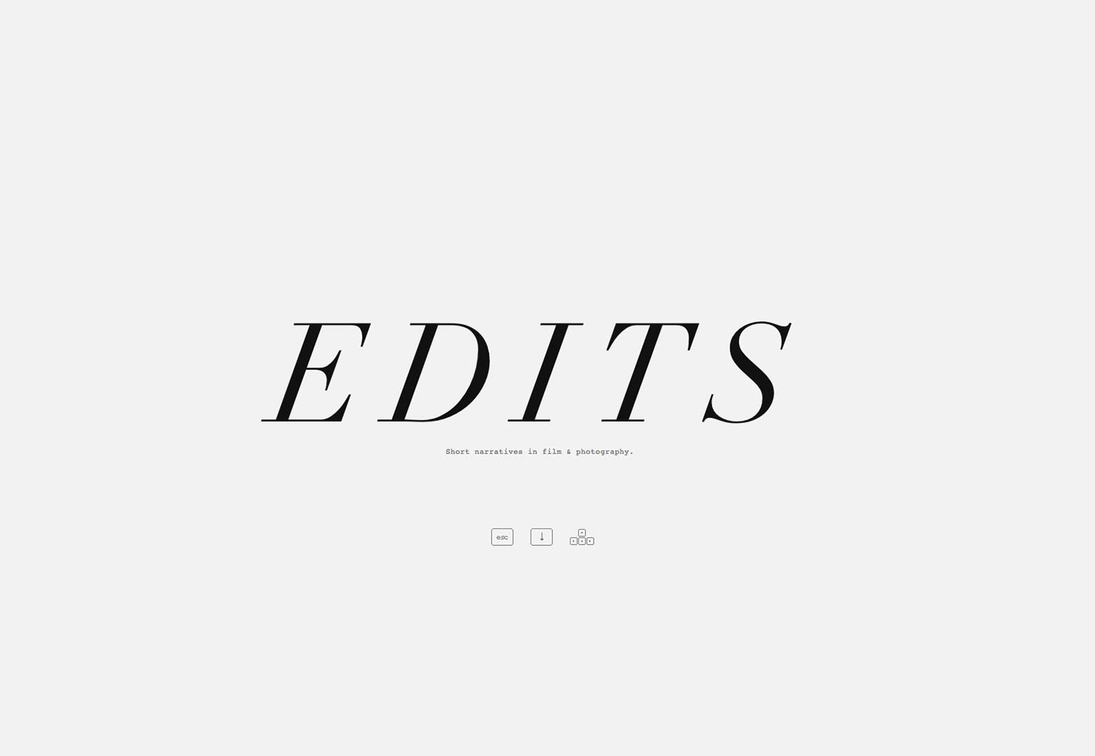
Edits
The purpose of this site is to present a digital magazine. The functionality is to create a bit of the effect of going through pages. That doesn't change the fact that they used one of these spleaders to essentially introduce themselves to viewers.
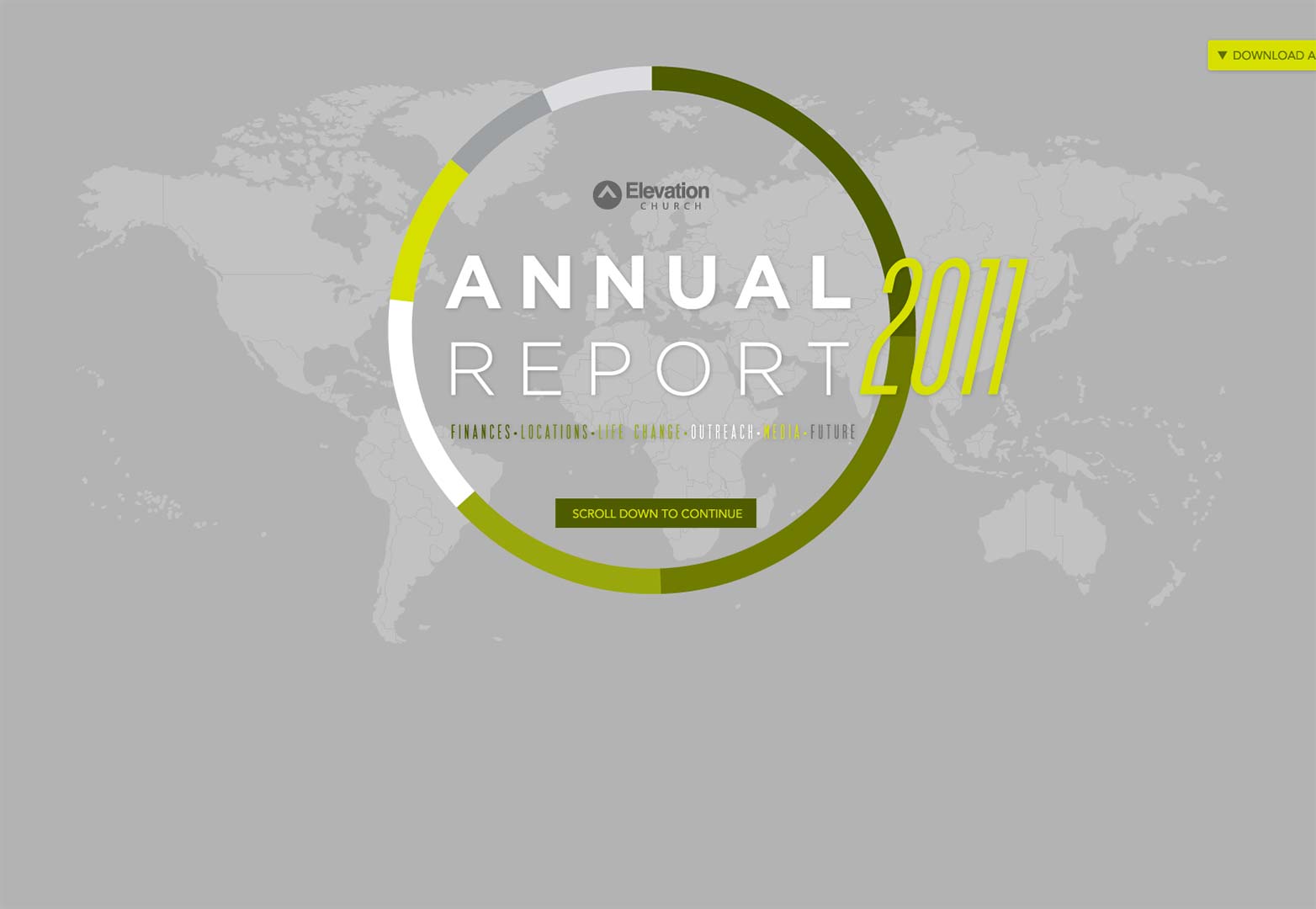
Elevation Church annual report 2011
I was first surprised to see a church go into so much detail (and quite frankly, develop a budget) for their annual report. However, this site not only serves as spleader inspiration, but infographic inspiration for everyone.
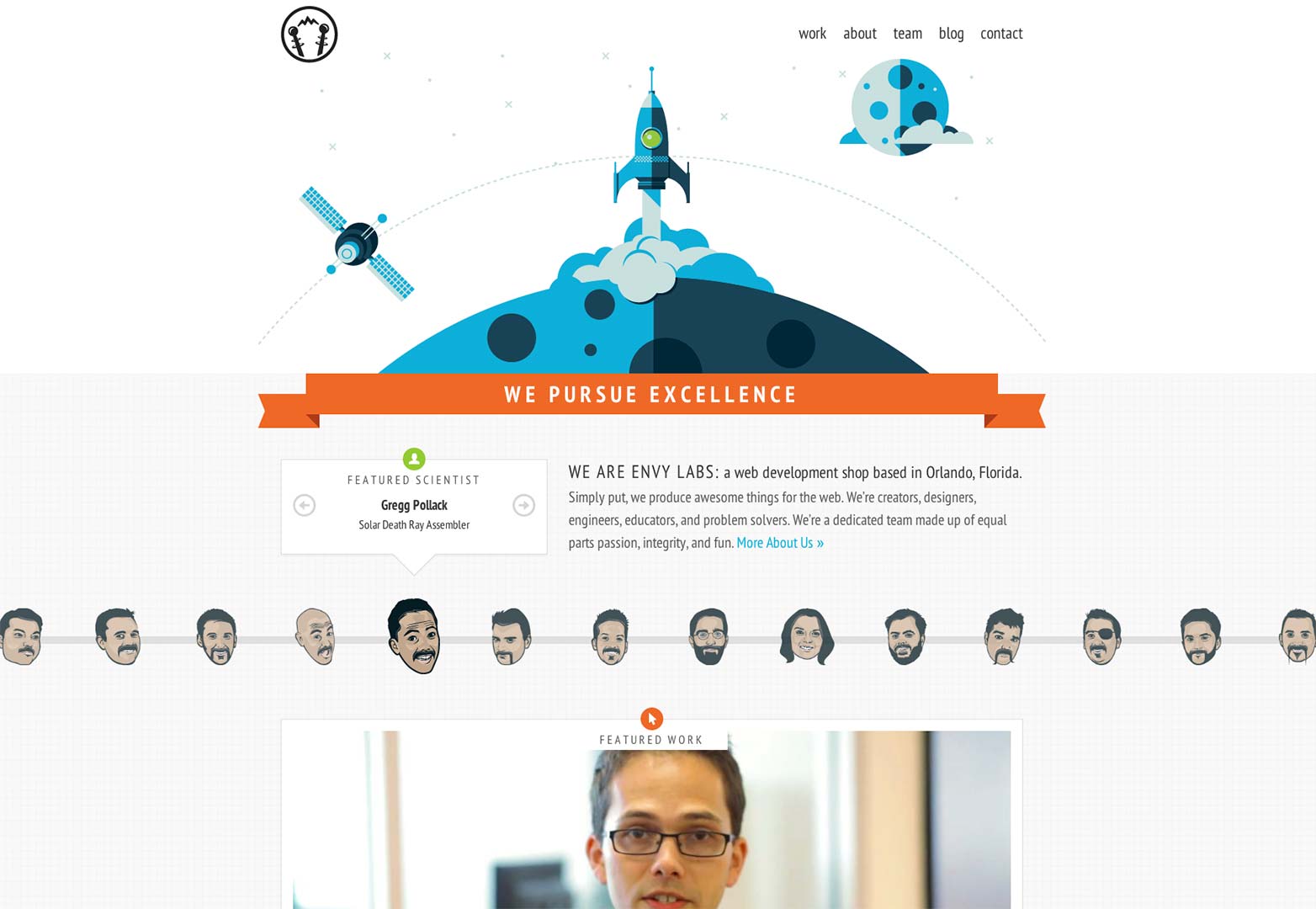
Envy Labs
Illustrative pieces in web design work help characterize companies to me. It lets me know they pay attention to detail, but also have a bit of a quirky side. Envy labs seems to be just that.
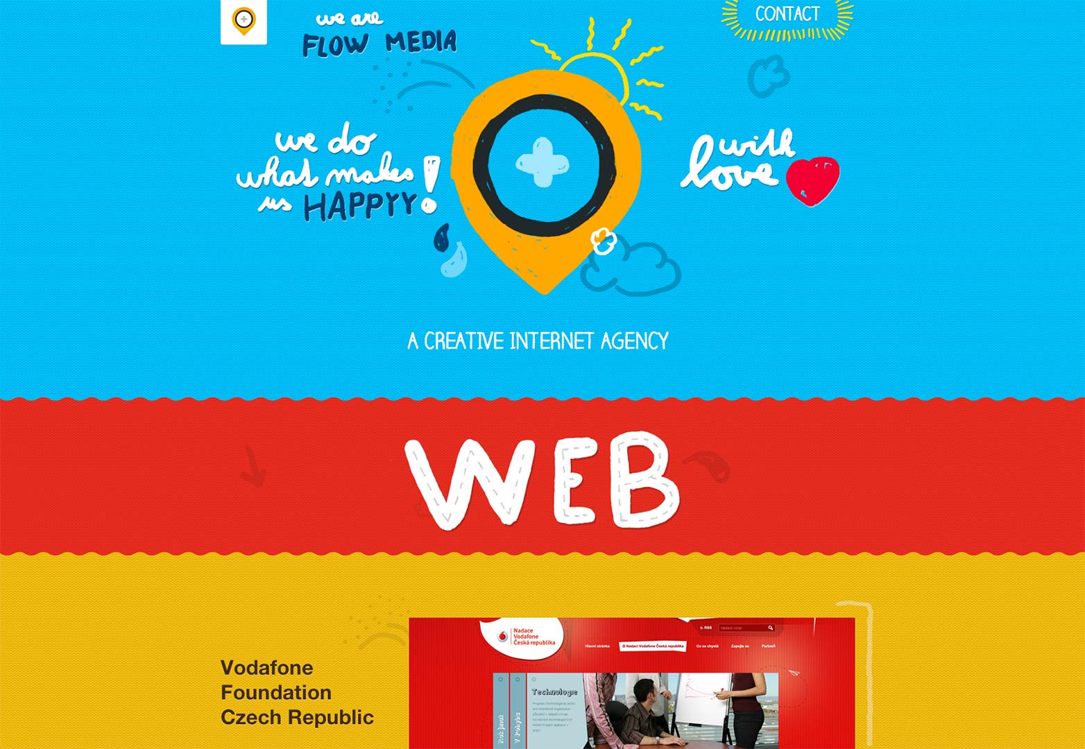
Flow Media
Again, this company uses a fun and imaginative illustrative style to represent their brand. Obviously if you are looking to have a little fun, you'll want to call on these people.
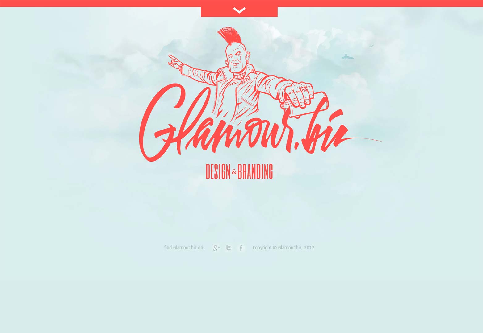
Glamor.biz
In all actuality, this is a real, living splash page on the web in 2012. I have to give him his props, however. This is one crazy and well designed splash, let alone website.
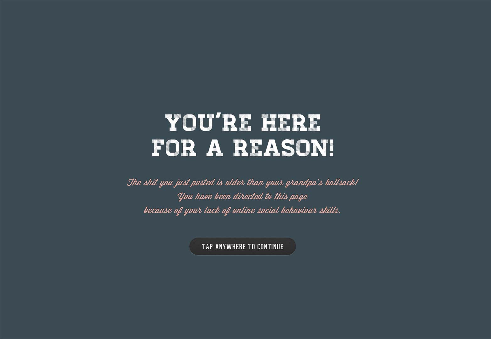
Grandpa's Ballsack
With such a crude name, you kind of have to back it with the reason for it's creation. Fortunately, this website not only tells you why you're on it, but also gives you ways to counterattack the problem. Funny.
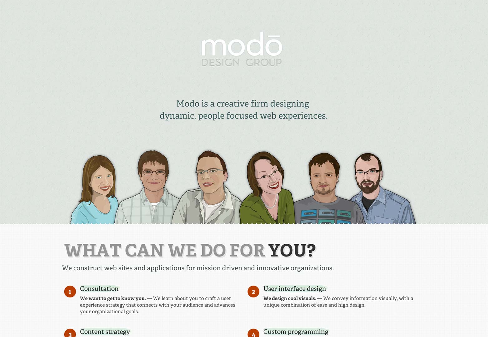
Modo Design Group
I really enjoy coming to a site and reading a quick sentence or two that lets you know where you are. Modo has utilized this feature. They also are good at keeping things simple and concise throughout the website.
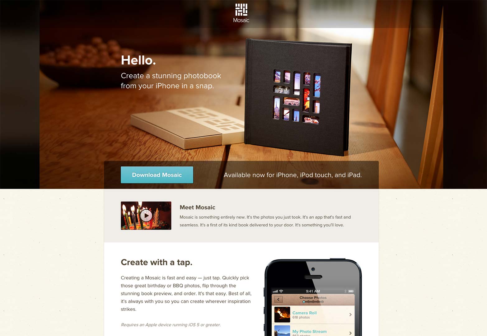
Mosaic
It doesn't matter where or how you read it, there is a reason people create landing pages. Many will tell you the idea is to inform someone of the product, what it does, and how to get to it. Mosaic does this all in it's spleader.
Startup Giraffe
While this header does not explicitly state the purpose behind the company, you can come to your own conclusions. After scrolling down for a bit, it becomes extremely clear. This is well put together, interesting website.
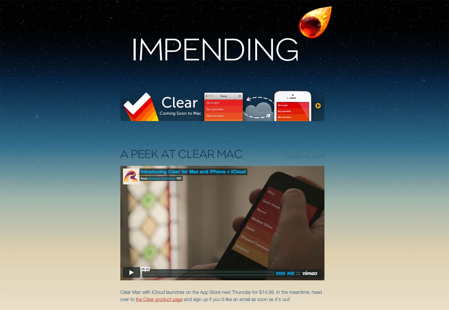
Impending
This company used their header for a bit of a different purpose. It wasn't to introduce or explain their purpose. But it was to create interest in a newly developed app by them. This is a different, yet solid approach.
Joint
This is an amazing different approach to web design all together. The navigation is in these little boxes (you could call them headers). The very first set you see suggests you should contact them. Good message for any website.
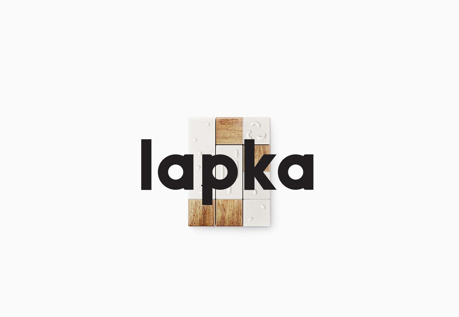
Lapka
Though this web header doesn't tell you everything you need to know, the logo and product shot are helpful. The presentation of this is also subtly amazing.
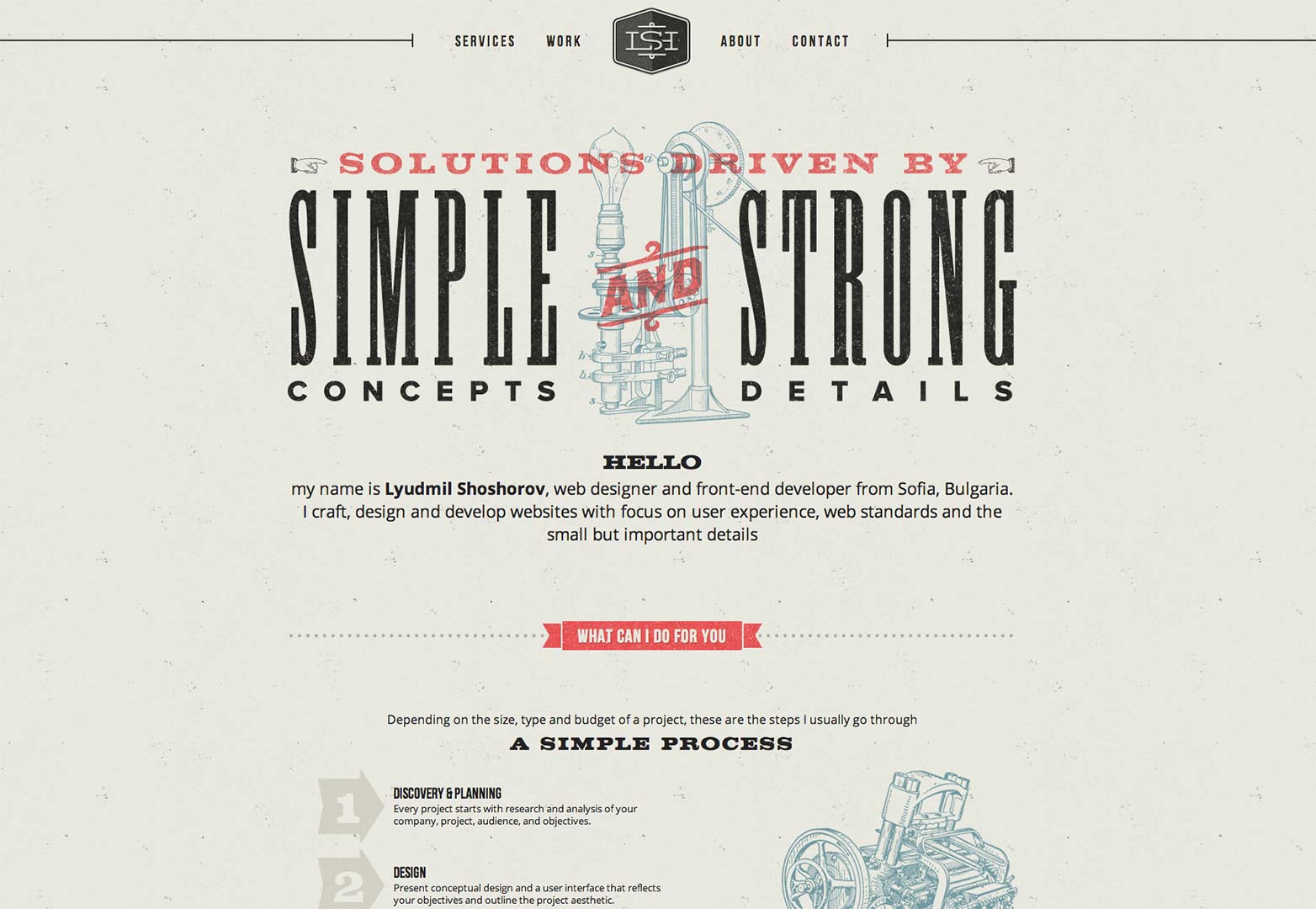
Lyumidl Shoshorov
As a designer, you always want to put your best foot forward when presenting yourself. The first impression counts and this designer understands that. This typography driven header lets viewers know the deal as well as shows off a bit of skill.
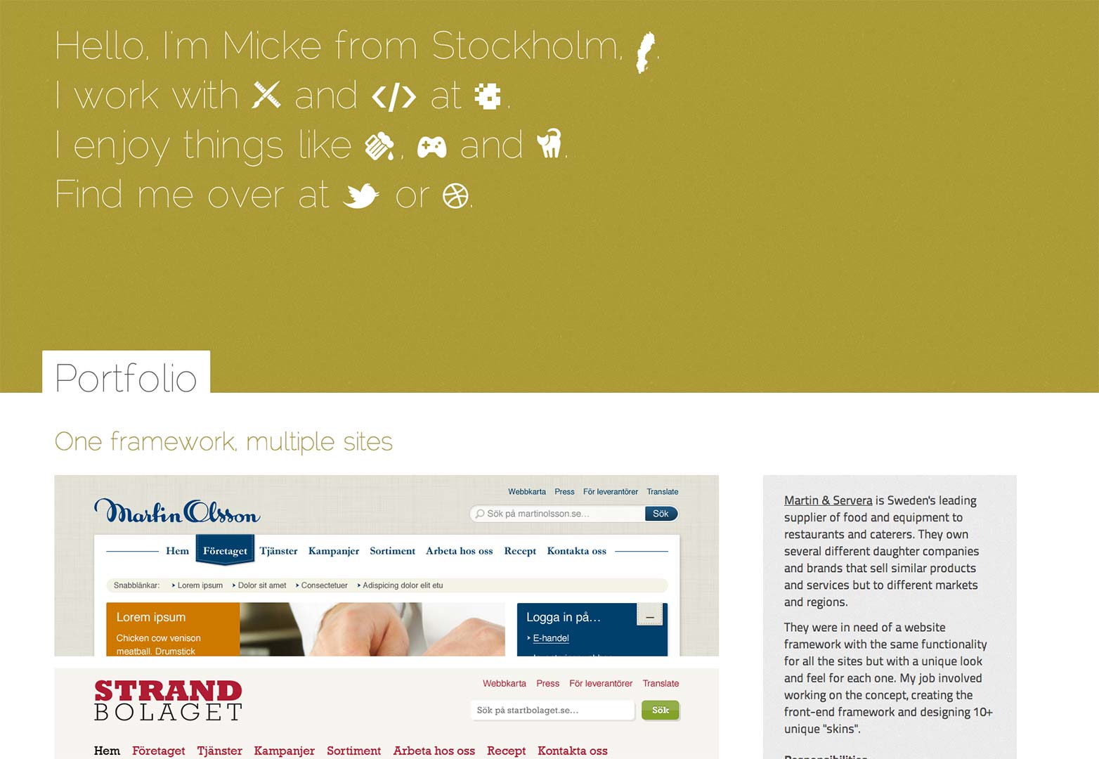
Mikael Norling
For a long time, freelancers were including lines of who they are and what they do in their headers. Mikael took this a step further by making this the only thing in his header. That's called creating a focus.
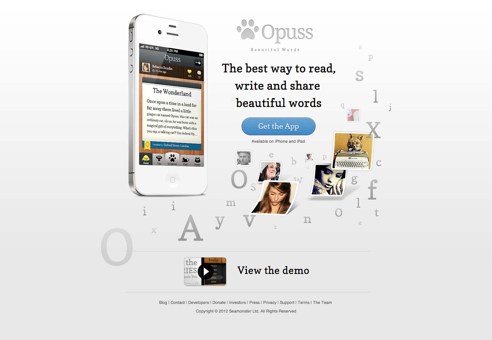
Opuss
This is another example of a landing page doing the right thing. Again, they put all their information in their 'spleader' to get the job done.
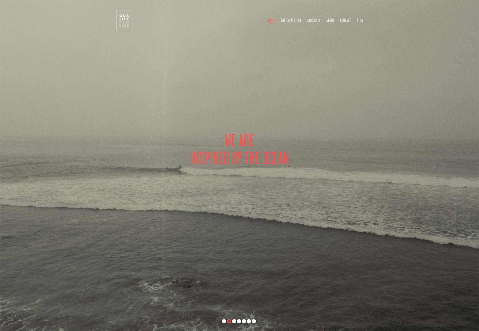
Quality Peoples
This is another traditional usage of the splash page. Here, they utilize slider type functionality to scroll through pictures and short sentences that explain who they are.
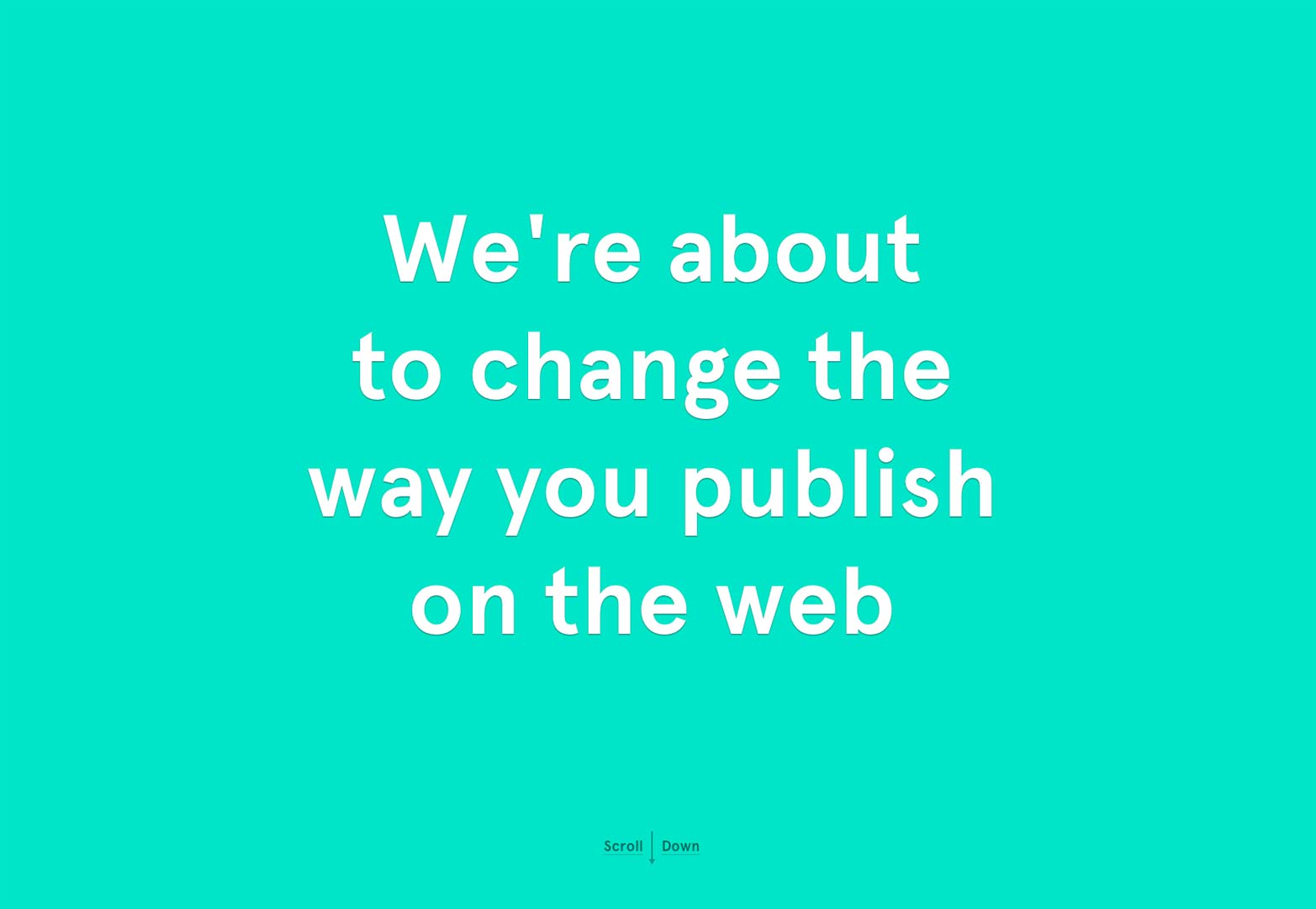
Readymag
I love this site not only because it's extremely entertaining to mess with, but because this offerring is extremely innovative. If you have the interest and the chance, you're going to want to keep an eye out for Readymag.
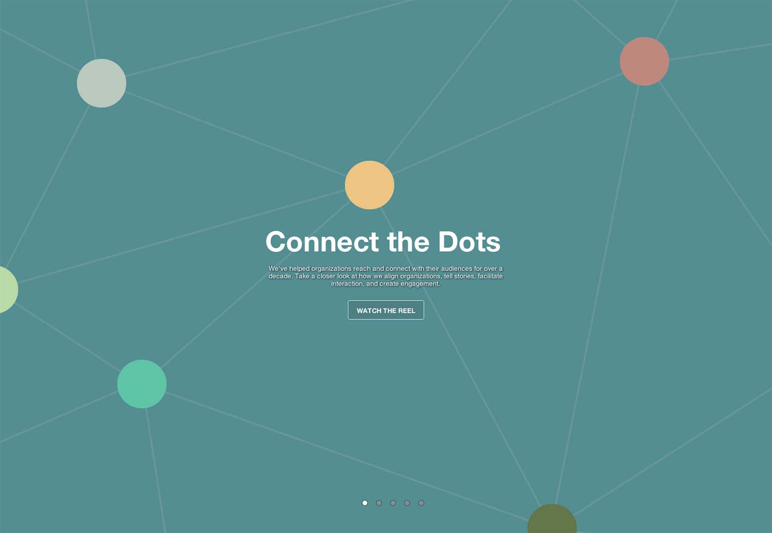
smashLAB
Again, this is a bit like the usage for the Quality People website with the slider. This time, you can scroll through the pages but the first one happens to be informative and links to their body of work.
SRKP
You're lying to yourself if you say you know exactly what this company does off first view. The pleasure of this site, however, is in it's creative ability to display themselves. This is a wonderful and interesting splash/header.
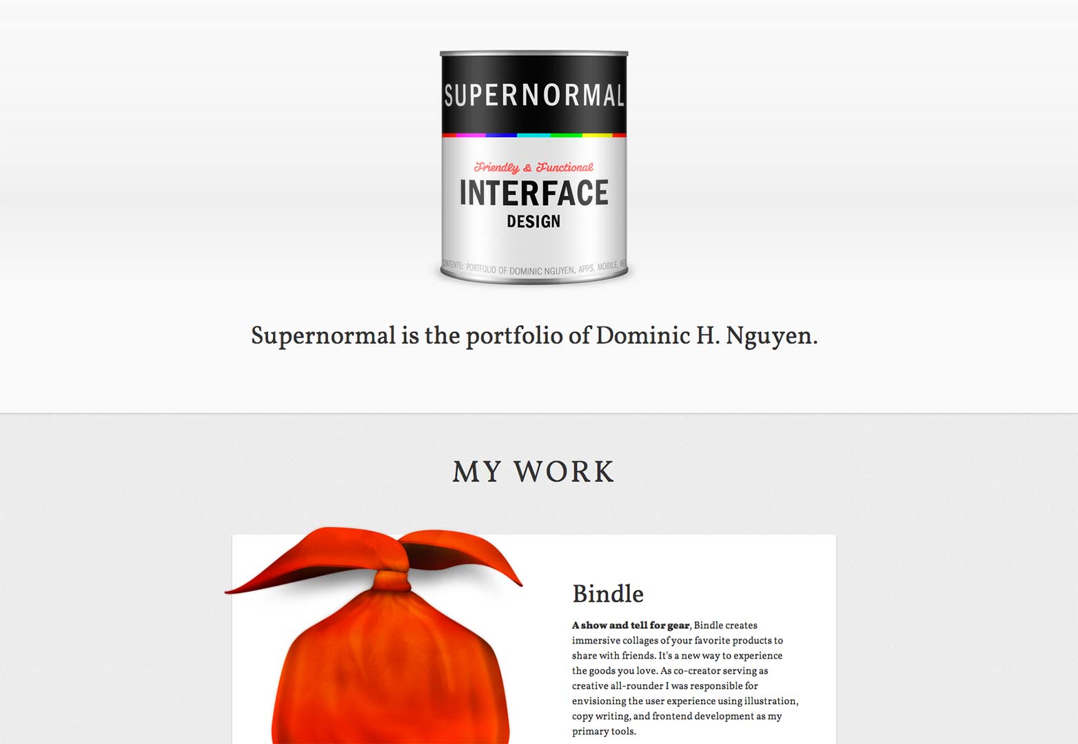
Supernormal
This site does exactly what it should for a designer. It not only introduces the guy, but introduces the work. It also interests you in a blog.
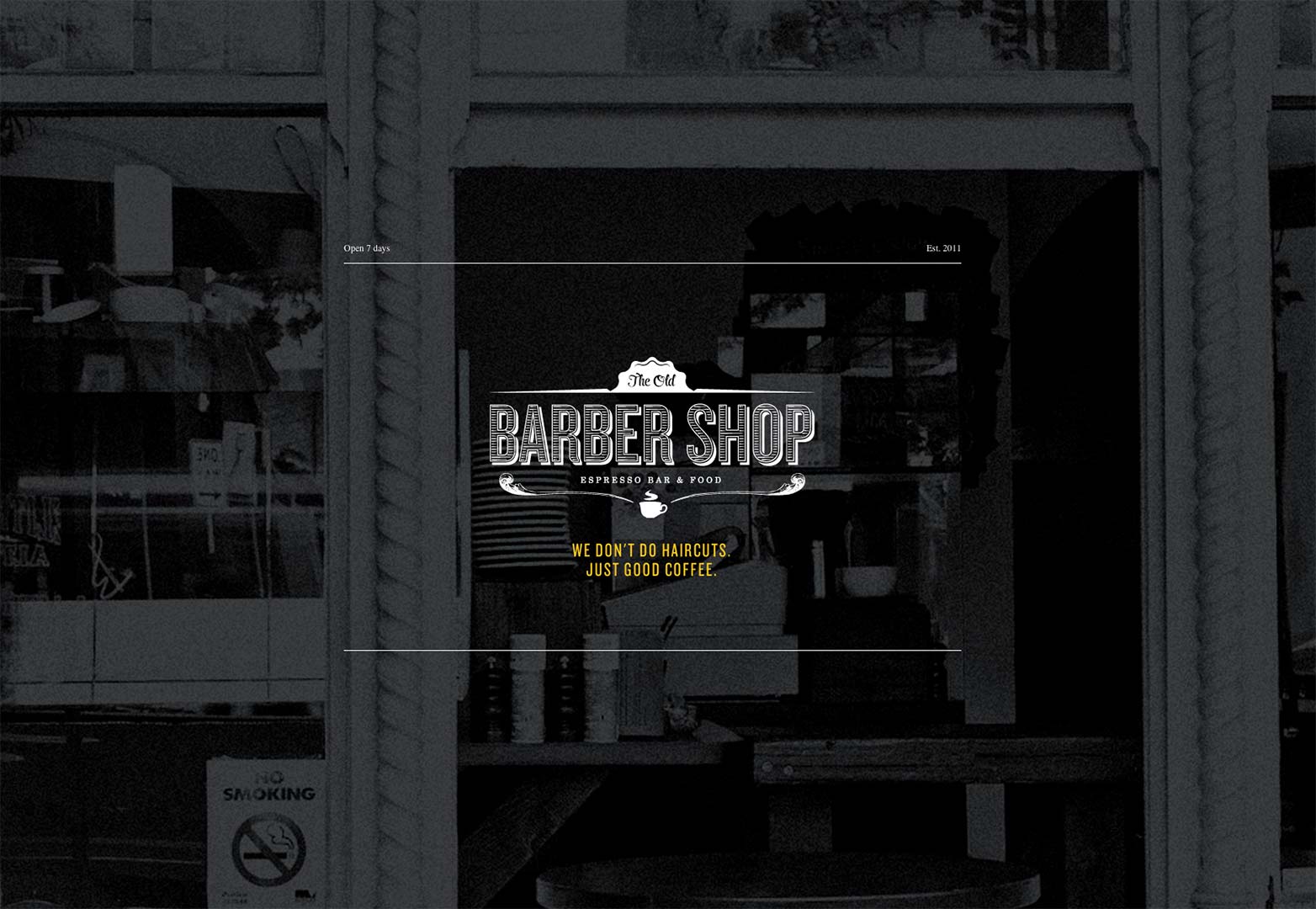
The Old Barber Shop
If you stumbled across a site with 'barber shop' in the title, you probably think it's about getting your haircut. Not so fast. This site takes their name and lets you know right away not to be so close minded. Not to mention the food here looks delicious.
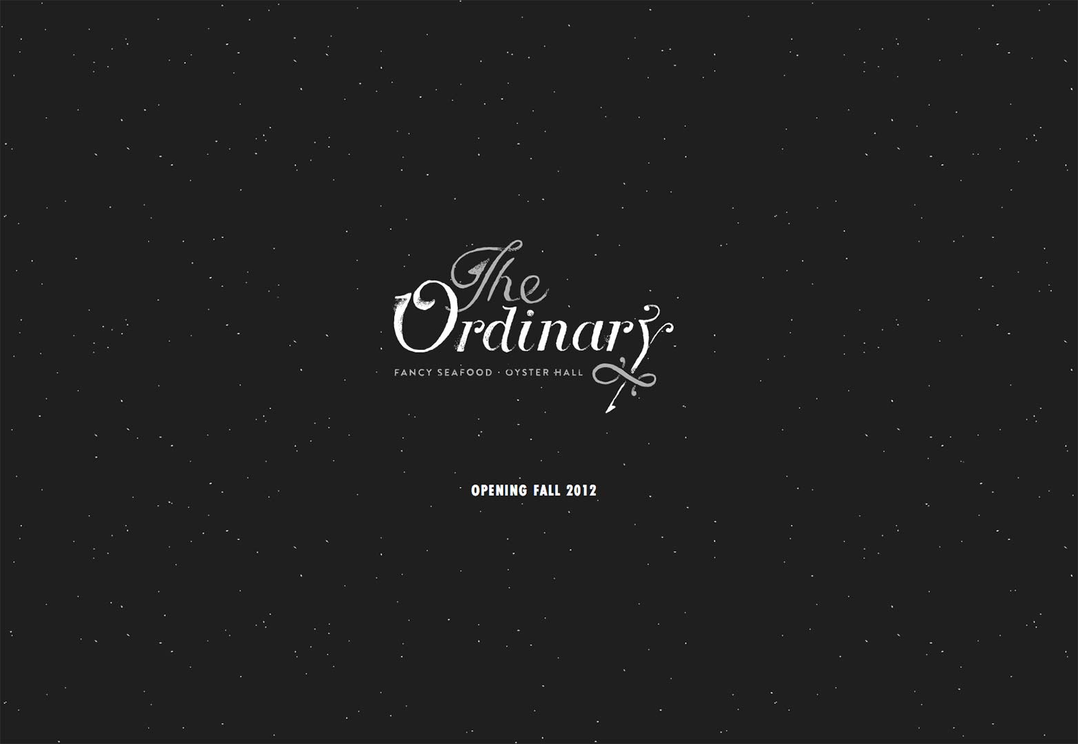
The Ordinary
We saw some traditional splash pages and some splash headers that presented themselves differently, but this is probably the most genuine splash header to be seen. It's a logo, line, and navigation to the next part. That's how it goes.
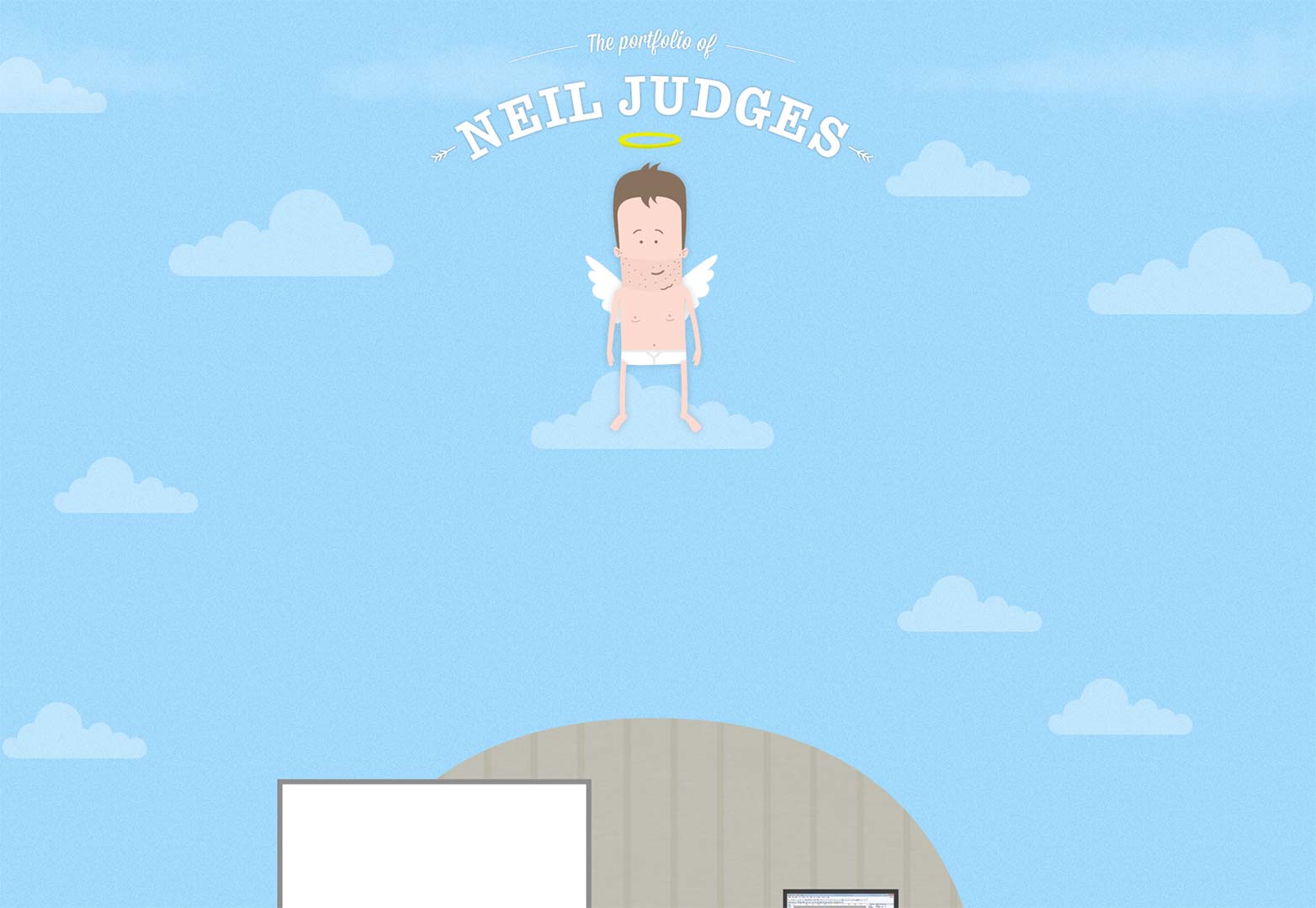
The portfolio of Neil Judges
This is an absolutely adorable site. The header obviously explains the nature of the site but it does not explain how cool it is. You're going to want to check this one out.
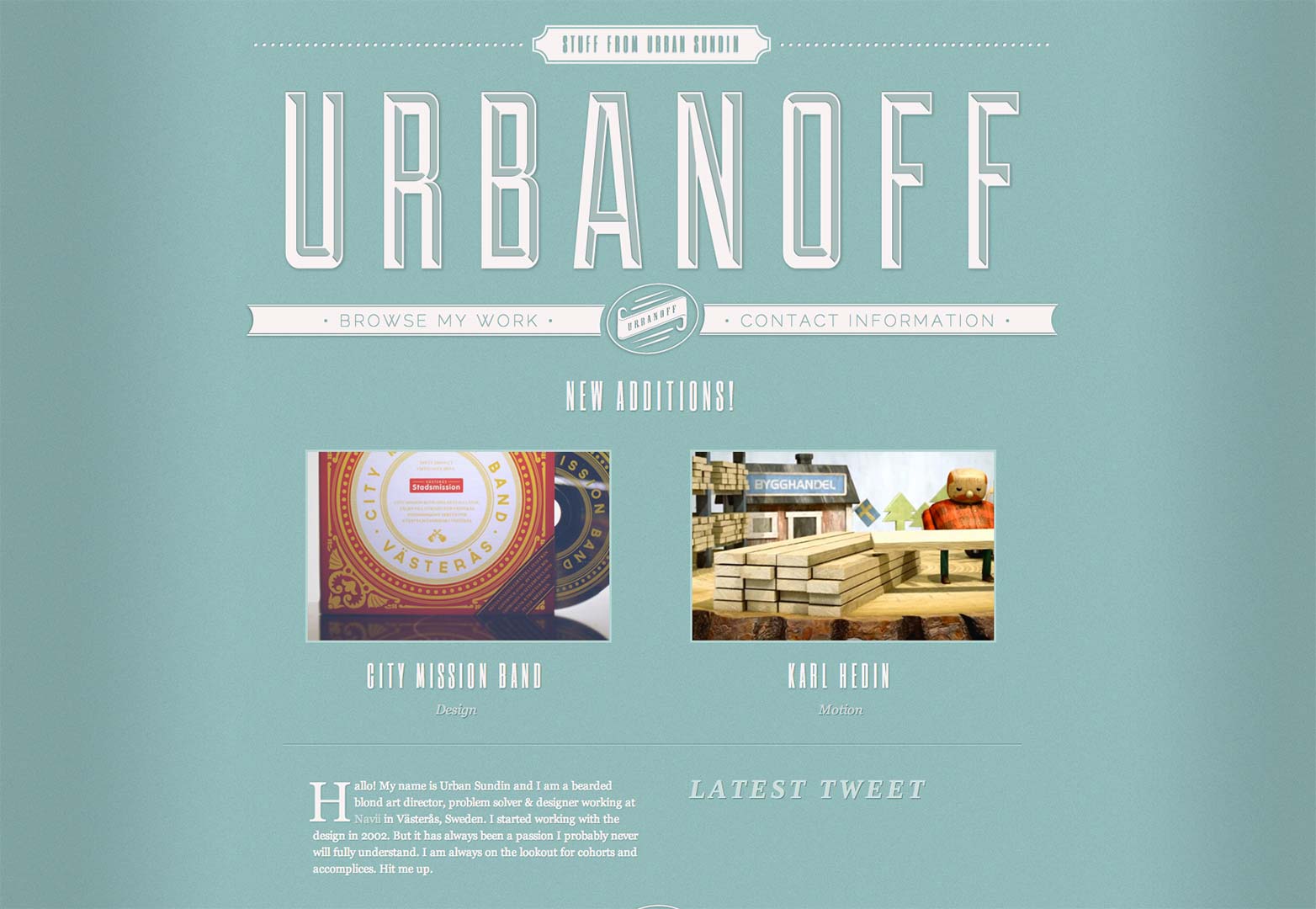
Urbanoff
We can utilize our headers for anything. While many use it to explain themselves, it can also be an opportunity to get more from your viewer. Urbanoff took this route by adding his contact link in his header.
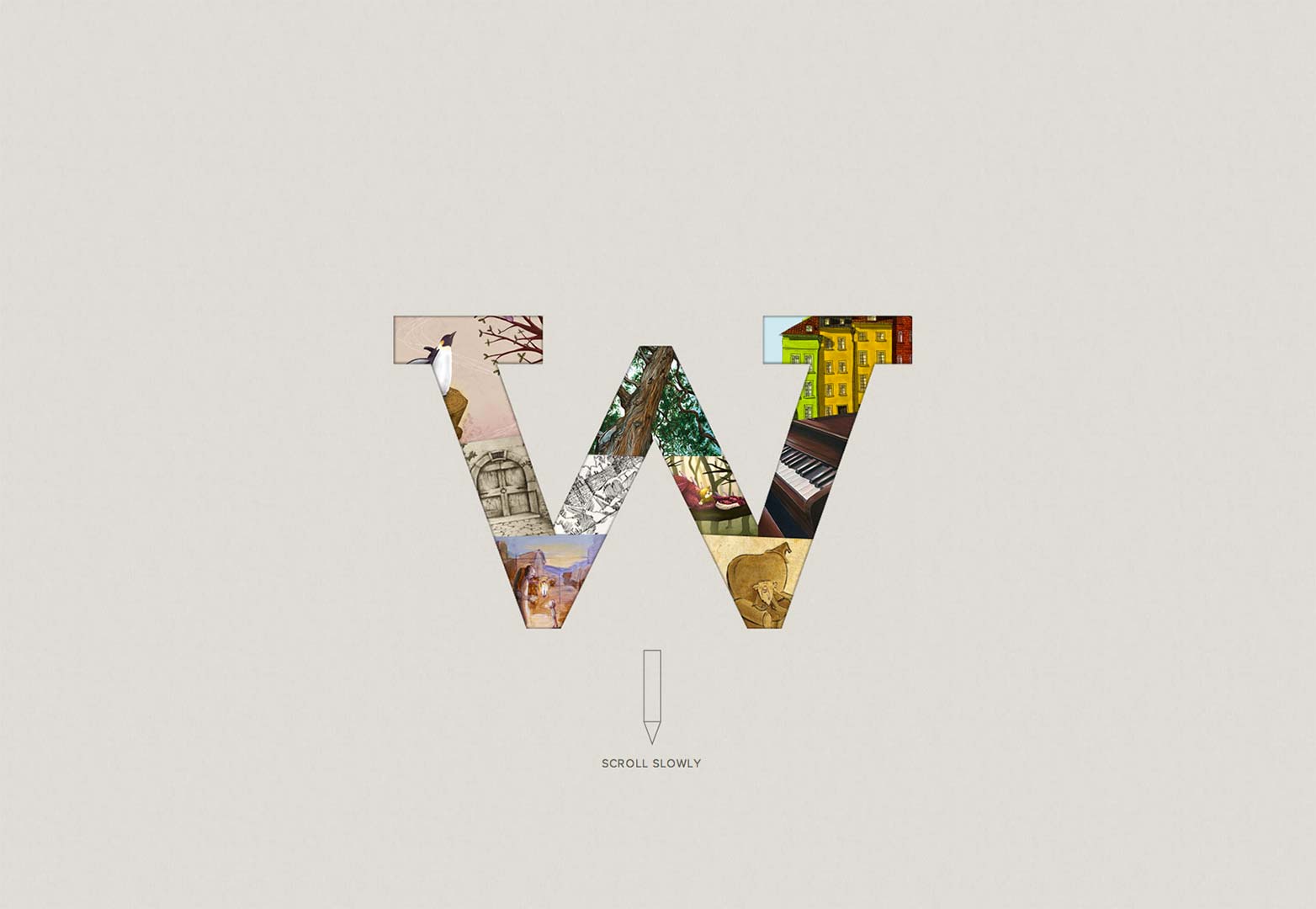
Wigolia
While this is a compelling header, again, this is a site to keep an eye on. If you are a legitimate creative who enjoys art, there may be something here for you now or in the future. Great idea.
Bake Agency
Bake introduces us immediately to their logo and navigation scheme. What is a plesant surprise is the crazy functionality of the site. It's really cool!
Type/Code
This site claims that they design things and make them come to life. After reaching and playing around with their splash page, you'll come to find out the claim is absolutely true.
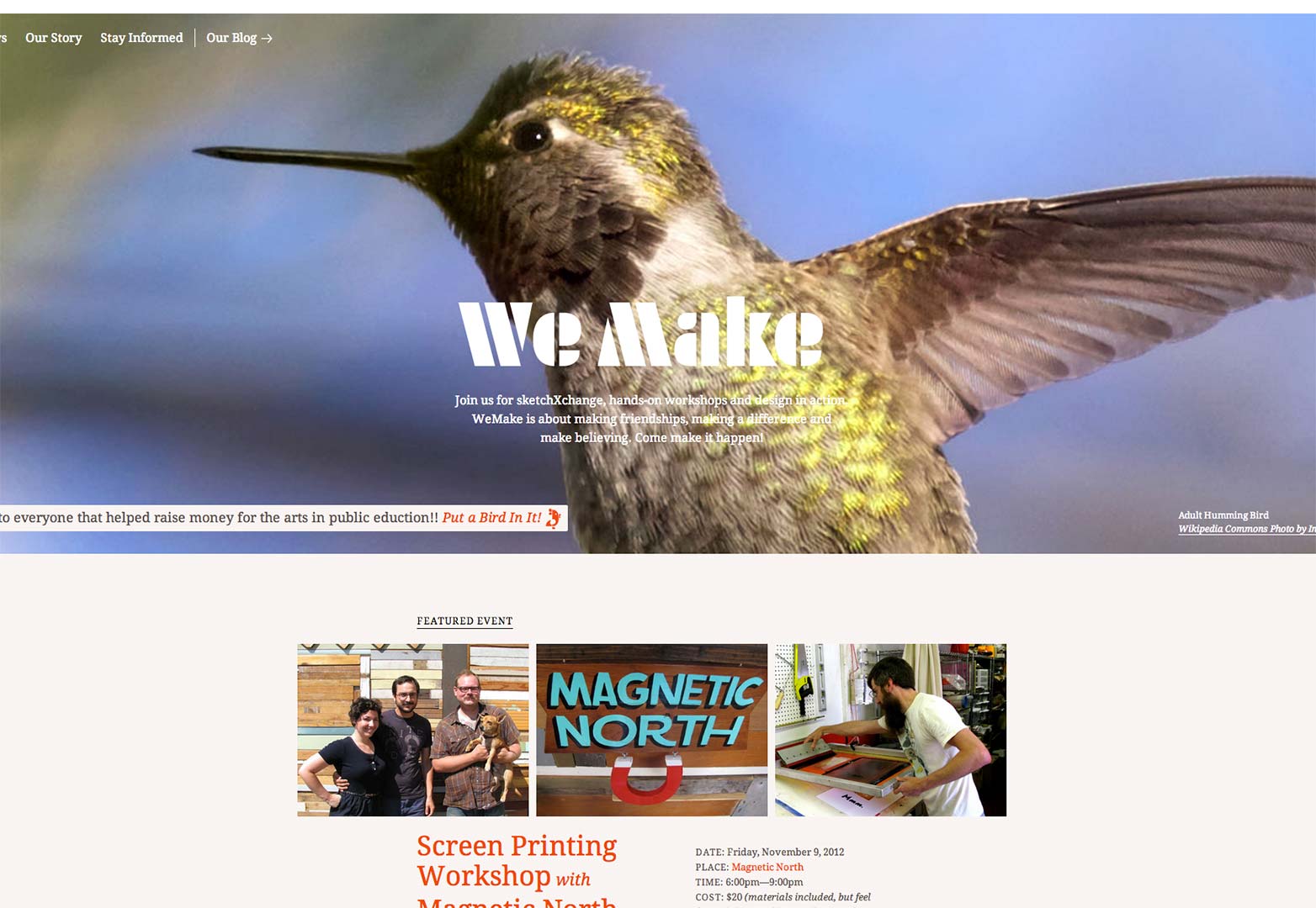
WeMake
This site also uses a slider to help illustrate who they are and what they do. They also include their line about who they are and what they do. This is a solid example of a splash header.
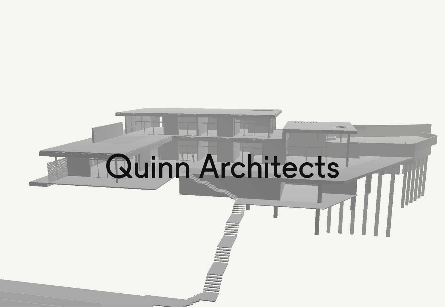
Quinn Architects
This is another old-school version of a splash page. It does not include a lot of information, but it does immediately familiarize you with their line of work.
Mickey / Johnny
This is a really intuitive and easy site. The splash is a gateway to the rest of the navigation and is simply brilliant.
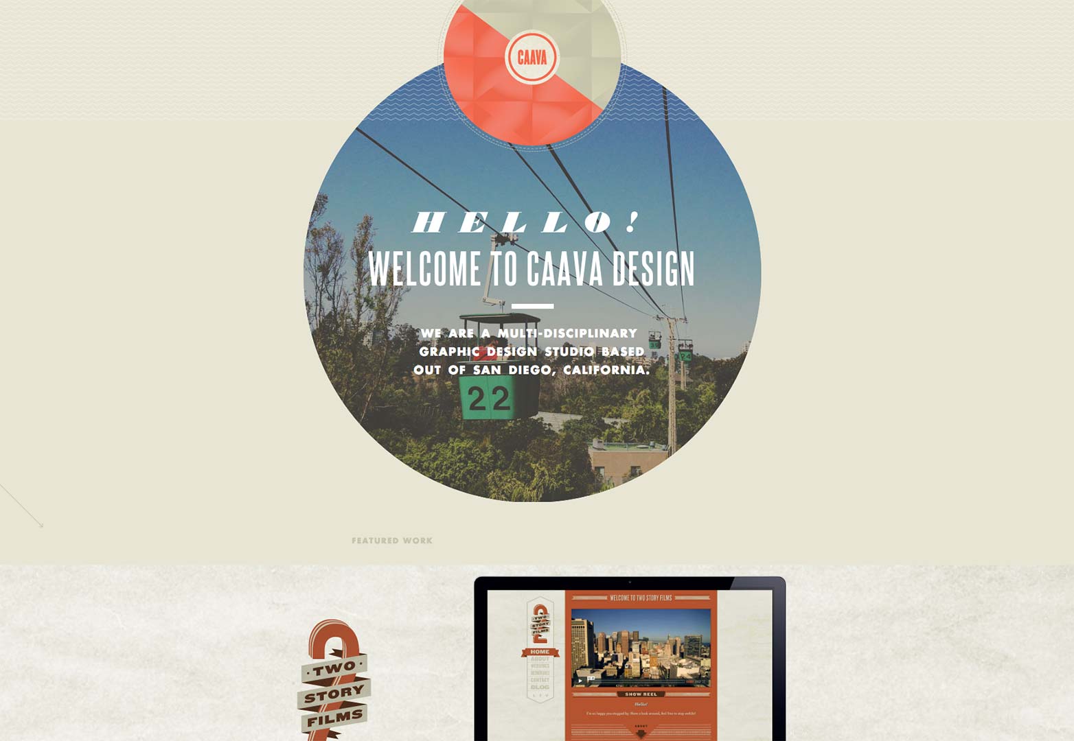
Caava Design
This site is all around good. Any designer is going to want to take a look and get inspired from this. The detail in the design and the development is simple amazing.
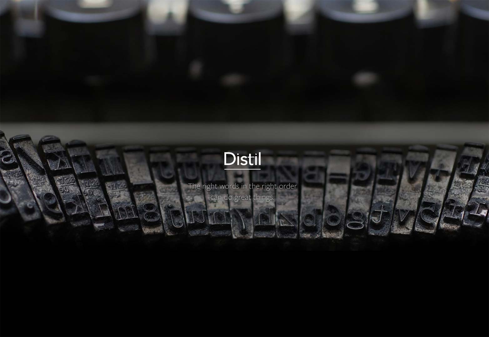
Distil Copywriting
This is another solid enactment of this splash header idea. We have a company name and a little insight the company believes. It creates curiosity for what's next.
FieldTrip
This header pretty much includes the logo and some other neat developmental tricks. Once you scroll down some, the purpose is revealed. However, this splash header is unique, illustrative, and fun.
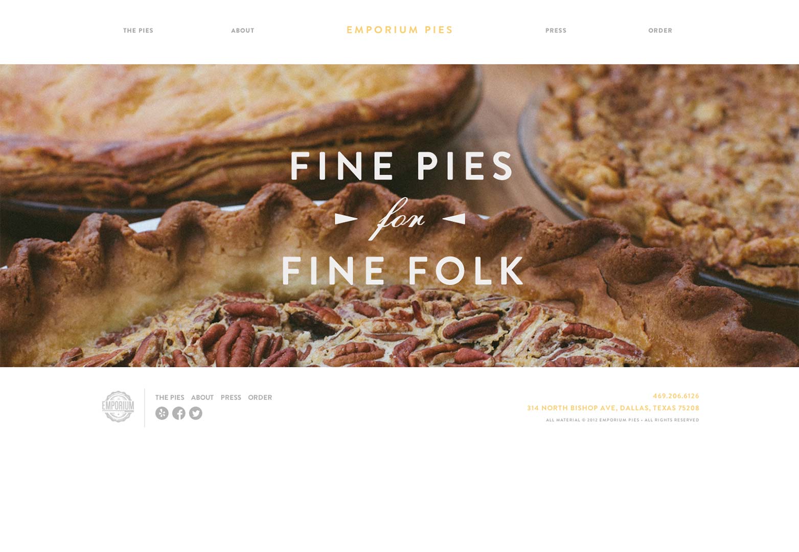
Emporium Pies
Emporium Pies has created another certified splash page that's guaranteed to make your mouth water.
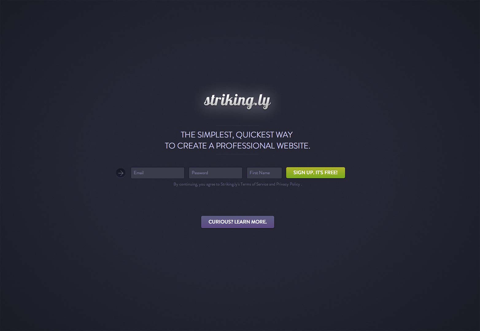
Striking.ly
This is another one of those sites you probably want to bookmark. The idea here is to take advantage of the trend that is single page websites. Striking.ly is sure to strike up some interest.
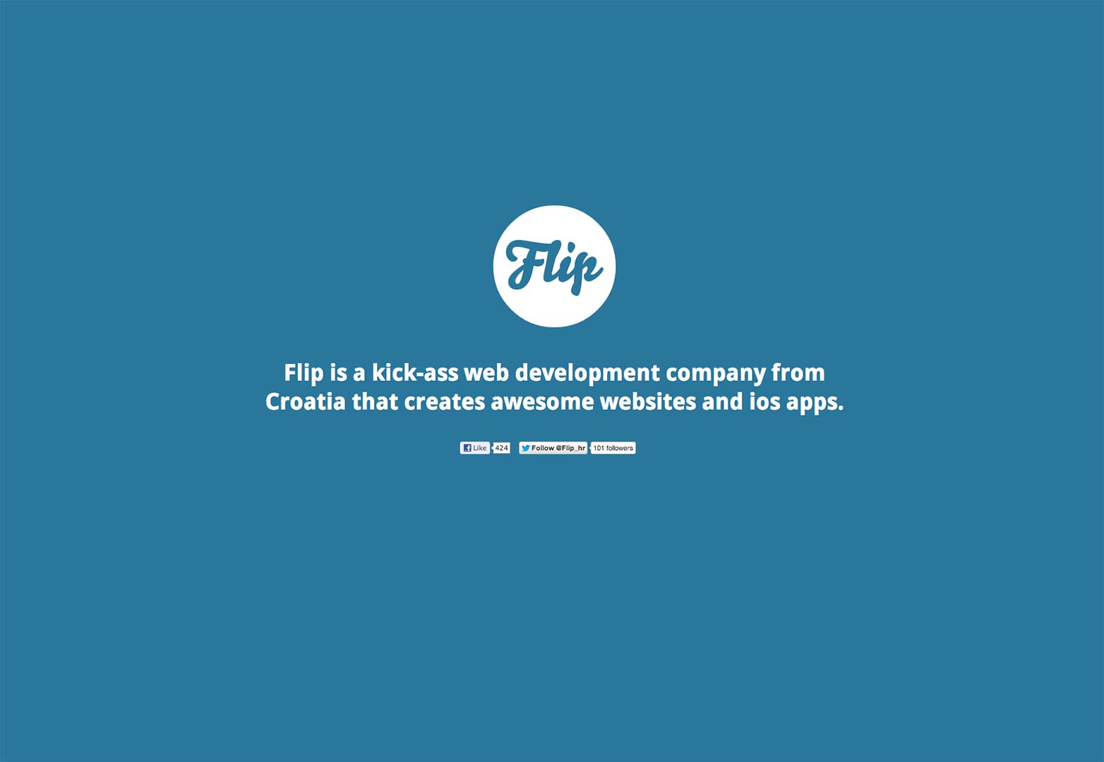
Flip
The people at Flip obviously know what they're doing. This informative entrance gives you an idea of the personality here. Fortunately they can back up the big talk with their portfolio of work.
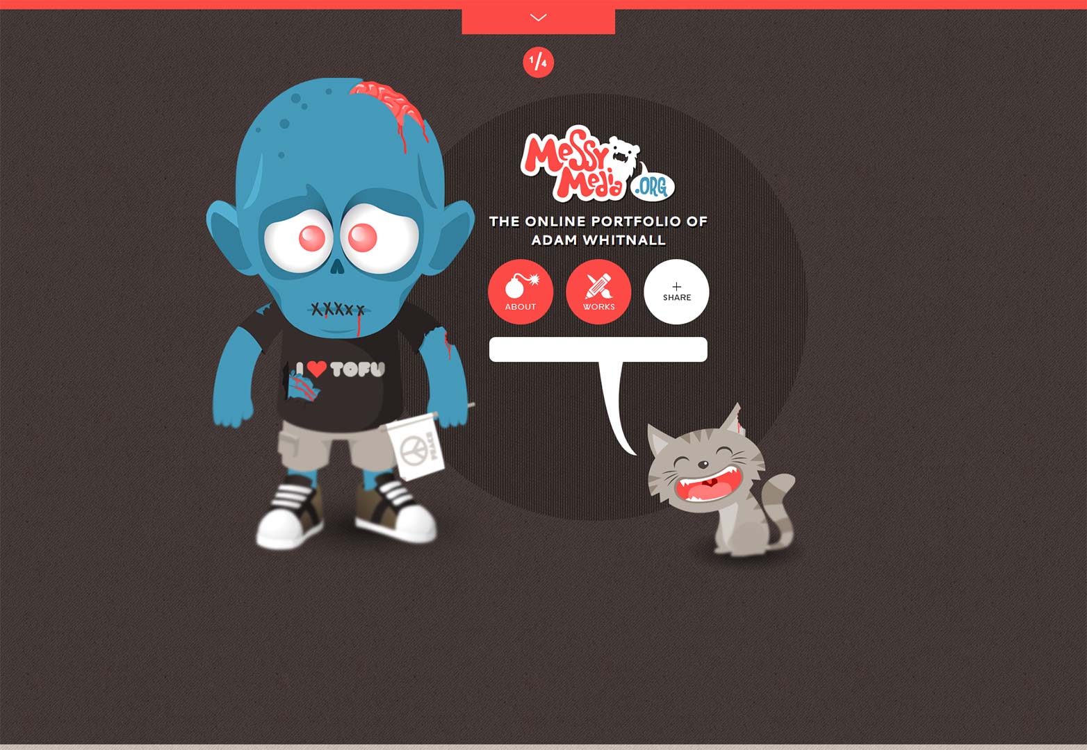
Messy Media
This website is exciting and interesting. You know immediately the work capabilities of this freelancer and you get a little of his personality. This is just a great all-around site.
Conclusion
As we can see, this type of idea comes in many different shapes, sizes and reiterations. We cannot deny the effectiveness of this type of thing. If I enter a site and am unfamiliar with the brand, I'm probably not going to stick around too long. I'm also not going to know how to navigate the site properly if it's a new type of fnctionality. I need directions for that. The header meshed with the splash page idea allows websites to be informative, representative and effective of the brand immediately.
In all honesty, with the focus of search engine optimization moving to the content of an entire website, I think it's a great time for real splash pages to make a comeback. They just make sense. What say you?
Are splash pages making a steady comeback? Any sites we missed? Let us know in the comments.
Featured image/thumbnail, splash image via Shutterstock

