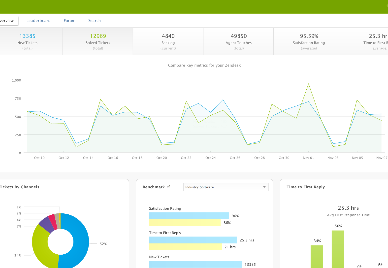
 While big data makes for useful applications, it can also stand in the way of clean, usable interface designs. With more and more web applications built upon mountains of data collected in the cloud, how can you deliver all that data without turning the resulting application into a visual train wreck?
Balancing complex data needs with a simple user interface is a challenge for any web application designer today. Stripping away information will simplify the user interface, but less data often means a less functional and useful application. Yet, keeping all that contextual data can create an unusable monster of an app.
Through the process of redesigning our customer service application, we learned several important lessons for designing simple interfaces built on complex data. We’re sharing a few tips here:
1. Know your use case
The central tenet of good UI design is to start with the problem you are trying to solve, not the data you have or the design you want. If your key goal is “we want it to look slick,” you’ll be basing design decisions on the wrong criteria.
Define a use case that will guide your design process. How do most people use your tool? Understand that you cannot please every single user. As a designer, your aim should be to provide the best tool for most of your users, most of the time.
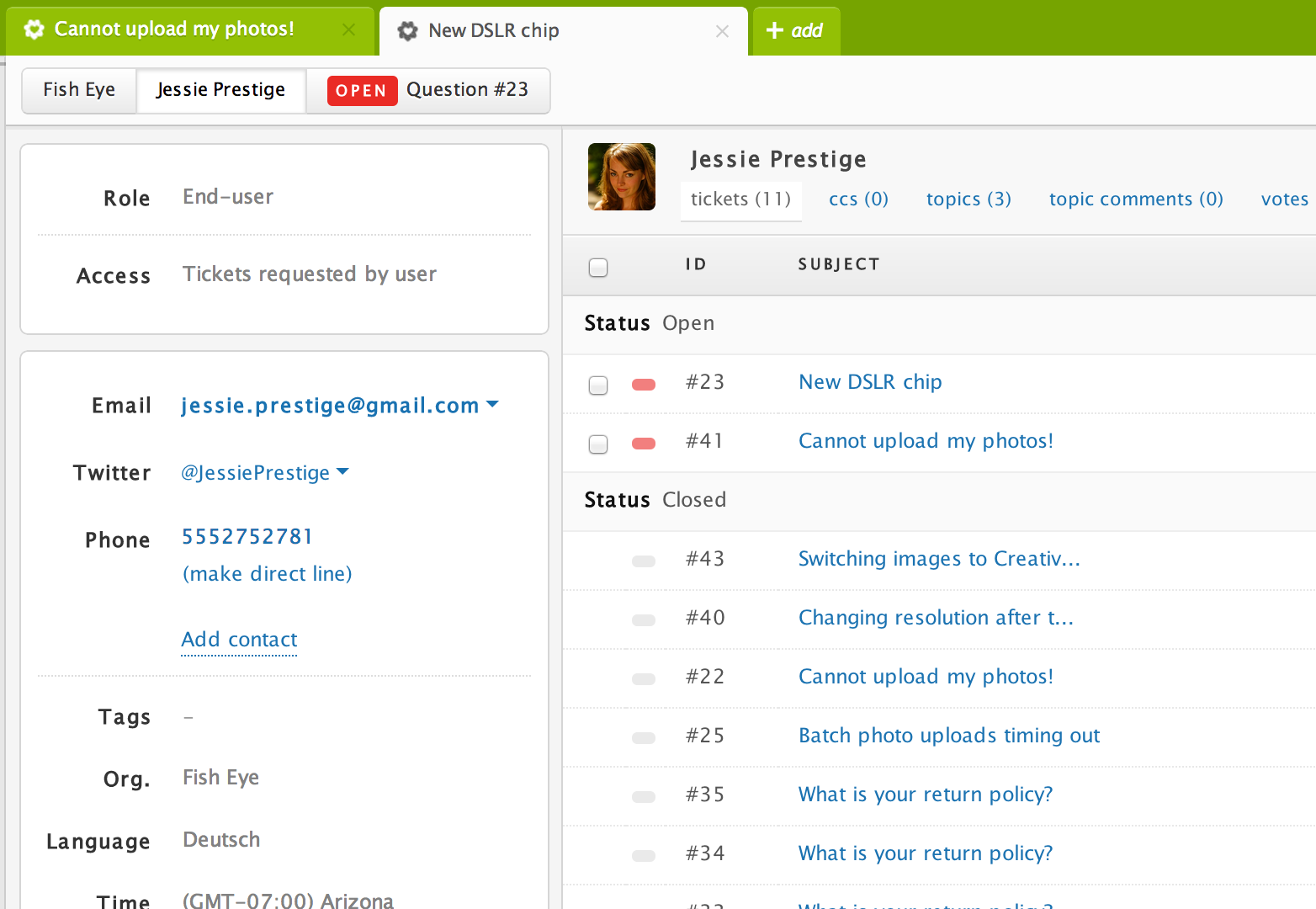
In Zendesk’s case, we wanted to make the process of resolving customer issues faster and more personal, meaning the support person should know the customer as much as possible. This criterion shaped each design decision and gave us a framework to prioritize all the data we had.

2. Start with everything, then simplify
Designing data-heavy applications is more like sculpting than painting. Rather than starting with a blank canvas, you begin with something massive and start chiseling away. When it comes to designing a section of your app, start with all the data that could possibly fit in the section, then start organizing and prioritizing the data according to your main use case.
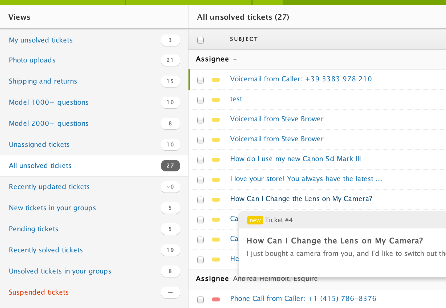
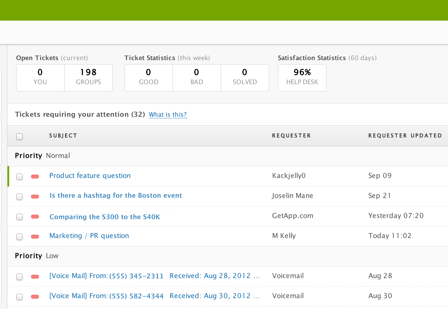
For instance, when it came time to design the support ticket page in the new Zendesk, we included everything that was potentially related to an actual support ticket and made it the same typeface, size, and color. The result was a horrifying and impenetrable mess. We then set out to whittle down, prioritize, and organize the information. We hid items, changed font weight, and added interactivity where needed. Each decision was based on our use case priorities defined above.

3. Use the content itself as your design elements
With data-heavy applications, there’s no need to add extra chrome. Drop shadows, sweeping gradients, multiple textures, and other extra design elements just add visual complexity to an already complex application.
This doesn’t mean your design needs to be black text on a white background. Instead, rely on the content and data itself to create visually pleasing experiences.
Invest your time in typography; reduce words where you can with solid and meaningful iconography and use color to group data and content in consistent ways.

4. Keep everything agile
Every design can be redesigned and every redesign can be redesigned again.
As more and more people use your application, you will discover areas that can be improved and simplified further. In order to iterate toward a better and cleaner design, it helps to break down all the elements of the application (data, functionality, design) into the smallest possible components on the backend.
Building your machine so it can be easily taken apart and rearranged will help you make improvements and meet changing needs as you go.

Conclusion
In summary, the twin goals of simplicity and data-richness don’t have to be mutually exclusive. In fact, big data can lead to great innovation in user interface design.
Regardless of the application, the lessons of starting with a use-case, sculpting rather than painting, designing with your content, and staying agile will help build simplicity on top of complexity.
Have you designed a beautiful user interface for a large amount of data? What tips and tricks can you share? Let us know in the comments.
Featured image/thumbnail, data image via Shutterstock.


