

 I ought to know a lot about charities and non-profit organizations. My parents are career missionaries; and I grew up in an environment where everyone I knew was dedicated to improving the lives of others. My family moved around a bit, and I spent my childhood and teen years in several different missionary communities in Canada and Mexico, each of which organized their own charitable endeavors.
In Ontario, it was a literacy program. In Sinaloa, we brought healthier, organic food and donated goods of all kinds to orphanages and daycares in low-income communities. In Jalisco, there’s a free kitchen for the children of a very poor neighborhood, where they can get at least one good meal per day. In Nuevo León, there are good people going to children’s hospitals to try and cheer up the patients and their relatives alike.
As the resident nerd, it often fell to me to create promotional materials and websites for whomever I happened to be working with at the time. After all, these were low-budget operations staffed by few people. Who could afford to hire a professional?
Well, the universe loves a joke: I became a professional.
How is design for non-profits different from commercial work?
It isn’t all that different, if you’re doing it right. The same basic principles of design still apply, and you’re still selling something to your users.
That’s right, you’re selling something. All design is about selling. In this case, you’re selling a cause. You’re selling a reason for some people to send money to other people. Only it’s a bit harder sometimes, because most of the time, the people dropping the cash don’t reap any direct benefit. This is one reason why even most of the charitable campaigns on Kickstarter and IndieGoGo offer perks and rewards.
Just like in any other transaction, you have to convince your users that parting with their money, time, or other resources is a good idea. This is never easy, but it’s not impossible either.
State your goals up-front
I think that every website should be doing this, but in the charity world, transparency is paramount. You want your users to understand, at their first glance at the website, both what it is that you do and what you need from them.
You need to be able to describe — in a maximum of three sentences — who you’re helping, how you’re helping them, and how your users can help you. The rest of the content on the website is only there to support the veracity of your initial statements.
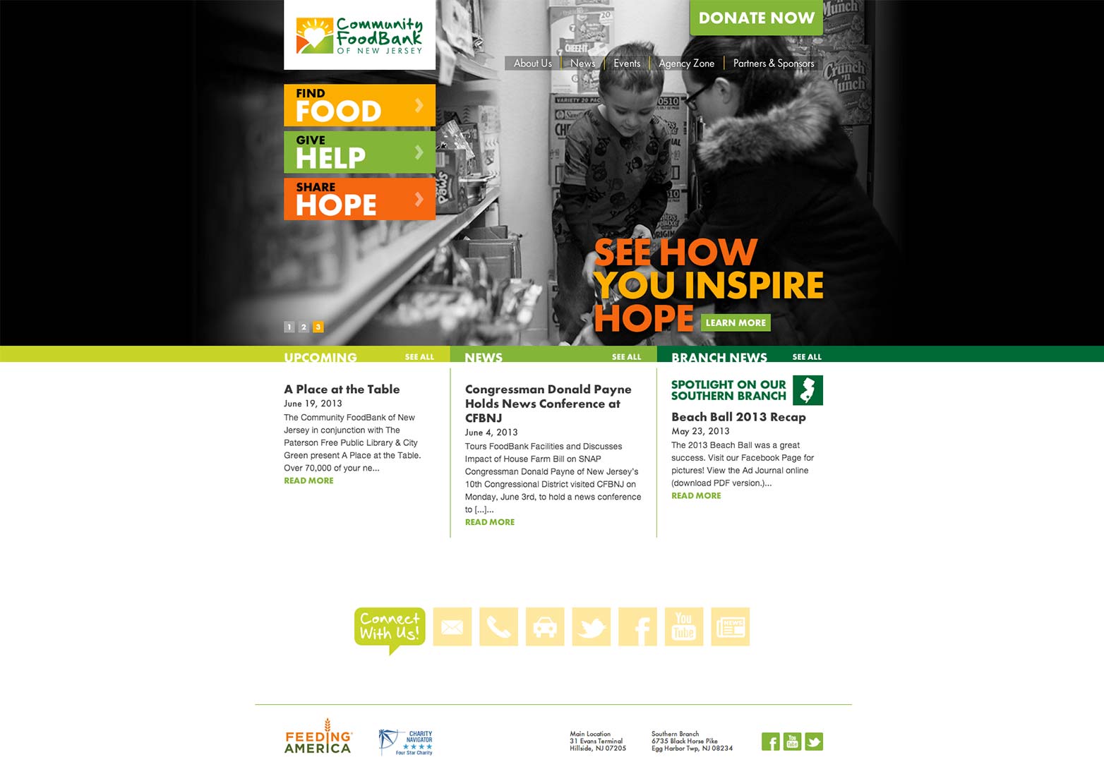
The Community FoodBank of New Jersey provides an excellent example of this principle. Who are they, and whom are they helping? How are they doing it? Your first clue is in the name. How can you help them? The calls to action are right there, including a “donate” button. (That’s important.)
Simple, transparent, and most importantly, obvious.
Tell a story
Out of all of the many, many communication tools we have developed over time, there is one that has never been equaled: the story. Most people see their own lives as one big story, somehow seeing themselves at the center of everything that goes on. We are all protagonists in our own minds.
Because of this natural narrative — this first-person perspective — we connect with stories, and the characters in them, on a level that almost defies reason. Do you want your users to identify with the people you’re trying to help? Tell them a story that they can’t ignore. You have to bring them down into the dark places, through the pain, and then out on the other side.
As a lover of stories myself, I often find myself going over them again and again in my head. I empathize with the pain the characters have gone through. I see the one little plot twist that, had it been explained to the right characters, could have saved them so much pain and heartache. Then, you can tell your users that they can, in fact, change the story. Wow. “Change the story” — somebody steal that from me.
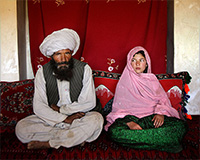
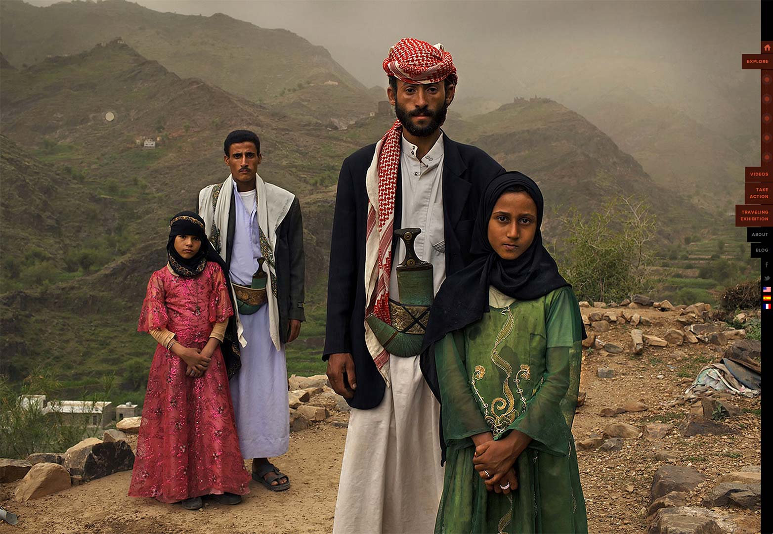
The most memorable website that I have ever seen employing this tactic is Too Young to Wed. They don’t use too many words to tell the stories. Few people have the patience for that anymore. Instead, they use heart-wrenching, compelling imagery to tell the tale.
Use photos of the actual people you’re helping
Don’t ever use stock photos of people. Really... don’t. They already look fake on regular commercial sites. On a charity site, it makes the organization look very scammy. Sadly, there are quite a few scams that claim to be charities, so it’s a valid concern.
As a corollary, don’t use pictures of the volunteers or organization administrators in the design. Sure, you can have some on the “About Us” page, or something of the like — just don’t put them front and center. This isn’t about the volunteers. It’s about helping the people that they help.
As far as imagery goes, you just can’t compete with pictures of real individuals who have real needs. Get a photographer, or go take the pictures yourself if you have to.
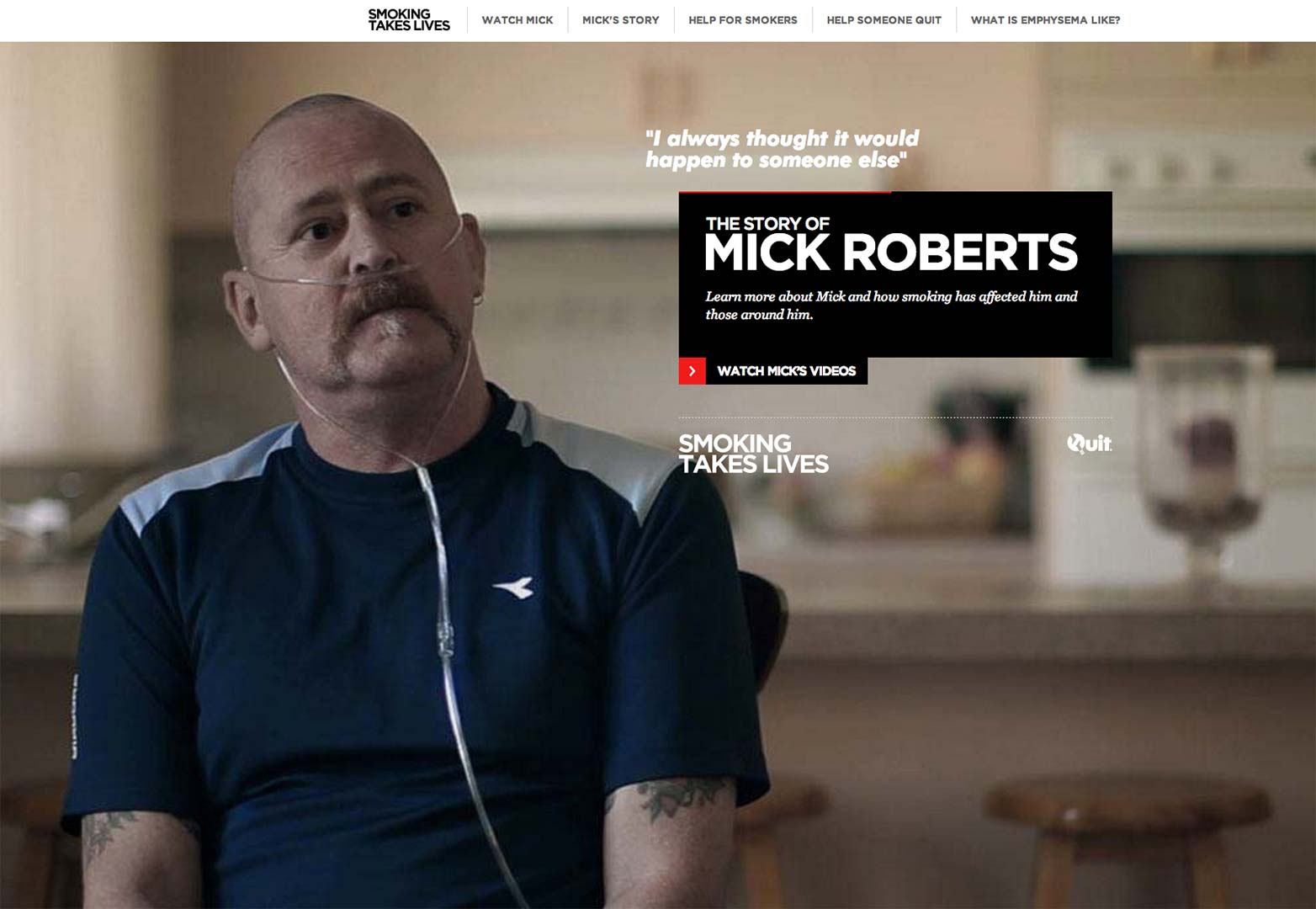
Oh, you want examples? Scroll back up and check out Too Young to Wed again, or take a look at Smoking Takes Lives. Right now, they’re going all out and focusing specifically on one individual, and his story, to great effect.
Almost worse than stock photos are staged photos. You know the ones. There’s a bunch of people standing uncomfortably close to fit as many as possible. They’re all wearing death-grins. They may be holding some donated goods aloft. Or maybe one person is passing some food to another person, but they’re both looking at the camera. Then, there was the guy that tried to do all of that and give me the thumbs up while I took the photo.
Don’t let anyone pressure you into using those kinds of photos.
Charge money, and other notes on dealing with your charity clients
Dealing with charity and non-profit clients can be a bit different. They’re usually very nice people, with all the best of intentions. They’re also often very opinionated. This is especially true if they’re getting the website for free.
Don’t ask me why, but nine times out of ten, people to whom you give free work are much more demanding than the clients who pay you a lot. Maybe they see your time, efforts, and expertise as less valuable, since they’re getting it all for free. Maybe there’s some other reason.
This is not to say you shouldn’t try to help. A reasonable discount is often a good way to go, but try to avoid doing anything for free — even for charity.
The one notable exception, in my experience, is a project I’m actually still working on. I probably can’t give out details just yet, but I’m working with a team. We’re all volunteers from different parts of the world, including our project manager, who does all of the talking with the clients. This has made the experience much smoother overall.
Other than the money issue, you’re likely to run into other, more typical client quirks. In smaller organizations, your client may have done their own newsletters or other promotional materials for a long time. As a result, they might have a tendency to micromanage.
One client actually criticized my work for being “too professional”. They thought having design that looked too good would give people the wrong impression about their organization. You know, the kind of stuff that makes for a good story when it’s all over.
Heck, aside from helping people, a good story almost makes it worth the trouble.
Have you designed for non-profits? What tips would you add? Let us know in the comments.
Ezequiel Bruni
Ezequiel Bruni is a web/UX designer, blogger, and aspiring photographer living in Mexico. When he’s not up to his finely-chiselled ears in wire-frames and front-end code, or ranting about the same, he indulges in beer, pizza, fantasy novels, and stand-up comedy.


Read Next

3 Essential Design Trends, May 2024

How to Write World-Beating Web Content

20 Best New Websites, April 2024

Exciting New Tools for Designers, April 2024

How Web Designers Can Stay Relevant in the Age of AI

14 Top UX Tools for Designers in 2024

What Negative Effects Does a Bad Website Design Have On My Business?

10+ Best Resources & Tools for Web Designers (2024 update)

3 Essential Design Trends, April 2024

How to Plan Your First Successful Website

15 Best New Fonts, March 2024
