

 There has been furious debate in the last twenty four hours on the merits and failings of Apple’s iOS7 update, and the most hotly debated subject is the new icons.
They’ve been hailed as a daring, and radical move, and they’ve been condemned as a half-hearted Android rip-off.
Apple are hoping that they’ll mark the start of a sustainable alternative to skeuomorphism that isn’t constrained by flat design.
Personally, I’ve always hated most of the iPhone’s native icons, I find icons like the sunflower image — I’ve never taken a photograph of a sunflower in my life — to be both naïve and a little lazy. I was optimistic therefore that a redesign would mean carrying something a little more thoughtful in my pocket in future. The result however, is a mixed bag:
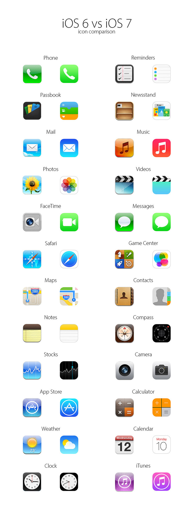
iOS6 & iOS7 comparison by nielsboey.
Some consistency has been attempted; the communication icons (Phone, FaceTime and Messages) are the same ectoplasmic green. Whilst the FaceTime icon is an improvement if only because the original icon was so poor. The white phone and speech bubble have considerably less contrast than their prior incarnations and are therefore less clear.
The Passbook icon may be a success, it blends more easily with the rest of the icons than the previous version. The Mail icon is also a success, despite the poor gradient, the well established icon is clean and easy to read. The Music player icon is also a success, its color differentiating it from the rest of the set, although the brackets joining the dots to the main stems on the musical note look a little clumsy.
Much was has been made of Apple dropping the green felt and wood look from icons like the Game Center, but it’s hard to see the icon's new incarnation as much more than a middle weight designer’s attempt to portrait everything, and nothing in one fell swoop.
There are the traditional issues Apple has with americanisms: the Maps icon looks like an American sat nav, but it’s unlike a map elsewhere in the world. Surely a map is one of the simplest icons to draw?
By far and away the biggest flop is the re-design of the Newsstand icon. Featuring the words ‘News’, ‘Art’, ‘Travel’ and ‘Sports’ it is supposed to represent a variety of magazines. Will it be redesigned for Germany, or Japan, or China, or Swaziland? If there’s one rule that icon designers should live (and die) by it’s this: if you have to add text to explain your drawing, you didn’t draw it well enough.
The rest of the icons are largely an attempt to ‘flatten’ the existing designs. So Stocks is a flat version of the earlier version. Weather looses its gloss as does Videos. Curiously the Camera icon has managed to retain inner shadows and a similar gradient to its earlier version.
The singularly biggest issue — apart from the color — is that so many of the icons are clearly intended to be round, but are crammed inside rounded rectangles. iTunes, Clock, AppStore, Compass, Safari, all feature circles larger than their predecessor. With the exception of Clock — which has never had enough space — each circle has been enlarged to decrease the amount of space between it and the edge of the icon. This results in an awkward, uncomfortable effect.
I suspect that these icons were originally designed as circles to match the circular number input elsewhere in the OS, and Apple either lost their courage, or couldn’t rationalize the other icons in a similar vein.
And that is probably the biggest problem with the iOS7 redesign; Apple set out with good intentions, but their fear of profit margins kept them from designing something truly exciting.
What do you think of the icons in iOS7? Which is the best, and which is the worst? Let us know your thoughts in the comments.
Featured image/thumbnail, uses flat smartphone image via Freebiesbug.
Ben Moss
Ben Moss has designed and coded work for award-winning startups, and global names including IBM, UBS, and the FBI. When he’s not in front of a screen he’s probably out trail-running.


Read Next

3 Essential Design Trends, May 2024

How to Write World-Beating Web Content

20 Best New Websites, April 2024

Exciting New Tools for Designers, April 2024

How Web Designers Can Stay Relevant in the Age of AI

14 Top UX Tools for Designers in 2024

What Negative Effects Does a Bad Website Design Have On My Business?

10+ Best Resources & Tools for Web Designers (2024 update)

3 Essential Design Trends, April 2024

How to Plan Your First Successful Website

15 Best New Fonts, March 2024
