

 The introduction of Windows 8 saw a massive overhaul of the Windows user interface in line with the Windows Phone interface in order to be more intuitive for people using touch screens, and Apple have subtly been adapting OSX over time, streamlining features that are becoming increasingly shared across their mobile and desktop operating systems. Whilst we have yet to see a touchscreen Mac, it's obvious that the touch screen revolution is looming upon us with users spending more and more time on their mobile devices than home PCs.
With this in mind and an ever increasing proportion of browsing taking place on smartphones and tablets, websites must decide how they will adapt to people accessing their content without a mouse and keyboard. Whilst the default response to this has often been 'just make a separate mobile interface!', a solution that has worked well in the past on smaller mobile devices such as phones, there is very little scope for the middle group occupied by larger phone and tablet displays.
This article will take a look at a number of sites that have gone down both unconventional and standard site designs to become more touch-friendly.
Focused websites vs. responsive websites
Many websites have created subsidiary sites or apps specifically for touch screen users, to allow them to focus on one type of user at a time. One problem is that since the websites are separate they rely on URL redirection which can often lead to problems such as the user being sent to the wrong site from links, or poor redirection as a result of needing redirection to formatted pages for mobile users.
The biggest problem with separate websites for mobile users however, is that often the mobile version lacks features or information that a desktop user receives; features and interfaces often simplified, buttons enlarged and options reduced. This can be solved through using a 'responsive' design. A responsive website is designed to be easily viewed on both platforms without losing quality on either one. This also has the benefit that only one website needs to be designed, rather than two, however this often results in compromises for both platforms.
Basic design differences
There are obvious differences between a touch screen and a desktop that you need to think about when creating your website. On a touch screen you swipe up the page in order to scroll down it, however on a desktop you move your scroll wheel down. Apple have attempted to correct this by consolidating their touch interface technologies into trackpads on both their laptop and desktop Macs, however PC users or even Mac users using conventional scroll wheels or sliders to scroll through web pages are at a disadvantage.
Buttons must be much bigger on mobile devices, as tapping is nowhere near as accurate as clicking with a mouse, there's nothing more infuriating than trying to click on a link for the next page and accidentally being sent back a page or onto an advert instead. The lack of a cursor also means you cannot have hover states to explain where a link goes, what a word means or even what is clickable.
There is also a difference between accuracy on mobile inputs since touchscreens can have either resistive or capacitive inputs which have varying sensitivities and subsequently accuracy can be lost on resistive touchscreens. Beyond this, designs must incorporate two hugely differing resolutions for mobile devices that have two orientations.
Screen orientation and aspect ratio
With multiple resolutions beyond regular monitor sizes means you can no longer think just in terms of standardized screen resolutions and vertical movement. The rapid changes in the technology market have produced screen sizes that differ from model and manufacturer and with all the rumors about so called smart watches we may start to see screens that are no longer restricted to four borders. Mobile screens add further complexity due to the fact that they can be viewed in both a portrait and landscape mode through rotation.
The answer are liquid layouts which self adjust for any resolution and can adapt for both portrait and landscape viewing. Some websites use a liquid layout that drastically changes the look of the website in order to optimise ease of control and use the full potential of the screen based on it’s orientation.
Whilst mice were specifically designed with scroll wheels for easy vertical scrolling many users are migrating to touchpads and touchscreens, and since Apple have embraced the more innovative form of touch-scrolling which is akin to dragging a page rather than scrolling, the more creative idea of horizontal scrolling may not be out of the question. Most apps use horizontal scrolling as a tool and by far the greatest success in horizontal scrolling is the kindle, so why not implement it into your web UI? Many single page sites have a solely horizontal axis, however they often have to use buttons in order to instigate the scrolling as users may not understand the non-standard format.
Horizontal scrolling may be similar to vertical scrolling in design terms, however the usage of both may open up the possibility of dual-axis scrolling, which may not work in-browser. Many users like to be anchored to an axis, obviously this is usually the x-axis, which is static, so if users get lost on the page they can just scroll up, and be back at the main navigation. On dual-axis sites this may not be as simple, and so navigation may need to be sticky, using a HUD style bar.
So what user interface should your website be using?
Obviously not every UI is suitable for every type of website, so ask yourself some basic questions: Who is your target audience? What are you trying to 'sell'? What impression do you want to give? Younger people are more likely to use touch screens than an older demographic who will likely use a desktop, but still may need bigger buttons and a clearer UI. There’s no point in creating the most innovative UI imaginable if no one can understand how to use it, so always remember to create a UI that a user can look at and instantly know how to use.
Radial menu
A radial menu, also known as a pie menu, is a circular context menu that uses multi-directional context rather than height or width as the selection tool.
This is a great form of intuitive design that prevents users from getting lost in dozens of sub menus. Another advantage is that a touchscreen user has better control over normal drop down lists as directional control is more accurate than tapping. The use of radial menus in forms and websites could dramatically enhance a touch screen users experience on the website, and extends to thumbsticks such as those used on games consoles, somewhere radial menus are often used since it allows games to be easily ported to PC. As such desktop users don’t lose out either as it remains the case that radial menus can simplify long lists into simple categories increasing the ease of use or productivity on a website.
Radial menus are a great way of showing context sensitive information, one example of this is clicking on a picture of a dish on a food site and being given the option of retweeting, the recipe link, ingredients list or saving the picture. However you must be careful that your menu remains accessible and simple, otherwise you can easily overwhelm the user especially when combining symbols and words in the same radial menu. Radial menu’s are much easier to use when static rather than dynamic as this can lead to difficulty in object selection such as on sites like Phong, in this case especially when using a mouse as cursor tracking makes it especially unintuitive.

Skeuomorphism
Skeuomorphic design imitates the look and functionality of an everyday object in order to create an intuitive UI, something which has recently gone out of vogue, especially since Scott Forstall resigned from Apple and Sir Jony Ive's flat design took over iOS and likely OS X in the future. Skeuomorphism had been a large part of Apple's push toward more intuitive design, recently with Contacts on Mac being designed as an actual address book, or Newsstand and iBooks on iOS being actual bookshelves. This design is one that more obviously benefits touch interface users, since we don't interact with the world around us with a cursor.
Familiarity adds to intuitiveness when using any user interface, this being the point of skeuomorphism, to bring an extra dimension of familiarity by joining forces with real objects so the user instantly knows how to interact with it. A successful skeuomorphic design means that just by glancing at the web page you will know what the subject is/the page is used for, making mouseover tooltips and link highlights obsolete.
Dial UI
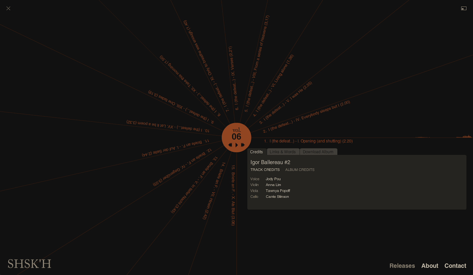
This is a combination of both the above where the whole user interface forms a simple dial; the design resembles a radial menu, but instead of hinging at the center, selecting from there, the dial rotates to a single point of selection. This is very effective in cases such as music where dials are often used to mix a track and control volume. In the case of the net label SHSK’H they use a modified type of dial UI to select which track you want to play.
The minimalist movement
Minimalism is where a website is stripped back to its bare essential elements. This is great for mobile users as it decreases load times and data usage as well as allowing the user to be able to access all the necessary information in a clear interface that is easier to use for smaller resolutions. Current minimalism has gone beyond stripping sites to the bare essentials, and has formed a new style known as flat design. This hinges on the belief that intuition is no longer necessary in design since interfaces and their usage have become such an important part of life that design can move beyond telling users what to do, a UI can finally be a tool, rather than also doubling as a mentor. Flat design has long been characterised by the use of bold block colors, but with the introduction of iOS7, gradients have taken their place in world of borderless flat design, extracting elegance from the garish.
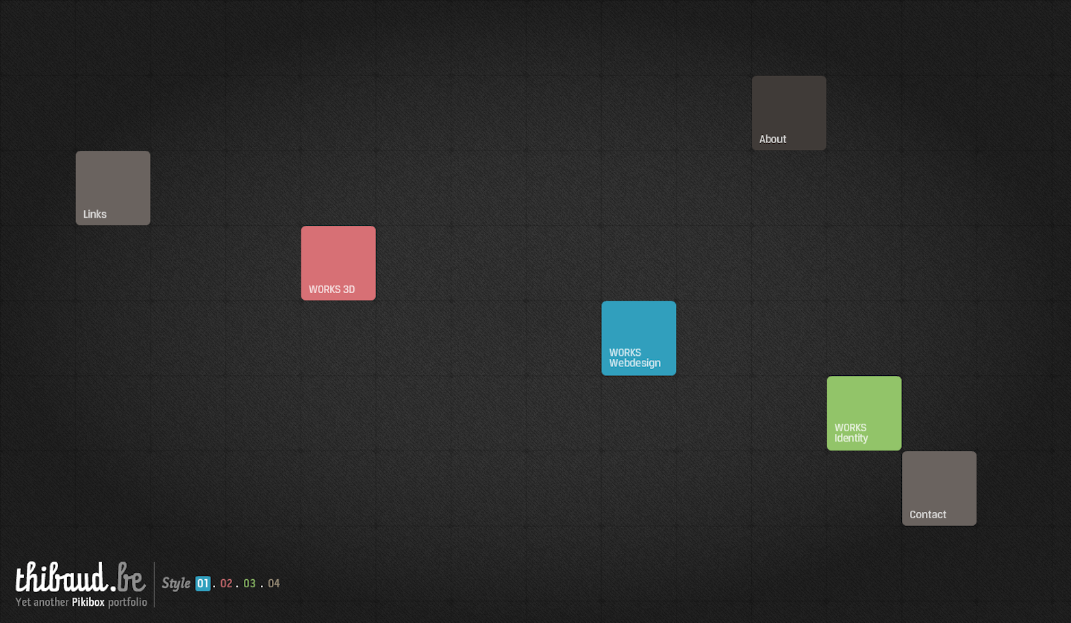
Finally, I'll end this article with a site that does things a little differently. Thibaud is a creative developer who has designed a portfolio website builder known as Pikibox. The website is extremely touch friendly but without hampering its accessibility to desktop users, on smaller touchscreen devices however the user is sent to a focused redirect with a mobile interface.
The simple design works wonderfully in showing off his entire portfolio in a professional manner whilst retaining a fun, new look that is extremely intuitive. Of course, a large part of the design is in the hands of the user, being able to alter the location of the navigation and adjust how it is used spatially, which some would say doesn't exactly constitute a design choice. The desktop version comes in four styles, and I invite you to have a play around with them, and draw your own conclusions as to whether this is simply indecisive or hugely creative.
What compromises have you made as a result of touch screens? It the hover state a thing of the past? Let us know in the comments.
Featured image/thumbnail, touch image via Shutterstock.


Read Next

20 Best New Websites, April 2024

Exciting New Tools for Designers, April 2024

14 Top UX Tools for Designers in 2024

What Negative Effects Does a Bad Website Design Have On My Business?

10+ Best Resources & Tools for Web Designers (2024 update)

3 Essential Design Trends, April 2024

How to Plan Your First Successful Website

15 Best New Fonts, March 2024

LimeWire Developer APIs Herald a New Era of AI Integration

20 Best New Websites, March 2024

Exciting New Tools for Designers, March 2024
