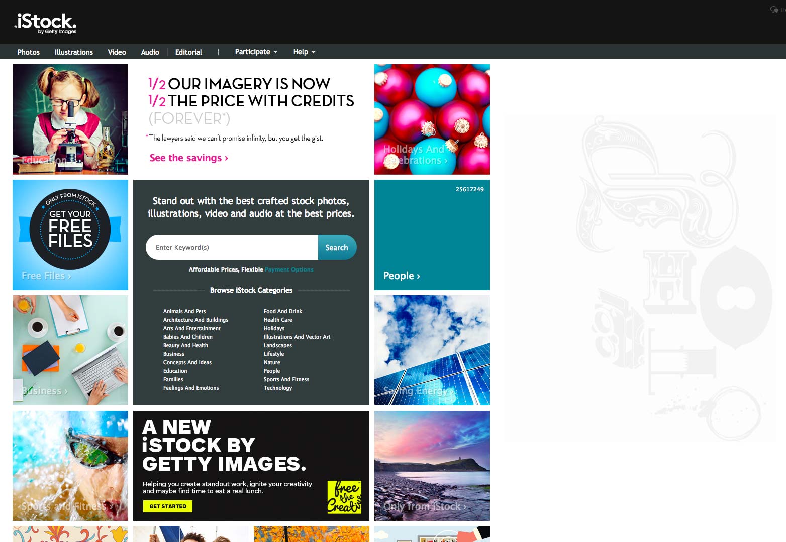
 It's pretty easy to get confused as to who owns what right now. Pick any web start-up and there's a good chance that it's either owned by a major player, or in the process of considering offers. Small companies innovate, but it takes big investment to fulfill the potential of those innovations.
iStock is one of the biggest names in stock photography on the web. And for good reason: iStock provides an innovative approach to stock imagery, providing photographers with a way to earn a living, and giving designers access to a huge pool of assets.
It's been seven years since iStock became part of the Getty Images family, and in that time, competition for designers' asset budgets has grown ten-fold. iStock continued to deliver great images, still provided an accurate search function, still provided value for money; but the brand had begun to feel dated — not ideal for a company marketing itself to designers.
The old iStockphoto logo (left), and the new iStock logo (right).
Seeking to change that, Getty Images decided to rebrand iStockPhoto properly, and now we have the all-new iStock.
This isn't a monumental change in the iStock business, because Getty Images has been there, working away behind the scenes for seven years. It's just that now, it's harder to miss them.
So why have they chosen to rebrand iStock now? Well, according to Getty Images, they feel that the recent changes they've made to the iStock business, provide the perfect time to make the change. The new, simplified search experience, the reduction in pricing and the addition of all new imagery exclusive to iStock is a watershed moment that's worth celebrating.
The most obvious change is the dropping of the 'Photo' from the name, making 'iStockPhoto', simply 'iStock'. The reason for this change is obvious: iStock don't sell just photos, they offer video, vectors, illustrations, even sound files.
When Getty Images chose to rebrand iStock, they intended to "[marry] the freshness, innovation, and strength of the iStock brand to the quality, heritage, and credibility of Getty Images". So, did they succeed? Well actually, yes. Getty Images is a huge name in stock, and they do have some of the most credible, high-quality photography available anywhere. What's important is that the change has retained the original spirit of the iStockPhoto branding.
Text remains white on black. The type employed is still sans-serif, although now considerably more geometric. The terminals of the stems are now sharp and precise instead of rounded; creating a more professional, less fun, feeling logo.
The cleverest part of the new design is the period that follows the 'iStock' word. It can be read in several ways: as a half-smiling nod to the missing 'Photo'; as a reference to the dot in '.com'; and also as a statement of intent, iStock is the last word in stock photography, period.
In addition to these changes, the logo is underpinned by the tagline 'by Getty Images', a reminder that the parent company's strength is behind iStock. Simultaneously it seeks to tie iStock to Getty Images' other brands; Thinkstock, also owned by the company, was similarly successfully rebranded some months ago.
The rebranding of iStock is a major undertaking for Getty Images, but one that they've carried out well. The result is a modern brand that delivers on quality & price, and breathes new life into one of web design's favourite resources.
What do you think of the new iStock brand? Do you use iStock, will the brand change encourage you to do so? Let us know in the comments.


