
 If you've spent time exploring the creative industry, you've probably heard the phrase, ‘rule of thirds’. It's one of those expressions people like to use when they want to sound clever. Go ahead. You can make a mental note for later. I won't tell anyone.
Oftentimes, the rule of thirds is used in reference to photography, and here's how it works: to effectively use an image, divide it into nine equal parts. The lines formed by this division should offer a clear definition of the most important aspects of the piece, creating a visually exciting image.
In the example below, the horizon in the right photograph lines up with the lower segment, while the rock formation, now off to the side, creates an interesting parallel to the wide expanse of sky. It's off-balance, as opposed to the symmetrical photograph on the left, which makes it more interesting, giving your brain more to study.

I'm sure you can imagine why striking a chord with viewers is integral for good photography. If a photograph isn't aesthetically pleasing, it hasn't done its job, and you, the viewer, walk away not caring what the photographer went through to get the shot. An image needs to linger to be effective. The brain understands symmetry and brushes it aside. Asymmetry, however, is challenging. Exciting. New. Oddly enough, it is this aesthetically pleasing reason that has lead to artists using the likes of the rule of thirds (and its cousin, divine proportion) for centuries.
But those are lessons for an art history class, and I promised I'd never go back there. — I'm kidding, of course. Please don't send me art history hate mail.
So, why is the rule of thirds important in design?
Of course with every rule given in art, it isn't necessary to strictly adhere to the construct. The rule of thirds is more of a guideline to aid a designer in where to focus content. Don't fret about it too much; it's not as though viewers would know immediately that a designer used the golden ratio. (Let's be honest, it'd be a remarkable waste of time to make sure every button was built using the Fibonacci sequence.) Instead, a viewer might think, ”Oh, that's nice to look at.” You know, the same way they may enjoy studying a well-structured work of art. And as frustrating as it is to know your hard work went mostly unnoticed, that's exactly what you want.
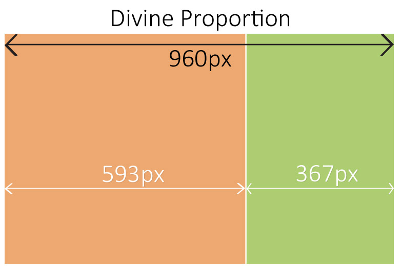
For all the hubbub surrounding different fads within design, a few elements have stayed true: don't overcrowd the page, keep your key aspects above the fold, and try to stick to the magical divine proportion.
For blogs and news sites, keeping to the 1.6 (etc., etc.) golden ratio is relatively easy. You've got your main content section on the left, and a side bar that's just over one-third of the size of the content space. With my little eye, I see that works out nicely with the nine squares for our rule of thirds. But that's if you want a blog.
Let's say you have a product to sell and want to make your page aesthetically pleasing to as many eyes as possible. We'll take a look at an example that uses the rule of thirds well, while shying away from the typical two-column structure.
Most readers look at a website in the ”F” formation. Scan the top of the page, and then move down the left hand side. Naturally, this works well with the two-column format. However, let's look at our example of uCast's site. Along the top three rectangles, we have the usual navigation goodies with a clean logo, so we know what we're getting into. The slogan lines up nicely with the upper third, fitting in just well enough to make it like the horizon line in the earlier photograph example. The eye then falls down the left side, but once it gets to the bottom, the numbered steps lead us to the right, yet again. We've made a full circle and in one page a viewer has a pretty clear understanding of the site and its product.

Where the lines intersect is of particular interest. Here is where many could make use of the rule of thirds, and, indeed, uCast has used the lines as a nice bookend for its slogan. However, it should be noted that the rule of thirds is not meant to be used fully. Skewing an image to the left or right creates movement and is much more appealing to the eye than a symmetrical design. Make use of the intersections and implied lines, but not all at once, or they lose their luster.
The rule of thirds is a simple tool to help keep your design in check. It isn't all-encompassing, but it's a good place to start if you feel like your design isn't quite fitting together visually.
Have you come across any websites that might incorporate the rule of thirds? How do you apply the rule to your designs? Let us know in the comments.
WDD Staff


Read Next

20 Best New Websites, April 2024

Exciting New Tools for Designers, April 2024

14 Top UX Tools for Designers in 2024

What Negative Effects Does a Bad Website Design Have On My Business?

10+ Best Resources & Tools for Web Designers (2024 update)

3 Essential Design Trends, April 2024

How to Plan Your First Successful Website

15 Best New Fonts, March 2024

LimeWire Developer APIs Herald a New Era of AI Integration

20 Best New Websites, March 2024

Exciting New Tools for Designers, March 2024
