20 impactful package designs that teach us about effective UX


I've always had this crazy infatuation with packaging design. There's just something about getting a physical product and checking out what it's presented in and how its presented. Is it in a box? What color is the label? Is there stuffing of any sort in it? What materials are being used? How does it make me feel?
Packaging is important because it's like the UX, or user experience, of a physical product. It determines how we interact with that product and allows us to make educated assessments of it. If a company doesn't put time and and effort into their packaging, I may get something I feel is cheap and that may reflect poorly on the product. Thus, I have a poorer experience and I'm not thrilled with the product. It's all related to the brand experience and our perceptions.
Because of this, designers must pay attention to how they are packaging items. We've got to keep in mind who's purchasing the product, what the product is for and what it's supposed to represent. Luxury items look and feel that way — they aren't in cheap packages.
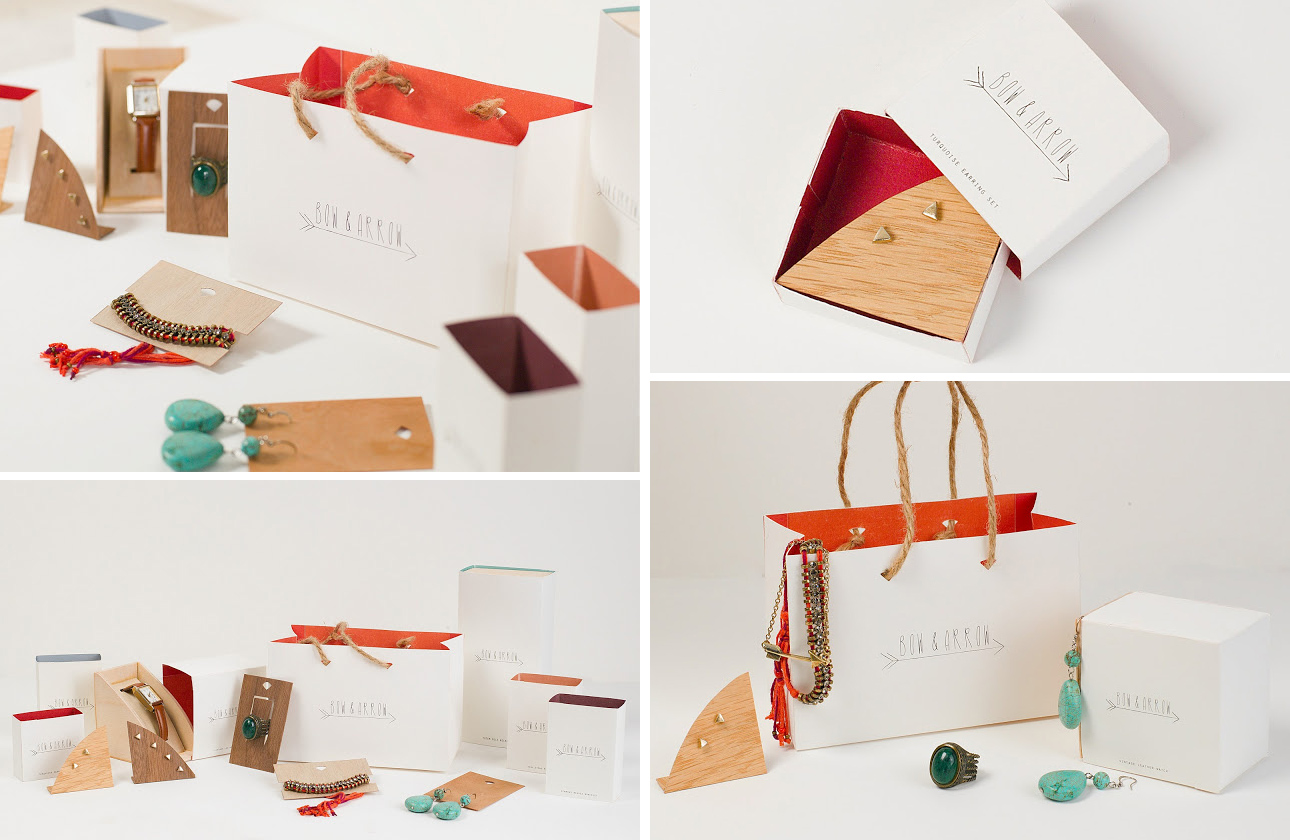
Bow and Arrow (student project)
Bow and Arrow is a store that makes handcrafted jewelry. The packaging of this brand reflects that as you have pieces of wood and and handwritten fonts on their bags and in their jewelry boxes. This is a very simple idea that makes a lot of sense and looks great in the process.
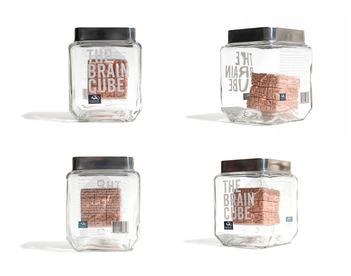
The Brain Cube
The Brain Cube is the Rubik's Cube on steroids. Instead of trying to match up different colors, you have to make sure the grooves of the brain are perfectly matched. I've never solved a Rubik's, so I can only imagine how tough this one is. But also of importance, how intriguing is this packaging? It comes in a clear jar and tends to remind you of a mad scientist who keeps organs in his basement!
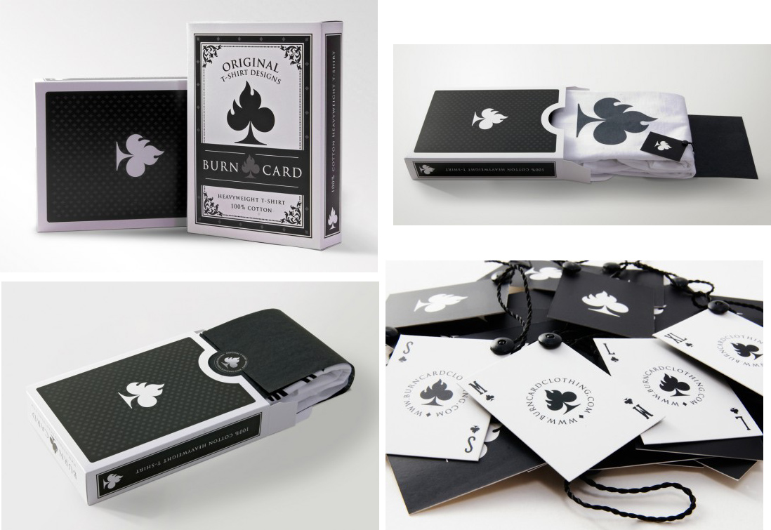
Burn Card T-Shirts
Without the scale, you'd think this was just a fancy deck of cards. But the imagination of these designers is awesome! They've decided to keep the 'card' going in their packaging to not only make the tag look like a playing card, but also create an apparel box that looks like a card deck.
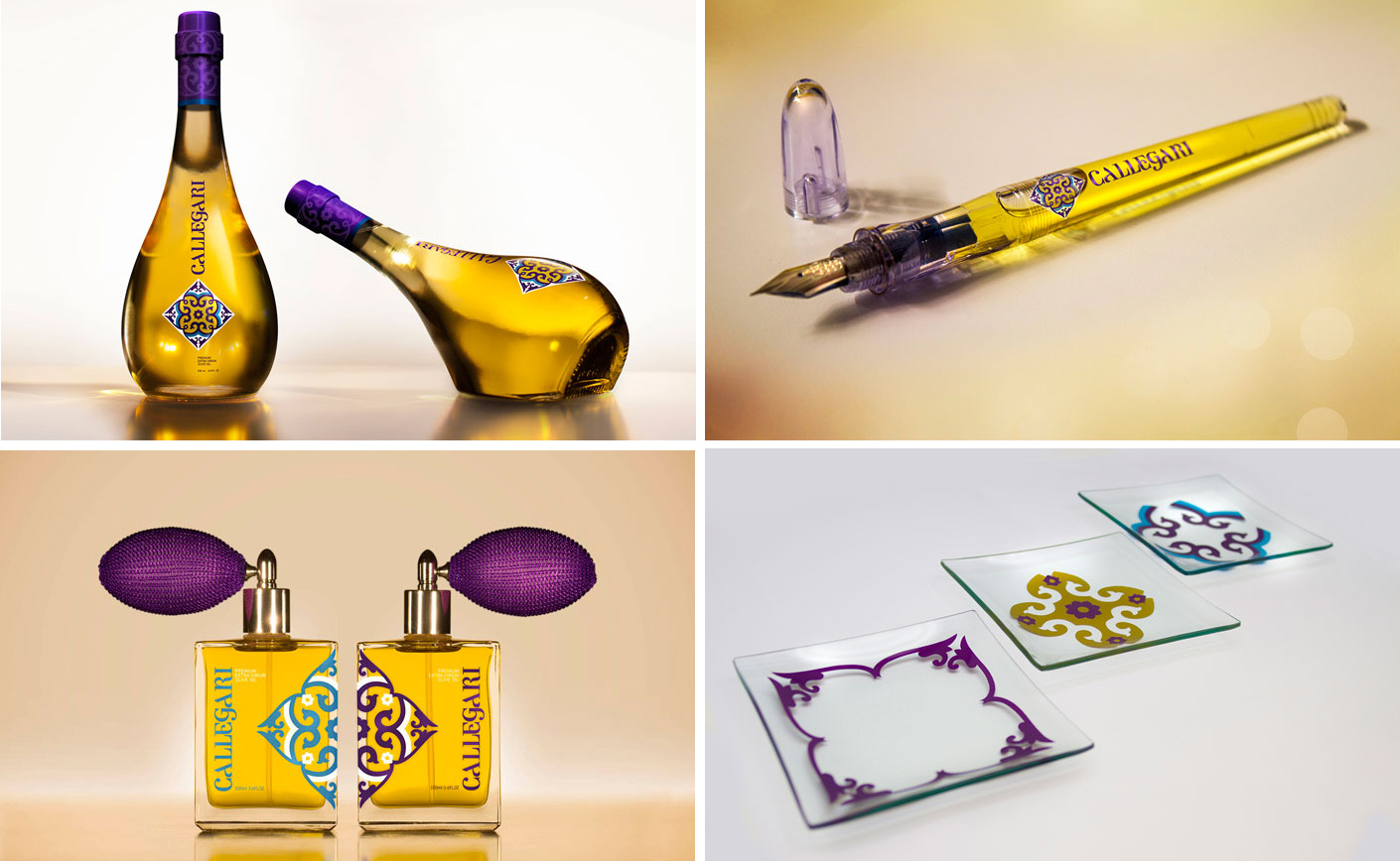
Callegari Olive Oil
If you saw this in a store next to other olive oils, you'd probably think a worker made an awful mistake by putting wine or pens or even perfume next to bottles of oil. Calligari has decided to be bold in their packaging design for their olive oil. They want you to feel differently about olive oil and use it differently than you would use most. Chefs are able to sign their dishes now while people can spray aromatic oil on their salads.
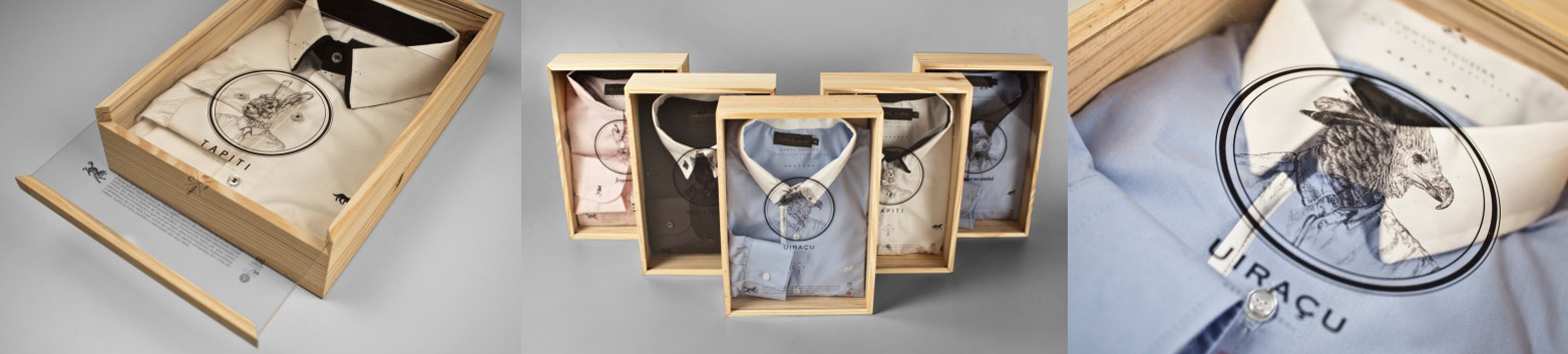
Conto Figueira
There's just something about menswear and wood that is always intriguing to me. It adds a level of luxury and an experience not common to most brands. Plus, the wood is re-usable and just hard to part with so consumers will always remember and see your brand.
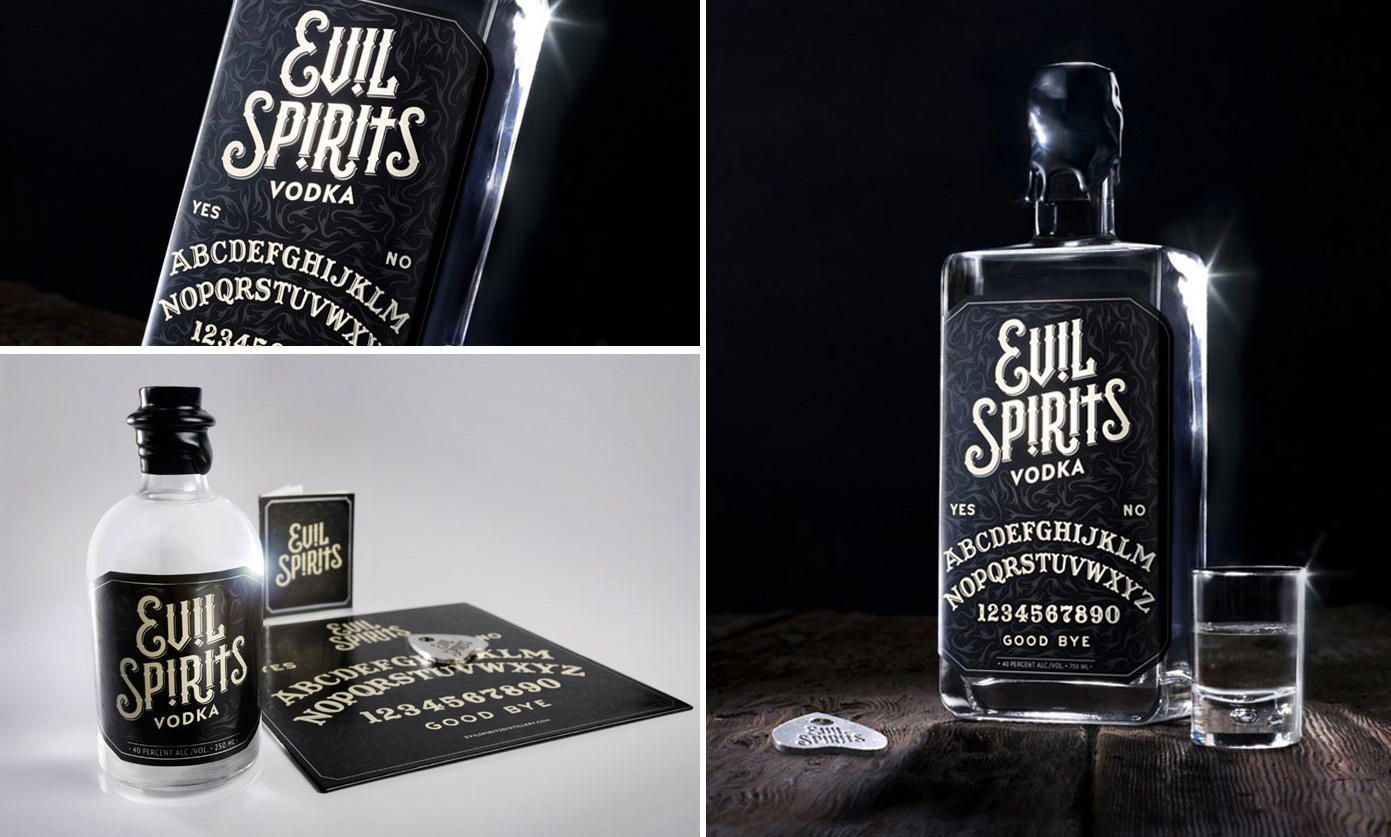
Evil Spirits Vodka
This vodka plays off the idea of the notorious board "game" called the Ouija Board. Apparently, you're supposed to put out this board and let the spirits guide you to the answers to your questions. It's all in good fun if you believe in spirits and in ghosts. Evil Spirits Vodka takes it to another level by creating a pairing to this type of culture, tapping into the spookiness that comes with the Ouija board.
Halycon
I really like how the packaging design and branding of the Halycon is consistent throughout each piece without being redundant and losing its luster. It's a really bold direction for a place like the Halycon.

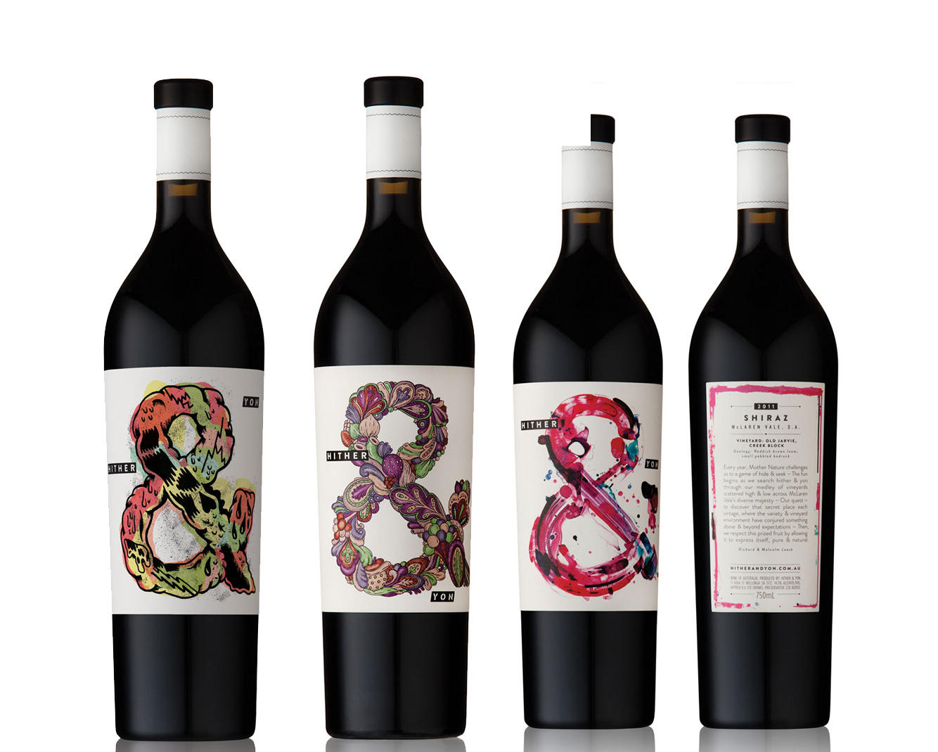
Hither & Yon
Who doesn't love wine labels? Rather than branding their wine with their full name, they've taken the very simple ampersand and have made it extremely beautiful for each different flavor. Each one is extremely creative and great for those wine lovers who also have a taste for the arts.
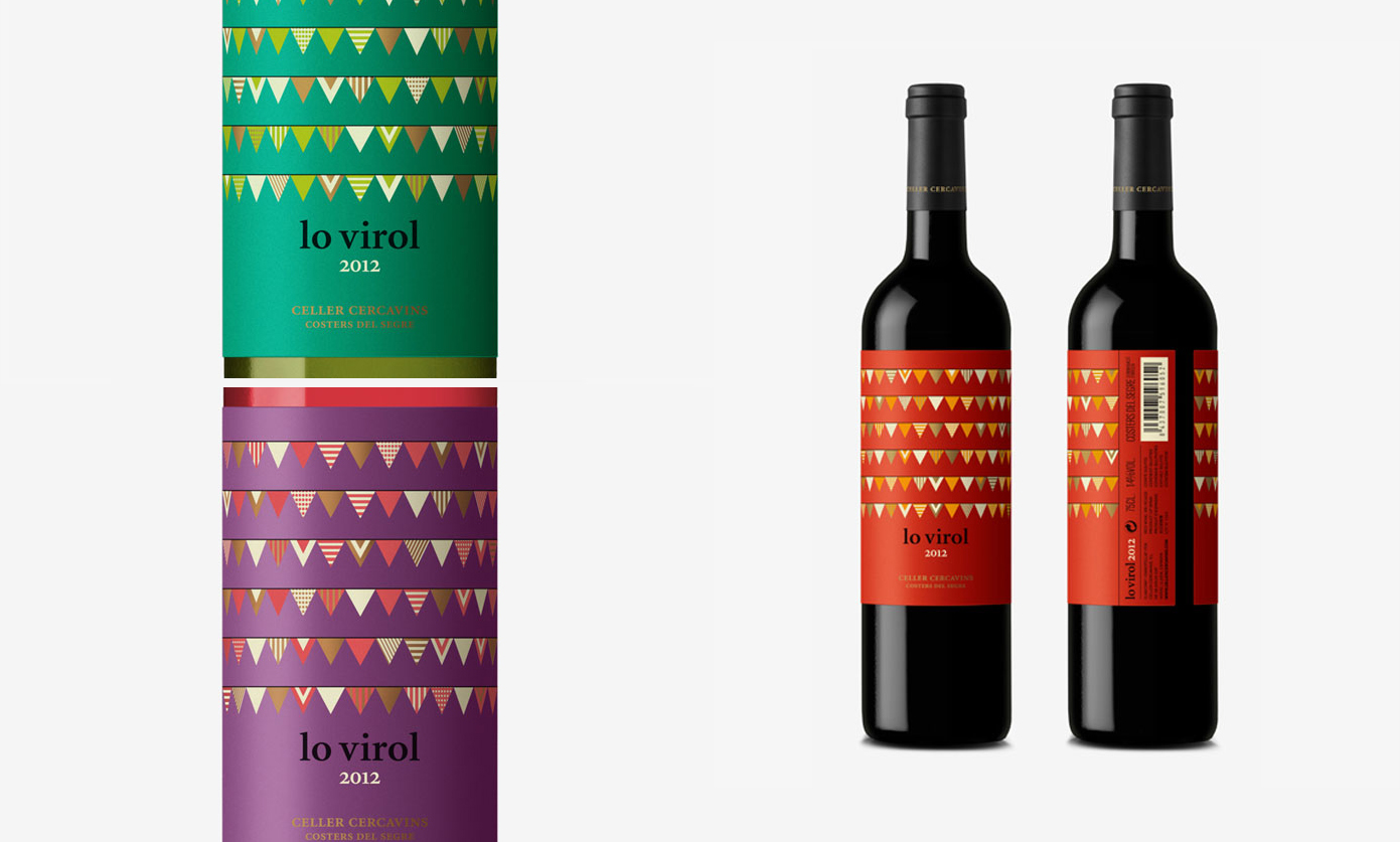
Lo Virol
Wine labels are popular when it comes to packaging. You always want to know how different you can be next to the traditional idea of wine bottles. What I like about this packaging is the pure graphic content. There's usually always some sort of hand crafted feel to wine labels, but I love how this label has bright colors and geometric shapes.
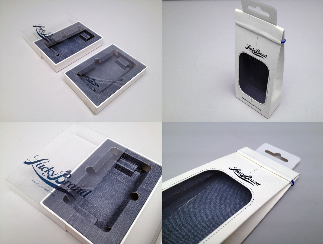
Lucky Brand Jeans
How do you keep your brand consistent when your brand decides to jump into a new industry? Clothing brand Lucky Brand Jeans have decided they wanted to make accessories for the tech-world without losing touch with what they're best out. So, they decided to create packaging with their jeans on it. It's so simple and perfect!
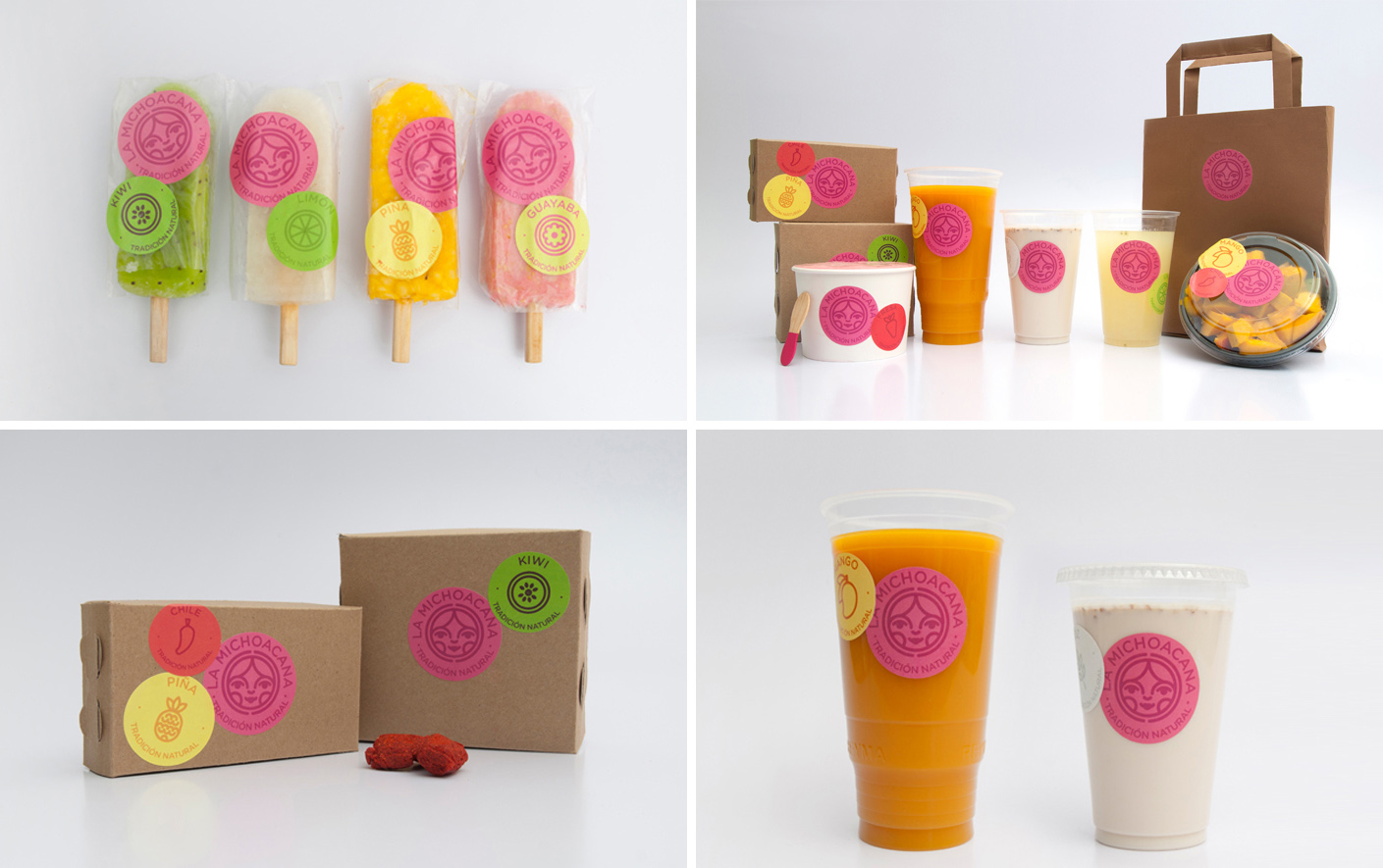
La Michoacana
La Michoacana is a traditional Mexican Paleteria. In my quick research, I found that is a small latin ice pop made out of different fruits. It leads me to believe La Michoacana not only makes those things, but also expands their brand as well to drinks and other tasty snacks for people. The brand looks delicious, and even with the help of a few colorful stickers, they've created something that's interesting and simple enough to remember.
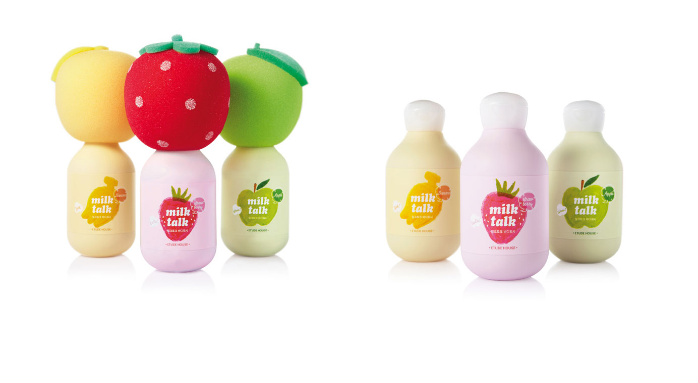
Milk Talk
Milk Talk creates moisturizing body soaps that smell like banana, strawberry or apples. These scents are reiterated in the coloring and the fun sponges put atop the packaging. Also, the bottles are made from a really smooth material that continues to echo the sentiment of the moisturizing soap. This is a great example of packaging that has a brand message and continues to send it in various ways.
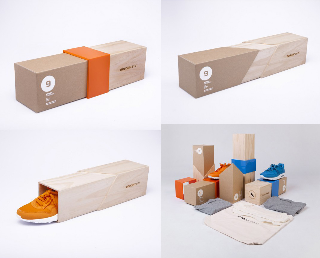
One Percent
By looking at the box, you'd probably have no clue what this product is. However, it's intriguing enough for you to want to pick it up and scope it out. This shoe box is very intricate and of high quality to help them make a statement to their target audience. It's hard to rethink packaging such as a shoe box but One Percent really took it to the next level to reflect what they stand for.
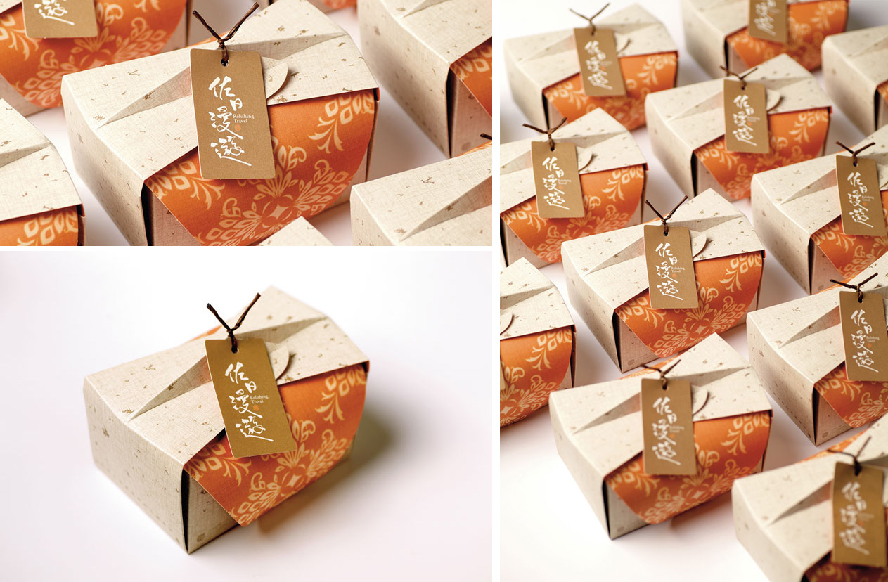
Relishing Travel Gold Bullion Pineapple Cake
There's cake in this box, so it automatically gains my interest. But seriously, think of a cake box and think of how Relishing Travel completely re-imaged the idea to fit their brand. They've created packaging that creates a higher interest level of the actual product. I would purchase this just to have a chance to unwrap the packaging and have what's inside. That's great design.
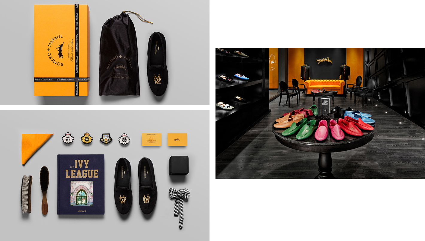
Romero and Paul
Above, One Percent showed us how we can completely re-imagine the shoe box. Romer and Paul decide the shoe box is fine, but they show us how to make it a luxurious experience. These wonderful, high quality loafers play a role in creating characters and settings for consumers, making you feel as if Romero and Paul are close friends.
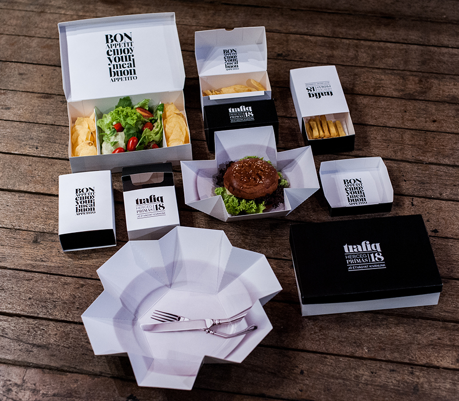
Trafiq
Trafiq is another brand that draws on traditional uses of the word 'trafik' to play off. It has a heavy vintage, yet classical feel that seems to make you feel a bit more elegant than eating burgers wrapped in thin paper.
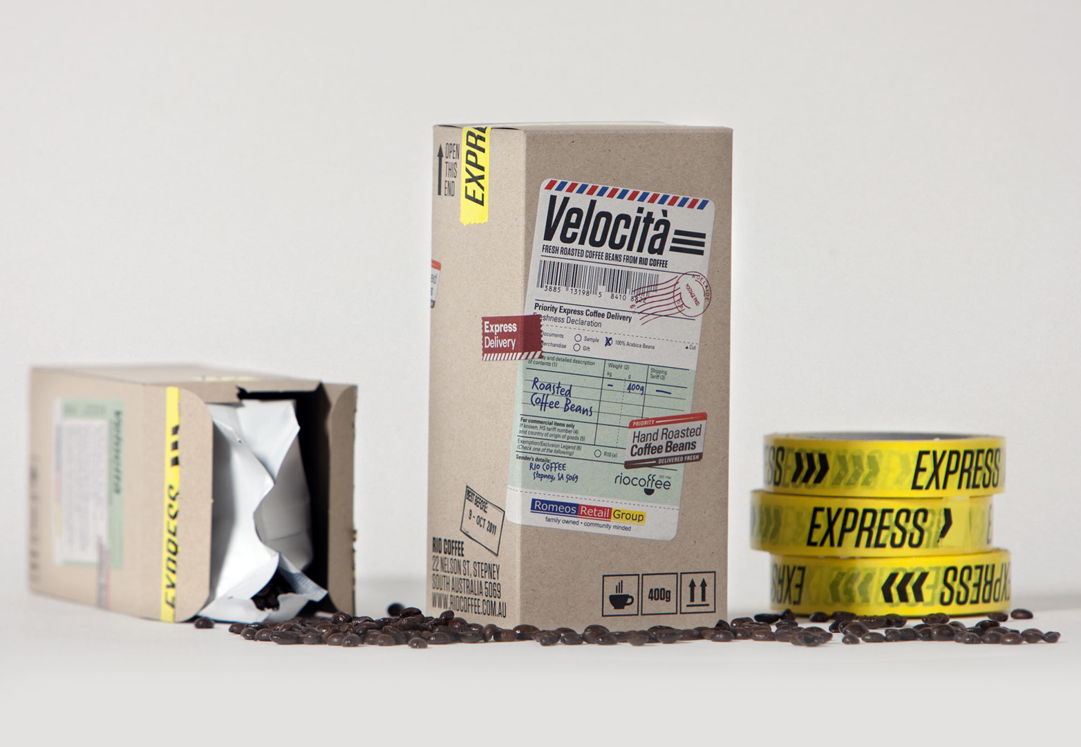
Velocita Coffee
Business is about taking risks and being bold in the decisions you make. How often do you see coffee makers create packaging that makes it look like it just came straight off the plane? Velocita created this packaging intentionally to let consumers know their coffee is so fresh, it's like they just received it from Rio. I love this because, again, it's bold and different and is sure to stand out amongst other brands.
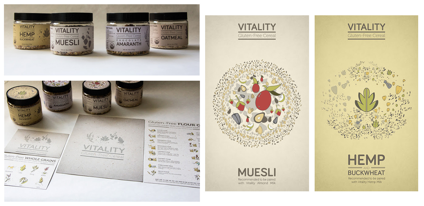
Vitaly (student project)
This brand focuses on serving gluten-free cereal to the gluten-free community. They wanted to create packaging that was intriguing to that sector and also offered one serving of cereal for them. I like the artistic, natural approach to this packaging because it just makes sense.
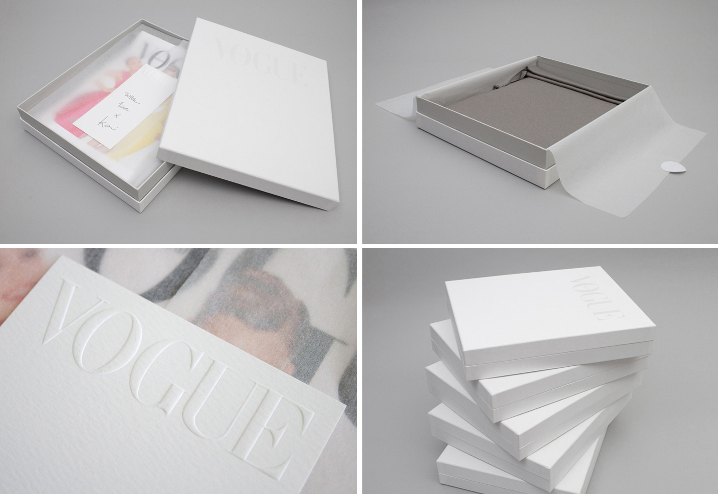
Vogue limited edition box
It's not often that you feel luxury when dealing with books or magazines. When magazines put out special and limited edition magazines, you just assume it will be larger in number. Vogue totally blew our minds by creating luxurious and elegant packaging for their limited edition magazine that also came with a bag as a gift for recipients. The handwritten note is also another very lovely touch.
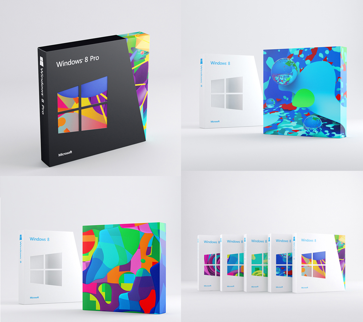
Windows 8
I would've never thunk it, but it seems like Windows 8 has been trying to prove something with their branding and designs in this new revival of Windows. Where we'd be lucky to see screen shots and just all around ugly stuff on software packaging, it seems Windows has decided to show their cards in the design department. There are some very interesting and beautiful boxes from Windows.
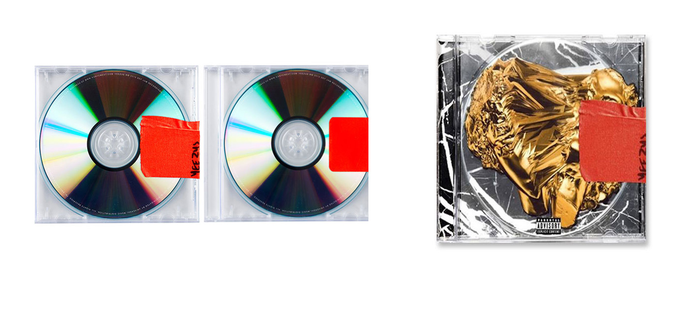
Kanye West - Yeezus album art
If you're familiar with the hip hop culture, you're familiar with Kanye West. Even if you aren't, you're probably familiar with Mr. West. At any rate, as always he tends to strike up a lot of conversation when it comes to his album covers. Some get banned and censored, others get praised as amazing and beautiful. With tons of controversy about Kanye's album, from the title to the cover, this could quite possibly be the very simple CD packaging for his next album. There's something extremely powerful in all this simplicity.
Conclusion
By now, I hope you see that—whether it's a pair of shoes or a mobile app—you don't just have to wrap your product up, put in a bag or a box and slap a sticker on it. Think out the process and really determine how you want the people purchasing the product to feel when they first encounter it. There are little to no rules, the sky's the limit, so think outside the box and be creative!
Kendra Gaines


Read Next

20 Best New Websites, April 2024

Exciting New Tools for Designers, April 2024

14 Top UX Tools for Designers in 2024

What Negative Effects Does a Bad Website Design Have On My Business?

10+ Best Resources & Tools for Web Designers (2024 update)

3 Essential Design Trends, April 2024

How to Plan Your First Successful Website

15 Best New Fonts, March 2024

LimeWire Developer APIs Herald a New Era of AI Integration

20 Best New Websites, March 2024

Exciting New Tools for Designers, March 2024
