How Google’s mobile-friendly update will affect you (and what you can do about it)


What has Google said?
Back in February, Google didn’t so much drop a hint, as issue a clearly written statement in plain English about their intention to penalize any site that they do not deem to be mobile-friendly.Starting April 21, we will be expanding our use of mobile-friendliness as a ranking signal.And if that wasn’t clear enough, they added:
This change will affect mobile searches in all languages worldwide and will have a significant impact in our search results.Of course you’ve got your finger on the pulse, you probably saw this coming. But hey, we’re all busy, maybe you haven’t got around to updating your site yet. And besides, who knew exactly what Google would deem to be mobile-friendly?
Why is Google making the change?
Love Google, or hate it, you have to admit its messages are consistent. Cynical thoughts about advertising revenue aside, the search engine giant repeatedly states that it wants users to have a fantastic online experience. It expects — or perhaps demands — that Web users should be able to easily find relevant, useful content, in response to a clearly defined search term. The impending update to Google’s algorithm places greater emphasis on users navigating easily on a mobile device. Why? Because Internet use from mobile devices has been rising sharply year on year. A cynical person might suggest that Google’s commitment to the mobile web is largely due to the relative success of its Android program compared to its Chromium program, but that would be a cynical person. Last month, at the SMX West conference in California, chief architect of SEO Clairity, Mitul Gandhi, demonstrated that 30% of organic traffic originates from mobile devices — and that data is valid across a range of industries. Those stats could even be on the conservative side; there’s a raft of data out there showing that the percentage of traffic from mobile devices is, in some cases, as high as 70%. We know that the mobile web is growing, if not exponentially, then certainly rapidly. In light of that fact, Google’s decision seems fair and rational.What’s the worst that could happen?
Taking Google at its word, any website that is deemed by their definition to not meet responsive standards will plummet in their rankings. And because a specific date has been provided, could the change happen overnight? Scarily the answer seems to be “yes”. So, although a non-responsive website could still appear to be useful to a human being after April 21st, Googlebot will be unimpressed. Does this mean that you have to make your website responsive? No, you don’t; and Google doesn’t have to rank you. Google is not the Internet, but let’s face it, failing to rank well on Google — and therefore every other search engine out there — is not a great way to ingratiate yourself with clients, or to run a successful website. There are some obvious new restrictions, and some that aren’t so obvious: you cannot, for example, use software that isn’t commonly found on mobile devices, such as Adobe Flash; you cannot display text that can’t be read without being zoomed; you cannot force users to scroll horizontally; you need to ensure there’s adequate space between links. There are other consequences that are harder to predict: for example, a lot of advertisers still use the SWF format, will hosting SWF-based adverts on your site damage your rankings? We’ll have to wait for the coming weeks to find out.What should you do?
The good news is, finding out whether to meet Google’s definition of mobile-friendly is easy. Anticipating the uproar, Google have provided a useful tool that will check the responsiveness of your website in seconds. Just enter the URL of the site you wish to check into Google’s mobile-friendly testing tool and cross your fingers. If the site is responsive, Google gives you the thumbs up. If not it will tell you why not. You’ll also get some extra detail about how Googlebot sees your pages; the only sugar-coating comes as Google offers you a series of links explaining how to solve the problems specific to your website.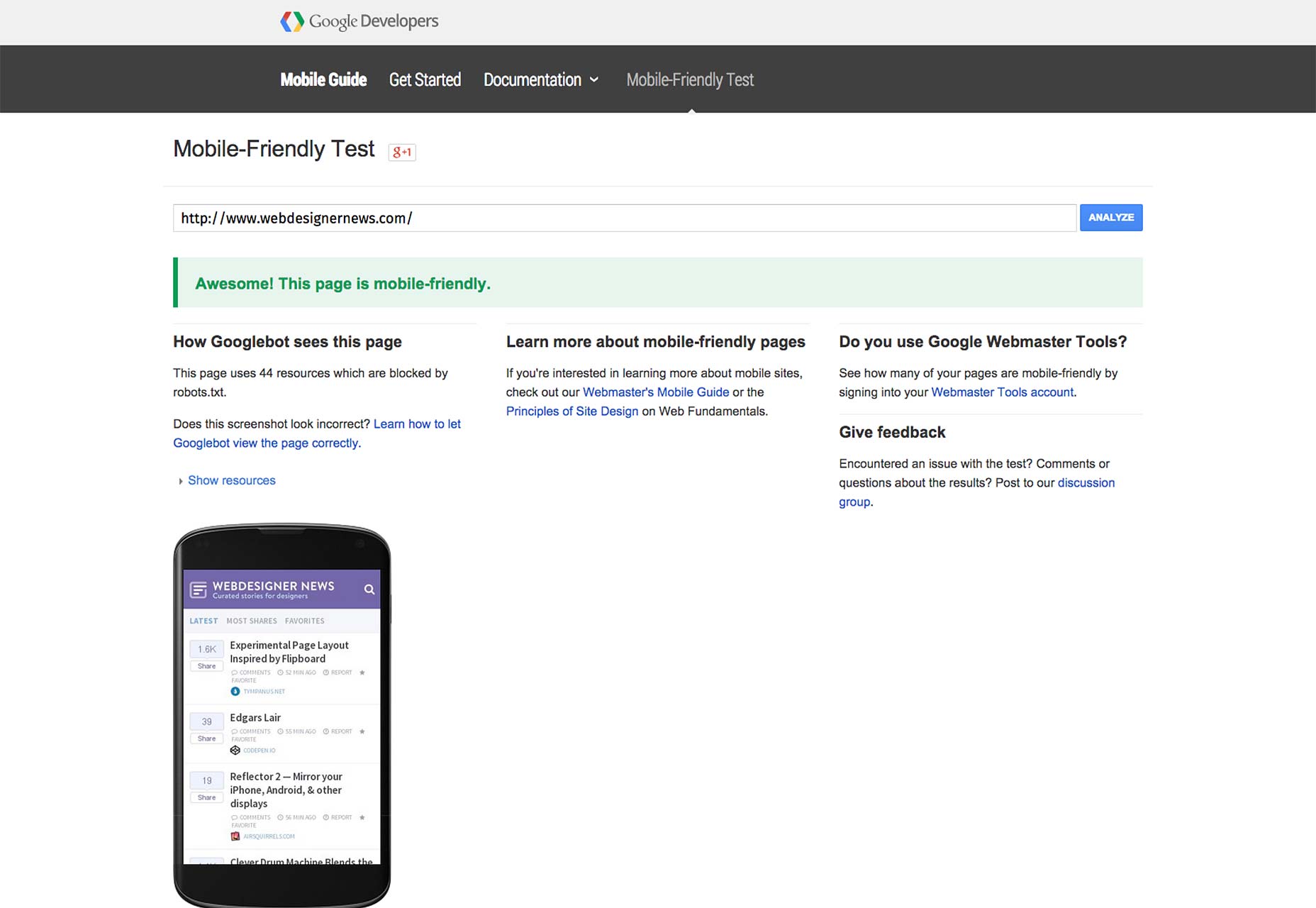 Whether you code sites from scratch, or rely on a web builder, Google has supplied a range of resources to help get you up to speed. Its guide to creating mobile friendly websites includes sections on:
- Customizing software to build responsively
- Selecting a mobile configuration
- Letting search engines know your site is mobile-friendly
- Avoiding common responsive mistakes
- Configuring for tablets and feature phones
How bad is it going to be?
It’s impossible to predict how big a shakeup Google’s new update will cause. Some people will notice no change, some will see their sites drop out of the rankings altogether. And the impact on rankings will naturally depend on just how much mobile traffic you receive. What’s good is that this provides an unassailable piece of ammunition to persuade clients to adopt a responsive approach to their web presence. What’s bad, is you only have a few days to address the issue, tick tock tick tock… Featured image uses business icons, retro computer image, devices image, vintage devices image, and skull image, via Shutterstock.Andrew May
Andrew May is a web designer and SEO expert from London, England. He owns a well known web design agency Mays Digital in the UK and he & his team focus their efforts on building websites that have great user experience and stand out from the rest.


Read Next

3 Essential Design Trends, May 2024
Integrated navigation elements, interactive typography, and digital overprints are three website design trends making…

How to Write World-Beating Web Content
Writing for the web is different from all other formats. We typically do not read to any real depth on the web; we…
By Louise North

20 Best New Websites, April 2024
Welcome to our sites of the month for April. With some websites, the details make all the difference, while in others,…

Exciting New Tools for Designers, April 2024
Welcome to our April tools collection. There are no practical jokes here, just practical gadgets, services, and apps to…

How Web Designers Can Stay Relevant in the Age of AI
The digital landscape is evolving rapidly. With the advent of AI, every sector is witnessing a revolution, including…
By Louise North

14 Top UX Tools for Designers in 2024
User Experience (UX) is one of the most important fields of design, so it should come as no surprise that there are a…
By Simon Sterne

What Negative Effects Does a Bad Website Design Have On My Business?
Consumer expectations for a responsive, immersive, and visually appealing website experience have never been higher. In…

10+ Best Resources & Tools for Web Designers (2024 update)
Is searching for the best web design tools to suit your needs akin to having a recurring bad dream? Does each…
By WDD Staff

3 Essential Design Trends, April 2024
Ready to jump into some amazing new design ideas for Spring? Our roundup has everything from UX to color trends…

How to Plan Your First Successful Website
Planning a new website can be exciting and — if you’re anything like me — a little daunting. Whether you’re an…
By Simon Sterne

15 Best New Fonts, March 2024
Welcome to March’s edition of our roundup of the best new fonts for designers. This month’s compilation includes…
By Ben Moss

LimeWire Developer APIs Herald a New Era of AI Integration
Generative AI is a fascinating technology. Far from the design killer some people feared, it is an empowering and…
By WDD Staff