

Animation is one of humanity’s life-long dreams (if some historians are to be believed). The theory begins with cave paintings: In some cave paintings, it’s common to see creatures drawn with far too many limbs.
There are a couple of theories behind this. Some suggest that this was simply because the artists had no means of erasing the limbs, leaving their mistakes on the walls for posterity. Others believe that these were the earliest attempts to capture the idea of motion in a static image. I choose to believe the second theory.
And what’s more natural than the desire to capture motion? Everything in nature moves. People walking, water running, plants unfolding, the only thing that is truly constant in nature is change, in the form of motion. Some of it happens in a blur, and some of it’s too slow to perceive, but it’s always happening.
[pullquote]Animation is no longer a novelty for web designers…it’s becoming the basis of effective interaction design.[/pullquote]
Animation is change, and motion. It’s the closest we get to capturing life in our art. This would be why people are always saying things like “animation makes our websites (or presentations, or whatever) come alive.” It might be overused, but it’s a phrase that elegantly captures the purpose of animation in web design.
That illusion of motion, when applied correctly, is what tells the users that they have actually done something. They have successfully interacted with the interface, and have caused something to change.
This triggers the same feelings (or at least very similar feelings) in them as the ones they experience when they interact with physical objects. In a way, animation is skeuomorphic. That’s right, I said the “s” word.
When used right, animation is designed to mimic real-world interactions. In a way, we’ve come full-circle. We might not be using far too many leather textures anymore, but we’re still trying to imitate the real world.
Animation on the Web: a short history
Before we get onto more practical things, let’s take a look at how animation on the Internet came to its present (and very cool) state. It pretty much all started with gifs…
.gif files are, it turns out, older than I am by about two years. They were introduced in 1987, just in time for the early days of the Internet as we know it (more or less). Thus began the era of dancing babies and other horrors best forgotten.
Still, if the popularity of gifs showed us anything, it was that people wanted to bring animation to their web pages. Mind you, most had probably not yet considered the ways that animation could enhance usability. It was all about bringing a little style, and a little bit of life, to the otherwise static realm of the web page.
[pullquote]There’s never been a better time to to focus on animation in relation to web-based interfaces and apps.[/pullquote]
When the capabilities of .gif files were exhausted, people wanted new and better ways to add animation to their sites. And sound! Oh, lovely sound. How awesome would it be if people opened up your web page, and your favorite song was playing? And, like, the actual song... none of that MIDI crap, right?
It was Flash which allowed us to learn that lesson the hard way. Let’s not forget though that Flash was pretty amazing for its day. In fact, it was an innovation. It was progress. It was cool.
No matter how badly it was abused later on, it must be acknowledged that Flash allowed us to do things with the Internet that we had not known before. It expanded creative horizons, created jobs for people in a brand-new industry, gave us “web cartoons,” and the greatest thing to ever happen in the 90s (besides Nirvana): Flash games. Even now, I find those things very addictive.
As time went on, many designers moved over to JavaScript-based animation for the smaller things, like dropdown menus and other navigational elements. It was more SEO-friendly, after all, if you did it right. Others only used JavaScript because that’s how FrontPage and DreamWeaver swapped button images, but slow progress is still progress.
By the middle of the last decade, however, the W3C was already working on including animation in the CSS specification. In 2009, the first public draft of the CSS animation spec was released.
And now? Now we’re finding ways to force hardware rendering, combine CSS animations with SVG files, JavaScript libraries to extend the basic animation functionality, and more.
Now we’re looking for ways to do more than add style to websites. Now we’re trying to increase usability, inform and educate users, and to make it easier for them to figure out what they’re doing.
Animation is no longer a novelty for web designers. In film, it became the basis for a whole new kind of storytelling. For us, it’s becoming the basis of effective interaction design.
There’s never been a better time to to focus on animation in relation to web-based interfaces and apps. The technology is not yet fully-formed (when is it ever?) or fully supported (when is it ever?) but we’re finding new ways to deliver it to people without using plugins, or proprietary code.
The more we base our animation on open standards, the more people will actually be able to see it in the first place. And with this recent focus on using it to drive interaction, that’s a very, very good thing.
It’s time to be an early adopter.
Types of web animation
Let’s get down to business. What kinds of animation are we talking about? I mean, I said a lot about using animation to enhance our user interfaces; but what exactly does that mean?
It’s obviously not enough to throw animation at our web page elements and hope it improves our conversion rate. That would be silly. Like every other aspect of design, what kinds of animation you use, and when you use them, must be carefully considered.
So too must the actual details of the implementation be considered. If your animations are so resource-heavy that they weigh down your users’ mobile devices, or worse, their desktops, you’ll have a problem. Or five.
Let’s start by looking at the different types of animation typically used on the web:
Interface element animation
I don’t know whether this is the most common type of animation, though, at a guess, it probably is. And so it should be. This is, in my opinion, the most useful kind of animation that we have available to us.
Like I said in the introduction, this is the animation that lets your users know that their action (clicking, for example) has been registered. Their click was the catalyst needed to make something happen, whether that be navigating to another page, opening a sidebar or modal window, or sending an e-mail from your contact form.
That feedback isn’t just nice to have, it’s essential now, in this world of flat design. People need to know the difference between interface and decoration. Animating our elements in simple, and subtle ways upon interaction gives them the feedback they need.
It can be as simple as making button backgrounds change, or making them bounce. This category also covers the animations that make sidebars “slide” onto the page, and the ones that make modal windows inflate themselves into existence.
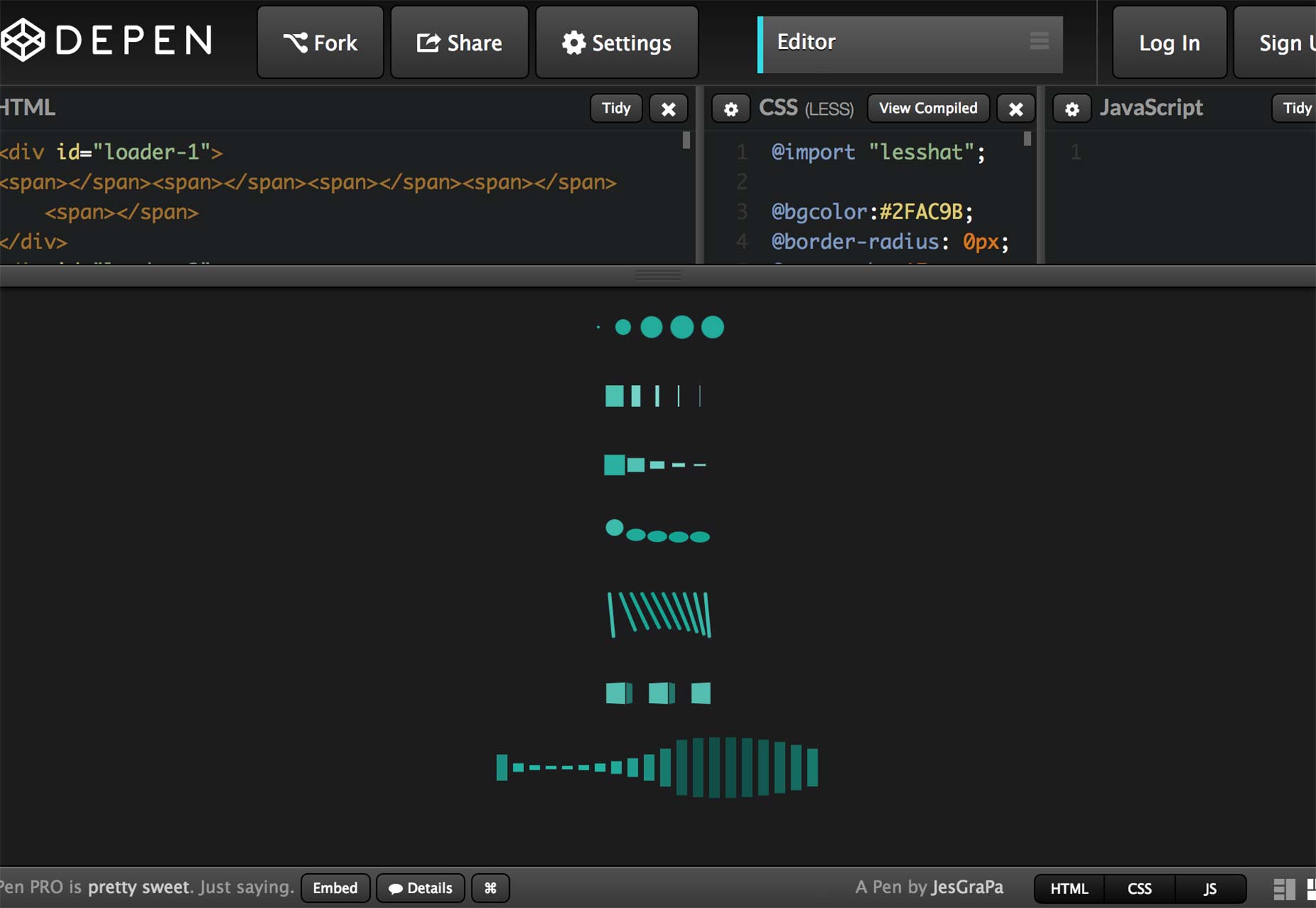
Waiting animations
And once again, it’s all about providing feedback to the user. These are the animations that you’ll show to the user when something’s happening in the background, and you don’t want them to freak out.
The utility of these animations was proven a long time ago, when graphical user interfaces were first invented. It started with the way the mouse cursor would turn into an hour glass, and progress bars, too. Apple introduced the “spinning beach ball of death,“ at some point, and windows showed files flying gracefully from one folder to another.
These conventions were adopted on the Web as soon as was possible, and with good reason. When people start to wonder what’s going on, they keep clicking, or tapping. It might be an expression of frustration. They might believe it actually makes things go faster.
Either way, telling your user what’s happening, even via a simple progress bar, can ease the mind considerably... even for those of us who’ve been using computers a long time.
Beegit, the writing app I used to write and edit this article gives me a handy “progress circle“ to tell me when my images will be done uploading, as you can see in the upper-left part of the modal window:
Story-telling animations
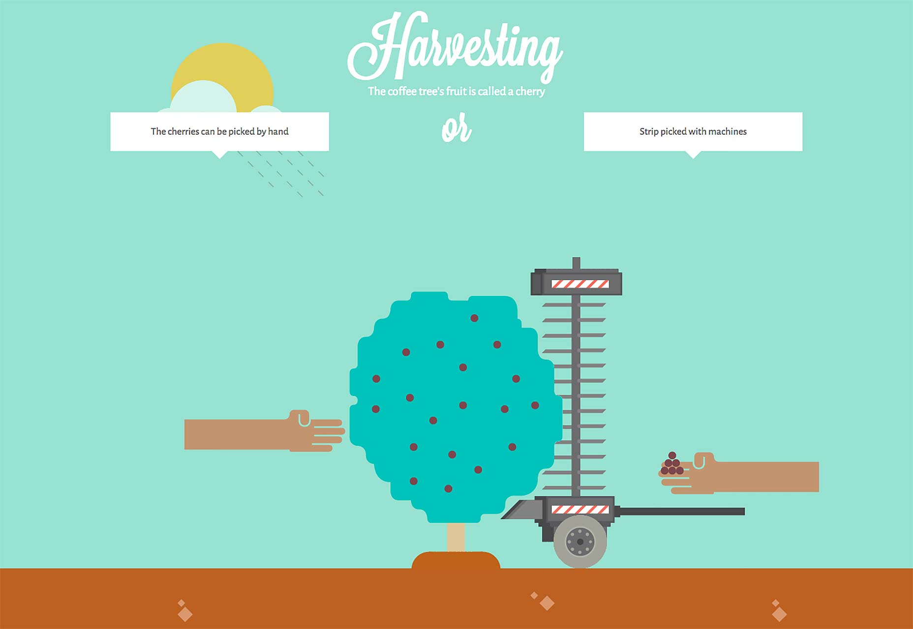
Now story-telling with animation goes beyond cartoons. In fact, I’m not talking about those at all. Rather, some people design websites so that as a user interacts with them (for example: by scrolling down the page), animations are triggered which tell a story.
Some common examples are those pages that will show off a new product by “assembling” it before your eyes. Others play out more like a cartoon, with little characters following you down the page and everything.
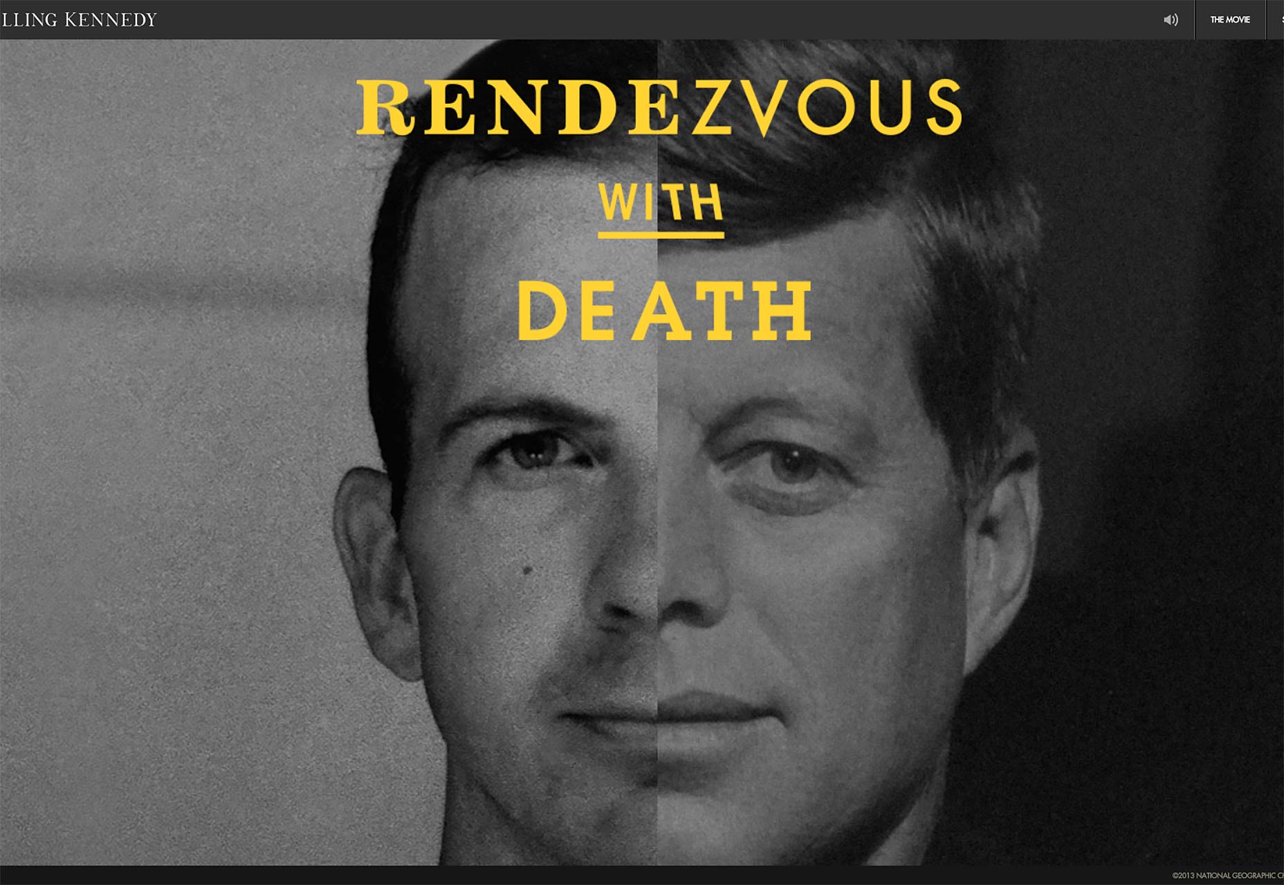
The effectiveness of these animations is... debatable. Typically, they are not intended to improve usability, but to impress the user, and give them some context for the subject of the page. They might be trying to show off the craftsmanship of a product, or share the experiences that led to a company’s creation.
Whether or not they accomplish these things would probably depend on the quality of the animations themselves, whether or not they unduly affect the site’s performance, and the content of the page itself. If a user does not find what they’re looking for on your website, all of the animations in the world can’t fix that.
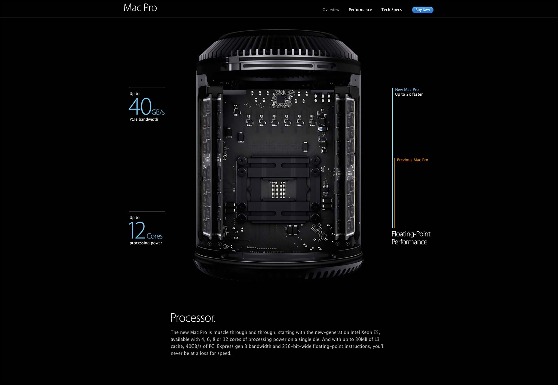
Two examples that I do like, a lot, come from brands that have a lot of experience with this sort of thing: Apple and Sony.
The page dedicated to the Mac Pro shows you exactly what’s under the hood as you scroll down:
Meanwhile, over at Sony, they showcase several different devices being, well, not so much “assembled” as having their parts smashed together, complete with fire effects.
Purely decorative animations
For better or worse, some people put animation on their site that serves no purpose other than to be seen. Is it worth it?
Yes, and no…
I would typically avoid it because it’s distracting. You want people’s eyes drawn to the reasons they should be buying whatever you’re selling, and your calls to action. You want them to get what they came for. If your website does not serve some purpose to the user, or if they get too distracted while trying to determine its purpose, they may not come back.
Decorative animation should be hidden, entirely. Show it after people complete your call to action. You could also include subtle animations that are only triggered once the user does something very specific, like hovering their mouse over something small in the header/footer.
Here on WDD, hovering over the logo animates it, though it could be argued that since the logo is a link, it’s not purely decorative, but it’s a good example nonetheless. A simple Google search will reveal that there are several sites where using the konami code will make something happen (like making Godzilla pop up and roar... I‘m not kidding).
Other examples include Google’s many known easter eggs, and this one from photojojo.com:
Scroll all the way down to the bottom of any page, and a friendly dinosaur will “take your picture.” What’s more, on pages that have it, the balloon seen in the screenshot will subtly float from side to side.
Animation in advertising, or: my gut says no but my wallet says yes
Advertising. To some, it’s their income (cough ahem cough), and to others, a scourge. Add animation to an ad, and boom! The eyes are drawn to it against their will. It’s a reflex action.
Add sound, and they will feel intense hatred... also a reflex action.
But it’s almost unavoidable. If you want to make people look at your ads, animating them is a great way to go. This may make you unwelcome on some modern advertising networks which pride themselves on “unobtrusive ads,” but if animated ads didn’t work, we wouldn’t still have them.
But that animation comes with the same problem posed by decorative animation: it distracts the user from their task. In the world of online sales, distraction can be death.
Ultimately, it will be up to you to weigh the pros and cons. No ads, unobtrusive ads, or animated ads, it’s all a trade-off.
You may notice that nowhere on this list did I mention splash screen animations. That’s because I expect everyone to know better.
Implementing Animation
The technical aspects of implementation do matter, but whether you’re using .gifs, video, CSS, SVG, or even Flash (shudder), there are some principles that matter more. Forget, for a moment, the technology or techniques that you plan to use, and get ready for a just a little more theory. Your users will thank you.
Performance, performance, performance
You might think, “Okay, this sounds obvious. Animations should run fast, not slow.” You’re right, it is obvious, in theory. The problem is that I still find websites, built with all the latest technology, with choppy animation.
I have an Nvidia GTX 750 TI video card that cost me about $200. Your animations should not be choppy. I was on some websites recently that made me think, “Skyrim runs faster than this.” And I wasn’t joking or exaggerating.
Now imagine what it would be like to navigate those same websites on a low-quality tablet or smart-phone. On the one hand, it’d be a great way to truly test someone’s character, but on the other hand, it won’t get those slow websites any more business. If your only options are slow animation or no animation at all, you’re better off with an interface that just sits there.
That’s to say nothing of websites that are built with so much animation and so many special effects that they need loading screens with progress bars. No one should have to wait for animations to load before they get to see the information they want or need. Ever. Making people wait is how you lose business.
Let’s break all of that down to bullet points:
- If Skyrim runs more smoothly than your website on my desktop, that’s bad.
- If your website needs a loading bar before users get to see the home page, that’s really bad.
And here’s where I’m going to give just a little technical advice: where hardware acceleration and performance are concerned, CSS is almost always better than JavaScript. Whenever you have a choice, use CSS-based animation, and use JS as a fallback.
Start with the small things
When considering animation as a design tool, rather than a stylistic choice, it’s best to start small. For one, small and unobtrusive animation performs better (see the section above). Second, big and flashy animation must have a purpose beyond just ”looking good” to be useful.
Most websites don’t need any animation beyond the kind used to make using UI elements feel “real” and semi-natural. Before you start throwing parallax around like rice at a wedding, ask yourself if it will actually improve the experience for your users. Would big and flashy things moving around on the screen inform and direct your users better than the usual text and pretty pictures?
In most cases, the answer is probably “no.” There will be exceptions, of course. There almost always are. Most of the time, however, it might be better to just animate your buttons, make your hidden navigation bar slide in, and animate the hell out of the success message that appears after someone uses your contact form.
Subtlety is key to good design, and yet so often underrated. Start there. And then, if it becomes clear that making something bigger and flashier would serve your purpose from a user experience standpoint, go all out!
Keep durations low, or: I feel the need... the need for speed
Animations should be fast, or rather, they should happen fast. I’m not talking about performance here, but rather the actual time an object spends in motion.
Think about how we interact with real objects. Sometimes we move faster, sometimes slower. The speed with which we interact with an object can depend on its size, the task at hand, or whether it’s full of a liquid we don’t want to spill; but generally, we pick things up and move them around pretty fast. Individual movements can happen in milliseconds.
“Milliseconds” is generally the amount of time in which we want to measure user interface animation. Any longer, and people start to lose patience with their machine, or your product, or both. You’ve got to keep it short, or things just feel slow.
This is especially true for products that people are required to use repeatedly. Even if the animation is super fun and entertaining, it’ll lose its appeal by the tenth time someone has to see it. It’s a bouncing button or a sliding menu, not the intro to your favorite TV show. No one’s singing along, here.
Make things bounce, once in a while
Physical objects bounce. Some of them don’t do it very well, but basically all objects bounce a little, if you drop them far enough onto a hard surface, and if there’s not too much air resistance and... you get my point.
Interacting with UI elements is like interacting with small, hard objects. You toss them to one side, they bounce a little. You drop them, they bounce a little.
Therefore, it can be helpful, when appropriate, to make your animations “bounce,” especially if they’ve been moving vertically. It’s all about maintaining the illusion.
Things don’t normally stop on a dime
Things in motion usually take a little time to stop. Stationary objects set into motion usually take a little time to speed up. Yay physics!
So, when you’re making objects move, or stop moving, remember to give them a little time (in milliseconds) to slow down or speed up. This is called “easing,” and there’s functionality for it built right into CSS.
Links
No Ultimate Guide article would be complete without at least one section full of links. So here you go. We’ve got links to articles dealing with the basic theory behind animation in web design, tutorials to get you started, and loads of examples. Enjoy.
Web animation theory
Want more information before you start animating stuff? No problem. Here’s a whole bunch of advice from very smart people, and some general speculation on the future of animation on the Internet.
Animation Principles for the Web
This article over at cssanimation.rocks outlines the most basic principles behind animating objects in general. Be sure to check out the rest of their website for examples, tutorials, and an e-mail course. (The e-mail course costs money, though.)
Invisible animation
Steven Fabre tells us how animation, like design itself, should be basically invisible. That only sounds paradoxical until you read it. Go do that.
Will animation be the big UI trend of 2015?
A speculative piece with a good, if short, explanation of some of the guiding principles of animation.
The Role of Animation in Web Design
Another piece with simple, basic advice. It’s short, and simple, but perhaps worth re-reading every time you have to make a major animation-related decision. Think of it as a cheat sheet for keeping perspective.
The State Of Animation 2014
An excellent overview of how web animation (more or less) currently gets done by Rachel Nabors. You’ll be seeing her name on here a few times, as she’s something of an expert on the topic.
Five Ways to Animate Responsibly
Another fantastic article by Rachel Nabors (I told you that you’d be seeing more of her stuff...). In this one, she goes over five ways to add animation to your work without alienating your users.
Tutorials
Get your keyframes on here! Learn more CSS properties than you ever thought possible/necessary. Learn the difference between easeIn and easeOut — I know I had to look it up.
4 Simple CSS3 Animation Tutorials
Skip the intro and get straight to the good stuff, if that’s the way you work. I’ve included quite a few introductory tutorials below. If you’d rather get straight to some basic code, start here.
A Beginner’s Introduction to CSS Animation
Exactly what it says in the title. As long as you have a basic knowledge of HTML and CSS, you’ll be able to follow this tutorial and get a working knowledge of CSS-based animation.
The Guide To CSS Animation: Principles and Examples
Smashing Magazine takes its readers through a number of basic animations. It’s simple, but valuable knowledge.
Flashless Animation
Another great introduction to CSS animation, written by the ever-fantastic Rachel Nabors. Yes, it’s from 2012, but the only difference between then and now is that the technique she provides has more browser support.
Codrops tutorials
I cannot, and I seriously mean this, I simply cannot recommend the guys at Codrops enough. They have made tons of examples, proofs of concepts, idea collections, and yes, tutorials. They love animation, and they do a lot to share that love.
Here are just a few of the animation-related tutorials that they've created:
- Tilted Content Slideshow
- Page Preloading Effect
- Sliding Header Layout
- Playful Trampoline Effect
- How to Create (Animated) Text Fills
CSS3 Transitions, Transforms, Animation, Filters and more!
An interactive, in-depth tutorial with live plenty of live examples. Come here when you’re done with the most basic tutorials. It gives you plenty of ideas to practice with.
Transitions & Animations
A guide to simple CSS animation with a special focus on transitions, and transitional properties.
Shaking Up The Web With CSS3 (How To Make Links Shake)
A tutorial with an emphasis in shaking stuff. I mean, there ya go.
High Performance Animations
This tutorial, co-authored by the much-beloved Paul Lewis and Paul Irish, focuses on how to animate things in a way that doesn’t slow down the browser. Since this can be especially important on mobile devices, it is very much worth the read.
Tutorial: Using animation-fill-mode In Your CSS Animations
After learning so much about how to make things move, it might be a good idea to learn about the behavior of objects that either haven’t moved yet, or have just finished their animation. Sometimes the styling can get tricky, and that's where animation-fill-mode comes in.
Keyframe Animation Syntax
A snippet provided by the ever-helpful css-tricks.com. Don’t remember how to make those keyframe things do what you want? Bookmark this, and stop worrying about it.
A Look Into: Cubic-Bezier In CSS3 Transition
This one’s all about timing. I mean, the literal timing of your animation. More specifically, it’s all about using the Bezier curve to get your animation timing just right.
Flip stuff!
I found two different, fantastic tutorials on how to create flipping animations. Each brings a different approach to the table, and some extras that the other doesn’t. So instead of just making up my mind, I’ve included them both.
Create a CSS Flipping Animation
CSS Transitions, Transforms & Animations – Flipping Card
Animating CSS3 Gradients
Most animation tutorials will assume that you want to animate an object’s geometry or position on the page. This one will teach you how to animate what’s inside them... in this case, a gradient.
Featured image, animation image via Shutterstock.
Ezequiel Bruni
Ezequiel Bruni is a web/UX designer, blogger, and aspiring photographer living in Mexico. When he’s not up to his finely-chiselled ears in wire-frames and front-end code, or ranting about the same, he indulges in beer, pizza, fantasy novels, and stand-up comedy.


Read Next

3 Essential Design Trends, May 2024

20 Best New Websites, April 2024

Exciting New Tools for Designers, April 2024

14 Top UX Tools for Designers in 2024

What Negative Effects Does a Bad Website Design Have On My Business?

10+ Best Resources & Tools for Web Designers (2024 update)

3 Essential Design Trends, April 2024

How to Plan Your First Successful Website

15 Best New Fonts, March 2024

LimeWire Developer APIs Herald a New Era of AI Integration

20 Best New Websites, March 2024
