

Designing your website navigation is like laying the foundation for your house. Failure to plan your foundation properly could put your building at risk of collapse, regardless of how nice it looks. If you want to benefit from the best sales or conversions possible from your site, you need to spend time planning how your audience will interact with your content, and figure out the most intuitive way of organizing, and representing it.
Always remember, if you get this part wrong, you risk alienating a large section of your audience.
What is navigation?
There’s more than one way of looking at navigation. You could say that it’s a focal element on your website that allows your customers to find what they are looking for without confusion or unnecessary clicks. Equally, you could argue that it’s a way to gently lead your customers to the most important information on your site, in order to generate sales or inquiries.
Chances are, it’s both.
Navigation design is like many other things in design: there’s no universally agreed-upon “right way” to do it. Every website presents its own challenges, which can be approached in a number of ways. The good news is that there are ways of thinking about and organizing content which minimize the risk of failure.
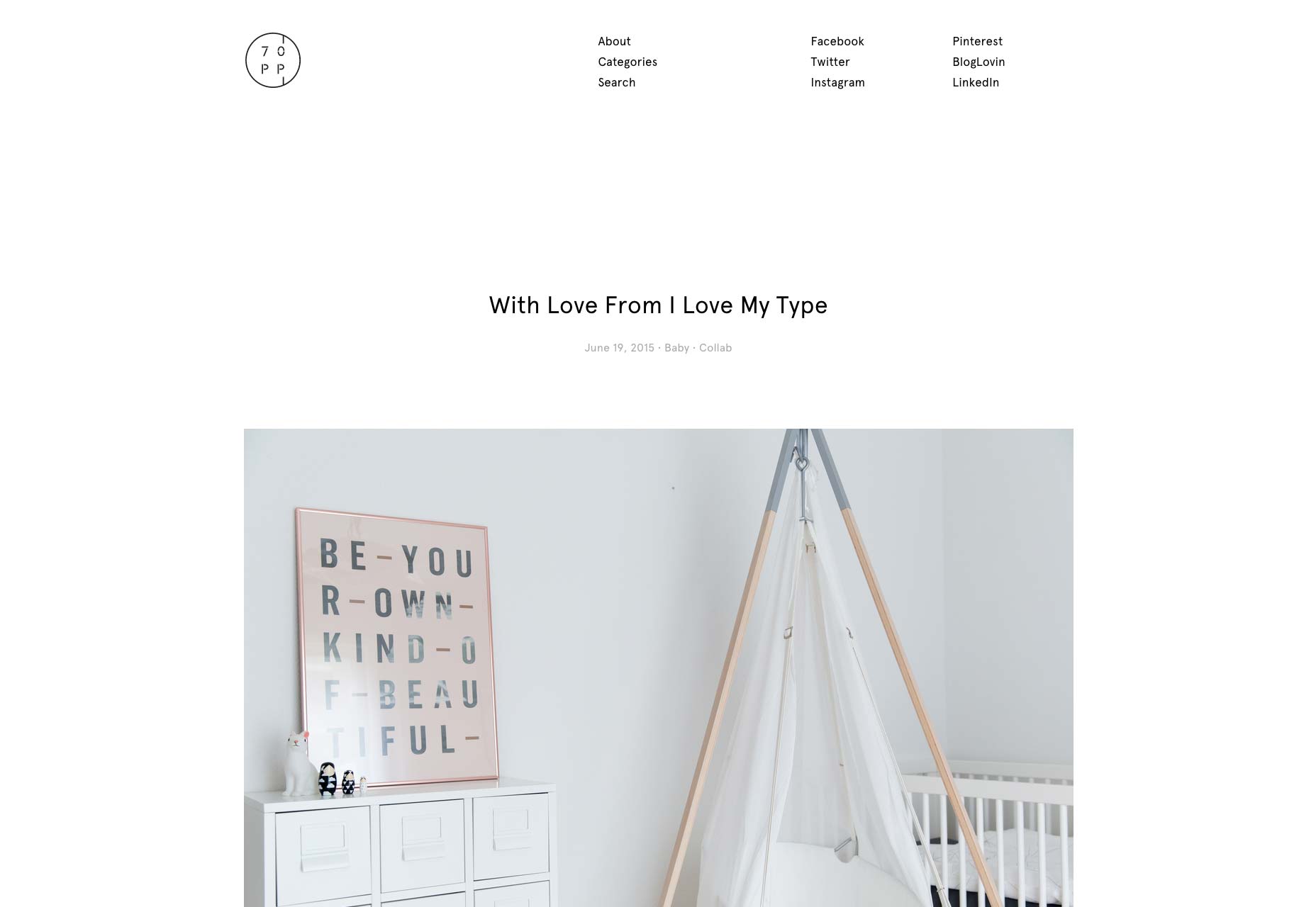
70percentpure’s site features simple navigation that is both vertical, and horizontal.
1) Finalize your IA first
Planning the content for a large website is an essential task which must be completed before you design your navigation. Otherwise known as IA (Information Architecture) this overview, understanding and manipulation of your content is what forms the backbone of your website's usability. Designing your navigation before – or instead of – properly designing your IA would be like creating a book index before typesetting the pages. Not a good idea.
A natural ability to see the big picture helps when working on IA. More importantly, you must be able to see the content from a user’s perspective. Sometimes this means going against the client’s own way of categorizing their content – so come prepared for resistance if that’s the case.
Here are a few things you can ask yourself to help prepare your scheme, and justify it to the client:
- What pages are needed for this site?
- Does each page have a purpose within the wider scheme, and is the content broken up into sensible, relatable chunks?
- What allowances must be made for adding content in the future?
- What user groups are you working with? (e.g. logged in/ out, subscription types, advertisers, etc.)
- What is the primary goal for each type of user?
Answering all of the above, and understanding how your content relates to your users is fundamental to good navigation design.
2) KISS: Keep it simple, sometimes
Everyone who’s ever used a website can probably agree: a navigation area should be as simple as possible. Overwhelming the user with choices and crowding the navigation with text is a bad idea, and will seriously hamper your website’s overall usability.
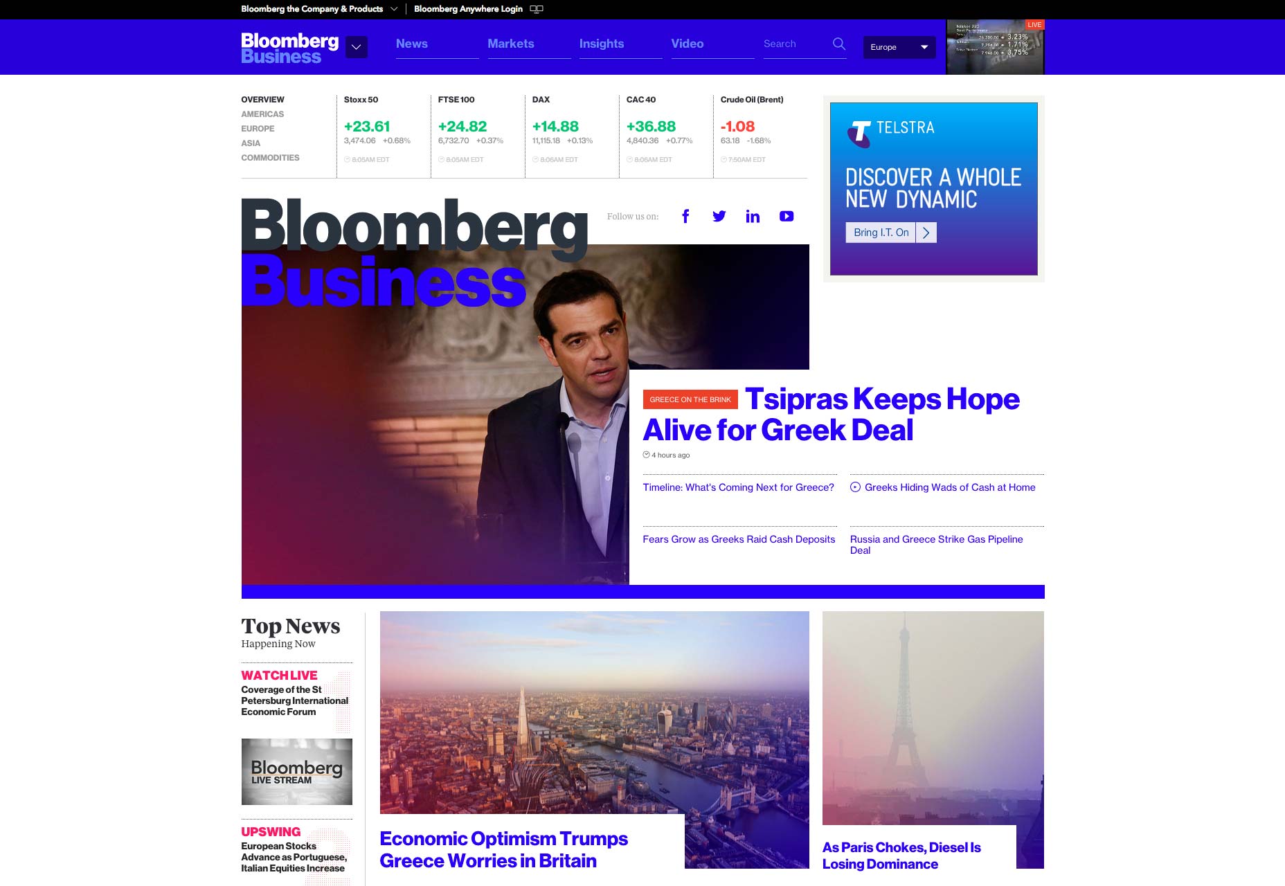
Bloomberg’s simple navigation belies the complexity of information on their site.
And yet, simplicity can be deceptive. Dig deeper and you may discover that what is actually quite complex has been cleverly packaged in a way that feels simple. This is IA in action.
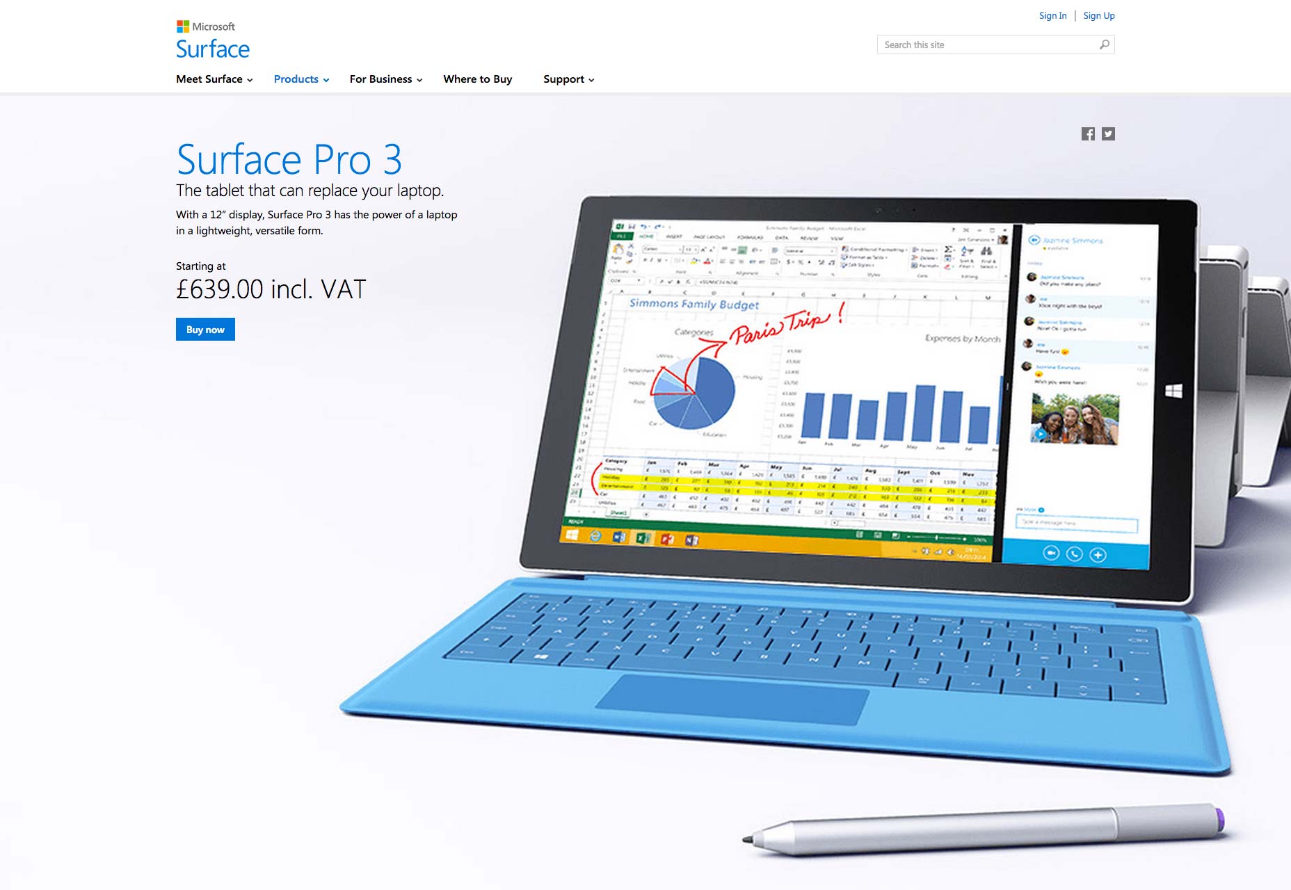
Take Microsoft’s home page for example. Their main navigation has just four items, which sounds like not nearly enough, considering their product range. But the drop-downs are very smartly split into sections, and presented in such a way that you can find what you’re looking for quickly and easily.
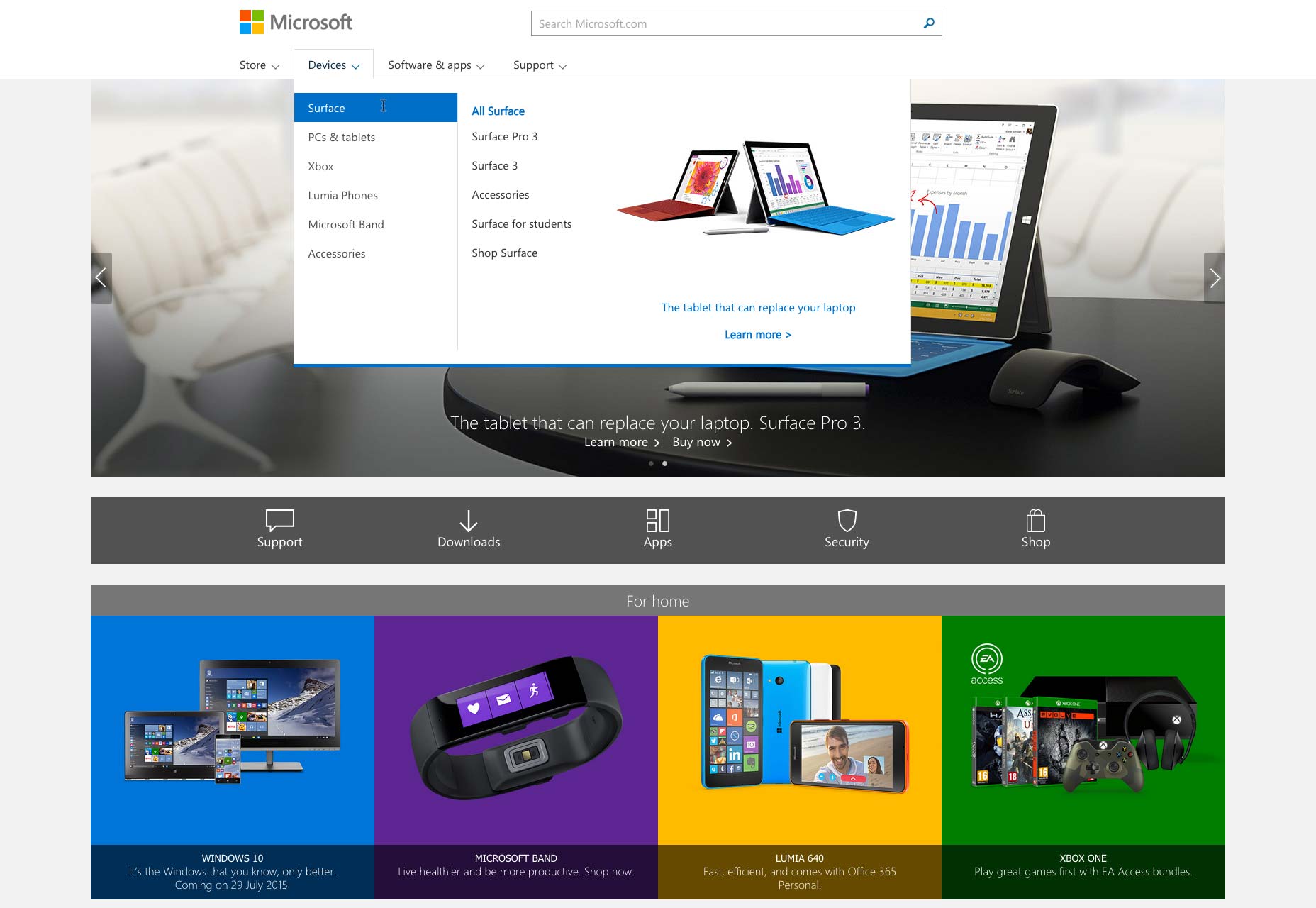
Sub pages are like mini-sites, following the same navigation format. The menu feels and behaves the same, but adapts to offer more detail the deeper you get into the site.
It’s easy to use, predictable, and consistent. Considering their product range, and the number of pages on their website, this is no mean feat, and is obviously the product of many hours of iterative development. Not only does it feel like one of their products — which is very reassuring for the visitor — but it organizes the content in a way that’s good for both customer and Microsoft themselves.
3) Choose orientation carefully
Given that a computer screen is traditionally used in a landscape format, horizontal navigation makes a lot of sense. So much of the time it just feels more balanced, less intrusive, and easy to place from a design perspective.
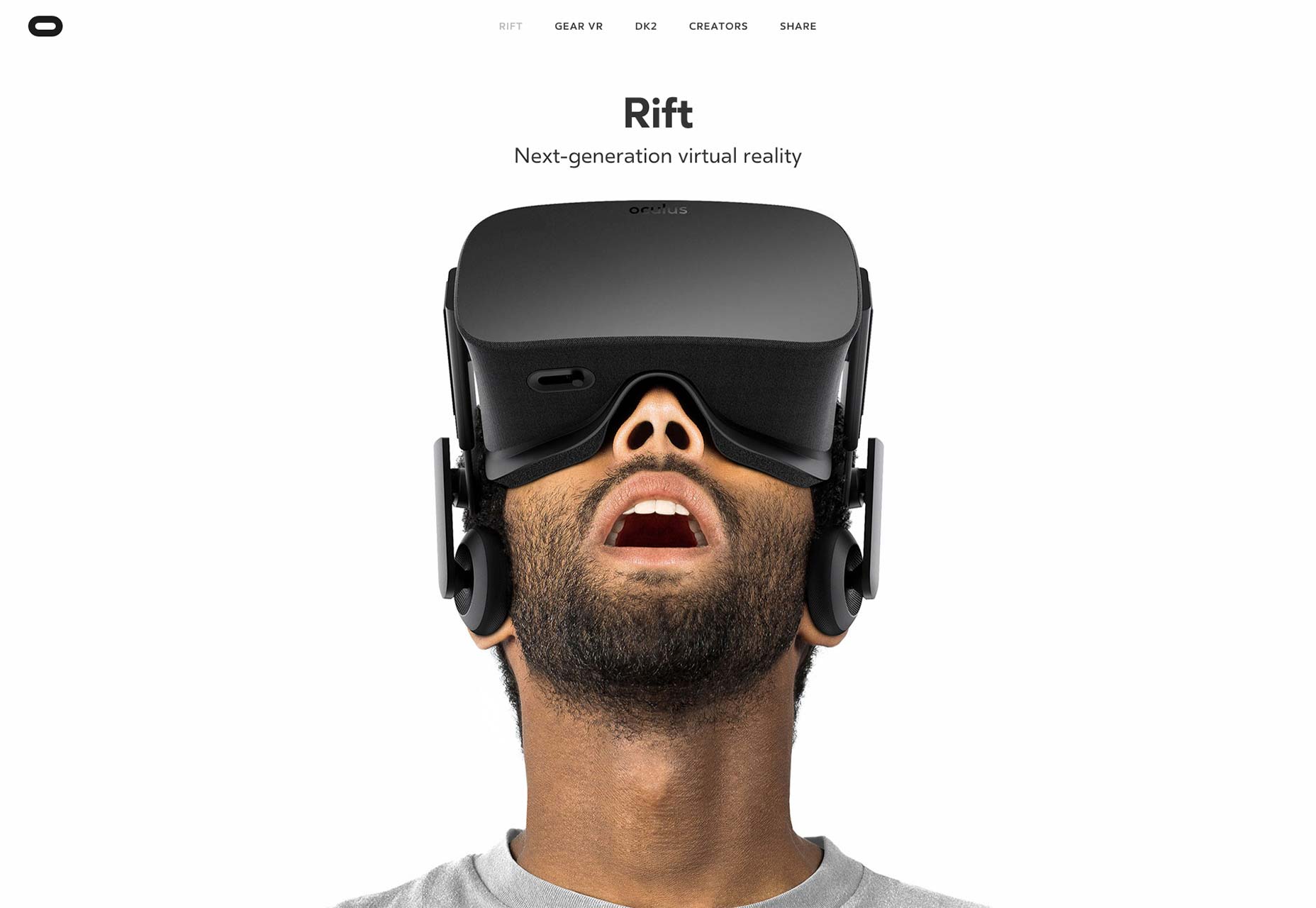
Oculus, makers of VR headsets would be foolish if they didn’t talk about their virtual landscapes with a horizontal menu. Not only does it carry a nice metaphor, but allows the user to delve deeper into their content by scrolling down the page.
However, horizontal menus don’t add value in every context, which is why you’ll see a lot of vertical navigation, particularly in e-commerce. It carries echoes of the coloured tabs which help you find products in a physical catalogue, and avoids cluttering a horizontal bar with too much text, and too many options.
A good vertical navigation is no easy feat, especially if you have a lot of products. Which is why I like this one from Jack Jones.
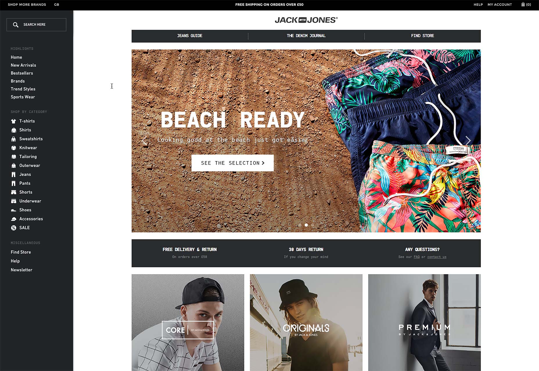
The icons next to the text really aid readability. The simple shapes are surprisingly communicative, and help to keep the navigation area focused and tidy. Click on a category, and the menu expands to reveal sub-options, again in a way that’s very easy on the eye.
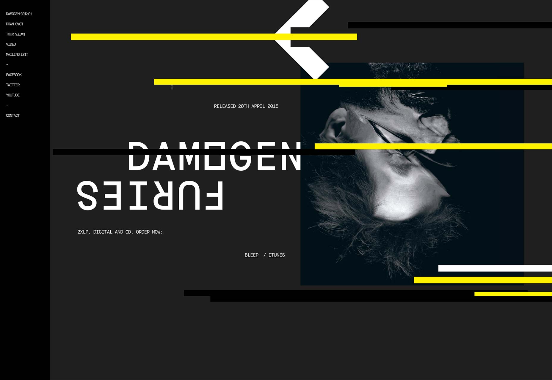
A more unusual use of the vertical menu can be found on Squarepusher’s site. Here, the navigation is used like a tab, off the side of the main content, which the user can simply scroll and click through. It’s a far more linear approach and echoes the sequential nature of a Squarepusher track.
The rules are changing
As with all things on the Web, new techniques, technologies, devices and trends bring their own challenges and innovations to the table. Responsive web design means a traditional horizontal nav is now also a vertical nav (on smaller screens). Parallax techniques see navigation areas ebb and flow like the tide, depending on where you are on the page.
There is no single way of creating the perfect site nav. But an iterative approach of designing and testing, preferably with access to your site’s stats and conversion data is likely to yield the best results.
Being the engine that drives your website, your navigation should be predictable, simple, consistent, and well-placed.
Ryan Gittings


Read Next

3 Essential Design Trends, May 2024

How to Write World-Beating Web Content

20 Best New Websites, April 2024

Exciting New Tools for Designers, April 2024

How Web Designers Can Stay Relevant in the Age of AI

14 Top UX Tools for Designers in 2024

What Negative Effects Does a Bad Website Design Have On My Business?

10+ Best Resources & Tools for Web Designers (2024 update)

3 Essential Design Trends, April 2024

How to Plan Your First Successful Website

15 Best New Fonts, March 2024
