

Say hello to the new Facebook logo pic.twitter.com/ofoFm4JQmK
— Christophe Tauziet (@ChrisTauziet) June 30, 2015
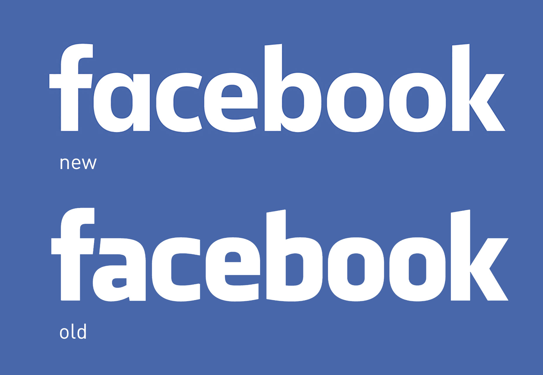 The ‘f’ appears to have the slightest of tweaks to its outer curve, but is otherwise unchanged. That is almost certainly a practical choice, given that modifying the ‘f’ would mean updating the familiar ‘f’ in a blue square logomark that is scattered across the Web.
The biggest change is the switch from a double-storey, to a single-storey ‘a’. The change increases the counter space and does an excellent job of balancing the more spacious double ‘o’ on the right-hand side of the word.
Lots of commentators have expressed a regret at the loss of the way in which the bar of old logo’s ‘f’ formed a connection with the stroke of the ‘a’; to me, that connection always seemed forced. This kind of linking is great when carefully worked — the Gillette logo is a prime example — but Facebook’s old logo felt like a designer looking for a connection for its own sake…on second thoughts, perhaps that was an ideal metaphor for Facebook.
The terminals on the ‘c’ and ‘e’ are slanted, which is very much the trend right now. They also introduce more whitespace which helps even out the word. The addition of the stem on the ‘b’ improves the rhythm along the baseline by matching the stems on the ‘a’ and ‘k’ (stem, no stem, no stem, stem, no stem, no stem, stem). The left half of the design is perhaps tracked a little too tightly, but that may be a personal preference.
Most importantly, the new version will be far more legible on small screens. As wearables enter the market, this is an essential rebrand for Facebook which will enable a consistent brand approach across the full range of devices.
[pullquote]this redesign feels a lot like a computer performing a guitar solo[/pullquote]
I’ve never been a fan of Klavika, which as a big Web 2.0 font, and feels about as dated now as Proxima Nova will in a decade. However this redesign feels a lot like a computer performing a guitar solo.
Which leads to the the biggest criticism, which is likely to be that the new logotype lacks personality. But really, isn’t that what Facebook wants? As our own personalities become personal brands [shudder] do we want a social network that envelops us in its own omni-presence? Don’t we want a social network’s brand to be the embodiment of invisible design?
What Facebook needs, is a non-threatening, non-committal, non-partisan, bland, brand that can fade into the background along with the scarier parts of its terms and conditions. From a design point of view, Facebook’s new logotype may be uninspiring, but from a business point of view it makes perfect sense.
The ‘f’ appears to have the slightest of tweaks to its outer curve, but is otherwise unchanged. That is almost certainly a practical choice, given that modifying the ‘f’ would mean updating the familiar ‘f’ in a blue square logomark that is scattered across the Web.
The biggest change is the switch from a double-storey, to a single-storey ‘a’. The change increases the counter space and does an excellent job of balancing the more spacious double ‘o’ on the right-hand side of the word.
Lots of commentators have expressed a regret at the loss of the way in which the bar of old logo’s ‘f’ formed a connection with the stroke of the ‘a’; to me, that connection always seemed forced. This kind of linking is great when carefully worked — the Gillette logo is a prime example — but Facebook’s old logo felt like a designer looking for a connection for its own sake…on second thoughts, perhaps that was an ideal metaphor for Facebook.
The terminals on the ‘c’ and ‘e’ are slanted, which is very much the trend right now. They also introduce more whitespace which helps even out the word. The addition of the stem on the ‘b’ improves the rhythm along the baseline by matching the stems on the ‘a’ and ‘k’ (stem, no stem, no stem, stem, no stem, no stem, stem). The left half of the design is perhaps tracked a little too tightly, but that may be a personal preference.
Most importantly, the new version will be far more legible on small screens. As wearables enter the market, this is an essential rebrand for Facebook which will enable a consistent brand approach across the full range of devices.
[pullquote]this redesign feels a lot like a computer performing a guitar solo[/pullquote]
I’ve never been a fan of Klavika, which as a big Web 2.0 font, and feels about as dated now as Proxima Nova will in a decade. However this redesign feels a lot like a computer performing a guitar solo.
Which leads to the the biggest criticism, which is likely to be that the new logotype lacks personality. But really, isn’t that what Facebook wants? As our own personalities become personal brands [shudder] do we want a social network that envelops us in its own omni-presence? Don’t we want a social network’s brand to be the embodiment of invisible design?
What Facebook needs, is a non-threatening, non-committal, non-partisan, bland, brand that can fade into the background along with the scarier parts of its terms and conditions. From a design point of view, Facebook’s new logotype may be uninspiring, but from a business point of view it makes perfect sense.
Ben Moss
Ben Moss has designed and coded work for award-winning startups, and global names including IBM, UBS, and the FBI. When he’s not in front of a screen he’s probably out trail-running.


Read Next

3 Essential Design Trends, May 2024
Integrated navigation elements, interactive typography, and digital overprints are three website design trends making…

20 Best New Websites, April 2024
Welcome to our sites of the month for April. With some websites, the details make all the difference, while in others,…

Exciting New Tools for Designers, April 2024
Welcome to our April tools collection. There are no practical jokes here, just practical gadgets, services, and apps to…

14 Top UX Tools for Designers in 2024
User Experience (UX) is one of the most important fields of design, so it should come as no surprise that there are a…
By Simon Sterne

What Negative Effects Does a Bad Website Design Have On My Business?
Consumer expectations for a responsive, immersive, and visually appealing website experience have never been higher. In…

10+ Best Resources & Tools for Web Designers (2024 update)
Is searching for the best web design tools to suit your needs akin to having a recurring bad dream? Does each…
By WDD Staff

3 Essential Design Trends, April 2024
Ready to jump into some amazing new design ideas for Spring? Our roundup has everything from UX to color trends…

How to Plan Your First Successful Website
Planning a new website can be exciting and — if you’re anything like me — a little daunting. Whether you’re an…
By Simon Sterne

15 Best New Fonts, March 2024
Welcome to March’s edition of our roundup of the best new fonts for designers. This month’s compilation includes…
By Ben Moss

LimeWire Developer APIs Herald a New Era of AI Integration
Generative AI is a fascinating technology. Far from the design killer some people feared, it is an empowering and…
By WDD Staff

20 Best New Websites, March 2024
Welcome to our pick of sites for March. This month’s collection tends towards the simple and clean, which goes to show…

Exciting New Tools for Designers, March 2024
The fast-paced world of design never stops turning, and staying ahead of the curve is essential for creatives. As…