

There’s no place like the home button
When designing a website, a primary consideration is the user experience within the site’s hierarchy. If they can’t easily navigate your website, your customers may lose their place, feel frustrated and leave entirely. If you’re selling products online, this means lowering your conversion rate and possibly revenue. Not only does it take up room that could be used for more important information, but it often adds an unwelcome amount of choice. Customers have a varying level of experience, can be easily distracted, and may need a number of contextual cues to help them keep their place when navigating your site; no matter how small or organized. Therefore, before making changes to your site, you must thoroughly consider the demographics of your user base and their level of understanding toward the web. For example, if your users are predominantly baby boomers, they may need extra guidance where younger users will have no trouble. Despite the advantages of removing the home button, you must be confident that doing so will ease their user experience, not hinder it. So how do you make the leap away from the comforts of a home button? How do we create enough convenience that a visitor doesn’t need to return home, while still providing the sense of security offered by the Home button? There are a few web design strategies that can be easily employed to provide accommodation to all:Clickable Logos
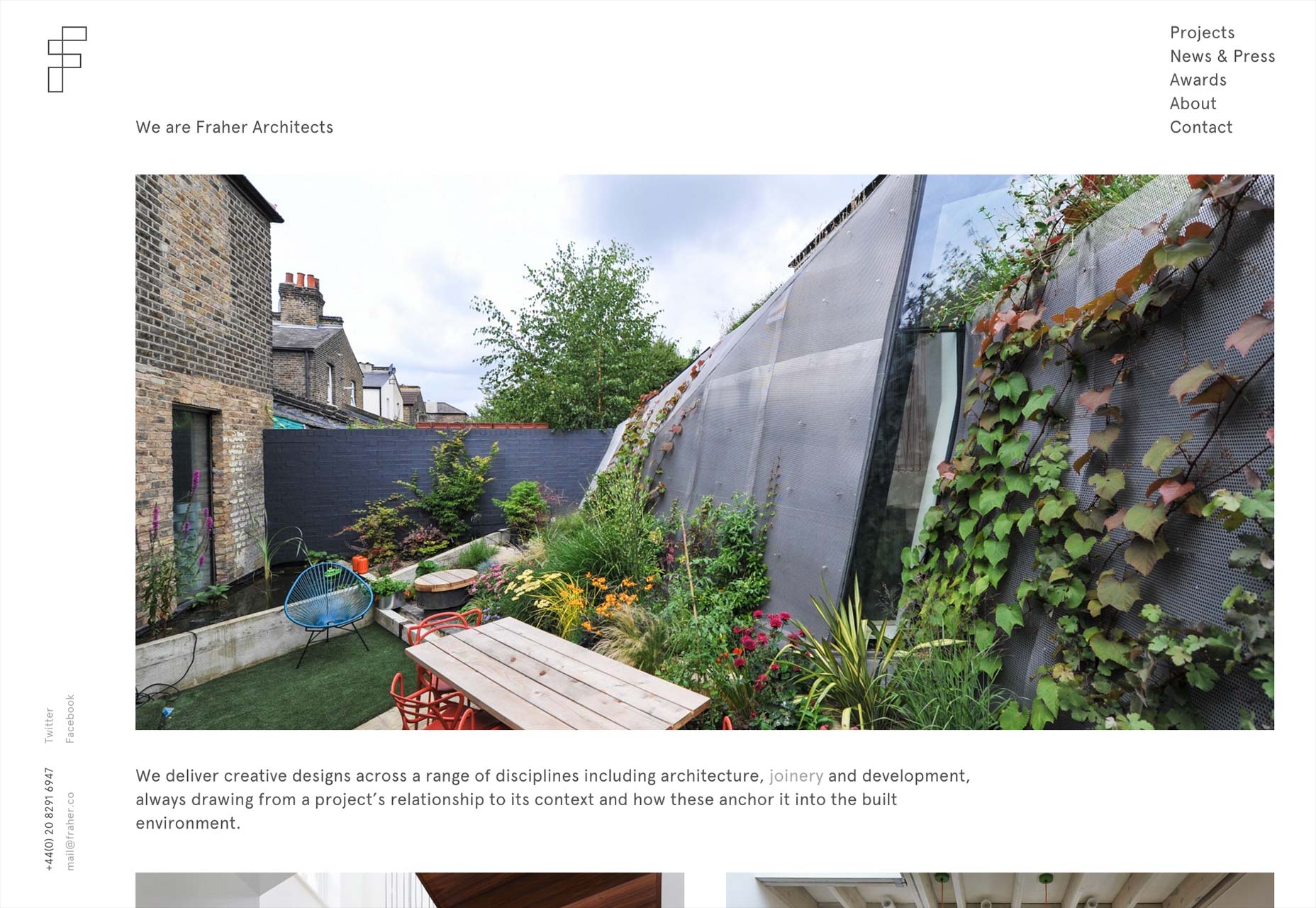
It has become a standardized web design pattern to make the company’s logo clickable, since that is perhaps the most familiar alternative to a home button for users. Because most sites feature the logo prominently in the header already (typically in the top left or center), this makes a convenient shortcut to return home. The design pattern is even more helpful when a company’s logo is always present on the page, acting as a permanent “home” button.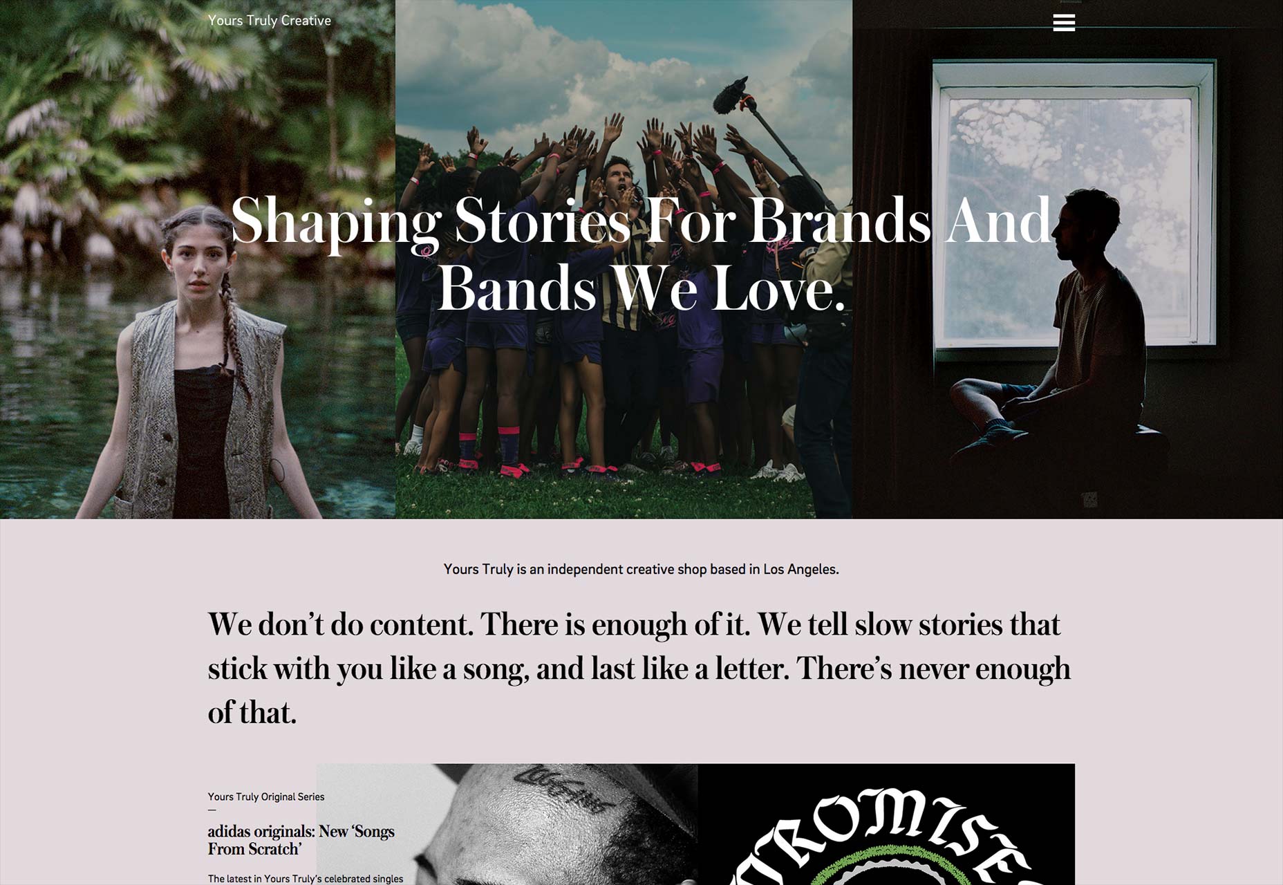

Breadcrumbs
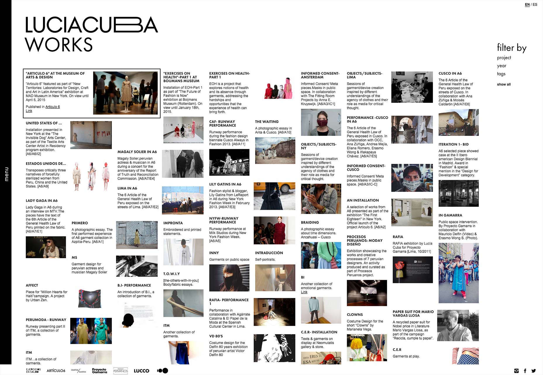
If your site is larger or has a complex hierarchy, you may consider a “breadcrumb trail” to provide users with an indication of where they are within the site’s organization. Breadcrumbs can be used to show your location in a multi-step form, deeply layered navigation, or even when browsing through store items organized or filtered by various categories. The breadcrumbs are links, usually at the top of the webpage, that describe your position in the site’s hierarchy in an unobtrusive fashion. They reveal exactly where you are in the site as you go from page to page, and provide a way to move the amount of steps you wish — even home, if needed. A good example of very traditional breadcrumb navigation is the gov.uk site. Their breadcrumbs also appear at the top of the page as you navigate deeper into their site, making for an easy trip back home. This is a great consideration if your site has a dense organizational structure as theirs does. But it’s not just complex sites that make use of breadcrumbs: luciacuba.com uses its logo and section headings as breadcrumbs to provide a path back up the document tree.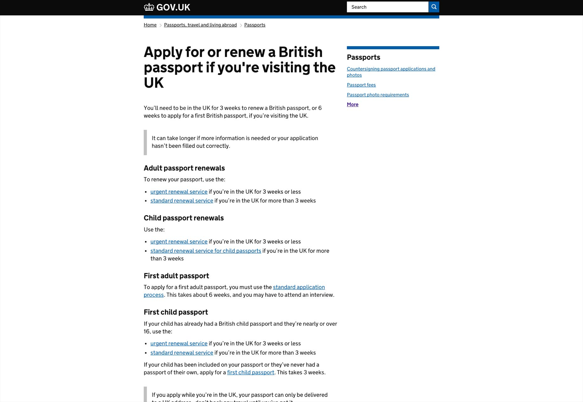
Footers
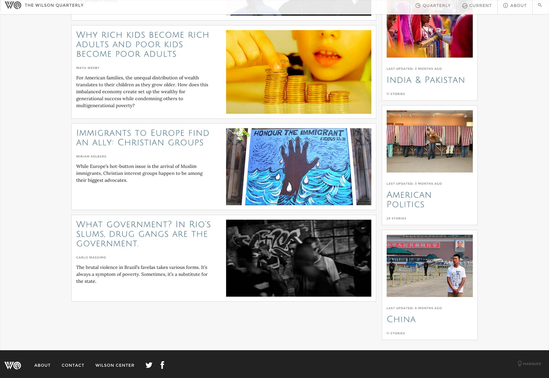
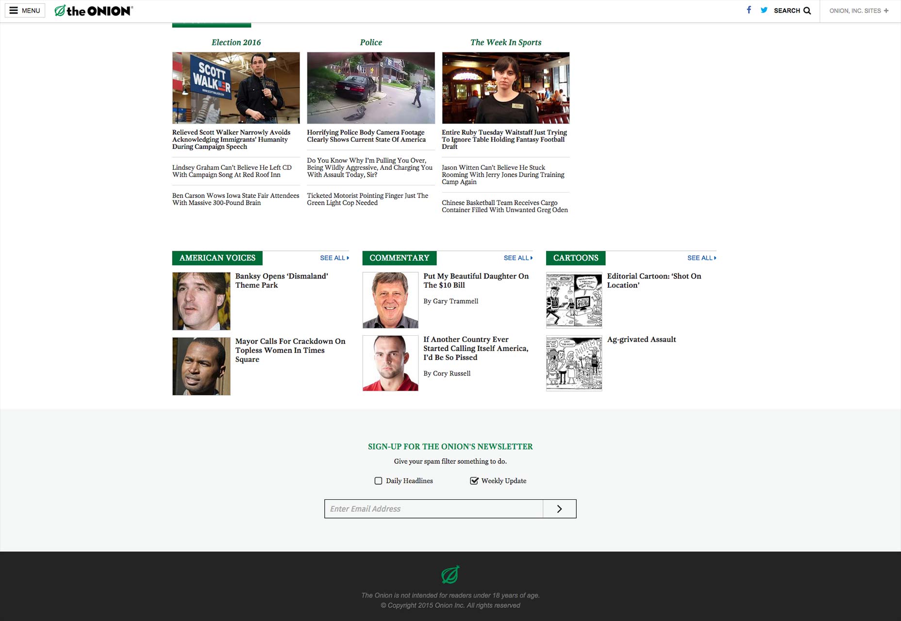
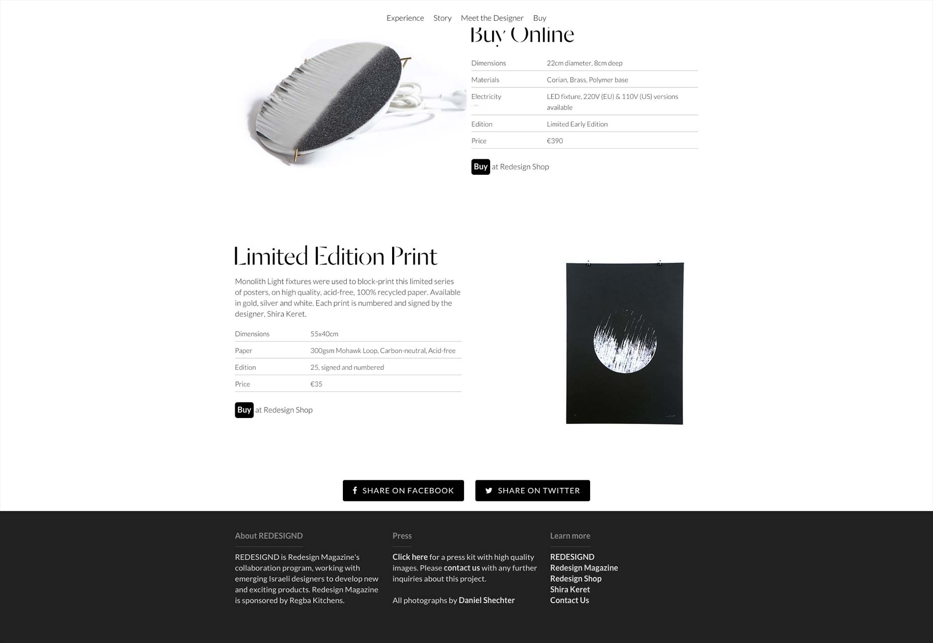
The website footer is another trusty standby; the bottom the the page is a place users of all levels of web familiarity know to go to for valuable information. A complete view of the website’s hierarchy can be placed in the footer, or simply a larger subset of the site’s navigation than is offered by the primary navigation — typically including a home button. This approach provides a fallback: even if your users are looking for something not offered in the clear and simple choices of primary navigation, there’s an offering of the website’s structure at the bottom of the page. The mini-site for AIGA’s design conference 2015 includes a home button, not to the mini-site’s front page, but to AIGA’s main homepage. Wilson Quarterly and The Onion both use logo marks to link from their footer to their home page, but Redesignd mixes it in with other useful links.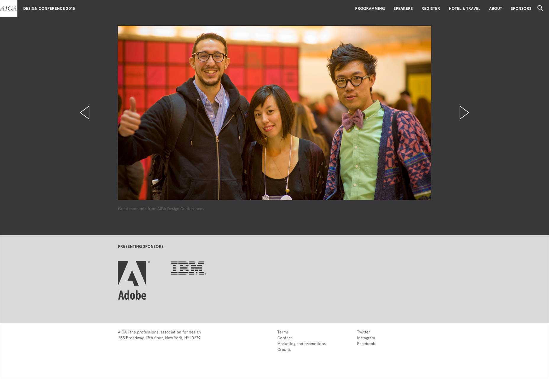
Focus on user experience
Good user experience design focuses on creating a successful user journey in order to create engaged and returning visitors, and in the case of an eCommerce site, shoppers. Although there are many tools to help make conversions more frequent, eliminating unnecessary navigation options such as the home button is an important way to streamline visitors’ journey through your website. [pullquote]Reducing decision-making and cognitive load for your users will help encourage more conversions[/pullquote] Giant organizations such as Amazon, Apple, Twitter, and Wikipedia have done away with their home button because home is not where the primary source of interaction is taking place, but merely a location for featured offers, promotions or a table of contents. Visitors are most likely to return home when they’ve lost their way. Eliminating the home button from your navigation should be just one step along the way towards making the user journey through your site intuitive and frustration-free. Reducing decision-making and cognitive load for your users will help encourage more conversions, purchases, videos watched, articles read, or whatever tasks your site helps visitors complete. Featured image, AIGA design conference 2015Mira Brody
Mira Brody is a copywriter and editor at Montana web design firm JTech Communications, where she's a member of the custom web development team providing technical writing and creating brand personas for a diverse array of clients.


Read Next

20 Best New Websites, April 2024
Welcome to our sites of the month for April. With some websites, the details make all the difference, while in others,…

Exciting New Tools for Designers, April 2024
Welcome to our April tools collection. There are no practical jokes here, just practical gadgets, services, and apps to…

14 Top UX Tools for Designers in 2024
User Experience (UX) is one of the most important fields of design, so it should come as no surprise that there are a…
By Simon Sterne

What Negative Effects Does a Bad Website Design Have On My Business?
Consumer expectations for a responsive, immersive, and visually appealing website experience have never been higher. In…

10+ Best Resources & Tools for Web Designers (2024 update)
Is searching for the best web design tools to suit your needs akin to having a recurring bad dream? Does each…
By WDD Staff

3 Essential Design Trends, April 2024
Ready to jump into some amazing new design ideas for Spring? Our roundup has everything from UX to color trends…

How to Plan Your First Successful Website
Planning a new website can be exciting and — if you’re anything like me — a little daunting. Whether you’re an…
By Simon Sterne

15 Best New Fonts, March 2024
Welcome to March’s edition of our roundup of the best new fonts for designers. This month’s compilation includes…
By Ben Moss

LimeWire Developer APIs Herald a New Era of AI Integration
Generative AI is a fascinating technology. Far from the design killer some people feared, it is an empowering and…
By WDD Staff

20 Best New Websites, March 2024
Welcome to our pick of sites for March. This month’s collection tends towards the simple and clean, which goes to show…

Exciting New Tools for Designers, March 2024
The fast-paced world of design never stops turning, and staying ahead of the curve is essential for creatives. As…

Web Tech Trends to Watch in 2024 and Beyond
It hardly seems possible given the radical transformations we’ve seen over the last few decades, but the web design…
By Louise North