

What are directional cues?
Directional cues come in all shapes and sizes, and you may even be surprised to learn what can pass as a directional cue. Furthermore, there are both explicit (very obvious) and implicit (more low-key) directional cues. Page elements that can be considered explicit directional cues include:- Arrows
- Fingers pointing
- Eye direction (when people’s faces are looking at a call to action)
- Lines
- Curves
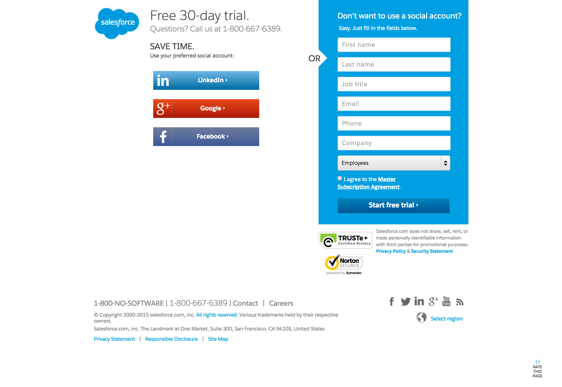
 Here’s an ideal example of an explicit directional cue from Salesforce’s landing page. Note the use of the obvious arrow directing the user’s eye to the short web form.
 Implicit directional cues are far easier to miss, and those elements that constitute an implicit directional cue are debatable, but they could include:
- Color
- Repetition of size, color and shape
- Hierarchy
How do you clarify page goals?
Every page has a purpose, which is usually to get a visitor to buy, sign up for, or subscribe to something. When users don’t understand what the page’s purpose is—such as when the navigation is poorly implemented or the page is much too cluttered—the user experience will drastically decline. This is where a crystal clear directional cue can be the page’s lifesaver. After all, when the users receive cues on what they’re supposed to do on the page, then their experience drastically improves. Their confusion and frustration is replaced by a confidence and efficiency that are brought about by great organization, design and planning. Fittingly, a superb example of a directional cue comes to us on a page that talks about the definition of a directional cue. On Unbounce’s definition page, note the huge arrow pointing to the right and thereby prompting visitors to actually read the definition of a directional cue! Thanks to this simple page element, users can clearly understand that the goal of the page is to read and understand this definition.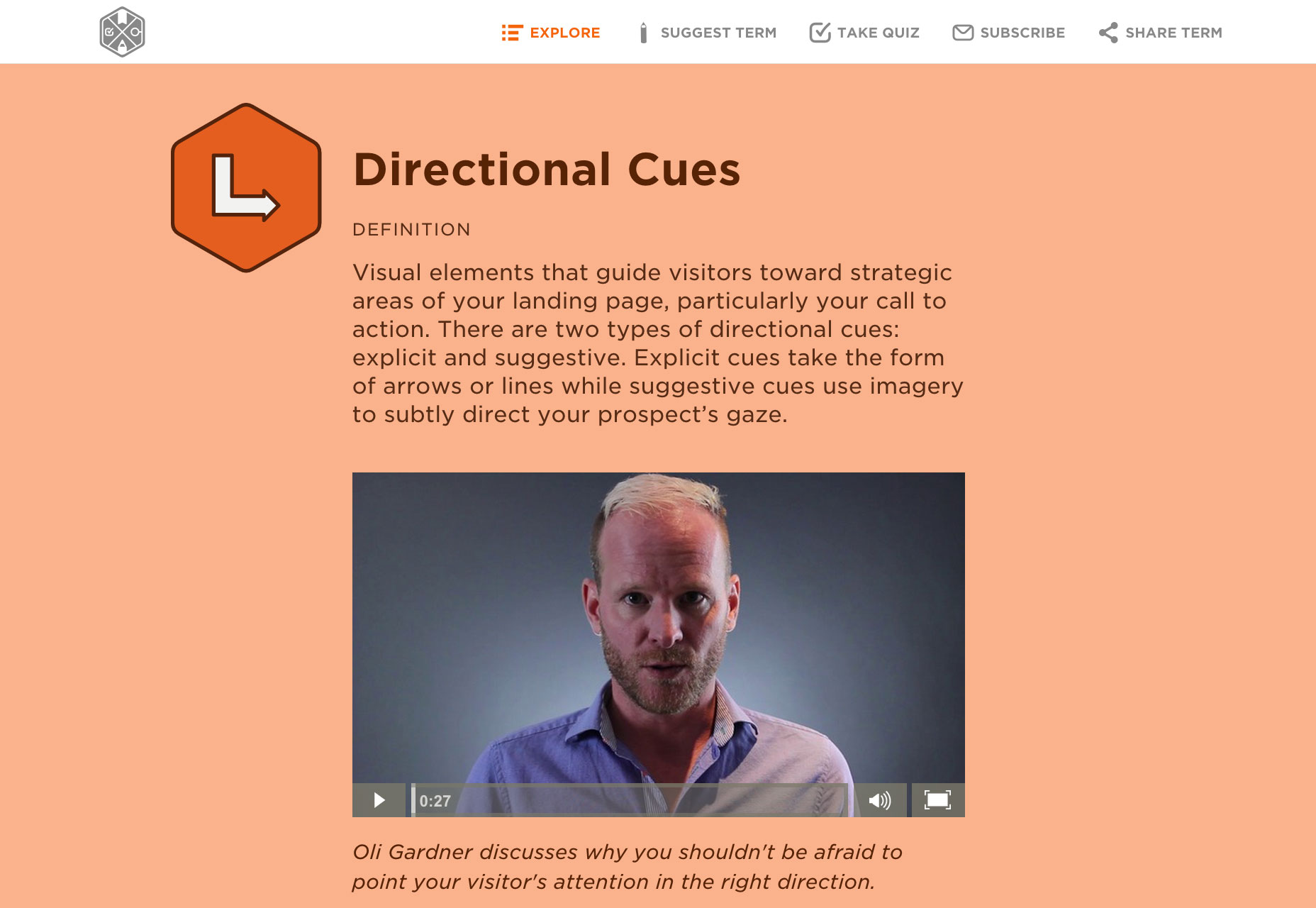
Empowering users with directional cues
Visual Website Optimizer looked at a page displaying an ad for Sunsilk shampoo. The results were astounding: when the woman’s eyes in the ad actually looked to her right—at the bottle of shampoo, instead of into space—the number of users who finally looked at the bottle skyrocketed to 84%, from just a meager 6% when the original ad had the woman looking straight ahead. Eazers.com is a German site for coupons that effectively uses the same technique; the gaze of the model draws your eyes straight to the central calls to action.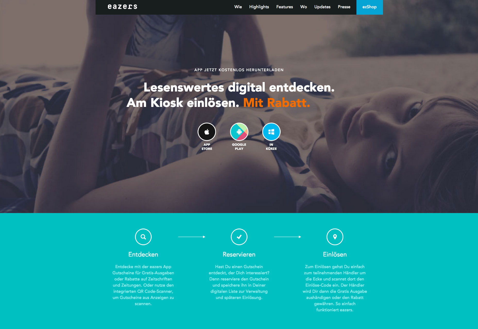 There’s no doubt that directional cues are very beneficial on a page, and it comes as no surprise, that the improved user experience provided by directional cues also naturally boosts the conversion rate on sites, as the two are interlinked. When the user experience of your site increases, people convert at higher rates because they understand what they’re supposed to do.
Users sometimes know exactly what they’re looking for when they visit your site. These are likely return visitors who want to use what they used the last time they were on your site. For these types of users, it’s paramount that your user experience is top-notch because the last thing you want to do is repel sure-bet conversions! One of the easiest ways to ensure a great user experience for a returning visitor who wants to use the same feature again is by providing a directional cue that’s easy to spot, interpret and then click on.
There’s no doubt that directional cues are very beneficial on a page, and it comes as no surprise, that the improved user experience provided by directional cues also naturally boosts the conversion rate on sites, as the two are interlinked. When the user experience of your site increases, people convert at higher rates because they understand what they’re supposed to do.
Users sometimes know exactly what they’re looking for when they visit your site. These are likely return visitors who want to use what they used the last time they were on your site. For these types of users, it’s paramount that your user experience is top-notch because the last thing you want to do is repel sure-bet conversions! One of the easiest ways to ensure a great user experience for a returning visitor who wants to use the same feature again is by providing a directional cue that’s easy to spot, interpret and then click on.
Don’t take directional cues for granted
The next time you’re designing and think of dismissing directional cues as just a bunch of unnecessary arrows, lines or curves, think again! Research has shown that they’re definitively tied into the user experience and, consequently, a page’s conversion rate. To help your site visitors experience a much better user experience—and your clients obtain a much better conversion rate—you’ve got to incorporate these directional cues into your design. More than issuing an instruction, directional cues are heavy-hints at what the user is expected to do. Some users won’t, some will, but the important thing is that they clearly understand what the ‘normal’ use of the page is. Directional cues are one of the best tools designers have for enhancing UX, and helping users to boost conversions for your client.Marc Schenker
Marc’s a copywriter who covers design news for Web Designer Depot. Find out more about him at thegloriouscompanyltd.com.


Read Next

20 Best New Websites, April 2024
Welcome to our sites of the month for April. With some websites, the details make all the difference, while in others,…

Exciting New Tools for Designers, April 2024
Welcome to our April tools collection. There are no practical jokes here, just practical gadgets, services, and apps to…

14 Top UX Tools for Designers in 2024
User Experience (UX) is one of the most important fields of design, so it should come as no surprise that there are a…
By Simon Sterne

What Negative Effects Does a Bad Website Design Have On My Business?
Consumer expectations for a responsive, immersive, and visually appealing website experience have never been higher. In…

10+ Best Resources & Tools for Web Designers (2024 update)
Is searching for the best web design tools to suit your needs akin to having a recurring bad dream? Does each…
By WDD Staff

3 Essential Design Trends, April 2024
Ready to jump into some amazing new design ideas for Spring? Our roundup has everything from UX to color trends…

How to Plan Your First Successful Website
Planning a new website can be exciting and — if you’re anything like me — a little daunting. Whether you’re an…
By Simon Sterne

15 Best New Fonts, March 2024
Welcome to March’s edition of our roundup of the best new fonts for designers. This month’s compilation includes…
By Ben Moss

LimeWire Developer APIs Herald a New Era of AI Integration
Generative AI is a fascinating technology. Far from the design killer some people feared, it is an empowering and…
By WDD Staff

20 Best New Websites, March 2024
Welcome to our pick of sites for March. This month’s collection tends towards the simple and clean, which goes to show…

Exciting New Tools for Designers, March 2024
The fast-paced world of design never stops turning, and staying ahead of the curve is essential for creatives. As…

Web Tech Trends to Watch in 2024 and Beyond
It hardly seems possible given the radical transformations we’ve seen over the last few decades, but the web design…
By Louise North