

Keep your design minimalist
Keep your mobile design clean and simple. Go for practicality and usefulness over any fanciness in your design. Remember that you’re designing for a much smaller screen than if you would for desktop. With screen real estate being very precious, it’s also just common sense that you can’t do a complex design. Thus, minimalism is your best bet. This also helps the user experience. After all, when users are looking at an uncluttered interface in their iPhones or Android devices, they’re going to be able to find what they’re looking for on a site extremely quickly, which improves their user experience. What does minimalism on a mobile screen look like? Users should only see the content that they need to see to properly use the site—which will automatically prompt them to explore and navigate further. Also, buttons and menus should be intuitive, in keeping with the focus on simplicity. Look at Crate & Barrel’s mobile site. It’s a study in mobile minimalism because its hamburger menu is tucked away on the top-left of the screen, yet still noticeable, and you know immediately what site you’re on thanks to the word-mark logo on top. Also, the colors and fonts are both basic, which ensures users aren’t overwhelmed.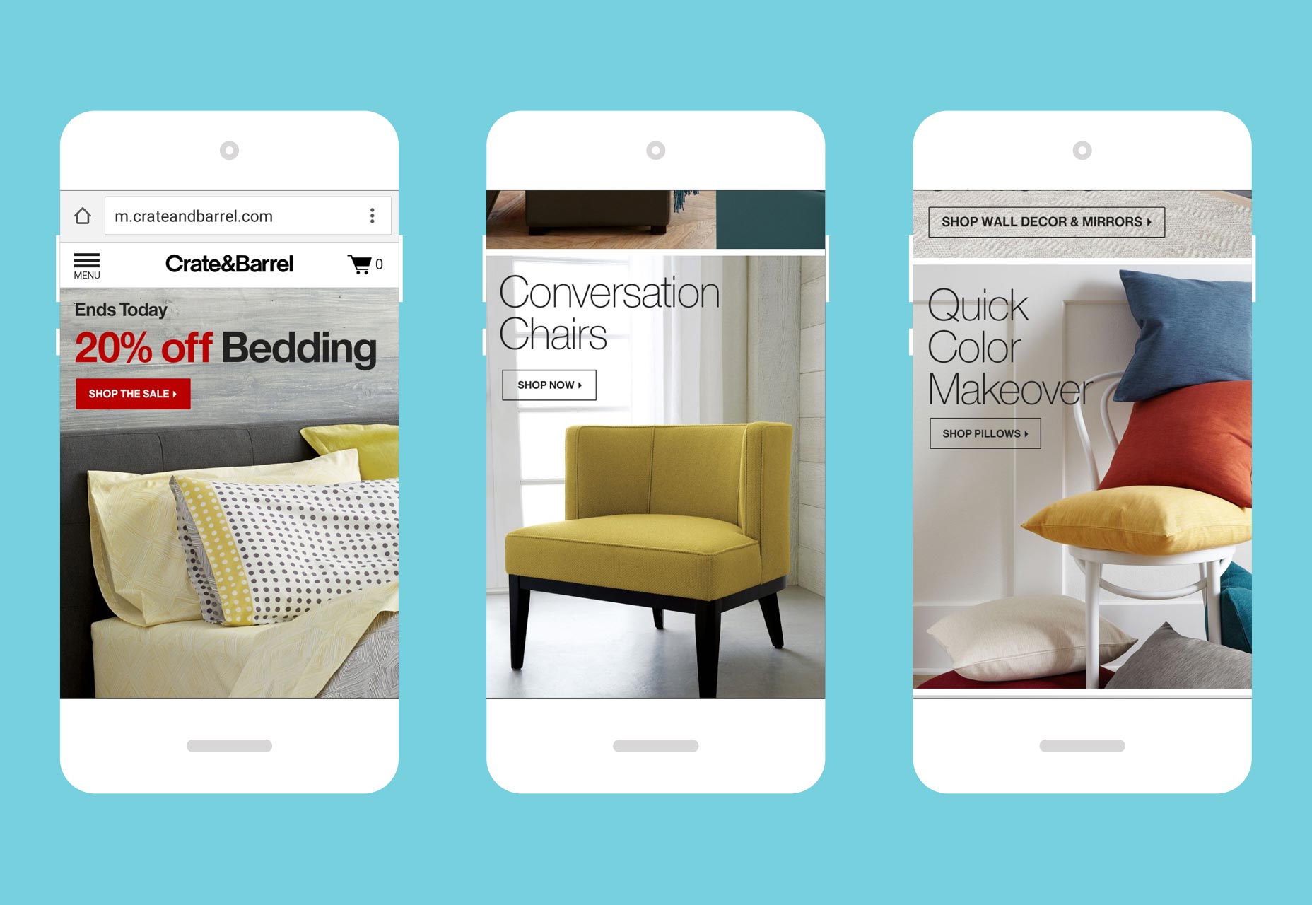
Be mindful of different devices and environments
Though you’re designing for mobile, not all mobile devices are created equally. This is key to successful mobile UX design today, but some designers forget that there are various platforms for which they have to design. Designing for mobile means designing for mobile apps and mobile sites. It’s imperative that you understand what devices your audience uses and what their mobile behavior is like. In other words, you shouldn’t design an app or a mobile site with the mistaken belief that iPhone and Android users will interact with your app or site in the same way. Research shows that iPhone users spend more on mobile ecommerce than do their Android counterparts. What’s particularly stunning about this stat is that there are fewer iPhone users than Android users, making iOS users’ spending power even more significant! Therefore, if you’re designing mobile apps and sites for an ecommerce business, you’ll want to focus first and more heavily on making a top-notch UX for iOS than you would for Android — simply because there’s more money to be made.Use familiarity to create highly functional navigation
Though there are now more people surfing the Internet on mobile than desktop, many of those people obviously started out browsing websites on their desktops. This means that they’ve come to expect a certain standard in terms of site navigation and appearance from all their time using desktop. Therefore, when designing for mobile, don’t mess with expectations and conventions: make sure your client’s mobile site replicates the navigation standards of any desktop site with great UX. Here are some common features that you should carry over into your mobile navigation:- Your most popular categories or site pages, based on analytics data
- Navigation menu in the form of a hamburger menu
- High-quality images
- Prominent search feature
- Clear, huge call-to-action buttons
Make the checkout process as convenient as you possibly can
This is the most important tip on this page, by far. It’s so important that every other tip leading up to this is useless if you failed to design your client’s mobile site in such a way as to get the conversion at the end of the user’s mobile-site browsing. The last thing you want is that dreaded shopping cart abandonment to occur, especially when you’ve already gone through the trouble of recognizing and trying to design a completely mobile-friendly site. Unsurprisingly studies show that like on desktop, shopping cart abandonment occurs on mobile when the UX is bad. For a mobile shopper looking to buy something, the user experience is the worst it can be when they’re trying to place an order…so when something goes haywire, they get frustrated, and leave your site forever, never to come back, not even on the desktop! One of the most notorious ways that the mobile checkout process can suffer is when the call to action and checkout buttons fail to support the shopper’s expectations. For instance, the buttons could be too small to easily see or tap on, or they could just fail to appear as soon as items are added to the cart. For an inspiring example on doing this basic design feature right, we look to Cult Pens’ mobile product page for one of its Pental brand pens. Note the large “add to basket” button splashed across the entire bottom of the page.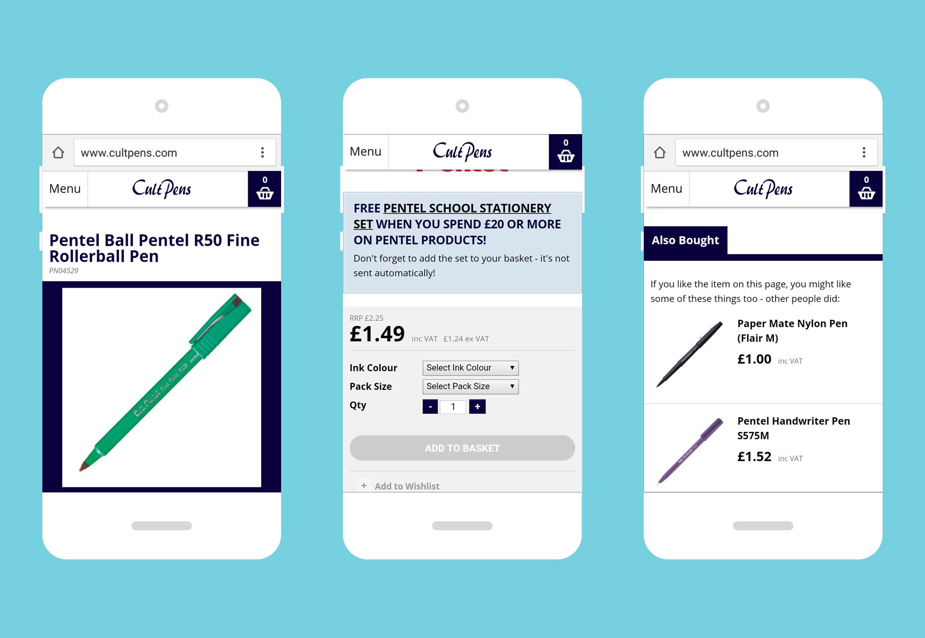
Mobile design: different from desktop design
Some designers just don’t get it. Designing for mobile is an entirely different concept than designing for desktop. Sure, you’ll have similarities, but they only go so far. Of course you want to keep your mobile design as close to the conventions that users are used to from desktop browsing, but there are exceptions. Minimalism — doing more with less — should be the golden rule for mobile design since the screen’s much smaller. Designers also have to understand that the user behavior for iOS and Android isn’t the same, so it’s best to research what each user base does with their smartphones beforehand. Of course, you’ll also have to design different mobile and apps for different platforms. Finally, the big one to get right is to make the checkout process as smooth as possible. Never inhibit shoppers from buying on their smartphones! If you do, it’s like throwing money out the window. Follow all these mobile-design best practices, and you’ll have happier clients who’ll get more conversions. Images use mobile experience image via Shutterstock.Marc Schenker
Marc’s a copywriter who covers design news for Web Designer Depot. Find out more about him at thegloriouscompanyltd.com.


Read Next

3 Essential Design Trends, May 2024
Integrated navigation elements, interactive typography, and digital overprints are three website design trends making…

How to Write World-Beating Web Content
Writing for the web is different from all other formats. We typically do not read to any real depth on the web; we…
By Louise North

20 Best New Websites, April 2024
Welcome to our sites of the month for April. With some websites, the details make all the difference, while in others,…

Exciting New Tools for Designers, April 2024
Welcome to our April tools collection. There are no practical jokes here, just practical gadgets, services, and apps to…

How Web Designers Can Stay Relevant in the Age of AI
The digital landscape is evolving rapidly. With the advent of AI, every sector is witnessing a revolution, including…
By Louise North

14 Top UX Tools for Designers in 2024
User Experience (UX) is one of the most important fields of design, so it should come as no surprise that there are a…
By Simon Sterne

What Negative Effects Does a Bad Website Design Have On My Business?
Consumer expectations for a responsive, immersive, and visually appealing website experience have never been higher. In…

10+ Best Resources & Tools for Web Designers (2024 update)
Is searching for the best web design tools to suit your needs akin to having a recurring bad dream? Does each…
By WDD Staff

3 Essential Design Trends, April 2024
Ready to jump into some amazing new design ideas for Spring? Our roundup has everything from UX to color trends…

How to Plan Your First Successful Website
Planning a new website can be exciting and — if you’re anything like me — a little daunting. Whether you’re an…
By Simon Sterne

15 Best New Fonts, March 2024
Welcome to March’s edition of our roundup of the best new fonts for designers. This month’s compilation includes…
By Ben Moss

LimeWire Developer APIs Herald a New Era of AI Integration
Generative AI is a fascinating technology. Far from the design killer some people feared, it is an empowering and…
By WDD Staff