1
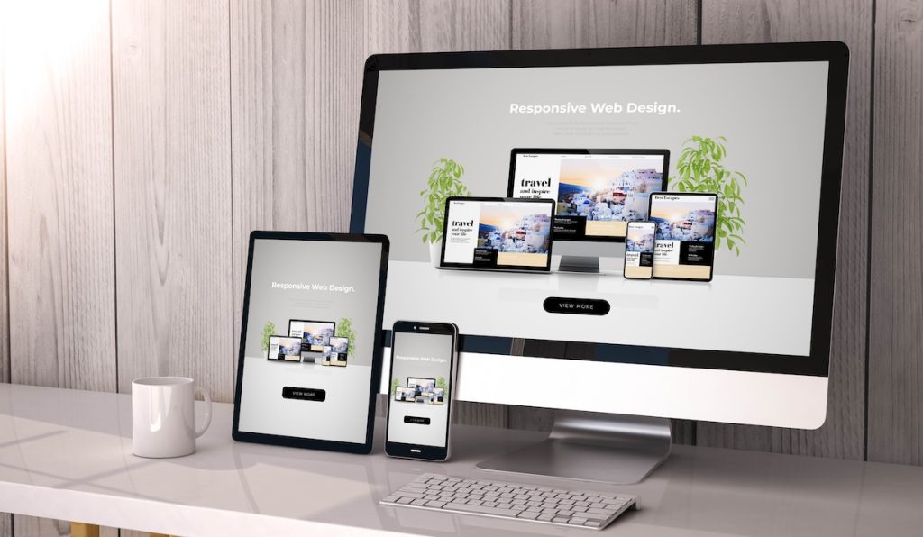
Since mobile devices have now overtaken the desktop in popularity it’s necessary that designers design with mobile in mind. Mobile-first is popular as a technique because it is easier to scale mobile up, than scale desktop down.
However, sometimes the choice is taken out of your hands. Commonly designers find themselves adapting existing desktop designs to mobile. And because some elements don’t translate well, it’s essential designers understand what specific adjustments to make when designing for the small screen. Here’s how…
Embrace minimalism
Minimalism has been popular in web design for years now, simply because it often aids usability and looks nice, too. When it comes to mobile, though, minimalism is less of an aesthetic choice, as it is one based purely on usability.
According to the Nielsen Norman Group, cutting features is a necessity in mobile design. So what does this mean for designers as they try to build a mobile site from an already-established desktop one?
It means doing away with what’s not essential to the mobile user experience. For instance, if you’re transitioning an e-commerce store from desktop to mobile, keep the same amount of products displayed on the mobile site; it only makes sense, because shoppers want to be able to find everything an online store has to offer, just as the online store wants to show everything it has to sell to its site visitors. A big ad carousel for the latest deals, however, might reasonably be be pared down a bit.
Hide navigation
One of the most common features on mobile screens is the hamburger menu, that almost omnipresent little icon with three horizontal line segments piled on top of each other. This is another perfect case where the smaller screen size of mobile forces designers to change around elements that are expected to look a certain way on desktops.
In spite of the divided opinion on the hamburger menu’s presence, it is pretty much ubiquitous on mobile screens simply because this is the best solution that designers have found for downscaling the navigation menu from desktops to mobile devices.
Check out famed chef Bobby Flay’s website for his chain eatery called Bobby’s Burger Palace. As expected, the navigation menu is horizontally laid out across the top of the homepage, yet when you go on the site’s mobile version, the horizontal menu is gone. In its place is the neat and tidy hamburger menu, right in the same place of the screen where the longer horizontal menu would be on the desktop version.


Walmart also makes use of the hamburger menu in its desktop-to-mobile design transition.
On its desktop site, Walmart displays the “All Departments” dropdown navigation that opens up a second layer of navigational choices all on the same page. On the mobile site, though, that feature isn’t possible due to the small screen size, so a replacement has been designed: the second layer of navigational choices are in the hamburger menu and these open up more and more navigational choices with every selection—almost like flipping the pages of a book from left to right.


Switch to a single-column
In keeping with the fact that simpler is just better when it comes to mobile design, you’ll do well for your clients if you remember that a single-column layout is cleaner and easier for their users to operate on a smaller screen. The big benefit of a single-column layout is that you do away with horizontal scrolling, as if you had a lot of text on a page and wanted your readers to swipe the screen from left to right, to read on.
When you introduce a single-column layout, you streamline the user experience, encouraging users to simply scroll down to read on or click on a link they want to see on a new page. This beats forcing them to swipe left to right, which is harder to do than simply scroll down, especially when you consider your user’s thumb position relative to how they hold a mobile device.
The desktop website of The New York Times newspaper features multiple columns. That’s easy to use on a desktop, when your client’s users can simply move the cursor from left to right with no issues on a trackpad or mouse.

Of course, The New York Times’ mobile site understands how things have to change on smaller screens, so it introduces a clean and efficient single-column design that boosts the user experience, as readers can just effortlessly scroll down for more content with their thumbs.

Mobile considerations
Because of mobile’s influence on users today, designers have to always design for mobile. It’s not good enough to simply design a mobile site along with the desktop site and call that designing for mobile, though!
Designing for mobile means actually being considerate of the specific adjustments you’ll have to make for your client’s site when you design for the small screen. This includes everything we talked about above, from minimalism in design to hiding the navigation bar to moving to a single-column layout.
By adopting these best practices in your skillset, you’ll create sites that are a perfect fit for mobile.
Not Useless: Why Experimental Websites Matter More Than You Think
Every once in a while, a site comes along that makes you pause, grin, and think: Wait—websites can do that? Maybe it’s a portfolio where the cursor morphs into a liquid blob,…
How Aspect Ratios Define Perception, Rhythm, and Flow
Designers talk about color, typography, and hierarchy constantly. But proportion—the silent structure beneath everything—rarely gets the same respect. Every card, photo, video, and module in an interface lives within a…

Token Fatigue: When Abstraction Eats Itself
In theory, design tokens were supposed to save us. They were the missing link between design and code, a neat way to abstract decisions—colors, spacing, typography, motion—into a unified language…

AI as Art Director: Can Machines Develop Taste?
Let’s get this out of the way: AI doesn’t have taste. It has statistics. It knows what’s popular, what’s trending, what’s most likely to earn a double-tap — but it…
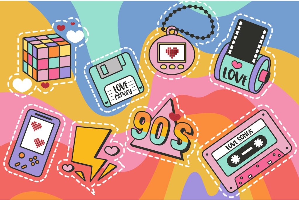
Pixel Nostalgia: Why We Miss the 90s Web (Even If It Was Ugly)
It’s easy to laugh at the 90s web now — the blinking GIFs, Comic Sans banners, table layouts held together with duct tape and hope. But beneath all that chaos…
Exciting New Tools for Designers, February 2026
There are so many new – and good – tools for designers out there right now. From tiny bits of artificial intelligence to icons that delight, there’s something to help…