

Creating an effective contact page
Creating an effective contact page is a key process for most sites, here are 9 elements to focus on, to ensure that the “send” button doesn’t sit idle:1) Limit the number of required fields
The more information you ask for from a user, the less likely they are to complete a contact form. Only ever ask for the information you absolutely need.2) Place a bounding box around forms
By placing a bounding box around forms you make them easy to identify at a glance, and help users gauge what parts of the page are interactive.3) Embed Google maps
For bricks-and-mortar businesses, helping users find the location is obviously beneficial. Even for online businesses, displaying a physical location adds credibility.4) Add social proof
Speaking of credibility, add elements that will give customers confidence, such as testimonials, BBB emblems, the number of years you’ve been in business, and so on.5) Add branding
It might sound foolish, but most potential customers are browsing numerous sites, often in multiple tabs. It pays to remind them exactly who they’re about to contact.6) Guide user input
Use UI elements like selects, and option fields, to guide user input. The easier it is to give you the information you want, the more likely it is you’ll get it.7) Keep it simple
Simple always wins, especially on mobile. Remember that on mobile, your form may need to be larger in order to be usable.8) Include your phone number
Many businesses don’t want to include a phone number because they think they’ll be fielding calls all day. The reality is a phone number is like Google maps, it gives you credibility and makes the customer feel safe handing over their personal details.9) Add a privacy statement
Add the guarantee that your company will keep users’ details confidential. This builds trust.Grain and Mortar
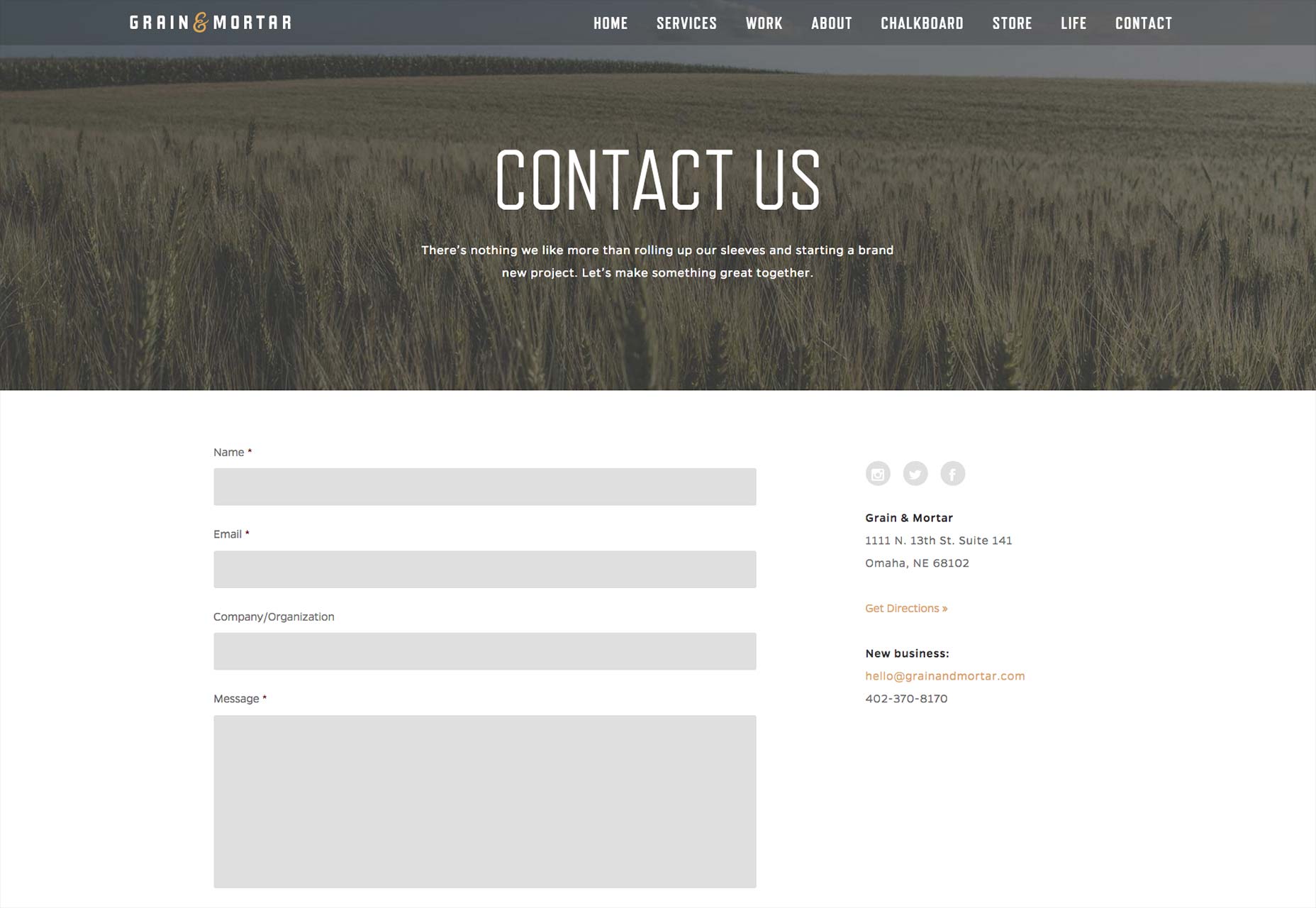
- The Human Test is easy, but keeps out spam. When spam tests are difficult to decipher, users get frustrated and click off.
- Putting the FAQs on the page saves users time and results in higher quality inquiries.
- Only three required fields — it can’t get much simpler.
- The overall simplicity of design, with over-sized fields for mobile UX, is generally pleasant to view and work with.
Evoke
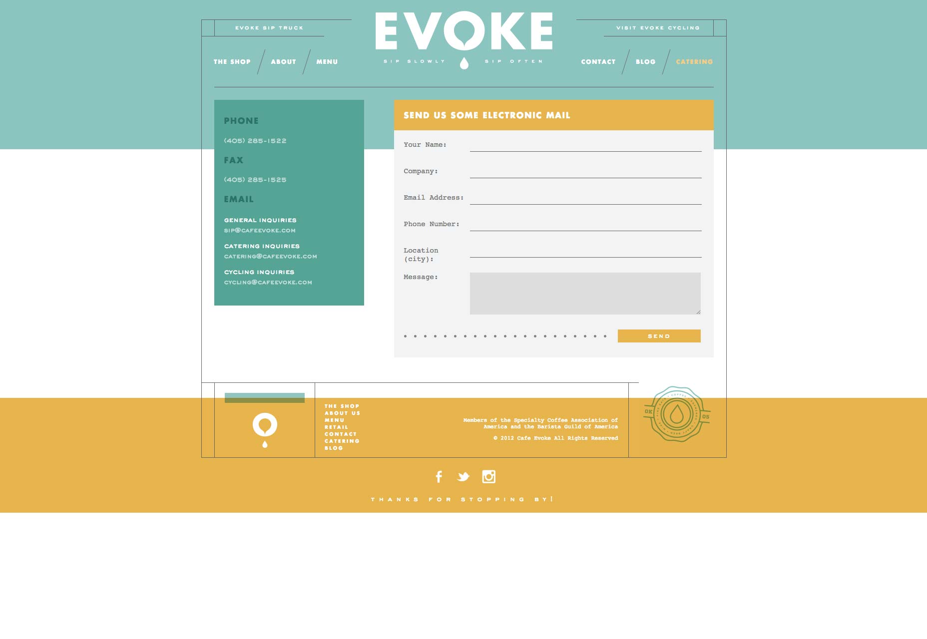
- This design is non-traditional, made to look like a postcard. Because the design is also simple and has a bit of fun woven into it, user interest is heightened.
- The bounding box around the inquiry form makes it stand out from the rest of the page.
- The color scheme, logo and credibility elements in the footer (associations) combine for a strong presentation of branding. This contact page definitely has its own character, gourmet yet down to earth. The form should resonate with people looking for these qualities.
Shiner
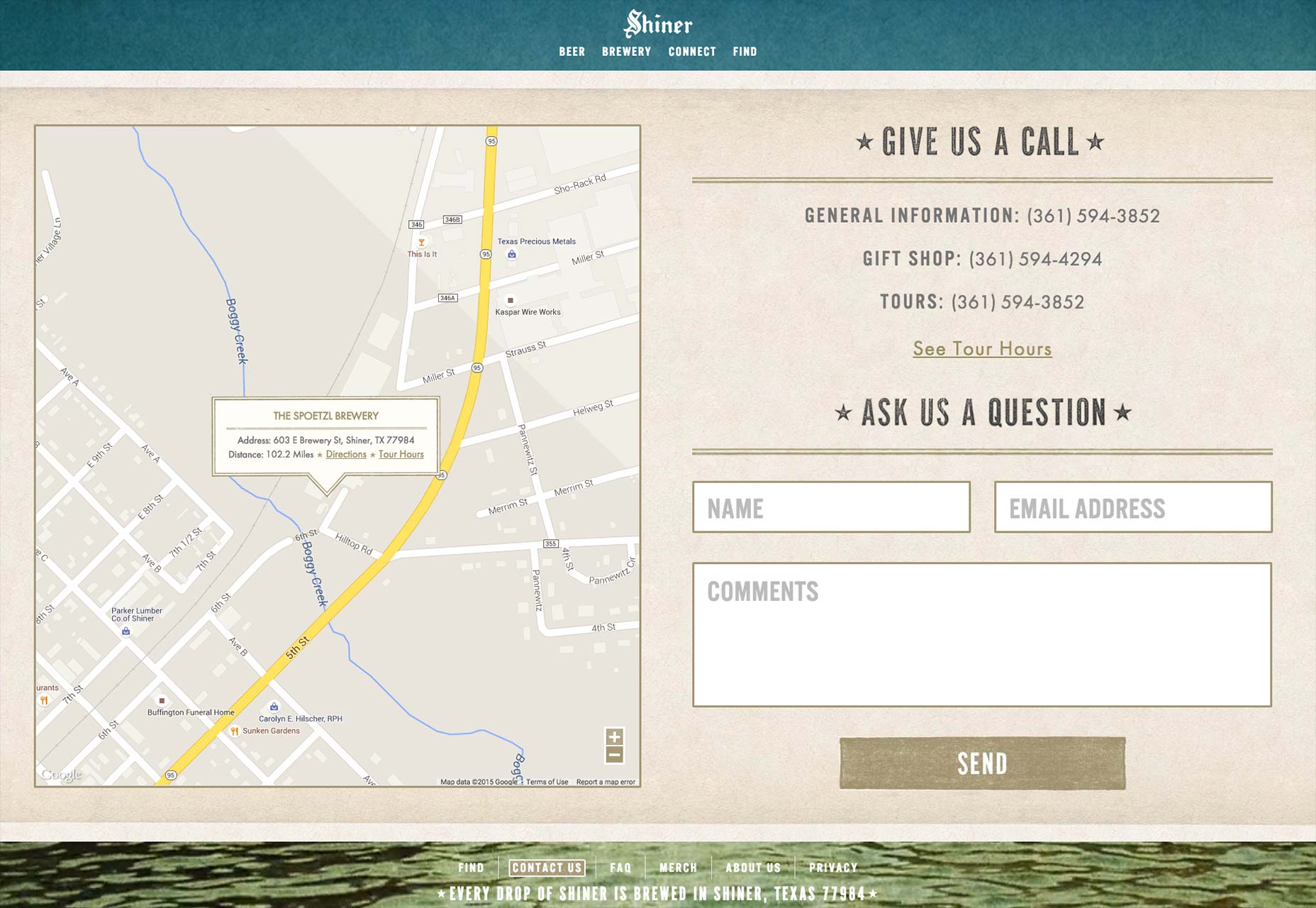
- Strong borders around the form fields make it impossible for users to get confused.
- Again, we see a small number of over-sized form fields.
- The design has a bit of old world, traditional flavor — no doubt exactly how their beer tastes. Brand consistency makes visitors thirsty!
- The large Google Maps embed is a nice convenience for users, lessening the need to enlarge or reduce it.
Knowing the business + knowing the customer = great contact page
Notice that all of these examples are effective, but use different design techniques. Crafting an effective design page requires an understanding of the brand, what potential customers want to know, and the key website user influencers. Universally, website users want simplicity, so it’s not surprising that all of these featured contact pages ooze “easy”. However, insight, imagination and a unique approach are needed to create, strengthen or sustain brand interest when users hit the contact page.Brad Shorr
Brad Shorr is the B2B Marketing Director of Straight North, an Internet marketing firm helping middle market companies build responsive websites that are designed around lead generation.


Read Next

3 Essential Design Trends, May 2024
Integrated navigation elements, interactive typography, and digital overprints are three website design trends making…

20 Best New Websites, April 2024
Welcome to our sites of the month for April. With some websites, the details make all the difference, while in others,…

Exciting New Tools for Designers, April 2024
Welcome to our April tools collection. There are no practical jokes here, just practical gadgets, services, and apps to…

14 Top UX Tools for Designers in 2024
User Experience (UX) is one of the most important fields of design, so it should come as no surprise that there are a…
By Simon Sterne

What Negative Effects Does a Bad Website Design Have On My Business?
Consumer expectations for a responsive, immersive, and visually appealing website experience have never been higher. In…

10+ Best Resources & Tools for Web Designers (2024 update)
Is searching for the best web design tools to suit your needs akin to having a recurring bad dream? Does each…
By WDD Staff

3 Essential Design Trends, April 2024
Ready to jump into some amazing new design ideas for Spring? Our roundup has everything from UX to color trends…

How to Plan Your First Successful Website
Planning a new website can be exciting and — if you’re anything like me — a little daunting. Whether you’re an…
By Simon Sterne

15 Best New Fonts, March 2024
Welcome to March’s edition of our roundup of the best new fonts for designers. This month’s compilation includes…
By Ben Moss

LimeWire Developer APIs Herald a New Era of AI Integration
Generative AI is a fascinating technology. Far from the design killer some people feared, it is an empowering and…
By WDD Staff

20 Best New Websites, March 2024
Welcome to our pick of sites for March. This month’s collection tends towards the simple and clean, which goes to show…

Exciting New Tools for Designers, March 2024
The fast-paced world of design never stops turning, and staying ahead of the curve is essential for creatives. As…