

Andrea Pilutti
Andrea Pilutti is a designer based out of Italy and Switzerland. On top of his apparent ability to teleport, his portfolio makes use of HTML5 background video, and smooth animations. That slows down the smooth scrolling a bit, but it’s pretty enough that I don’t care too much.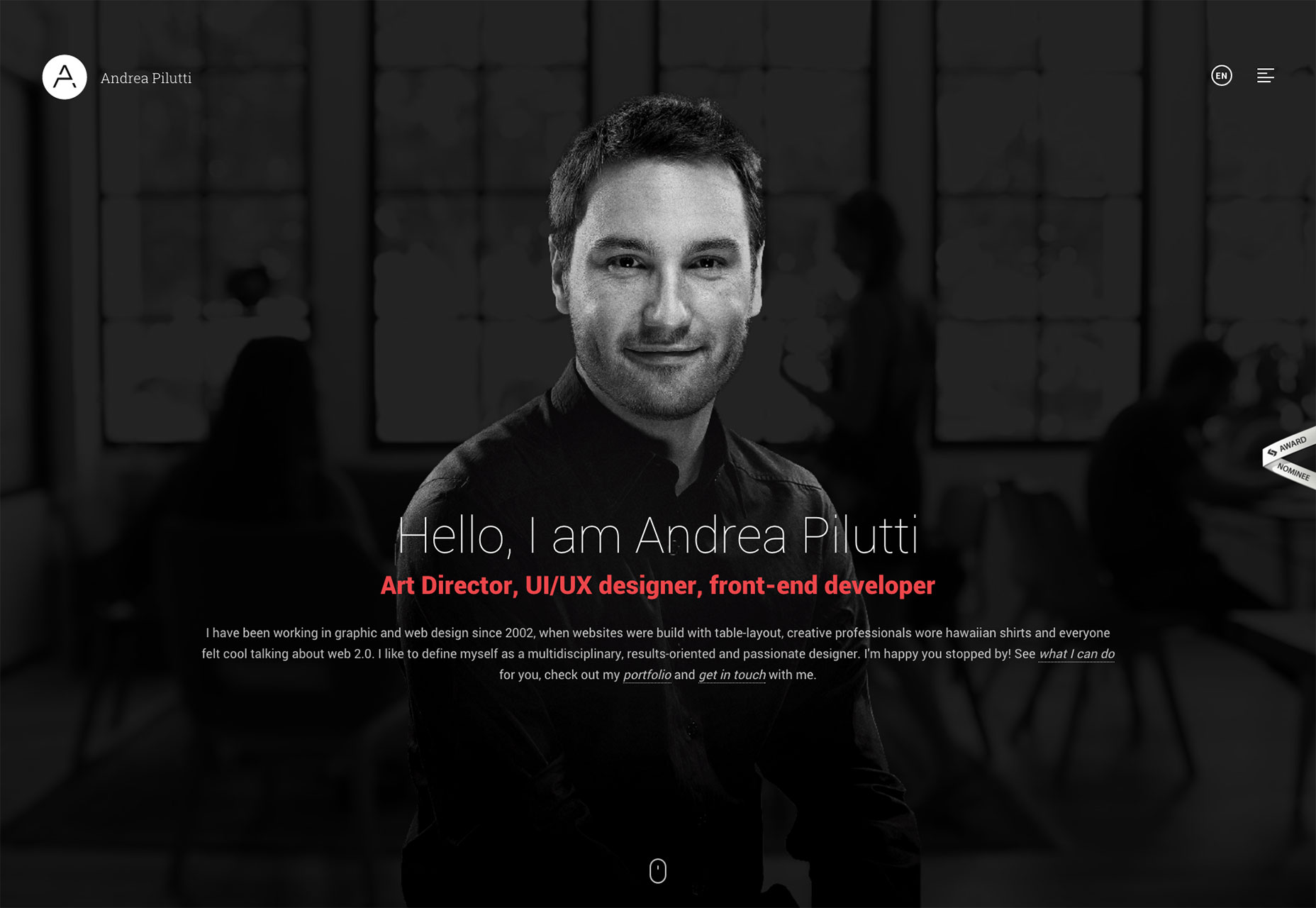
Mikha Makhoul
Mikha Makhoul’s portfolio conforms to the now-classic full-screen-section format, but his typography is beautiful. Each project is presented elegantly, so flip through all his work.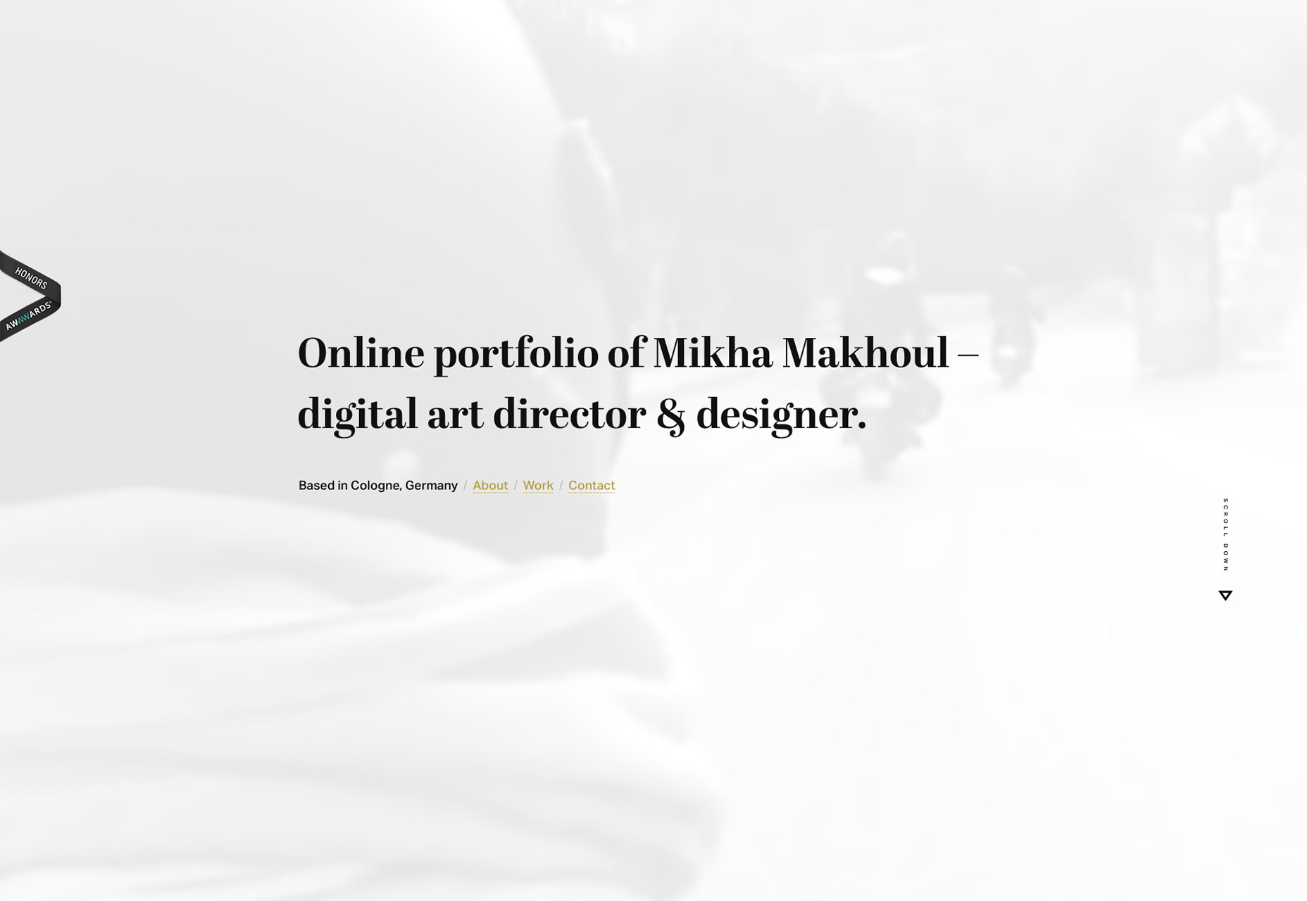
Julien Renvoyé
Stepping away from the pseudo-PowerPoint style we see all the time, Julien Renvoyé shows off his work with a simple single column full of screenshots. It’s all spiced up with excellent typography and the sensible use of animation.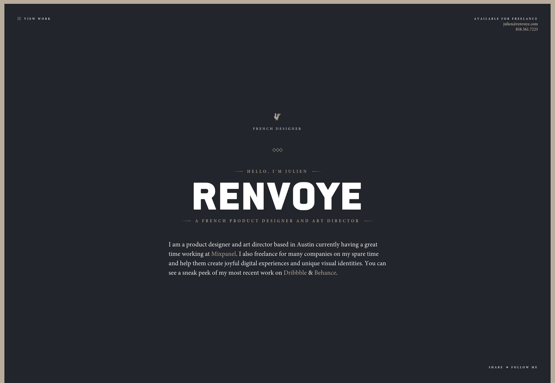
Bryn Taylor
Bryn Taylor made a bold choice by using daring, and dare I say, glaring colors all over his site. If you’re not immediately blinded, there’s a certain genius to his method. I certainly won’t be forgetting his portfolio anytime soon. And neither will my retinas. I should also mention that this is actually a great way to cater to visually impaired users.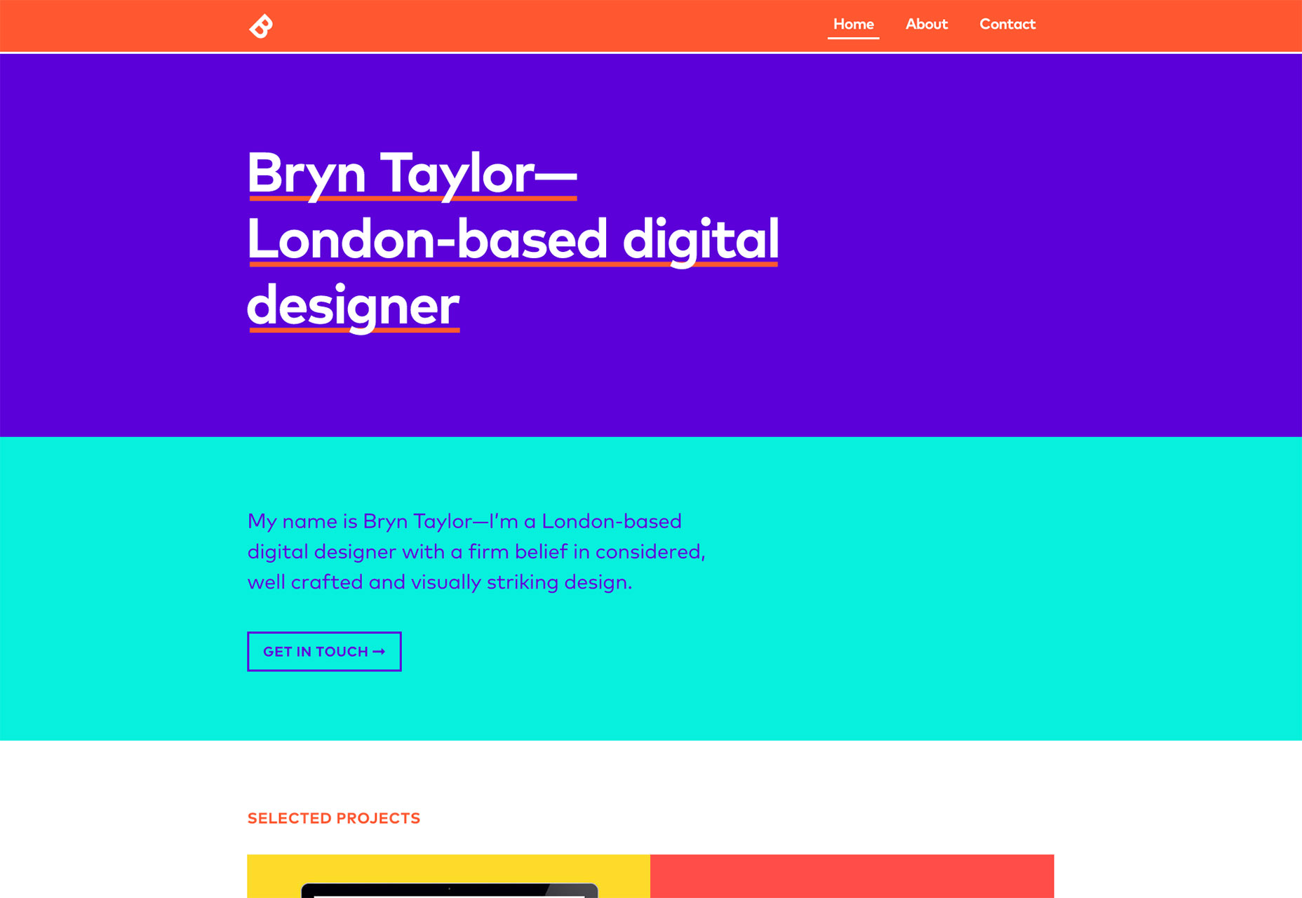
StudioBrave
I'll never be a fan of sites that need pre-loaders. That said, StudioBrave has implemented an excellent asymmetrical design. Plus, they use a monospace typeface, and they make it look good. That's not easy.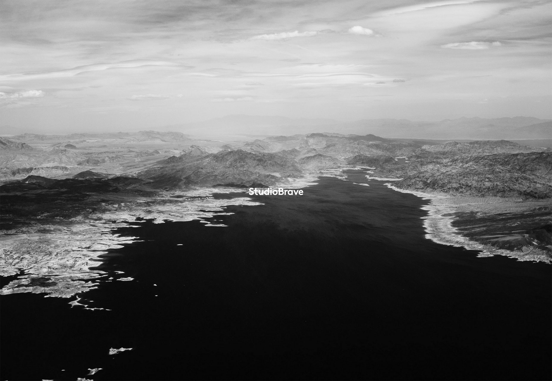
Co Partnership
Co Partnership is a great argument for simplicity. No gimmicks, no tricks. They just put their branding work in front of you, and let you form your own opinions. It doesn’t hurt that their work is pretty great.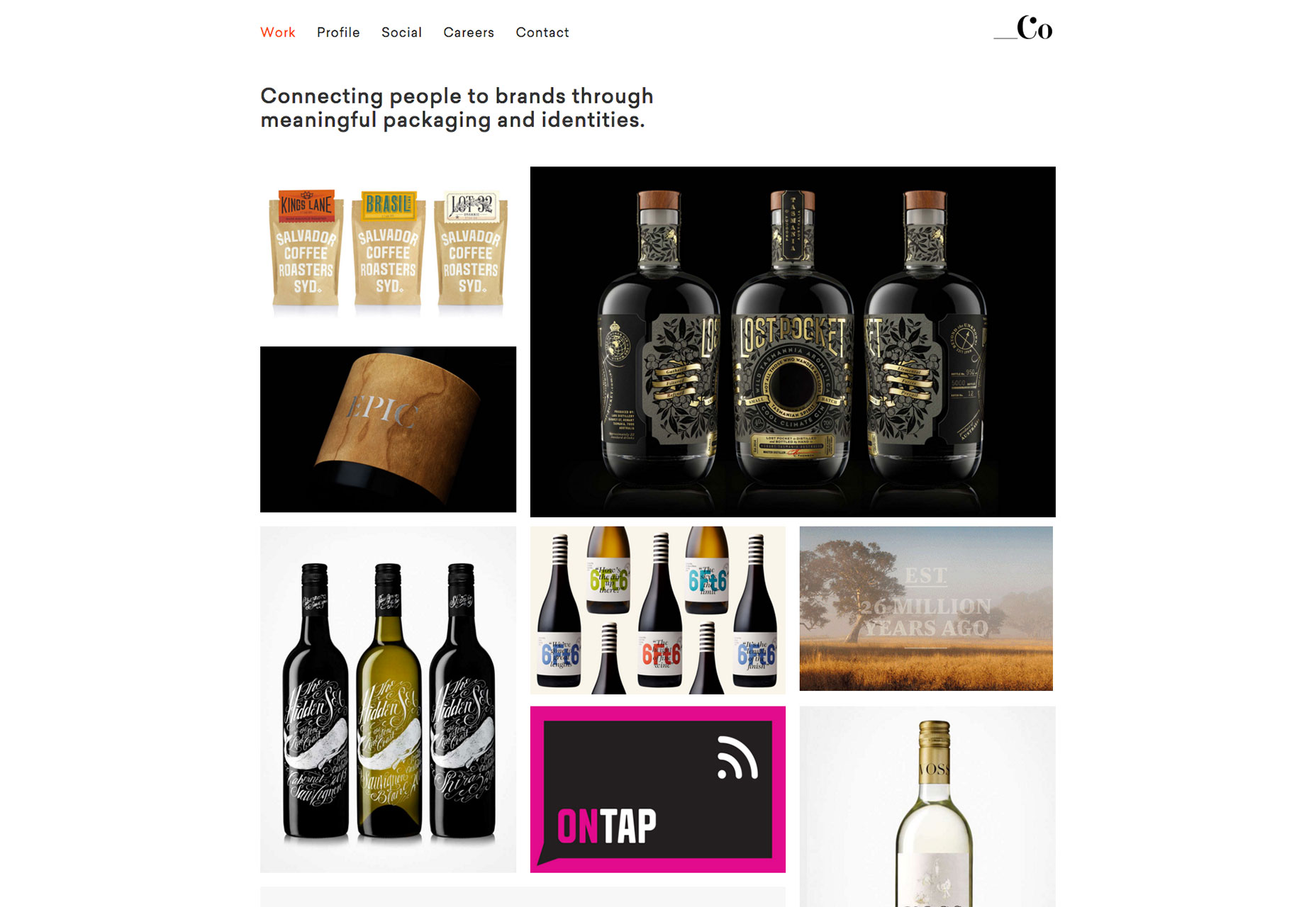
Big Fan
Striking a balance between tasteful white space and using all available space, Big Fan shows us how to take advantage of huge monitors. I mean sure, it looks just as great on my phone, but I love how they didn’t shy away from the higher resolutions with the typical centered column.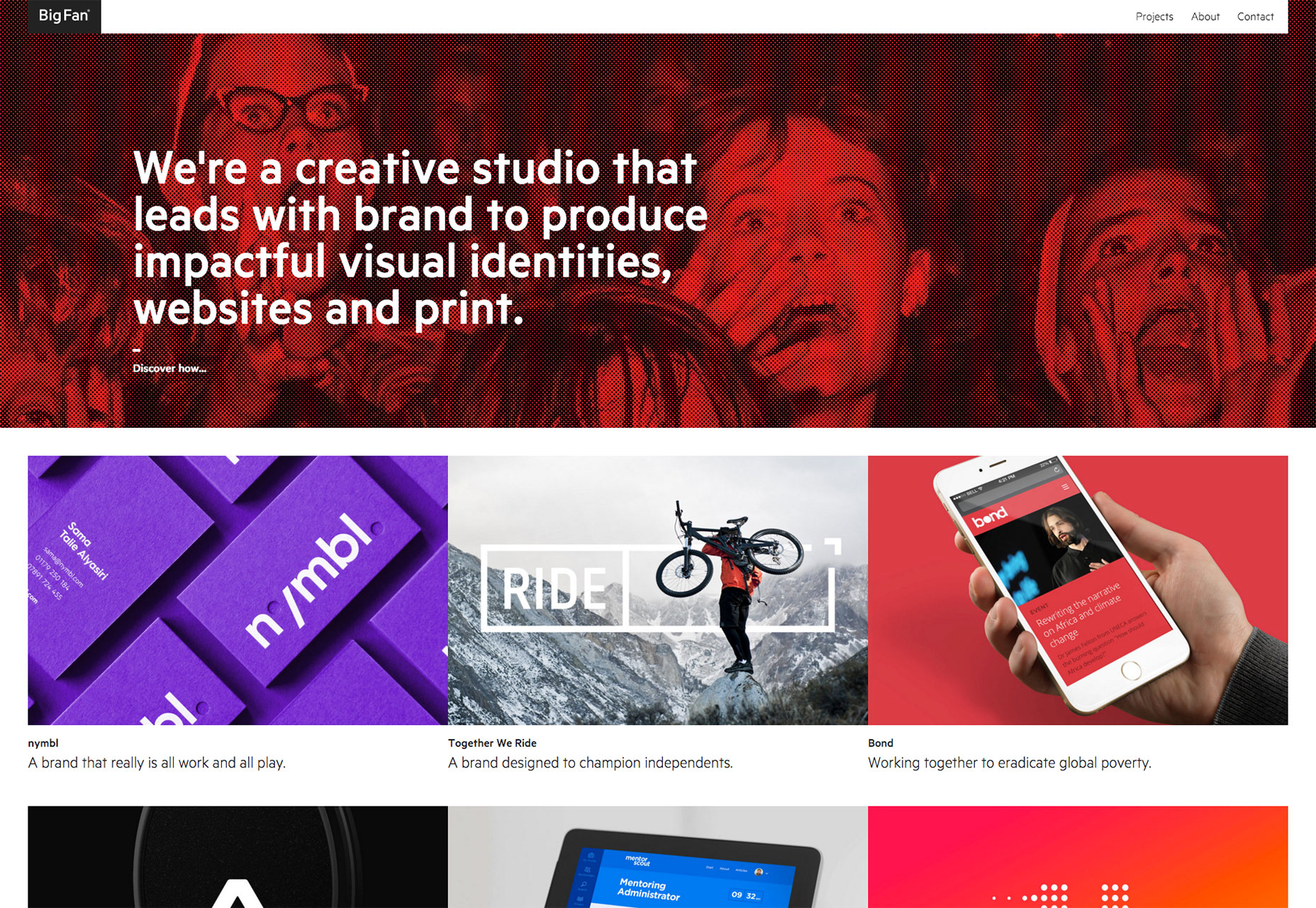
No Divide
It’s not often that I get to say that a website’s layout is what made it stand out to me, but the guys at No Divide have accomplished that. Sure, the basic layout concepts and patterns aren’t new, but the execution is flawless.
Garbett Design
Bold colors, a big layout, a lot of dots, a weird eye thing that blinks at you, Garbett Design has it all! And despite the inherent oddness of its modern art-inspired design, it’s a usable, smooth experience.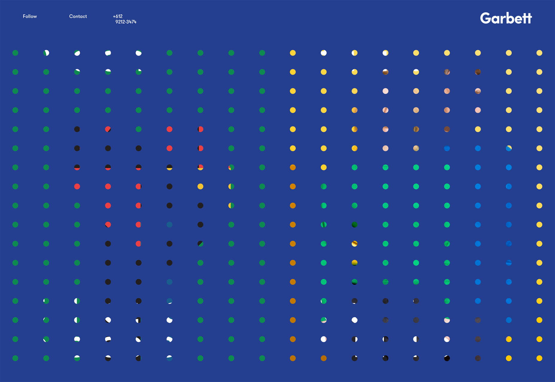
Pillar Studio
Pillar Studio is what happens when you take classic layout patterns and design conventions and just do everything right. It’s a website that should be boring, but isn’t because because they made classic elements look good. Plus, they made default-link-blue look good as a color scheme. How many people can say that?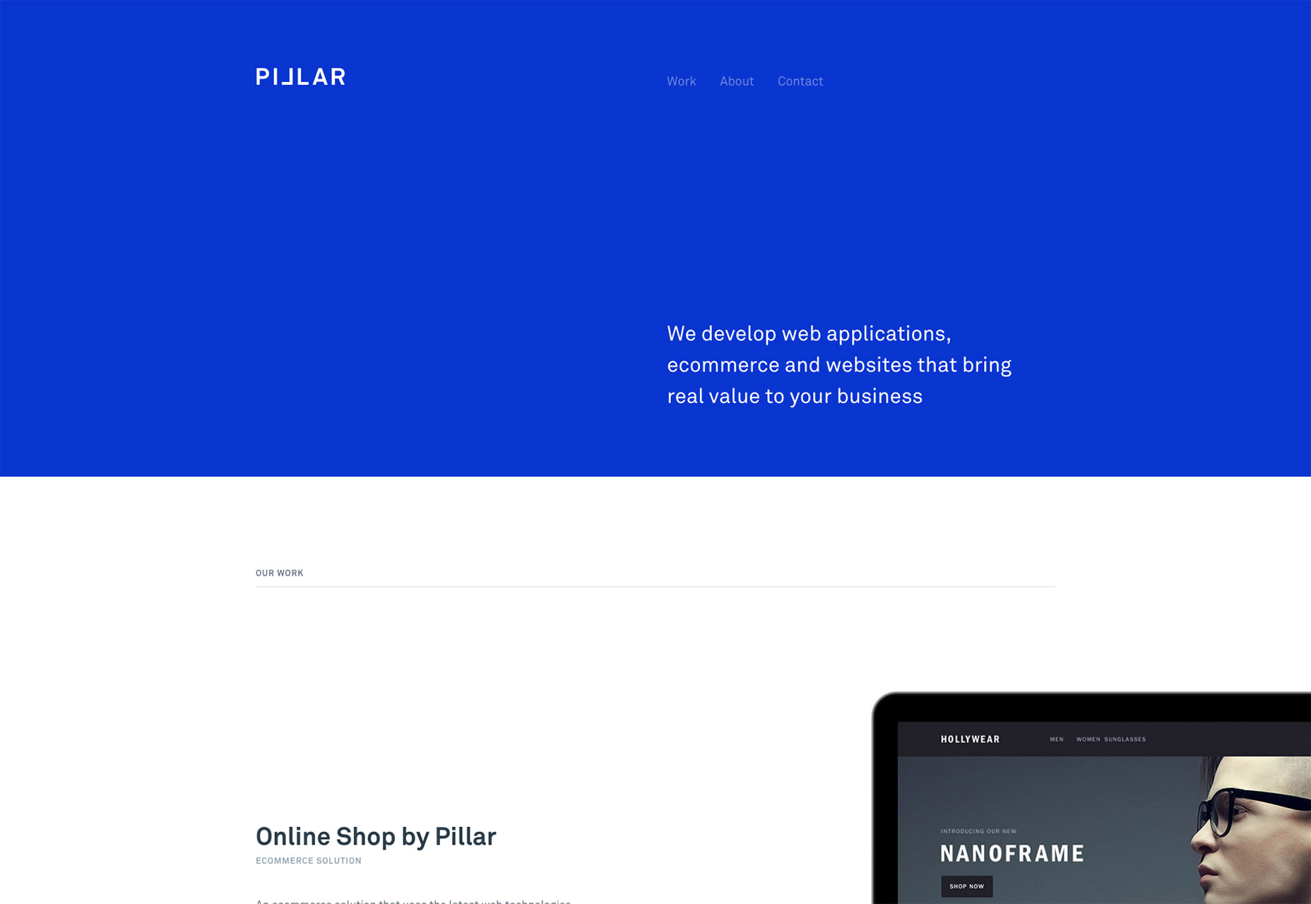
Sam Dallyn
Sam Dallyn’s portfolio is an example of minimalism taken to great lengths, if not to the extreme. Potential navigation issues aside, it’s just plain pretty.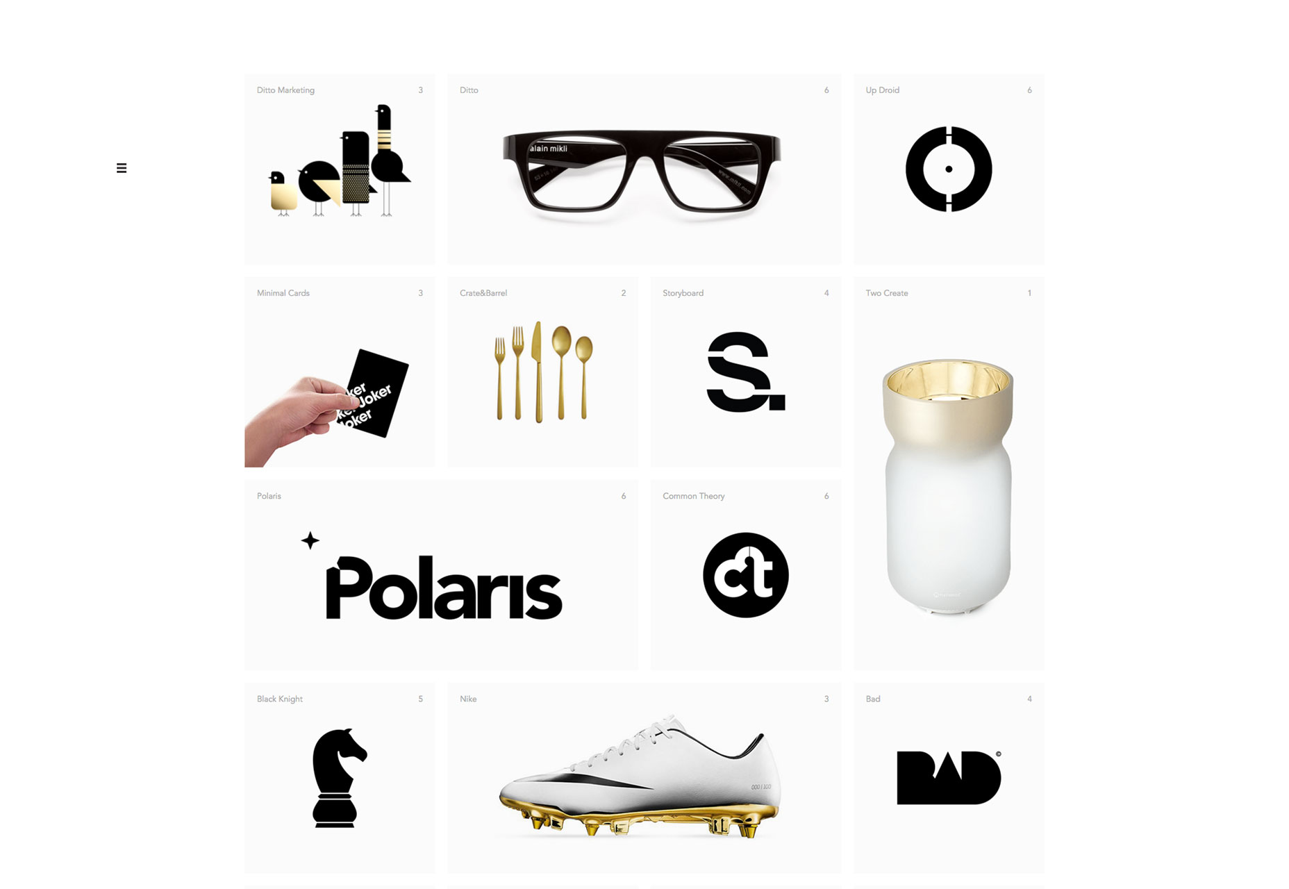
Jordan Egstad
Jordan Egstad’s one-page portfolio site is an oddity in that it looks both professional and oddly personal. That personal touch mostly comes from the huge hero shot of Jordan working at home alone, and yet it just seems to fit.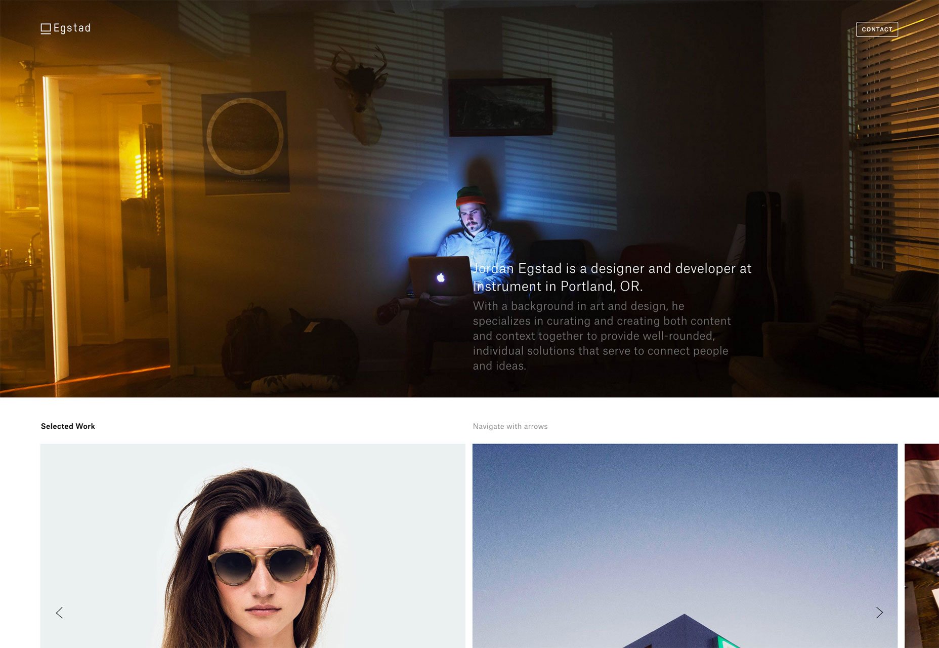
Viljami Salminen
Viljami Salminen takes an odd approach to the portfolio but throwing you head-first into his blog. Mind you, if you take the time to read what he has to say, this quickly proves to be a good idea. The man knows what he’s talking about, and he says it with exquisite typography. Actually clicking your way over to the portfolio section of the site is just icing on the cake by that point.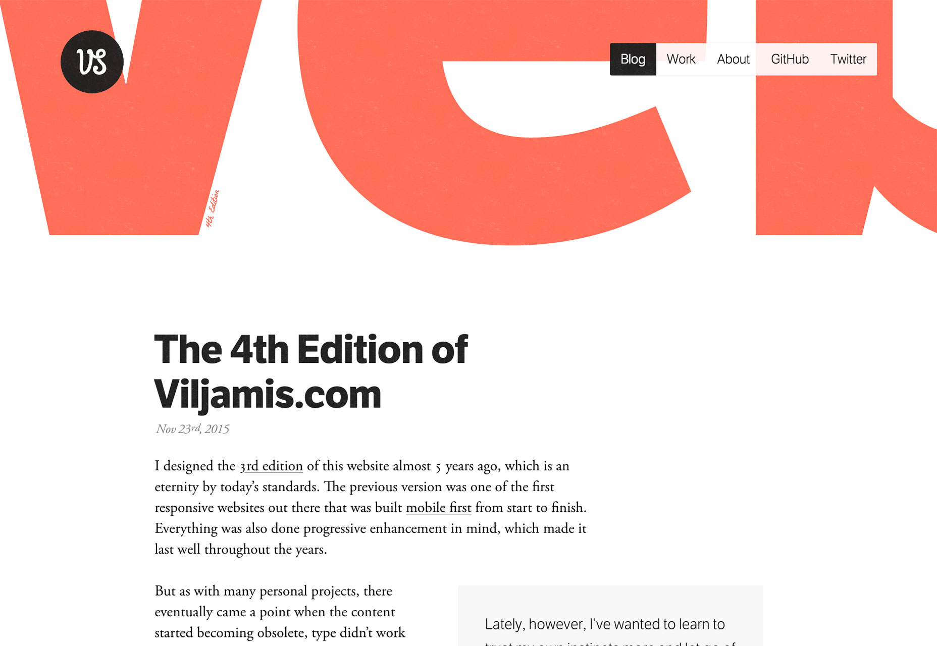
Julien Bailly
Julien Bailly’s “PopUpFolio” is unique in that it only shows his latest project. However, that latest project is featured in detail, telling the story of how it came to be. It’s a rather extreme definition of quality over quantity, but it seems to work for him.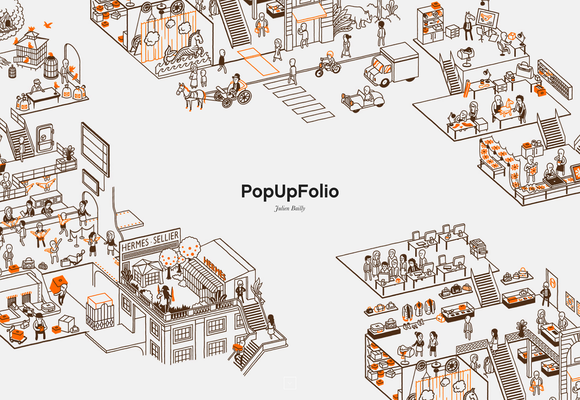
Kyle Mac
Kyle Mac keeps it simple by just giving you the relevant information right off the bat (including contact info). Wanna see his work? Scroll down. Wanna see more of it? Keep scrolling. It’s as simple an experience as anyone could ask for.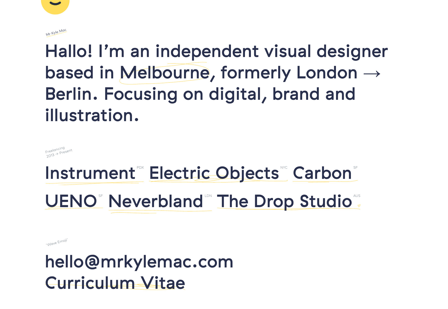
Clarqa Tudela
Okay, let’s be honest with ourselves. Few people will be able to pull off a portfolio like Clara Tudela’s. There’s little information about each project. Just screenshots (or illustrations from the project), the title, and an external link. But then, she works at Google. She can get away with that.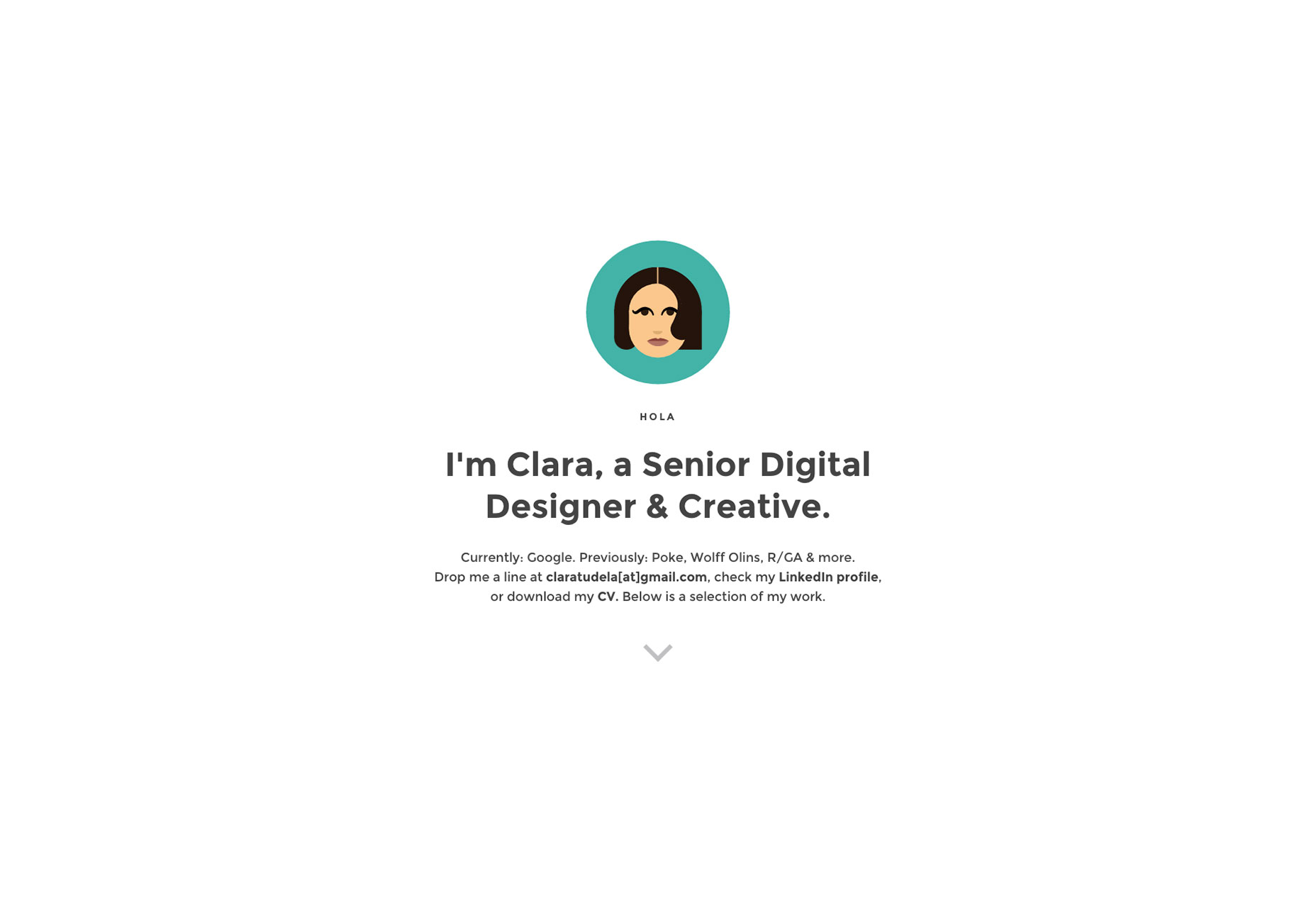
Important Looking Pirates
Being a visual effects and animation studio, video is important to the Important Looking Pirates. Projects are showcased with a combination of background videos, and manually animated thumbnails. Manually animated? By that I mean that all the frames for a couple seconds of video are loaded into the thumbnail space, then each is shown and hidden in turn with JavaScript. This is more bandwidth-efficient for mobile users, because on a phone, nothing’s animated. One might assume that they just load in one frame for the thumbnail on mobile devices, making this an interesting and bandwidth-efficient technique.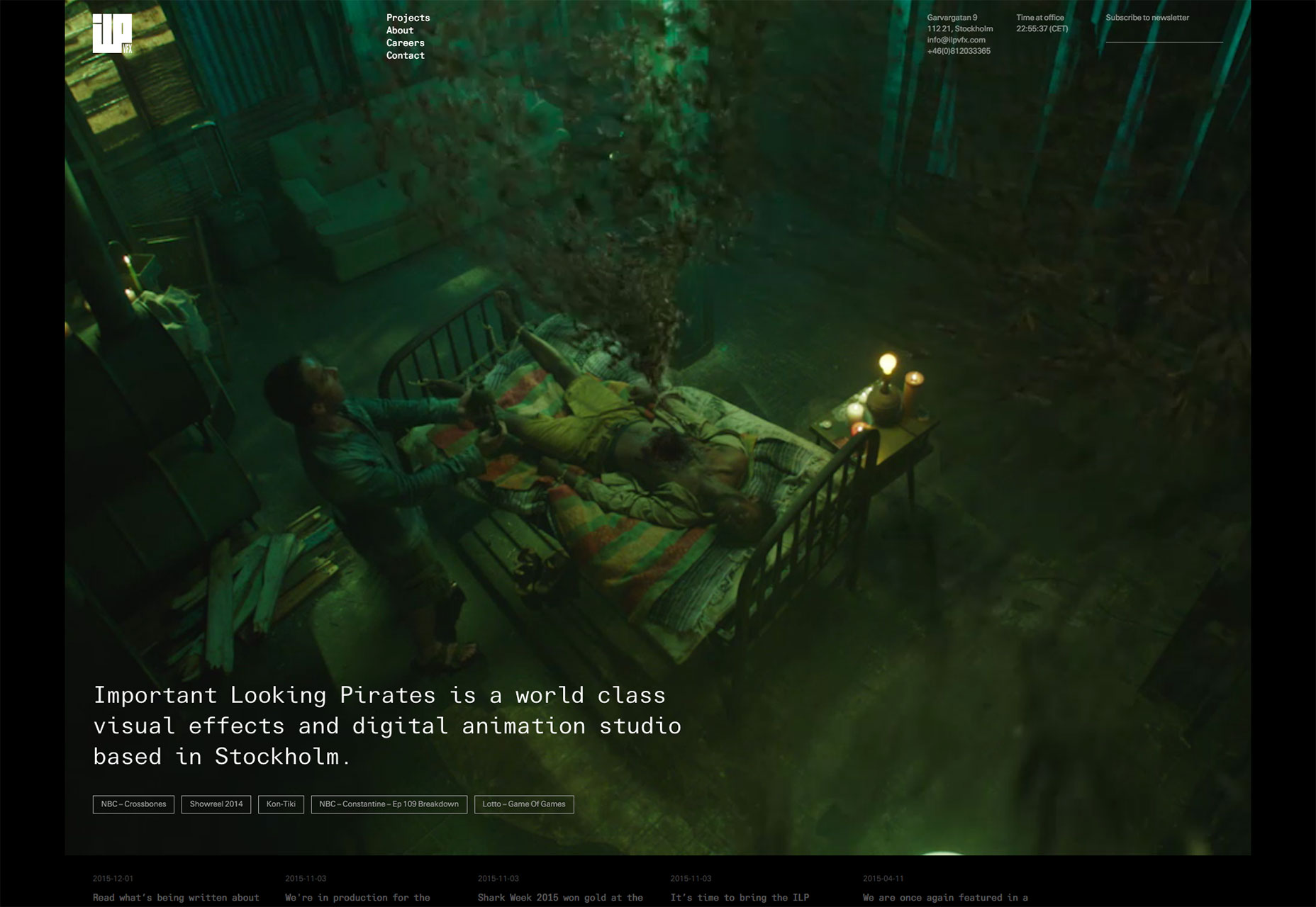
Deux Huit Huit
Deux Huit Huit would be a well-designed, though generally unremarkable website except for their creative application of performance-friendly animations. Listen closely, because I’ll probably never say anything like this again: they have a four-second splash animation (which probably serves as a very short preloader) that I don’t hate, and they actually managed to make a text marquee look good. Yeah, never saying that again, probably.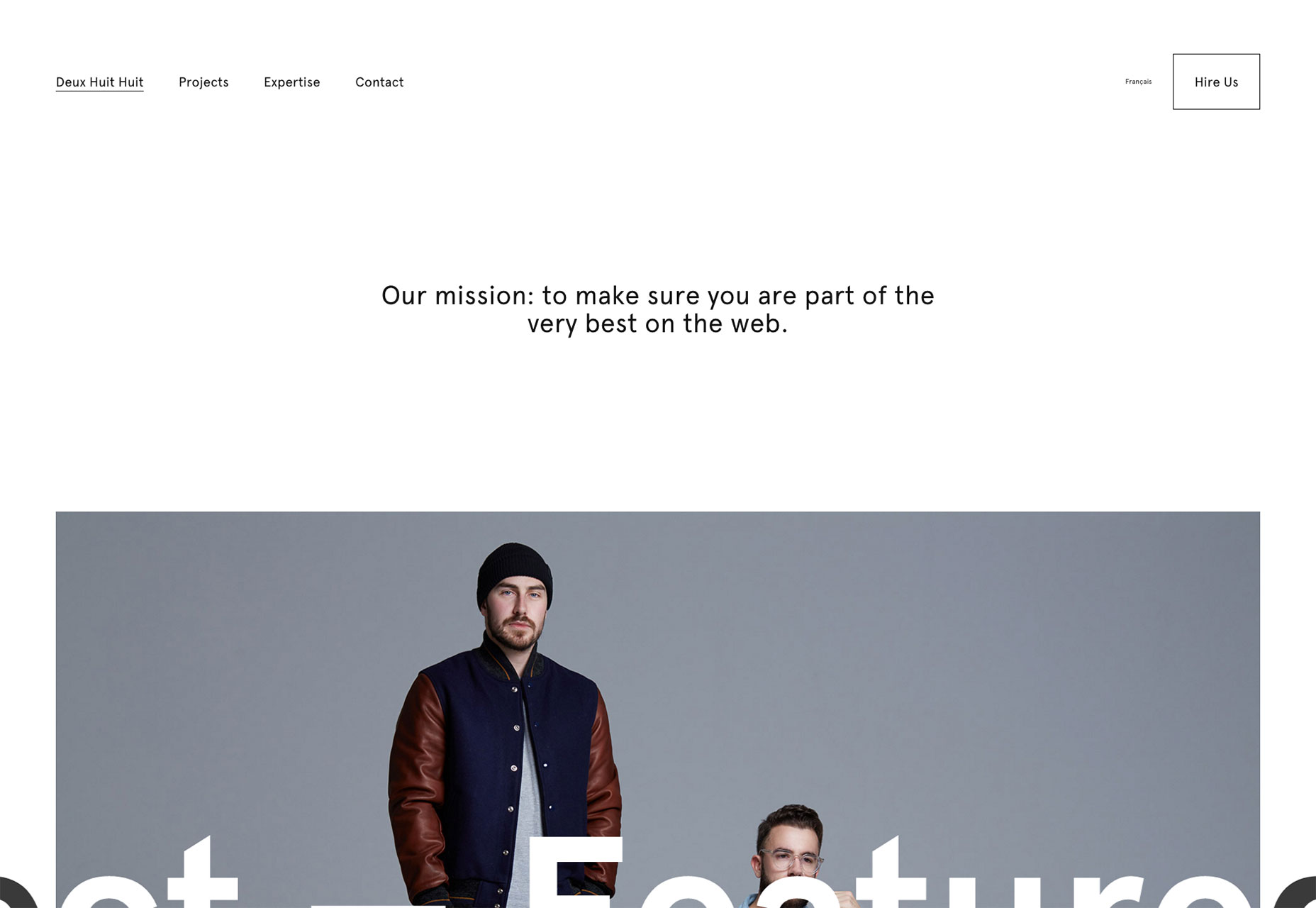
Tundra
Nothing too special to say about Tundra. They hid their navigation away unnecessarily, and haven't gone too far outside the box. Still, it’s very pretty, and the animations work smoothly on my first-generation Moto G smartphone. A lot could be learned from their technical proficiency, if nothing else.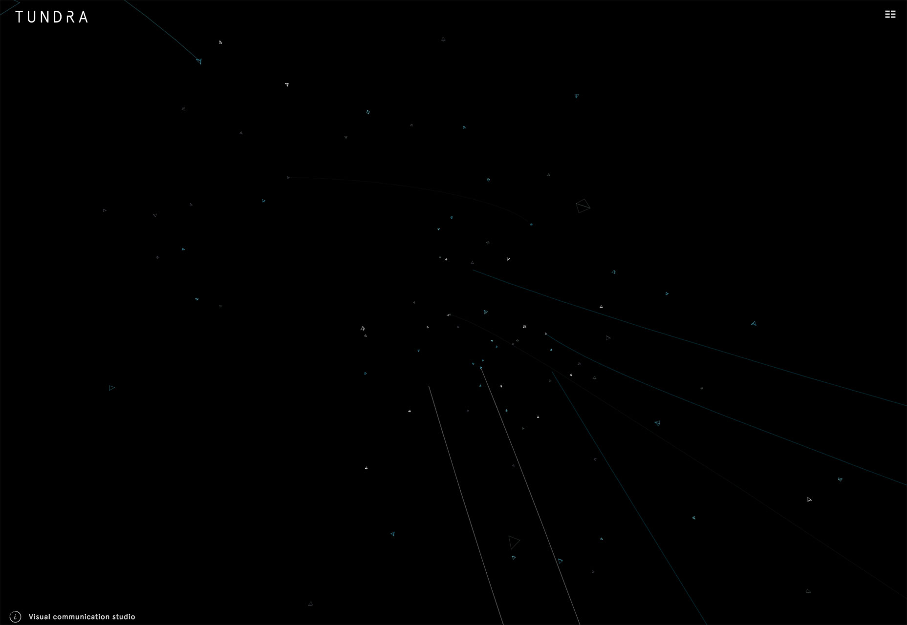
Fanny Myon
I’m generally a fan of static, minimally-animated interfaces for websites because of potential performance and UX issues. It’s websites like Fanny Myon’s that give me hope for the future of more dynamic interfaces. See? They don't have to be slow. Still wouldn’t want this kind of interface for a blog or knowledge base though.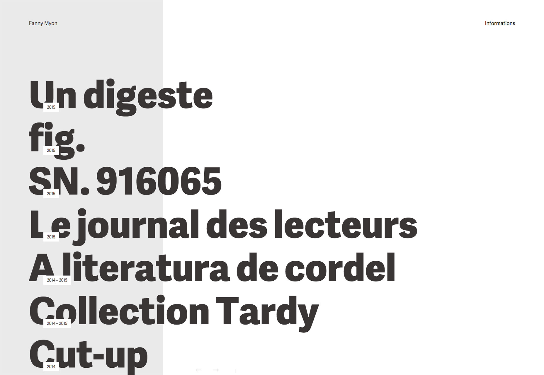
By Association Only
Good concept, excellent execution, pretty, and fast. By Association Only pretty much has it all. It sometimes feels more like an old Flash presentation than a website, but they’ve done it without sacrificing usability. I can get behind that.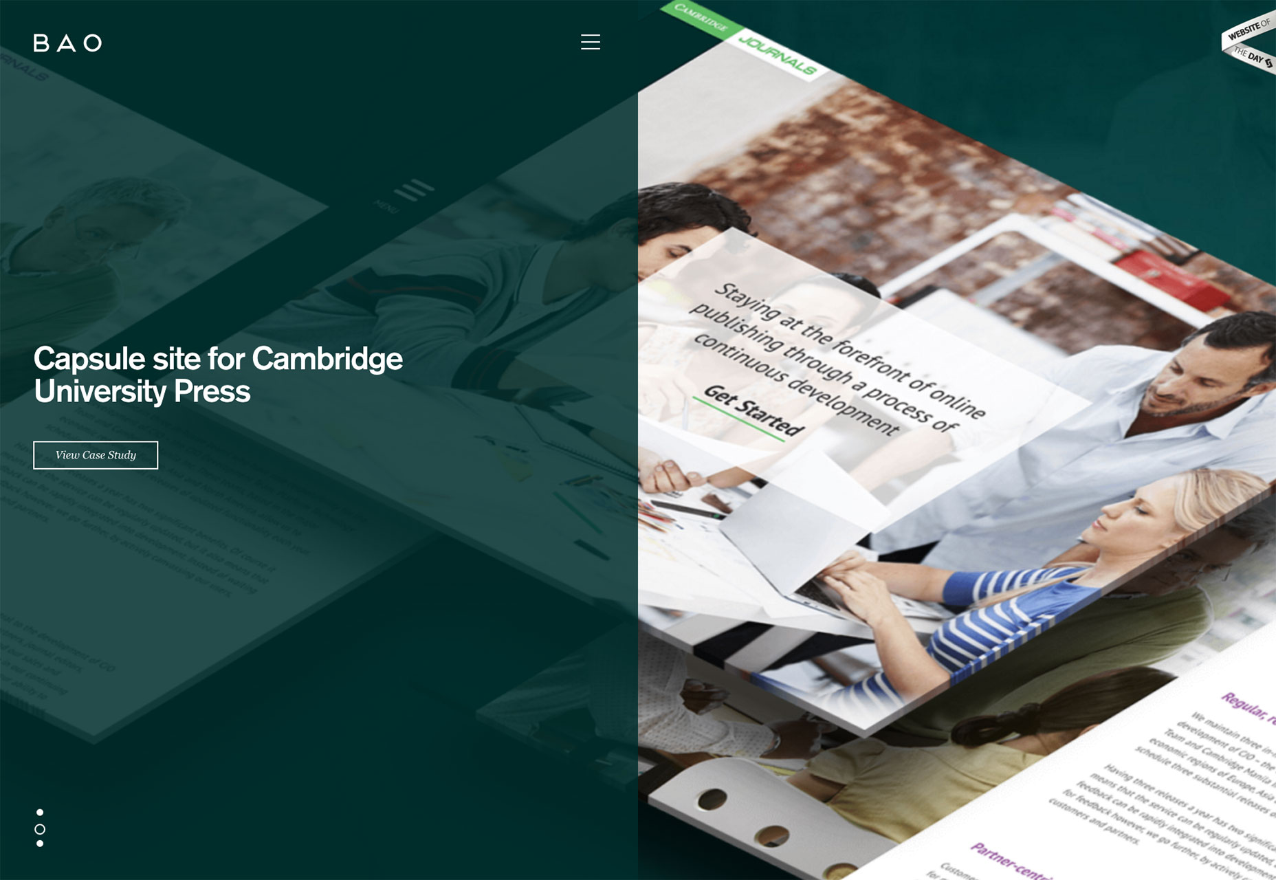
Ariel Beninca
Ariel Beninca went all out with minimalism, excellent typography, asymmetrical design, and animation. The whole thing just screams “fancy”, and it works.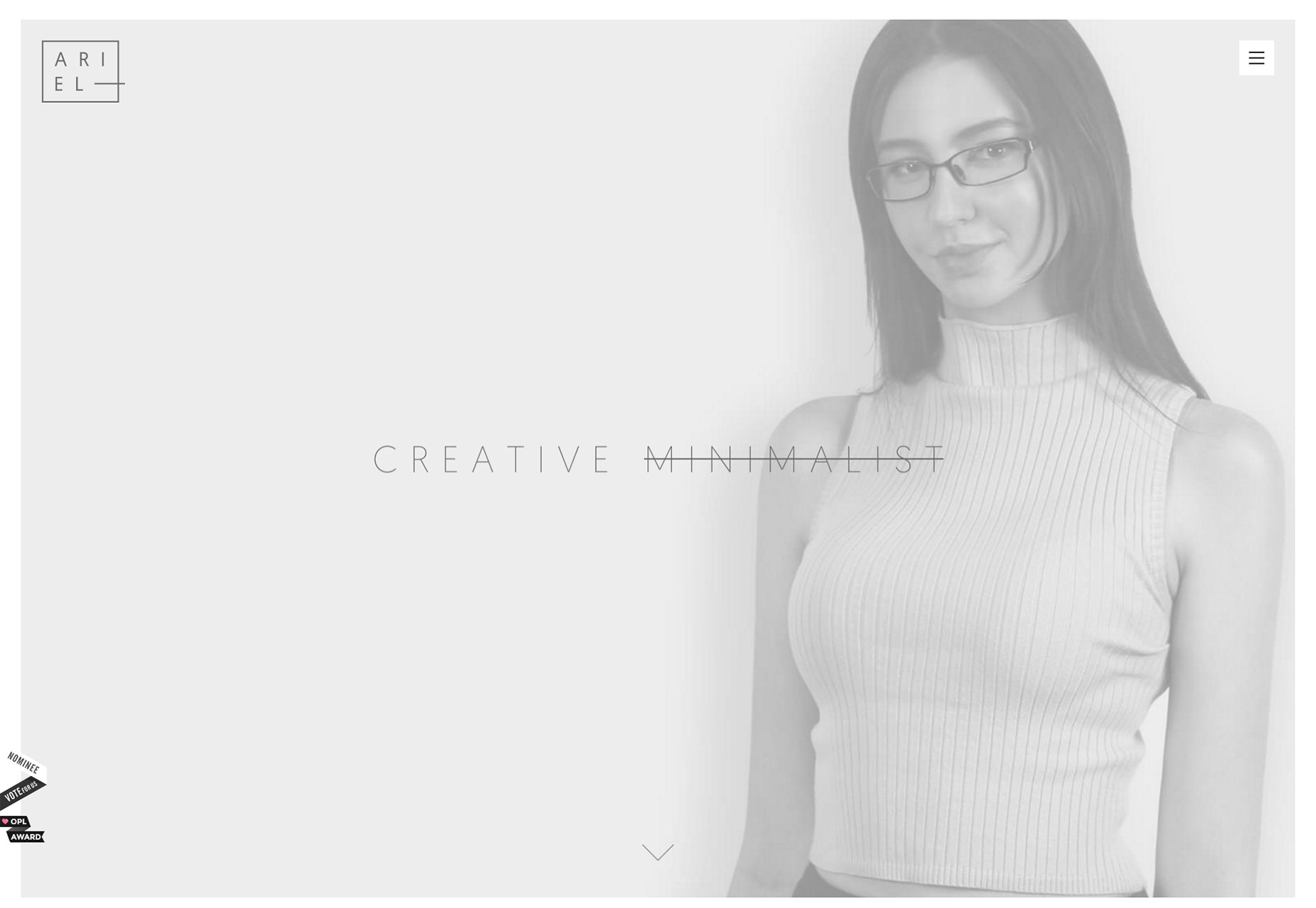
Admir Hadzic
Admir is an award-winning designer with brands like Google and Apple in his resumé. (He should hit up Microsoft and get the trifecta). As you might expect, his website is beautiful, often looking more like a magazine layout, or a work of art than a simple portfolio. Even so, it’s easy to find your way around, and that’s what counts.
Fantasy
Background animations, dead-simple copy, case studies that read (and look) like presentations. It’s hard to get that right, but Fantasy does it well.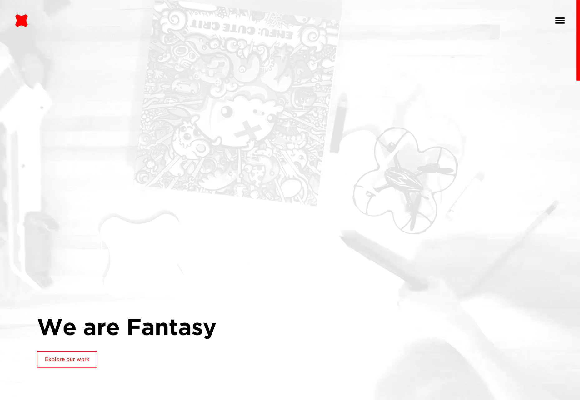
Derek Boateng
Derek Boateng’s website is interesting in that all of his work projects are represented with illustrations, rather than screenshots. He’s an art director, so relying on symbolism to convey each project’s purpose is just one more way to showcase his talent.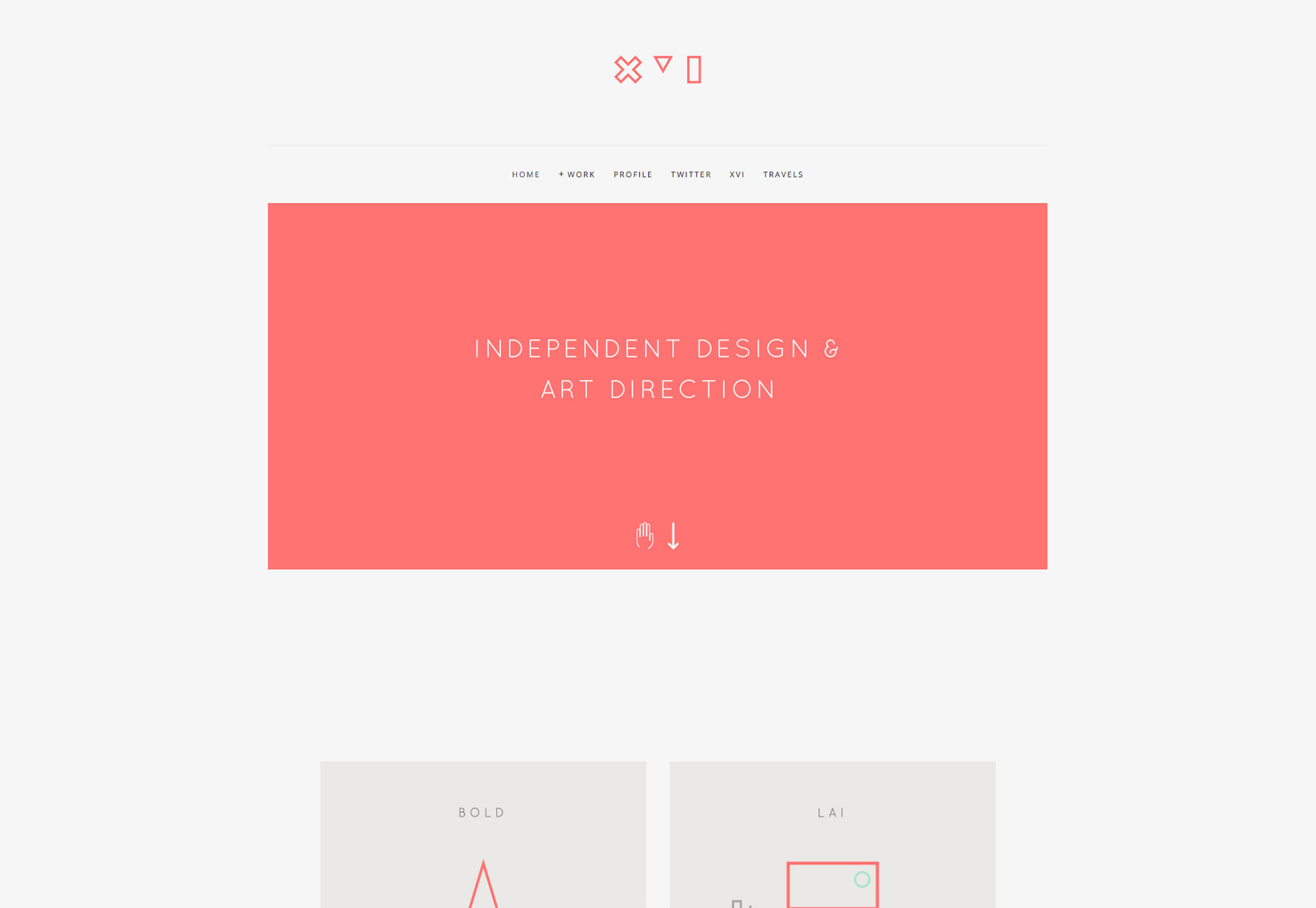 If you’re launching a new, or updated portfolio this month and you’d like to be considered for our next roundup, email [email protected]
Ezequiel Bruni
Ezequiel Bruni is a web/UX designer, blogger, and aspiring photographer living in Mexico. When he’s not up to his finely-chiselled ears in wire-frames and front-end code, or ranting about the same, he indulges in beer, pizza, fantasy novels, and stand-up comedy.


Read Next

20 Best New Websites, April 2024
Welcome to our sites of the month for April. With some websites, the details make all the difference, while in others,…

Exciting New Tools for Designers, April 2024
Welcome to our April tools collection. There are no practical jokes here, just practical gadgets, services, and apps to…

14 Top UX Tools for Designers in 2024
User Experience (UX) is one of the most important fields of design, so it should come as no surprise that there are a…
By Simon Sterne

What Negative Effects Does a Bad Website Design Have On My Business?
Consumer expectations for a responsive, immersive, and visually appealing website experience have never been higher. In…

10+ Best Resources & Tools for Web Designers (2024 update)
Is searching for the best web design tools to suit your needs akin to having a recurring bad dream? Does each…
By WDD Staff

3 Essential Design Trends, April 2024
Ready to jump into some amazing new design ideas for Spring? Our roundup has everything from UX to color trends…

How to Plan Your First Successful Website
Planning a new website can be exciting and — if you’re anything like me — a little daunting. Whether you’re an…
By Simon Sterne

15 Best New Fonts, March 2024
Welcome to March’s edition of our roundup of the best new fonts for designers. This month’s compilation includes…
By Ben Moss

LimeWire Developer APIs Herald a New Era of AI Integration
Generative AI is a fascinating technology. Far from the design killer some people feared, it is an empowering and…
By WDD Staff

20 Best New Websites, March 2024
Welcome to our pick of sites for March. This month’s collection tends towards the simple and clean, which goes to show…

Exciting New Tools for Designers, March 2024
The fast-paced world of design never stops turning, and staying ahead of the curve is essential for creatives. As…

Web Tech Trends to Watch in 2024 and Beyond
It hardly seems possible given the radical transformations we’ve seen over the last few decades, but the web design…
By Louise North