

Start with a black and white outline
 It sounds pretty simple: start with a black and white wireframe for the design. Think about the intent of the card and what parts of it will be click, or tappable. (The entire card can serve as a link.)
Plan for elements like spacing, images, and typography so that you can see the card without color or embellishment. Think of it as the “playing card” phase of the design. All the elements of the card are there. Does it seem like a framework that’s easy to understand?
Think about how you would use it from this stage. Where would you click for an action? Is the pattern and result clear? How do you go back or advance? The answers to these questions should be relevant without cues such as a red “click here” button blinking on the screen.
As with any other project, if the outline does not work in black and white, the final design probably won’t either.
It sounds pretty simple: start with a black and white wireframe for the design. Think about the intent of the card and what parts of it will be click, or tappable. (The entire card can serve as a link.)
Plan for elements like spacing, images, and typography so that you can see the card without color or embellishment. Think of it as the “playing card” phase of the design. All the elements of the card are there. Does it seem like a framework that’s easy to understand?
Think about how you would use it from this stage. Where would you click for an action? Is the pattern and result clear? How do you go back or advance? The answers to these questions should be relevant without cues such as a red “click here” button blinking on the screen.
As with any other project, if the outline does not work in black and white, the final design probably won’t either.
Use exaggerated spacing
 The biggest challenge when it comes to cards is creating a compact design that does not feel cluttered. That’s where whitespace comes in. And you’ll want to use more of it than feels comfortable at first.
The addition of whitespace will give elements more room to breathe, making the overall card seem more spacious and increasing readability.
Generally, you might want to start with twice the spacing you might normally consider between elements. Gutters should be extra wide and line spacing could use the extra room as well. The extra space will help you create an open design and organize the content more clearly. The card has a pretty limited canvas and should fit on a single screen on a phone, and a similar-sized portion of the screen on larger devices such as tablets or desktops. Cards may also compete against other cards for attention on larger screens. Added whitespace will help the entire design feel more open and easy to dive into.
The biggest challenge when it comes to cards is creating a compact design that does not feel cluttered. That’s where whitespace comes in. And you’ll want to use more of it than feels comfortable at first.
The addition of whitespace will give elements more room to breathe, making the overall card seem more spacious and increasing readability.
Generally, you might want to start with twice the spacing you might normally consider between elements. Gutters should be extra wide and line spacing could use the extra room as well. The extra space will help you create an open design and organize the content more clearly. The card has a pretty limited canvas and should fit on a single screen on a phone, and a similar-sized portion of the screen on larger devices such as tablets or desktops. Cards may also compete against other cards for attention on larger screens. Added whitespace will help the entire design feel more open and easy to dive into.
Add natural color and shading
 Now you are ready to think about color and shading for the design. Keep it natural looking and mimic reality in the shadows and styles of the design.
No, we are not talking skeuomorphism here, we’re talking about creating color with natural outlines and shadows. Think about how a card will be viewed. The user should get the same feeling as if he or she were actually holding it.
Use some of the basic rules of physics to imagine (and design) each card as it would be held:
Now you are ready to think about color and shading for the design. Keep it natural looking and mimic reality in the shadows and styles of the design.
No, we are not talking skeuomorphism here, we’re talking about creating color with natural outlines and shadows. Think about how a card will be viewed. The user should get the same feeling as if he or she were actually holding it.
Use some of the basic rules of physics to imagine (and design) each card as it would be held:
- Lighting should cast some shadows to the back and bottom.
- The darkest part of the design is likely at the bottom thanks to lighting conditions, which normally come from above.
- Avoid content in areas that are required for holding the card.
- Touchpoints (and the associated calls-to-action) should be focal points and easy to interact with. (Just like the face of a playing card is in the center of the design.)
- One card equals one bit of information.
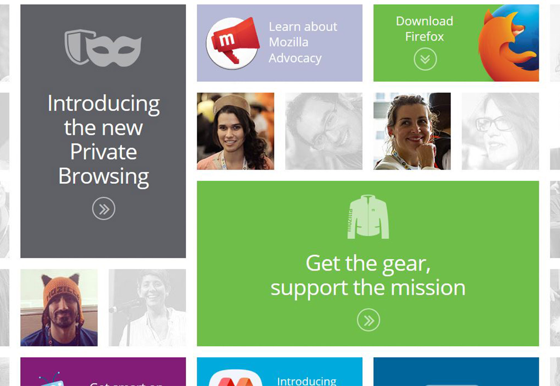
Create simple layers
 Now that you are thinking about physics, take it to the next level with simple layering to create a unified card style for the entire interface. Not sure where to start? Google’s Material Design guidelines are a great starting point.
 “In material design, the physical properties of paper are translated to the screen. The background of an application resembles the flat, opaque texture of a sheet of paper.
An application’s behavior mimics the paper’s ability to be re-sized, shuffled, and bound together in multiple sheets. Elements that live outside of applications, such as status or system bars, receive a different treatment. They are separate from the app content beneath them, and do not carry the physical properties of paper.
Break this down and it goes back to making a digital object look and feel physical. And if users want to touch it, they’ll want to click it. The concept is just that simple.
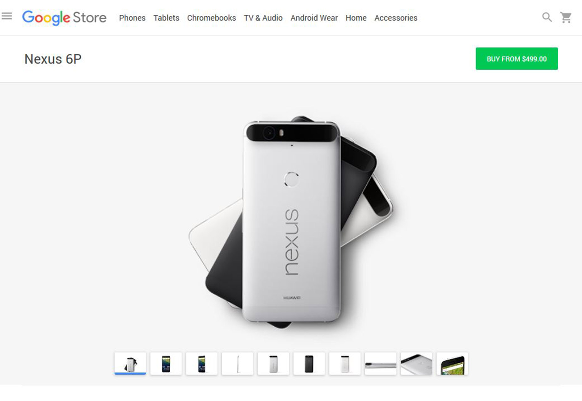
Stick to simple typefaces
 When it comes to typography, simple sans serifs are often the answer. Avoid super thin or condensed options because they can be somewhat tougher on the eyes.
Most cards work best with two typeface options (even if they are from the same family) – something for the main body and another for the headline or call-to-action. The most important factor when it comes to typography is to remember to include plenty of contrast so that text elements are easy to read. Remember to include contrast between typefaces and contrast between the background and text elements for each card.
When it comes to typography, simple sans serifs are often the answer. Avoid super thin or condensed options because they can be somewhat tougher on the eyes.
Most cards work best with two typeface options (even if they are from the same family) – something for the main body and another for the headline or call-to-action. The most important factor when it comes to typography is to remember to include plenty of contrast so that text elements are easy to read. Remember to include contrast between typefaces and contrast between the background and text elements for each card.
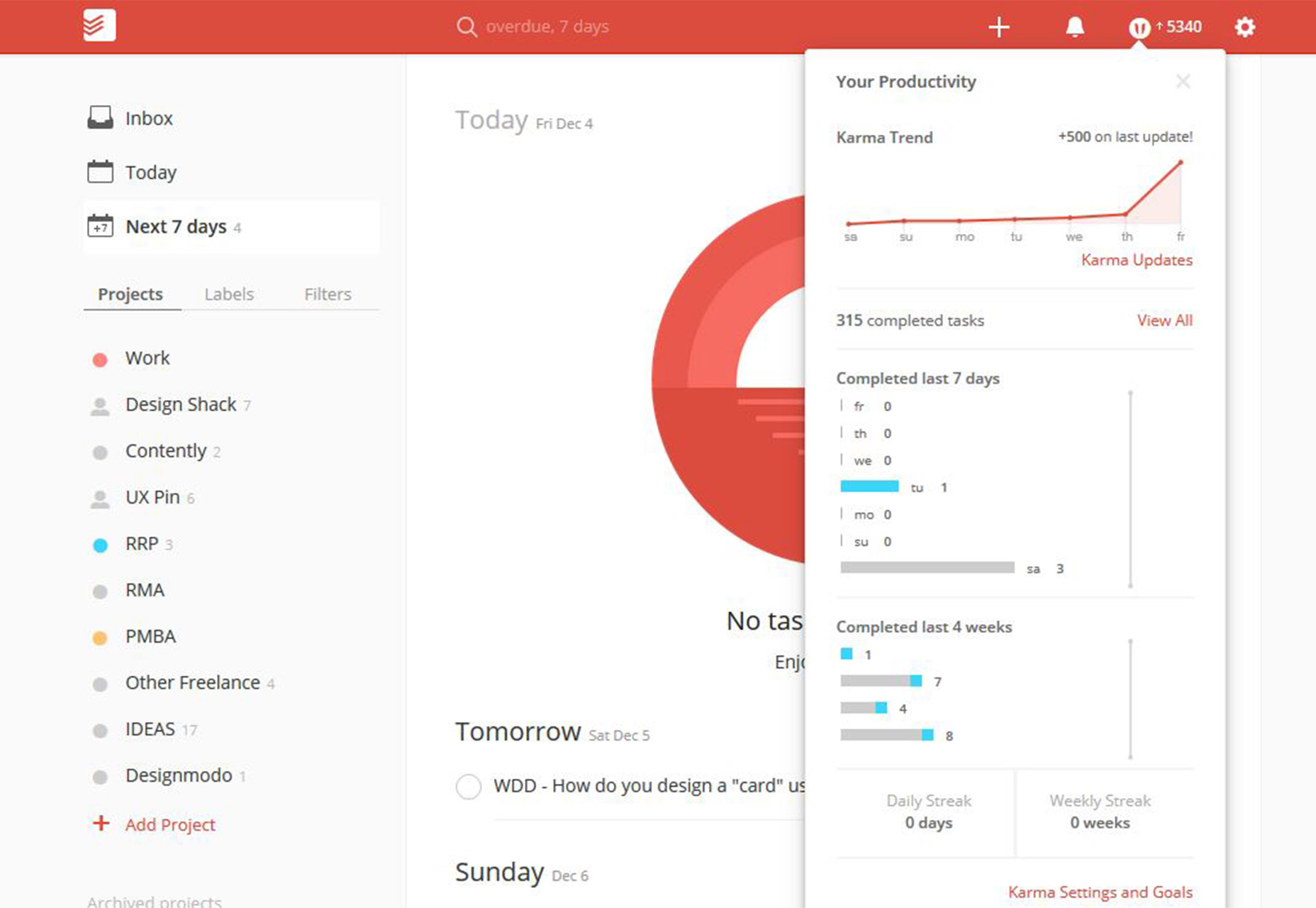
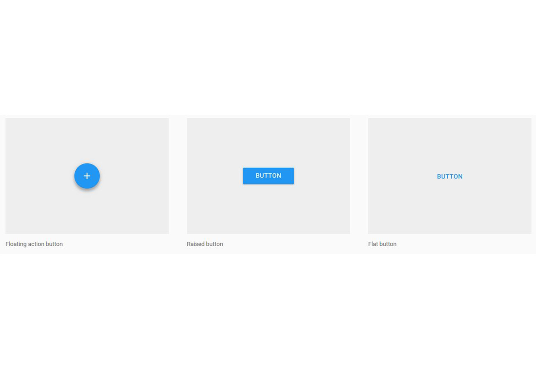
Limit UI elements
 Repeat after me: one card equals one action.
So that probably means you don’t need to include a bunch of user interface elements such as buttons throughout the design.
You might not even need a button at all in a card-style design.
But if you think users need a visual cue, one button is enough. Keep the shape and design simple – again, the Material Design approach is a good option – and stick to just one button.
A button is probably the only UI element you need. This is your design goal.
Repeat after me: one card equals one action.
So that probably means you don’t need to include a bunch of user interface elements such as buttons throughout the design.
You might not even need a button at all in a card-style design.
But if you think users need a visual cue, one button is enough. Keep the shape and design simple – again, the Material Design approach is a good option – and stick to just one button.
A button is probably the only UI element you need. This is your design goal.
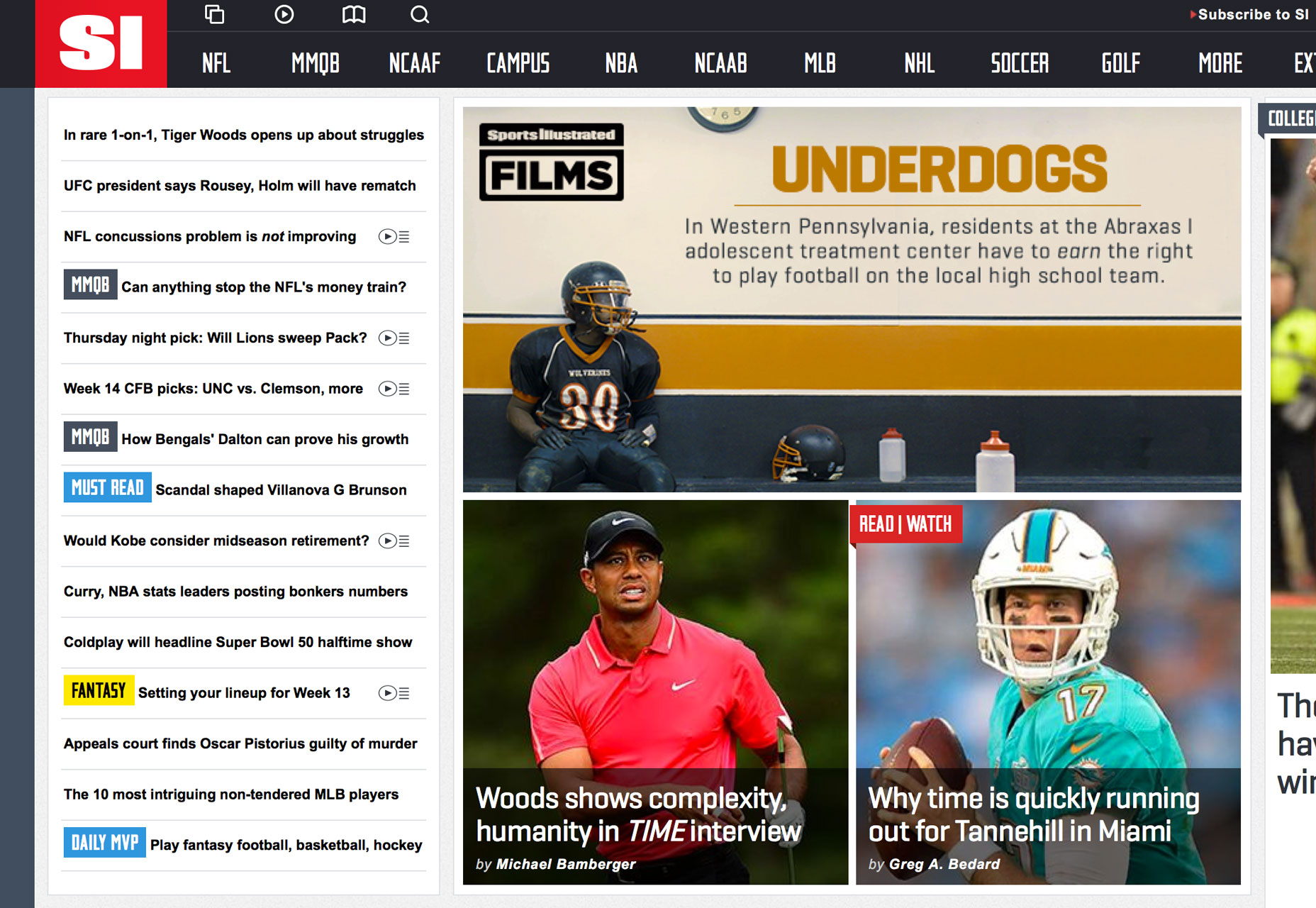
Conclusion
There isn’t a magic formula for the perfect card, but there are some design choices you can make that encourage every user to click (or tap). Keep your design centered in reality, follow a minimalist approach with plenty of space and contrast, put an emphasis on simple typography, and create a single action for each card. Following this outline will help you best imagine and conceptualize card-style projects that users want to interact with. Combine these ideas with design theory and your mad skills for a great project that will be fun for users and aesthetically on-trend.Carrie Cousins
Carrie Cousins is a freelance writer with more than 10 years of experience in the communications industry, including writing for print and online publications, and design and editing. You can connect with Carrie on Twitter @carriecousins.


Read Next

20 Best New Websites, April 2024
Welcome to our sites of the month for April. With some websites, the details make all the difference, while in others,…

Exciting New Tools for Designers, April 2024
Welcome to our April tools collection. There are no practical jokes here, just practical gadgets, services, and apps to…

14 Top UX Tools for Designers in 2024
User Experience (UX) is one of the most important fields of design, so it should come as no surprise that there are a…
By Simon Sterne

What Negative Effects Does a Bad Website Design Have On My Business?
Consumer expectations for a responsive, immersive, and visually appealing website experience have never been higher. In…

10+ Best Resources & Tools for Web Designers (2024 update)
Is searching for the best web design tools to suit your needs akin to having a recurring bad dream? Does each…
By WDD Staff

3 Essential Design Trends, April 2024
Ready to jump into some amazing new design ideas for Spring? Our roundup has everything from UX to color trends…

How to Plan Your First Successful Website
Planning a new website can be exciting and — if you’re anything like me — a little daunting. Whether you’re an…
By Simon Sterne

15 Best New Fonts, March 2024
Welcome to March’s edition of our roundup of the best new fonts for designers. This month’s compilation includes…
By Ben Moss

LimeWire Developer APIs Herald a New Era of AI Integration
Generative AI is a fascinating technology. Far from the design killer some people feared, it is an empowering and…
By WDD Staff

20 Best New Websites, March 2024
Welcome to our pick of sites for March. This month’s collection tends towards the simple and clean, which goes to show…

Exciting New Tools for Designers, March 2024
The fast-paced world of design never stops turning, and staying ahead of the curve is essential for creatives. As…

Web Tech Trends to Watch in 2024 and Beyond
It hardly seems possible given the radical transformations we’ve seen over the last few decades, but the web design…
By Louise North