

Search
Including a search feature with the very familiar affordance of the looking glass goes straight to the point of giving mobile users a way to find what they’re looking for…fast. On mobile screens, you’re not going to be able to cram in as many of your elements on the homepage, as you would on a desktop site. That’s why what would otherwise be obvious right from the start may not be so on mobile screens. For anyone who can’t find what they’re looking for right from the moment they visit your site—whether that’s a particular news article, product page or contact info—it’s imperative that a search feature is available and easy to spot. The best practice is to put the search feature right at the top of the screen, whether it’s a mobile website or a mobile app. With this placement, you can be assured that your users will easily find it and then use it.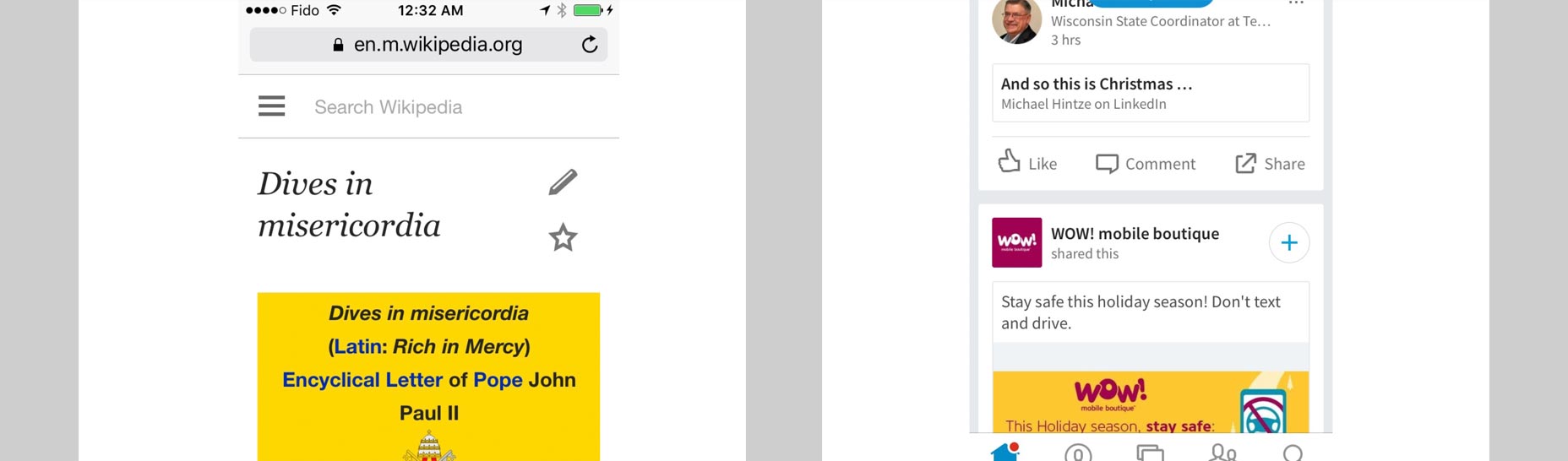 Wikipedia’s mobile site features the search bar right in the top, main navigation of the screen where it can’t be missed, but LinkedIn’s mobile app features it at the bottom of the screen in its navigation menu, illustrating two different approaches to the same goal.
Home
Another menu-option design convention that survives the transition from desktop to mobile, the home icon is so familiar to anyone browsing a website on either mobile or desktop that it’d be absurd to exclude one. The home icon operates as a symbolic affordance, as the average user will easily know what to do and expect when they see the icon of a house in the menu. The home icon is essential for mobile users because it gives them an efficient and direct overview of the most important content on your site. As such, it also grants them easy access to more content on your site, rather than having to solely rely on in-site links within a webpage or in a column next to an article. It’s also a functional way for users to reorient themselves with what your site’s about since they can easily get distracted while browsing on their mobile devices. Anything from a phone call to an incoming text message to any of the seemingly unending badges and alerts for installed apps can interrupt them from continuing to absorb your site content. When this occurs and after they’ve returned their attention, it’s convenient for them to just hit the home button to get more info from your site and determine if it’s still relevant to them.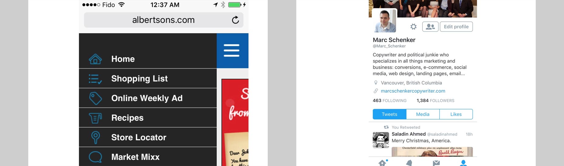 Grocery chain Albertson’s mobile site is an ideal example of using this home icon in its hamburger menu. Even mobile apps like Twitter use the symbolic home icon in the navigation menu in the footer of the app.
The share icon
The share icon is another essential part of your mobile navigation menu that you simply can’t omit. This is a recommendation based on user data. Not only is social sharing instrumental to social proof and persuading people that your article, product or site is popular and so should be further read or bought, but it’s also a habit that many mobile users partake in. It turns out that sharing content on mobile is even more popular than doing so on desktop! This makes sense when you look at it in the context of the broader reality that more people are using mobile, so more people will be sharing on mobile as well. That’s exactly why your navigation menu should include the very unique share icon, as the CBC does in its mobile site. After all, with so many users absorbing your mobile site’s content, it’s a pity not to take advantage of all that potential social-sharing power.
Relevant categories
If you’re an e-commerce store, sometimes, you can’t shorten your navigation menu too much, but that’s acceptable if you’re offering your mobile customers what they’re looking for: easy and direct access to different purchase categories. Instead of having menu options that you’d typically expect on most mobile sites—like home, about us and contact us—online stores don’t really need to do much more than making it easy for shoppers to find precisely what they want to buy.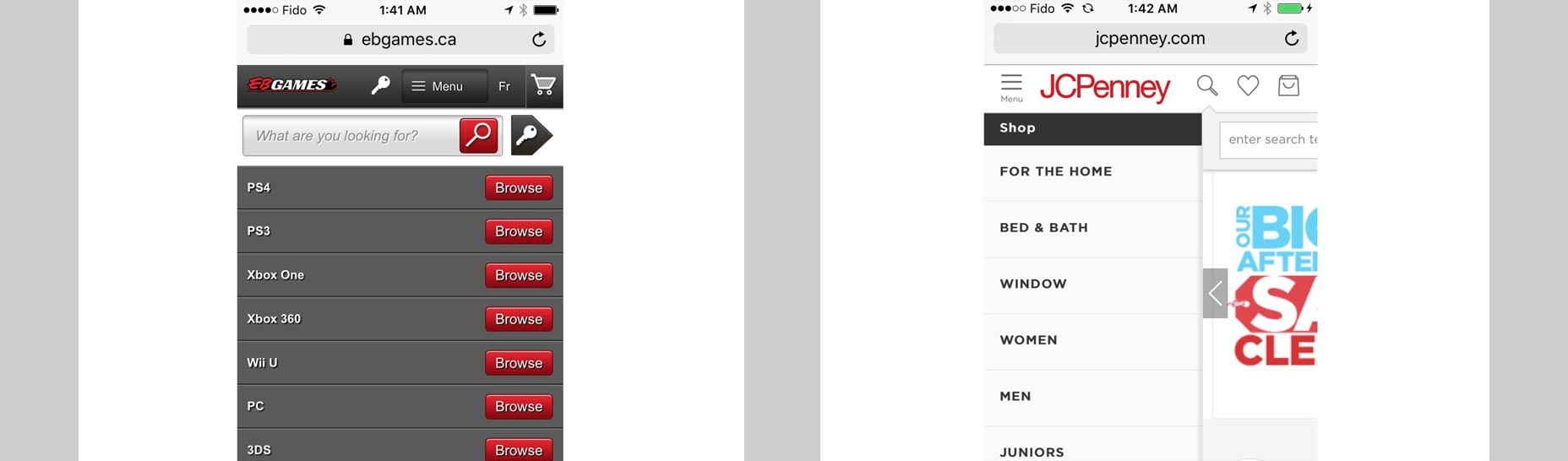 In the case of both JC Penney’s and EB Games’ mobile navigation, their respective hamburger menus open up to reveal a list of category choices, thus helping shoppers to get where they want to go on their mobile sites all the more efficiently.
Only a few choices for menu options
As designers, sometimes you’re tempted to do too much for your clients. This can sometimes manifest in your design as including too many choices in your navigation menu. When it comes to mobile, less is assuredly better each time. The last thing you want is for your mobile users to face a sort of choice paralysis as they navigate all the different options you’ve included. This goes double for mobile, where people are already impatient, want instant gratification, and don’t have all day to find what they’re searching for on your client’s site. Remember that, if your website fails to give them what they want, there are literally hundreds of other mobile sites and apps in the same space as your client that can give them a better experience. Don’t send leads and site visitors to your client’s competitors due to poorly thought-out design! Mobile is big, and it’s super-important now. Design with purpose and precision for the tasks your clients’ users want to accomplish. As you design with a mobile-first mentality going forward, keep in mind that putting minimalism into your design will work wonders. The fewer options in your navigation menu, the fewer distractions and elements that will paralyze your users. In turn, this will lead to a better user experience, as people are better able to find what they want more efficiently. Featured image, mobile image via Shutterstock.Marc Schenker
Marc’s a copywriter who covers design news for Web Designer Depot. Find out more about him at thegloriouscompanyltd.com.


Read Next

20 Best New Websites, April 2024
Welcome to our sites of the month for April. With some websites, the details make all the difference, while in others,…

Exciting New Tools for Designers, April 2024
Welcome to our April tools collection. There are no practical jokes here, just practical gadgets, services, and apps to…

14 Top UX Tools for Designers in 2024
User Experience (UX) is one of the most important fields of design, so it should come as no surprise that there are a…
By Simon Sterne

What Negative Effects Does a Bad Website Design Have On My Business?
Consumer expectations for a responsive, immersive, and visually appealing website experience have never been higher. In…

10+ Best Resources & Tools for Web Designers (2024 update)
Is searching for the best web design tools to suit your needs akin to having a recurring bad dream? Does each…
By WDD Staff

3 Essential Design Trends, April 2024
Ready to jump into some amazing new design ideas for Spring? Our roundup has everything from UX to color trends…

How to Plan Your First Successful Website
Planning a new website can be exciting and — if you’re anything like me — a little daunting. Whether you’re an…
By Simon Sterne

15 Best New Fonts, March 2024
Welcome to March’s edition of our roundup of the best new fonts for designers. This month’s compilation includes…
By Ben Moss

LimeWire Developer APIs Herald a New Era of AI Integration
Generative AI is a fascinating technology. Far from the design killer some people feared, it is an empowering and…
By WDD Staff

20 Best New Websites, March 2024
Welcome to our pick of sites for March. This month’s collection tends towards the simple and clean, which goes to show…

Exciting New Tools for Designers, March 2024
The fast-paced world of design never stops turning, and staying ahead of the curve is essential for creatives. As…

Web Tech Trends to Watch in 2024 and Beyond
It hardly seems possible given the radical transformations we’ve seen over the last few decades, but the web design…
By Louise North