

Design patterns
Design patterns are layouts and interfaces that will strike a familiar chord with users because they’ve seen them countless times in all their years of surfing the Web. Therefore, it only makes sense to present your users with designs that they’ve already seen before to reduce user errors. After all, when a user has had experience navigating through a certain design, then it’s a good bet that he won’t make errors related to getting lost on your site, failing to understand what the page goal is, or not understanding how to perform a specific action. Stats say that approximately 40% of the Earth’s population currently enjoys Internet access. These users have seen your basic navigation menu (horizontal, vertical, etc.), know how to scroll below the fold, understand that calls to action should be clickable—and much more. They’re also familiar with various design trends, everything from parallax scrolling and flat design to minimalism and the long-scrolling page. Work within these well-understood patterns to drastically cut down on the possibility of user errors!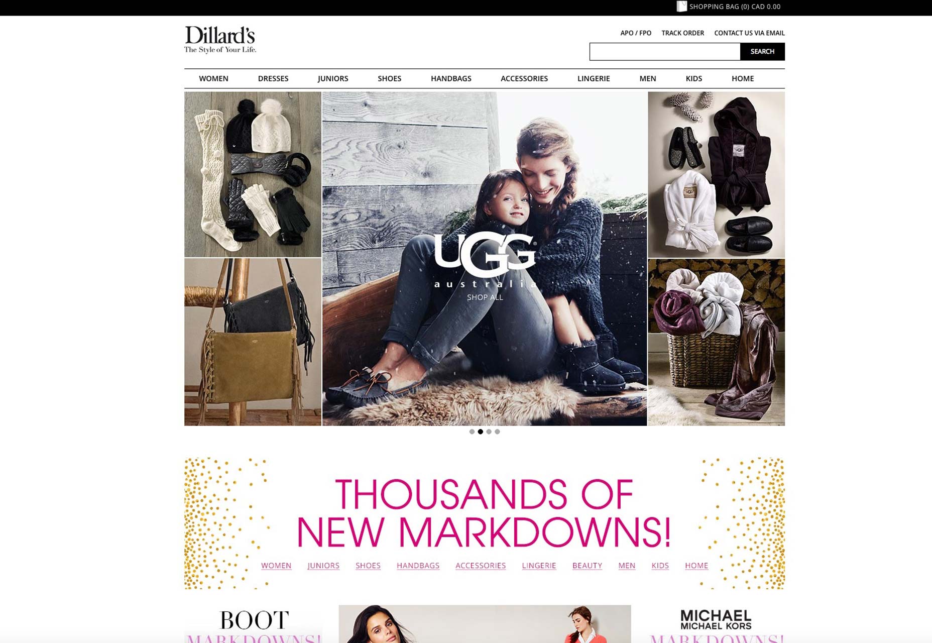 Dillard’s department stores exemplifies this basic-yet-familiar approach to web design. On its homepage, you can clearly see how many elements it does right:
- horizontal navigation menu offering clear and easy access to different departments;
- single-column design;
- white space to focus attention on the content;
- search bar to facilitate good UX that lets shoppers quickly find what they want;
- big images that show products sharply and attractively.
Rely on affordances
Affordances are those indications that tell your users how they can interact with your client’s site. They’re absolutely essential to a great user experience and, therefore, reducing user errors. Affordances come in all shapes and sizes:- physical;
- language;
- pattern;
- symbolic or iconic.
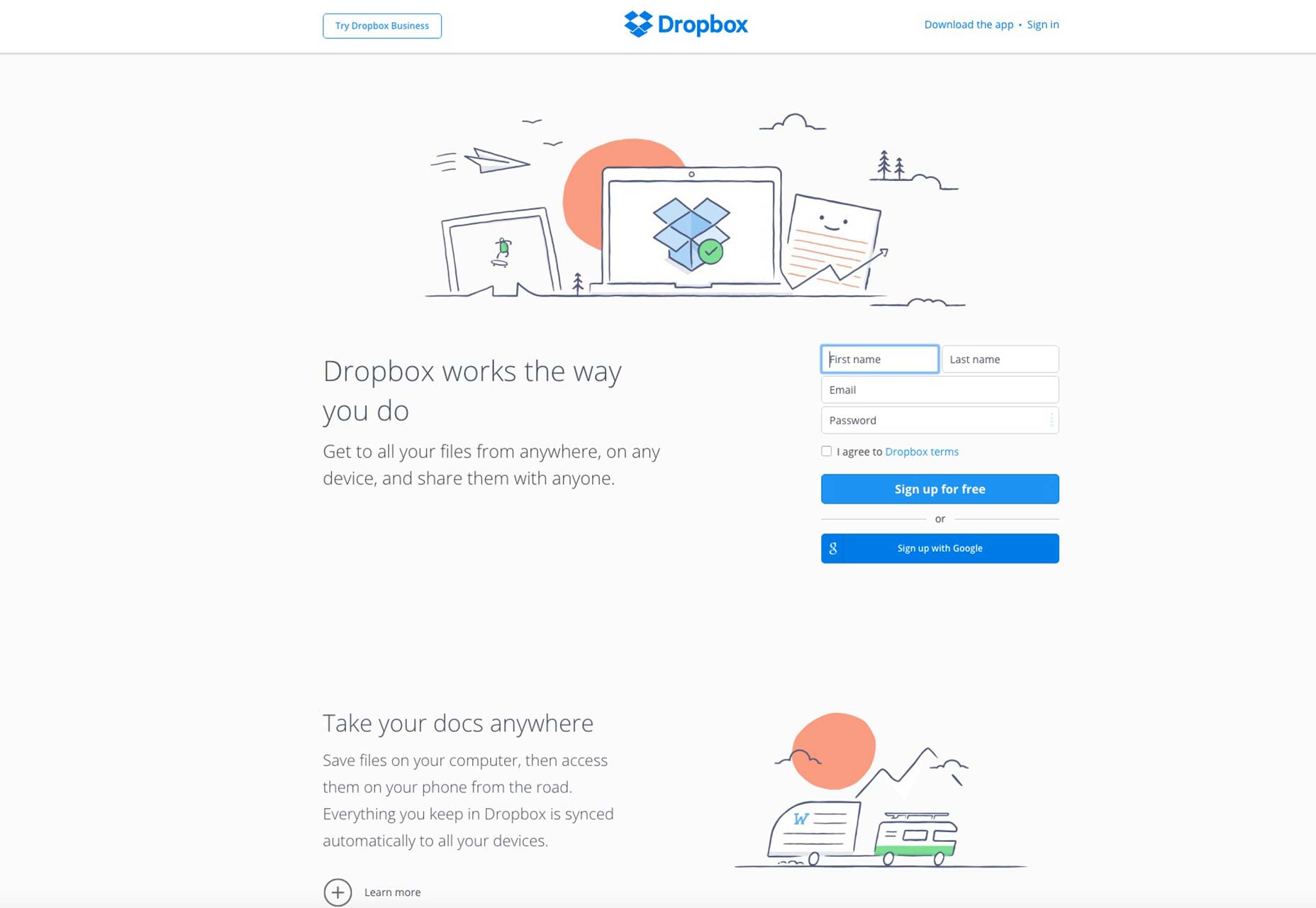 On Dropbox’s homepage, you can see the sign-up form prominently displayed right in the middle of the screen. The form only has four fields, but to help the user experience, Dropbox has included language affordances in every field, so that all users know that they’re expected to type in their first and last names, email addresses and passwords to sign up.
Now that users are 100% sure on what to enter into these fields, they won’t make any mistakes, and as a result, sign up will be extremely smooth because there won’t be any friction in the process.
On Dropbox’s homepage, you can see the sign-up form prominently displayed right in the middle of the screen. The form only has four fields, but to help the user experience, Dropbox has included language affordances in every field, so that all users know that they’re expected to type in their first and last names, email addresses and passwords to sign up.
Now that users are 100% sure on what to enter into these fields, they won’t make any mistakes, and as a result, sign up will be extremely smooth because there won’t be any friction in the process.
Use a deletion failsafe
One of the most common user errors is based on accidental deletions of created works, whether those works are very time-consuming, such as written reports, or just shared media like photographs that take but a second to shoot. It stands to reason, then, that creating effective safeguards against accidental deletions is one of the best ways to cut down on user errors. Most everyone has, at one point or another, experienced a situation where he accidentally deleted a valuable or necessary piece of content. The cost of such a user error can oftentimes be more than just the frustration of having pressed the wrong button or failed to read the pop up-window messages more carefully. Accidental deletions can permanently erase precious memories and work-related documents that cost real money. The confirmation dialog box, asking users if they really meant to delete an item, is still a vital failsafe that has to be part of every well-functioning design. The beauty of this failsafe is that, in keeping with the rule about using design conventions, all users will be instantly familiar with it, thereby upping its effectiveness as a loss-prevention system.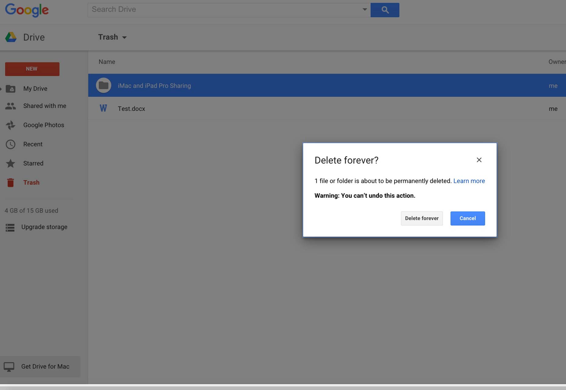 Google Drive’s interface uses confirmation dialog boxes that immediately grab the user’s attention, ensuring they can’t be ignored.
Note how the box features the confirmation question in bigger font than all the other text in the box, almost as if it was its own headline? In addition, action-oriented words like “delete” begin the question, further making it likely that users will take notice. The line containing the warning is in bold as well, contributing to the urgency behind the question. Finally, note how the call to action button of “cancel” is the one that’s highlighted in blue, indicating a desire by the designers to have users err on the side of caution in cases of accidental deletions.
All told, such a use of confirmation dialog boxes acts as a failsafe against rash users who may not have intended to press a certain button.
Google Drive’s interface uses confirmation dialog boxes that immediately grab the user’s attention, ensuring they can’t be ignored.
Note how the box features the confirmation question in bigger font than all the other text in the box, almost as if it was its own headline? In addition, action-oriented words like “delete” begin the question, further making it likely that users will take notice. The line containing the warning is in bold as well, contributing to the urgency behind the question. Finally, note how the call to action button of “cancel” is the one that’s highlighted in blue, indicating a desire by the designers to have users err on the side of caution in cases of accidental deletions.
All told, such a use of confirmation dialog boxes acts as a failsafe against rash users who may not have intended to press a certain button.
Conclusion
One thing that we constantly say in web design is how important it is to design with the user in mind at all times. The user experience should be put first and foremost in all design decisions. However, the interesting aspect of design is how designers usually associate the user experience in the context of what they can add to a design to improve the users’ experience. They rarely approach designing with the user in mind first from the standpoint of eliminating potential errors the user can get wrapped up in. That’s why it’s essential that designers always try to put themselves in the user’s shoes and try to anticipate how he’ll behave as he’s navigating their design. Only then can user errors truly be minimized. Featured image, confirm image via Shutterstock.Marc Schenker
Marc’s a copywriter who covers design news for Web Designer Depot. Find out more about him at thegloriouscompanyltd.com.


Read Next

3 Essential Design Trends, May 2024
Integrated navigation elements, interactive typography, and digital overprints are three website design trends making…

20 Best New Websites, April 2024
Welcome to our sites of the month for April. With some websites, the details make all the difference, while in others,…

Exciting New Tools for Designers, April 2024
Welcome to our April tools collection. There are no practical jokes here, just practical gadgets, services, and apps to…

14 Top UX Tools for Designers in 2024
User Experience (UX) is one of the most important fields of design, so it should come as no surprise that there are a…
By Simon Sterne

What Negative Effects Does a Bad Website Design Have On My Business?
Consumer expectations for a responsive, immersive, and visually appealing website experience have never been higher. In…

10+ Best Resources & Tools for Web Designers (2024 update)
Is searching for the best web design tools to suit your needs akin to having a recurring bad dream? Does each…
By WDD Staff

3 Essential Design Trends, April 2024
Ready to jump into some amazing new design ideas for Spring? Our roundup has everything from UX to color trends…

How to Plan Your First Successful Website
Planning a new website can be exciting and — if you’re anything like me — a little daunting. Whether you’re an…
By Simon Sterne

15 Best New Fonts, March 2024
Welcome to March’s edition of our roundup of the best new fonts for designers. This month’s compilation includes…
By Ben Moss

LimeWire Developer APIs Herald a New Era of AI Integration
Generative AI is a fascinating technology. Far from the design killer some people feared, it is an empowering and…
By WDD Staff

20 Best New Websites, March 2024
Welcome to our pick of sites for March. This month’s collection tends towards the simple and clean, which goes to show…

Exciting New Tools for Designers, March 2024
The fast-paced world of design never stops turning, and staying ahead of the curve is essential for creatives. As…