

pixelindustry
If pixelindustry’s agency portfolio looks a whole lot like a theme, that’s because they make themes. So while it may not be the world’s most original design, it certainly plays to their strengths, and showcases their talents. This may be the only case where a site “feeling like a theme” is a positive thing.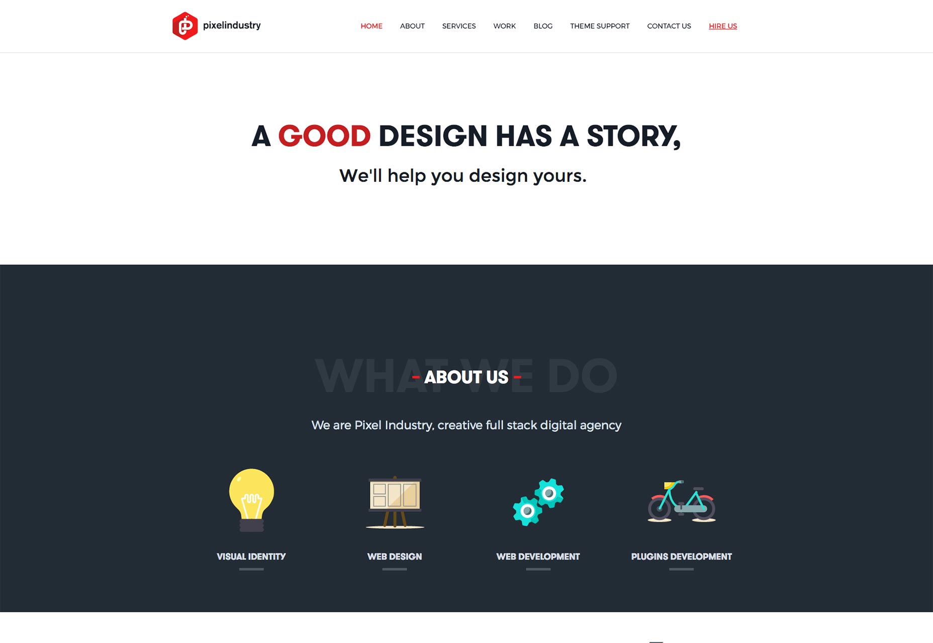
David Alexander
David Alexander’s portfolio throws you right into the work with a large, image-focused, fully-screen-friendly layout. If your content is light on text, and heavy on imagery, this is one great way to do it.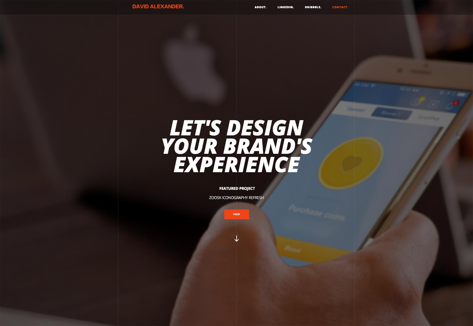
Martine aimait les films
The portfolio site for Martine aimait les films, a video production company, embraces that divided-in-half feel that I love. Combined with the short, high-quality clips used as video backgrounds, the whole site feels modern and professional, and seems to fit the style of the videos presented.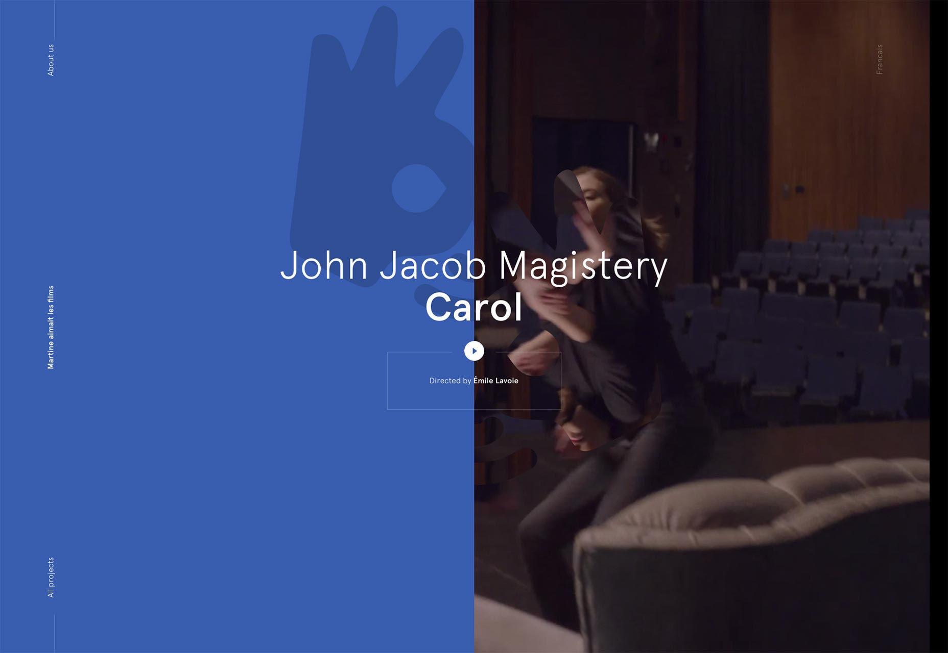
Aycan Elijah Yilmaz
Aycan Elijah Yilmaz’s portfolio is the second one I’ve seen embrace the “galaxy beard”. Galaxybeards aside, this is a pretty, minimalist site with a lot going for it.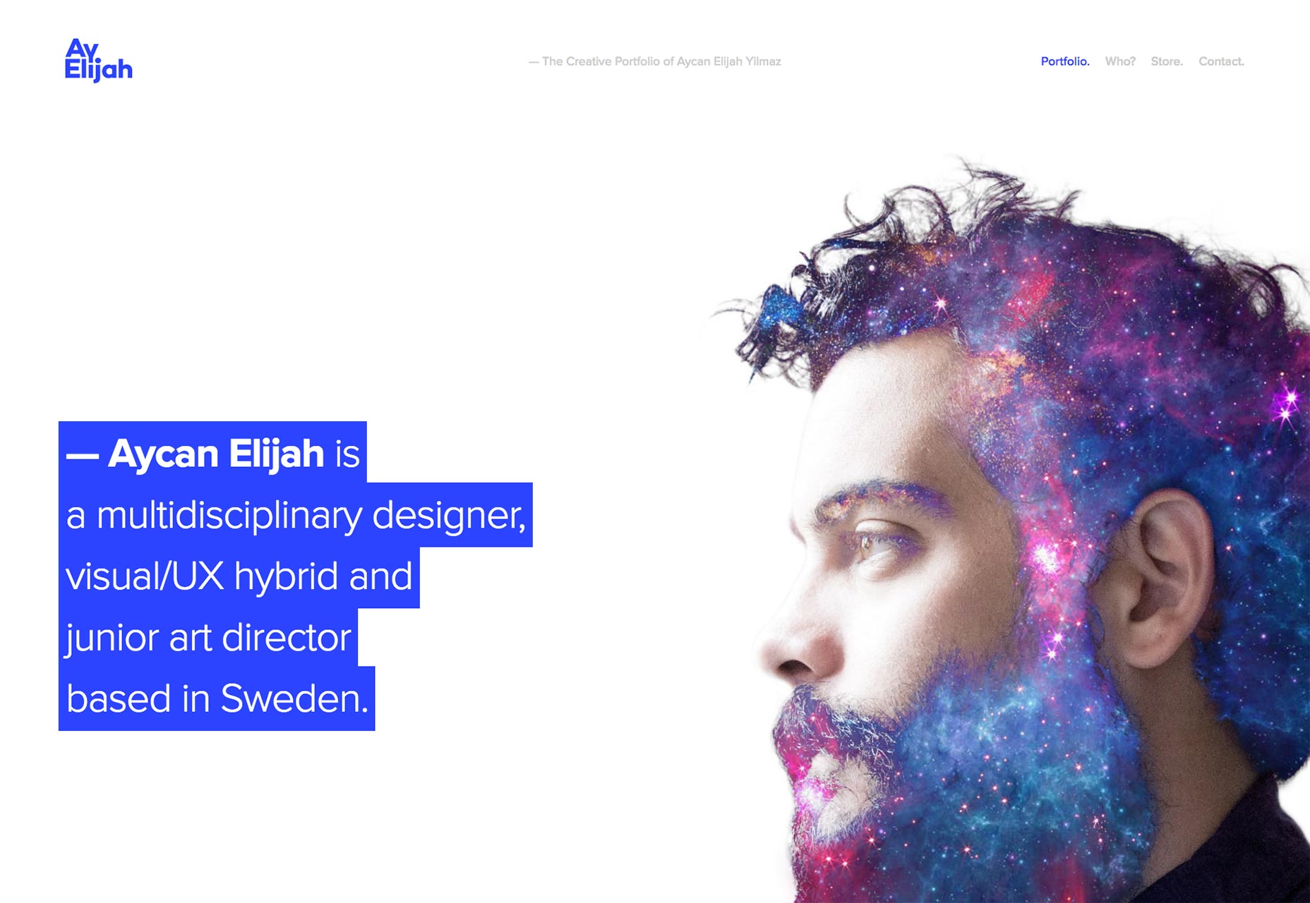
Chris Cook
Chris Cook’s portfolio is simple, largely monochrome, with decent typography. The thing I really like about it, however, is the use of a subtle background pattern. I know that background patterns were basically abandoned along with skeuomorphism, but this is a site that does it right. I’d like to see more subtle patterns used here, and there. We might even wean ourselves off of our near-complete dependence on huge (and thus slow-to-load) photos.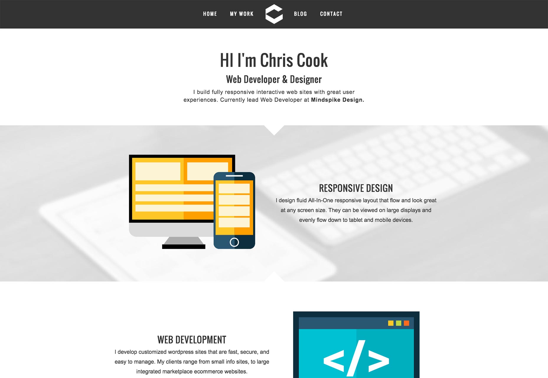
whitelist
The site for video production studio whitelist goes full 90s multimedia presentation, but with modern technologies and style. I’ve often railed against the usability problems this kind of design presents, but that doesn’t mean it isn’t pretty. You could drop most of the fancy JS and animation, and what you’d have left is a beautiful, minimalist site. I especially like how it makes use of less-common geometric shapes both to decorate, and to draw the eye to UI elements and important content.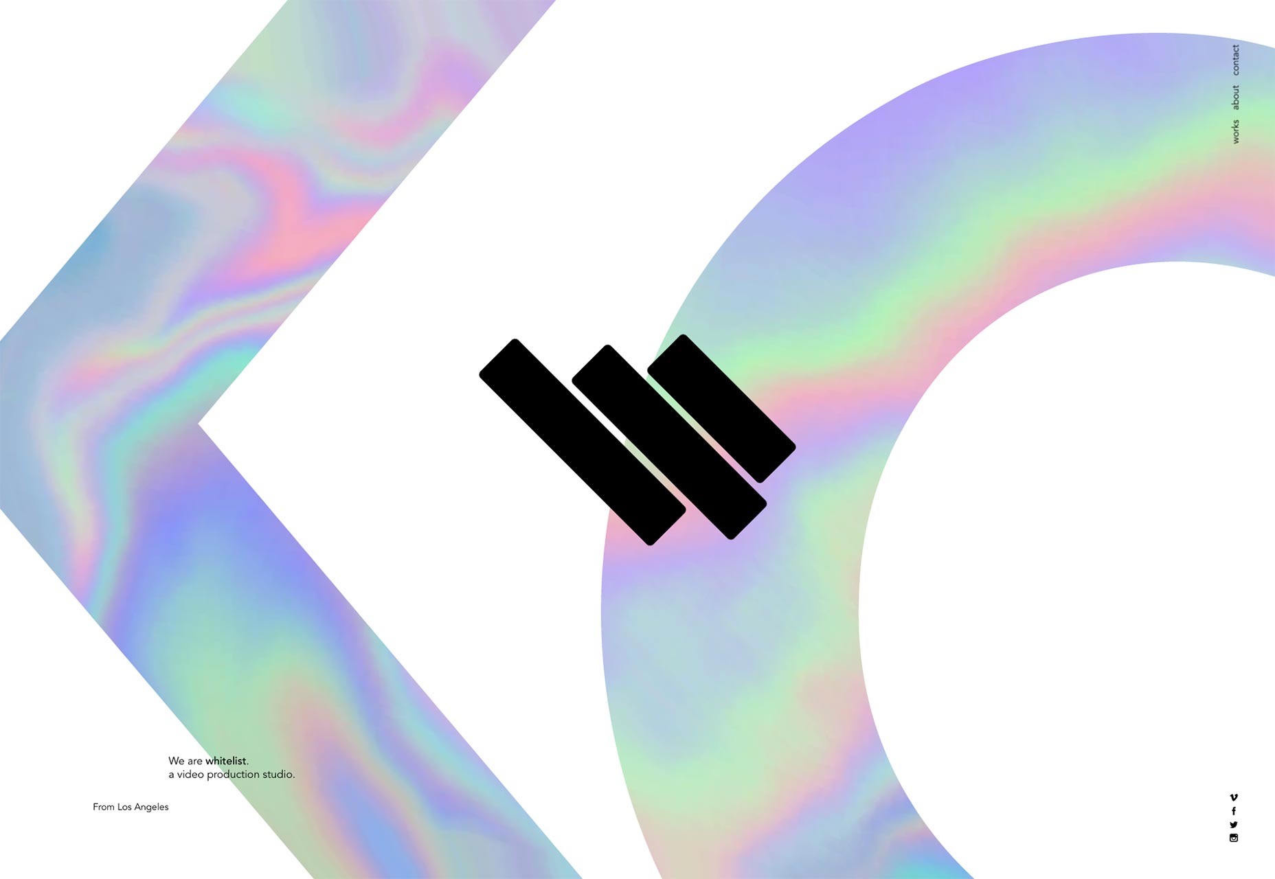
4musketier
I’m forced to assume that 4musketier is a design agency, because though I can’t read German, that’s what’s in the portfolio section. It’s not too imaginative. It’s really a textbook flat design that seems dedicated to a pastel version of the rainbow itself, rather than a specific color scheme. Still, it looks good, with excellent typography, generous white space, and more. The whole design feels like it was executed with precision, and that alone is worth a look.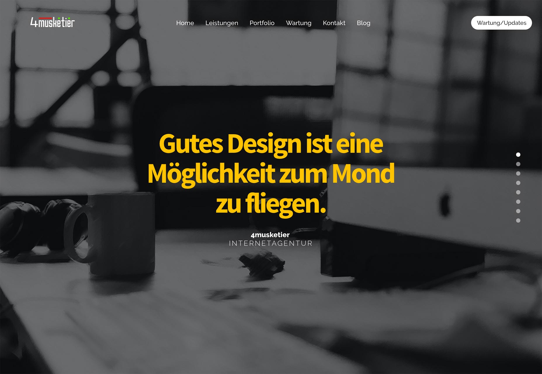
Lachlan Kincaid
Lachlan Kincaid’s portfolio brings us back into the world of minimalism, with a more literal definition of “white space”. It’s a simple site that shares the emphasis between the text and imagery, in an effort to give proper context for all of the work presented. It’s an effort that I appreciate.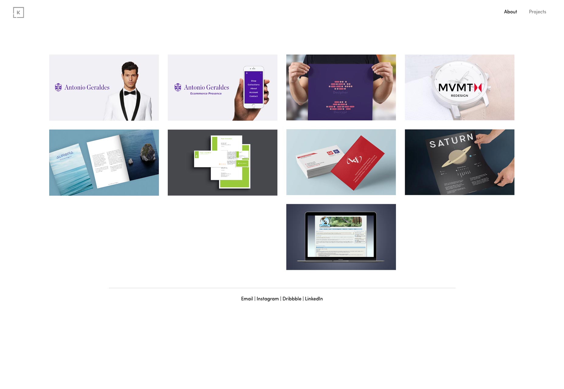
Electric Enjin
Electric Enjin’s portfolio site starts off with a bang, by presenting a polygonal 3D globe that zooms in and… well I’m not going to spoil it. Suffice it to say that, potential usability problems aside, this is what all those Flash site designers were going for, but couldn’t quite manage. It’s quite something to see. The rest of the site is decidedly simpler, and not too spectacular, though certainly pleasing to the eye. But that home page… that will definitely give customers something to think about (if it works in their browser).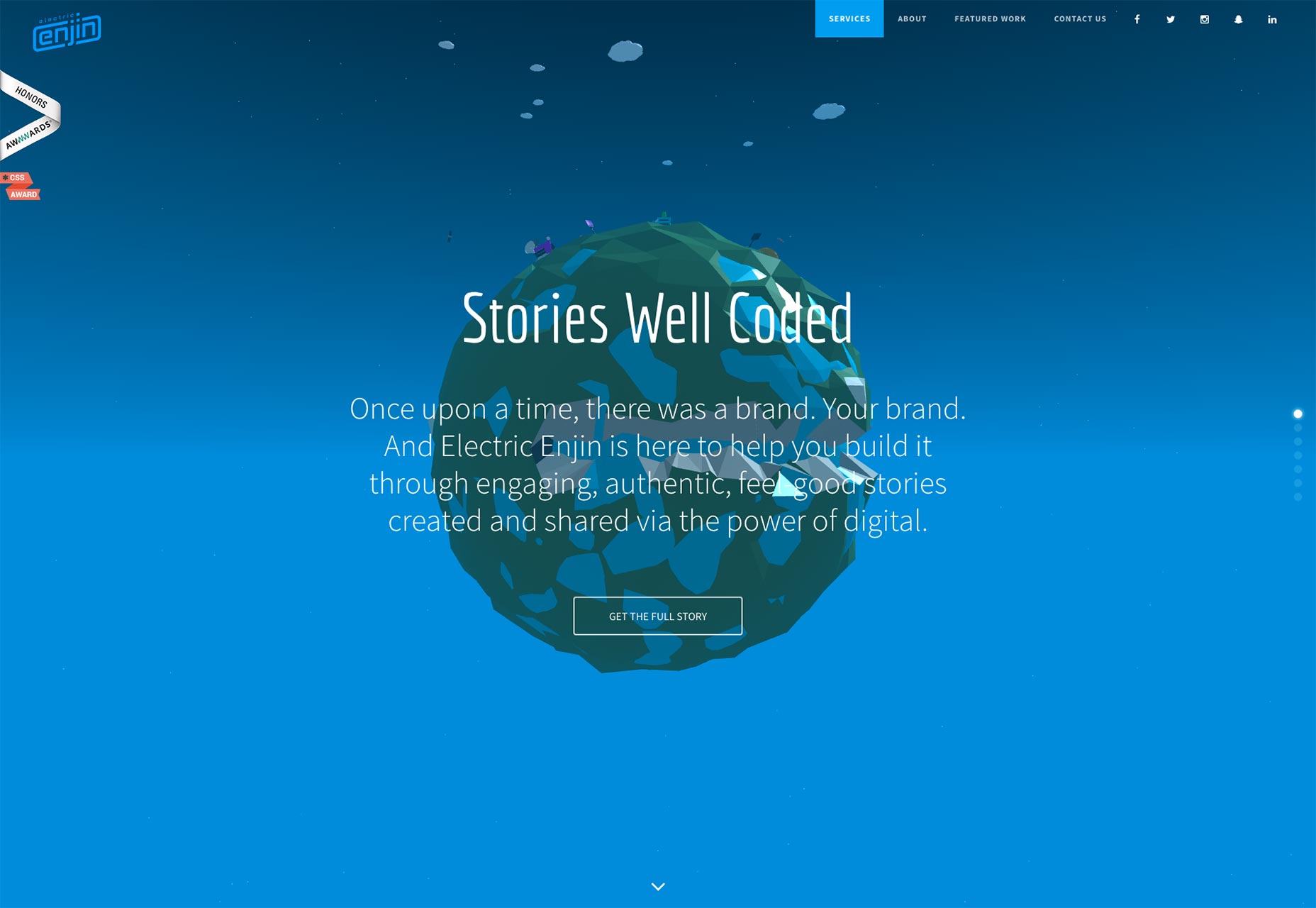
Olle
The studio portfolio site for Olle combines minimalism with a streak of Bauhaus style. The pages weren’t just designed, they were art directed. Designers take note: art isn’t just about fancy layouts. Simply changing small details on the page, or the entire color scheme, to match the content… that counts too.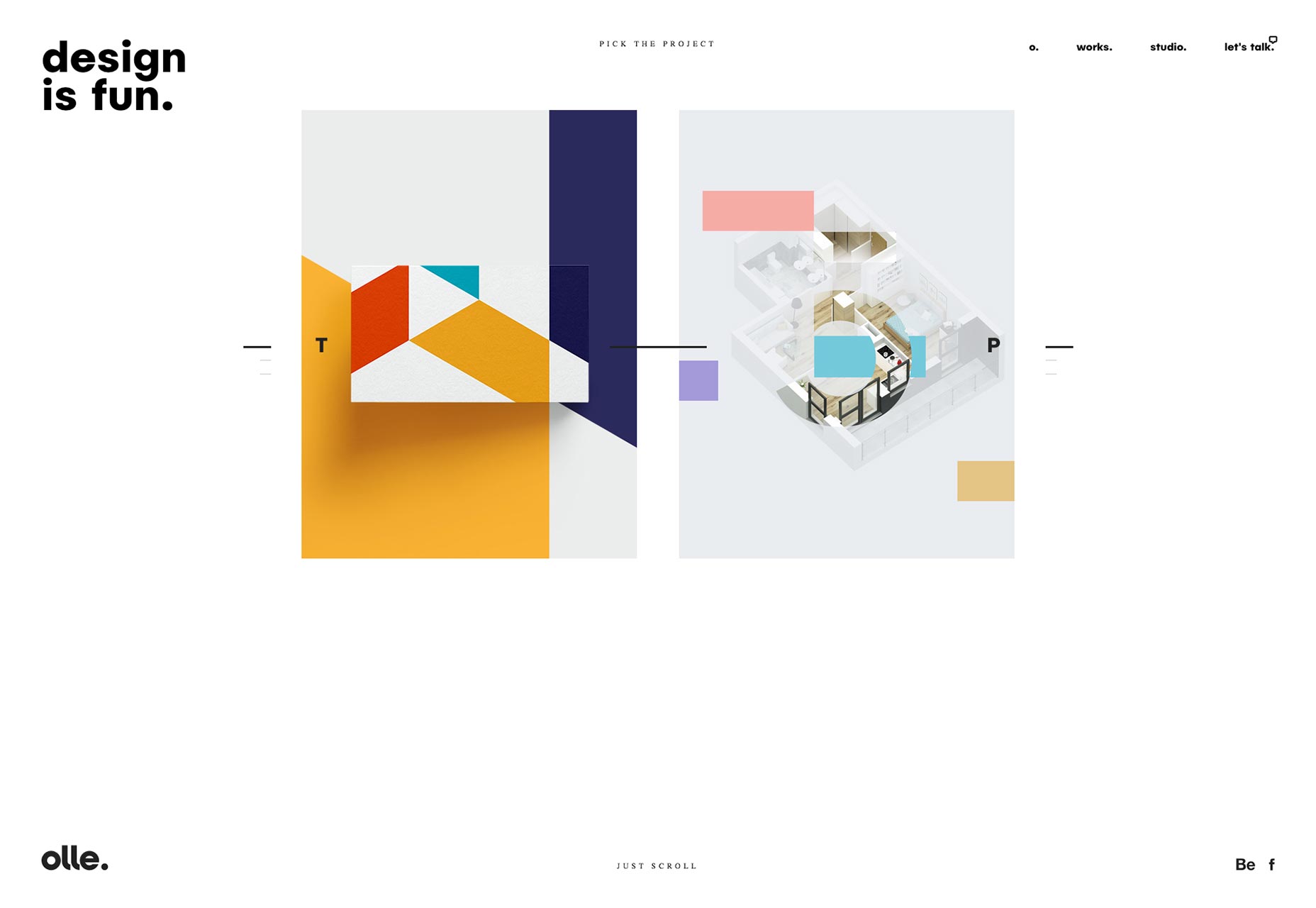
Locomotive
Locomotive’s portfolio site is a fantastic example of a site based on Material Design that doesn’t look all-Google, all the time. Yes, certain elements retain that very specific Material Design feel, but the site very much has its own personality.
AREA 17
Combine a modern aesthetic, a strictly black and white color scheme, a bit of asymmetry, and you get AREA17. Now, I love my greyscale sites, as you know, but it’s not often someone can actually pull off a design with near-solid black (it will look solid black on most screens, anyway), and a lot of it.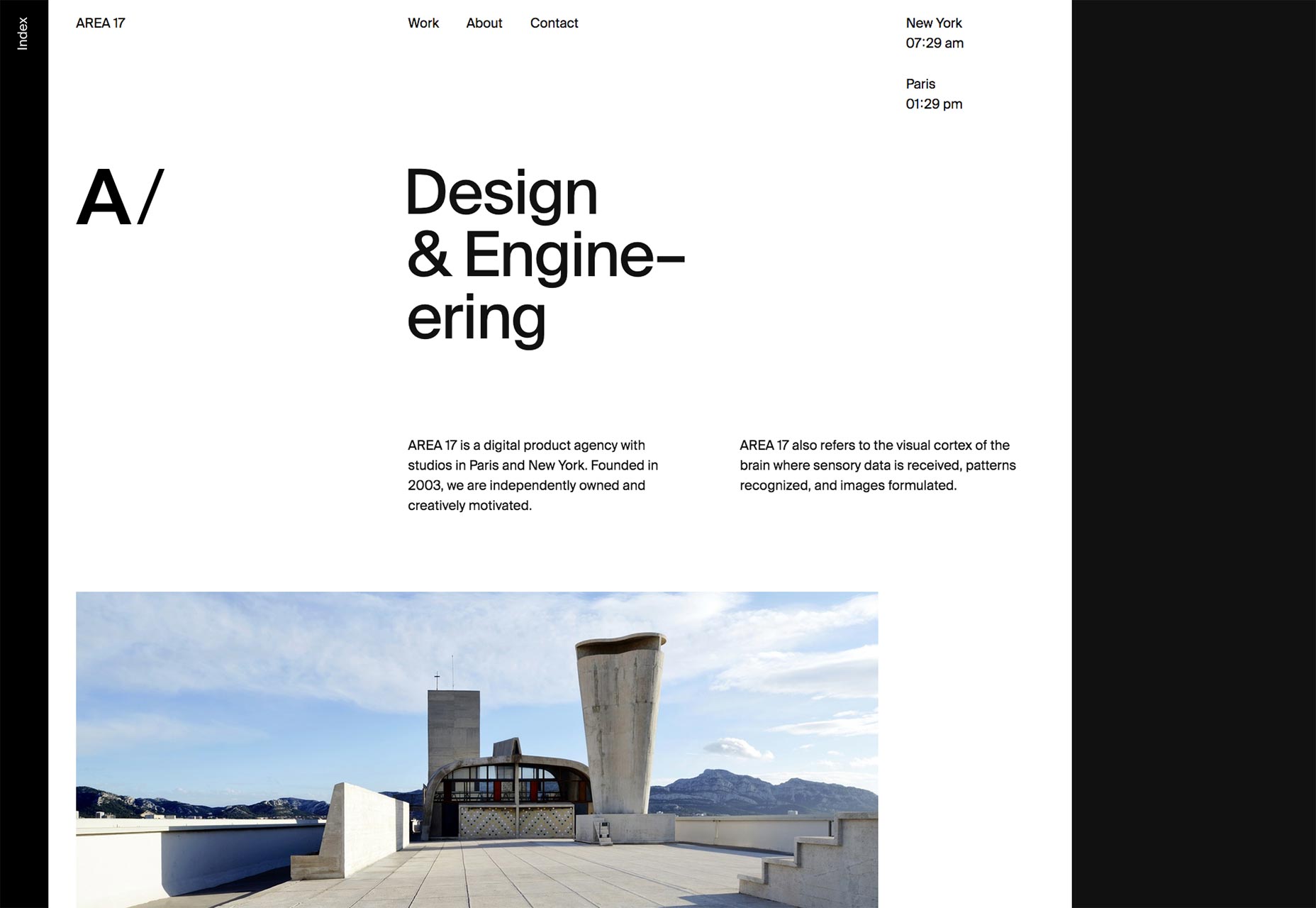
C RCL
C RCL’s portfolio site makes a risky choice with using a full-screen carousel in the middle of their one-page site. Well, the risk comes from the fact that it’s the only way to see their work. Still, it fits in with the aesthetic. Great typography too.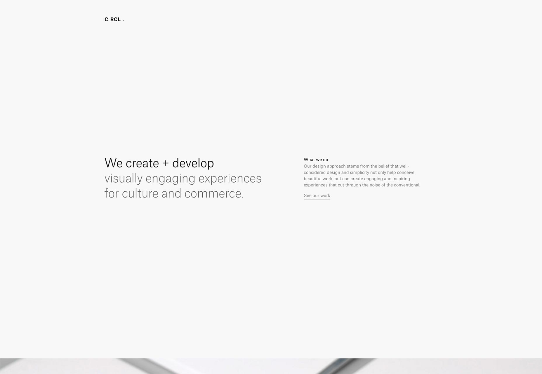
Whitehall
Whitehall is an interior design studio in New York City. They leave all the sales work to the excellent photos of their projects, which are presented full screen. The rest of the site is kept simple, giving you just enough information, and no more. The asymmetry on the “About” page surprised me, but it still seems to work, even if it’s nowhere else on the site.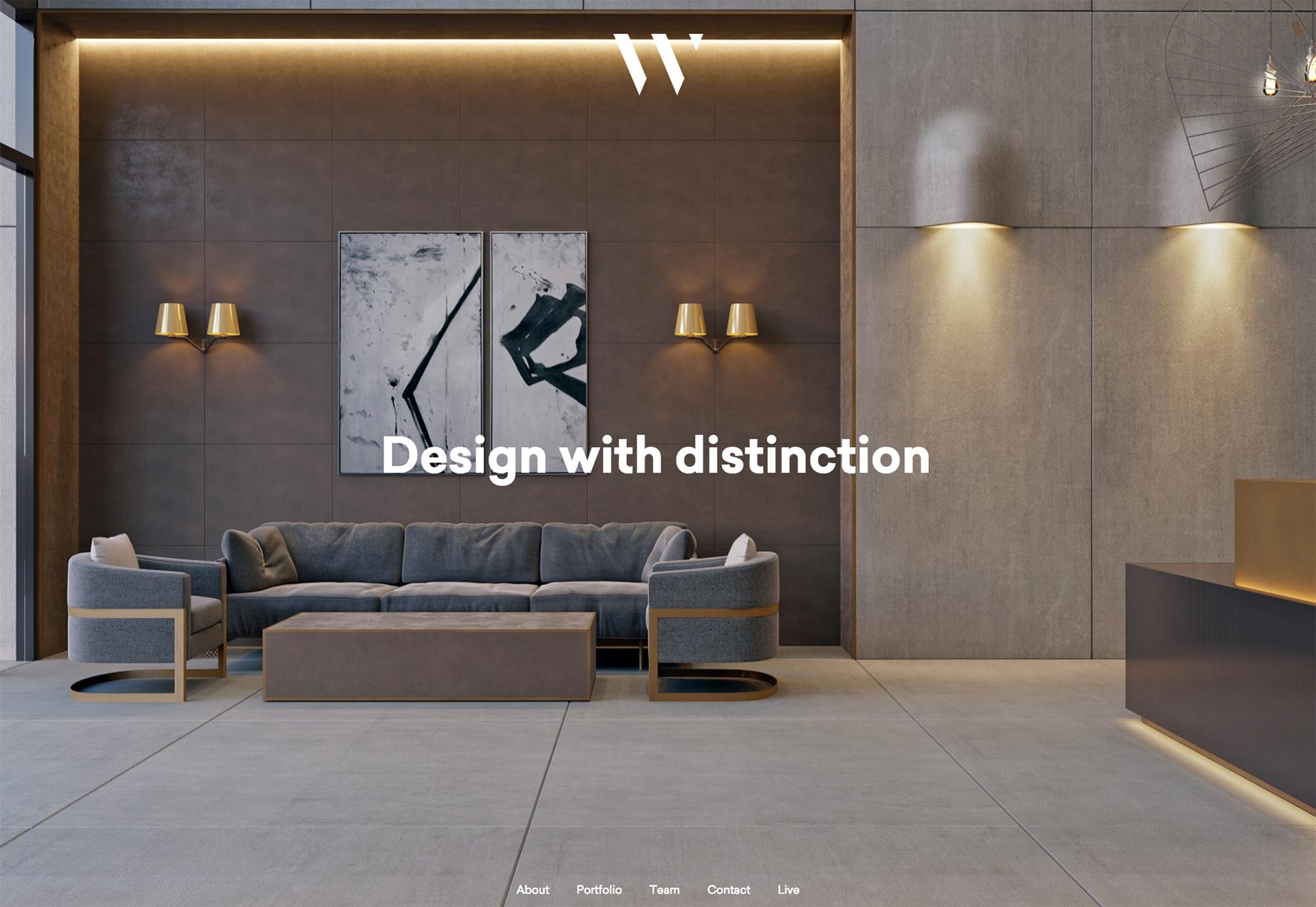
Uzik
Uzik’s agency portfolio site is another one of those that’s not too original, but too well-executed to ignore. It just has fantastic use of imagery, type, color, and everything else. There’s something to be said for following the formula once in a while, and it’s working for Uzik. It’s a pretty site. Go look.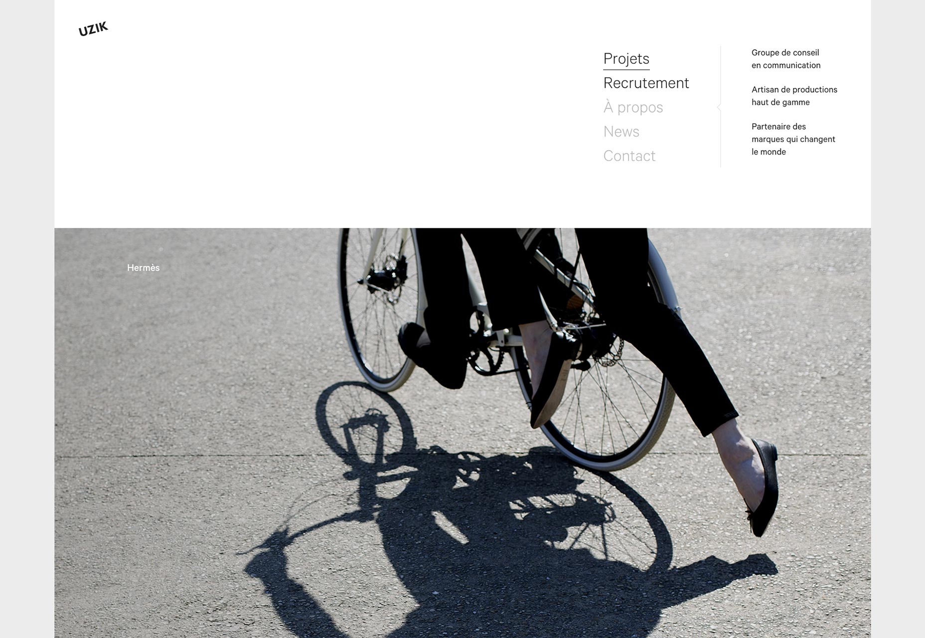
Dunlop Builders
The portfolio for Dunlop Builders is another great example of a minimalist business site. It looks very familiar, in terms of structure and the elements used, yet still retains its own distinct personality. Some of that personality comes from the imagery, but a lot comes from the use of layout and type.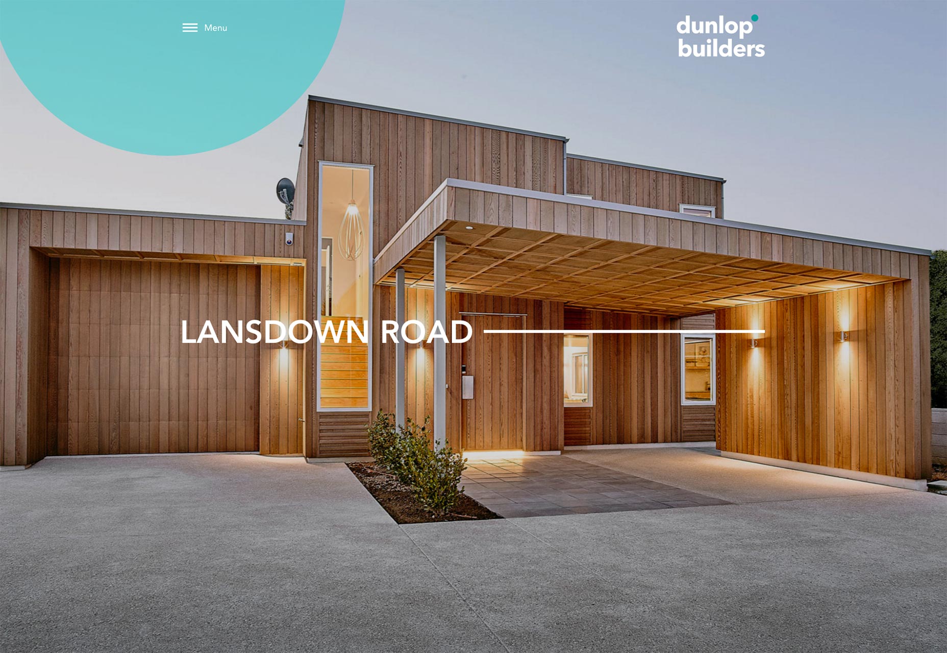
David Schweitzer
Composer David Schweitzer’s portfolio isn’t a one-page website, but it might as well be. All of the most important information is on the home page. Almost random colored geometric shapes are used to spice up an otherwise monochrome website to great effect, although they make the text a bit less legible where they overlap with it. What I love, though, is that you can click on any of his musical projects for a full case study, or just listen to a sample right there, with the provided mini media player. The whole site is efficient like that, while also providing more details for anyone who wants them.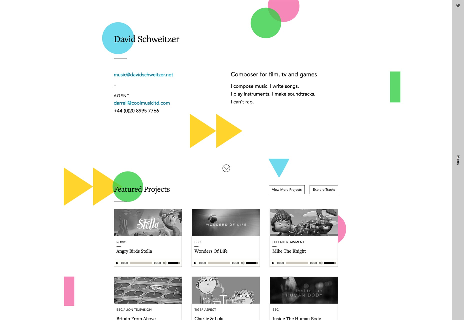
Geordie Wood
Ok, Geordie Wood’s portfolio is, to be perfectly honest, an unusable mess. Take a glance and tell me where the main navigation is. No, it’s not the arrow in the upper right. It’s revealed on hovering over the photographer’s name. That mess aside, I love the use of typography, and the way the text stays on top of the hover-images until you click through. I love the way each photo is given a different ratio of white space. It’s feels experimental, a little unpredictable, like the photography it’s showing off. I love that. (They still should fix that navigation, though.)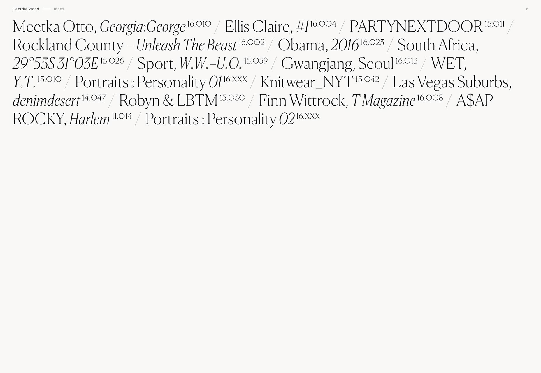
Sam Lord Flavin
And we keep getting experimental with Sam Lord Flavin’s portfolio. And it kind of has to get experimental. After all, he’s using this site to showcase three major, and majorly different, skillsets. Well, the combination of asymmetry and parallax effects works incredibly well, here. (Yup, there it is.)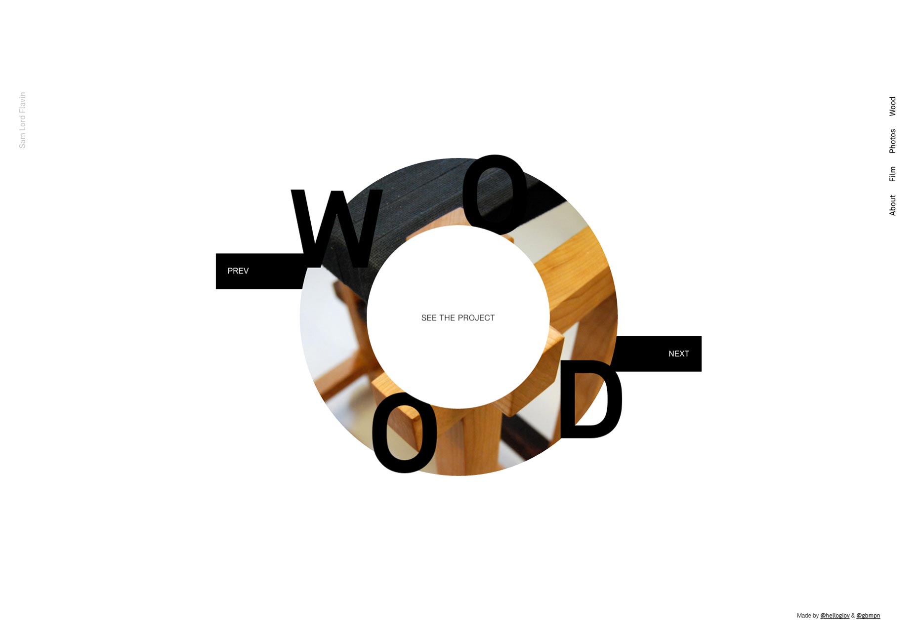
Villa Böhnke
Villa Böhnke’s one-page poortfolio feels, at first, like more of a collage than anything else. I’d say it works for them, even with, gasp, drop shadows. Okay, it really is mayhem out here. But for the content, this is perfectly appropriate.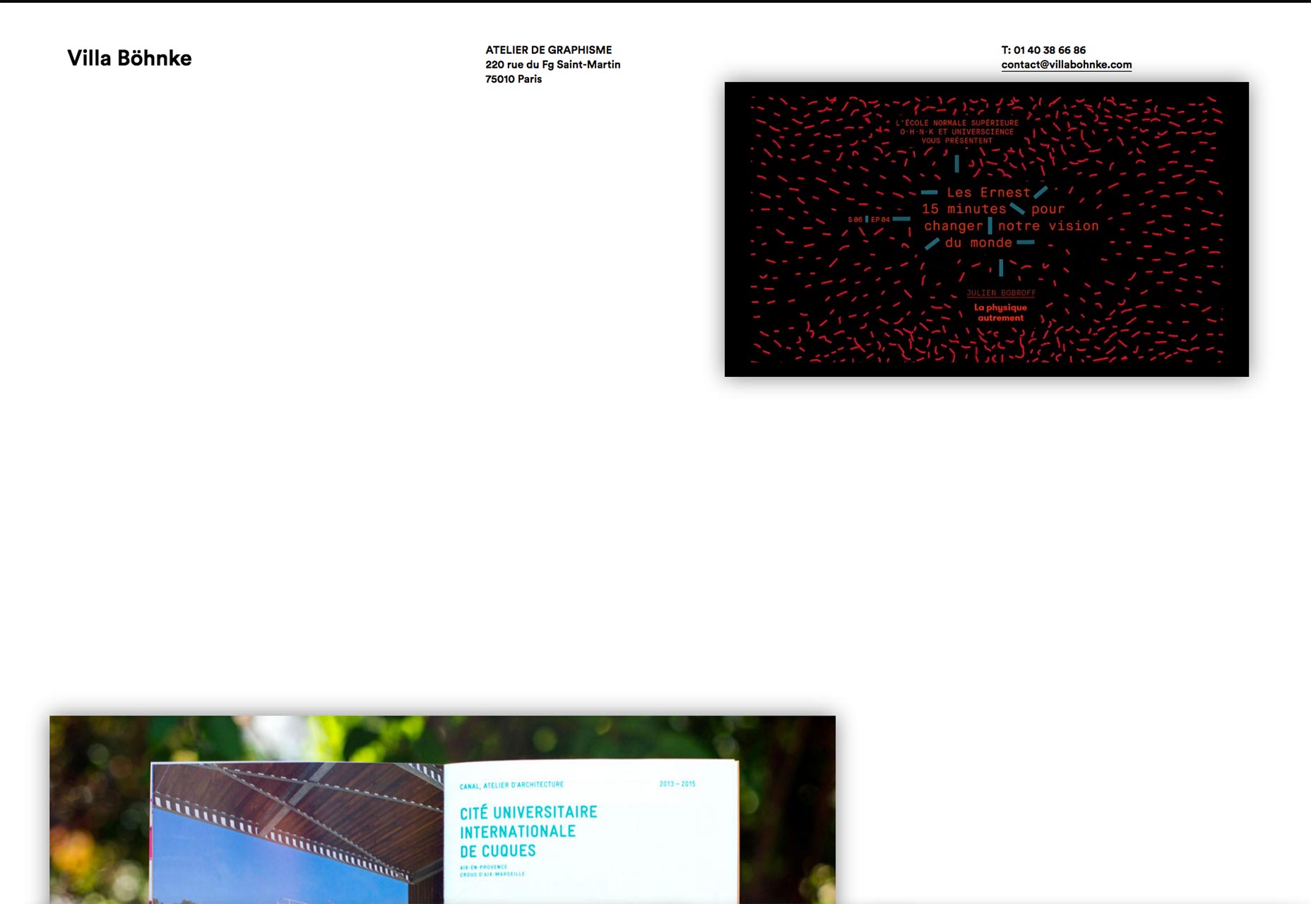
Jon Montenegro
Jon Monttenegro’s portfolio gives us another decidedly minimalist one-page portfolio. This one is targeted at… people impressed by really long lists? I mean ok, I’m actually impressed. That’s a lot of work done. So, if anyone wants social proof, that’s one way to show off. I just wish he hadn’t used those clicking sounds when you hover over a link.
HOO KOO E KOO
HOO KOO E KOO has a name I don’t even want to try to say out loud because I just know I’ll get it wrong. It also gets off to a great start with what might be the most modern-feeling animated depiction of Pong that I’ve ever seen. Scrolling down gives us a change in background color that never feels awkward, so that’s cool too.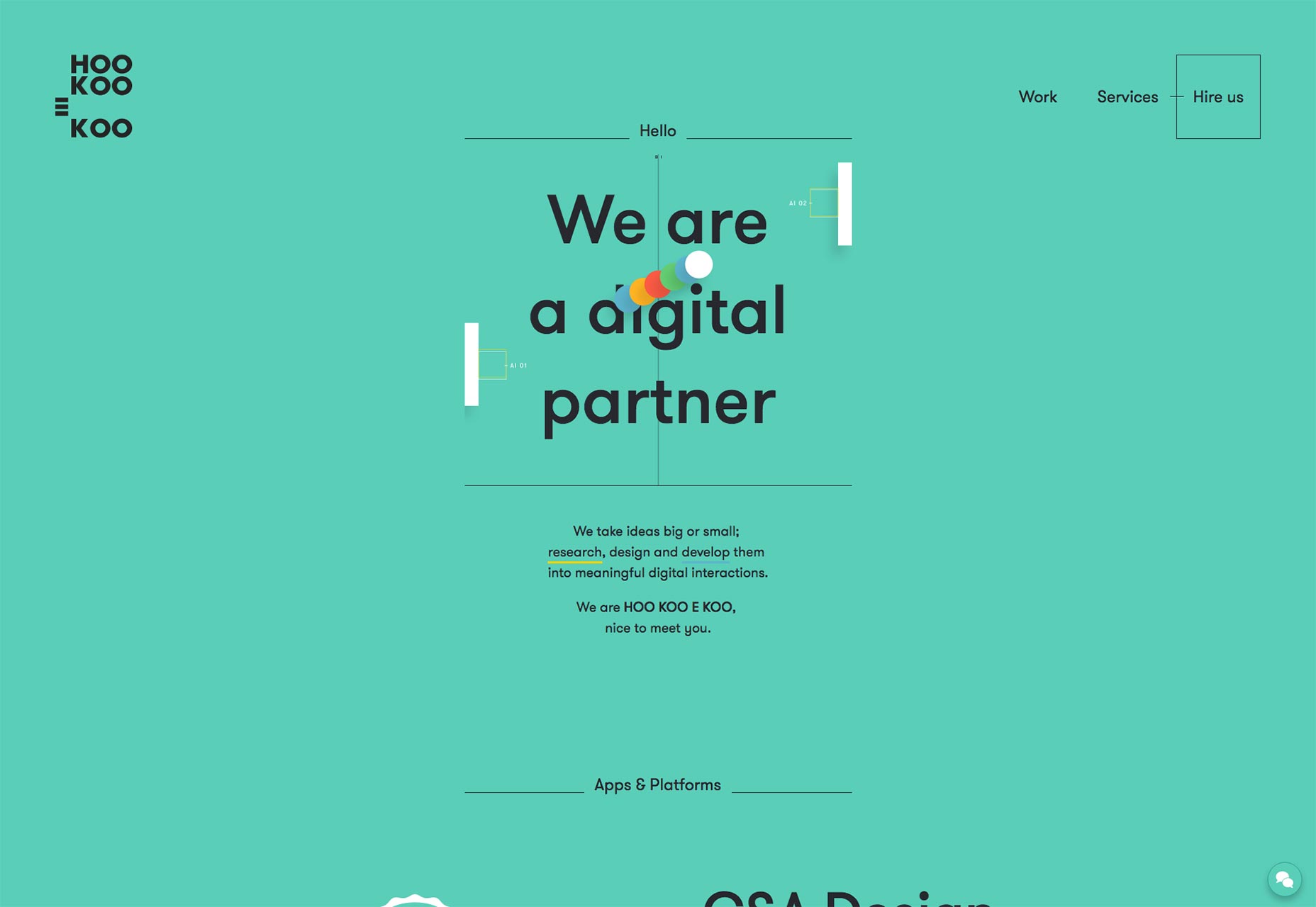
Humans & Machines
The portfolio for Humans & Machines brings us more asymmetry, more minimalism, more goodness.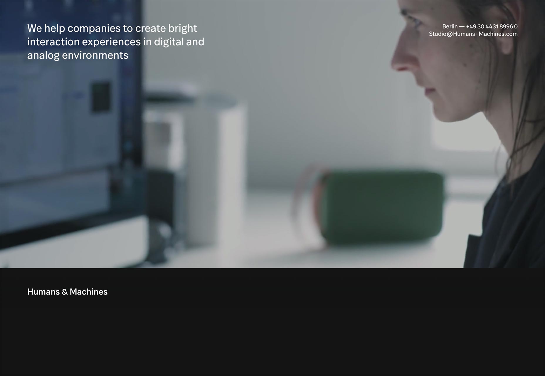
Pilote
Pilote’s portfolio presents their portfolio in just two photos. They showcase their print and graphic design by zooming in on each product as you click through the menus. It’s a bit “Flash-y”, but still fairly unique, and an interesting way to do it.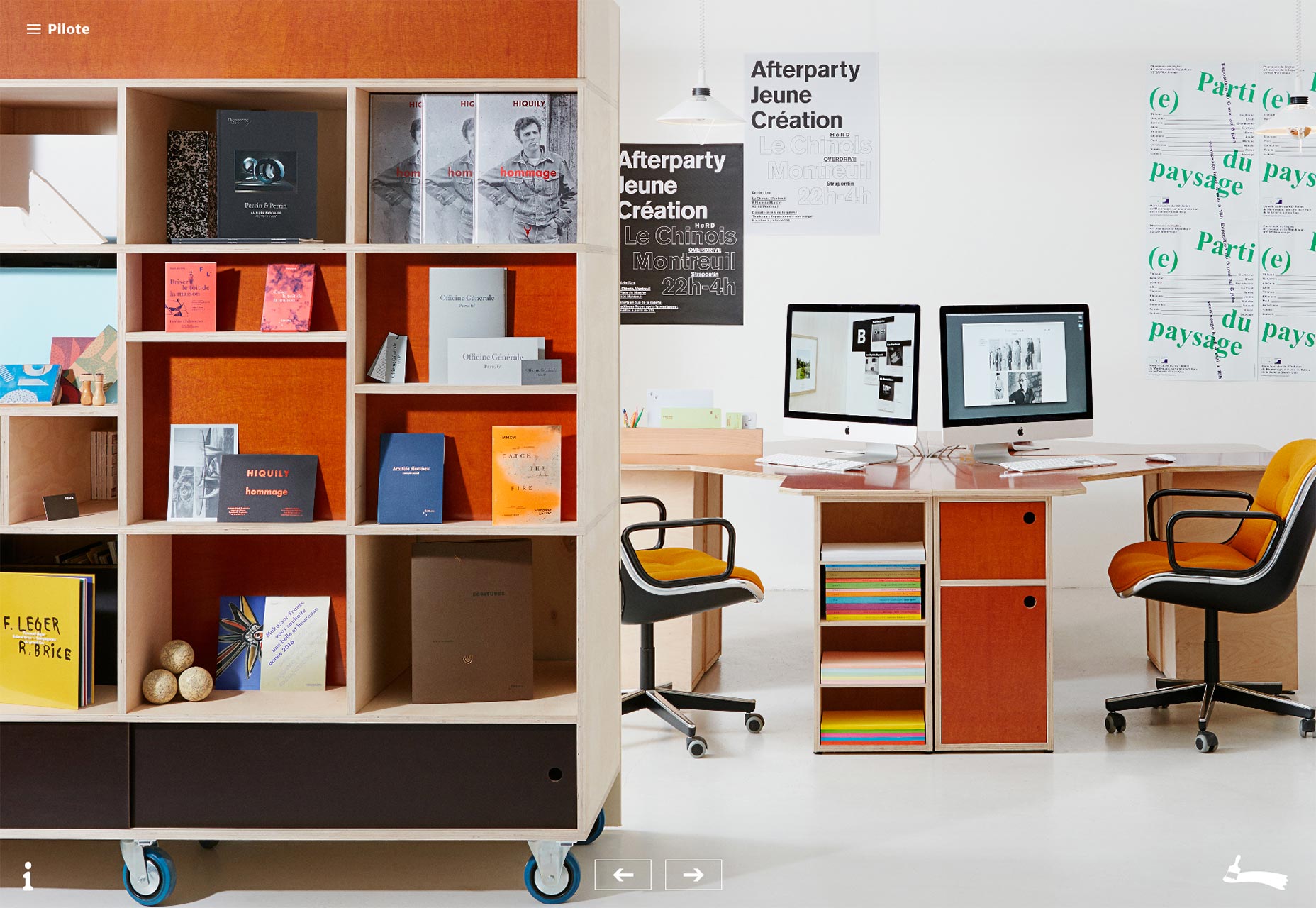
Brave People
Brave People’s portfolio site is another that’s not too original, but still beautiful. Have a look at that typography, especially. It’s pretty.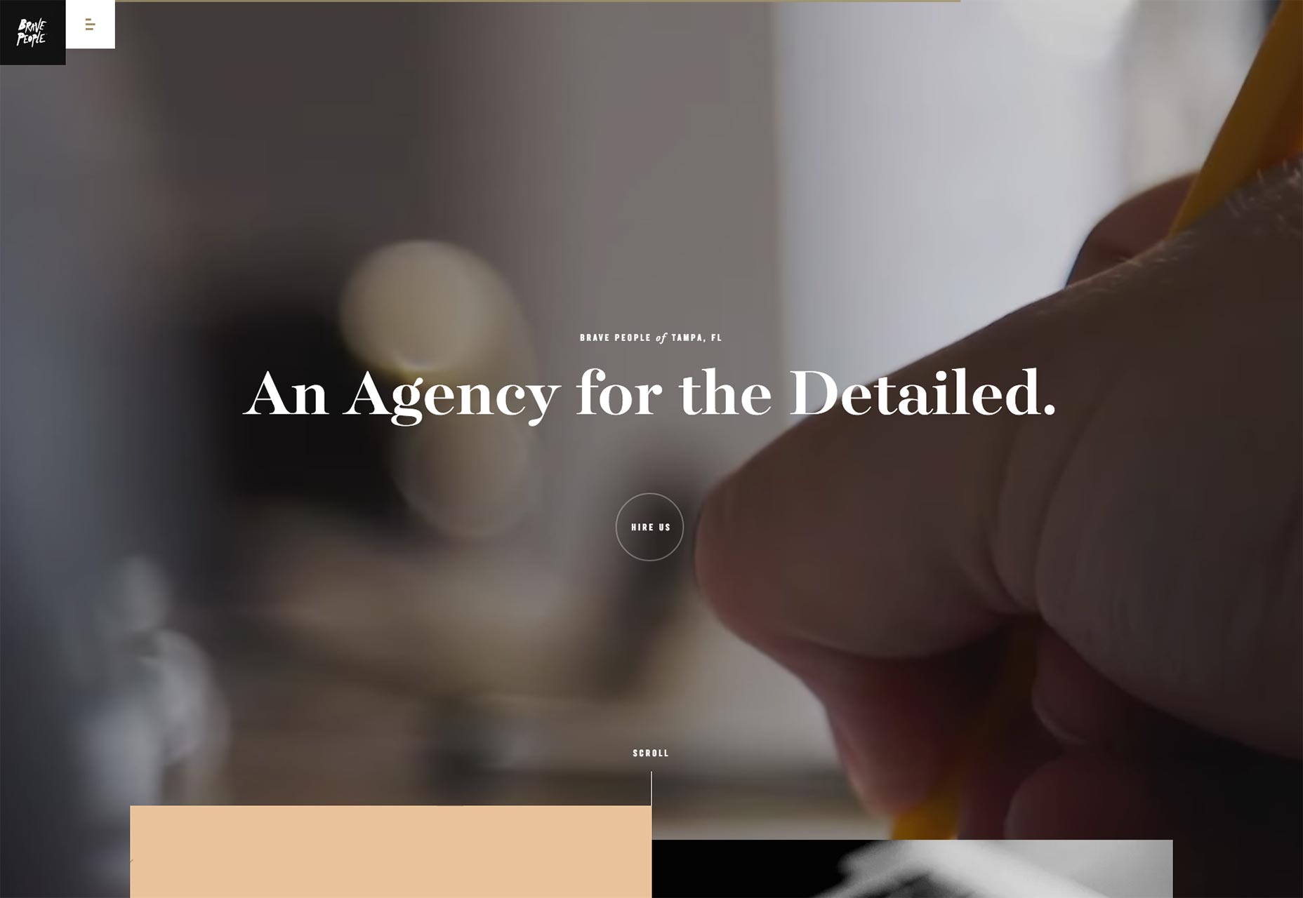
Ezequiel Bruni
Ezequiel Bruni is a web/UX designer, blogger, and aspiring photographer living in Mexico. When he’s not up to his finely-chiselled ears in wire-frames and front-end code, or ranting about the same, he indulges in beer, pizza, fantasy novels, and stand-up comedy.


Read Next

20 Best New Websites, April 2024
Welcome to our sites of the month for April. With some websites, the details make all the difference, while in others,…

Exciting New Tools for Designers, April 2024
Welcome to our April tools collection. There are no practical jokes here, just practical gadgets, services, and apps to…

14 Top UX Tools for Designers in 2024
User Experience (UX) is one of the most important fields of design, so it should come as no surprise that there are a…
By Simon Sterne

What Negative Effects Does a Bad Website Design Have On My Business?
Consumer expectations for a responsive, immersive, and visually appealing website experience have never been higher. In…

10+ Best Resources & Tools for Web Designers (2024 update)
Is searching for the best web design tools to suit your needs akin to having a recurring bad dream? Does each…
By WDD Staff

3 Essential Design Trends, April 2024
Ready to jump into some amazing new design ideas for Spring? Our roundup has everything from UX to color trends…

How to Plan Your First Successful Website
Planning a new website can be exciting and — if you’re anything like me — a little daunting. Whether you’re an…
By Simon Sterne

15 Best New Fonts, March 2024
Welcome to March’s edition of our roundup of the best new fonts for designers. This month’s compilation includes…
By Ben Moss

LimeWire Developer APIs Herald a New Era of AI Integration
Generative AI is a fascinating technology. Far from the design killer some people feared, it is an empowering and…
By WDD Staff

20 Best New Websites, March 2024
Welcome to our pick of sites for March. This month’s collection tends towards the simple and clean, which goes to show…

Exciting New Tools for Designers, March 2024
The fast-paced world of design never stops turning, and staying ahead of the curve is essential for creatives. As…

Web Tech Trends to Watch in 2024 and Beyond
It hardly seems possible given the radical transformations we’ve seen over the last few decades, but the web design…
By Louise North