
img { max-width: 100%; }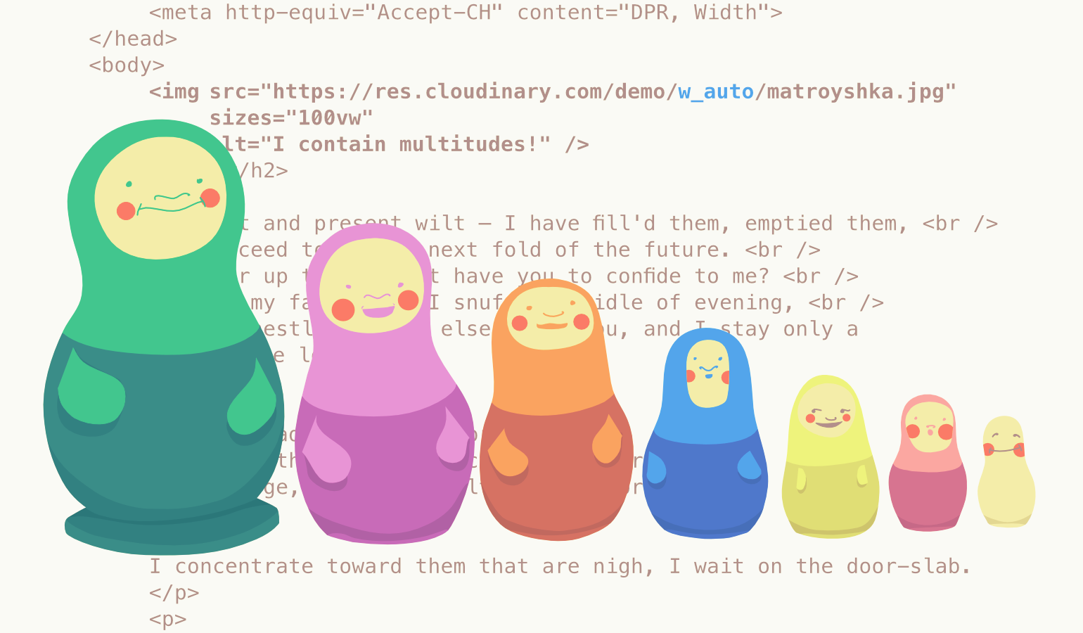 The image resources being served must be big enough to fill large viewports and high-resolution displays to make this code work effectively. Simply setting a percentage width on images is not enough, the images need to be resized as well, or else huge image resources will be sent to everyone which is a performance disaster.
Another way developers have combated images into responsive layouts is using the suite of new HTML features which allows images to transform in a way that allows users get tailored resources based on their context. These features provide adaptation via allowing authors to mark up multiple, alternate resources like so:
The image resources being served must be big enough to fill large viewports and high-resolution displays to make this code work effectively. Simply setting a percentage width on images is not enough, the images need to be resized as well, or else huge image resources will be sent to everyone which is a performance disaster.
Another way developers have combated images into responsive layouts is using the suite of new HTML features which allows images to transform in a way that allows users get tailored resources based on their context. These features provide adaptation via allowing authors to mark up multiple, alternate resources like so:
<img size=”100vw”
 srcset=”tiny.jpg 320w,
 Small.jpg 512w,
 Medium.jpg 640w,
 Large.jpg 1024w,
 Huge.jpg 1280w,
 Enormous.jpg 2048w”
 src=”fallback.jpg”
alt=”To each according to his ability” />Considering JavaScript
Another method developers employ is using Javascript. JavaScript can directly measure the browsing context and when paired with on-the-fly, server-side resizing, it requests a single, perfectly-sized resource every time with little or no extra markup required. This post explains how to use JavaScript to achieve automatic responsive images. Now there are challenges with this approach:- Setting up JavaScript infrastructure which might be complex
- Inserting JavaScript between users and our page’s core content which might be tricky to do effectively.
- Browser vendors use the speculative pre-parser to shed off as many image loads as possible before a page’s HTML has even finished parsing. And for JavaScript to load measured image resources, it must wait for page layout to be complete before it can measure the page.
- Let the pre-parser do its work and set JavaScript to double-load all of our images, or,
- Disrupt the pre-parser by authoring invalid src-less <img>s so that our JavaScript can start loading our pages’ images last, instead of first.
Client Hints to the rescue
 All the options we considered above either came bundled with a huge compromise or was just verbose and complicated. What other options do we have? Where can we shift this burden of complexity? I’ve got an idea, let’s put it on the server!
Front-end developers don’t have to sweat it anymore. Make responsive images somebody else’s problem.
All the options we considered above either came bundled with a huge compromise or was just verbose and complicated. What other options do we have? Where can we shift this burden of complexity? I’ve got an idea, let’s put it on the server!
Front-end developers don’t have to sweat it anymore. Make responsive images somebody else’s problem.
Automatic DPR
Here’s a simple, live example. Clicking through the link above (or on the photo), you'll see an image, the URL of which delivers different resources to different users, depending on their context. In browsers that support Client Hints (at the moment, mostly Chrome), 1x devices will receive 1x resources, 2x screens will receive 2x resources. How is this possible? A little tag is placed in the <head> of this page which looks like this:
<meta http-equiv="Accept-CH" content="DPR">The code above tells the browser to send an extra HTTP header named DPR, thus advertising devicePixelRatio. Those DPR HTTP headers are Client Hints. So, when you send DPR hints with a little meta magic and dpr_auto appended to the URL, Cloudinary is able to deliver different resources to different users depending on their display density.
Automatic width
dpr_auto scales images to fit different display densities. Cloudinary provides w_auto which scales images to fit variable layout widths. A typical example is shown below:<meta http-equiv="Accept-CH" content="DPR, Width">
[…snip…]
<img sizes="100vw"
src="https://res.cloudinary.com/demo/w_auto/on_the_phone_csmn8h.jpg"
alt="Obama on the phone with Castro." /> - The meta tag instructs the browser to send another Client hint: Width in addition to DPR.
- The img tag includes a sizes attribute which informs the browser about the layout width of the image.
- The browser then broadcasts the width to the server via the Width hint
Advanced w_auto usage
 Let’s dive into a further use of Cloudinary’s w_auto parameter. w_auto can take two optional parameters like so:
http://res.cloudinary.com/demo/w_auto:100:400/bike.jpgAutomatic breakpoints
Four years ago, Jason Grigsby noted that it makes more sense to think about step-size in terms of bytes rather than pixels. Cloudinary went ahead to build the tool that brings Jason’s idea into reality: the Responsive Image Breakpoints generator. The same logic for this tool has been built into w_auto too! Cloudinary servers can look at your images, see how they compress, and determine byte-size-based gaps between images for you if a special value :breakpoints is provided. This is just the steps parameter. w_auto:breakpoints is a result of years of smart thinking and tremendous efforts to provide an impressive automatic responsive images solution that is smart not only about the images’ context, but also their particular content. However, :breakpoints require a bit of very technical set up at the CDN layer, so at the moment, you’ll need to contact Cloudinary to set it up for your account.Client Hints browser support
Client Hints are only supported in Chrome and Opera at the moment. I’m afraid to say that it means dpr_auto and w_auto will work for approximately half of your users. It is not news that other browsers are slow at implementing new web platform features including Client Hints. Browser vendors mostly want to implement features after they have seen a large demand for them. Authors also don’t want to use features on their web pages until they enjoy a wide browser support. Cloudinary is advocating for the adoption of Client Hints in a wider range of browsers because dpr_auto and w_auto are, among other things, an attempt to encourage Client Hints usage. Simple, responsive, automated and performant images should be the norm these days!Developer's dilemma
Everyone should be thinking about responsive images when working on projects - either new or revisiting old ones. What is the best way to go about it? At the end of the day, the decision still lies with the developer or the team involved. A mark-up based solution will get you most browser support but then automating that could be complicated. JavaScript based solutions on the other end can easily come in handy, but operate within significant performance constraints. Client hints paves a third option, which is both simple and performant. w_auto and dpr_auto are very useful right now even with the fair browser support of Client Hints. Implementing dpr_auto and w_auto is just seamless and delivers to around half of your visitors worldwide. They provide incredible performance gains and those gains will grow as browser support improves. Sign up for a free account today and start accruing performance gains today with automatic responsive image resolution! [– This is an advertorial post on behalf of Cloudinary –]WDD Staff
WDD staff are proud to be able to bring you this daily blog about web design and development. If there's something you think we should be talking about let us know @DesignerDepot.
Read Next

20 Best New Websites, April 2024
Welcome to our sites of the month for April. With some websites, the details make all the difference, while in others,…

Exciting New Tools for Designers, April 2024
Welcome to our April tools collection. There are no practical jokes here, just practical gadgets, services, and apps to…

14 Top UX Tools for Designers in 2024
User Experience (UX) is one of the most important fields of design, so it should come as no surprise that there are a…
By Simon Sterne

What Negative Effects Does a Bad Website Design Have On My Business?
Consumer expectations for a responsive, immersive, and visually appealing website experience have never been higher. In…

10+ Best Resources & Tools for Web Designers (2024 update)
Is searching for the best web design tools to suit your needs akin to having a recurring bad dream? Does each…
By WDD Staff

3 Essential Design Trends, April 2024
Ready to jump into some amazing new design ideas for Spring? Our roundup has everything from UX to color trends…

How to Plan Your First Successful Website
Planning a new website can be exciting and — if you’re anything like me — a little daunting. Whether you’re an…
By Simon Sterne

15 Best New Fonts, March 2024
Welcome to March’s edition of our roundup of the best new fonts for designers. This month’s compilation includes…
By Ben Moss

LimeWire Developer APIs Herald a New Era of AI Integration
Generative AI is a fascinating technology. Far from the design killer some people feared, it is an empowering and…
By WDD Staff

20 Best New Websites, March 2024
Welcome to our pick of sites for March. This month’s collection tends towards the simple and clean, which goes to show…

Exciting New Tools for Designers, March 2024
The fast-paced world of design never stops turning, and staying ahead of the curve is essential for creatives. As…

Web Tech Trends to Watch in 2024 and Beyond
It hardly seems possible given the radical transformations we’ve seen over the last few decades, but the web design…
By Louise North