

1) Hidden Settings
I opened my Spotify app today with the intent of showing an undecided co worker its “extreme quality” streaming options, so that he could make an informed decision on which music platform would serve him best—Google Play Music, Spotify, or Tidal. Before Spotify redesigned their Android app to mimic the design language of their iOS app (and in effect, iOS itself), the settings icon was located in the hamburger menu. It was straightforward, and intuitive. Now that the hamburger menu is toast, the four menu options have been moved to a permanent spot at the bottom of the screen. So where’s the settings button?
That’s the question I found myself asking.
Turns out, Spotify’s designers have tucked the settings away in the top right corner of the “Your Library” tab; an extremely unintuitive placement, if you ask me.
And did you notice where the “My Profile” button went? Yeah, me neither. That little icon in the top left corner of the “Your Library” tab (the one that barely passes for a stick figure) is what you’re looking for.
The new design may become upsetting to users, because it forces them to fiddle with the menu in order to find the settings, or their profile.
For some, this may be a prime example of the drawbacks of the Apple-style bottom menu; for others, this is just a case of loathsome design.
So where’s the settings button?
That’s the question I found myself asking.
Turns out, Spotify’s designers have tucked the settings away in the top right corner of the “Your Library” tab; an extremely unintuitive placement, if you ask me.
And did you notice where the “My Profile” button went? Yeah, me neither. That little icon in the top left corner of the “Your Library” tab (the one that barely passes for a stick figure) is what you’re looking for.
The new design may become upsetting to users, because it forces them to fiddle with the menu in order to find the settings, or their profile.
For some, this may be a prime example of the drawbacks of the Apple-style bottom menu; for others, this is just a case of loathsome design.
2) Disruptive Launch
One particularly loathsome design choice, is the disruptive launch. Uber and Wikipedia are both extremely guilty of this, except Wikipedia only does this during their fundraising season, while Uber does this year round. A disruptive launch is one where the user is required to complete a task prior to using the app. In most cases, this is a one-time thing required of users on first launch—aka, the user must sign up before they can use the service. It makes sense, and it’s not that much of a hassle. Uber takes this one step further by forcing users to rate their previous driver before they can order a ride. Regardless of whether you’re in a hurry, or if you don’t want to rate a driver, you cannot order a ride without rating the previous one. This is not only an inconvenience, but it actively changes the way that users interact with the app. By mercilessly prompting users to rate a driver at every launch, they are essentially conditioning users to mindlessly click a rating as quickly as they can (see: classical conditioning). What probably looked like a good idea on the Uber design team’s whiteboard is actually a horrible tactic that has made me, and likely other users, apathetic toward the rating system.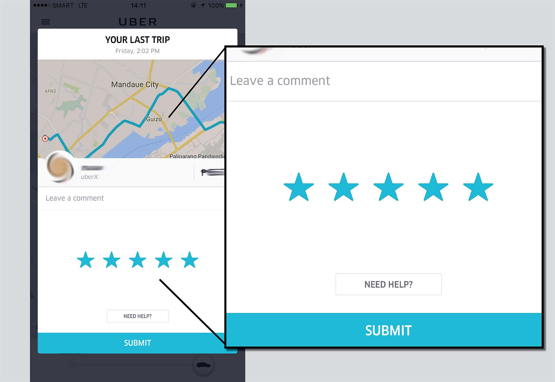 Users are effectively encouraged not to think before rating, because doing so will delay their gratification. Every driver gets a five star rating (or wherever a user’s thumb comfortably falls on the rating scale), regardless of the experience.
Wikipedia is guilty of this as well, if to a lesser extent. During fundraiser season, visitors to Wikipedia are prompted to donate to the online encyclopedia—something I am not innately opposed to.
It’s the way that the site prompts users to donate that makes it loathsome.
The donation prompt takes over the full height of the screen, and gives no indication the user need only scroll down to view their intended page.
Over time, of course, most users will learn that if they do not wish to donate, they need only scroll down, but for first-time users it is likely to be a catastrophic annoyance.
Users are effectively encouraged not to think before rating, because doing so will delay their gratification. Every driver gets a five star rating (or wherever a user’s thumb comfortably falls on the rating scale), regardless of the experience.
Wikipedia is guilty of this as well, if to a lesser extent. During fundraiser season, visitors to Wikipedia are prompted to donate to the online encyclopedia—something I am not innately opposed to.
It’s the way that the site prompts users to donate that makes it loathsome.
The donation prompt takes over the full height of the screen, and gives no indication the user need only scroll down to view their intended page.
Over time, of course, most users will learn that if they do not wish to donate, they need only scroll down, but for first-time users it is likely to be a catastrophic annoyance.
3) Cumbersome Interactions
Occasionally, all it takes for a design choice to become loathsome is for it to require cumbersome interactions. A prime example of this is the way in which Apple and some third party versions of Android have designed their alarm clock apps. It’s not the apps as a whole that are causing me to feel encumbered, but rather the way in which the designers require users to input the time at which an alarm will sound. This is the face of pure evil. Who decided that scrolling to a specific time, in increments of one, was a good idea? Not only does it take longer to scroll than it would to input a time in one of a handful of other common ways, but it also cannot be done in one movement. On ZTE’s Android skin, in order to get from “01” minutes to “59” minutes, users have to swipe several times. On iOS, one swipe will send the numbers spinning with momentum. Of course it’s cool and realistic, but it is hardly more efficient or usable. This seems to be a current trend with Apple.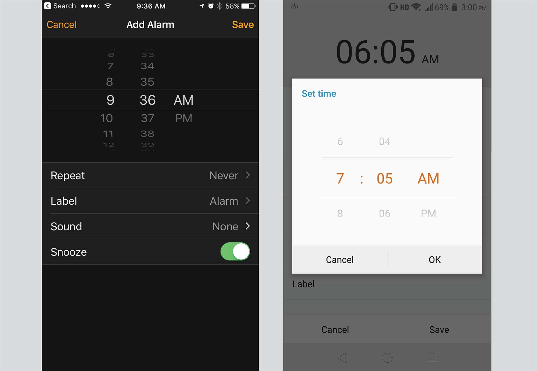 A dramatically more efficient and usable method for inputting alarm values is presented in stock Android.
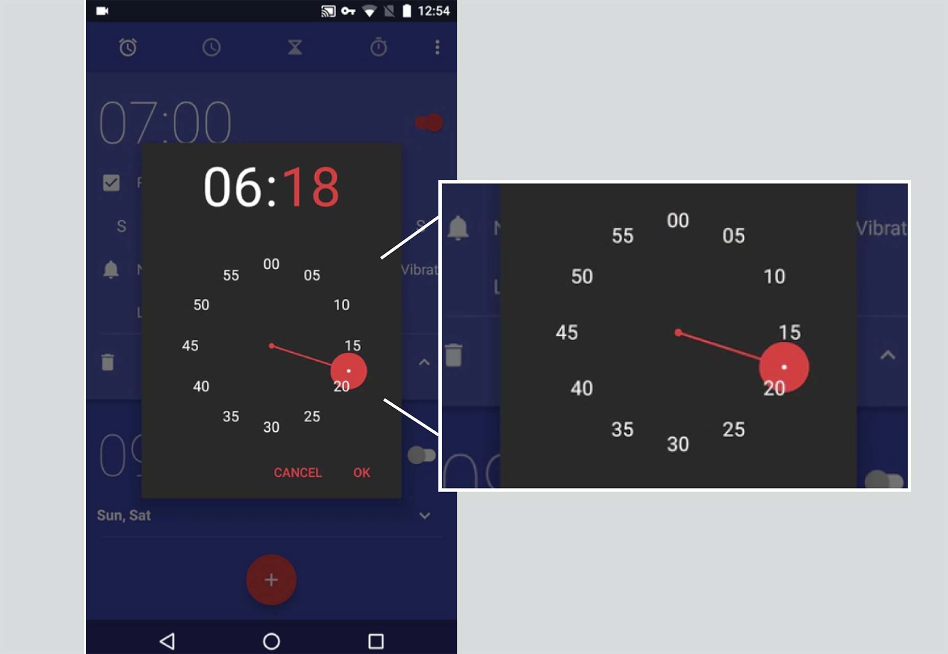 Google’s designers have figured out a layout that allows users to input alarm values in just two taps. This means that when sleepy users are trying to set an alarm, they won’t be forced to pay extra attention to the input method, and can instead focus on getting to sleep.
Don’t Make Your Users Loathe Your Design
There aren’t that many things that will make users loathe your app. Typically, the number one offense is simply inconveniencing users. Hiding critical functions, disrupting the launch of an app, and designing overly complex interactions will inconvenience your users, and depending on how much it bothers them, they may come to loathe your app. Avoiding the pitfalls of loathsome design isn’t hard. You just have to start (and finish) every feature with one simple question: am I making this as convenient and intuitive as it could be? If the answer to any of these questions is no, then there is still work to be done.Yona Gidalevitz
Yona is Codal’s technical researcher & writer. He is responsible for content strategy, documentation, blogging, and editing. He works closely with Codal’s UX, development, marketing, and administrative teams to produce all manner of written content. You can check out his work on Codal’s blog, Usability Geek, Invisionapp, and Medgadget’s blog, among others. In his free time, Yona is an avid guitarist, cook, and traveler.


Read Next

20 Best New Websites, April 2024
Welcome to our sites of the month for April. With some websites, the details make all the difference, while in others,…

Exciting New Tools for Designers, April 2024
Welcome to our April tools collection. There are no practical jokes here, just practical gadgets, services, and apps to…

14 Top UX Tools for Designers in 2024
User Experience (UX) is one of the most important fields of design, so it should come as no surprise that there are a…
By Simon Sterne

What Negative Effects Does a Bad Website Design Have On My Business?
Consumer expectations for a responsive, immersive, and visually appealing website experience have never been higher. In…

10+ Best Resources & Tools for Web Designers (2024 update)
Is searching for the best web design tools to suit your needs akin to having a recurring bad dream? Does each…
By WDD Staff

3 Essential Design Trends, April 2024
Ready to jump into some amazing new design ideas for Spring? Our roundup has everything from UX to color trends…

How to Plan Your First Successful Website
Planning a new website can be exciting and — if you’re anything like me — a little daunting. Whether you’re an…
By Simon Sterne

15 Best New Fonts, March 2024
Welcome to March’s edition of our roundup of the best new fonts for designers. This month’s compilation includes…
By Ben Moss

LimeWire Developer APIs Herald a New Era of AI Integration
Generative AI is a fascinating technology. Far from the design killer some people feared, it is an empowering and…
By WDD Staff

20 Best New Websites, March 2024
Welcome to our pick of sites for March. This month’s collection tends towards the simple and clean, which goes to show…

Exciting New Tools for Designers, March 2024
The fast-paced world of design never stops turning, and staying ahead of the curve is essential for creatives. As…

Web Tech Trends to Watch in 2024 and Beyond
It hardly seems possible given the radical transformations we’ve seen over the last few decades, but the web design…
By Louise North